Upgrade to Pro — share decks privately, control downloads, hide ads and more …

Leveraging themes and styles to implement dark mode on Android

Leveraging themes and styles to implement dark mode on Android

Presentation at DevFest Nürnberg, 2019 (https://devfestnuremberg.com/)

Abstract:
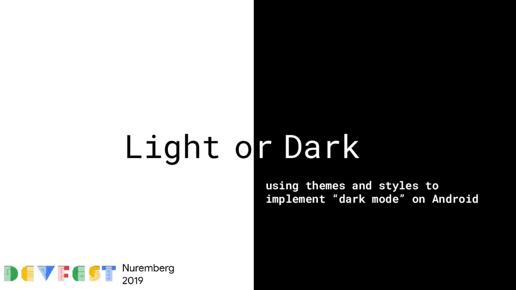
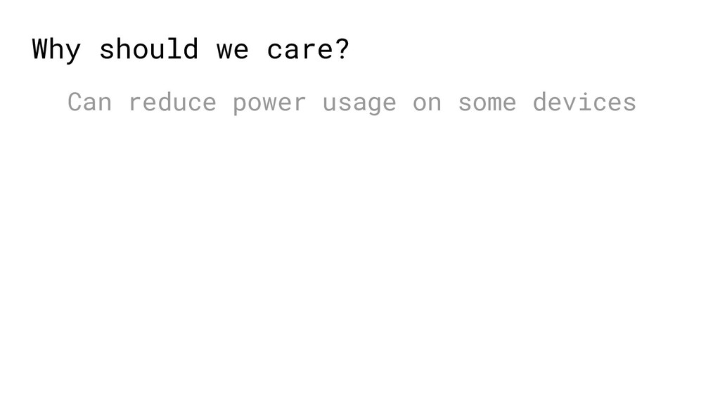
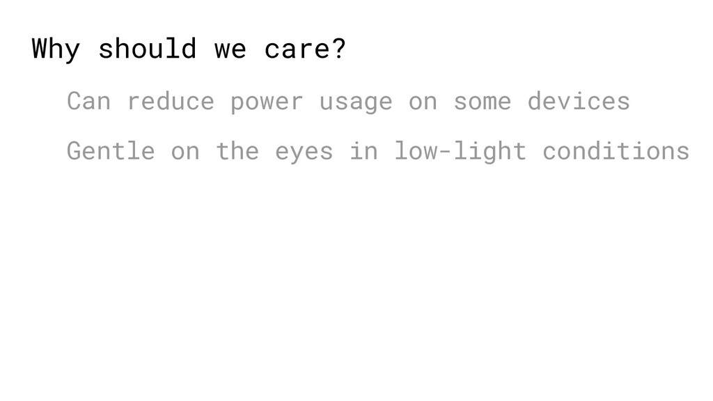
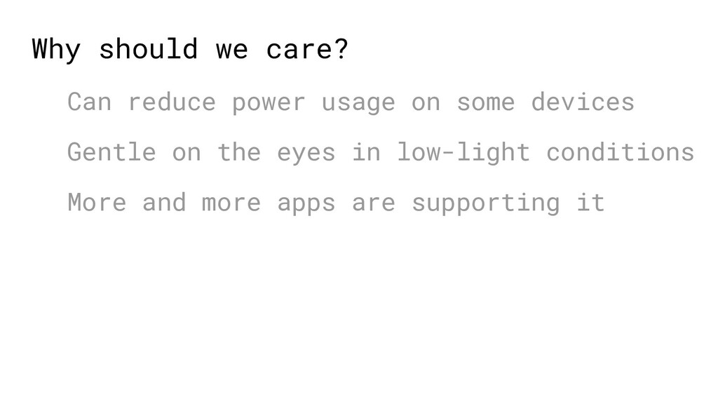
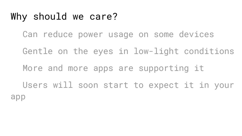
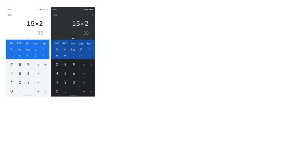
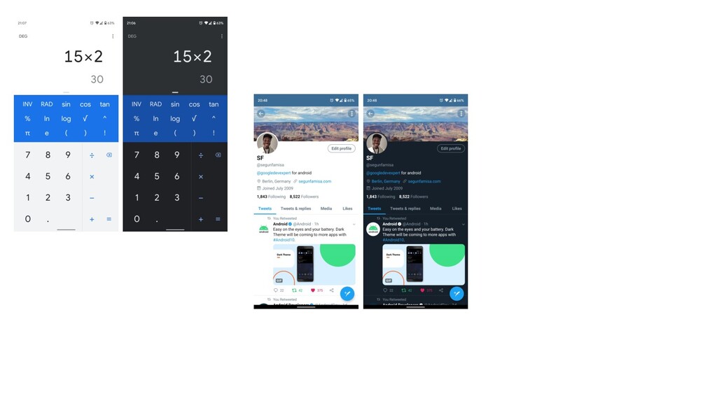
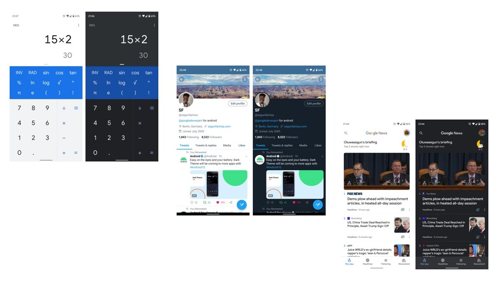
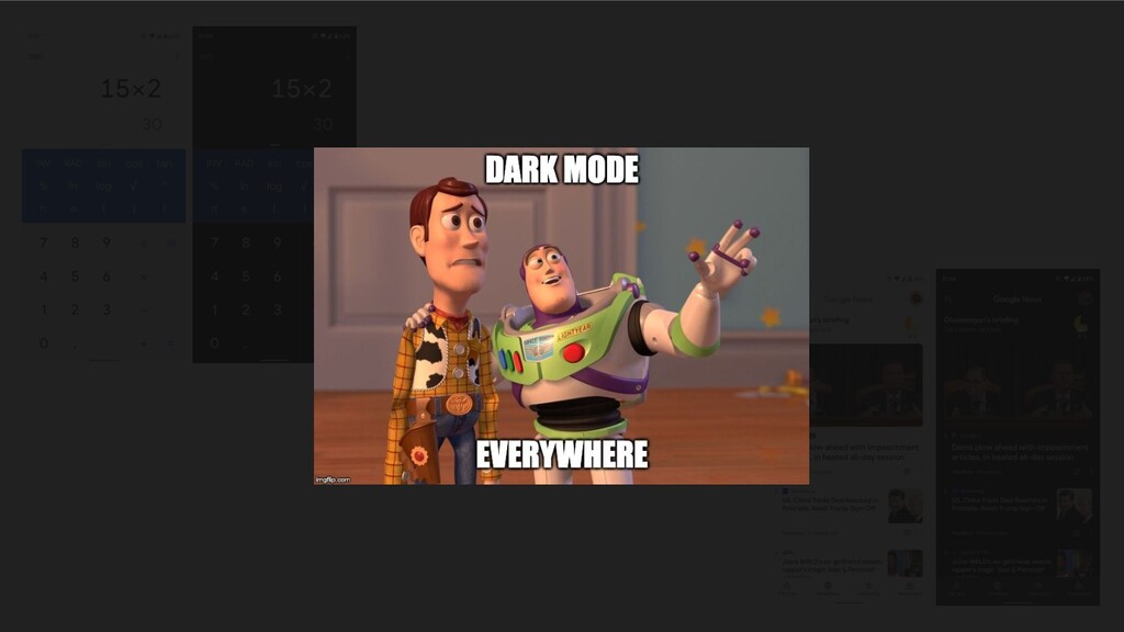
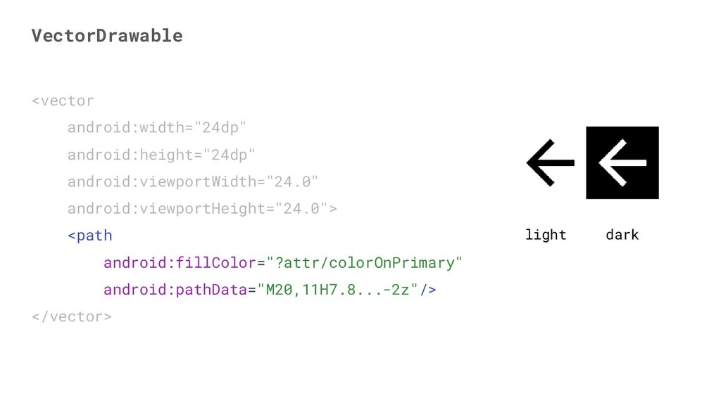
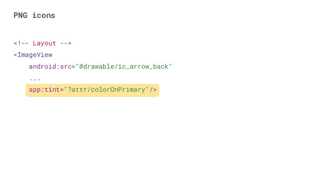
In recent times, light and dark modes have become popular in apps and as a result, users are starting to expect this feature in the apps they use.

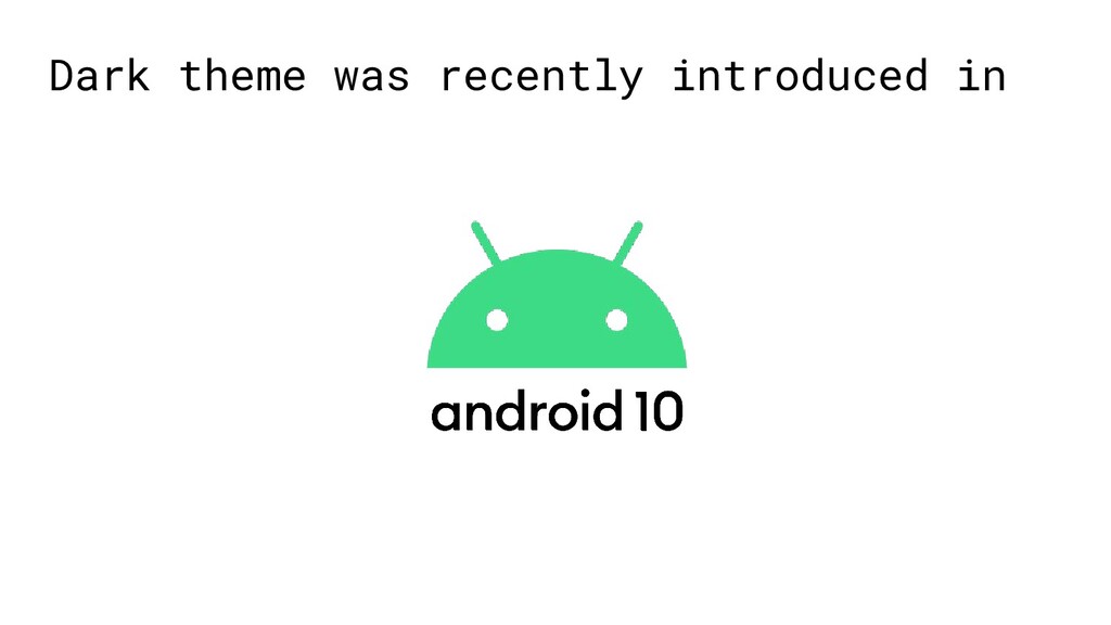
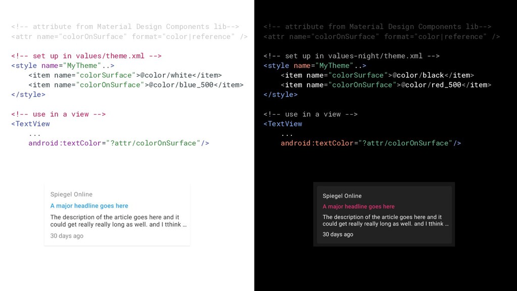
In Android 10, users are now able to set their device theme to dark or light. In order to be able to deliver a consistent experience for users across many apps, it’s good for these apps to respond appropriately to the theme set by the user on their device.

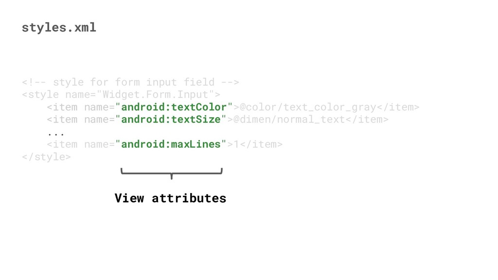
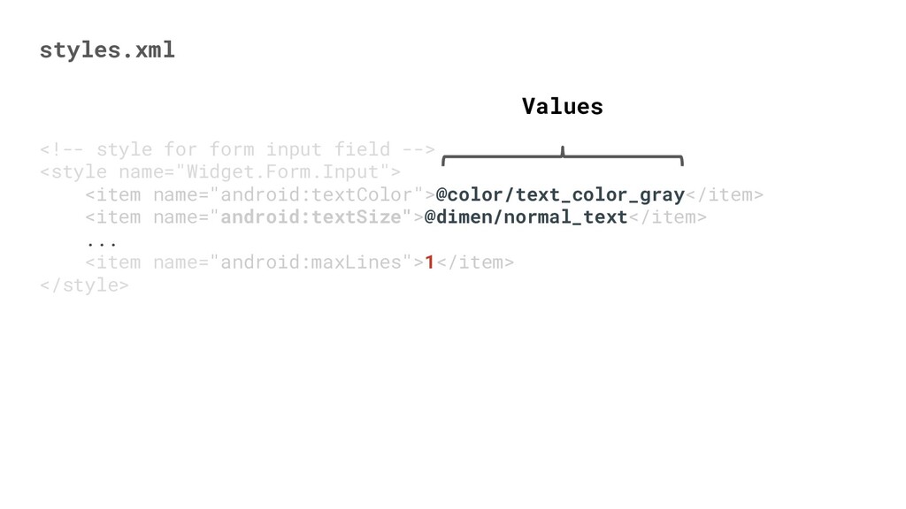
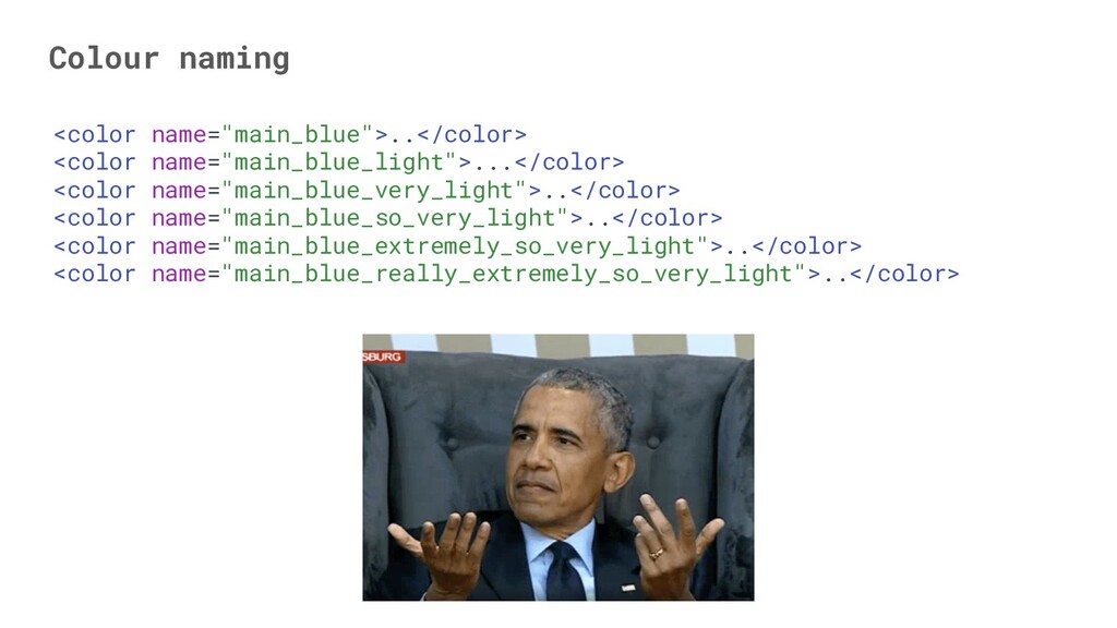
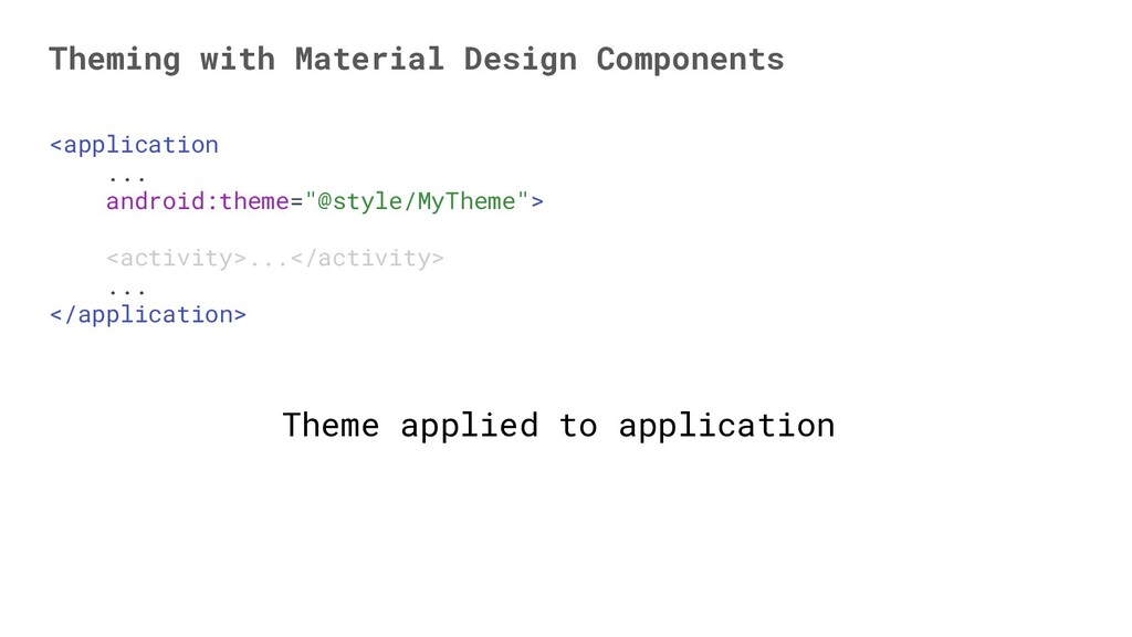
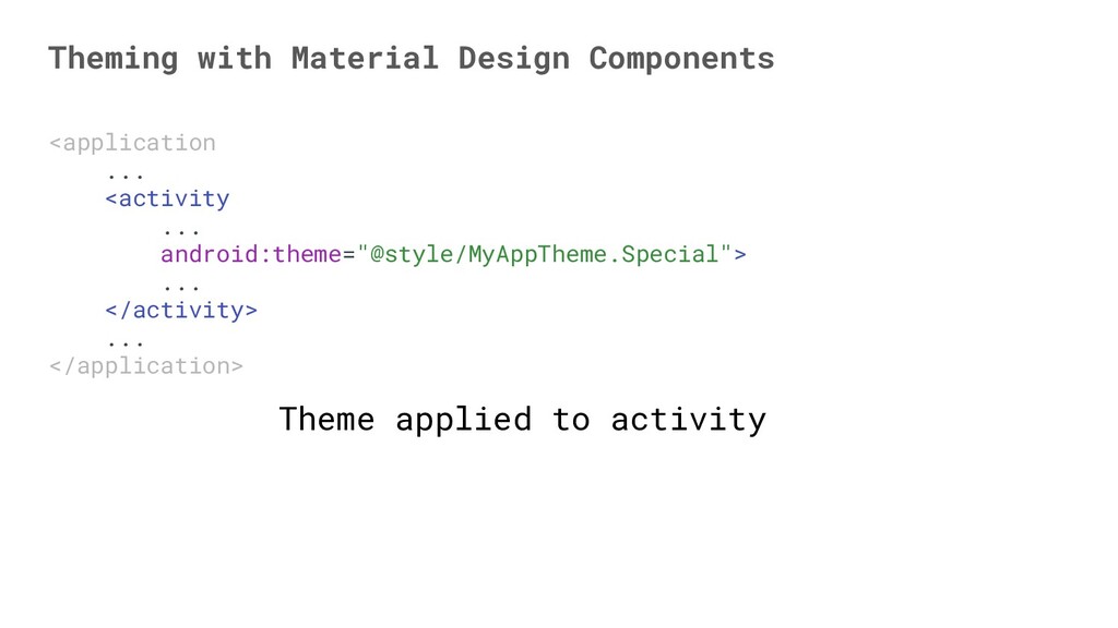
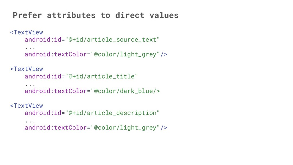
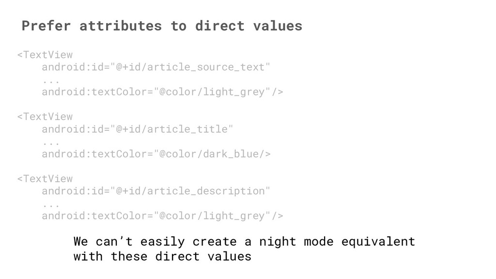
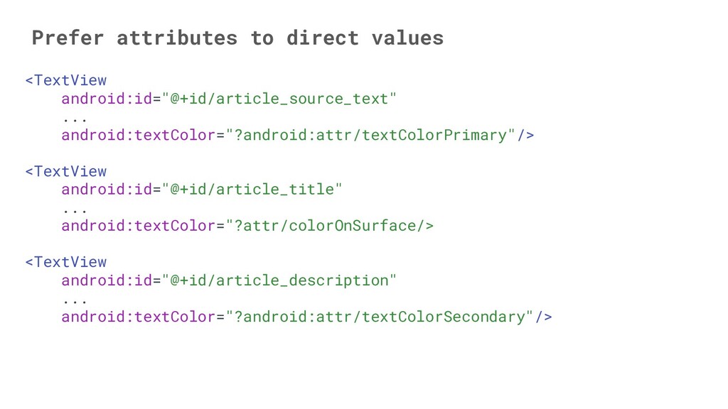
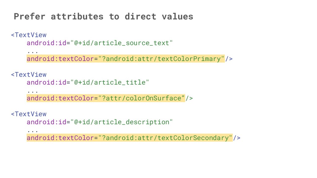
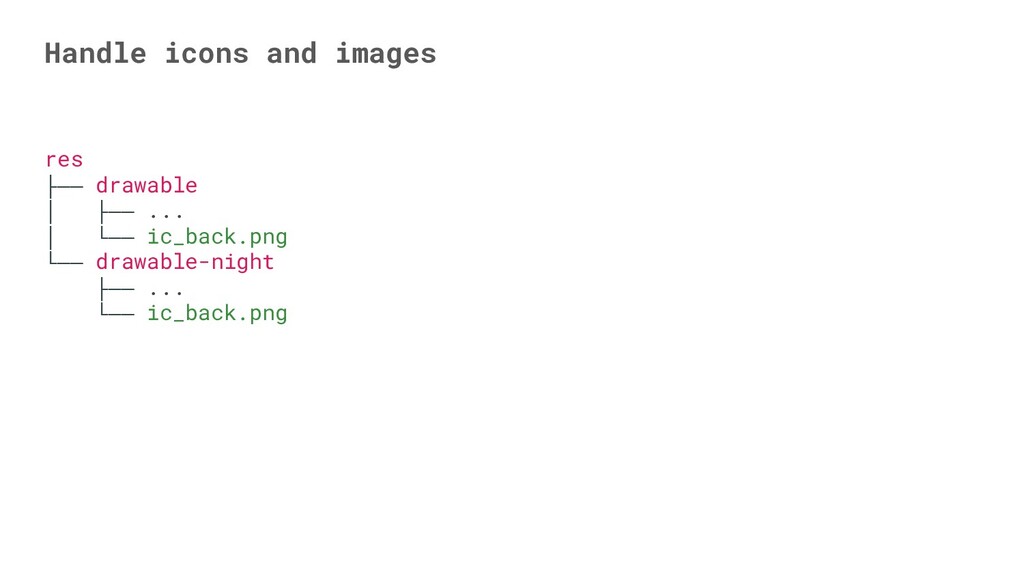
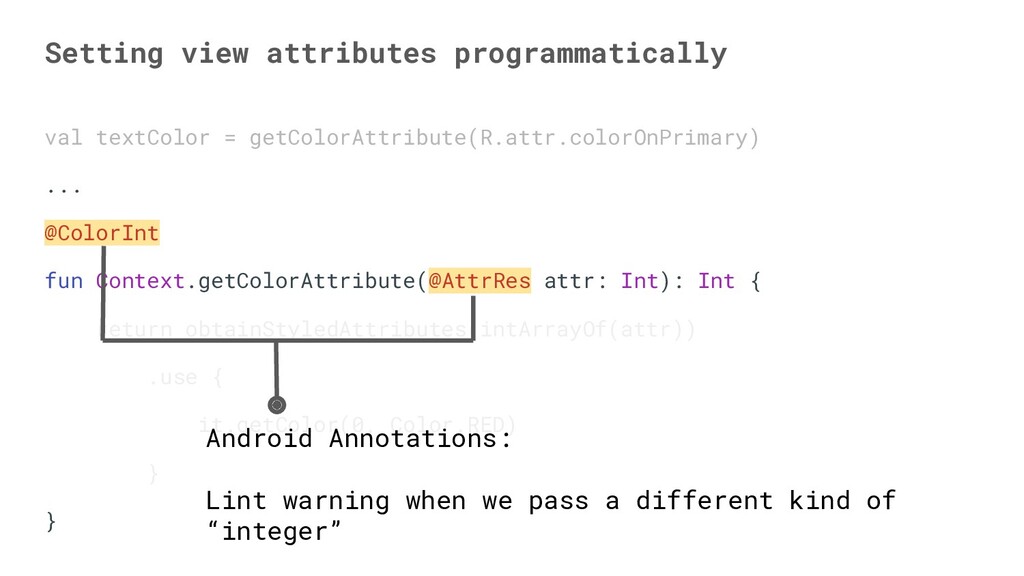
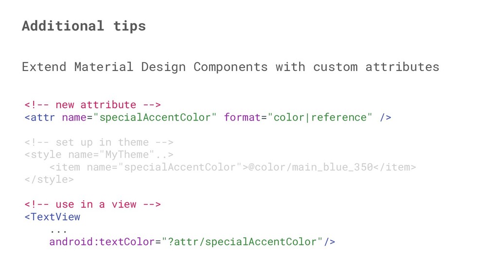
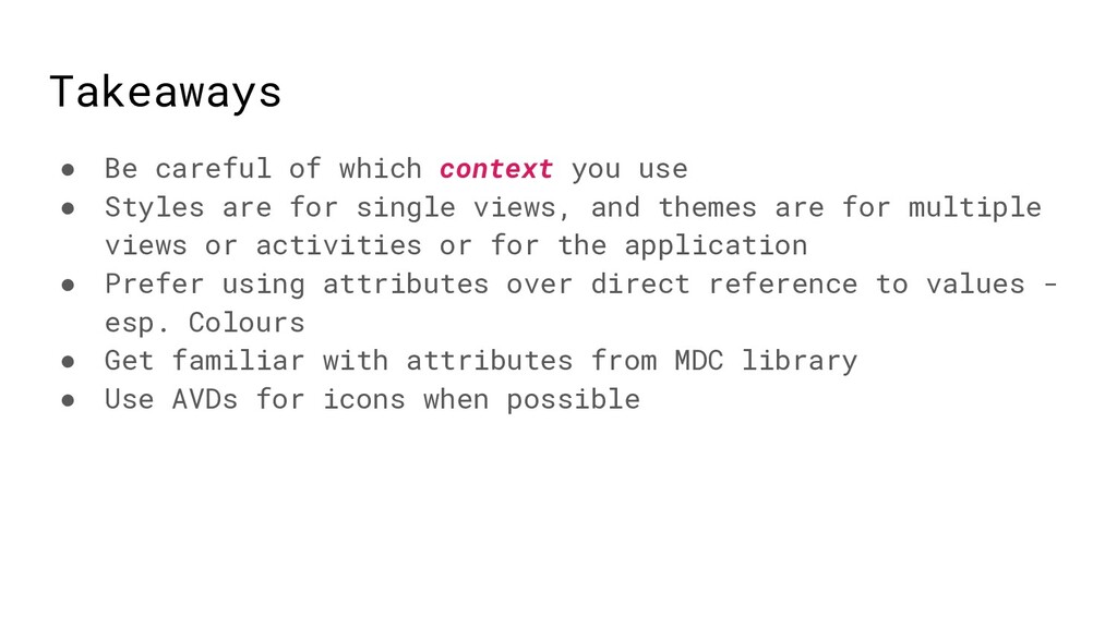
In order to implement this feature in our apps, there are changes we need to make to our app.

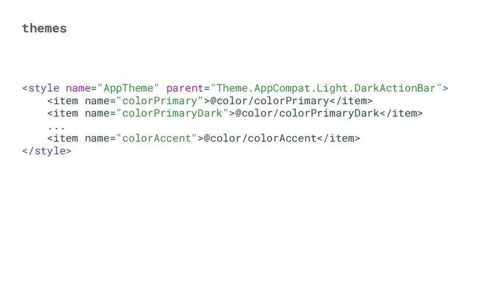
In this talk, we will look at how we can collaborate with our designers and support this feature in our apps. We will cover topics ranging from adopting a design system, to leveraging material design components, making use of styles and themes, the process of migration from no-design-system to using a design system.

By the end of this talk, we would have covered in practical steps, what we need and how to go about supporting dark mode in our apps in incremental steps.

Resources & Links in the presentation
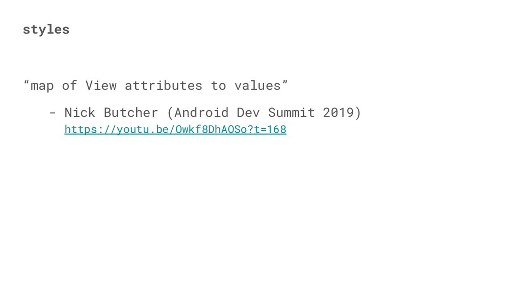
* Android Dev Summit, 2019: https://youtu.be/Owkf8DhAOSo?t=168
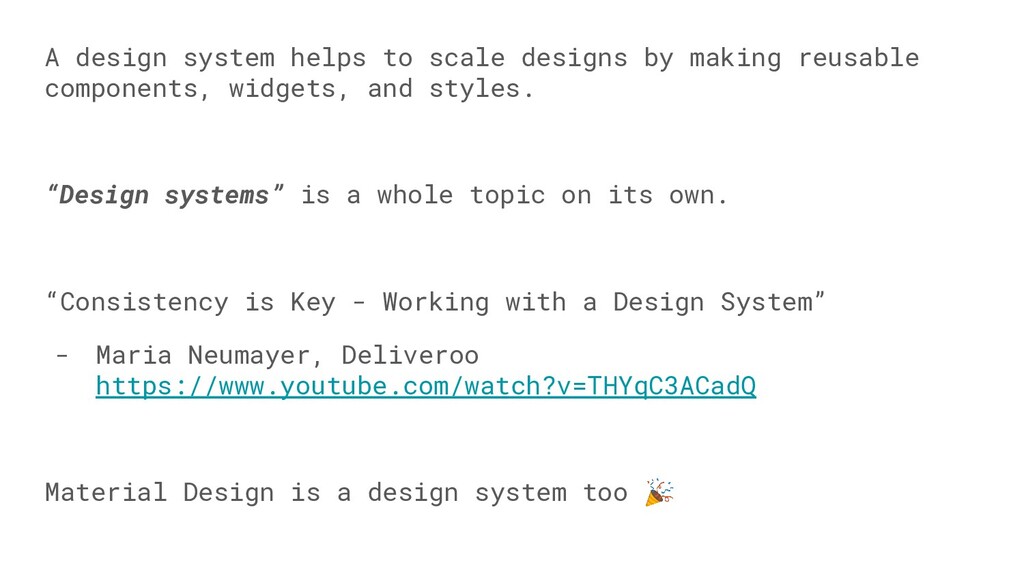
* “Consistency is Key - Working with a Design System” - Maria Neumayer - https://www.youtube.com/watch?v=THYqC3ACadQ
* Material Design Components on GitHub: https://github.com/material-components/material-components-android
* https://jorgecastillo.dev/dependency-inversion-on-android-theming
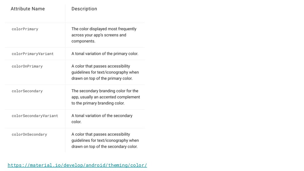
* https://material.io/develop/android/theming/color/

Segun Famisa

December 14, 2019
Tweet

More Decks by Segun Famisa

Other Decks in Programming

Transcript

  1. Why should we care? Can reduce power usage on some

    devices Gentle on the eyes in low-light conditions
  2. Why should we care? Can reduce power usage on some

    devices Gentle on the eyes in low-light conditions More and more apps are supporting it
  3. Why should we care? Can reduce power usage on some

    devices Gentle on the eyes in low-light conditions More and more apps are supporting it Users will soon start to expect it in your app
  4. styles “map of View attributes to values” - Nick Butcher

    (Android Dev Summit 2019) https://youtu.be/Owkf8DhAOSo?t=168
  5. styles.xml <!-- style for form input field --> <style name="Widget.Form.Input">

    <item name="android:textColor">@color/text_color_gray</item> <item name="android:textSize">@dimen/normal_text</item> ... <item name="android:maxLines">1</item> </style>
  6. styles.xml <!-- style for form input field --> <style name="Widget.Form.Input">

    <item name="android:textColor">@color/text_color_gray</item> <item name="android:textSize">@dimen/normal_text</item> ... <item name="android:maxLines">1</item> </style> View attributes
  7. styles.xml <!-- style for form input field --> <style name="Widget.Form.Input">

    <item name="android:textColor">@color/text_color_gray</item> <item name="android:textSize">@dimen/normal_text</item> ... <item name="android:maxLines">1</item> </style> Values
  8. themes “map of theme attributes to values” - Nick Butcher

    (Android Dev Summit 2019) https://youtu.be/Owkf8DhAOSo?t=168
  9. Themes Collection of attributes applied to an entire app, activity,

    or view hierarchy—not just an individual view Styles Collection of attributes that specify the appearance for a single View
  10. Themes Collection of attributes applied to an entire app, activity,

    or view hierarchy—not just an individual view ViewGroups pass down themes to their descendants Styles Collection of attributes that specify the appearance for a single View
  11. A design system helps to scale designs by making reusable

    components, widgets, and styles. “Design systems” is a whole topic on its own.
  12. A design system helps to scale designs by making reusable

    components, widgets, and styles. “Design systems” is a whole topic on its own. “Consistency is Key - Working with a Design System” - Maria Neumayer, Deliveroo https://www.youtube.com/watch?v=THYqC3ACadQ
  13. A design system helps to scale designs by making reusable

    components, widgets, and styles. “Design systems” is a whole topic on its own. “Consistency is Key - Working with a Design System” - Maria Neumayer, Deliveroo https://www.youtube.com/watch?v=THYqC3ACadQ Material Design is a design system too
  14. Attributes are like interfaces, and the referenced colours are like

    implementations. Allows for inversion of control. Only change the implementations to change the value. https://jorgecastillo.dev/dependency-inversion-on-android-theming Understanding attributes
  15. <!-- attribute from Material Design Components lib--> <attr name="colorOnSurface" format="color|reference"

    /> <!-- set up in values/theme.xml --> <style name="MyTheme"..> <item name="colorSurface">@color/white</item> <item name="colorOnSurface">@color/blue_500</item> </style>
  16. <!-- attribute from Material Design Components lib--> <attr name="colorOnSurface" format="color|reference"

    /> <!-- set up in values/theme.xml --> <style name="MyTheme"..> <item name="colorSurface">@color/white</item> <item name="colorOnSurface">@color/blue_500</item> </style> <!-- use in a view --> <TextView ... android:textColor="?attr/colorOnSurface"/>
  17. <!-- attribute from Material Design Components lib--> <attr name="colorOnSurface" format="color|reference"

    /> <!-- set up in values/theme.xml --> <style name="MyTheme"..> <item name="colorSurface">@color/white</item> <item name="colorOnSurface">@color/blue_500</item> </style> <!-- use in a view --> <TextView ... android:textColor="?attr/colorOnSurface"/>
  18. <!-- attribute from Material Design Components lib--> <attr name="colorOnSurface" format="color|reference"

    /> <!-- set up in values/theme.xml --> <style name="MyTheme"..> <item name="colorSurface">@color/white</item> <item name="colorOnSurface">@color/blue_500</item> </style> <!-- use in a view --> <TextView ... android:textColor="?attr/colorOnSurface"/> <!-- attribute from Material Design Components lib--> <attr name="colorOnSurface" format="color|reference" /> <!-- set up in values-night/theme.xml --> <style name="MyTheme"..> <item name="colorSurface">@color/black</item> <item name="colorOnSurface">@color/red_500</item> </style> <!-- use in a view --> <TextView ... android:textColor="?attr/colorOnSurface"/>
  19. <!-- attribute from Material Design Components lib--> <attr name="colorOnSurface" format="color|reference"

    /> <!-- set up in values/theme.xml --> <style name="MyTheme"..> <item name="colorSurface">@color/white</item> <item name="colorOnSurface">@color/blue_500</item> </style> <!-- use in a view --> <TextView ... android:textColor="?attr/colorOnSurface"/> <!-- attribute from Material Design Components lib--> <attr name="colorOnSurface" format="color|reference" /> <!-- set up in values-night/theme.xml --> <style name="MyTheme"..> <item name="colorSurface">@color/black</item> <item name="colorOnSurface">@color/red_500</item> </style> <!-- use in a view --> <TextView ... android:textColor="?attr/colorOnSurface"/>
  20. Look at how you can fit your design into existing

    material design system framework Fit your design into the material design system
  21. Look at how you can fit your design into existing

    material design system framework Identify what could be the colorPrimary, colorSecondary, colorOnPrimary, etc. Fit your design into the material design system
  22. Instead, it’s recommended to name your colours by shade <color

    name="main_blue_700">..</color> <color name="main_blue_500">...</color> <color name="main_blue_300">..</color> <color name="main_blue_200">..</color> <color name="main_blue_100">..</color> <color name="main_blue_50">..</color>
  23. Instead, it’s recommended to name your colours by shade <color

    name="main_blue_700">..</color> <color name="main_blue_500">...</color> <color name="main_blue_300">..</color> <color name="main_blue_200">..</color> <color name="main_blue_100">..</color> <color name="main_blue_50">..</color>
  24. <!-- values/theme.xml --> <style name="MyTheme" parent="Theme.MaterialComponents.DayNight.Bridge"/> Theming with Material Design

    Components Bridge: inherits from AppCompat and still brings new attributes from MDC
  25. <!-- values/theme.xml --> <style name="MyTheme" parent="Theme.MaterialComponents.DayNight.Bridge"> <item name="colorPrimary">@color/main_blue_500</item> <item name="colorPrimaryVariant">@color/main_blue_300</item>

    <item name="colorSecondary">@color/main_red_500</item> <item name="colorSecondaryVariant">@color/main_red_300</item> ... <item name="colorOnPrimary">@color/white</item> </style> Theming with Material Design Components
  26. <!-- values-night/theme.xml --> <style name="MyTheme" parent="Theme.MaterialComponents.DayNight.Bridge"> <item name="colorPrimary">@color/main_blue_300</item> <item name="colorPrimaryVariant">@color/main_blue_500</item>

    <item name="colorSecondary">@color/main_red_300</item> <item name="colorSecondaryVariant">@color/main_red_500</item> ... <item name="colorOnPrimary">@color/white</item> </style> Theming with Material Design Components
  27. <!-- values/theme.xml --> <style name="MyTheme" parent="..."> <item name="colorPrimary">...</item> <item name="colorPrimaryVariant">...</item>

    <item name="colorSecondary">...</item> <item name="colorSecondaryVariant">...</item> ... <item name="colorOnPrimary">...</item> </style> <!-- values-night/theme.xml --> <style name="MyTheme" parent="..."> <item name="colorPrimary">...</item> <item name="colorPrimaryVariant">...</item> <item name="colorSecondary">...</item> <item name="colorSecondaryVariant">...</item> ... <item name="colorOnPrimary">...</item> </style>
  28. Prefer attributes to direct values <TextView android:id="@+id/article_source_text" ... android:textColor="@color/light_grey"/> <TextView

    android:id="@+id/article_title" ... android:textColor="@color/dark_blue/> <TextView android:id="@+id/article_description" ... android:textColor="@color/light_grey"/>
  29. Prefer attributes to direct values <TextView android:id="@+id/article_source_text" ... android:textColor="@color/light_grey"/> <TextView

    android:id="@+id/article_title" ... android:textColor="@color/dark_blue/> <TextView android:id="@+id/article_description" ... android:textColor="@color/light_grey"/> We can’t easily create a night mode equivalent with these direct values
  30. Handle icons and images res ├── drawable │ ├── ...

    │ └── ic_back.png └── drawable-night ├── ... └── ic_back.png
  31. Handle icons and images res ├── drawable │ ├── ...

    │ └── ic_back.png └── drawable-night ├── ... └── ic_back.png
  32. VectorDrawable <!-- values/theme.xml --> <style name="MyTheme"> ... <item name="colorOnPrimary">@color/black</item> </style>

    <!-- values-night/theme.xml --> <style name="MyTheme"> ... <item name="colorOnPrimary">@color/white</item> </style>
  33. Setting view attributes programmatically val textColor = getColorAttribute(R.attr.colorOnPrimary) ... @ColorInt

    fun Context.getColorAttribute(@AttrRes attr: Int): Int { return obtainStyledAttributes(intArrayOf(attr)) .use { it.getColor(0, Color.RED) } }
  34. Setting view attributes programmatically val textColor = getColorAttribute(R.attr.colorOnPrimary) ... @ColorInt

    fun Context.getColorAttribute(@AttrRes attr: Int): Int { return obtainStyledAttributes(intArrayOf(attr)) .use { it.getColor(0, Color.RED) } } Android Annotations: Lint warning when we pass a different kind of “integer”
  35. <!-- new attribute --> <attr name="specialAccentColor" format="color|reference" /> <!-- set

    up in theme --> <style name="MyTheme"..> <item name="specialAccentColor">@color/main_blue_350</item> </style> Extend Material Design Components with custom attributes Additional tips
  36. Extend Material Design Components with custom attributes Additional tips <!--

    new attribute --> <attr name="specialAccentColor" format="color|reference" /> <!-- set up in theme --> <style name="MyTheme"..> <item name="specialAccentColor">@color/main_blue_350</item> </style> <!-- use in a view --> <TextView ... android:textColor="?attr/specialAccentColor"/>
  37. Extend Material Design Components with custom attributes Use AppCompatDelegate for

    compatibility with old versions of android Additional tips
  38. Takeaways • Be careful of which context you use •

    Styles are for single views, and themes are for multiple views or activities or for the application • Prefer using attributes over direct reference to values - esp. Colours • Get familiar with attributes from MDC library • Use AVDs for icons when possible