Upgrade to Pro — share decks privately, control downloads, hide ads and more …

Data Visualisation in Python

Shane Lynn
November 17, 2018

Data Visualisation in Python

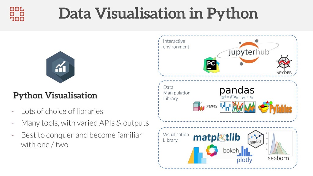
The ability to explore and grasp data structures through quick and intuitive visualisation is a key skill of any data scientist. Different tools in the Python ecosystem required varying levels of mental-gymnastics to manipulate and visualise information during a data exploration session.

The array of Python libraries, each with their own idiosyncrasies, available can be daunting for newcomers and data scientists-in-training. In this talk, we examine the core data visualisation libraries compatible with the popular Pandas data wrangling library.

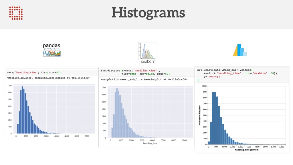
We'll look at the base-level Matplotlib library first, and then show the benefits of the higher-level Pandas visualisation toolkit and the popular Seaborne library. By the end of the talk, you'll be bar plotting, scatter plotting, and line plotting (never pie charting) your way to data visualisation bliss.

This talk was presented at Pycon Dublin 2018 in November 2018.

Shane Lynn

November 17, 2018
Tweet

Other Decks in Programming

Transcript

  1. COMPLEX DECISIONS SIMPLIFIED edgetier Data Visualisation in Python Quick and

    easy routes to plotting magic Shane Lynn Ph.D. @shane_a_lynn www.edgetier.com | [email protected] | @TeamEdgeTier
  2. • Data Visualisation Basics • Basic Python Setup & Core

    Libraries • Code examples and comparisons • What to avoid COMPLEX DECISIONS SIMPLIFIED edgetier Outline
  3. Commercially focused SaaS to increase revenue and reduce costs Focus

    on data science, machine learning, and automation AI system works alongside customer service agents to increase efficiency by 100% EdgeTier specialise in data and artificial intelligence products for customer contact centres. COMPLEX DECISIONS SIMPLIFIED edgetier EdgeTier
  4. COMPLEX DECISIONS SIMPLIFIED edgetier Data Visualisation Data visualisation is a

    general term that describes any effort to help people understand the significance of data by placing it in a visual context.
  5. COMPLEX DECISIONS SIMPLIFIED edgetier Data Visualisation Iteration speed Un-intrusive Flexible

    Aesthetically pleasing Choice of Data Visualisation Tool is important
  6. COMPLEX DECISIONS SIMPLIFIED edgetier Chart Choice – Fearsome Foursome HISTOGRAM

    An accurate graphical representation of the distribution of numeric data. BARPLOT Represents the value of entities using bar of various length. SCATTER PLOT Show the relationship between 2 numeric variables. LINE CHART Shows the evolution of numeric variables. Icons: www.data-to-viz.com
  7. COMPLEX DECISIONS SIMPLIFIED edgetier Chart Choice – Fearsome Foursome HISTOGRAM

    An accurate graphical representation of the distribution of numeric data. BARPLOT Represents the value of entities using bar of various length. SCATTER PLOT Show the relationship between 2 numeric variables. LINE CHART Shows the evolution of numeric variables. Icons: www.data-to-viz.com BARPLOT Represents the value of entities using bar of various length. SCATTER PLOT Show the relationship between 2 numeric variables. BOXPLOT Summarize the distribution of numeric variables SANKEY DIAGRAM Showing flows with smooth links Special Mentions CHOROPLETH MAP Display an aggregated value for each region of a map
  8. COMPLEX DECISIONS SIMPLIFIED edgetier Data Visualisation in Python - Lots

    of choice of libraries - Many tools, with varied APIs & outputs - Best to conquer and become familiar with one / two Python Visualisation seaborn Interactive environment Data Manipulation Library Visualisation Library
  9. COMPLEX DECISIONS SIMPLIFIED edgetier Matplotlib Low level plotting library with

    Matlab-like API + Very flexible, complete control - Verbose plots, aesthetically lacking, sometimes difficult with Pandas ...need to know enough to debug… Grand daddy of Python Plotting
  10. COMPLEX DECISIONS SIMPLIFIED edgetier Pandas / Seaborn / Altair Pandas

    – Visualisation API built into DataFrame & Series objects, interface to Matplotlib. Seaborn – extends and provides high- level API on Matplotlib with improved styling. Altair – Built on “Vega-Lite” visualisation grammar. Allows some interactive plots in Jupyter Notebooks. Higher level plotting
  11. COMPLEX DECISIONS SIMPLIFIED edgetier Basic Notebook Setup Top of notebook

    – inline vs notebook style. Theme also can be chosen here Imports on Matplotlib
  12. COMPLEX DECISIONS SIMPLIFIED edgetier Sample Data EdgeTier relevant sample dataset

    on chat system performance. Agents answering customer chats from different websites and languages – 5477 chats over 100 agents.
  13. COMPLEX DECISIONS SIMPLIFIED edgetier The Bar Plot - Matplotlib Python

    visualisation libraries often require that the data for plotting is pre-formatted for visualisation. For Pandas and Matplotlib, the visualisation library often only present the values, and does not do calculations. Bar plot of chats per user
  14. COMPLEX DECISIONS SIMPLIFIED edgetier The Bar Plot - Matplotlib .bar()

    function does the work, manually position ‘x’ labels and positions. Most code here is formatting and display.
  15. COMPLEX DECISIONS SIMPLIFIED edgetier The Bar Plot - Pandas Plot

    output is Matplotlib – same manipulation. Slightly simpler API / data access.
  16. COMPLEX DECISIONS SIMPLIFIED edgetier The Bar Plot - Seaborn Simpler

    data access again. Same Matplotlib formatting functions seaborn
  17. COMPLEX DECISIONS SIMPLIFIED edgetier The Bar Plot - Altair Not

    Matplotlib-based – very different syntax and formatting. Ordering was difficult here. Only one command for everything. JSON format behind.
  18. COMPLEX DECISIONS SIMPLIFIED edgetier The Bar Plot - Altair Not

    Matplotlib-based – very different syntax and formatting. Ordering was difficult here. Only one command for everything. JSON format behind.
  19. COMPLEX DECISIONS SIMPLIFIED edgetier Prettier Pandas Plots seaborn Seaborn styles

    are applied to all matplotlib plots – Cheat your way to nicer looking Pandas Plots!
  20. COMPLEX DECISIONS SIMPLIFIED edgetier More Challenging Bar Plot For the

    top 20 agents, what was the split of the top websites? We want a ‘stacked bar’ for this visualisation.
  21. COMPLEX DECISIONS SIMPLIFIED edgetier Stacked Bar - Seaborn Elegant API,

    simple code structure, but … …embarrassingly… no stacked-bar chart support! seaborn
  22. COMPLEX DECISIONS SIMPLIFIED edgetier Stacked Bar - Seaborn Elegant API,

    simple code structure, but … …embarrassingly… no stacked-bar chart support! seaborn
  23. COMPLEX DECISIONS SIMPLIFIED edgetier Stacked Bar - Altair Simple output,

    short code. Some issues around data storage, JSON formats, and sorting is difficult.
  24. COMPLEX DECISIONS SIMPLIFIED edgetier Seaborn - Estimators Calculations done as

    part of plotting – no previous data manipulations. Separation of data and visualisation code. seaborn
  25. COMPLEX DECISIONS SIMPLIFIED edgetier Seaborn - Estimators Very simple to

    change estimator function to calculate different statistics. Similar functionality available in Altair seaborn
  26. COMPLEX DECISIONS SIMPLIFIED edgetier Histograms - Seaborn Some really nice

    options for impressive and informative hints on Seaborn graphs. seaborn
  27. COMPLEX DECISIONS SIMPLIFIED edgetier Scatter Plots - Pandas Pandas: Good

    for quick single-coloured scatter visualisations. Messy with multiple categories.
  28. COMPLEX DECISIONS SIMPLIFIED edgetier Scatter Plots - Pandas Pandas: Good

    for quick single-coloured scatter visualisations. Messy with multiple categories.
  29. COMPLEX DECISIONS SIMPLIFIED edgetier Scatter Plots - Seaborn Seaborn /

    Altair: Better higher level representation, and better for multi-category scatters. seaborn
  30. COMPLEX DECISIONS SIMPLIFIED edgetier Scatter Plots - Altair Seaborn /

    Altair: Better higher level representation, and better for multi-category scatters.
  31. COMPLEX DECISIONS SIMPLIFIED edgetier Line Plots Plot chats per language

    over time Pandas: Needs data manipulation, simple thereafter.
  32. COMPLEX DECISIONS SIMPLIFIED edgetier More Options! Folium: Generate interactive maps

    using leaflet.js Matplotlib: Basemap plugin Geospatial Viz Bokeh: Makes visualisations for web browser interaction. Plotly: Online visualisations – runs by default in cloud Interactive Plots
  33. COMPLEX DECISIONS SIMPLIFIED edgetier What to Avoid – Angles? Pie

    Charts: Radial angle for comparison. Humans are very bad at accurate radial comparisons – we’ve evolved for speedy length / distance comparisons. https://blog.funnel.io/why-we-dont-use-pie-charts-and-some-tips-on- better-data-visualizations
  34. COMPLEX DECISIONS SIMPLIFIED edgetier What to Avoid – Angles? Pie

    Charts: Radial angle for comparison. Humans are very bad at accurate radial comparisons – we’ve evolved for speedy length / distance comparisons. https://blog.funnel.io/why-we-dont-use-pie-charts-and-some-tips-on- better-data-visualizations
  35. COMPLEX DECISIONS SIMPLIFIED edgetier What to Avoid – Area? Area:

    We’re bad at area – rank these bubbles by area, and compare them relative to each other.
  36. COMPLEX DECISIONS SIMPLIFIED edgetier What to Avoid – Area? Area:

    We’re bad at area – rank these bubbles by area, and compare them relative to each other. https://www.data-to-viz.com/caveat/area_hard.html
  37. COMPLEX DECISIONS SIMPLIFIED edgetier What to Avoid – 3d? 3d:

    In general, 3D is “fake fancy”. Impractical but gee-whizz – avoid! Caveat: Interactive Scatters?
  38. Wide variety of tools available in Python. Get familiar with

    Pandas syntax for quick & simple exploration, and use with Seaborn themes. Learn one more high-level library in detail – Seaborn or Altair for publication of output and more flexibility “Simplicity is the ultimate sophistication” Leonardo Da Vinci COMPLEX DECISIONS SIMPLIFIED edgetier Conclusions
  39. COMPLEX DECISIONS SIMPLIFIED edgetier Data Visualisation in Python Quick and

    easy routes to plotting magic Shane Lynn PhD @shane_a_lynn | @TeamEdgeTier www.edgetier.com | [email protected] | @TeamEdgeTier
  40. Resources Tour of Python’s Data Landscape https://dsaber.com/2016/10/02/a-dramatic-tour-through-pythons-data- visualization-landscape-including-ggplot-and-altair/ Python Graph

    Gallery https://python-graph-gallery.com/ From Data to Viz https://www.data-to-viz.com/ COMPLEX DECISIONS SIMPLIFIED edgetier More?