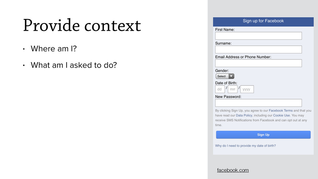
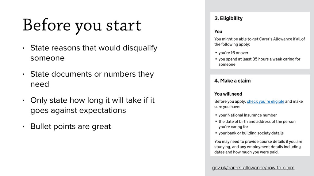
• State documents or numbers they need • Only state how long it will take if it goes against expectations • Bullet points are great gov.uk/carers-allowance/how-to-claim
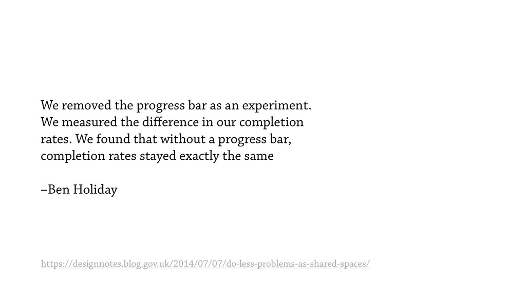
the difference in our completion rates. We found that without a progress bar, completion rates stayed exactly the same –Ben Holiday https://designnotes.blog.gov.uk/2014/07/07/do-less-problems-as-shared-spaces/
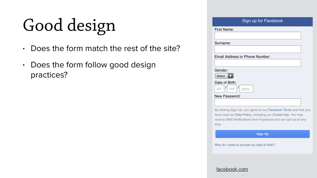
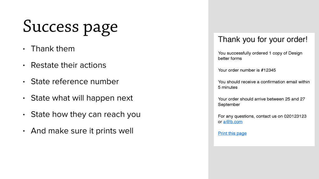
State reference number • State what will happen next • State how they can reach you • And make sure it prints well Thank you for your order! You successfully ordered 1 copy of Design better forms Your order number is #12345 You should receive a confirmation email within 5 minutes Your order should arrive between 25 and 27 September For any questions, contact us on 020123123 or [email protected] Print this page
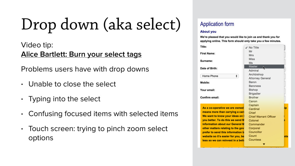
your select tags Problems users have with drop downs • Unable to close the select • Typing into the select • Confusing focused items with selected items • Touch screen: trying to pinch zoom select options Master
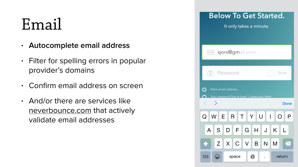
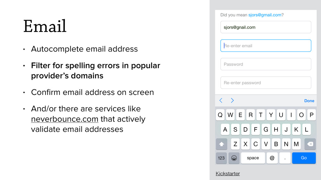
in popular provider’s domains • Confirm email address on screen • And/or there are services like neverbounce.com that actively validate email addresses Kickstarter
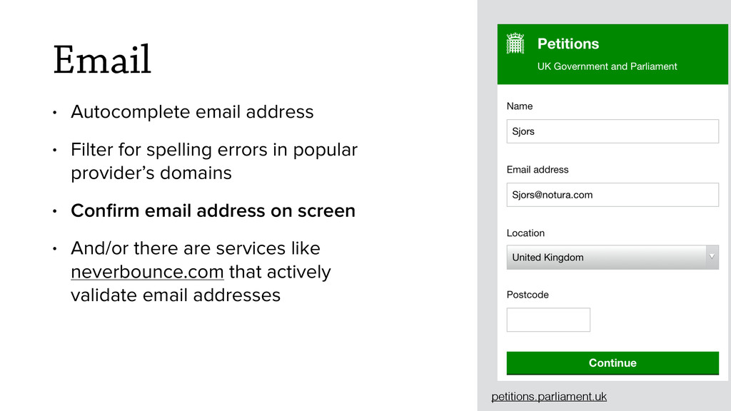
in popular provider’s domains • Confirm email address on screen • And/or there are services like neverbounce.com that actively validate email addresses petitions.parliament.uk
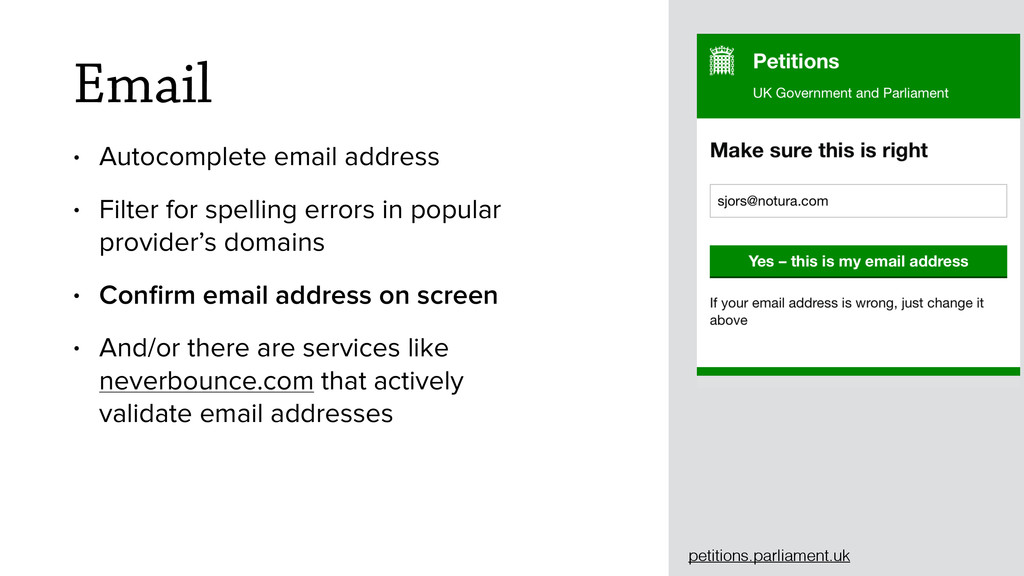
in popular provider’s domains • Confirm email address on screen • And/or there are services like neverbounce.com that actively validate email addresses petitions.parliament.uk
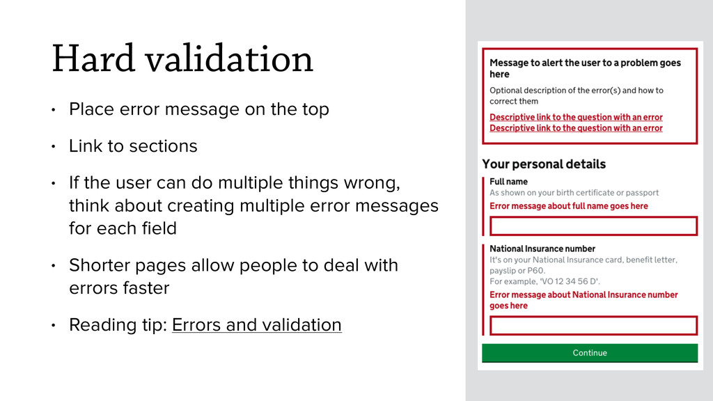
Link to sections • If the user can do multiple things wrong, think about creating multiple error messages for each field • Shorter pages allow people to deal with errors faster • Reading tip: Errors and validation