“Unenforced standards of conduct which demonstrate that a person is proper, caring, non-grouchy, polite, and refined.” http://en.wikipedia.org/wiki/Manners Having good mobile manners means showing respect for your users. By doing these things, we can make them more successful and happier (which will lead to more loyalty).
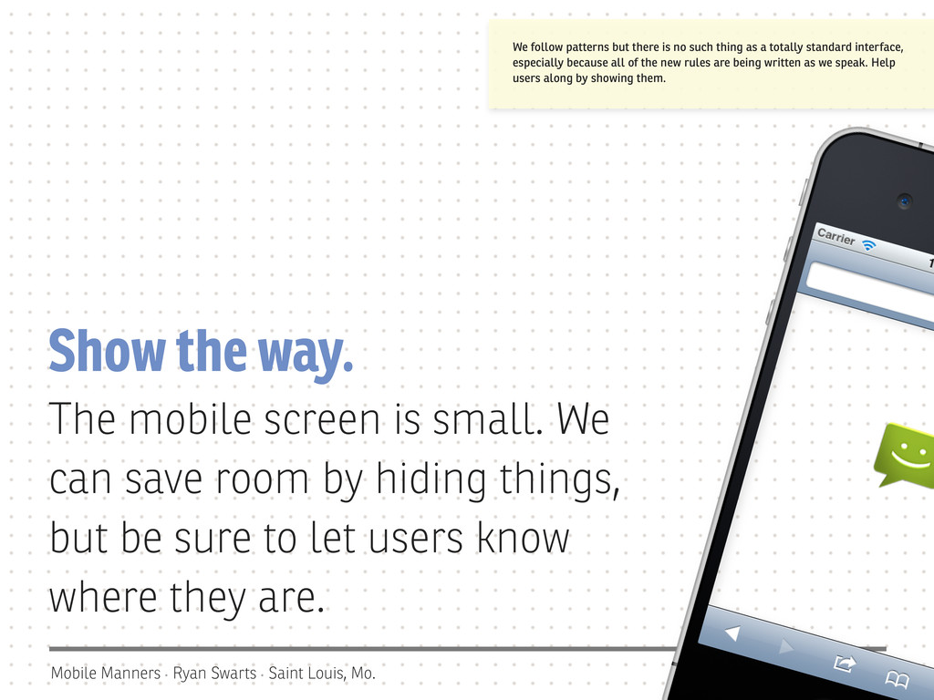
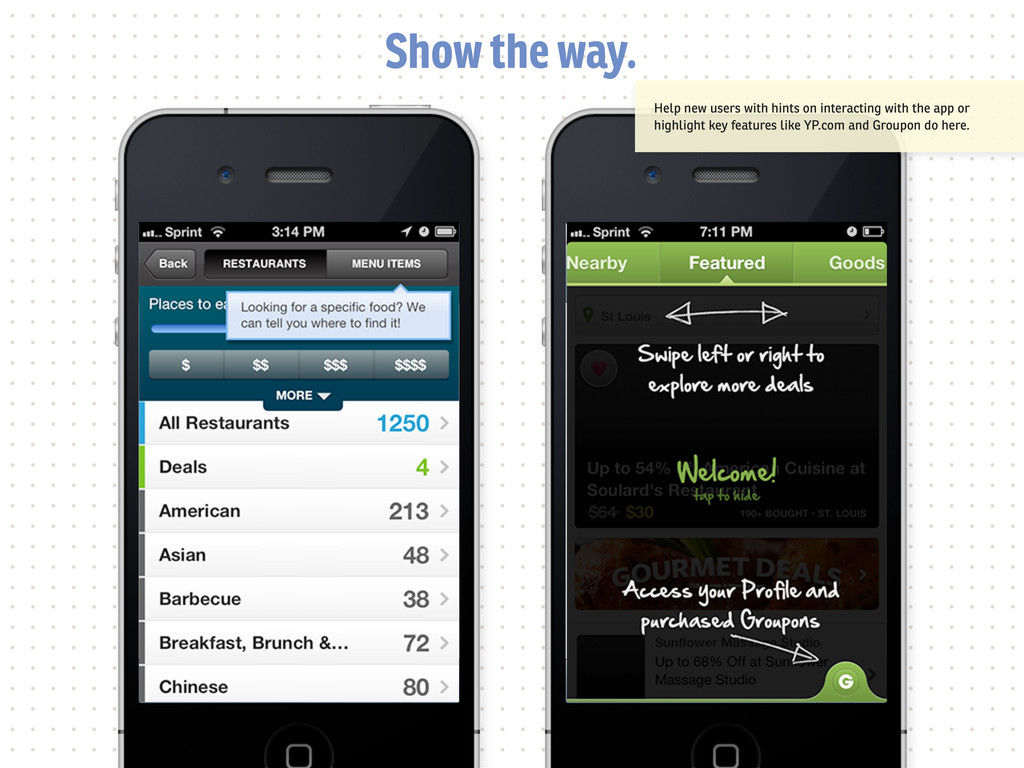
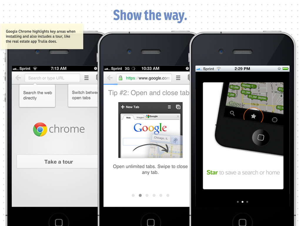
the way. The mobile screen is small. We can save room by hiding things, but be sure to let users know where they are. We follow patterns but there is no such thing as a totally standard interface, especially because all of the new rules are being written as we speak. Help users along by showing them.
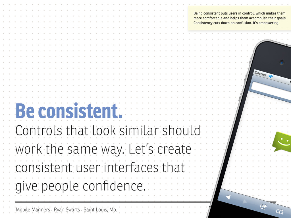
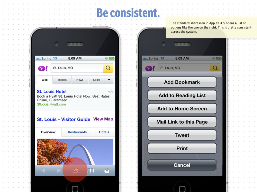
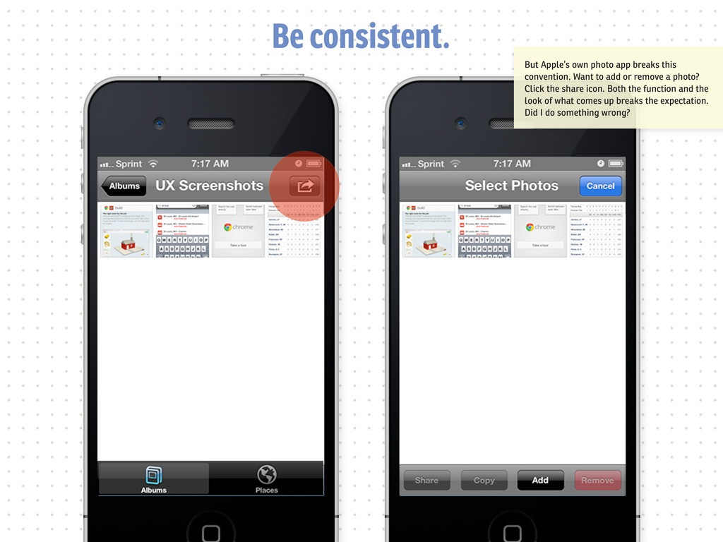
consistent. Controls that look similar should work the same way. Let’s create consistent user interfaces that give people confidence. Being consistent puts users in control, which makes them more comfortable and helps them accomplish their goals. Consistency cuts down on confusion. It’s empowering.
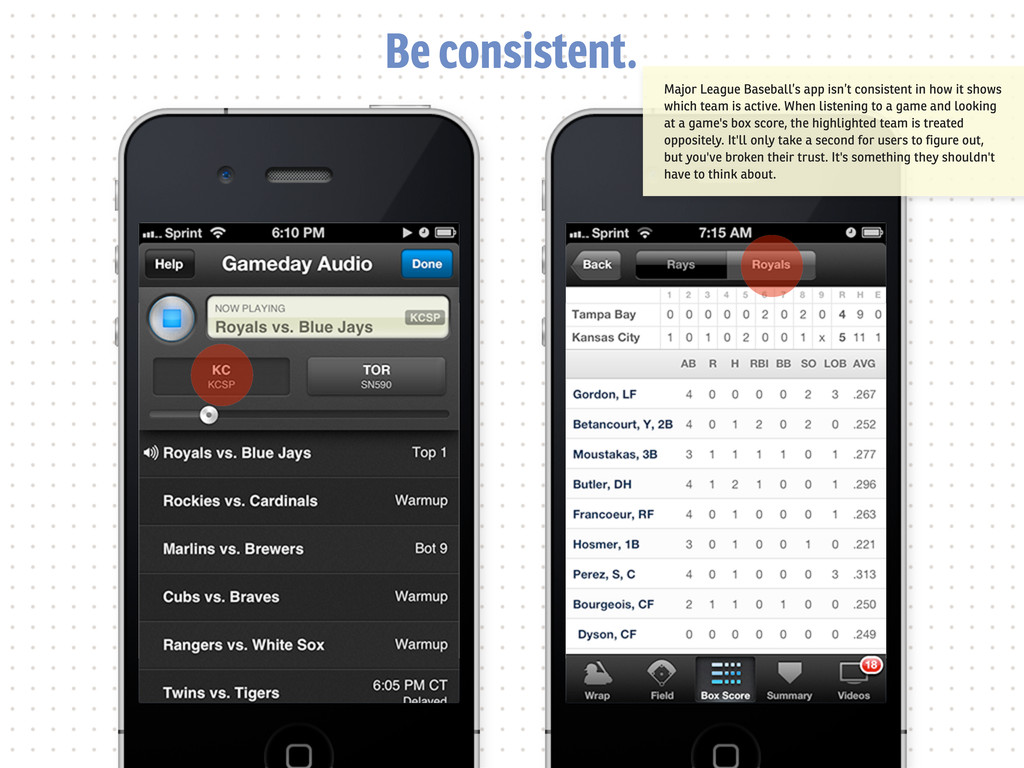
it shows which team is active. When listening to a game and looking at a game's box score, the highlighted team is treated oppositely. It'll only take a second for users to figure out, but you've broken their trust. It's something they shouldn't have to think about.
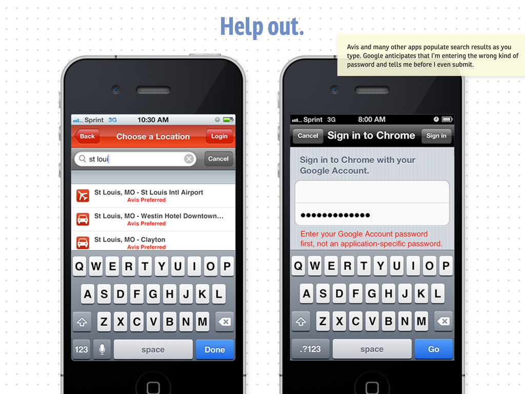
out. We can save users time by doing some jobs for them. If we have access to their location, why ask them to enter it? Phones are smart enough today to take care of a lot of our work. Let’s take advantage of that.
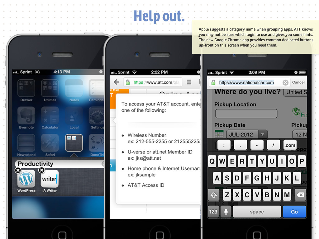
ATT knows you may not be sure which login to use and gives you some hints. The new Google Chrome app provides common dedicated buttons up-front on this screen when you need them.
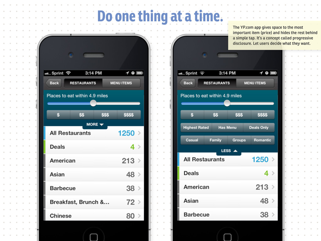
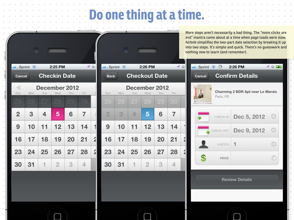
one thing at a time. Good mobile experiences are focused. Let’s not ask users to do everything at once. By breaking things up, we can simplify things. There’s isn’t a lot of room on most mobile devices. We can make things easier by sometimes breaking up actions into their specific parts. A tap isn’t the same thing as a click.
space to the most important item (price) and hides the rest behind a simple tap. It’s a concept called progressive disclosure. Let users decide what they want.
a bad thing. The “more clicks are evil” mantra came about at a time when page loads were slow. Airbnb simplifies the two-part date selection by breaking it up into two steps. It’s simple and quick. There’s no guesswork and nothing new to learn (and remember).
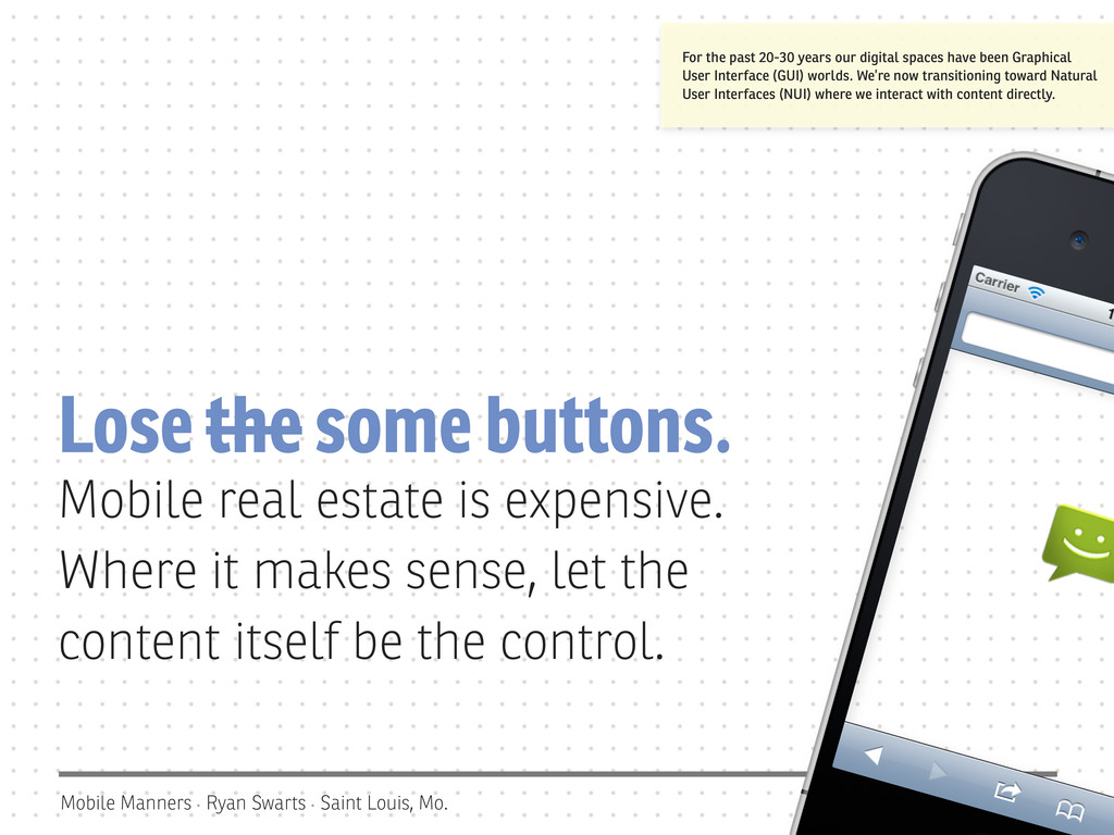
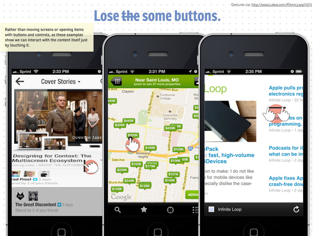
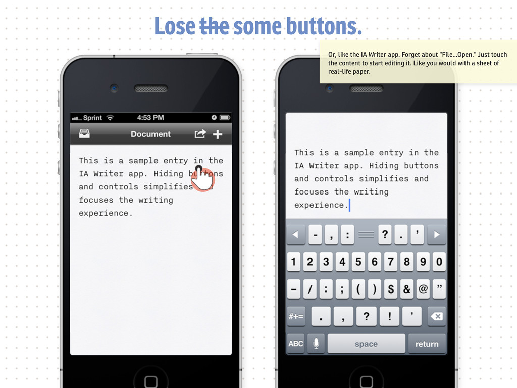
the some buttons. Mobile real estate is expensive. Where it makes sense, let the content itself be the control. For the past 20-30 years our digital spaces have been Graphical User Interface (GUI) worlds. We’re now transitioning toward Natural User Interfaces (NUI) where we interact with content directly.