Special Thanks Ethan Marcotte, Brad Frost, Andy Clarke, Josh Clark, The Filament Group, Trent Walton, Stephanie Rieger, Mark Otto, Jacob Thornton, Luke Wroblewski, Michael Angeles, Andy Budd, Khoi Vinh, Cennydd Bowles and all of the other smart, kind people working on hard design problems every day and sharing solutions with the Web
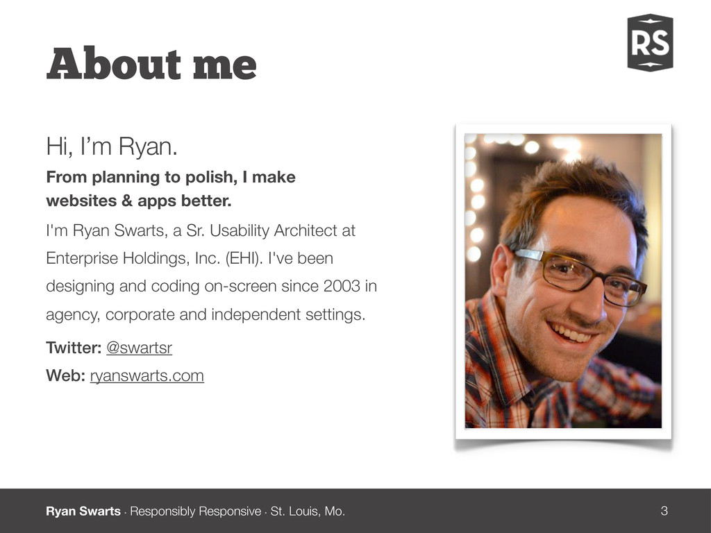
About me Hi, I’m Ryan. From planning to polish, I make websites & apps better. I'm Ryan Swarts, a Sr. Usability Architect at Enterprise Holdings, Inc. (EHI). I've been designing and coding on-screen since 2003 in agency, corporate and independent settings. Twitter: @swartsr Web: ryanswarts.com
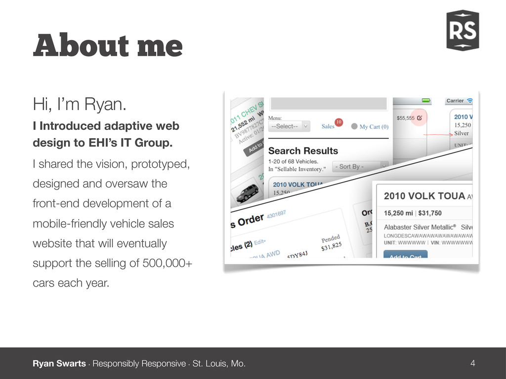
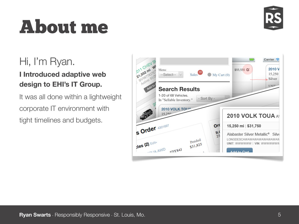
About me Hi, I’m Ryan. I Introduced adaptive web design to EHI’s IT Group. I shared the vision, prototyped, designed and oversaw the front-end development of a mobile-friendly vehicle sales website that will eventually support the selling of 500,000+ cars each year.
About me Hi, I’m Ryan. I Introduced adaptive web design to EHI’s IT Group. It was all done within a lightweight corporate IT environment with tight timelines and budgets.
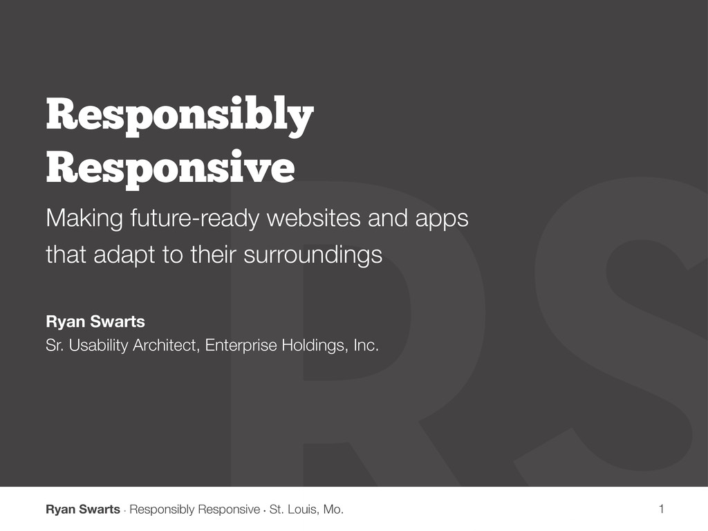
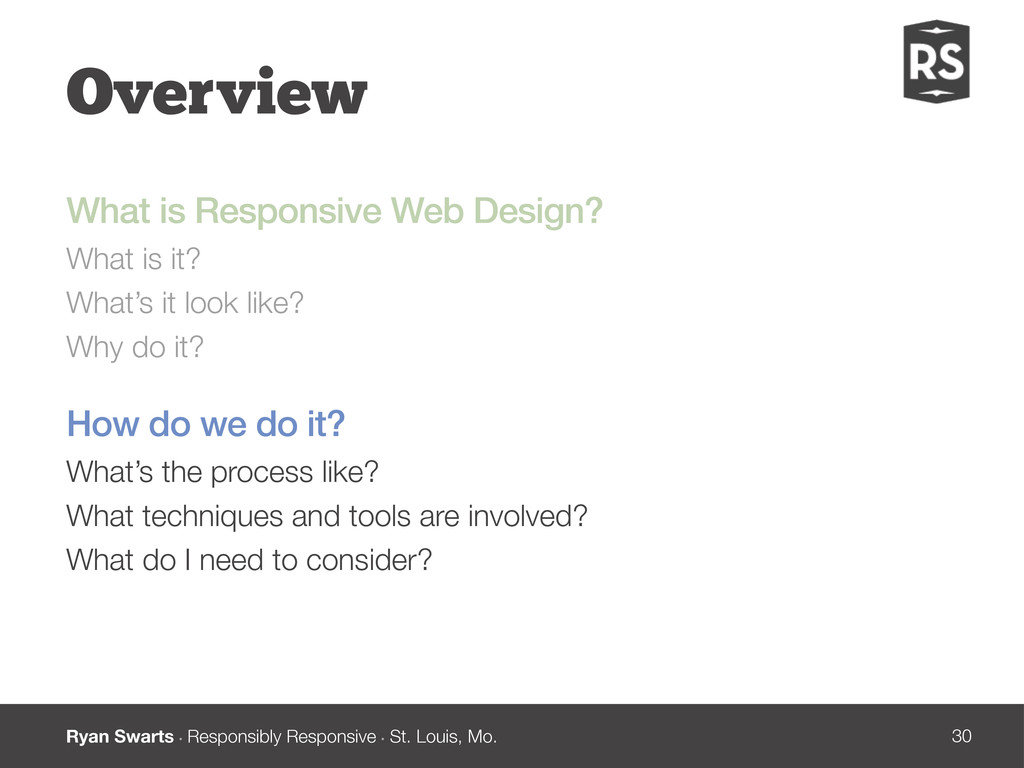
Overview What is Responsive Web Design? What is it? What’s it look like? Why do it? How do we do it? What’s the process like? What techniques and tools are involved? What do I need to consider?
The Idea “In recent years, I’ve been meeting with more companies that request ‘an iPhone website’ as part of their project. ... I think we often take comfort in such explicit requirements, as they allow us to compartmentalize the problems before us. We can quarantine the mobile experience on separate subdomains, spaces distinct and separate from ‘the non-iPhone website.’ But what’s next? An iPad website? An N90 website? Can we really continue to commit to supporting each new user agent with its own bespoke experience? At some point, this starts to feel like a zero sum game.” Ethan Marcotte (http://bit.ly/L3rTxO) What is Responsive Web Design?
The Idea “Rather than tailoring disconnected designs to each of an ever-increasing number of web devices, we can treat them as facets of the same experience. We can design for an optimal viewing experience, but embed standards-based technologies into our designs to make them not only more flexible, but more adaptive to the media that renders them.” Ethan Marcotte (http://bit.ly/L3rTxO) What is Responsive Web Design?
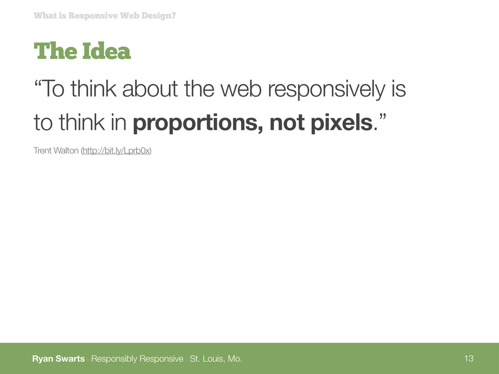
The Idea “To think about the web responsively is to think in proportions, not pixels.” Trent Walton (http://bit.ly/Lprb0x) What is Responsive Web Design?
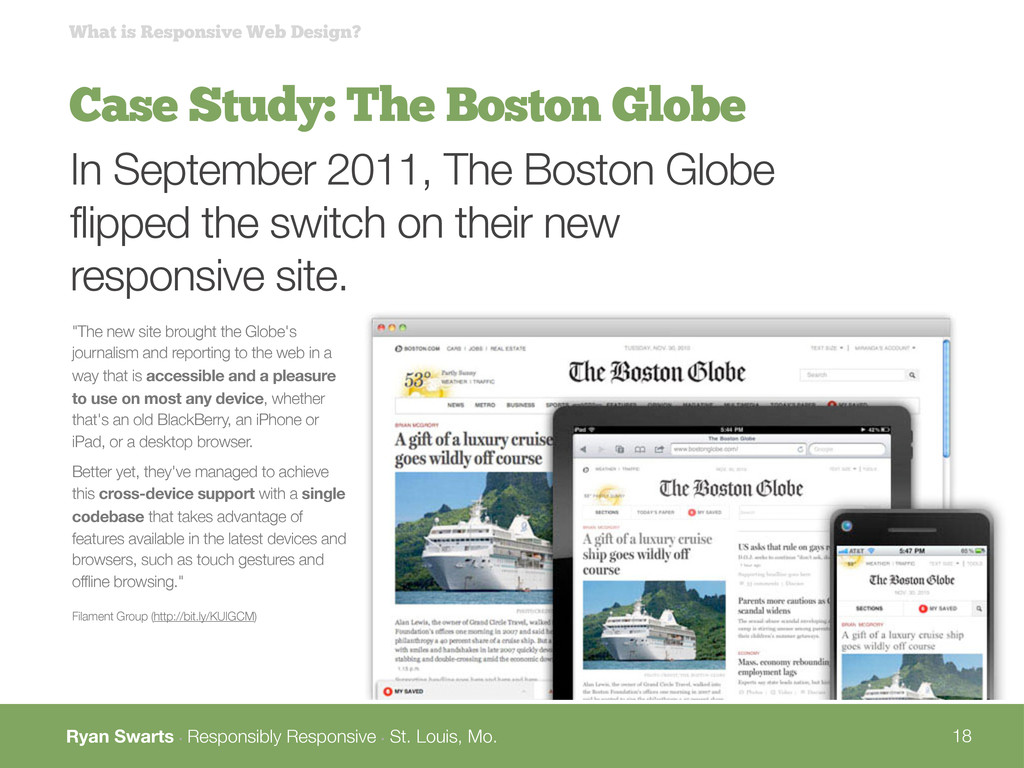
Case Study: The Boston Globe What is Responsive Web Design? In September 2011, The Boston Globe flipped the switch on their new responsive site. "The new site brought the Globe's journalism and reporting to the web in a way that is accessible and a pleasure to use on most any device, whether that's an old BlackBerry, an iPhone or iPad, or a desktop browser. Better yet, they've managed to achieve this cross-device support with a single codebase that takes advantage of features available in the latest devices and browsers, such as touch gestures and offline browsing." Filament Group (http://bit.ly/KUIGCM)
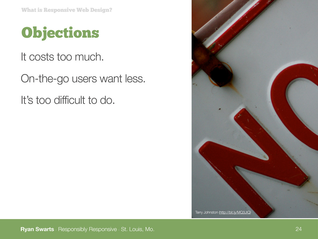
Objections What is Responsive Web Design? It costs too much. On-the-go users want less. It’s too difficult to do. Terry Johnston (http://bit.ly/MQ3JIQ)
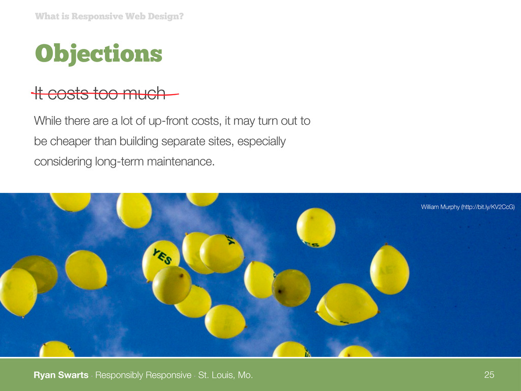
Objections What is Responsive Web Design? It costs too much William Murphy (http://bit.ly/KV2CcG) While there are a lot of up-front costs, it may turn out to be cheaper than building separate sites, especially considering long-term maintenance.
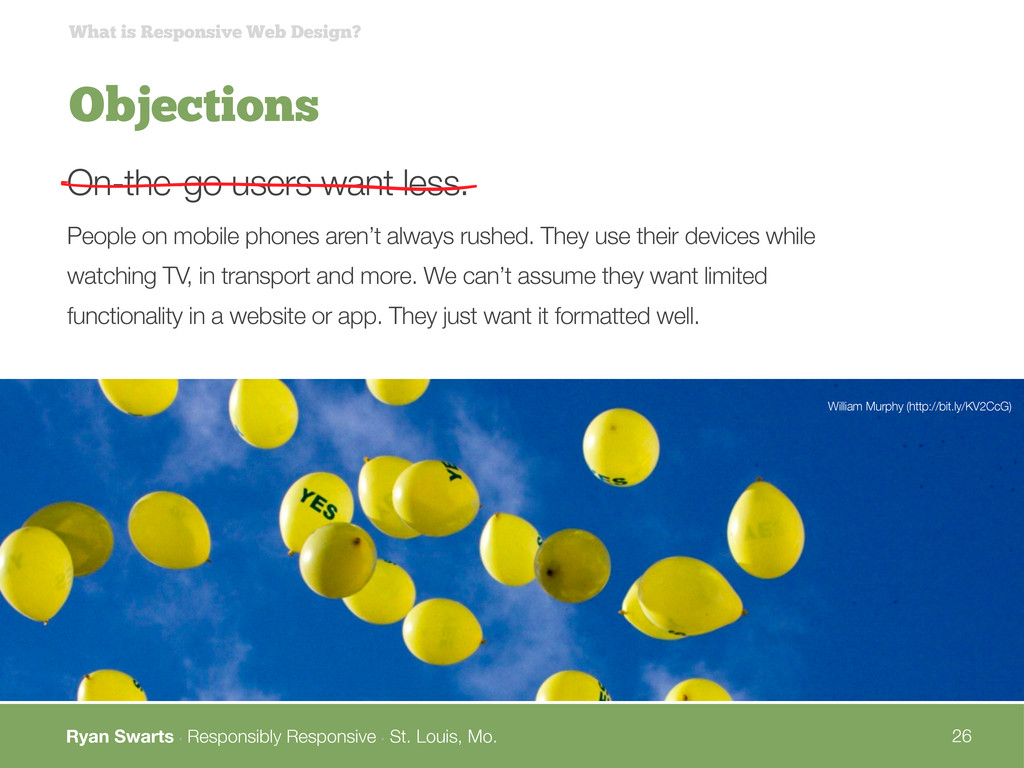
Objections What is Responsive Web Design? On-the-go users want less. William Murphy (http://bit.ly/KV2CcG) People on mobile phones aren’t always rushed. They use their devices while watching TV, in transport and more. We can’t assume they want limited functionality in a website or app. They just want it formatted well.
Objections What is Responsive Web Design? It’s too difficult to do. William Murphy (http://bit.ly/KV2CcG) It is hard. But lots of smart people are working through the challenges and coming up with tools to help. And in the end, it’s worth it.
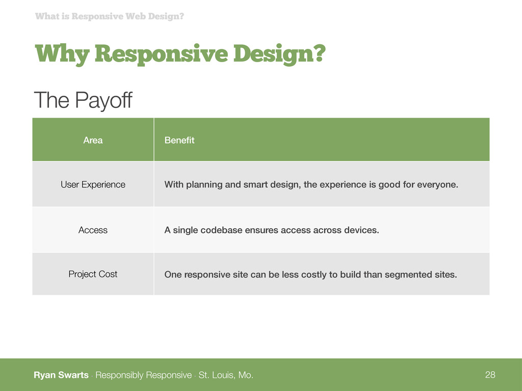
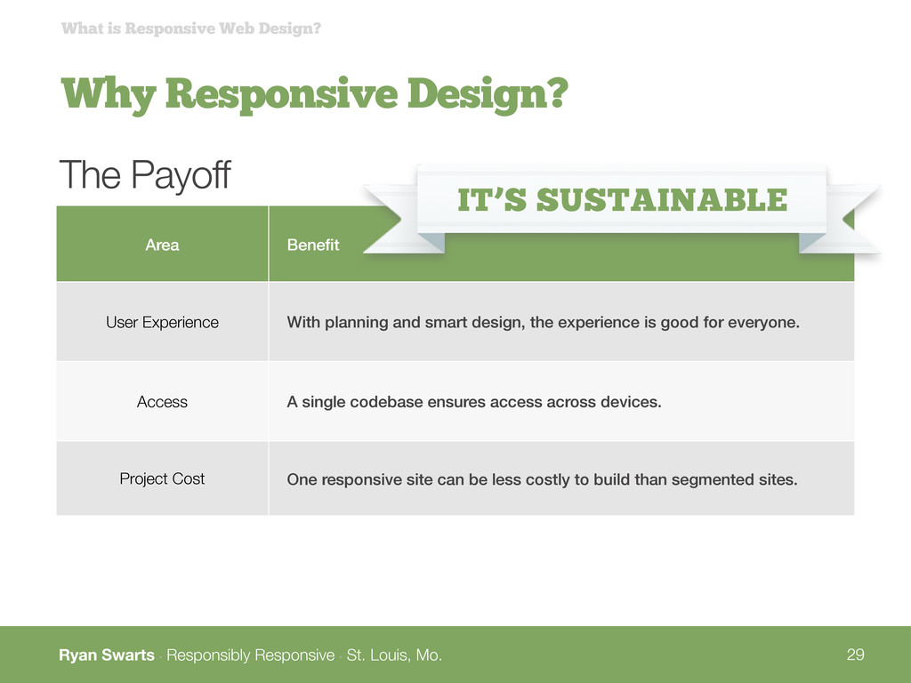
Why Responsive Design? What is Responsive Web Design? Area Benefit User Experience With planning and smart design, the experience is good for everyone. Access A single codebase ensures access across devices. Project Cost One responsive site can be less costly to build than segmented sites. The Payoff
Why Responsive Design? What is Responsive Web Design? Area Benefit User Experience With planning and smart design, the experience is good for everyone. Access A single codebase ensures access across devices. Project Cost One responsive site can be less costly to build than segmented sites. The Payoff IT’S SUSTAINABLE
Overview What is Responsive Web Design? What is it? What’s it look like? Why do it? How do we do it? What’s the process like? What techniques and tools are involved? What do I need to consider?
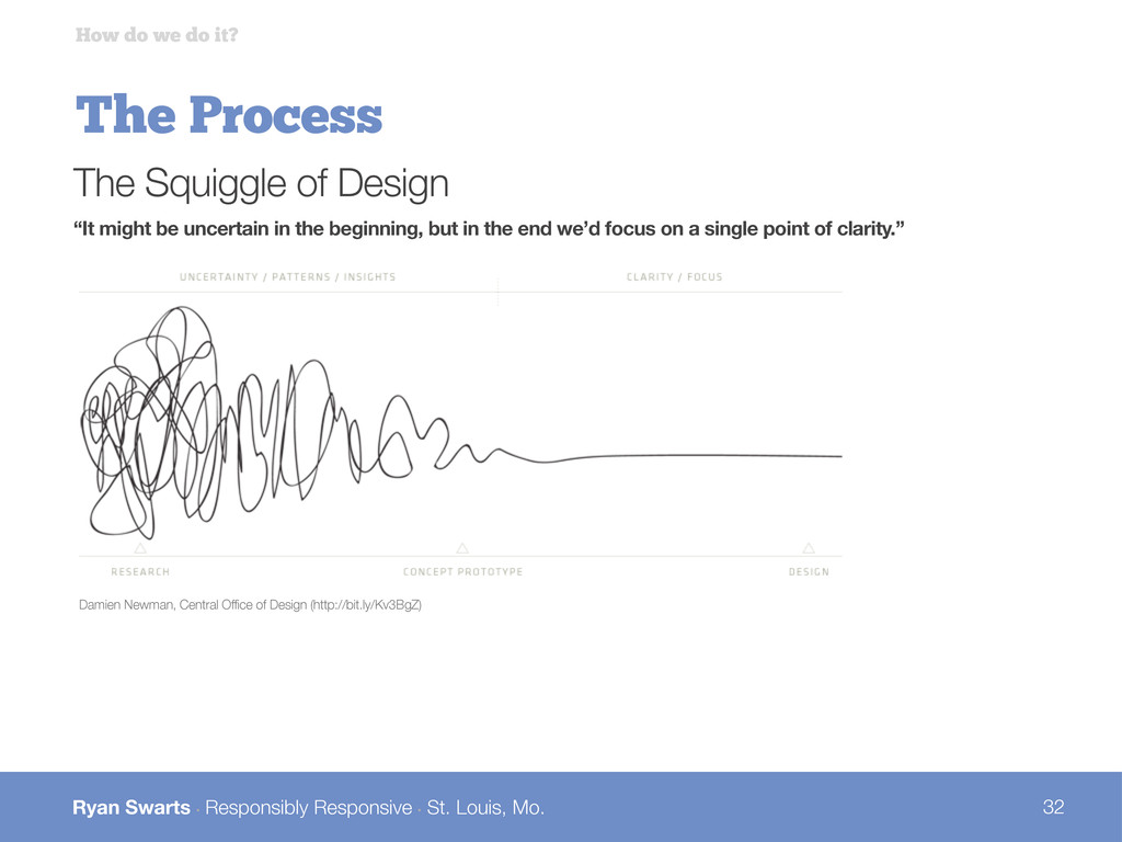
The Process How do we do it? Damien Newman, Central Office of Design (http://bit.ly/Kv3BgZ) The Squiggle of Design “It might be uncertain in the beginning, but in the end we’d focus on a single point of clarity.”
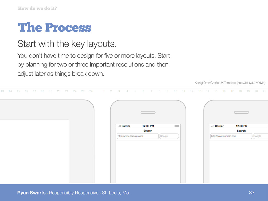
The Process How do we do it? Start with the key layouts. You don’t have time to design for five or more layouts. Start by planning for two or three important resolutions and then adjust later as things break down. Konigi OmniGraffle UX Template (http://bit.ly/K7MYM3)
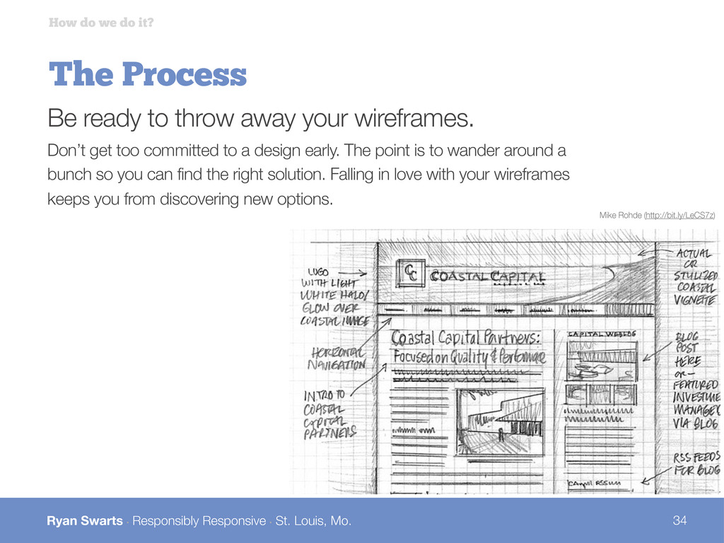
The Process How do we do it? Be ready to throw away your wireframes. Don’t get too committed to a design early. The point is to wander around a bunch so you can find the right solution. Falling in love with your wireframes keeps you from discovering new options. Mike Rohde (http://bit.ly/LeCS7z)
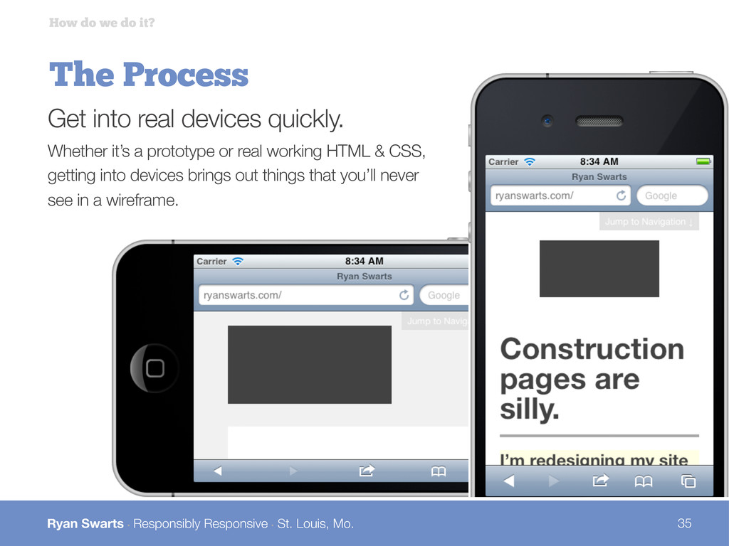
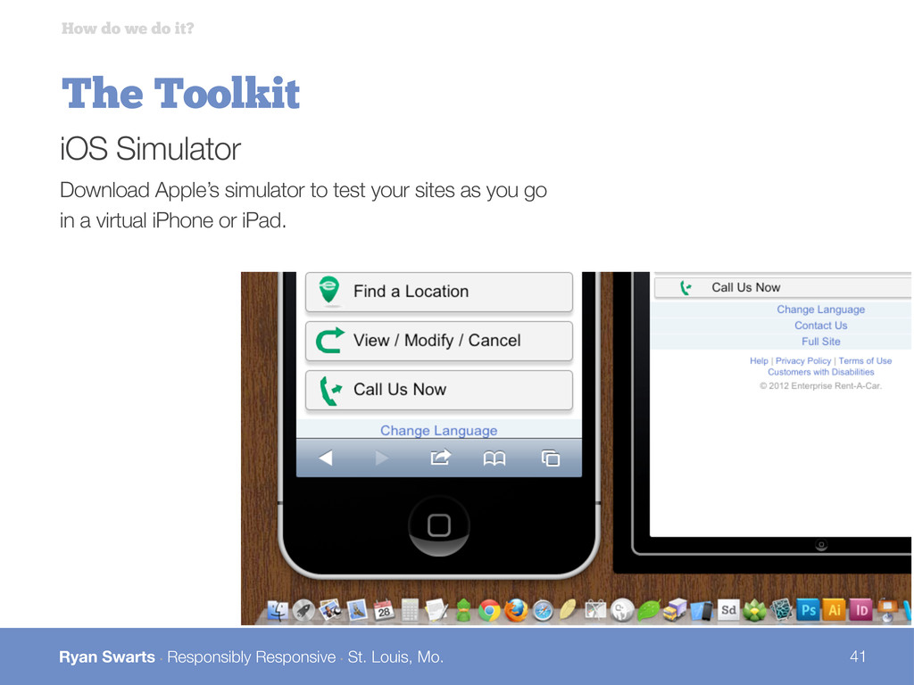
The Process How do we do it? Get into real devices quickly. Whether it’s a prototype or real working HTML & CSS, getting into devices brings out things that you’ll never see in a wireframe.
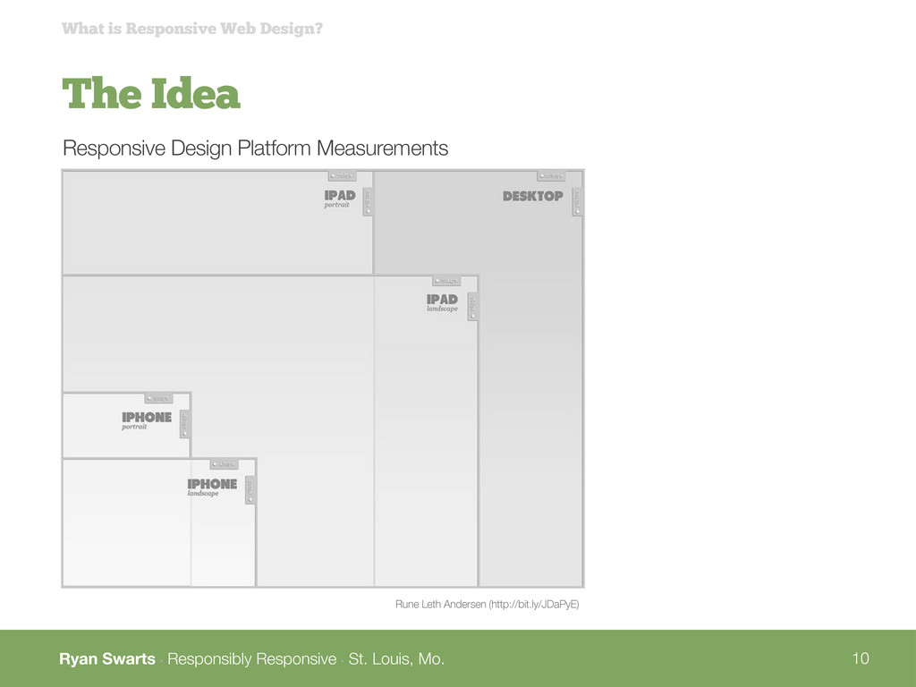
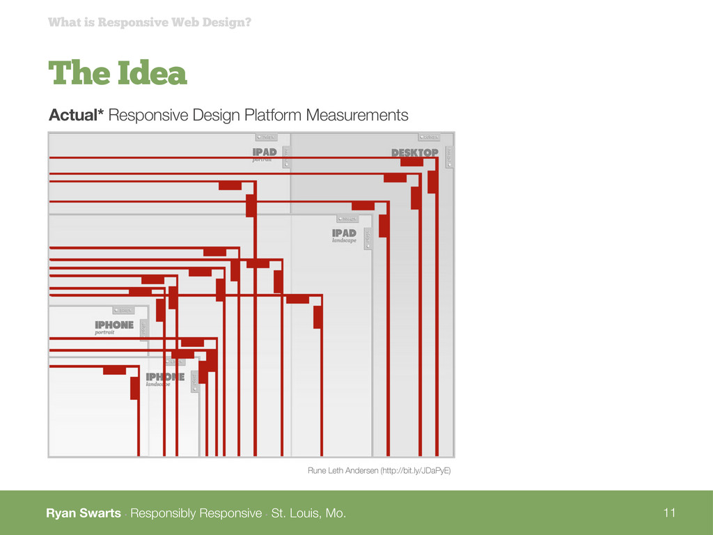
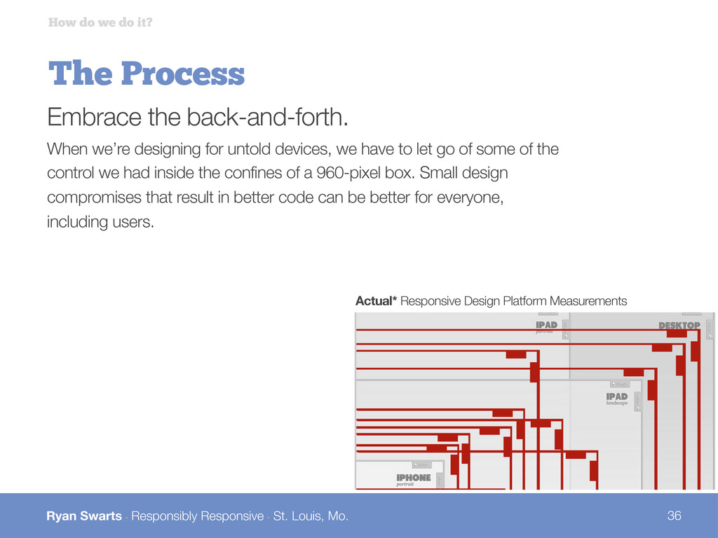
The Process How do we do it? Embrace the back-and-forth. When we’re designing for untold devices, we have to let go of some of the control we had inside the confines of a 960-pixel box. Small design compromises that result in better code can be better for everyone, including users. Actual* Responsive Design Platform Measurements
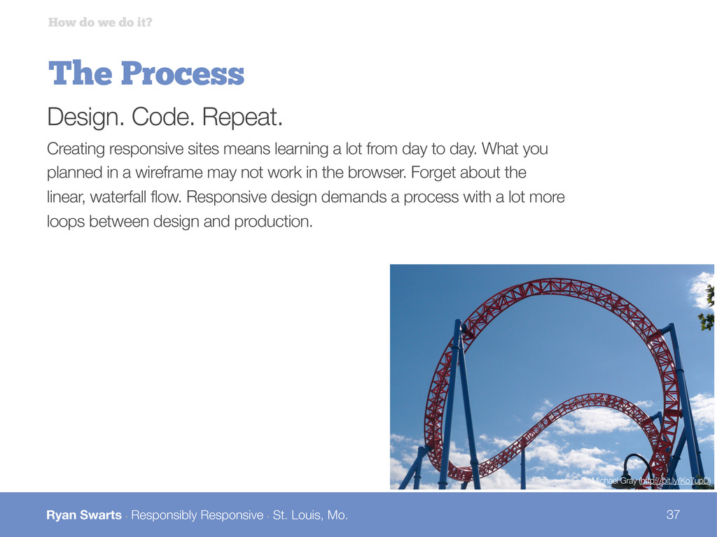
The Process How do we do it? Design. Code. Repeat. Creating responsive sites means learning a lot from day to day. What you planned in a wireframe may not work in the browser. Forget about the linear, waterfall flow. Responsive design demands a process with a lot more loops between design and production. Michael Gray (http://bit.ly/Ko7upD)
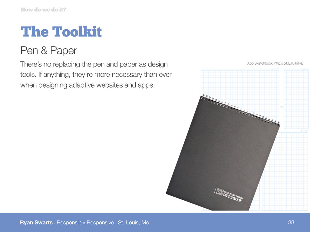
The Toolkit How do we do it? Pen & Paper There’s no replacing the pen and paper as design tools. If anything, they’re more necessary than ever when designing adaptive websites and apps. App Sketchbook (http://bit.ly/KRnfRB)
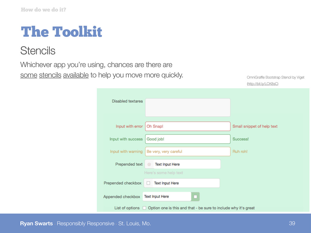
The Toolkit How do we do it? Stencils Whichever app you’re using, chances are there are some stencils available to help you move more quickly. OmniGraffle Bootstrap Stencil by Viget (http://bit.ly/LCK8sC)
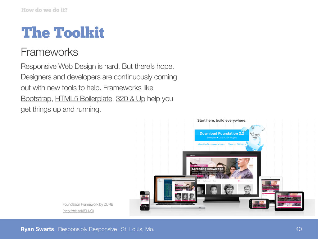
The Toolkit How do we do it? Frameworks Responsive Web Design is hard. But there’s hope. Designers and developers are continuously coming out with new tools to help. Frameworks like Bootstrap, HTML5 Boilerplate, 320 & Up help you get things up and running. Foundation Framework by ZURB (http://bit.ly/KlSHvQ)
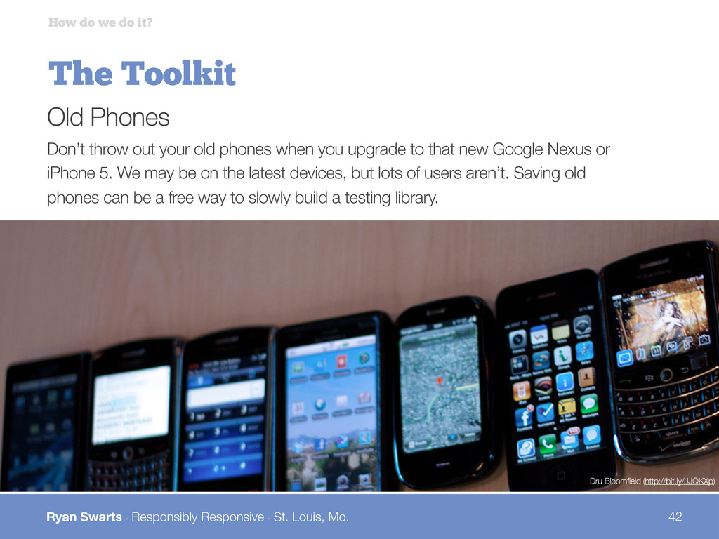
The Toolkit How do we do it? Old Phones Don’t throw out your old phones when you upgrade to that new Google Nexus or iPhone 5. We may be on the latest devices, but lots of users aren’t. Saving old phones can be a free way to slowly build a testing library. Dru Bloomfield (http://bit.ly/JJQKXp)
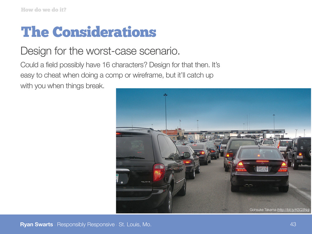
The Considerations How do we do it? Design for the worst-case scenario. Could a field possibly have 16 characters? Design for that then. It’s easy to cheat when doing a comp or wireframe, but it’ll catch up with you when things break. Gohsuke Takama (http://bit.ly/KSQ3Nq)
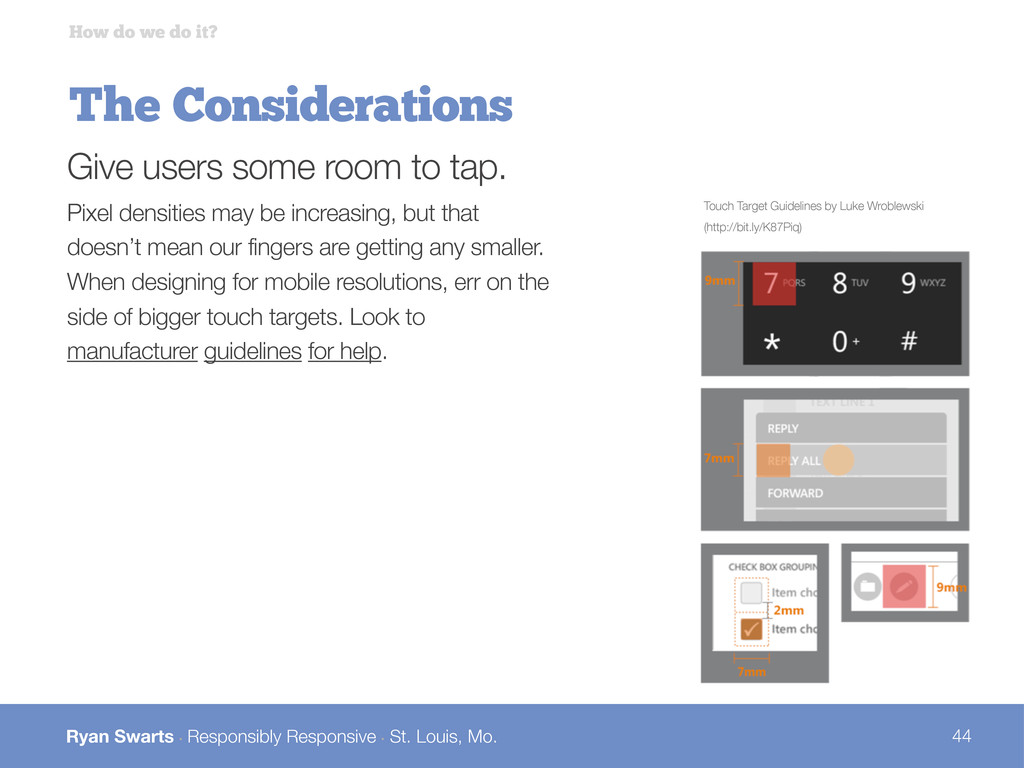
The Considerations How do we do it? Give users some room to tap. Pixel densities may be increasing, but that doesn’t mean our fingers are getting any smaller. When designing for mobile resolutions, err on the side of bigger touch targets. Look to manufacturer guidelines for help. Touch Target Guidelines by Luke Wroblewski (http://bit.ly/K87Piq)
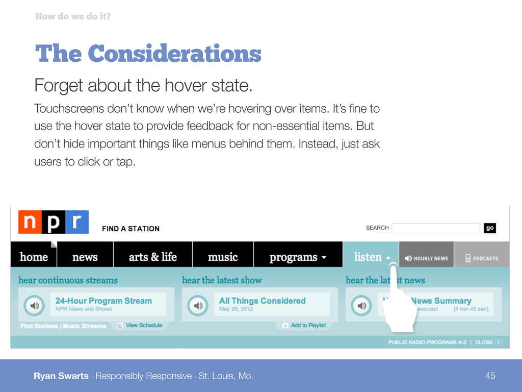
The Considerations How do we do it? Forget about the hover state. Touchscreens don’t know when we’re hovering over items. It’s fine to use the hover state to provide feedback for non-essential items. But don’t hide important things like menus behind them. Instead, just ask users to click or tap.
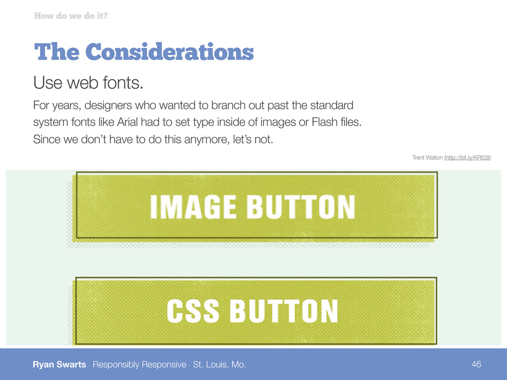
The Considerations How do we do it? Use web fonts. For years, designers who wanted to branch out past the standard system fonts like Arial had to set type inside of images or Flash files. Since we don’t have to do this anymore, let’s not. Trent Walton (http://bit.ly/KRIl28)
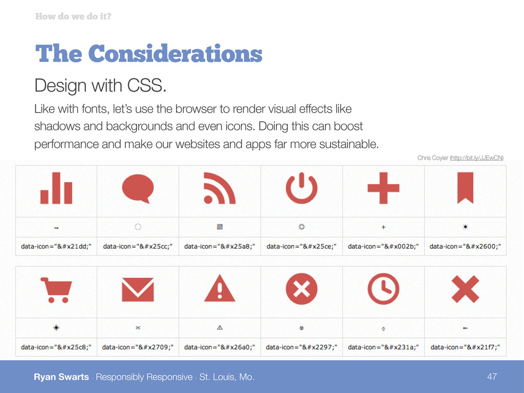
The Considerations How do we do it? Design with CSS. Like with fonts, let’s use the browser to render visual effects like shadows and backgrounds and even icons. Doing this can boost performance and make our websites and apps far more sustainable. Chris Coyier (http://bit.ly/JJEwCN)
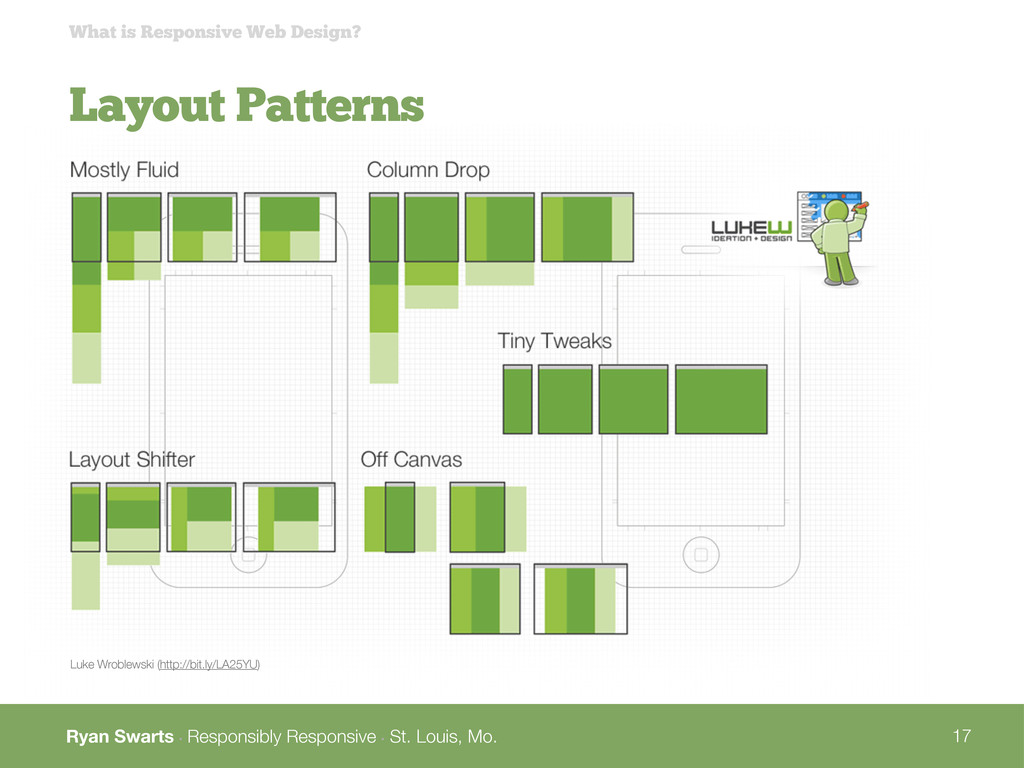
Resources Mobile Web Best Practices (http://bit.ly/K0suUM) Responsive Design Navigation Patterns (http://bit.ly/MRvGTc) Responsive Design Layout Patterns (http://bit.ly/LA25YU) Seven Deadly Mobile Myths (http://bit.ly/KoqbcQ) Anatomy of a Mobile-First Responsive Design (http://bit.ly/N191RU) Responsive Tables (http://bit.ly/L9pPUS) Responsive Images & Web Standards at a Turning Point (http://bit.ly/LZQdWo) A Responsive Workflow (http://bit.ly/K8bKf0) Mobile UI Patterns (http://mobile-patterns.com/) For a Future-Friendly Web (http://bit.ly/KX4zkR)
 swartsr
 terencebasart
 rezaline
 hiro0218
 nagata03
 keita_yoshikawa
 hiranotomoki
 kumanoayumi
 mhand01
 kaikou
 klemens
 a2k
a2k
 uxman
uxman
 eileencodes
 mza
mza
 jct
jct
 raygrieselhuber
 davidcarrasco
 mayunak
 malarkey
 katarinadahlin
 mraible
 akihiro_kokubo
 aleyda
 inesmontani