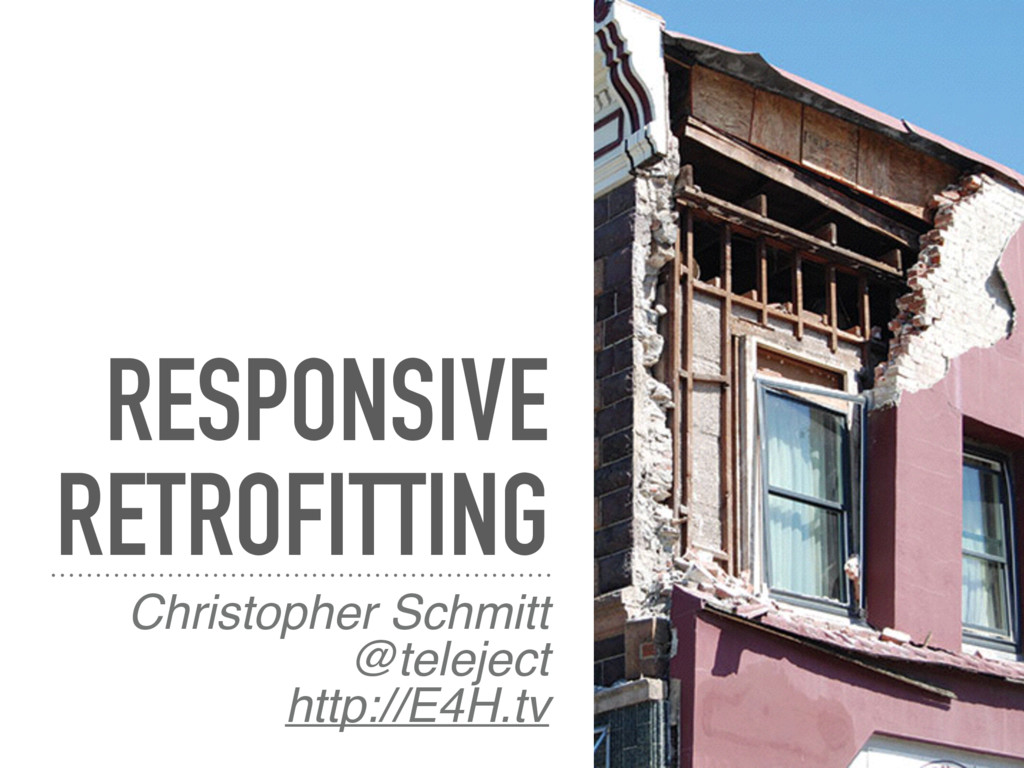
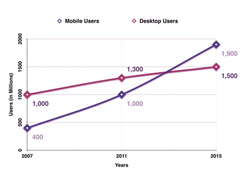
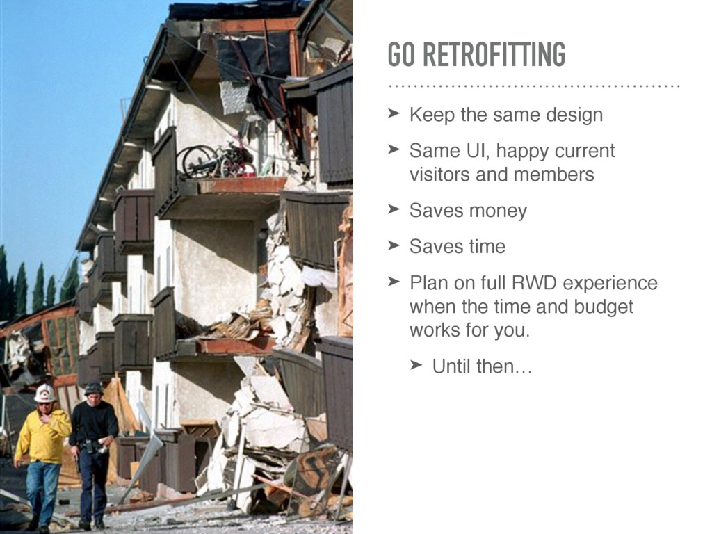
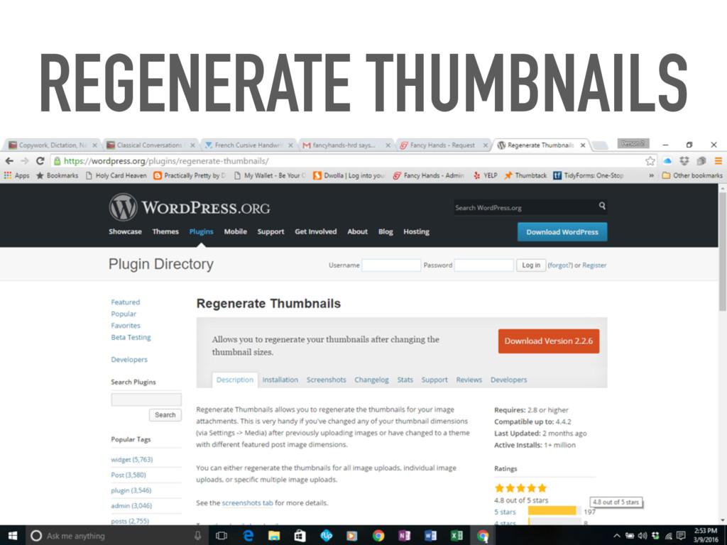
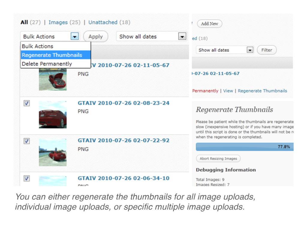
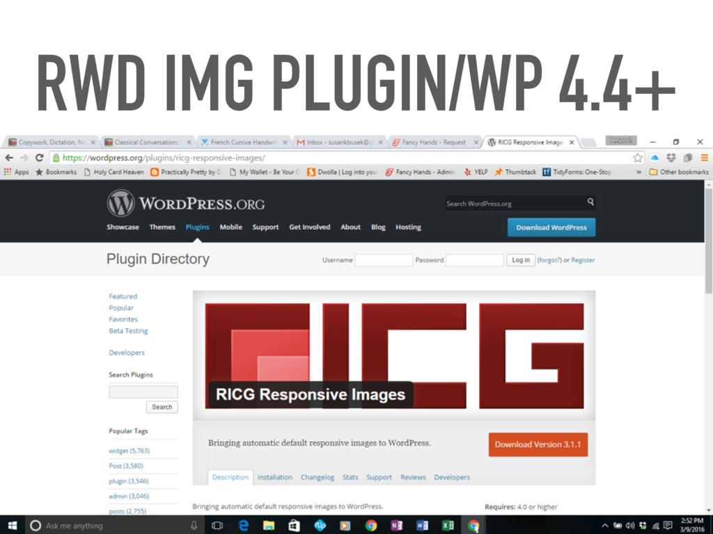
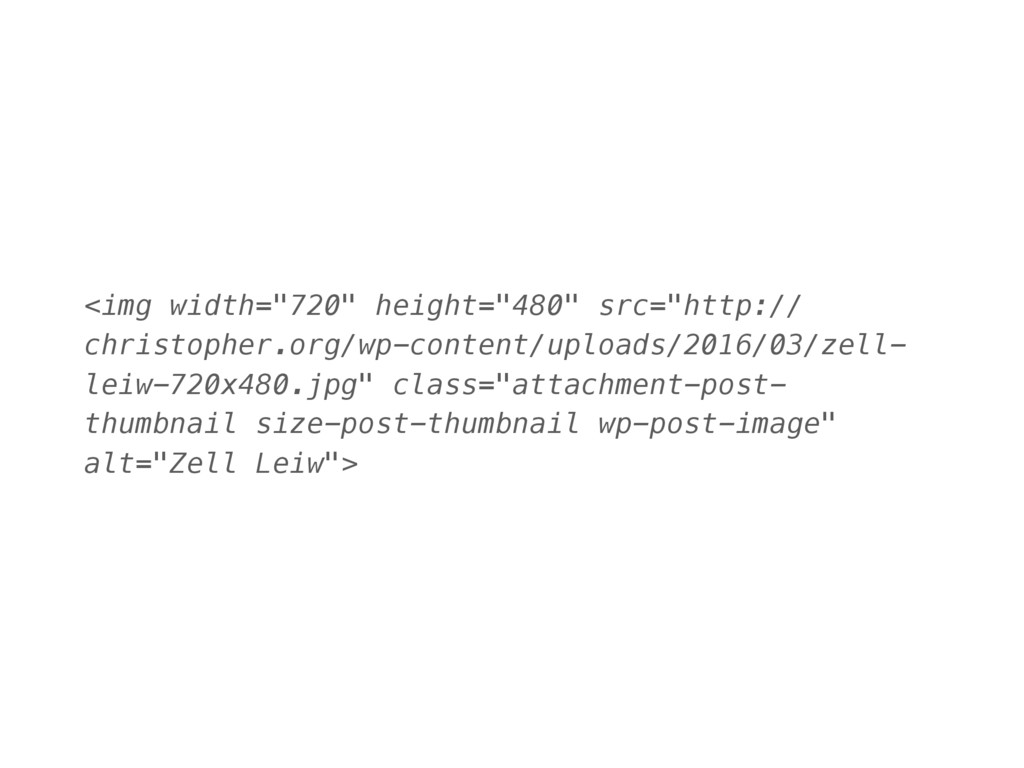
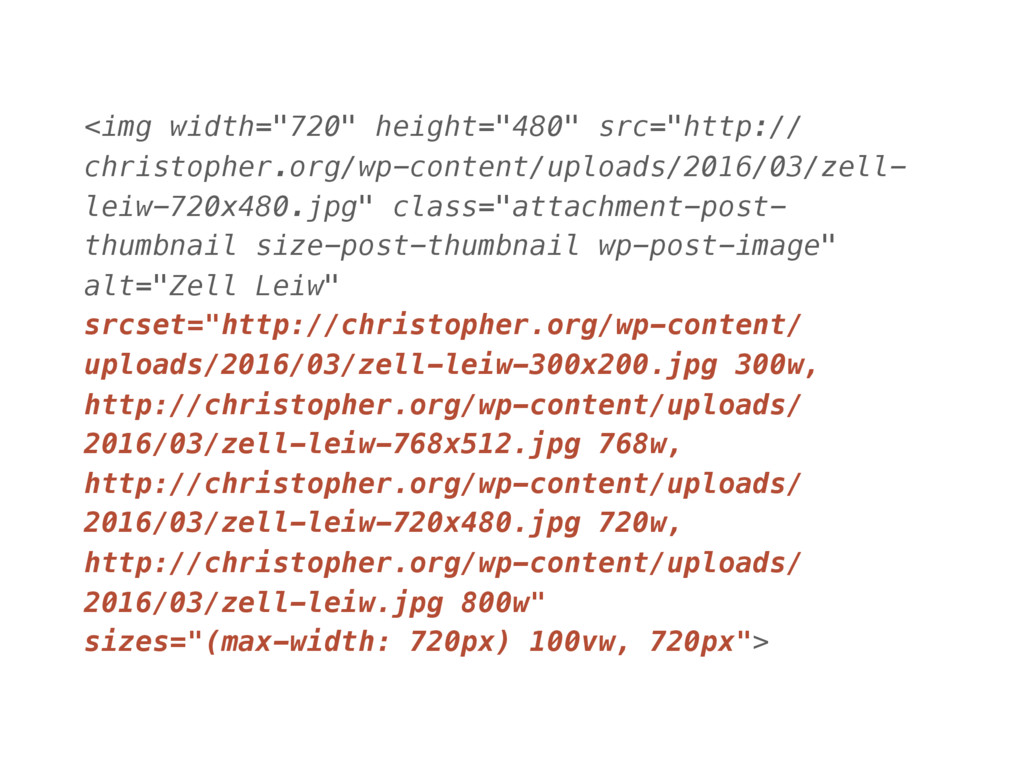
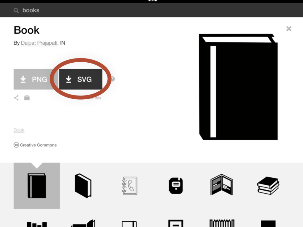
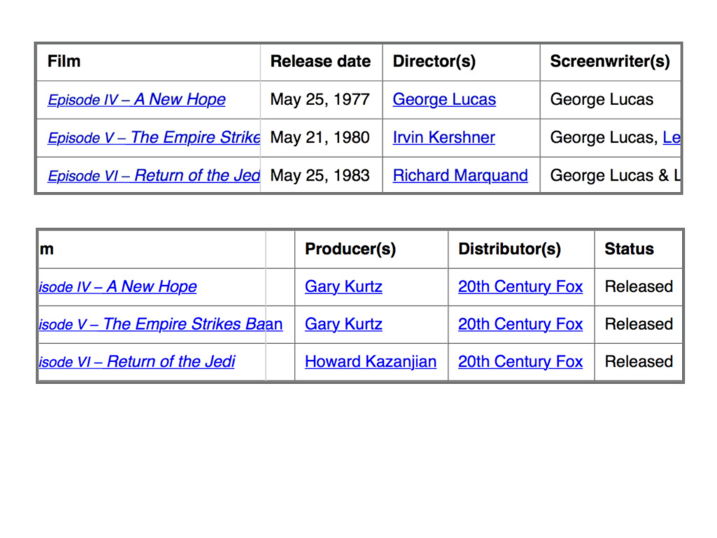
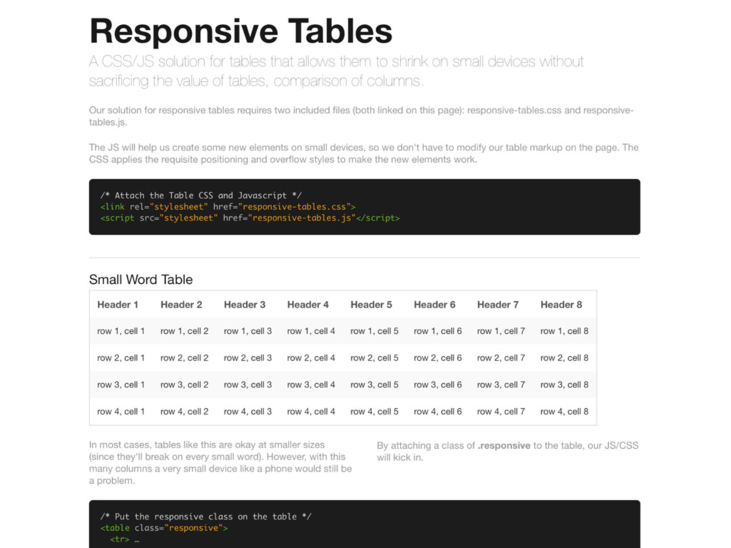
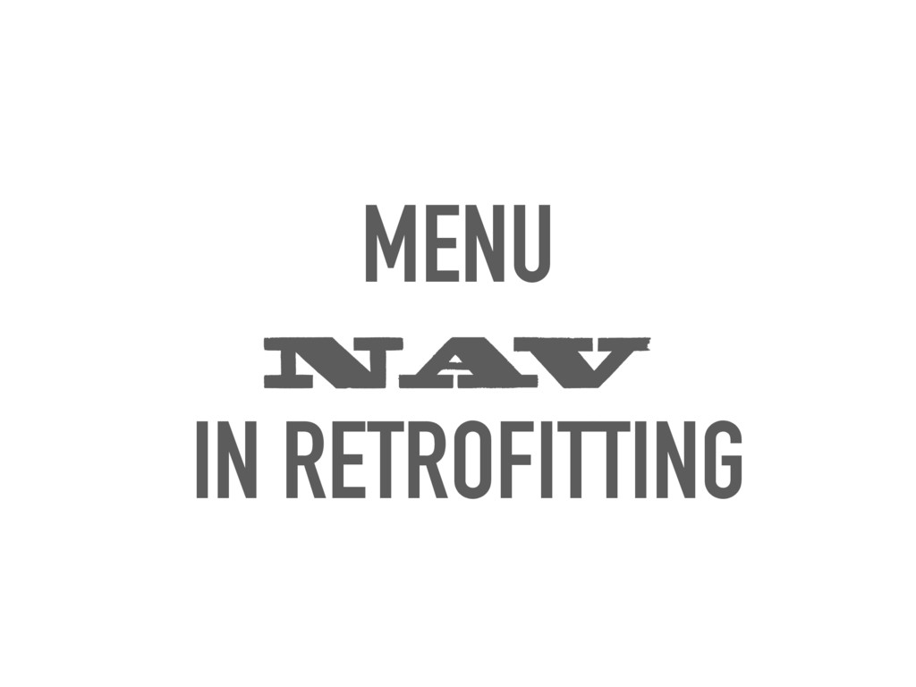
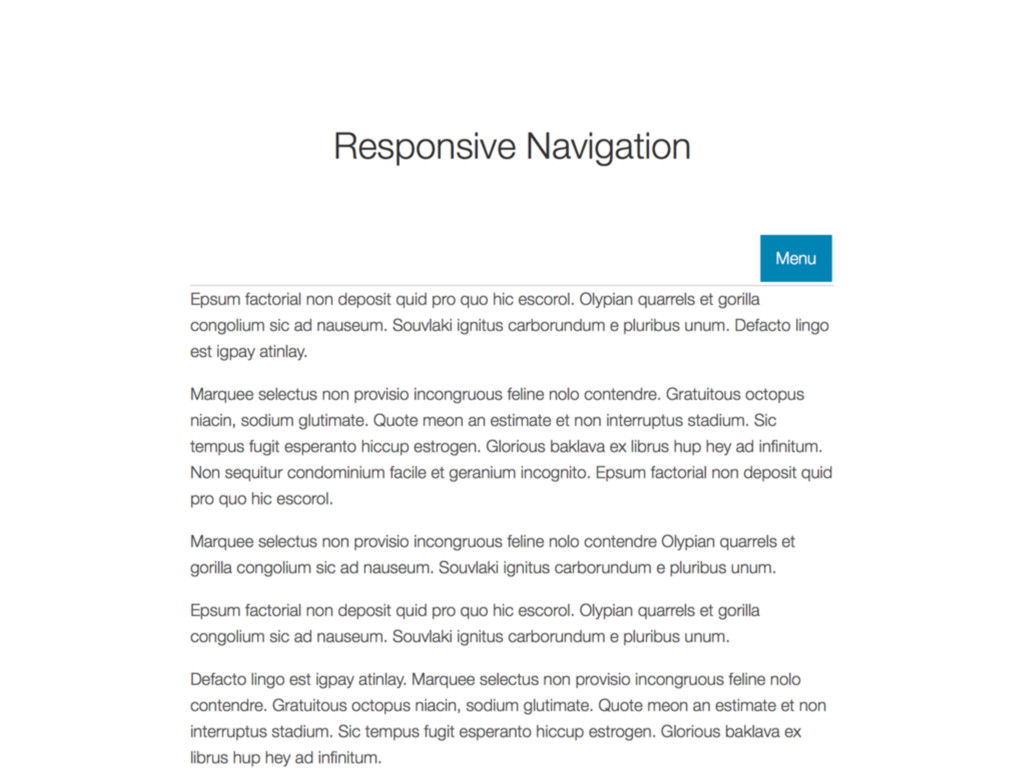
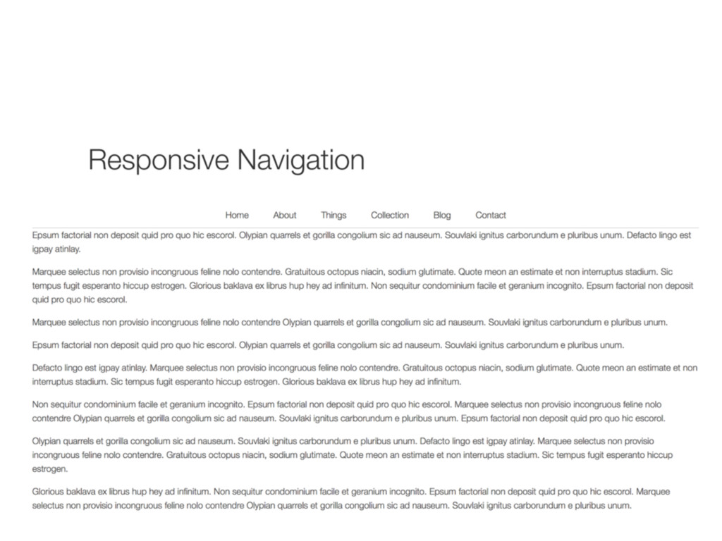
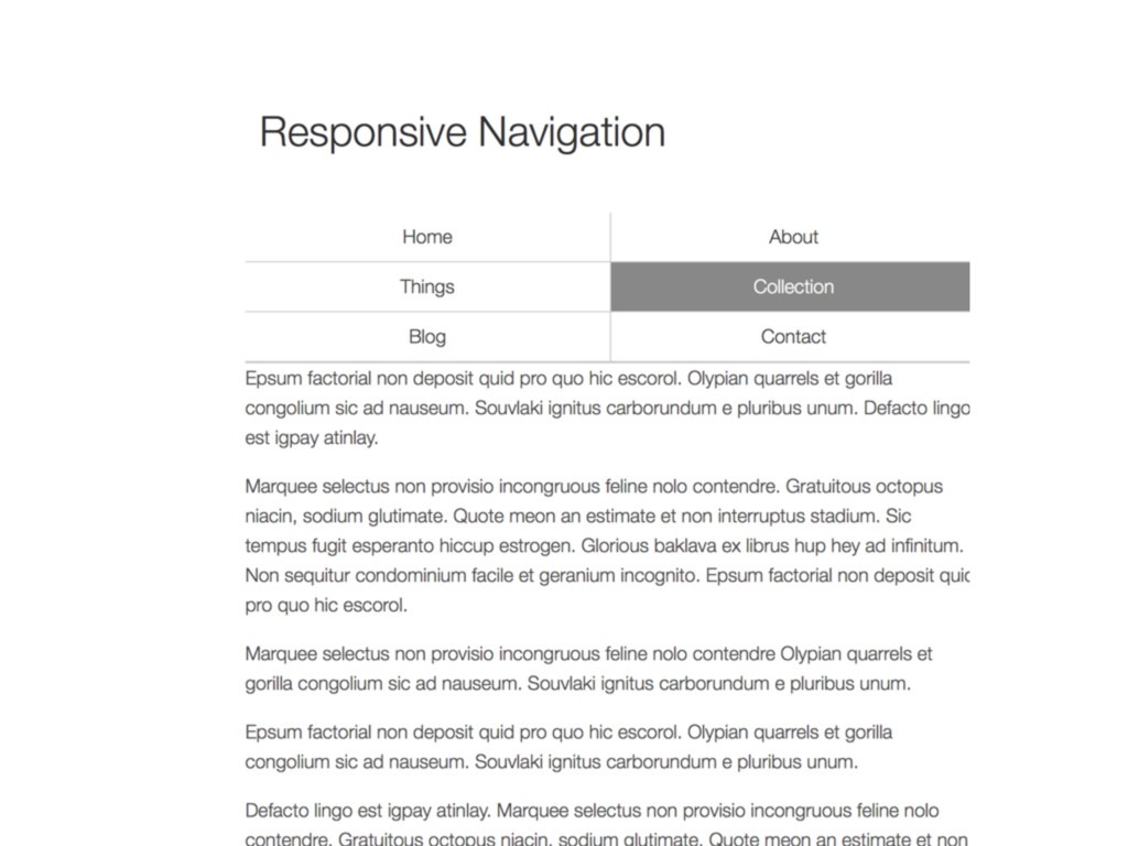
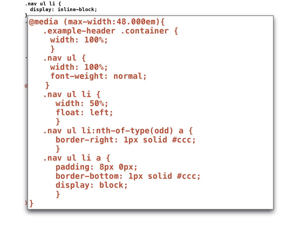
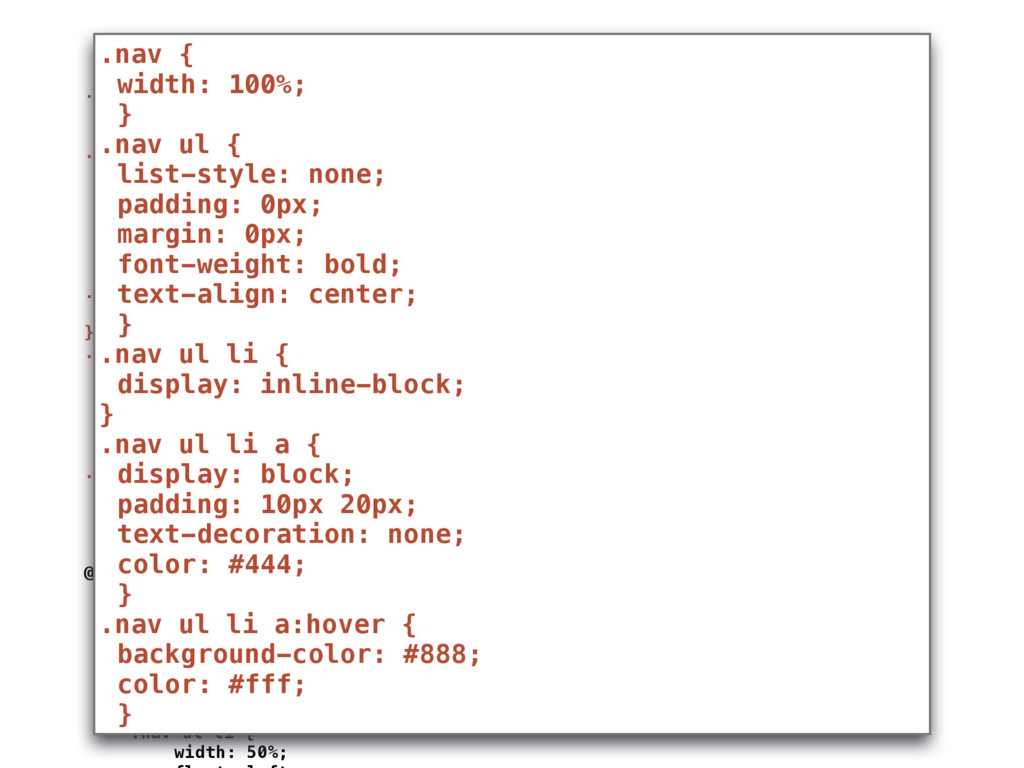
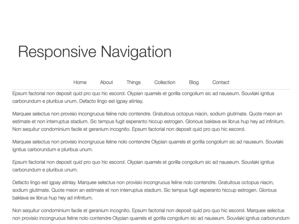
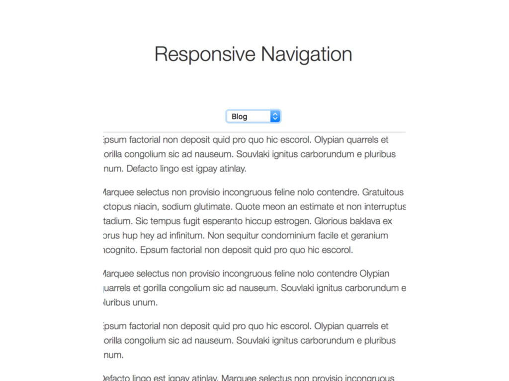
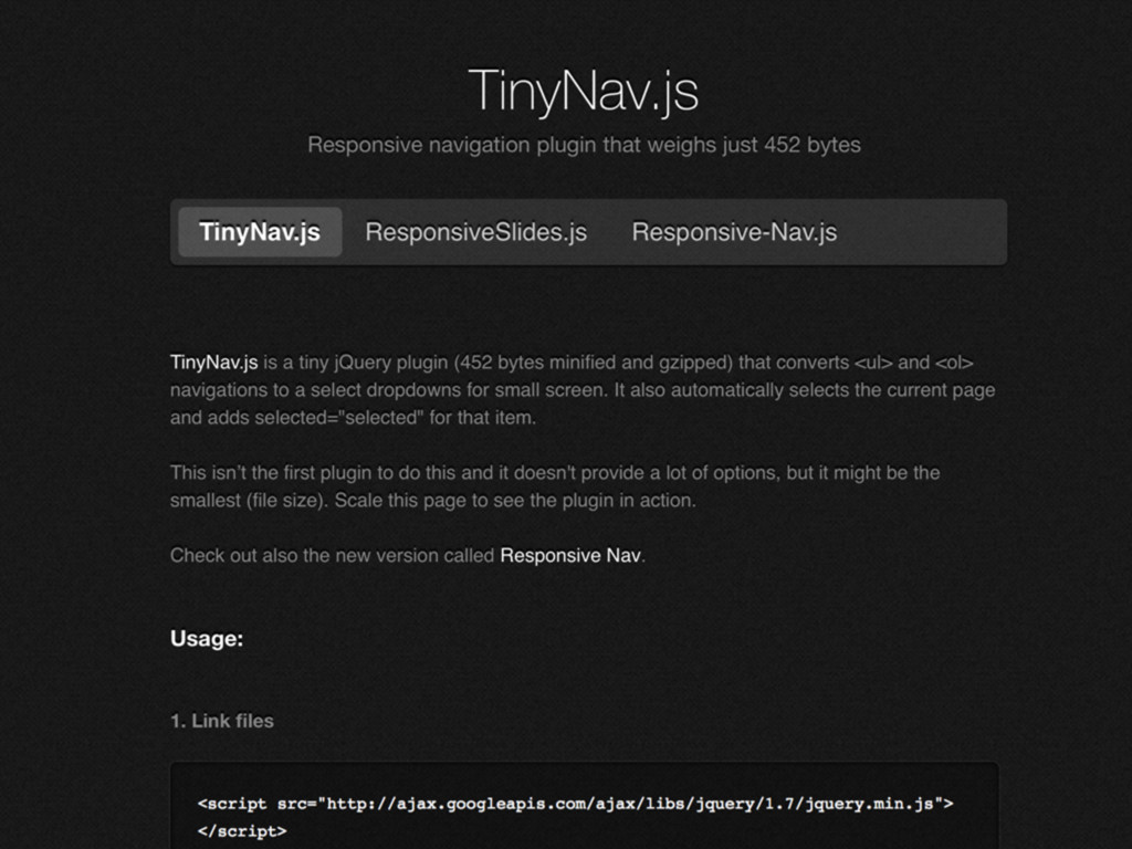
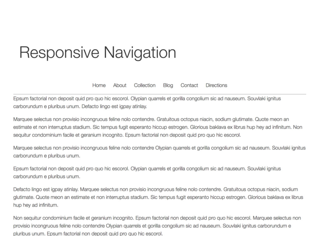
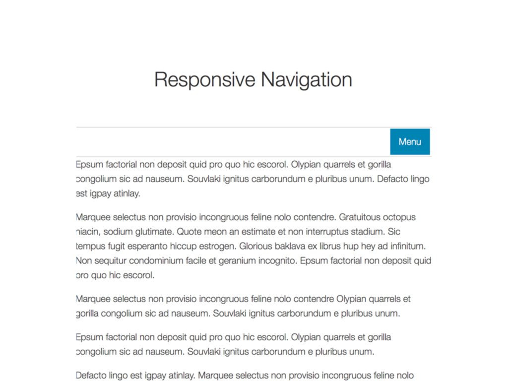
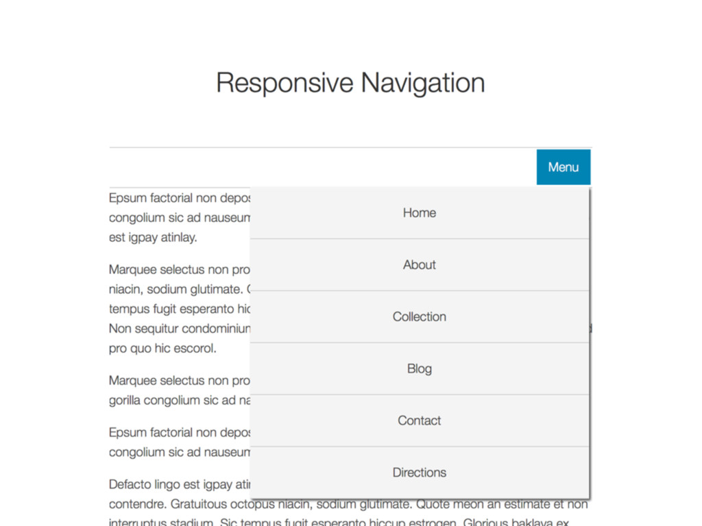
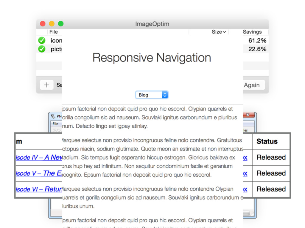
Covering tips on WordPress, web performance, navigation, HTML tables, and more, Responsive Retrofitting takes legacy sites with fixed-widths designs and make them ready for a mobile viewing.
Until a time in the future starting over is financially and feasible, *responsively retrofitting* is financially effective and time saving solution.
 aeonpeople
 okdt
okdt
 yuu26
yuu26
 thehajime
 noalisaai
 oracle4engineer
 miyamu
 sansan33
 nagisa53
 shift_evolve
 rvirus0817
 taketakekaho
 keithpitt
 tmiket
 notwaldorf
 cassininazir
 hatefulcrawdad
 varn
varn
 csswizardry
 mongodb
 popppiees
 samlambert
 techseoconnect
 swwweet
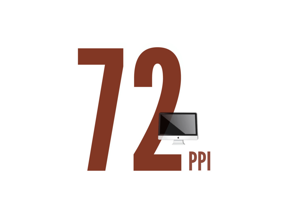
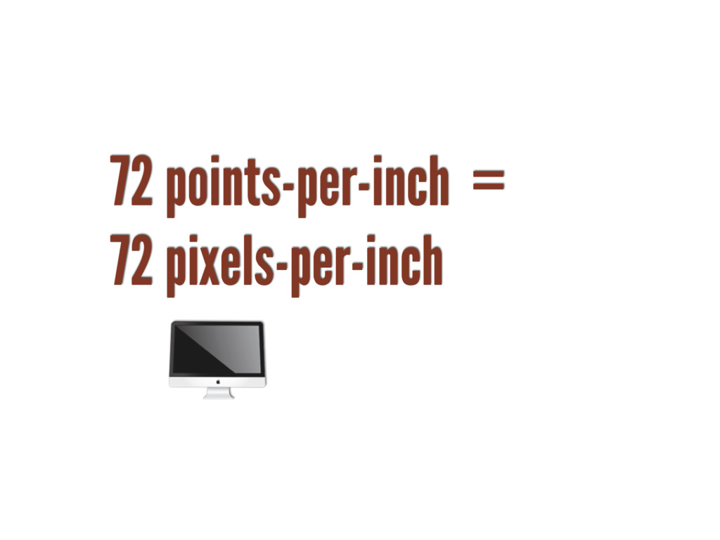
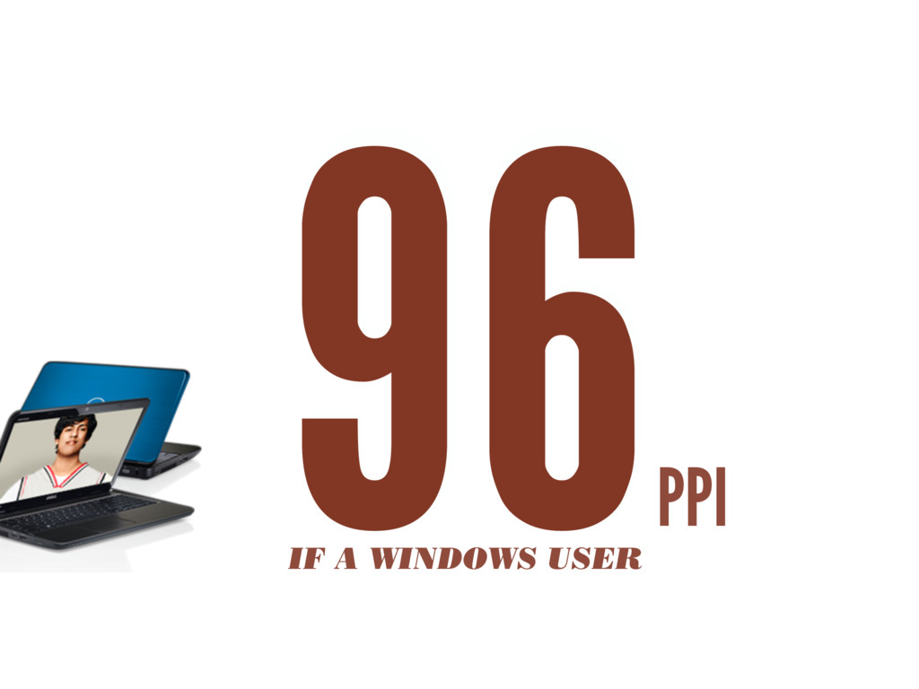
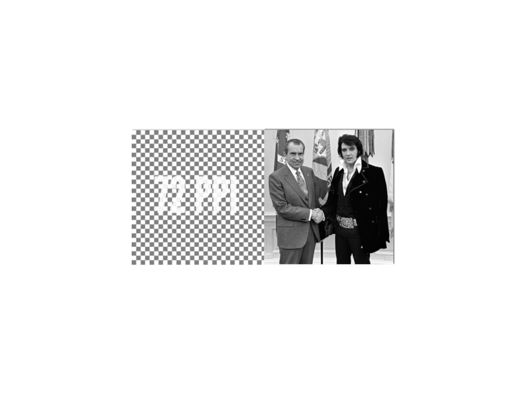
![72 points-per-inch x [1+(1/3)] = 96 PPI](https://files.speakerdeck.com/presentations/772c6a1a5fd14ebe87d2eda779ecaedf/slide_42.jpg)
![“ [In 2013, Intel sees their product line] offer a](https://files.speakerdeck.com/presentations/772c6a1a5fd14ebe87d2eda779ecaedf/slide_45.jpg)
![FIND ME AT ➤ TWITTER @teleject ➤ EMAIL [email protected] ➤](https://files.speakerdeck.com/presentations/772c6a1a5fd14ebe87d2eda779ecaedf/slide_135.jpg)