Upgrade to Pro — share decks privately, control downloads, hide ads and more …

Futureproof styling (in Drupal 8)

Tamás Hajas
November 28, 2015

Futureproof styling (in Drupal 8)

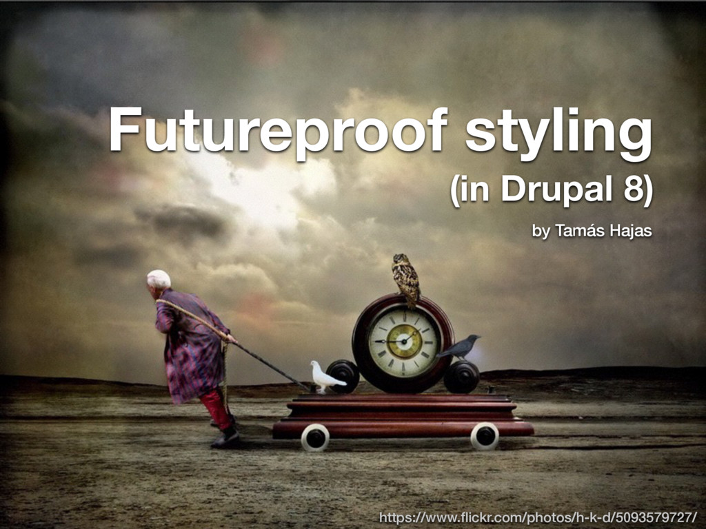
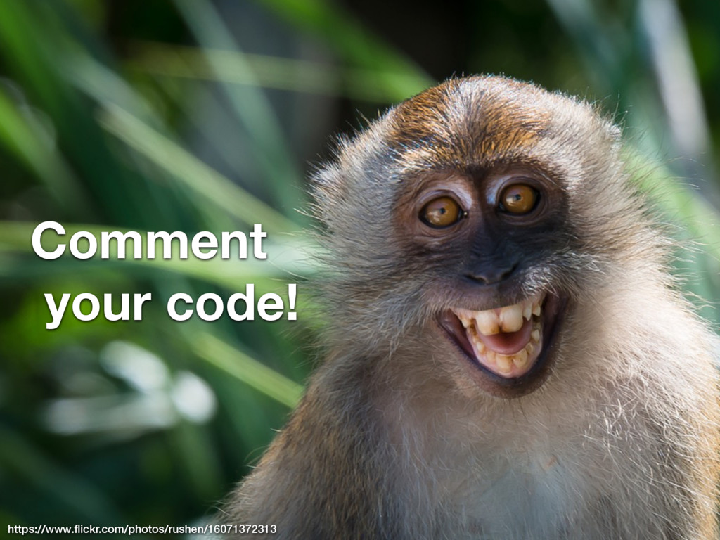
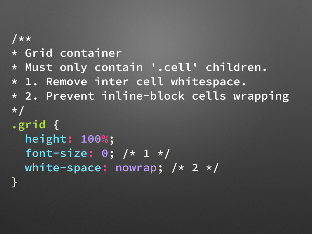
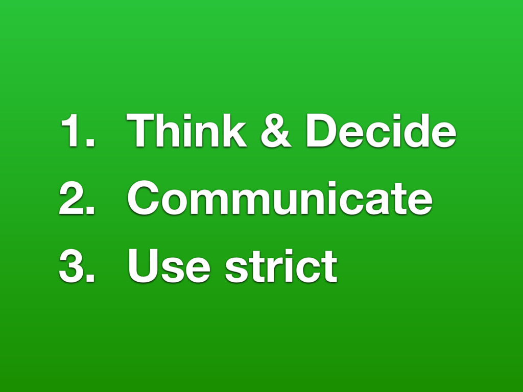
A brand new version of my talk about writing CSS (in Drupal) which is maintainable in long term and expandable to big size.

Presentation video: https://www.youtube.com/watch?v=akDwPn7V2DQ

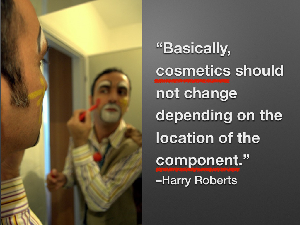
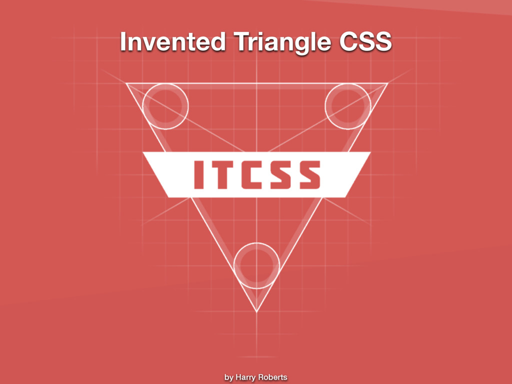
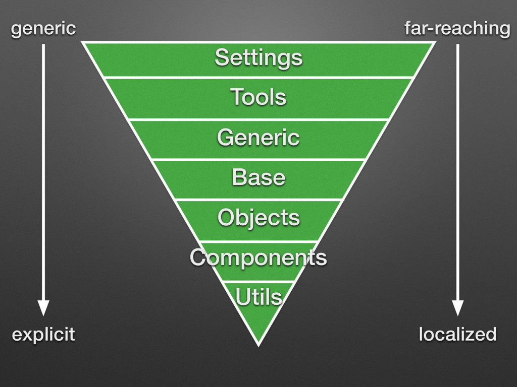
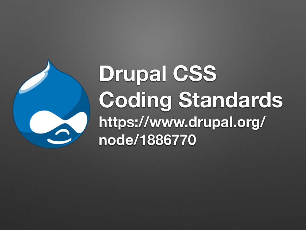
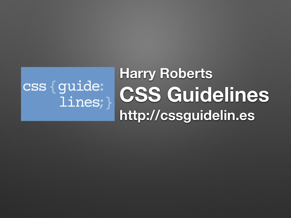
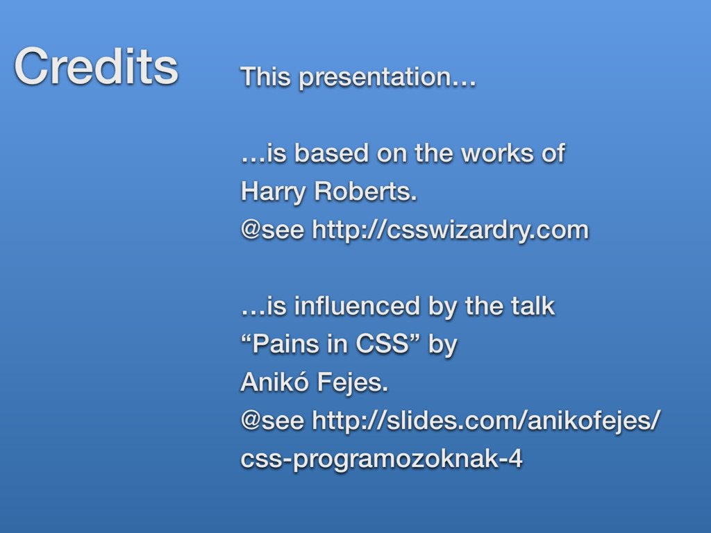
(Credits: Harry Roberts http://csswizardry.com, Anikó Fejes http://slides.com/anikofejes/css-programozoknak-4)

Tamás Hajas

November 28, 2015
Tweet

More Decks by Tamás Hajas

Other Decks in Technology

Transcript

  1. Tamás Hajas Drupal / Web Project Manager & Front-end Developer

    Integral Vision Ltd https://thamas.github.io
  2. @if body { @if .node-19 { @if #sidebar-first { @if

    div { @if .block { @if .title { @if a { color: red !important; } } } } } } } Cyclomatic Complexity
  3. body.node-19 #sidebar-first div.block .title a { color: red !important; }

    Are you sure, it is red, because it is in… … .title? … .block? … #sidebar-first? … body? Context?
  4. body.node-19 #sidebar-first div.block .title a { color: red !important; }

    Are you sure, it is red, because it is in… … .title? … .block? … #sidebar-first? … body?! Context? Seriously?!
  5. #sidebar-first div.block .title a { color: #fff; } Undoing things

    :( body.node-19 #sidebar-first div.block .title a { color: red !important; } div.block .title a { color: #333; }
  6. Specificity :( body.node-19 #sidebar-first div.block .title a { color: red

    !important; } 0001 0001 0001 0010 0010 0010 0100 0,1,3,3
  7. body.node-19 #sidebar-first div.block .title a { color: red !important; }

    .promo-title { color: $color-brand; } Flat selectors
  8. <blockquote class="o-media c-testimonial"> <img class="o-media__img c-avatar 
 c-avatar--large" src="…" alt="…">

    <div class="o-media__body c-testimonial__text"> <p>…</p> </div> </blockquote>
  9. <blockquote class="o-media c-testimonial"> <img class="o-media__img c-avatar 
 c-avatar--large" src="…" alt="…">

    <div class="o-media__body c-testimonial__text"> <p>…</p> </div> </blockquote> Object
  10. <blockquote class="o-media c-testimonial"> <img class="o-media__img c-avatar 
 c-avatar--large" src="…" alt="…">

    <div class="o-media__body c-testimonial__text"> <p>…</p> </div> </blockquote> Component
  11. .o-media { display: table; width: 100%; } .c-testimonial { padding:

    $base-spacing-unit; border-radius: $base-radius; background-color: $color-shadow; color: $color-text; } Object vs. Component
  12. <blockquote class="o-media c-testimonial"> <img class="o-media__img c-avatar 
 c-avatar--large" src="…" alt="…">

    <div class="o-media__body c-testimonial__text"> <p>…</p> </div> </blockquote> “Namespaces”
  13. Single responsibility principle .button-login { display: inline-block; padding: 2em; background-color:

    $color-brand-sec; color: $color-text--inverse; } Mixing responsibilities Base Structural Cosmetic
  14. Single responsibility principle .button { display: inline-block; } .button--large {

    padding: 2em; } .button--positive { background-color: $color-brand-sec; color: $color-text--inverse; }
  15. .o-media { display: table; width: 100%; } .c-testimonial { padding:

    $base-spacing-unit; border-radius: $base-radius; background-color: $color-shadow; color: $color-text; } Object vs. Component
  16. Don’t Repeat Yourself! $spacing-unit: 20px; .u-margin-top { margin-top: $spacing-unit *

    1.5; } .u-margin-right { margin-right: $spacing-unit ; } .u-margin-bottom { margin-bottom: $spacing-unit / 2; } .u-margin-left { margin-left: $spacing-unit; }
  17. Open / Closed principle for extension for modification .button {

    … padding: 1em 2em; } #sidebar .button { padding: 1.5em 2.5em; } It is modified 
 by “context”
  18. Open / Closed principle for extension for modification .button {

    … padding: 1em 2em; } .button--large { padding: 1.5em 2.5em; }
  19. /** * Grid container * Must only contain '.cell' children.

    */ .grid { height: 100%; font-size: 0; white-space: nowrap; }
  20. /** * Grid container * Must only contain '.cell' children.

    */ .grid { height: 100%; /* Remove inter-cell whitespace */ font-size: 0; /* Prevent inline-block cells wrapping */ white-space: nowrap; }
  21. /** * Grid container * Must only contain '.cell' children.

    * 1. Remove inter cell whitespace. * 2. Prevent inline-block cells wrapping */ .grid { height: 100%; font-size: 0; /* 1 */ white-space: nowrap; /* 2 */ }
  22. Credits This presentation… 
 …is based on the works of

    
 Harry Roberts. @see http://csswizardry.com …is influenced by the talk “Pains in CSS” by Anikó Fejes. @see http://slides.com/anikofejes/ css-programozoknak-4