Upgrade to Pro — share decks privately, control downloads, hide ads and more …

A short guide to Web Typography

Thompson
November 19, 2015

A short guide to Web Typography

Thompson

November 19, 2015
Tweet

Other Decks in Design

Transcript

  1. Web Typography Reading Legibility In fairy-tales, witches always wear silly

    black hats and black coats, and they ride on broomsticks. But this is not a fairy-tale. This is about REAL WITCHES. ‘Legibility’ means text can be interpreted. • We read shapes, we don’t read words. • Letters carry more of their identifying features in their top halves. In fairy-tales, witches always wear silly black hats and black coats, and they ride on broomsticks. But this is not a fairy-tale. This is about REAL WITCHES.
  2. IN FAIRY-TALES, WITCHES ALWAYS WEAR SILLY BLACK HATS AND BLACK

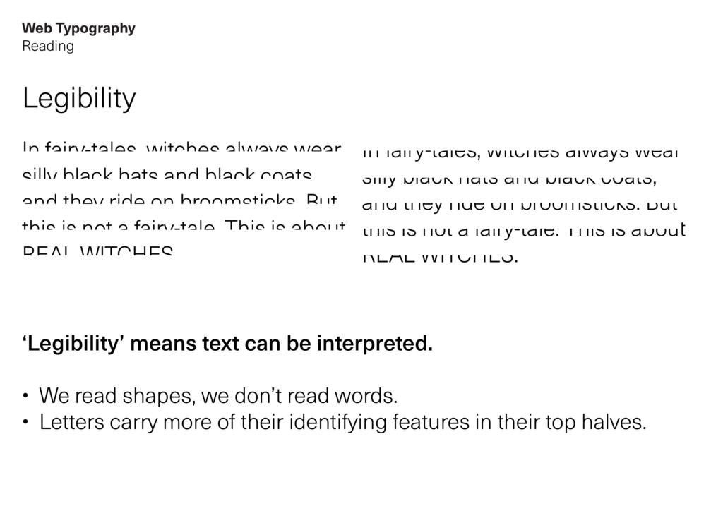
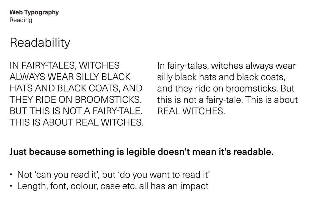
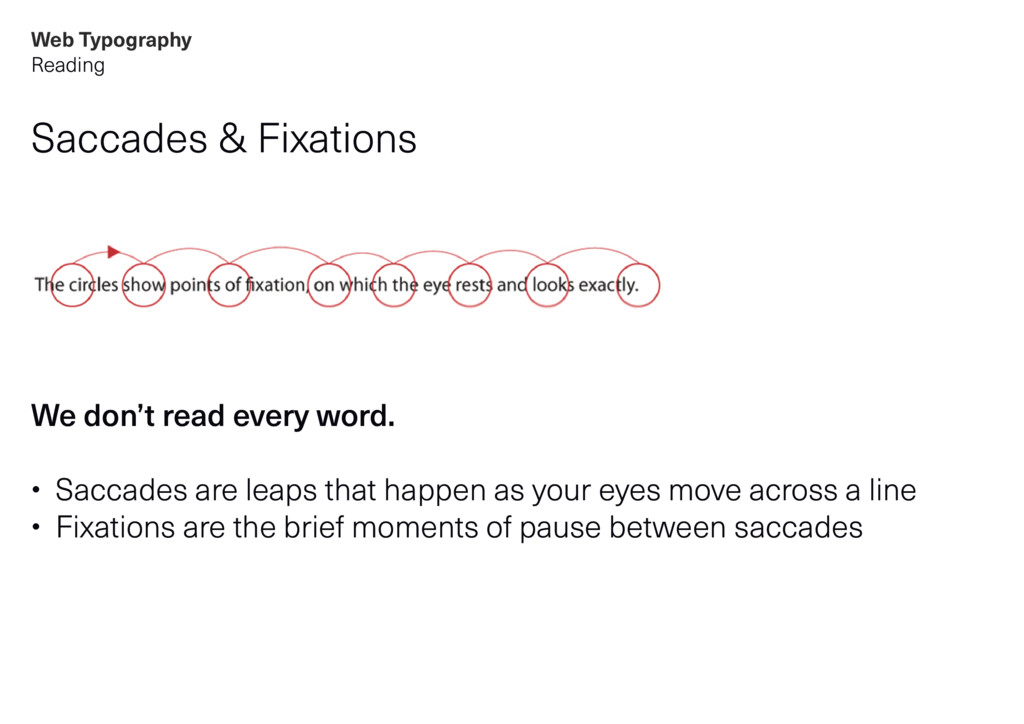
    COATS, AND THEY RIDE ON BROOMSTICKS. BUT THIS IS NOT A FAIRY-TALE. THIS IS ABOUT REAL WITCHES. In fairy-tales, witches always wear silly black hats and black coats, and they ride on broomsticks. But this is not a fairy-tale. This is about REAL WITCHES. Readability Just because something is legible doesn’t mean it’s readable. • Not ‘can you read it’, but ‘do you want to read it’ • Length, font, colour, case etc. all has an impact Web Typography Reading
  3. Saccades & Fixations We don’t read every word. • Saccades

    are leaps that happen as your eyes move across a line • Fixations are the brief moments of pause between saccades Web Typography Reading
  4. System fonts or Images We used to have a very

    limited number of typefaces available: Arial, Georgia, Verdana, Tahoma, Times, Lucida Sans, Comic Sans, plus a few more… The alternative was to embed images of text: • Bad for accessibility • Difficult to maintain on a large scale • Can pixellate with compression • Poor SEO Web Typography History
  5. Web Typography History sIFR Then some clever people invented an

    alternative. sIFR (Scalable Inman Flash Replacement) used Macromedia Flash to replace text with encoded fonts. Good because: • More accessible • More variety / choice Bad because: • Slow • Reliant on Flash being installed • Reliant on Javascript
  6. Web Typography History Cufón Then some clever people invented another

    alternative. Cufón converts fonts into vector graphics and stores them in JSON data format. Good because: • Not reliant on Flash • More variety / choice Bad because: • Fonts are unencrypted • Can’t select / search text • Reliant on Javascript
  7. Web Typography History @font-face Then some clever people invented ANOTHER

    alternative. @font-face is a CSS declaration that allows you to reference a font file (that’s hosted online) to use when rendering text on a Web page. Good because: • More accessible! • More variety / choice! • Not reliant on Javascript! Bad because… • Nothing! (Other than being unencrypted and open to being stolen)
  8. Web Typography Issues & Considerations Browser rendering All browsers render

    fonts differently. OSX is particularly good. Windows is particularly bad. Especially older versions. Most fonts aren’t hinted and optimised for Web. Many font vendors simply convert typefaces into web-friendly file formats. However without proper hinting they can render terribly. We must test in-browser.
  9. Web Typography Issues & Considerations Weights & Styles The more

    weights and styles we include, the longer the load time. Having said that, there’s a minimum we should aim for: • Regular • Italic • Bold • Bold italic For ‘body’ copy, if we don’t include these as a minimum, we’re leaving it up to the browser to ‘make them up’ (we all know how ugly faux-bold is in Photoshop).
  10. Web Typography Opentype Features Ligatures / Smallcaps / Lining numerals

    / Hyphenation In the most modern browsers, these are now possible. However we need to consider: • Does our web typeface include these features? • How much extra file-size does it add? (And is it worth it?) • How does it gracefully degrade in browsers that don’t support it?
  11. Web Typography Attributes Print Tracking Line spacing Weight Style Point

    size Underline / Line-through Kerning Leading ---- Baseline grid alignment letter-spacing line-height font-weight font-style font-size text-decoration (doesn’t exist in CSS) (doesn’t exist in CSS) ---- (near impossible) Online
  12. Web Typography Attributes A note on line spacing / line-height

    Line spacing in print is not the same as line-height on the Web. Line spacing = the distance from baseline to baseline line-height = the distance between the mid-points in the space above and below a line of text Line spacing Abcdefghijklmnop qrstuvwxyz line-height Abcdefghijklmnop qrstuvwxyz Space added from base-line to base-line. Equal space added above and below each line of text.
  13. Web Typography Attributes A note on sizing Points in print

    are not the same as pixels on the Web. 12 points = 16 pixels 16 pixels is the base size for Web Typography. 16px = { font-size: 100%; }
  14. Web Typography Services About font-serving services Fonts hosted on third-party

    platforms and distributed to your website using Javascript. Good because: • Secure / no theft issues • Hinted / fully tested (usually) • Cost-effective • Always up-to-date tech • Flexible Bad because… • Slower than self-hosted • Might see more FOUT* • Reliant on Javascript *FOUT stands for ‘Flach of unstyled text’.
  15. Web Typography Services Services we trust to do a good

    job: Font-serving: • Typekit • Fontdeck • Cloud.typography • Fonts.com Testing: • Typecast