Upgrade to Pro
— share decks privately, control downloads, hide ads and more …
Speaker Deck
Features
Speaker Deck
PRO
Sign in
Sign up for free
Search
Search
Viewport Trickery (v1.0)
Search
Sponsored
·
SiteGround - Reliable hosting with speed, security, and support you can count on.
→
Jessica Stokes
August 05, 2015
Technology
62
0
Share
Embed
Copy iframe code
Copy JS code
Copy link
Start on current slide
Viewport Trickery (v1.0)
Putting responsive UIs atop desktop-only sites.
Presented at MelbMobile on 05/08/2015
Jessica Stokes
August 05, 2015
More Decks by Jessica Stokes
See All by Jessica Stokes
Viewport Trickery (v1.1)
ticky
0
360
Other Decks in Technology
See All in Technology
product engineering with qa
nealle
0
150
生成AIの活用/high_school2026
okana2ki
0
110
なぜ私たちのSREプラクティスはなかなか機能しないのか 〜システムより先に組織を見る〜 / Why our SRE practices aren't really working
vtryo
1
2.4k
知らん間に、回ってる
ming_ayami
0
310
AIに「使われる」時代のSaaS戦略 〜既存WebAPIのMCPサーバー化における開発ノウハウ〜
ekispert_api
0
300
AIで政治は変わるのか? — 中高生と考えたAI時代の民主主義(東海高校サタデープログラム)
eitarosuda
0
400
SRE Lounge Hiroshimaへの招待
grimoh
0
380
AI駆動開発におけるQAエンジニアの役割事例 〜AI駆動開発の現場から〜
kobayashiyorimitsu
0
390
Mastraエージェント、どのクラウドにデプロイする?
minorun365
PRO
2
170
環境凍結という Toil を倒す -セルフサービス型 Ephemeral テスト環境の 設計と実践
shirouz
1
1.4k
認証認可だけじゃない! ID管理の構成要素と ライフサイクルを意識しよう
ritou
1
520
Claude Code 珍プレー好プレー
shinyasaita
0
280
Featured
See All Featured
Odyssey Design
rkendrick25
PRO
2
730
The World Runs on Bad Software
bkeepers
PRO
72
12k
Become a Pro
speakerdeck
PRO
31
6k
Six Lessons from altMBA
skipperchong
29
4.3k
The B2B funnel & how to create a winning content strategy
katarinadahlin
PRO
1
420
Technical Leadership for Architectural Decision Making
baasie
3
430
Evolution of real-time – Irina Nazarova, EuRuKo, 2024
irinanazarova
9
1.4k
Faster Mobile Websites
deanohume
310
32k
Mozcon NYC 2025: Stop Losing SEO Traffic
samtorres
1
270
I Don’t Have Time: Getting Over the Fear to Launch Your Podcast
jcasabona
34
2.8k
Tips & Tricks on How to Get Your First Job In Tech
honzajavorek
1
550
From Legacy to Launchpad: Building Startup-Ready Communities
dugsong
0
240
Transcript
Viewport Trickery or, putting responsive UIs atop desktop-only sites
Jessica Stokes Cybersorceress jessicastokes.net | @ticky
None
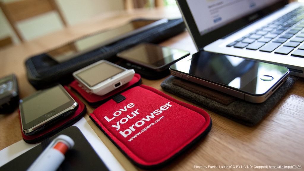
Photo by Patrick Lauke (CC-BY-NC-ND; Cropped) https://flic.kr/p/bTt6P8
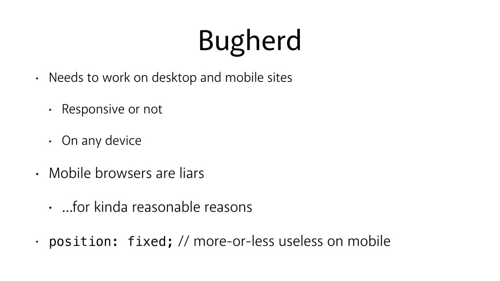
Bugherd • Needs to work on desktop and mobile sites
• Responsive or not • On any device • Mobile browsers are liars • …for kinda reasonable reasons • position: fixed; // more-or-less useless on mobile
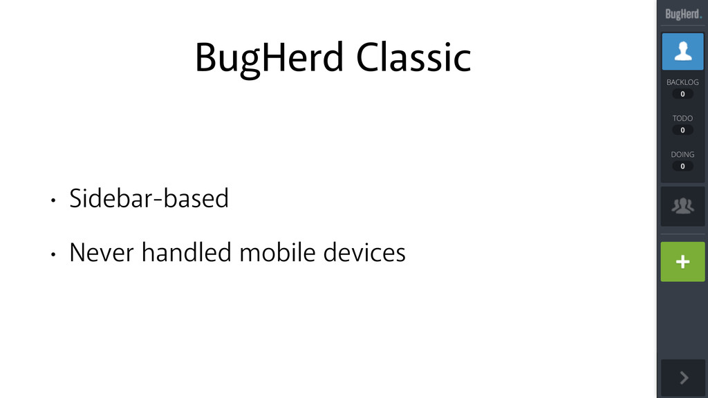
BugHerd Classic • Sidebar-based • Never handled mobile devices
None
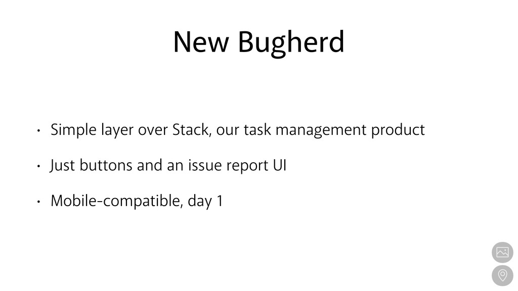
New Bugherd • Simple layer over Stack, our task management
product • Just buttons and an issue report UI • Mobile-compatible, day 1
None
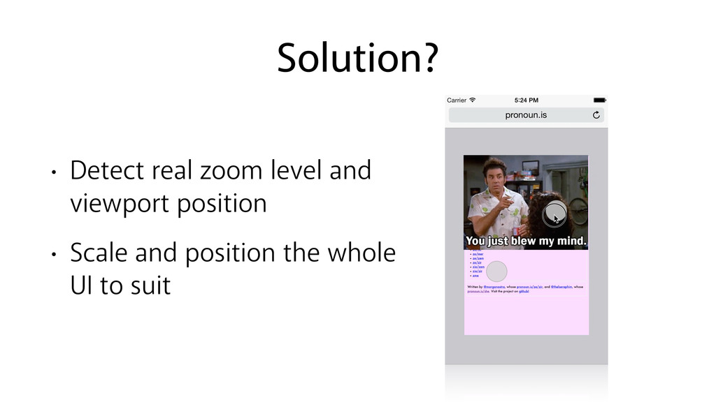
Solution? • Detect real zoom level and viewport position •
Scale and position the whole UI to suit
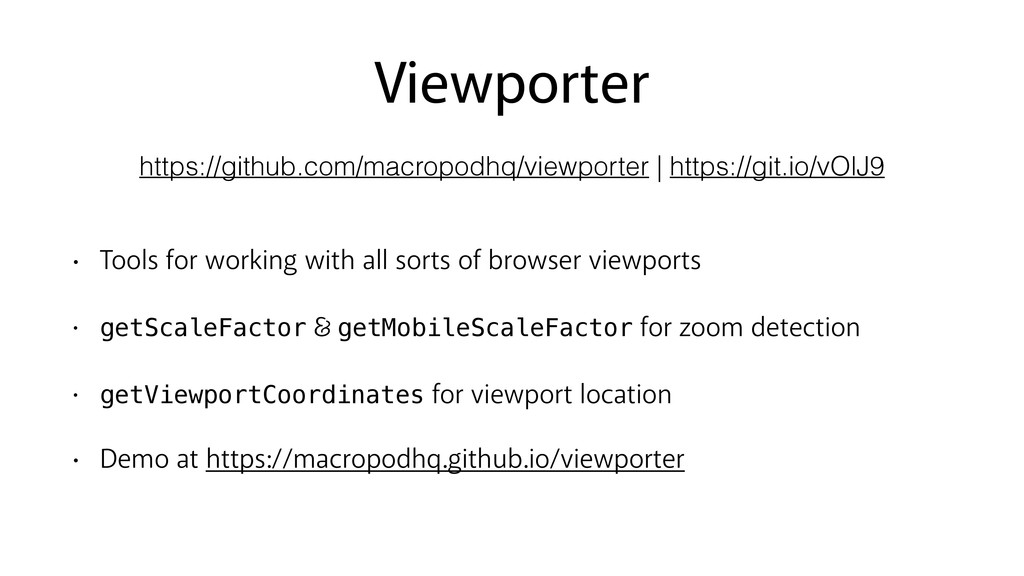
Viewporter • Tools for working with all sorts of browser
viewports • getScaleFactor getMobileScaleFactor for zoom detection • getViewportCoordinates for viewport location • Demo at https://macropodhq.github.io/viewporter https://github.com/macropodhq/viewporter | https://git.io/vOlJ9
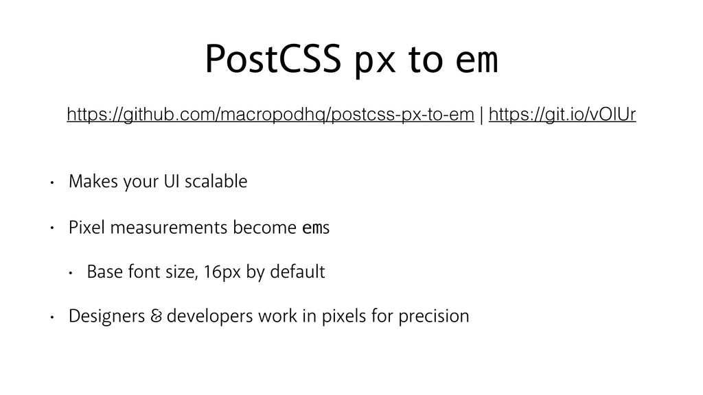
PostCSS px to em • Makes your UI scalable •
Pixel measurements become ems • Base font size, 16px by default • Designers developers work in pixels for precision https://github.com/macropodhq/postcss-px-to-em | https://git.io/vOlUr
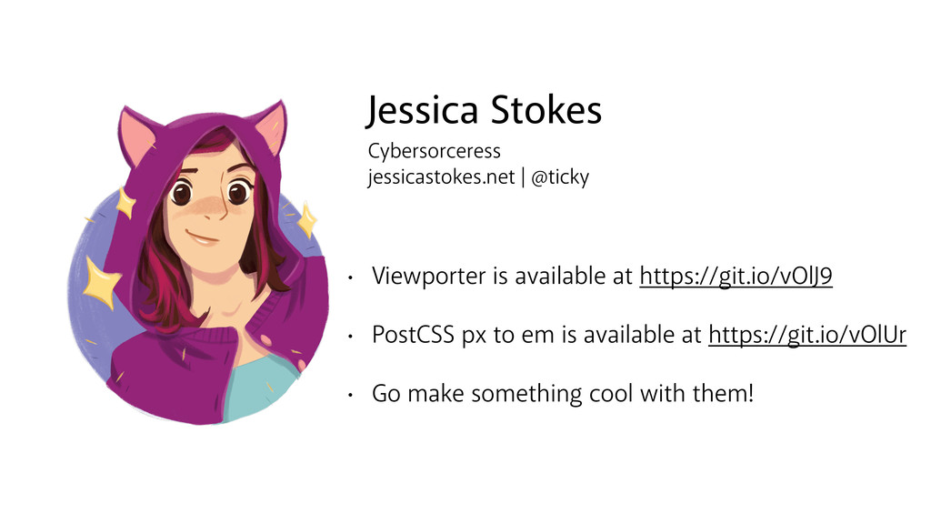
Jessica Stokes Cybersorceress jessicastokes.net | @ticky • Viewporter is available
at https://git.io/vOlJ9 • PostCSS px to em is available at https://git.io/vOlUr • Go make something cool with them!
 SiteGround - Reliable hosting with speed, security, and support you can count on.
 ticky
ticky
 nealle
 okana2ki
 vtryo
vtryo
 ming_ayami
 ekispert_api
 eitarosuda
 grimoh
 kobayashiyorimitsu
 minorun365
 shirouz
 ritou
ritou
 shinyasaita
 rkendrick25
 bkeepers
 speakerdeck
 skipperchong
 katarinadahlin
 baasie
 irinanazarova
 deanohume
 samtorres
 jcasabona
 honzajavorek
 dugsong