Upgrade to Pro
— share decks privately, control downloads, hide ads and more …
Speaker Deck
Features
Speaker Deck
PRO
Sign in
Sign up for free
Search
Search
Viewport Trickery (v1.1)
Search
Jessica Stokes
September 09, 2015
Programming
360
0
Share
Embed
Copy iframe code
Copy JS code
Copy link
Start on current slide
Viewport Trickery (v1.1)
Putting responsive UIs atop desktop-only sites.
Presented at MelbJS on 09/09/2015
Jessica Stokes
September 09, 2015
More Decks by Jessica Stokes
See All by Jessica Stokes
Viewport Trickery (v1.0)
ticky
0
62
Other Decks in Programming
See All in Programming
その問い、本当に正しいですか?AI時代のエンジニアに必要な哲学と認知科学 / ai-philosophy-cognitive-science
minodriven
14
6.7k
技術記事、 専門家としてのプログラマ、 言語化
mizchi
14
7.3k
LLM本来の能力を解き放つサンドボックス技術とAI民主化への適用
yukukotani
3
4.9k
例外の正しい扱い方 そのエラー try-catchして大丈夫?
jinwatanabe
0
340
Language Server 使ってる? 〜VSCode と Zed の場合〜 / Are you using a Language Server? ~For VS Code and Zed~
handlename
0
830
キャリア迷子上等 ─ "ない道"は自分で作ればいい
16bitidol
3
2.8k
【やさしく解説 設計編・中級 #1】一つの車に、運転手は一人 ~ある倉庫システムの事例から~
panda728
PRO
0
110
トークンをケチるな、設計しろ:GitHub Copilotを賢く使うコンテキスト戦略
ochtum
0
300
AIキャラアプリkaiwaの低遅延音声通話基盤をどう作ったか - AWS Gravitonで支える低遅延・低コストAI Agent基盤
mogamit
0
160
Hatena Engineer Seminar #37「言語モデルの活用に関する研究」
slashnephy
0
500
地域 SRE コミュニティ最前線 - ホンマでっかSRE勉強会
tk3fftk
0
140
Vue × Nuxt × Oxc どこまで使える?実運用の現在地
andpad
0
360
Featured
See All Featured
The browser strikes back
jonoalderson
0
1.4k
How To Speak Unicorn (iThemes Webinar)
marktimemedia
1
500
The Art of Programming - Codeland 2020
erikaheidi
57
14k
CSS Pre-Processors: Stylus, Less & Sass
bermonpainter
360
30k
Build The Right Thing And Hit Your Dates
maggiecrowley
39
3.2k
Introduction to Domain-Driven Design and Collaborative software design
baasie
1
890
Public Speaking Without Barfing On Your Shoes - THAT 2023
reverentgeek
1
450
The Pragmatic Product Professional
lauravandoore
37
7.4k
Ethics towards AI in product and experience design
skipperchong
2
320
Easily Structure & Communicate Ideas using Wireframe
afnizarnur
194
17k
A better future with KSS
kneath
240
18k
Writing Fast Ruby
sferik
630
63k
Transcript
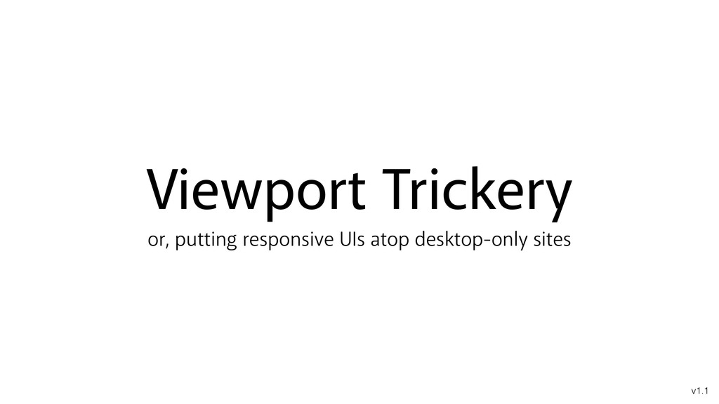
Viewport Trickery or, putting responsive UIs atop desktop-only sites v1.1
Jessica Stokes Cybersorceress jessicastokes.net | @ticky
None
Photo by Patrick Lauke (CC-BY-NC-ND; Cropped) https://flic.kr/p/bTt6P8
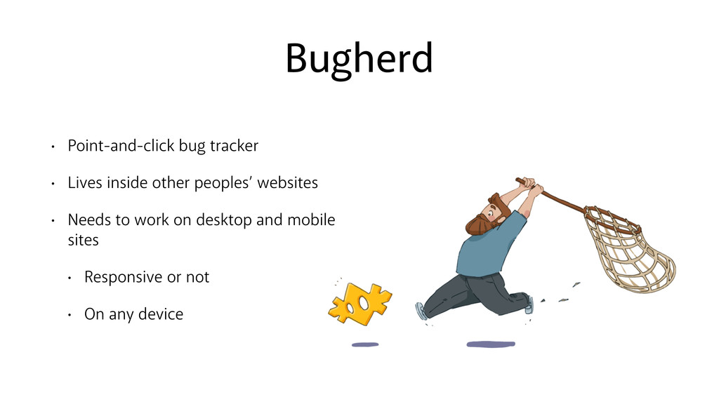
Bugherd • Point-and-click bug tracker • Lives inside other peoples’
websites • Needs to work on desktop and mobile sites • Responsive or not • On any device
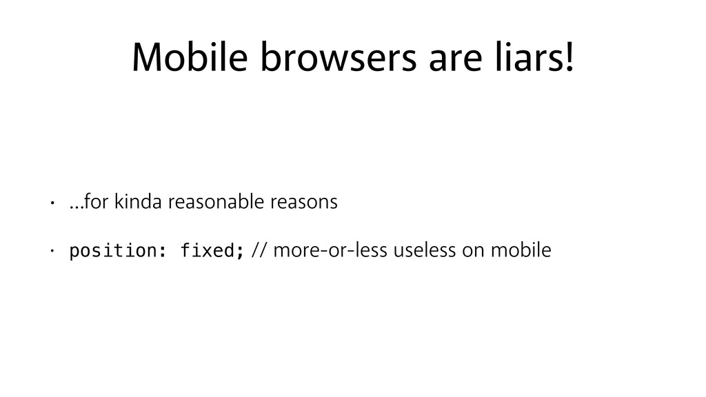
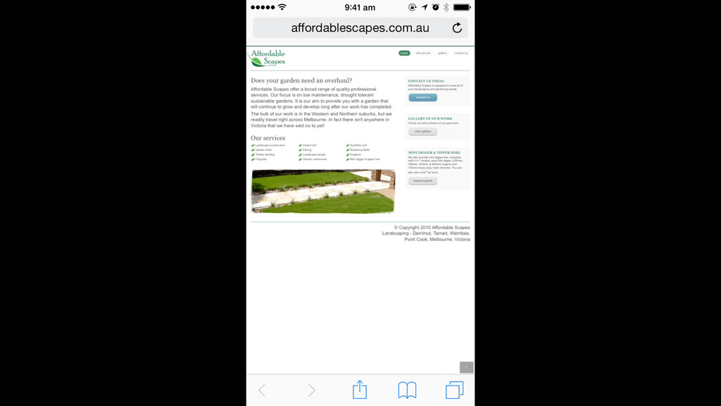
Mobile browsers are liars! • …for kinda reasonable reasons •
position: fixed; // more-or-less useless on mobile
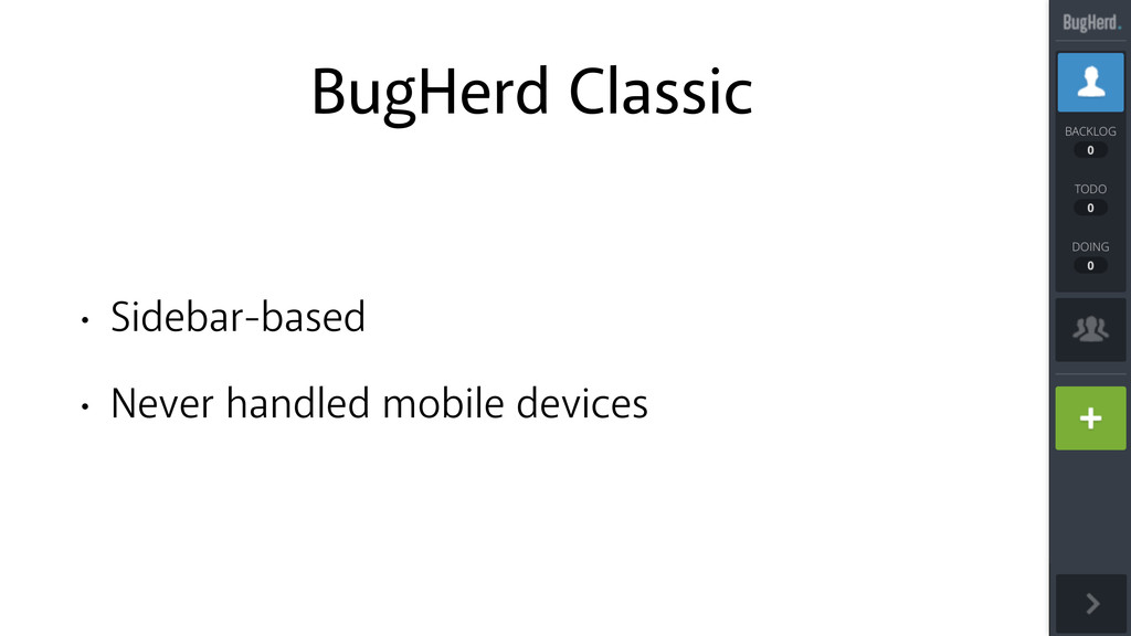
BugHerd Classic • Sidebar-based • Never handled mobile devices
None
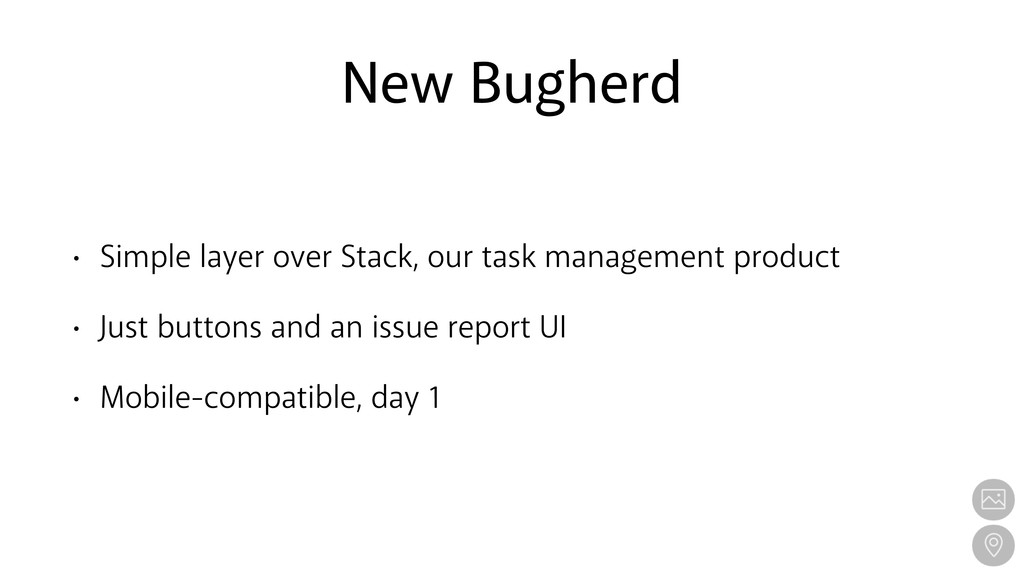
New Bugherd • Simple layer over Stack, our task management
product • Just buttons and an issue report UI • Mobile-compatible, day 1
None
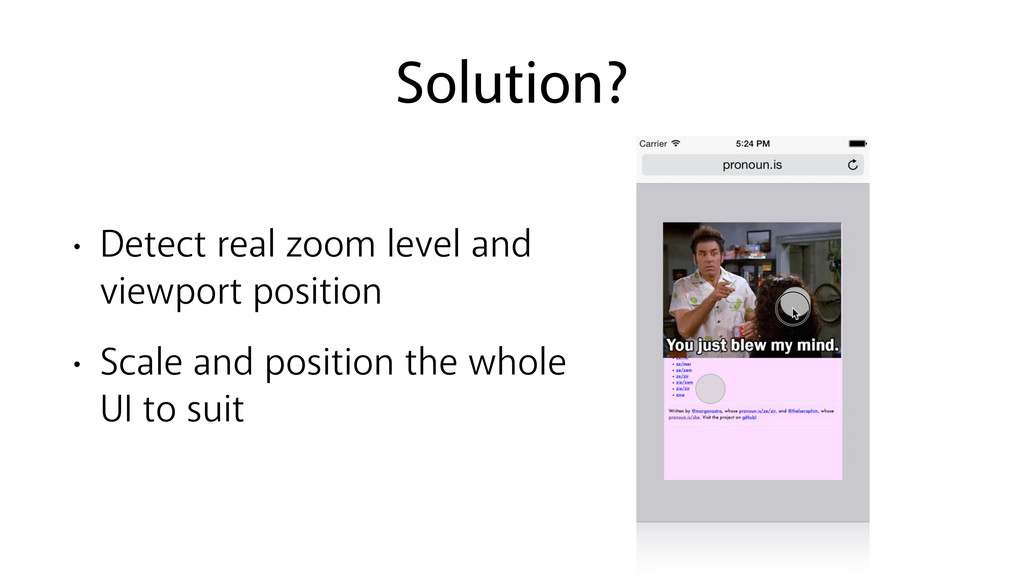
Solution? • Detect real zoom level and viewport position •
Scale and position the whole UI to suit
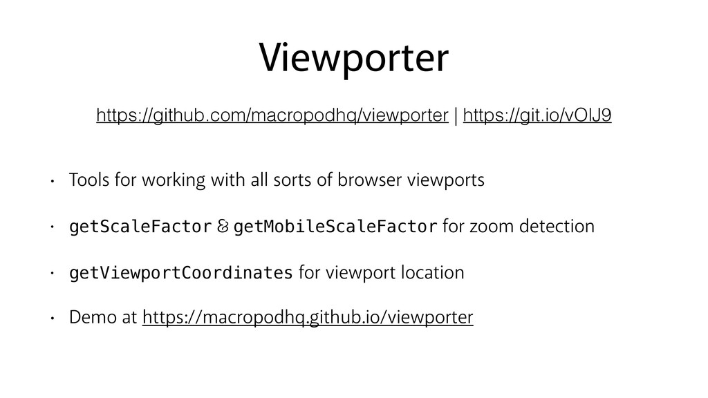
Viewporter • Tools for working with all sorts of browser
viewports • getScaleFactor getMobileScaleFactor for zoom detection • getViewportCoordinates for viewport location • Demo at https://macropodhq.github.io/viewporter https://github.com/macropodhq/viewporter | https://git.io/vOlJ9
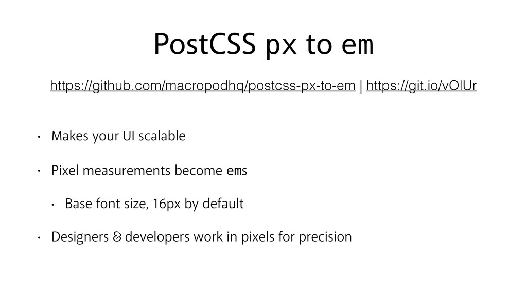
PostCSS px to em • Makes your UI scalable •
Pixel measurements become ems • Base font size, 16px by default • Designers developers work in pixels for precision https://github.com/macropodhq/postcss-px-to-em | https://git.io/vOlUr
Jessica Stokes Cybersorceress jessicastokes.net | @ticky • Viewporter is available
at https://git.io/vOlJ9 • PostCSS px to em is available at https://git.io/vOlUr • Go make something cool with them!
 ticky
ticky
 minodriven
 mizchi
 yukukotani
 jinwatanabe
 handlename
 16bitidol
 panda728
 ochtum
 mogamit
 slashnephy
 tk3fftk
 andpad
 jonoalderson
 marktimemedia
 erikaheidi
 bermonpainter
 maggiecrowley
 baasie
 reverentgeek
 lauravandoore
 skipperchong
 afnizarnur
 kneath
 sferik