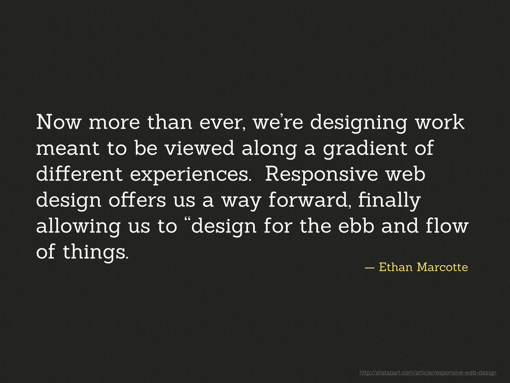
meant to be viewed along a gradient of different experiences. Responsive web design offers us a way forward, finally allowing us to “design for the ebb and flow of things. http://alistapart.com/article/responsive-web-design
print medium, and often desire in the web medium, is simply a function of the limitation of the printed page. We should embrace the fact that the web doesn’t have the same constraints, and design for this flexibility. http://alistapart.com/article/dao
meant to be viewed along a gradient of different experiences. Responsive web design offers us a way forward, finally allowing us to “design for the ebb and flow of things. gradient of different experiences http://alistapart.com/article/responsive-web-design
meant to be viewed along a gradient of different experiences. Responsive web design offers us a way forward, finally allowing us to “design for the ebb and flow of things. gradient of different experiences http://alistapart.com/article/responsive-web-design
in Angkor Thom, Cambodia"> <div data-src="small.jpg"></div> <div data-src="medium.jpg" data-media="(min-width: 400px)"></div> <div data-src="large.jpg" data-media="(min-width: 800px)"></div> <div data-src="extralarge.jpg" data-media="(min-width: 1000px)"></div> <!-- Fallback content for non-JS browsers. Same img src as the initial, unqualified source element. --> <noscript> <img src="external/imgs/small.jpg" alt="A giant stone face at The Bayon temple in Angkor Thom, Cambodia"> </noscript> </div>
could be hard to maintain Organization can be easier Extra weight, regardless of if needed Smaller CSS for device not supporting media queries All styles downloaded All styles downloaded (if media queries supported)
 tkadlec
 tk3fftk
 guaca
guaca
 k1mu21
 elenatanasoiu
 cottpan
 naoya
naoya
 d0riven
 kajitack
 ryugen04
 77web
77web
 funnyycat
 yukikurage
 ipullrank
 maltzj
 michaelherold
 smashingmag
 auna
auna
 jakevdp
 skipperchong
 csswizardry
 aleyda
 akademiya2063
 erikaheidi
 nonsquared
![$("[data-append],[data-replace],[data-after], [data-before]").ajaxInclude();](https://files.speakerdeck.com/presentations/568ee270957e0130dc164e41a2a1fb69/slide_69.jpg)
![var toShow = document.querySelectorAll('[data-lazy- content=' + item.getAttribute('[data-lazy-reveal]') + ']'; for](https://files.speakerdeck.com/presentations/568ee270957e0130dc164e41a2a1fb69/slide_72.jpg)