often desire in the web medium, is simply a function of the limitation of the printed page. We should embrace the fact that the web doesn’t have the same constraints, and design for this flexibility. But first, we must “accept the ebb and flow of things.” “ - JOHN ALLSOPP ” author of “A Dao of Web Design” Friday, May 31, 13
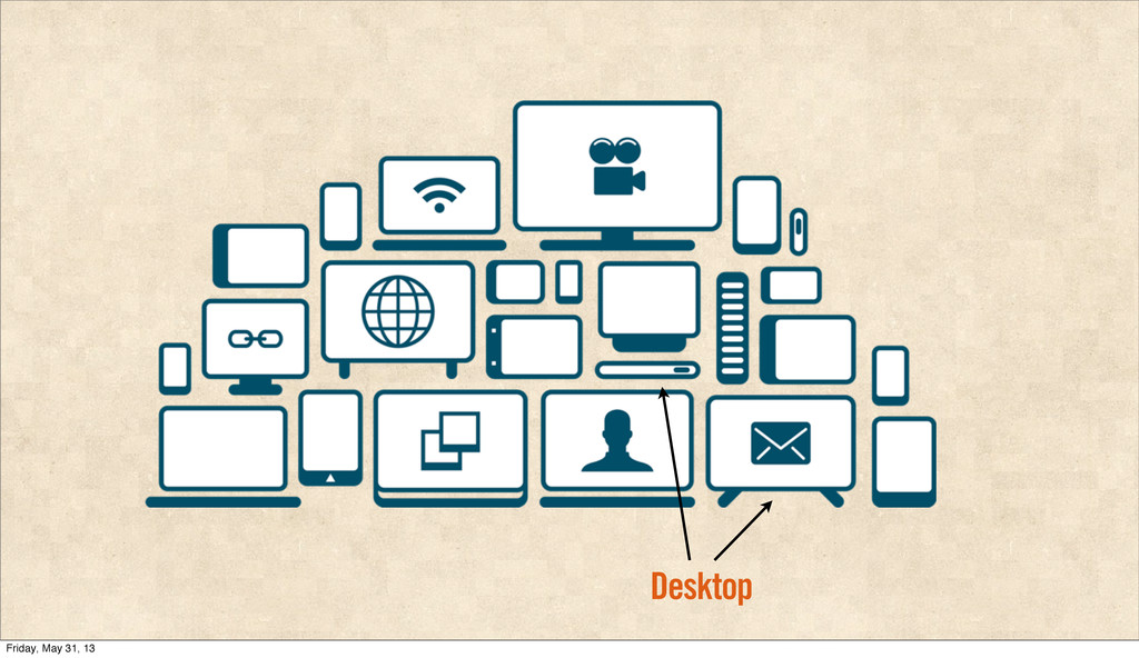
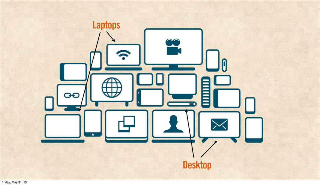
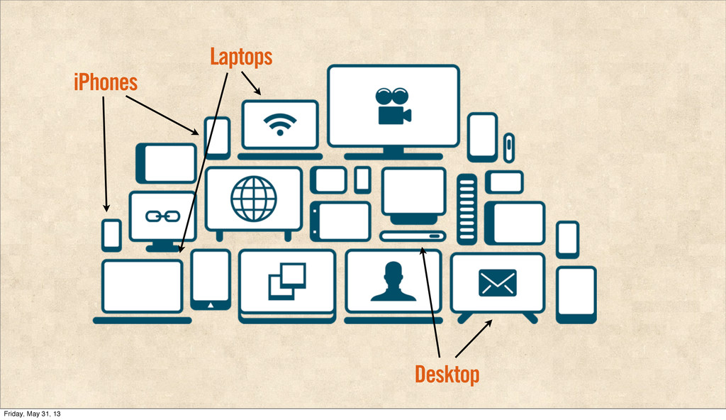
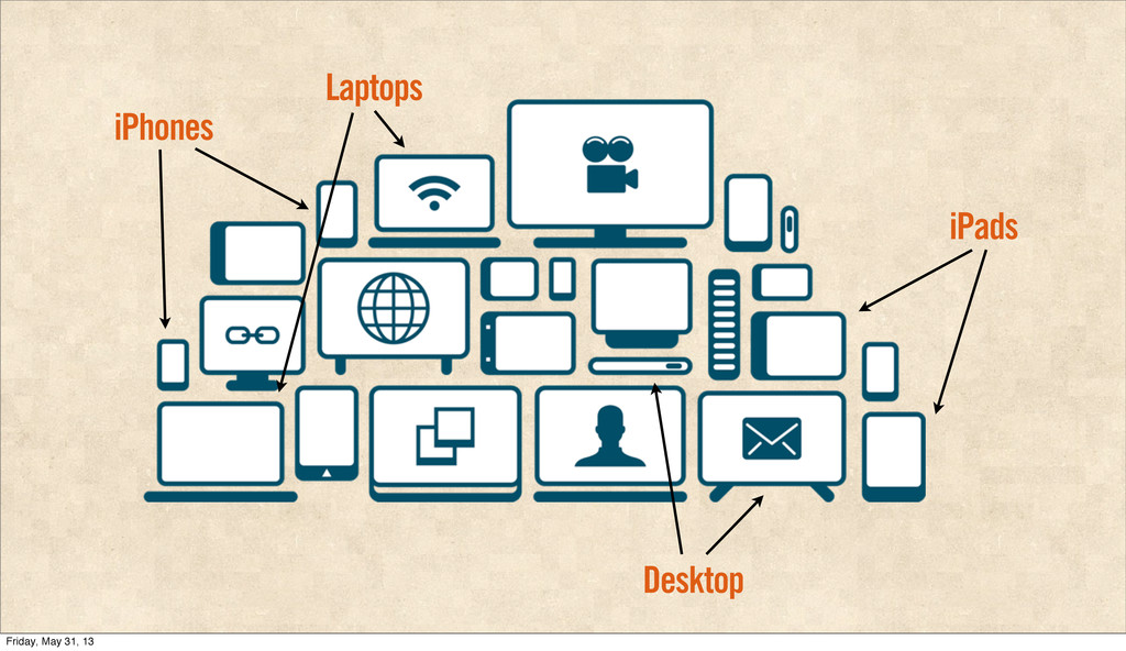
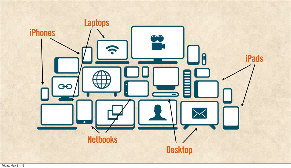
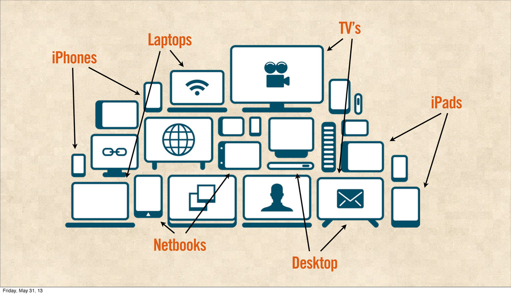
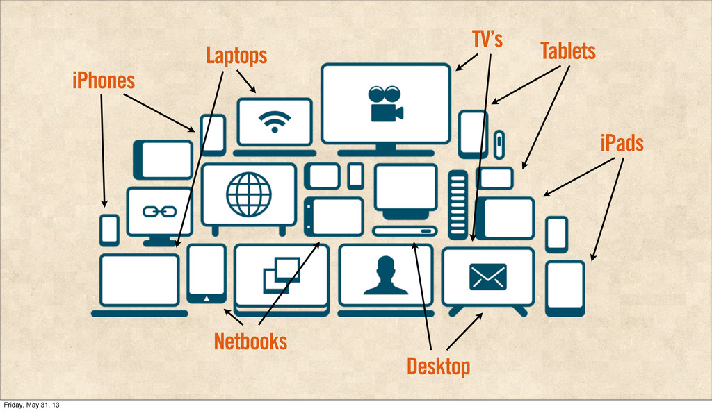
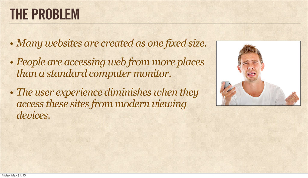
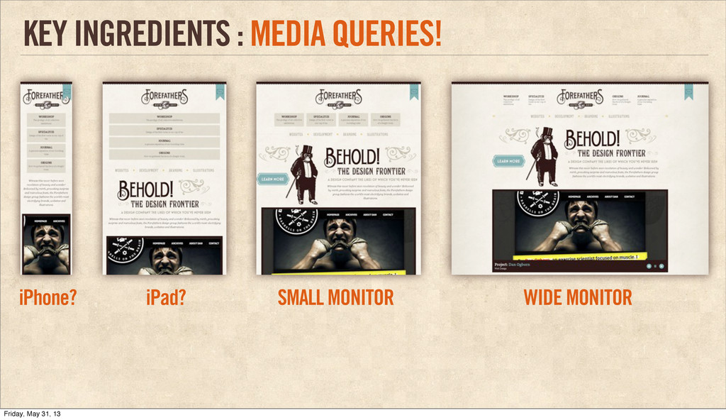
size. • People are accessing web from more places than a standard computer monitor. • The user experience diminishes when they access these sites from modern viewing devices. Friday, May 31, 13
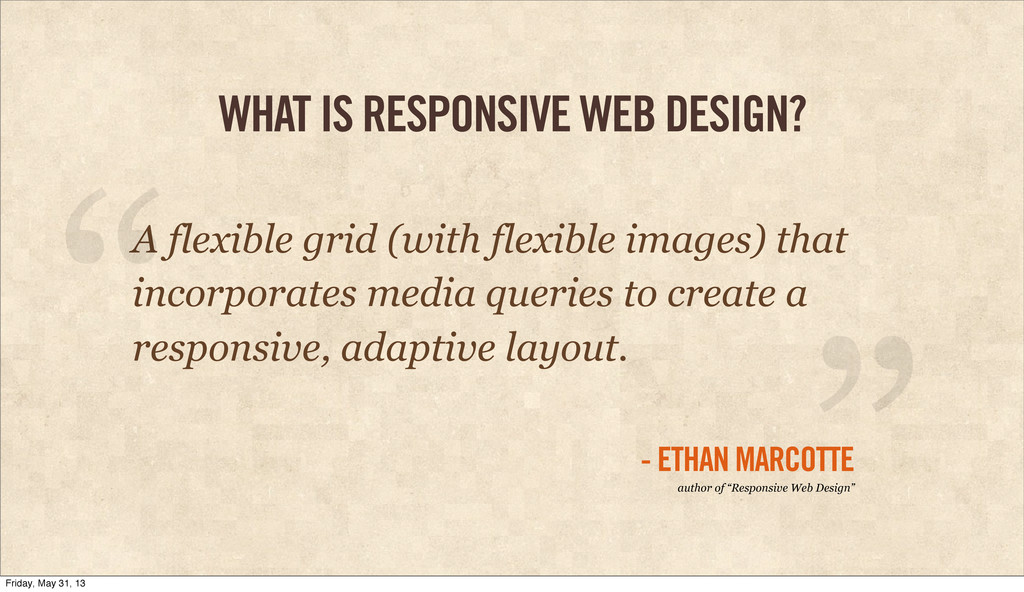
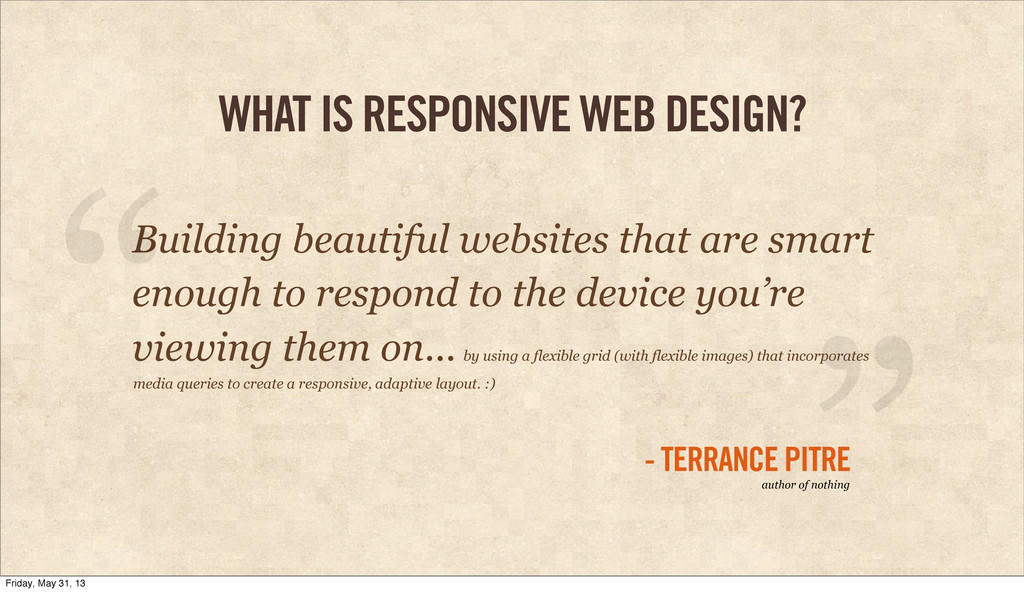
smart enough to respond to the device you’re viewing them on... “ - TERRANCE PITRE ” author of nothing by using a flexible grid (with flexible images) that incorporates media queries to create a responsive, adaptive layout. :) Friday, May 31, 13
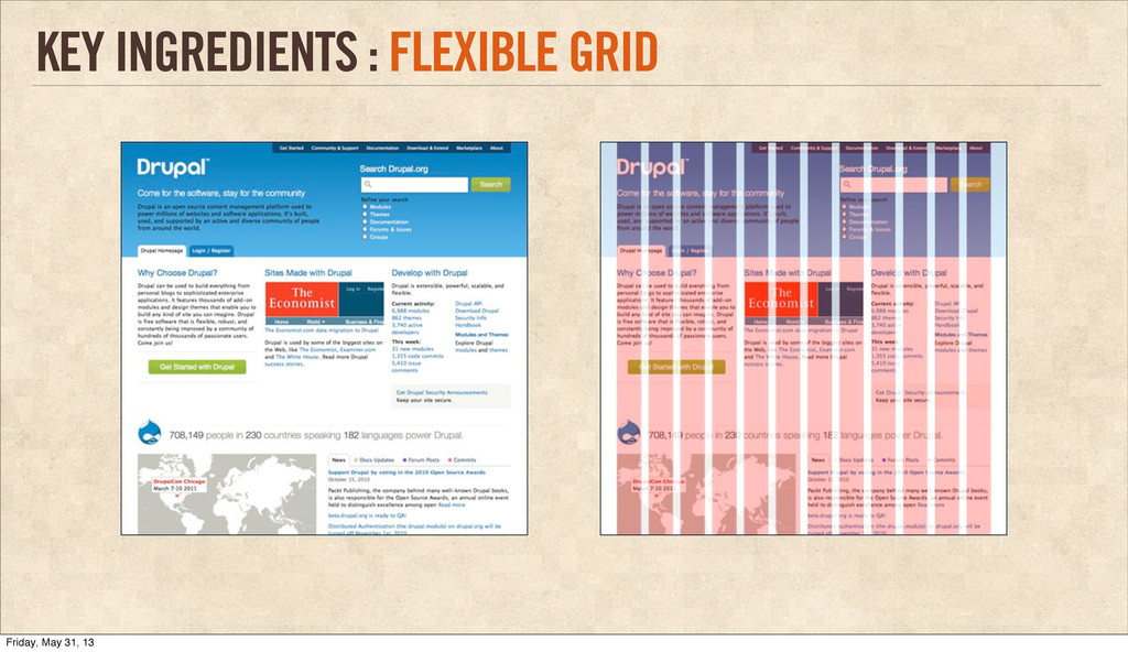
columns • But unlike fixed grids, the columns are measured in percent, not fixed pixels • Size everything in ems and percentages KEY INGREDIENTS : FLEXIBLE GRID Friday, May 31, 13
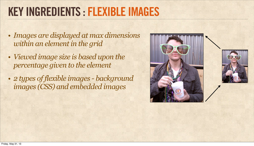
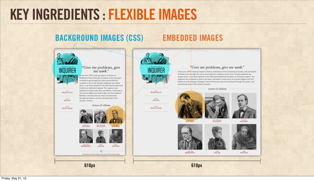
in the grid • Viewed image size is based upon the percentage given to the element • 2 types of flexible images - background images (CSS) and embedded images KEY INGREDIENTS : FLEXIBLE IMAGES Friday, May 31, 13
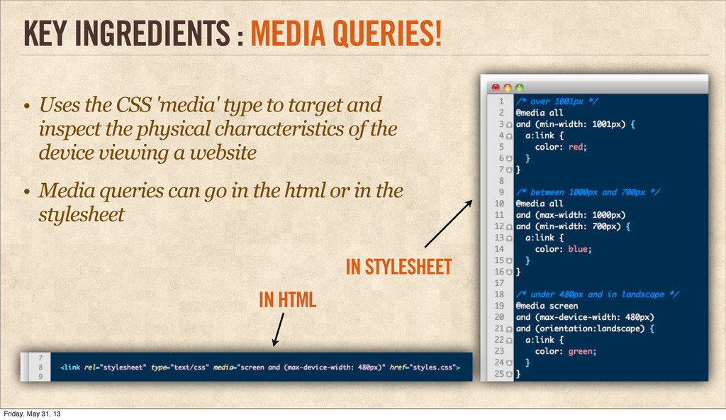
the physical characteristics of the device viewing a website • Media queries can go in the html or in the stylesheet KEY INGREDIENTS : MEDIA QUERIES! IN HTML IN STYLESHEET Friday, May 31, 13
 tpitre
 hiranotomoki
 tajima_kaho
 mhand01
 sevendex
 bebe
bebe
 baasie
 takanorip
 terencebasart
 kenichiota0711
 satosio
 webnaut
 yamasaku
 marktimemedia
 sarafernandez
 szymonslowik
 sabderemane
 michaelherold
 tammyeverts
 jmmastey
 katiecoart
 skoyamalab
 aleyda
 destraynor
 skipperchong