often desire in the web medium, is simply a function of the limitation of the printed page. We should embrace the fact that the web doesn’t have the same constraints, and design for this flexibility. But first, we must ‘accept the ebb and flow of things.’ - JOHN ALLSOPP Author of A Dao of Web Design
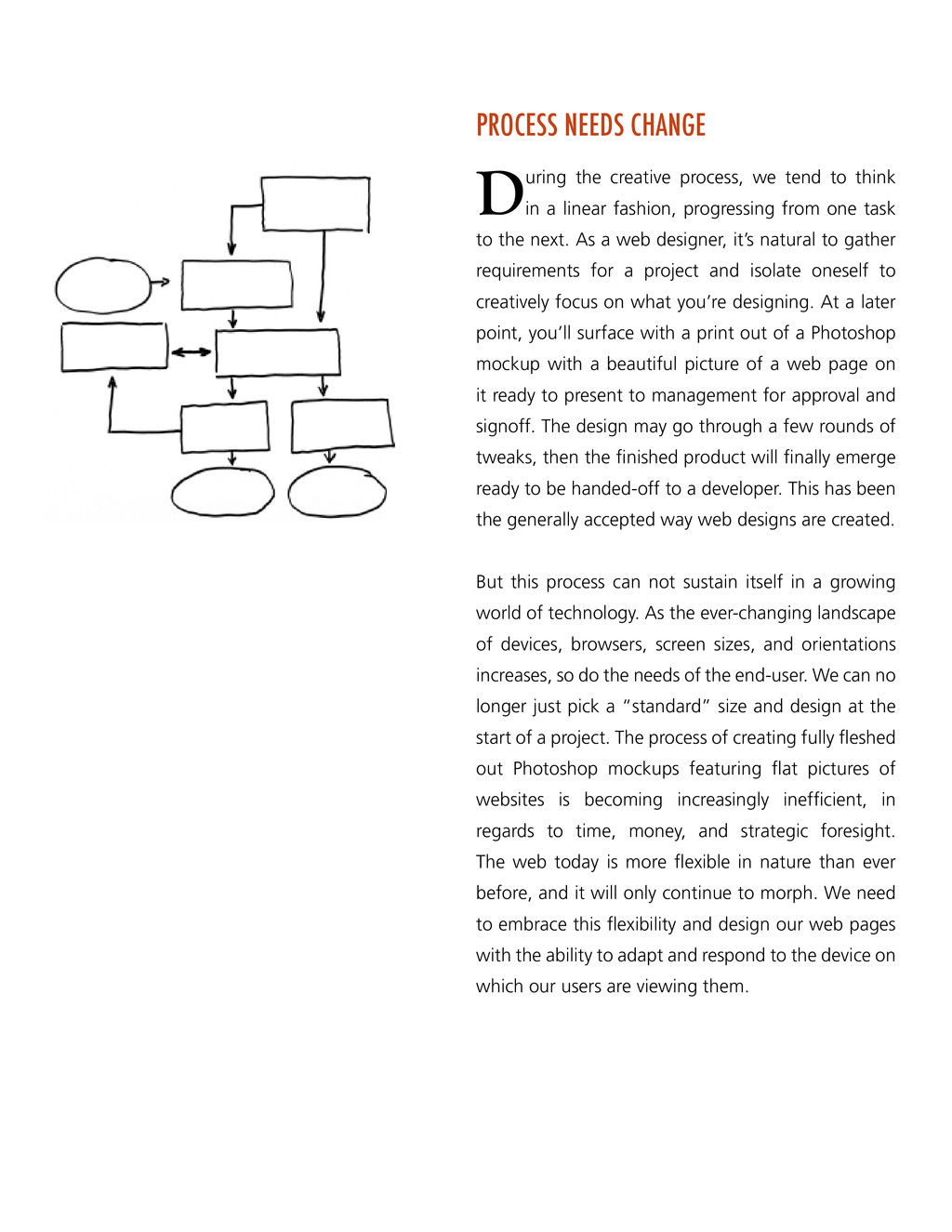
think in a linear fashion, progressing from one task to the next. As a web designer, it’s natural to gather requirements for a project and isolate oneself to creatively focus on what you’re designing. At a later point, you’ll surface with a print out of a Photoshop mockup with a beautiful picture of a web page on it ready to present to management for approval and signoff. The design may go through a few rounds of tweaks, then the finished product will finally emerge ready to be handed-off to a developer. This has been the generally accepted way web designs are created. But this process can not sustain itself in a growing world of technology. As the ever-changing landscape of devices, browsers, screen sizes, and orientations increases, so do the needs of the end-user. We can no longer just pick a “standard” size and design at the start of a project. The process of creating fully fleshed out Photoshop mockups featuring flat pictures of websites is becoming increasingly inefficient, in regards to time, money, and strategic foresight. The web today is more flexible in nature than ever before, and it will only continue to morph. We need to embrace this flexibility and design our web pages with the ability to adapt and respond to the device on which our users are viewing them.
incorporates media queries to create a responsive, adaptive layout. - ETHAN MARCOTTE Author of Responsive Web Design To be able to properly address this growing landscape of new devices and resolutions, a new process has to be established in which one can produce a web page without having to create a version for every single device and resolution. A newly emerging design method called Responsive Web Design provides the solution to this problem. Instead of designing for the most common desktop resolution along with an accompanying mobile version, Responsive Web Design enables designers to create a design using flexible grids with flexible images and fluid layouts to adapt to the device in which it’s being viewed. Responsive Web Design consists of three main components to be considered fully responsive: • Flexible, grid-based layout • Flexible images & media • Media queries (CSS) Responsive Web Design forces developers and designers to become more unified and collaborative with the end result being a site featuring one code base that is designed for optimal viewing on any device, resolution, or orientation.
end result is an experience focused on the key tasks users want to accomplish without the extraneous detours and general interface debris that litter today’s desktop-accessed Web sites. That’s good user experience and good for business. - LUKE WROBLEWSKI Author of Mobile First In addition to just designing responsively, some thought and consideration needs to be made about the content around which we’re designing. For years, organizations have been designing and arranging content for the desktop without devoting much attention to mobile devices. Desktop websites viewed on mobile devices are often ugly and cumbersome to navigate. And given notoriously slow network speeds, interacting with such a website could be nearly impossible. But due to technological advancements in the past few years, we’ve seen a massive mobile explosion - so much so that designing web pages for desktop first may now be a backwards way of thinking about it. We must shift our perspectives to considering mobile accessibility from the beginning, or thinking “Mobile First.” The Mobile First approach provides a more efficient starting point for building out a web design because it forces you to focus on what is most important in your web product. Mobile First ensures that as mobile devices continue to grow, you’ll be prepared to grow along with them and take advantage of all opportunities within this realm. It allows you to prioritize what needs to be in the design and also puts your most relevant content at the forefront of it. The outcome can lead to the simplification of what might otherwise be an overly complex and often cluttered desktop first website.
been the workflow adapted by organizations for over a decade. There may be a little more that can be added to this process, but this essentially outlines how our web design should happen in linear, well-defined stages. Currently, when we are creating a responsive web design, the above-mentioned workflow causes some problems. We cannot simply shoehorn a new responsive process into our present method. As previously mentioned, it is no longer practical to create fully fleshed out design mockups, nor is it practical to design a mockup for every device, resolution, or orientation. In addition, we can no longer design for one arbitrary size based on popular screen resolutions. Part of the problem is that we are tied to design tools stuck in the old method of building web pages. To think and design responsively, we must use the tools that allow us to view and edit designs in the container in which the designs are being delivered: the browser. • Create wireframes & user flows - The user’s needs are determined and wires are built out to show the user flow and basic page outline. • Design flat mockups - Based on the wireframes and user flows, a design is applied in Photoshop. • Iterate - The designs go though a series of reviews and approvals until they’re signed off. • Build - The designs are handed over to the front-end department to be built for web.
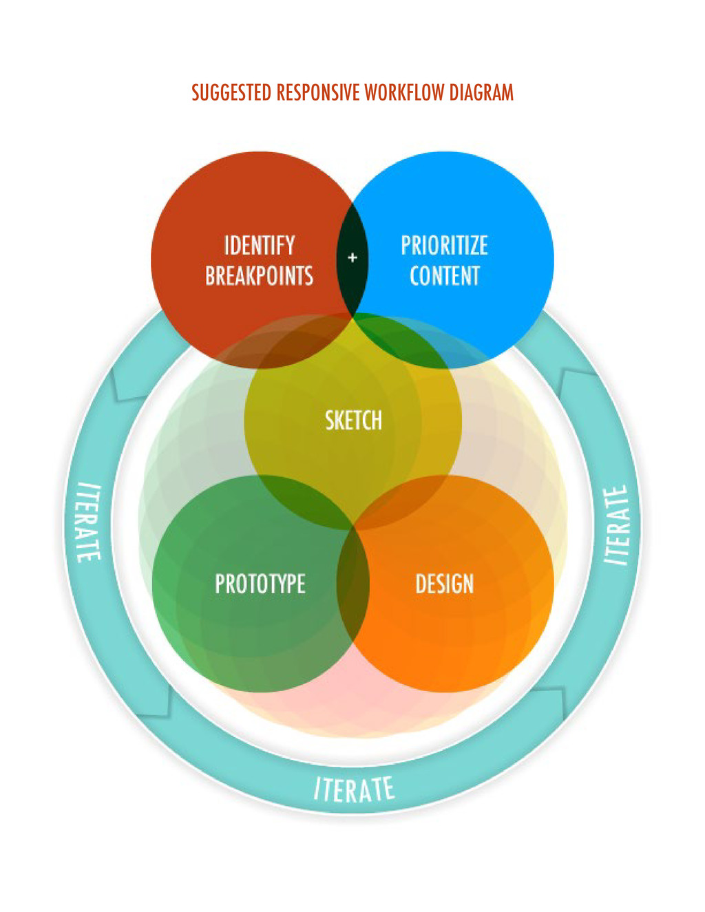
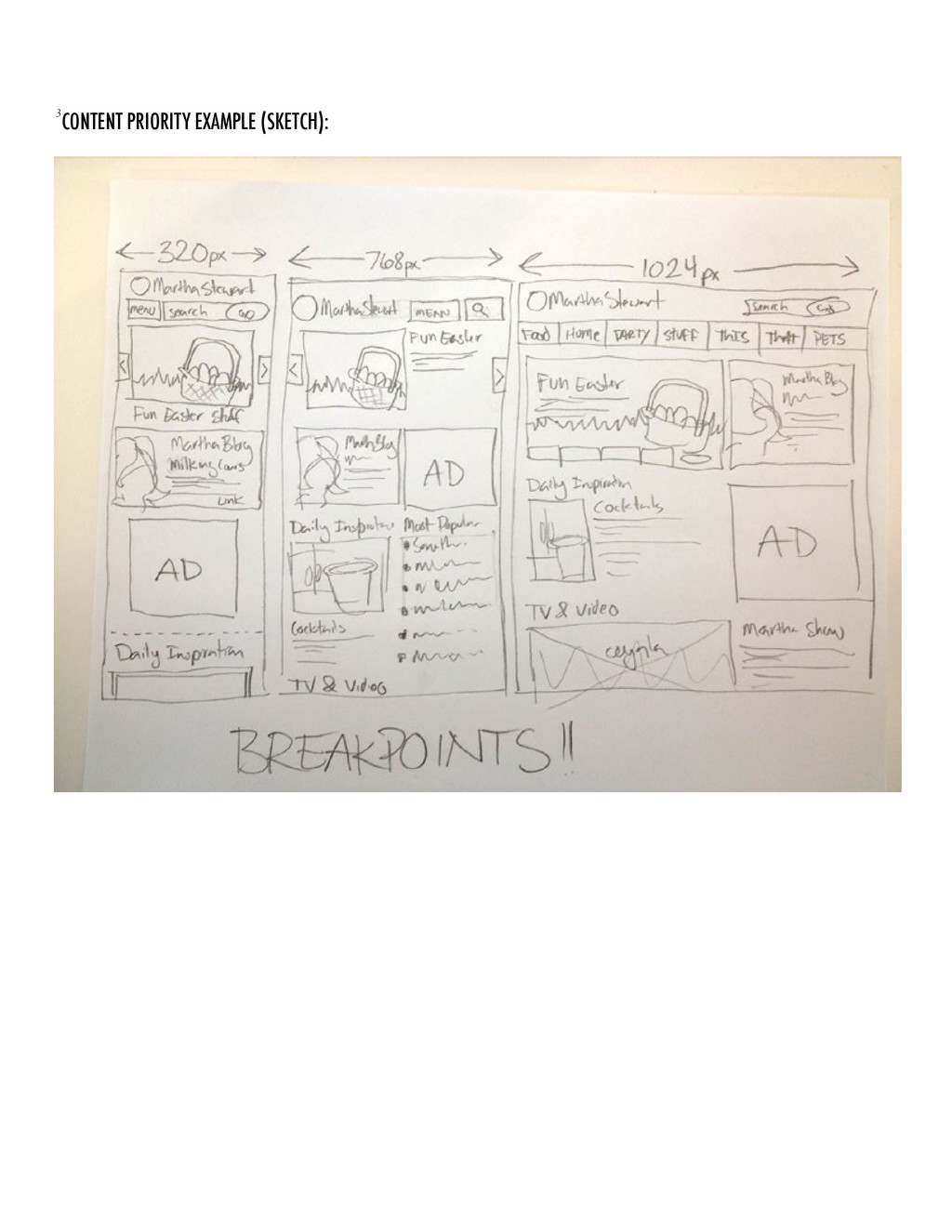
As in any new process, there is room for discussion and tweaks. It is, at minimum, a step forward in developing what will hopefully be a universally accepted solution. By beginning with breakpoint identification, this will give us a starting point to see where the majority of our mobile traffic originates. Start with the smallest breakpoint, build outward, and progressively enhance the user’s experience. Doing this in tandem with prioritizing our content will give us the foundation around which we build our designs. • Identify breakpoints1 - Utilizing data retrieved from our website analytics software, we can generally determine which devices we should be designing for and what resolutions they have. • Prioritize content2 - Make a list of all of the content that needs to be displayed on the page, and order it from most to least important. Do this for each breakpoint. Each layout will have its own priority and design considerations. • Sketch3 - Get the ideas on paper starting with the Mobile First approach. Sketching is fast, easy to change, collaborative, and allows you to see different layouts next to each other. • Prototype - Create a prototype in HTML based off of wires and sketches, and refine the prototype in the browser. It doesn’t have to be perfect at this stage. • Design - Now that we have a working prototype, we can apply design to it. The design can loosely be done in Photoshop or any other image editing software then applied to the prototype. • Iterate - Keep reviewing each prototype on selected devices and resolutions until you feel comfortable with the end result. 1,2,3 See appendix
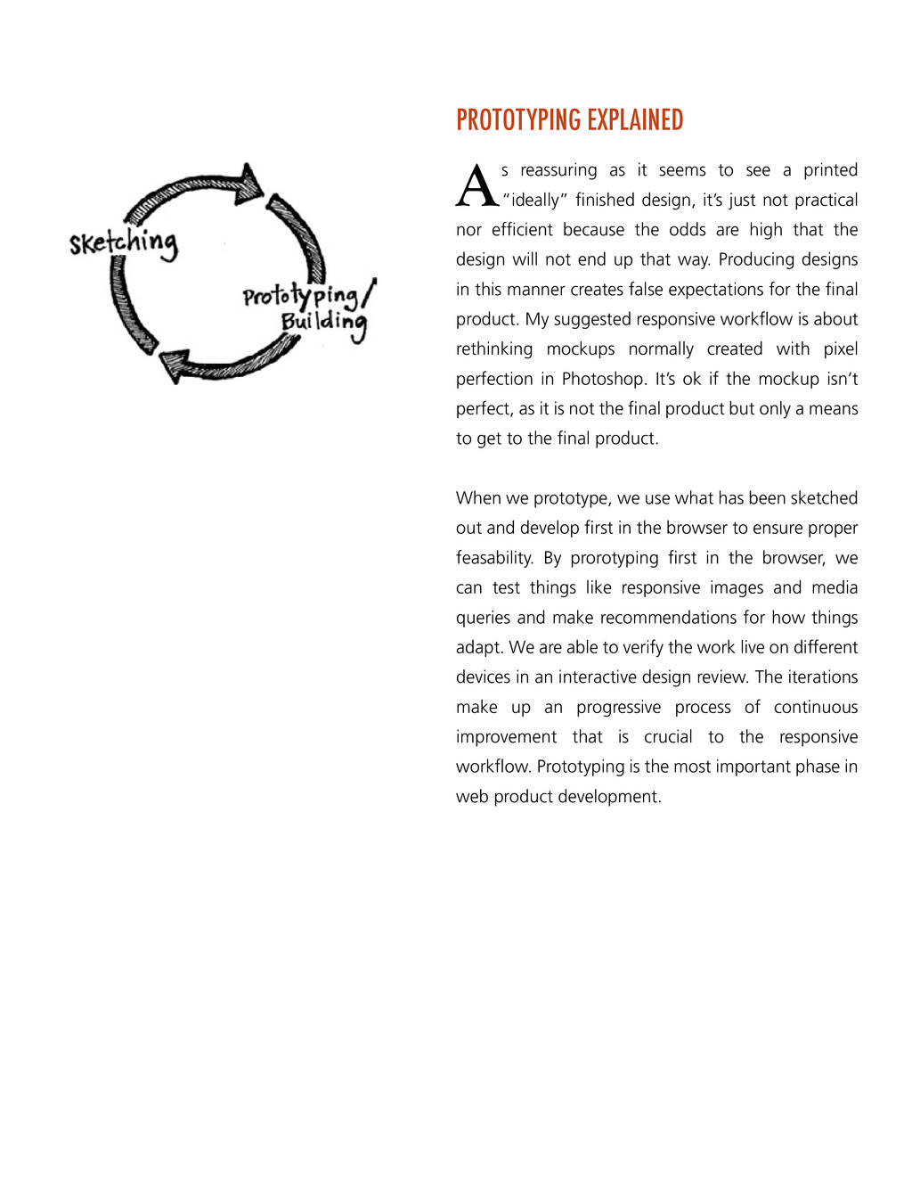
a printed “ideally” finished design, it’s just not practical nor efficient because the odds are high that the design will not end up that way. Producing designs in this manner creates false expectations for the final product. My suggested responsive workflow is about rethinking mockups normally created with pixel perfection in Photoshop. It’s ok if the mockup isn’t perfect, as it is not the final product but only a means to get to the final product. When we prototype, we use what has been sketched out and develop first in the browser to ensure proper feasability. By prorotyping first in the browser, we can test things like responsive images and media queries and make recommendations for how things adapt. We are able to verify the work live on different devices in an interactive design review. The iterations make up an progressive process of continuous improvement that is crucial to the responsive workflow. Prototyping is the most important phase in web product development.
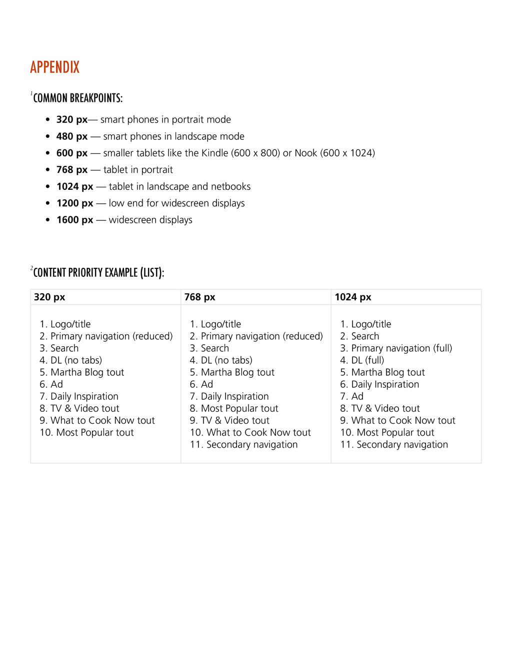
phones in portrait mode • 480 px — smart phones in landscape mode • 600 px — smaller tablets like the Kindle (600 x 800) or Nook (600 x 1024) • 768 px — tablet in portrait • 1024 px — tablet in landscape and netbooks • 1200 px — low end for widescreen displays • 1600 px — widescreen displays 320 px 768 px 1024 px 1. Logo/title 2. Primary navigation (reduced) 3. Search 4. DL (no tabs) 5. Martha Blog tout 6. Ad 7. Daily Inspiration 8. TV & Video tout 9. What to Cook Now tout 10. Most Popular tout 1. Logo/title 2. Primary navigation (reduced) 3. Search 4. DL (no tabs) 5. Martha Blog tout 6. Ad 7. Daily Inspiration 8. Most Popular tout 9. TV & Video tout 10. What to Cook Now tout 11. Secondary navigation 1. Logo/title 2. Search 3. Primary navigation (full) 4. DL (full) 5. Martha Blog tout 6. Daily Inspiration 7. Ad 8. TV & Video tout 9. What to Cook Now tout 10. Most Popular tout 11. Secondary navigation APPENDIX
First http://www.lukew.com/ff/entry.asp?933 Responsive Web Design Gallery http://mediaqueri.es/ The Responsive Design Process http://mattwilcox.net/archive/entry/id/1078/ Responsive Web Design: Missing the Point http://bradfrostweb.com/blog/web/responsive-web-design-missing-the-point/
 Ship Features Fearlessly
 tpitre
 superpenguin
 tai20200303
 ubiregi_saiyo
 fabrica_com
 okitsu
 simpleform
.jpg) ikuodanaka
ikuodanaka
 ienter
 yushimad
 findy_eventslides
 yappli_recruit
 leimatthew05
 addyosmani
 caitiem20
 nikkihalliwell
 62gerente
 stephenakadiri
 mkilby
 jcasabona
 inesmontani
 hatefulcrawdad
 techseoconnect
 axbom
axbom