Upgrade to Pro — share decks privately, control downloads, hide ads and more …

Responsive Design for WordPress

Responsive Design for WordPress

Responsive Design for WordPress
Presented by Shannon Smith • Technical Track • WordCamp Montreal 2012

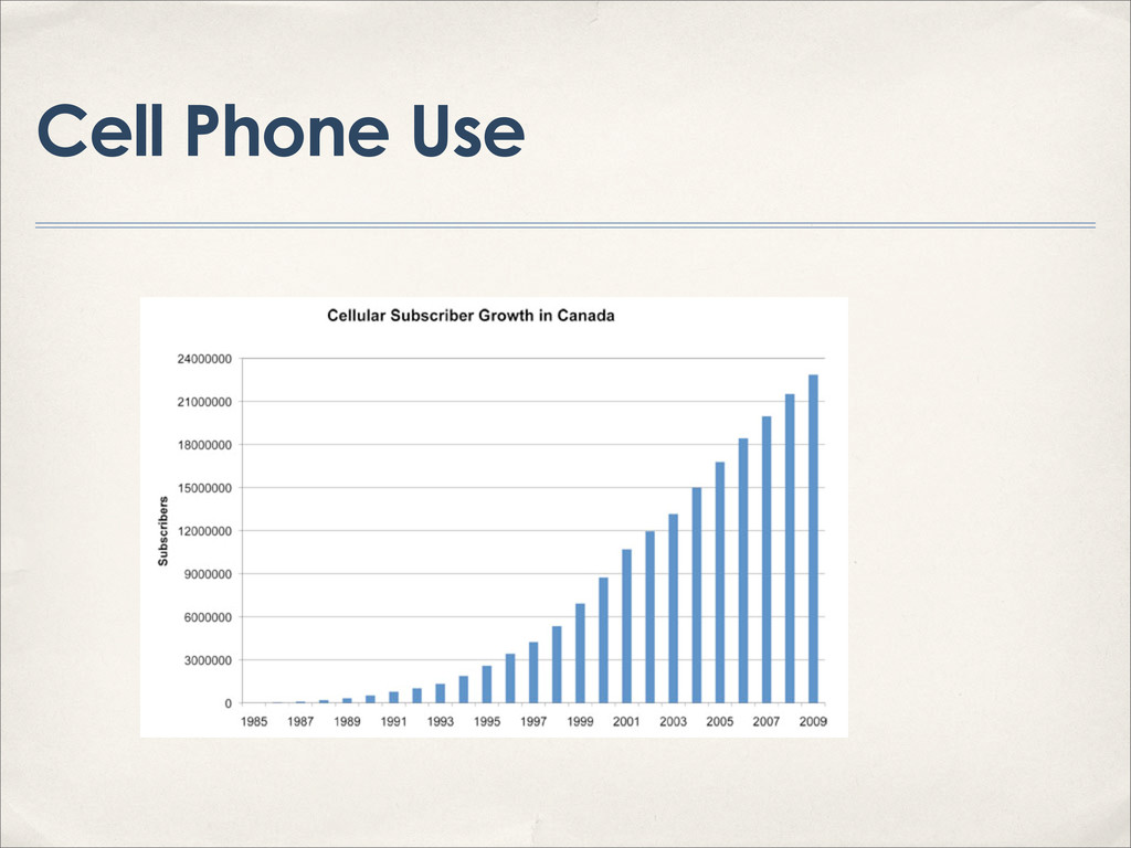
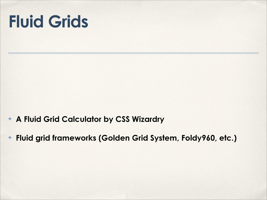
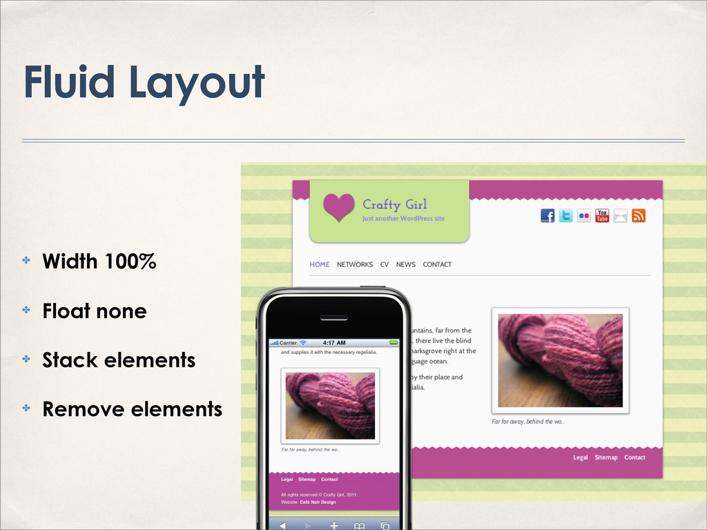
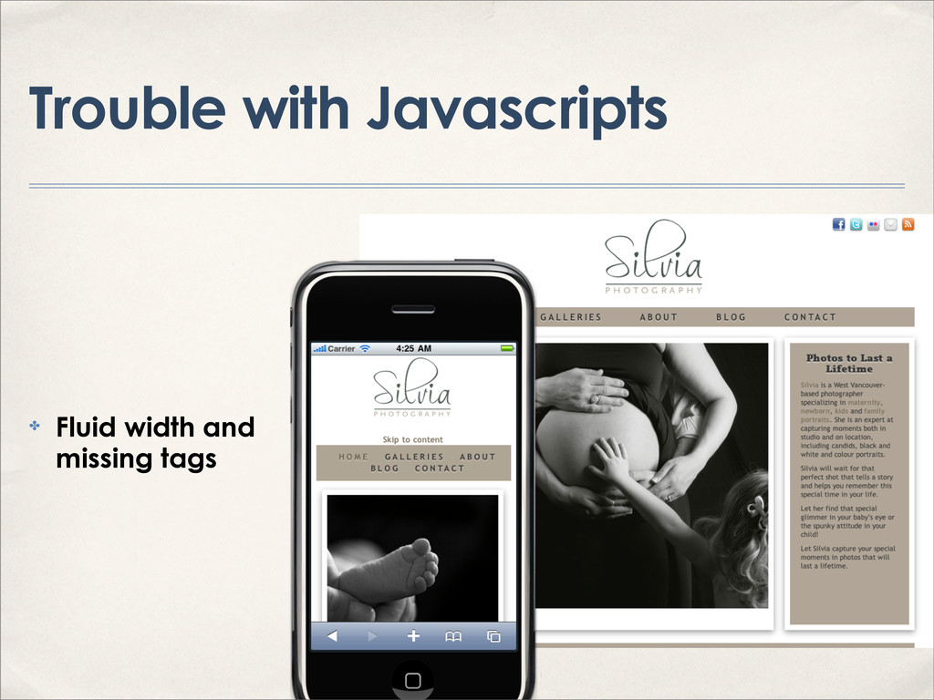
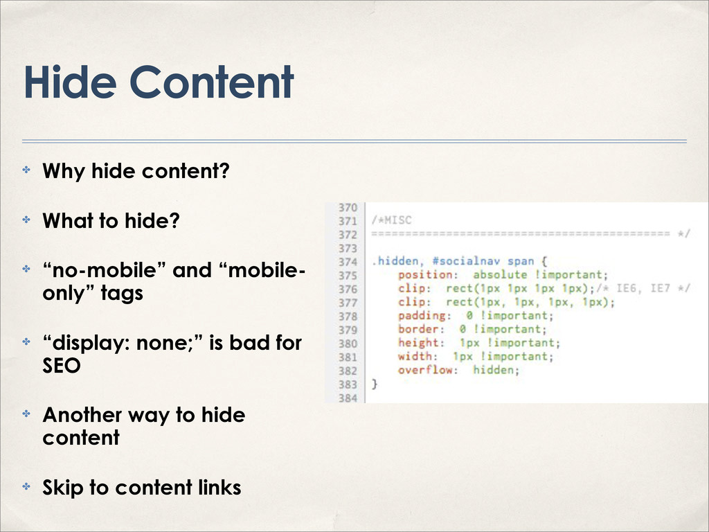
Responsive design: is it mobile, fluid, dynamic, or all of the above? A summary of all the ways you can get your WordPress site ready for the responsive Web. I’ll look at responsive images, typography, grids and video. I’ll cover online services that create a responsive version of your site, special WordPress plugins, responsive-ready WordPress themes, and more. I’ll talk about how to target specific devices, what to avoid and what’s best for SEO.

Requires familiarity with WordPress, HTML and CSS. This talk is intended for web designers and developers.

Shannon
Shannon is the founder of Café Noir Design, a boutique Montreal web design company specializing in multilingual web development. She builds beautiful, functional websites that her clients can update themselves and that are easy for search engines to find. She support things like making the web accessible for everyone, using open source software, helping organizations find greener more sustainable ways to operate through online technology and helping non-profits with online community organizing. Also foodie and mother of four. Follow @cafenoirdesign on twitter.

Shannon Smith

August 19, 2012
Tweet

More Decks by Shannon Smith

Other Decks in Technology

Transcript

  1. Mobile Browsing ✤ 8.5% of all Web browsing from mobile

    devices (Net Application/ Statcounter) ✤ 4.2% of U.S. Web browsing comes on the iPhone, 4.0% on Android devices, and 4.2% on the iPad with BlackBerry next at 0.46%. (As of Jan 2012, Netmarketshare) ✤ 50% smart phone penetration by 2014 (eMarketer) ✤ Mobile retail dollars doubled between April and December 2011 (RichRelevance)
  2. iPod Touch 15% Android Phone 8% iPhone 35% iPad 34%

    iPad Android Tablet Other tablet iPhone Android Phone Other Smart Phone Feature Phone iPod Touch Other Share of Canadian Non-Computer Device Traffic - May 2011 Source: comScore Device Essentials http://bit.ly/mJVyy5
  3. Online Services for Any Site ✤ Via RSS feed: MoFuse

    and Mippin Mobilizer, WireNode, Mobify, dotMobi ✤ Google Mobile Optimizer
  4. WordPress Solutions ✤ Mobile-Ready Themes (Mobius, iPhonista) ✤ Mobile Frameworks

    (Obox, JQTouch) ✤ Free Plugins (MobilePress, WPTouch, WordPress Mobile Edition, WPTap, WordPress Mobile Pack, BuddyPress Mobile) ✤ Premium Plugins (WPTouch Pro) ✤ Plugins for online services ✤ Tools for Admins (WordPress for iPhone, Blackberry, and Android, and WPhone)
  5. What are we designing for? ✤ OS ✤ Browser ✤

    Screen resolution ✤ Screen aspect ratio ✤ Special capabilities
  6. Other OSs? ✤ Android: which one? ✤ Blackberry: market share?

    ✤ Windows: market share? ✤ OS, resolution, screen dimensions
  7. How are we serving this? ✤ Server-side methods & the

    UA (User Agent) string ✤ Client-side methods & media queries ✤ Measuring screen size with javascript http://css-tricks.com/snippets/javascript/redirect-mobile-devices/ ✤ PHP function to detect mobile user agents & browsers http://detectmobilebrowsers.mobi/
  8. Serving with WordPress ✤ Theme Switch plugin http://digwp.com/2009/12/redirect- mobile-users-to-mobile-theme/ ✤

    Built in conditional tags <?php if ( $is_iphone ) {?> <?php include( TEMPLATEPATH . '/mobile/single.php' ); ?> <?php } else { ?> // entire contents of your regular single.php template <?php } ?>
  9. What needs to change ✤ Dimensions ✤ Bandwidth ✤ Font-size

    ✤ Features ✤ Floated elements ✤ Mouseover states ✤ Flash
  10. Tools ✤ Browser testing tools ✤ Emulators iOS SDK, Android

    SDK, Online Opera Mini Emulator ✤ Screen Capture Tools (iPhone-Simulator Cropper) ✤ Validators (W3C mobileOK Checker) ✤ Screen width bookmarklets (RWD Bookmarklet) ✤ Adobe Shadow
  11. Icons ✤ iPhone icon (rel="apple-touch-icon") 114x114 pixels ✤ Opera browser

    icon (rel="icon") 195x195px ✤ Precomposed icons ✤ Retina display icons (Append @2x) 144x144px
  12. Images ✤ Double image dimensions, then resize ✤ Individual component

    caching: iOS 3.x will only cache HTML pages under 25k , iOS 4 102.4 kb per item, iOS5 4MB ✤ Total component caching: Older Android and iOS 4 set limit at 2MB, iOS 5 at 100 MB and Android Chrome at 250 MB ✤ gzip has no effect on cache-ability on any device ✤ http://www.yuiblog.com/blog/2010/06/28/mobile-browser-cache-limits/
  13. Variable Resolution ✤ Use fewer images ✤ Use CSS for

    images ✤ Use icon fonts ✤ High-resolution iOS: For every image at a normal resolution (or @1x), have a high-resolution version (@2x) ✤ @media(-webkit-min-device-pixel-ratio: 2) { #element { background-image('image-2x.png'); } } ✤ Use sprites ✤ Use fluid images (width in em)
  14. Targeting Viewport Dimensions & Orientation ✤ Hardboiled CSS3 Media Queries

    (Andy Clarke) http://www.stuffandnonsense.co.uk/blog/about/hardboiled_css3_media_queries
  15. Targeting by Device ✤ iOS retina display @media only screen

    and (-webkit-min-device-pixel-ratio: 2) ✤ Android high-resolution @media only screen and (-webkit-device-pixel-ratio:1.5) ✤ Windows 7 <!--[if IEMobile 7]> ✤ <link rel="stylesheet" type="text/css" href="mobile.css" href="mobile.css" media="screen" /> ✤ <![endif]-->
  16. Accessibility ✤ Pinch to zoom: body {-webkit- text-size-adjust:100%;} ✤ Disable

    user zoom: Accessibility and maximum- scale=1.0 ✤ “auto-zoom when changing orientation” feature ✤ http://mattgemmell.com/2010/12/19/accessibility- for-iphone-and-ipad-apps ✤ http://www.456bereastreet.com/archive/201012/ controlling_text_size_in_safari_for_ios_without_disabli ng_user_zoom/
  17. Fancy fonts ✤ SVG and fancy fonts http://www.fontsquirrel.com/ ✤ Other

    font-face generator tools ✤ Licensing ✤ Google font API ✤ MIME type for SVG to "image/ svg+xml" in the server settings
  18. CSS3 Kerning Pairs & Ligatures ✤ On desktops: body {

    text-rendering: optimizeLegibility; } ✤ On mobile: @media and (max-device-width : 480px) { body { text- rendering: optimizeSpeed; } } ✤ Beware of overusing processor cycles
  19. Fluid Grids ✤ A Fluid Grid Calculator by CSS Wizardry

    ✤ Fluid grid frameworks (Golden Grid System, Foldy960, etc.)
  20. Shims, Fallbacks, and Polyfills ✤ What is a polyfill? ✤

    Overthrow, FitText, Respond, ✤ Stop solving problems you don’t yet have by Rachel Andrew
  21. Hide Content ✤ Why hide content? ✤ What to hide?

    ✤ “no-mobile” and “mobile- only” tags ✤ “display: none;” is bad for SEO ✤ Another way to hide content ✤ Skip to content links
  22. Add Content ✤ Clickable Phone Numbers with class="phone-link" ✤ Special

    Input Types with HTML5 ✤ type="tel" type="email" type="url" type="number" type="range" type="search" type="date"
  23. Alternative Strategies ✤ Mobile first ✤ Mobile boilerplate (Mobile Boilerplate,

    320 and Up, Twitter Bootstrap, etc.) ✤ Roots Theme ✤ Completely fluid design
  24. Additional Reading ✤ Responsive Web Design by Ethan Marcotte ✤

    @RWD ✤ WordPress Mobile Tutorials http://speckyboy.com/2011/03/17/mobile-toollbox-for-wordpress-tutorials-plugins-and-themes/