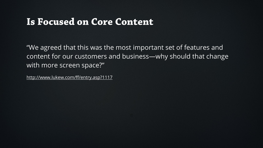
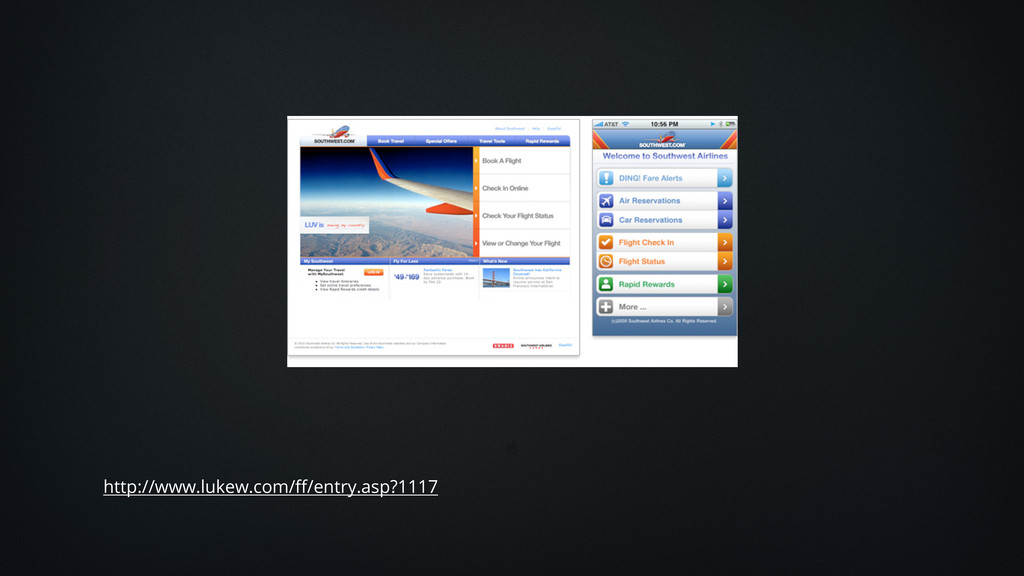
the most important set of features and content for our customers and business—why should that change with more screen space?” http://www.lukew.com/ff/entry.asp?1117
of the web to be flexible, and it should be our role as designers and developers to embrace this flexibility, and produce pages which, by being flexible, are accessible to all." ~ John Allsopp
 payatsusan213
 mcksmith
 ajstarks
 takumasaito
 hilokifigma
 bebe
bebe
 solmetts
 akatsuki174
 majimasachi
 pixyzehn
 root_recruit
 nonsquared
 davetheseo
 reverentgeek
 cargoodrich
 kimpetersen
 panda_program
 badams
 marktimemedia
 mfonobong
 portentint
 afnizarnur
 uxyall