Upgrade to Pro — share decks privately, control downloads, hide ads and more …

Responsibly Responsive Web Design

Responsibly Responsive Web Design

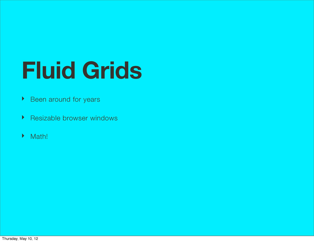
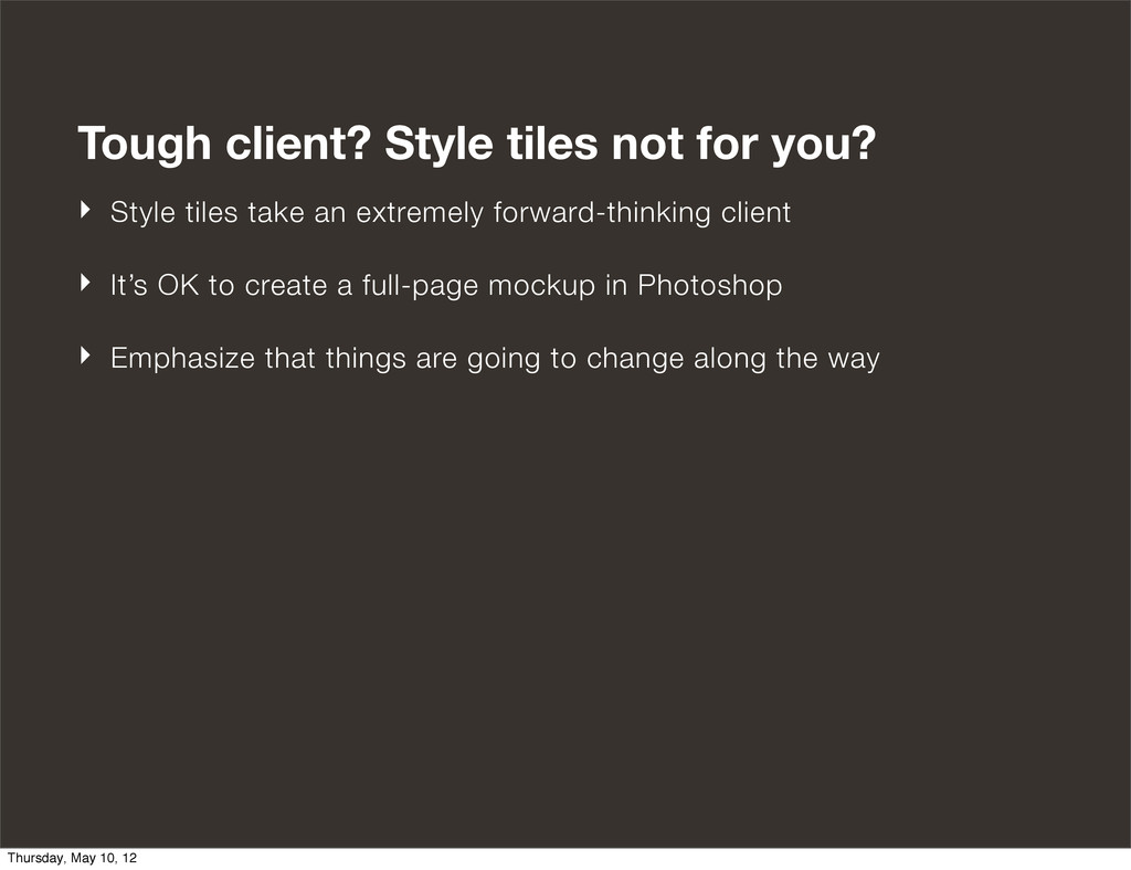
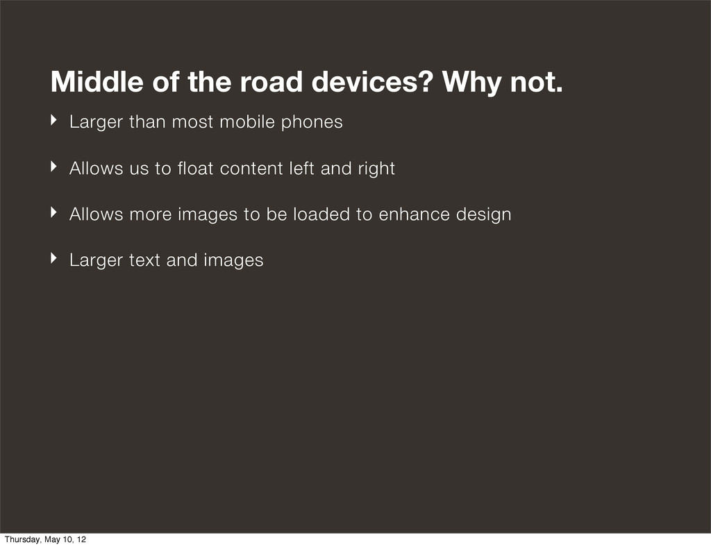
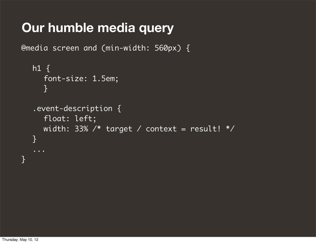
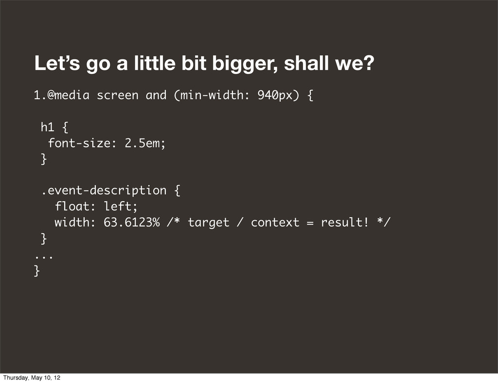
So you understand the technical basics of Responsive Web Design, including media queries, fluid grids and images, but are grappling at how to apply it to your workflow. Should we be designing in the browser, or making static comps of different screen widths? We're all struggling at how to best refine our process for a new generation of web design and development in order to accommodate today's array of devices without pointless rework.

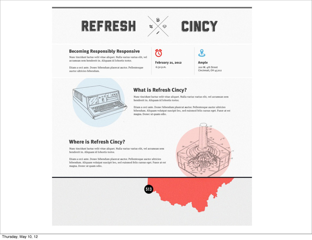
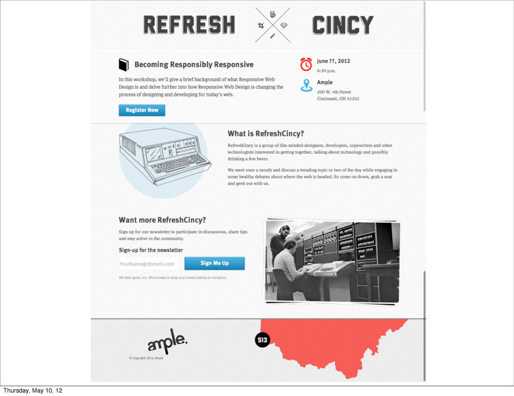
In this workshop, we'll give a brief background of what Responsive Web Design is and delve further into how Responsive Web Design is changing the process of designing and developing for today's web. We'll also offer techniques and solutions to expedite time and help pitch this process to the client by walking through an example site from start to finish.

Ryan Merrill

May 13, 2012
Tweet

Other Decks in Design

Transcript

  1. Becoming Responsibly Responsive Or, How We Learned to Love the

    Browser May 10, 2012 Thursday, May 10, 12
  2. Ryan Merrill Bobby Uhlenbrock, Partner/Developer http://uhlenbrock.us/ Bobby Uhlenbrock Who We

    Are Ryan Merrill, Developer http://ryanmerrill.net/ Ample is a small-batch digital agency in Cincinnati and an organizer of QC Merge. http://helloample.com/ Taylor MacDonald, Developer http://tcmacdonald.com/ Taylor MacDonald Thursday, May 10, 12
  3. What does this mean for us? ‣ A range of

    devices and new ones coming out weekly ‣ A ton of different mobile web browsers. ‣ Each device has a different screen size ‣ New browser wars? We don't want to go back to 1999, please. Thursday, May 10, 12
  4. Fluid Grids ‣ Been around for years ‣ Resizable browser

    windows ‣ Math! Thursday, May 10, 12
  5. Target / Context = Result Or, how to turn pixels

    into percentages and ems h1 { font-family: Georgia, serif; width: 25%; /* 100px / 25px */ font-size: 1.5em; /* 24px / 16px = 1.5em */ } Thursday, May 10, 12
  6. But they come in a lot more flavors, too @media

    screen and (min-width: 600px) {} @media handheld and (min-width: 320px) {} @media projection and (min-width: 600px) {} @media screen and (max-width: 600px) {} @media handheld and (orientation: portrait) {} and on, and on, and on, and on... Thursday, May 10, 12
  7. Frameworks and other helpers ‣ Twitter Bootstrap (http://twitter.github.com/bootstrap/) ‣ Zurb

    Foundation (http://foundation.zurb.com/) ‣ Compass (http://compass-style.org/) ‣ Susy Grid (http://susy.oddbird.net/) ‣ FitText & FitVid: (http://fittextjs.com/ & http://fitvidsjs.com/) ‣ Adobe Shadow (http://labs.adobe.com/technologies/shadow/) ‣ Retina.js (http://retinajs.com/) Thursday, May 10, 12
  8. The Design & Process So has Responsive Design totally screwed

    up our whole process? In short: yes. Thursday, May 10, 12
  9. This doesn’t work any more ‣ Too resource intensive to

    create multiple static comps at different widths in Photoshop ‣ Literally throwing away these hours spent. No tangible product produced. ‣ Miscommunication between the client, designer and development team Thursday, May 10, 12
  10. A new way of doing things ‣ The designer is

    the developer ‣ More collaboration between developers and designers ‣ Developers are integrated in the entire process Thursday, May 10, 12
  11. Mobile first web design ‣ Popularized by Luke Wroblewski ‣

    Let’s the designer focus on the most important areas of the site ‣ A mobile-first mindset is something everyone needs to practice Thursday, May 10, 12
  12. Advanced Responsive Design Southwest.com ‣ Too cluttered, not focused ‣

    Why is the mobile site better than the desktop?! ‣ Rip out needless stuff ‣ Better user experience overall Source: http://chicago2011.drupal.org/sessions/designing-mobile Thursday, May 10, 12
  13. RefreshCincy, our client, wants: ‣ A clean site ‣ Relevant

    information ‣ Wants to attract local technologists, writers, hackers, designers ‣ Should be easily accessible on any device Thursday, May 10, 12
  14. Phase Two - Wireframing and UX This is familiar, too.

    I thought you said things were new?! Thursday, May 10, 12
  15. Phase Three - Design ‣ But wait... how do we

    design for a fluid grid and layout capabilities? ‣ Tons and tons of mockups?! Thursday, May 10, 12
  16. Forget your old way of working, for now. ‣ Practically

    impossible for a designer to work this way ‣ Need the ability to present multiple ideas to a client ‣ Need to set the look and feel of a site, though Thursday, May 10, 12
  17. Enter Style Tiles ‣ Popularized by Samantha Warren ‣ Style

    tiles allow the client to focus on the look and feel of the site ‣ More detailed than mood boards ‣ Help reinforce a visual identity without focusing on layout Thursday, May 10, 12
  18. Tough client? Style tiles not for you? ‣ Style tiles

    take an extremely forward-thinking client ‣ It’s OK to create a full-page mockup in Photoshop ‣ Emphasize that things are going to change along the way Thursday, May 10, 12
  19. Why the client loves this, too ‣ Allows the client

    to interact with something and see how their content flows on a page ‣ More hands-on than static PDFs Thursday, May 10, 12
  20. Less is more. Start with mobile. ‣ Start with a

    mobile-first stylesheet ‣ Base styles should be for the smallest screen ‣ Starting with mobile-first allows older browsers to degrade gracefully ‣ Mobile and small screen devices do not load large images ‣ Build up from there Thursday, May 10, 12
  21. ‣ All of these styles and images will be carried

    out through the rest of the design ‣ No superfluous images ‣ Only display the relevant information ‣ Clean and simple ‣ Direct Thursday, May 10, 12
  22. Middle of the road devices? Why not. ‣ Larger than

    most mobile phones ‣ Allows us to float content left and right ‣ Allows more images to be loaded to enhance design ‣ Larger text and images Thursday, May 10, 12
  23. Our humble media query @media screen and (min-width: 560px) {

    h1 { font-size: 1.5em; } .event-description { float: left; width: 33% /* target / context = result! */ } ... } Thursday, May 10, 12
  24. ‣ Added more images, such as the computer background image

    ‣ A more pleasing layout to larger screens ‣ Larger images Thursday, May 10, 12
  25. Let’s go a little bit bigger, shall we? 1.@media screen

    and (min-width: 940px) { h1 { font-size: 2.5em; } .event-description { float: left; width: 63.6123% /* target / context = result! */ } ... } Thursday, May 10, 12
  26. Final changes and browser test ‣ There shouldn’t be a

    ton of changes from the client ‣ Been involved in the whole process ‣ Browser testing should be minimal if a mobile-first mindset was maintained throughout the project Thursday, May 10, 12
  27. CSS Pre-Processors ‣ SASS & LESS has greatly improved the

    way we’re doing things as front-end developers ‣ Nestable declarations ‣ Ability to create mixins, or functions to speed up development ‣ Reusable code and variables help maintain readability Thursday, May 10, 12
  28. Code Examples $breakSmall: 320px; $breakMedium: 560px; $breakLarge: 940px; @mixin respond-to($media)

    { @if $media == tiny-screens { @media only screen and (max-width: $breakSmall) { @content; } } @else if $media == small-screens { @media only screen and (min-width: $breakSmall + 1) { @content; } } @else if $media == medium-screens { @media only screen and (min-width: $breakMedium + 1) { @content; } } @else if $media == wide-screens { @media only screen and (min-width: $breakLarge) { @content; } } } Thursday, May 10, 12
  29. Whoa, this is easy .event-details { width: 100%; float: none;

    /* Media Queries */ @include respond-to(medium-screens) { float: left; width: 63%; } //medium-screen @include respond-to(wide-screens) { width: 83%; } //wide-screens } //event-details Thursday, May 10, 12
  30. Let’s go even further with Retina images @mixin retina-image($width, $height)

    { @media only screen and (-webkit-min-device-pixel-ratio: 2) { @content; -webkit-background-size: $width $height; } } Thursday, May 10, 12
  31. Which in practice, looks like: .event-time { background: url('parts/ico-time.png') no-repeat

    top left; @include retina-image(41px, 48px) { background: url('parts/[email protected]') no-repeat top left; } } Thursday, May 10, 12
  32. Going forward ‣ RefreshCincy’s first meetup will be announced for

    June ‣ Checkout the RefreshCincy site as a start on Github: https://github.com/ample/qc-merge Thursday, May 10, 12