Upgrade to Pro — share decks privately, control downloads, hide ads and more …

Design For The Act Of Communication

Design For The Act Of Communication

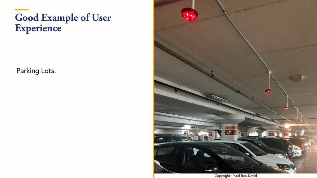
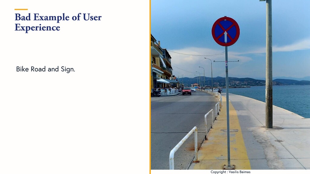
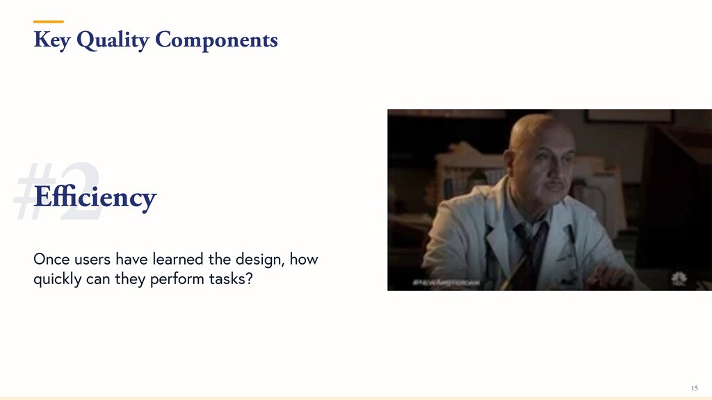
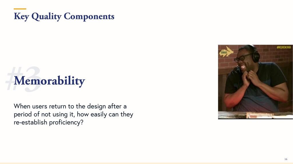
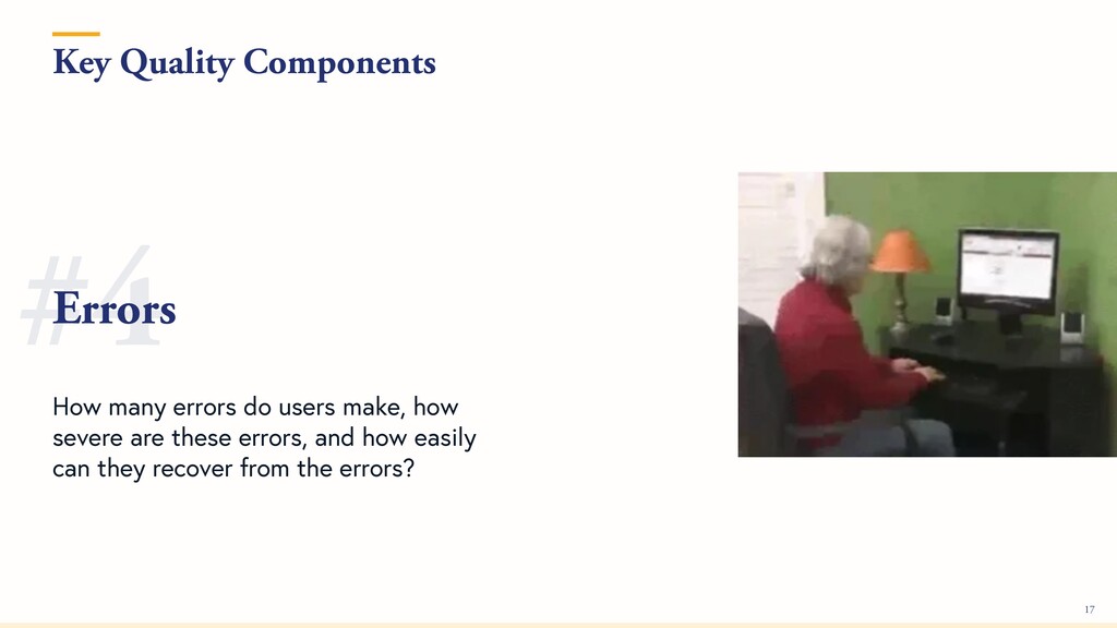
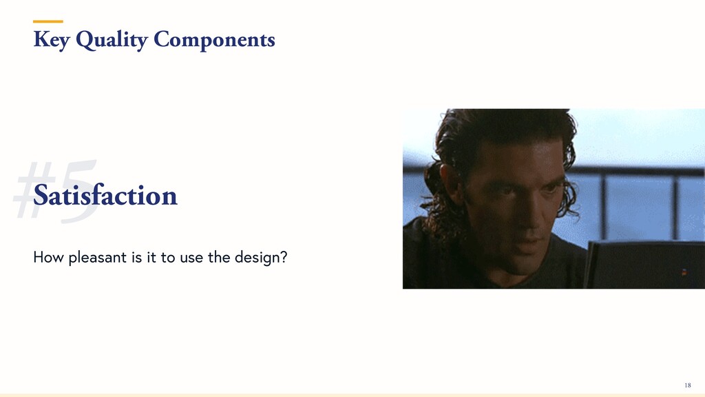
The usability and user experience are both identical aspects. Simple usability improvements can greatly increase your website's chances of success. As a designer, it is therefore vital to consider usability as an obvious process and include it in your workflow as soon as possible.
Through the talk, we will see how you can implement smart design decisions which will significantly improve the usability of your website, while at the same time will make the user experience more enjoyable.

Vasilis Baimas

April 16, 2021
Tweet

Other Decks in Design

Transcript

  1. VASILIS BAIMAS 1 WORDCAMP GREECE 2021 Design ∩ Research ∩

    Product “Design For Th e Act Of Communication”
  2. 6 De fi nition of User Experience User experience refers

    to a person's subjective feelings and attitudes when using or interacting with a particular product, such as an app or site.
  3. 9 Th e Basic Aspect of UX Usability It is

    useful to me. It meets my needs. Desirability Utility Brand Experience I am able to use the product easily. I like the way the product looks and feel. My overall feeling about the brand/product (in the abstract) is good. (Source: user experience, 2008 mGroup Conference Amsterdam)
  4. 10 De fi nition of Usability Usability is a quality

    attribute that assesses how easy user interfaces are to use. FFFEFC
  5. 13 Th e Outcome Usability comes to one question :

    Does your site provide an e ff i cient and enjoyable user experience? FFFEFC
  6. 14 Learnability #1 How easy is it for users to

    accomplish basic tasks the first time they encounter the design? Key Quality Components
  7. 15 E ffi ciency #2 Once users have learned the

    design, how quickly can they perform tasks? Key Quality Components
  8. 16 Memorability #3 When users return to the design after

    a period of not using it, how easily can they re-establish proficiency? Key Quality Components
  9. 17 Errors #4 How many errors do users make, how

    severe are these errors, and how easily can they recover from the errors? Key Quality Components
  10. 18 Satisfaction #5 How pleasant is it to use the

    design? Key Quality Components
  11. 21

  12. 23 • Make your user to get from point A

    (the entry point) to point B (where they want to be) as quickly as possible. Site Layout • Clear hierarchical structure. • Make your layout clean with all the essential info.
  13. 24 • A web page without any images is very

    boring and hard to read. • Include images to supporting your content. Images
  14. 27 • Helps to emphasize particular elements that require deep

    attention from users. White Space (negative space) • Include “white space” in your content, images, brand.
  15. 28 • Avoid cluttered content. • Keep carefully balance graphics

    and content. Layout • Don't use unusual layouts.
  16. 30 Layout Colors • The colors deliver readability. • Don’t

    use to many and bright colors. • Use tints of a single color. • Colors needs to develop an aesthetic appeal.
  17. 32 Visual Hierarchy • Define the hierarchy of the content.

    • Define the key point(s) you want the user to take away. • Use Z or F Pattern.
  18. 33 Prioritize Buttons • Make the most important button look

    like the most important one. • Always try to make the primary action button more prominent. • By making the button bigger you make it look more important for users.
  19. 34 • Avoid using generic instructions such as “read more”,

    “more”, and “click here”. • Make it memorable. Call To Action
  20. 35 Forms • Users complete top aligned labeled forms at

    a much higher rate than left- aligned labels. • Forms should be one column.
  21. 36 Search Box • Don’t hide the search box among

    other elements. • Don’t make the “Submit” button fit too small. • Make the search box visible on every page.
  22. 37 Errors • Use inline validations after the users fills

    out the field. • Show the user where the error occurred and provide a reason.
  23. 40 • Give your text room to breathe. • A

    lack of “white space” between each line can affect readability. • Avoid long narratives. • Use heading, subheadings, bulleted/ numbered lists, intents, online. Typography
  24. 41 • Left aligned text is easier to read than

    centered text for paragraphs. • Centered text is best used for headlines and short lines of text. • Avoid to combine centered text with left aligned text. Alignment in Fonts
  25. 42 • Don’t use the same or similar colors for

    text and background. • The more visible text, the faster users are able to scan and read. • High color contrast is useful for readability. Color Contrast
  26. 43 • Avoid using, especially if such sites are likely

    to be read by users who are not familiar with such technical terminology. • Instead of the features, focus on the benefits of the product / service. Jargon
  27. 45 • Don’t hide your links. • Change your link

    colors and be sure that links can be recognised. • Become highlighted or change color on mouseover. Site Links
  28. If you don't have users' voice in your design, if

    you haven't done your research, how do you know that your design is usable ? 47 — Alison Gavine (Interaction Design Foundation)
  29. 48 The list could go on and on Usability Testing

    helps you to make subjective findings
  30. 49 The list could go on and on Do users

    enjoy using the product?