Upgrade to Pro
— share decks privately, control downloads, hide ads and more …
Speaker Deck
Features
Speaker Deck
PRO
Sign in
Sign up for free
Search
Search
CSS Grids
Search
w3cplus
January 11, 2013
Technology
430
6
Share
Embed
Copy iframe code
Copy JS code
Copy link
Start on current slide
CSS Grids
CSS Grids
w3cplus
January 11, 2013
More Decks by w3cplus
See All by w3cplus
手淘互动动效探索
w3cplus
0
250
CSS Future
w3cplus
2
650
Web Animation
w3cplus
5
510
CSS3带来的变化
w3cplus
0
1.5k
Web重构之道
w3cplus
1
2.9k
Sass带来的变革
w3cplus
2
640
Responsive小试牛刀
w3cplus
3
570
CSS预处器——Sass、LESS和Stylus实践
w3cplus
0
400
http协议与缓存简述
w3cplus
5
540
Other Decks in Technology
See All in Technology
デジタル・デザイン構想 by Sayaka Ishizuka
y150saya
0
190
美しいコードを書くためにF#を学んでみた話
yud0uhu
1
270
環境凍結という Toil を倒す -セルフサービス型 Ephemeral テスト環境の 設計と実践
shirouz
1
910
Zoom2Youtube.Claude
kawaguti
PRO
2
450
FinOps X 2026 Recap from Engineer Side #JapanFinOps
chacco38
0
260
認証認可だけじゃない! ID管理の構成要素と ライフサイクルを意識しよう
ritou
1
520
AIペネトレーションテスト・ セキュリティ検証「AgenticSec」紹介資料
laysakura
2
8k
依頼文化をやめる日 EM視点で語るPlatform EngineeringとInclusive SRE / Discussing Platform Engineering and Inclusive SRE from an EM's Perspective
shin1988
4
3.5k
ループエンジニアリングでE2Eテストを実践
noriyukitakei
0
290
“ID沼入口” - 基本とセキュリティから始める、考え続けるためのID管理技術勉強会 告知&イントロ
ritou
0
430
金融の未来を考える / Thinking About the Future of Finance
ks91
PRO
0
170
フルカイテン株式会社 エンジニア向け採用資料
fullkaiten
0
11k
Featured
See All Featured
DevOps and Value Stream Thinking: Enabling flow, efficiency and business value
helenjbeal
1
260
Become a Pro
speakerdeck
PRO
31
6k
Ecommerce SEO: The Keys for Success Now & Beyond - #SERPConf2024
aleyda
1
2k
Leveraging LLMs for student feedback in introductory data science courses - posit::conf(2025)
minecr
1
310
The Pragmatic Product Professional
lauravandoore
37
7.4k
Build your cross-platform service in a week with App Engine
jlugia
234
18k
Navigating the moral maze — ethical principles for Al-driven product design
skipperchong
2
410
Docker and Python
trallard
47
3.9k
The World Runs on Bad Software
bkeepers
PRO
72
12k
State of Search Keynote: SEO is Dead Long Live SEO
ryanjones
0
220
How Fast Is Fast Enough? [PerfNow 2025]
tammyeverts
3
640
Responsive Adventures: Dirty Tricks From The Dark Corners of Front-End
smashingmag
254
22k
Transcript
Blog: http://www.w3cplus.com QQ: 81059347 QQ交流群: 1041263 新浪微薄: http://weibo.com/w3cplus E-mail:
[email protected]
CSS Grids
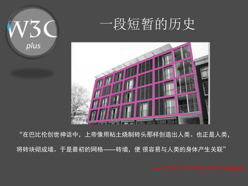
“在巴比伦创世神话中,上帝像用粘土烧制砖头那样创造出人类。也正是人类, 将砖块砌成墙。于是最初的网格——砖墙,便 很容易与人类的身体产生关联” 一段短暂的历史 ——艺术史学家Hannah B Higgins
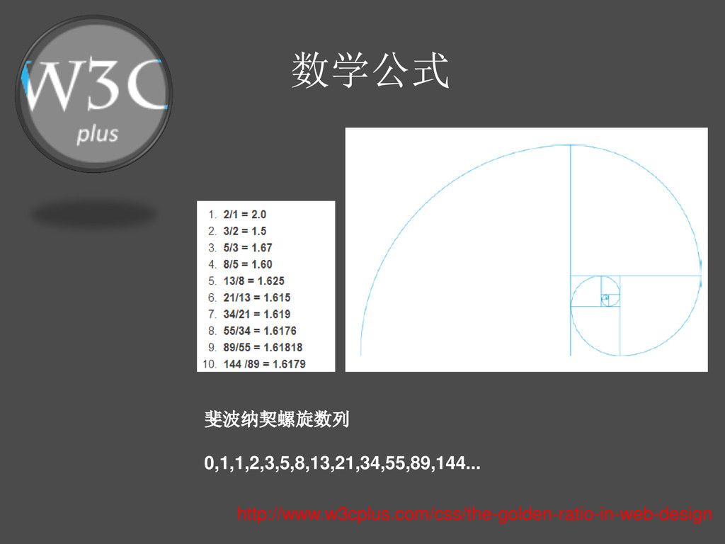
斐波纳契螺旋数列 0,1,1,2,3,5,8,13,21,34,55,89,144... 数学公式 http://www.w3cplus.com/css/the-golden-ratio-in-web-design
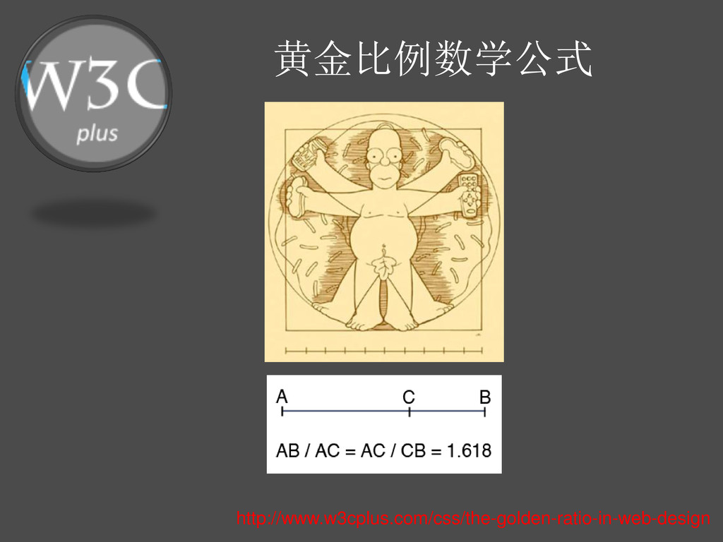
黄金比例数学公式 http://www.w3cplus.com/css/the-golden-ratio-in-web-design
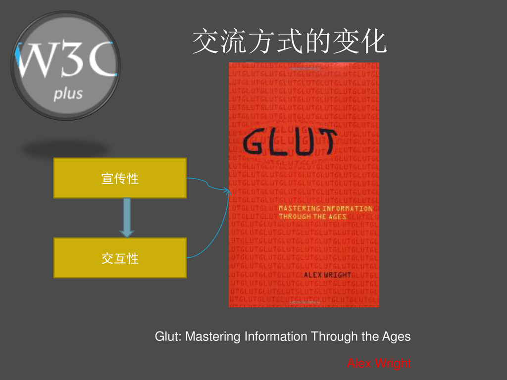
交流方式的变化 Alex Wright 宣传性 交互性 Glut: Mastering Information Through the
Ages
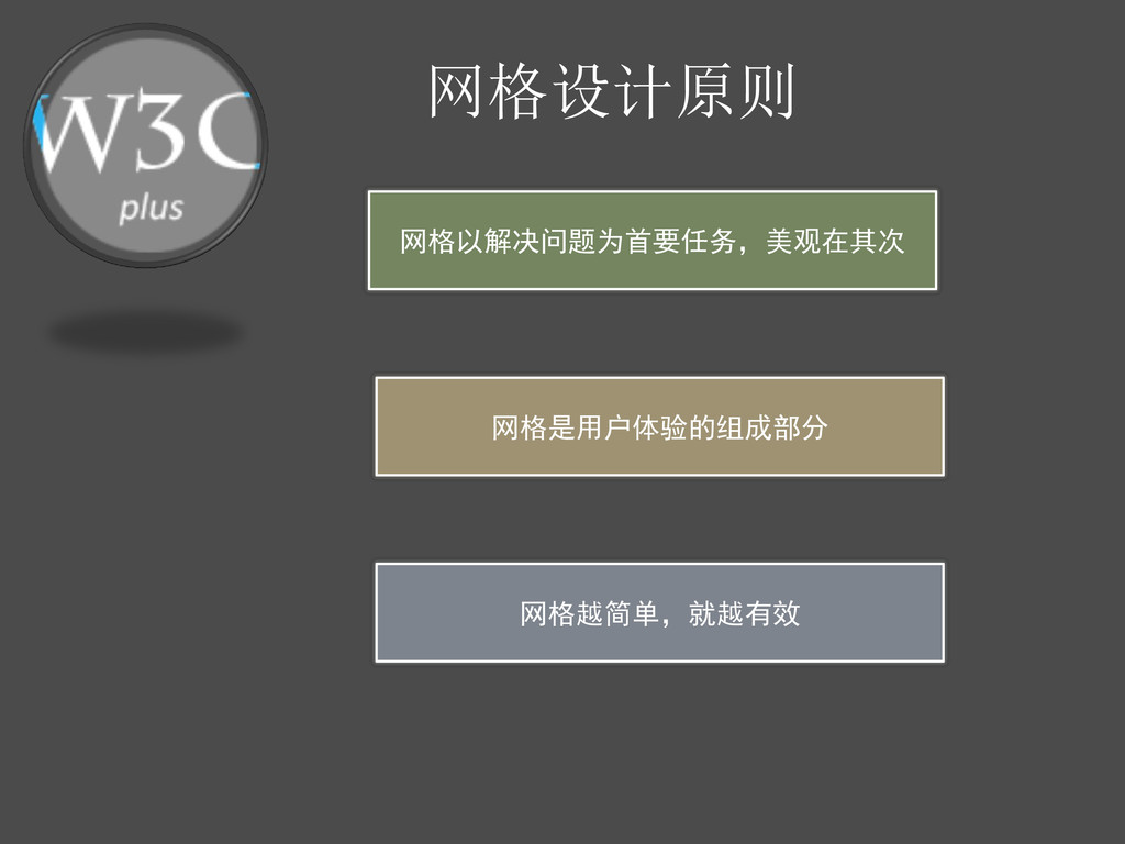
网格设计原则 网格以解决问题为首要任务,美观在其次 网格是用户体验的组成部分 网格越简单,就越有效
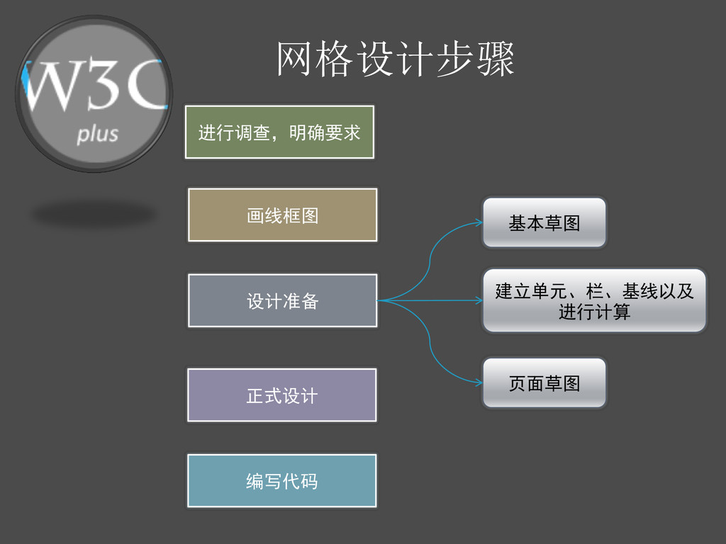
网格设计步骤 进行调查,明确要求 画线框图 设计准备 正式设计 编写代码 基本草图 建立单元、栏、基线以及 进行计算 页面草图
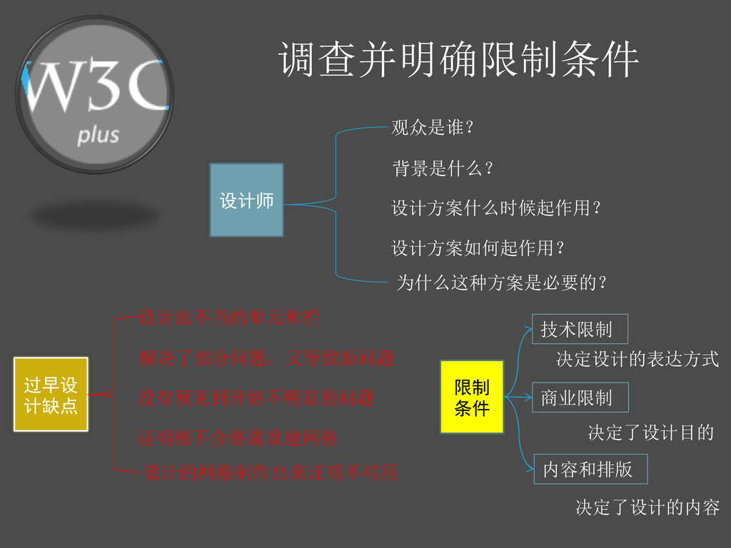
调查并明确限制条件 设计师 观众是谁? 背景是什么? 设计方案什么时候起作用? 设计方案如何起作用? 为什么这种方案是必要的? 过早设 计缺点 设计出不当的单元和栏
解决了部分问题,又导致新问题 没有预见到开始不明显的问题 证明极不合格需重建网格 设计的网格制作出来证明不可用 限制 条件 技术限制 决定设计的表达方式 商业限制 决定了设计目的 内容和排版 决定了设计的内容
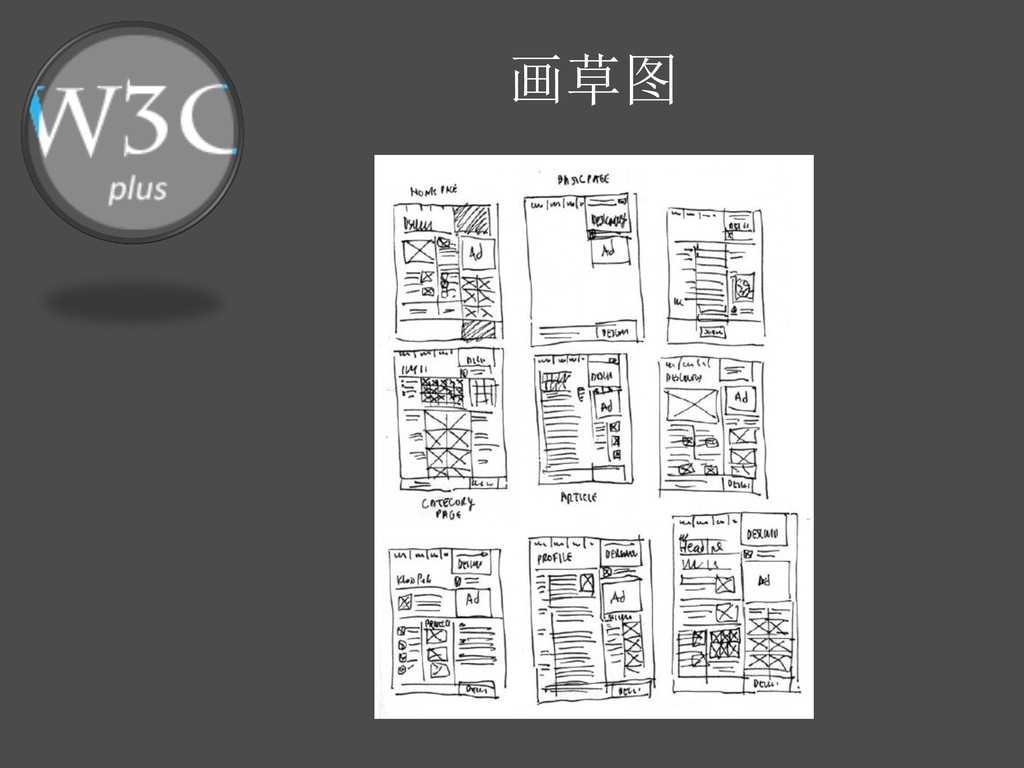
画草图
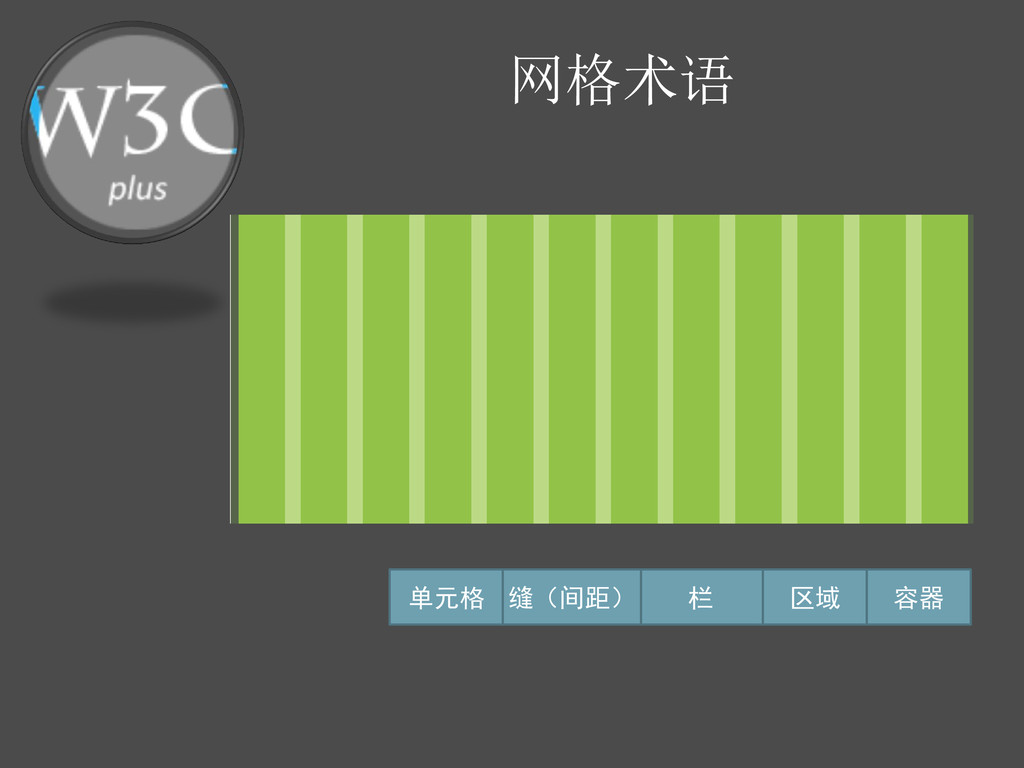
网格术语 单元格 栏 缝(间距) 区域 容器
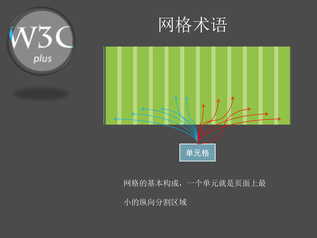
网格术语 单元格 网格的基本构成,一个单元就是页面上最 小的纵向分割区域
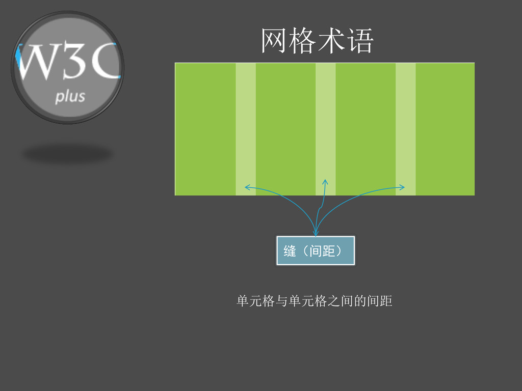
网格术语 缝(间距) 单元格与单元格之间的间距
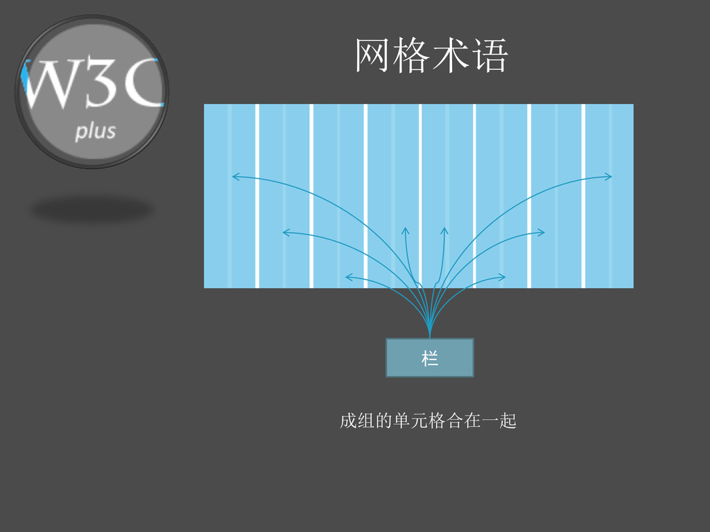
网格术语 栏 成组的单元格合在一起
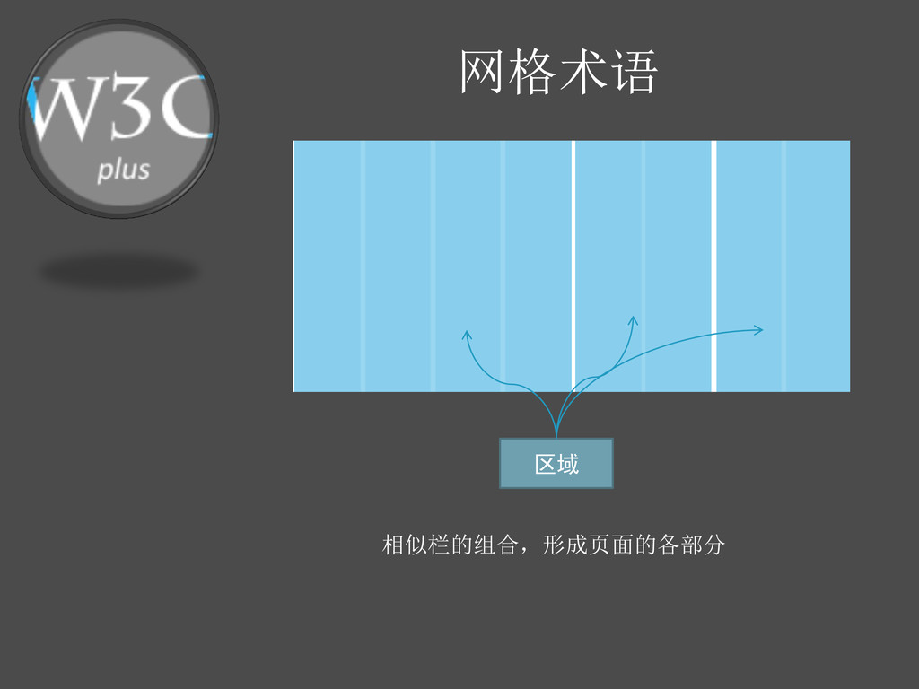
网格术语 区域 相似栏的组合,形成页面的各部分
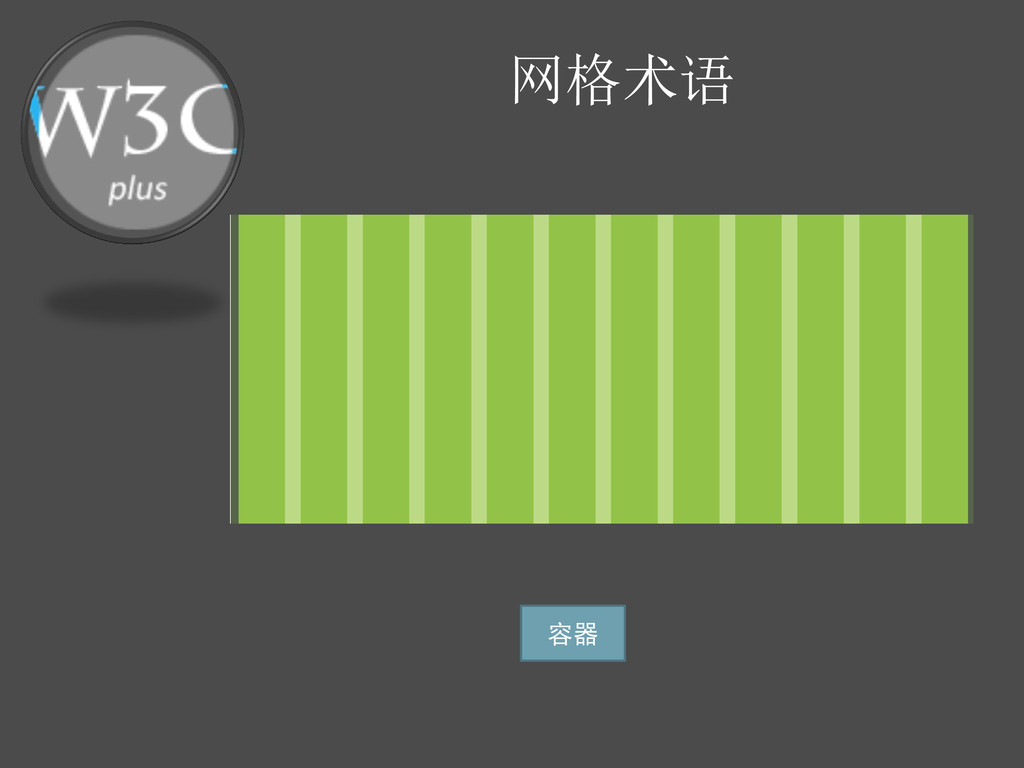
网格术语 容器
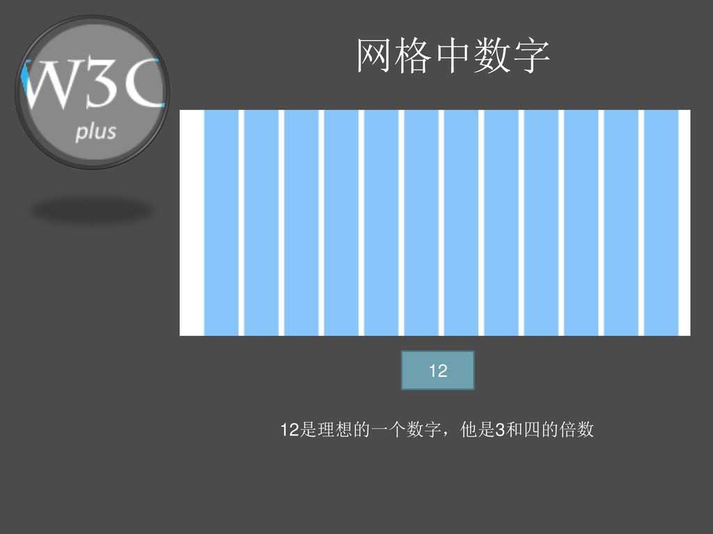
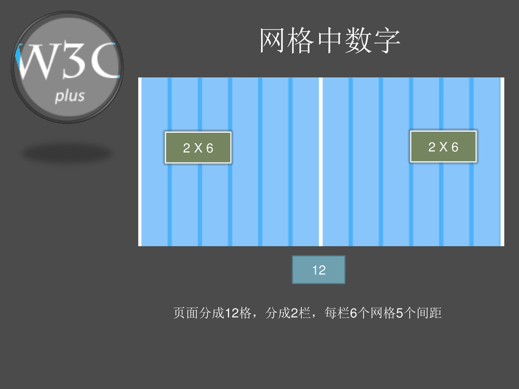
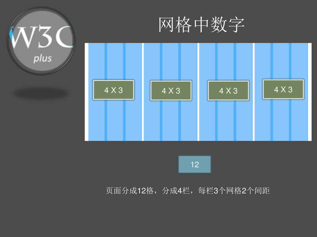
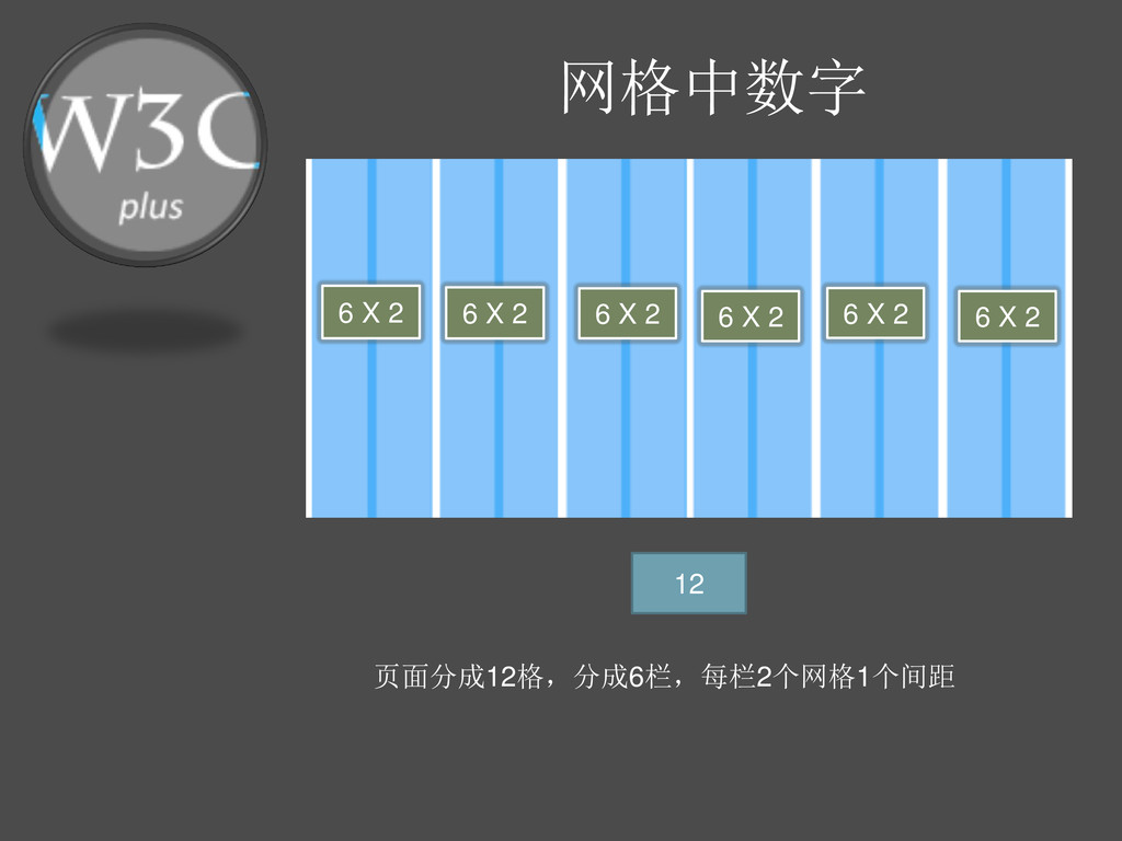
网格中数字 12 12是理想的一个数字,他是3和四的倍数
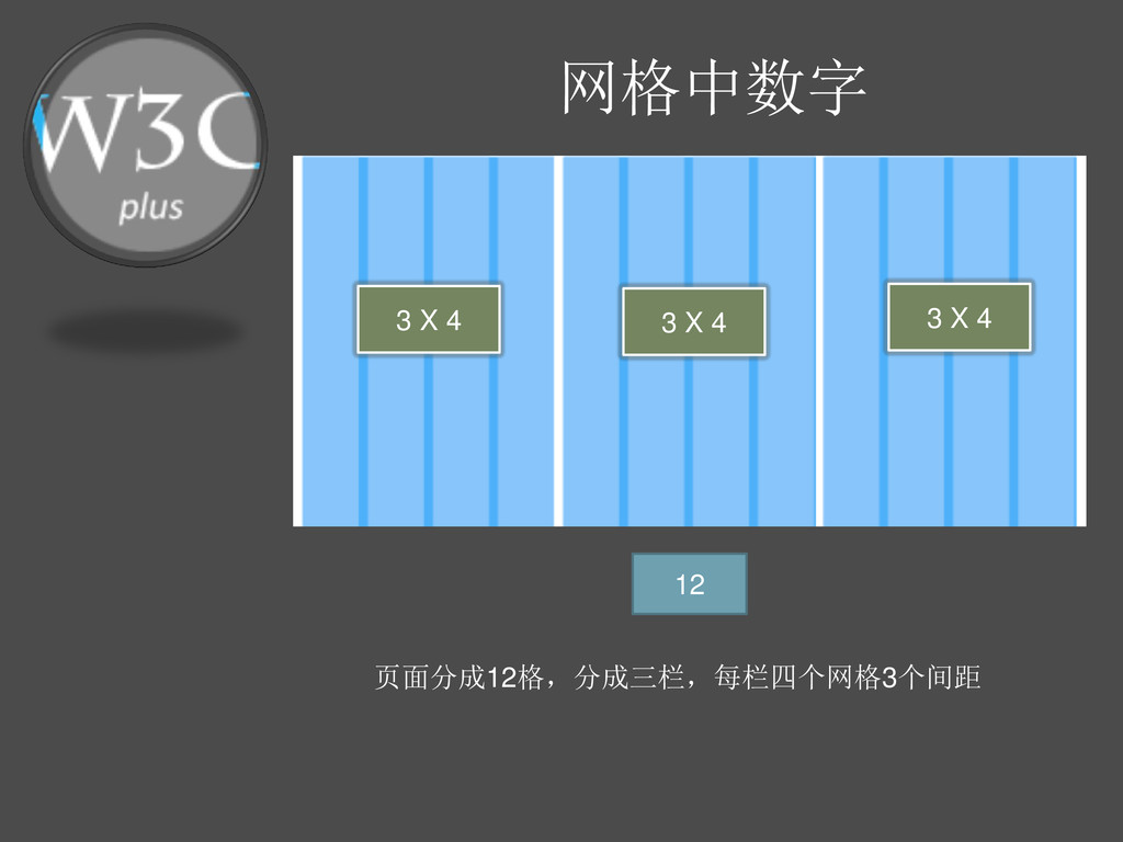
网格中数字 12 页面分成12格,分成三栏,每栏四个网格3个间距 3 X 4 3 X 4 3
X 4
网格中数字 12 页面分成12格,分成2栏,每栏6个网格5个间距 2 X 6 2 X 6
网格中数字 12 页面分成12格,分成4栏,每栏3个网格2个间距 4 X 3 4 X 3 4
X 3 4 X 3
网格中数字 12 页面分成12格,分成4栏,每栏3个网格2个间距 4 X 3 4 X 3 4
X 3 4 X 3
网格中数字 12 页面分成12格,分成6栏,每栏2个网格1个间距 6 X 2 6 X 2 6
X 2 6 X 2 6 X 2 6 X 2
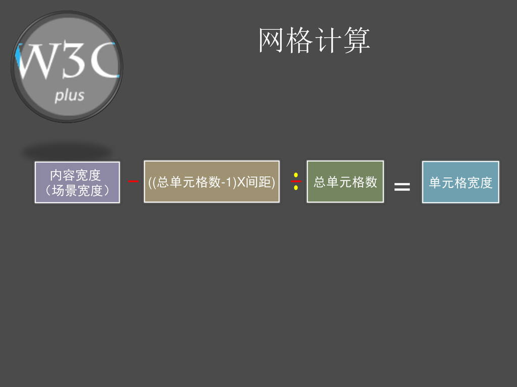
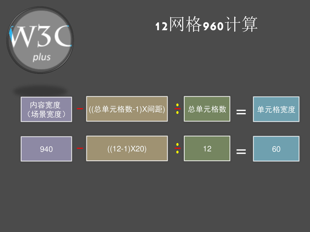
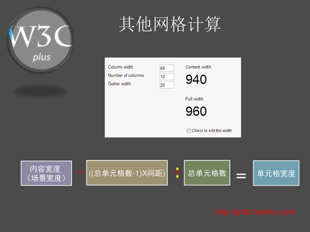
网格计算 内容宽度 (场景宽度) ((总单元格数-1)X间距) 总单元格数 = 单元格宽度
12网格960计算 内容宽度 (场景宽度) ((总单元格数-1)X间距) 总单元格数 = 单元格宽度 940 ((12-1)X20) 12
= 60
16网格960计算 内容宽度 (场景宽度) ((总单元格数-1)X间距) 总单元格数 = 单元格宽度 950 ((16-1)X10) 16
= 50
其他网格计算 内容宽度 (场景宽度) ((总单元格数-1)X间距) 总单元格数 = 单元格宽度 http://grids.heroku.com/
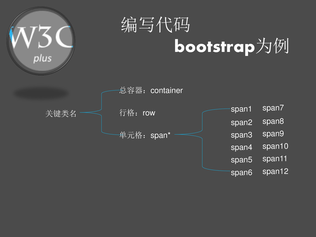
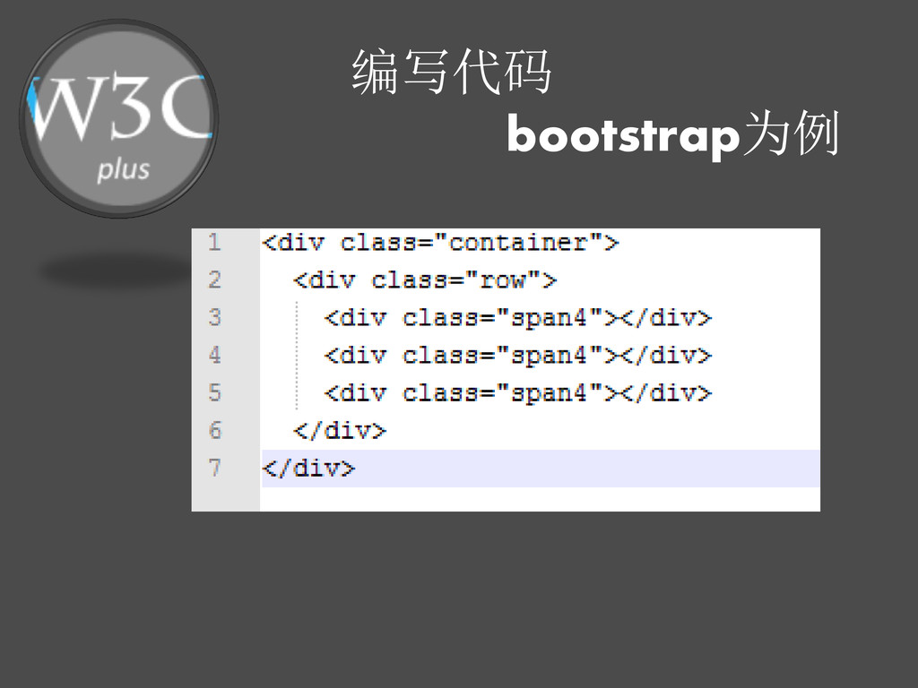
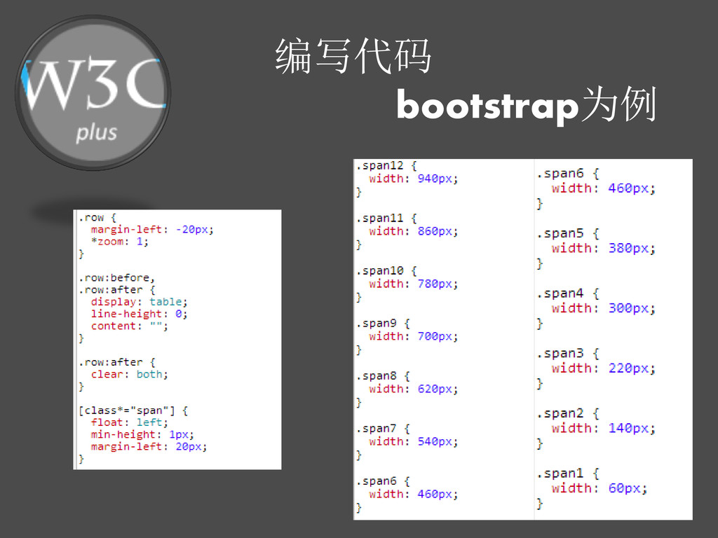
编写代码 bootstrap为例 总容器:container 关键类名 行格:row 单元格:span* span1 span2 span3 span4
span5 span6 span7 span8 span9 span10 span11 span12
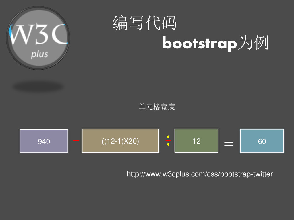
编写代码 bootstrap为例 单元格宽度 940 ((12-1)X20) 12 = 60 http://www.w3cplus.com/css/bootstrap-twitter
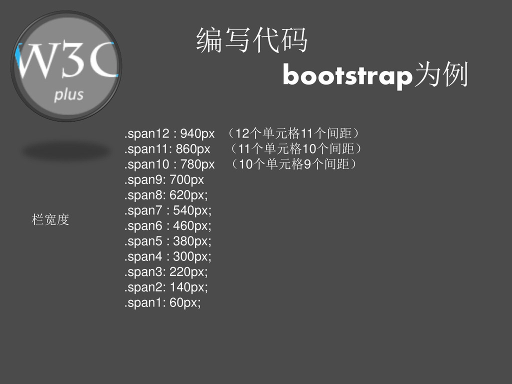
编写代码 bootstrap为例 栏宽度 .span12 : 940px (12个单元格11个间距) .span11: 860px (11个单元格10个间距)
.span10 : 780px (10个单元格9个间距) .span9: 700px .span8: 620px; .span7 : 540px; .span6 : 460px; .span5 : 380px; .span4 : 300px; .span3: 220px; .span2: 140px; .span1: 60px;
编写代码 bootstrap为例
编写代码 bootstrap为例
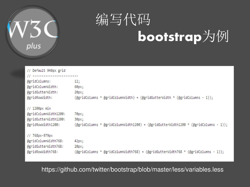
编写代码 bootstrap为例 https://github.com/twitter/bootstrap/b lob/master/docs/assets/css/bootstra p.css
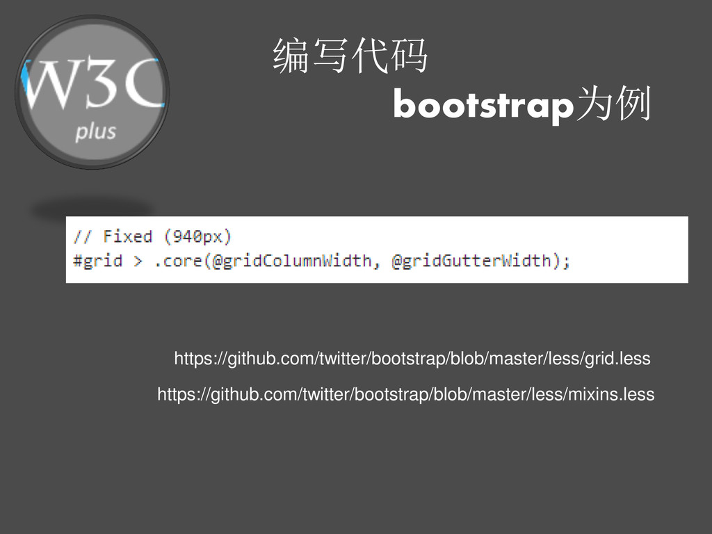
编写代码 bootstrap为例 https://github.com/twitter/bootstrap/blob/master/less/variables.less
编写代码 bootstrap为例 https://github.com/twitter/bootstrap/blob/master/less/mixins.less https://github.com/twitter/bootstrap/blob/master/less/grid.less
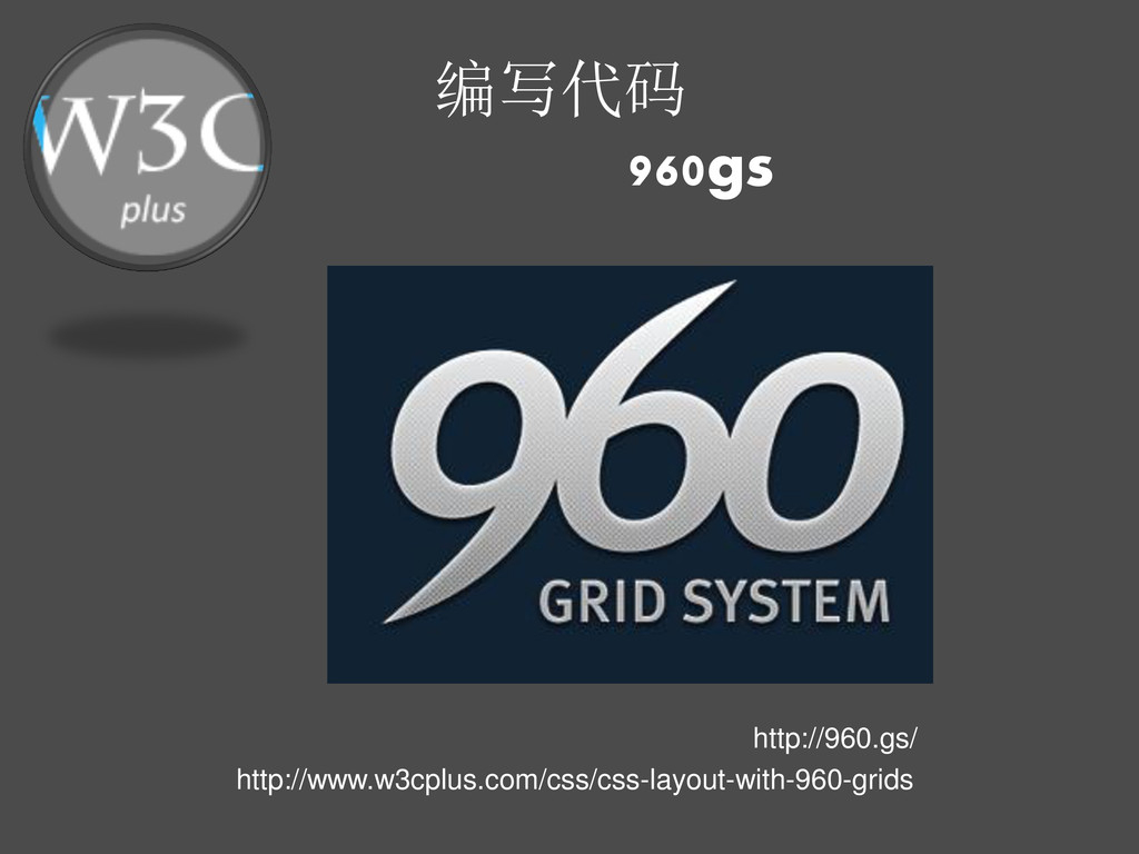
编写代码 960gs http://960.gs/ http://www.w3cplus.com/css/css-layout-with-960-grids
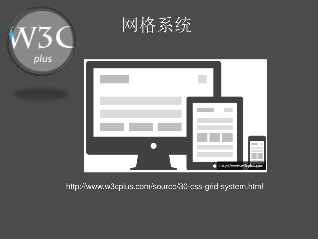
网格系统 http://www.w3cplus.com/source/30-css-grid-system.html
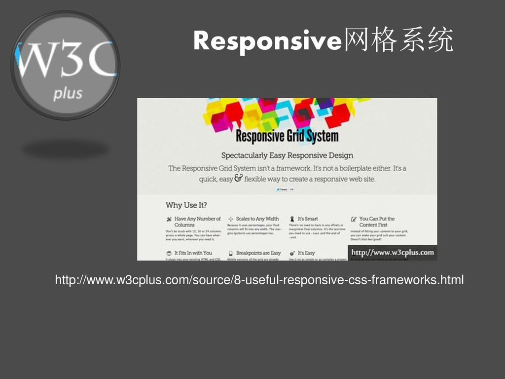
Responsive网格系统 http://www.w3cplus.com/source/8-useful-responsive-css-frameworks.html
网格系统资源 CSS布局——960gs http://www.w3cplus.com/css/css-layout-with-960-grids CSS——Bootstrap From Twitter http://www.w3cplus.com/css/bootstrap-twitter 30+ CSS Grid
System http://www.w3cplus.com/source/30-css-grid-system.html 8个实用的响应式设计框架 http://www.w3cplus.com/source/8-useful-responsive-css- frameworks.html 16个优秀的Responsive CSS框架 http://www.w3cplus.com/source/16-responsive-css- frameworks-worth-considering.html
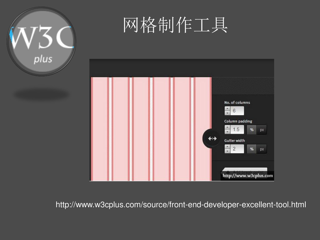
网格制作工具 http://www.w3cplus.com/source/front-end-developer-excellent-tool.html
问与答
Blog: http://www.w3cplus.com QQ: 81059347 QQ交流群: 1041263 新浪微薄: http://weibo.com/w3cplus E-mail:
[email protected]
谢谢!
 w3cplus
 y150saya
 yud0uhu
 shirouz
 kawaguti
 chacco38
 ritou
ritou
 laysakura
 shin1988
 noriyukitakei
 ks91
ks91
 fullkaiten
.png) helenjbeal
helenjbeal
 speakerdeck
 aleyda
 minecr
 lauravandoore
 jlugia
 skipperchong
 trallard
 bkeepers
 ryanjones
 tammyeverts
 smashingmag
![Blog: http://www.w3cplus.com QQ: 81059347 QQ交流群: 1041263 新浪微薄: http://weibo.com/w3cplus E-mail: [email protected]](https://files.speakerdeck.com/presentations/fe6732d03dfa01301b0d22000a8f8683/slide_0.jpg)
![Blog: http://www.w3cplus.com QQ: 81059347 QQ交流群: 1041263 新浪微薄: http://weibo.com/w3cplus E-mail: [email protected]](https://files.speakerdeck.com/presentations/fe6732d03dfa01301b0d22000a8f8683/slide_39.jpg)