Upgrade to Pro — share decks privately, control downloads, hide ads and more …

Data Visualization Using R

William Gunn
January 26, 2013

Data Visualization Using R

An invited workshop at Science Online 2013 on data visualization using R.

William Gunn

January 26, 2013
Tweet

More Decks by William Gunn

Other Decks in Research

Transcript

  1. Data Visualization using R
    How to get, manage, and present
    data to tell a compelling science
    story
    William Gunn
    @mrgunn
    Head of Academic Outreach, Mendeley
    Access point: NRC Visitor

    View Slide

  2. 1. A short history of graphical
    presentation of data
    2. Introduction to R
    3. Finding, cleaning, and presenting
    data
    4. Reproducibility and data sharing

    View Slide

  3. Data viz has a long history
    John Snow’s
    cholera map
    helped
    communicate
    the idea that
    cholera was a
    water-borne
    disease.

    View Slide

  4. Florence Nightingale used dataviz

    View Slide

  5. Modernization of dataviz

    View Slide

  6. Chart junk: good, bad, and ugly
    Which presentation is better?

    View Slide

  7. View Slide

  8. It can be elegant…

    View Slide

  9. View Slide

  10. Tufte

    View Slide

  11. Tufte

    View Slide

  12. How our eyes and brain perceive
    It takes 200 ms to initiate an eye movement, but the red dot
    can be found in 100 ms or less. This is due to pre-attentive
    processing.

    View Slide

  13. Shape is a little slower than color!

    View Slide

  14. Pre-attentive processing fails!

    View Slide

  15. There are many “primitive”
    properties which we perceive
    • Length
    • Width
    • Size
    • Density
    • Hue
    • Color intensity
    • Depth
    • 3-D orientation

    View Slide

  16. Length

    View Slide

  17. Width

    View Slide

  18. Density

    View Slide

  19. Hue

    View Slide

  20. Color Intensity

    View Slide

  21. Depth

    View Slide

  22. 3D orientation

    View Slide

  23. View Slide

  24. Types of color schemes
    • Sequential – suited for ordered 
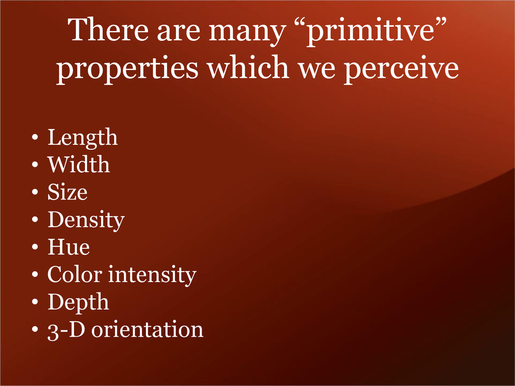
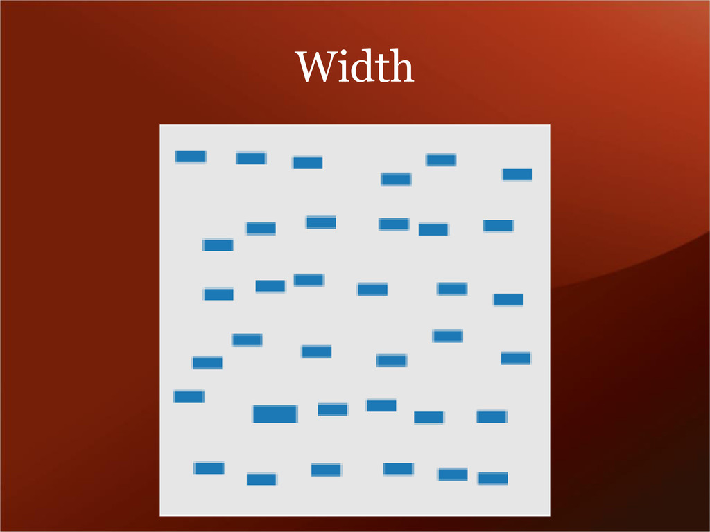
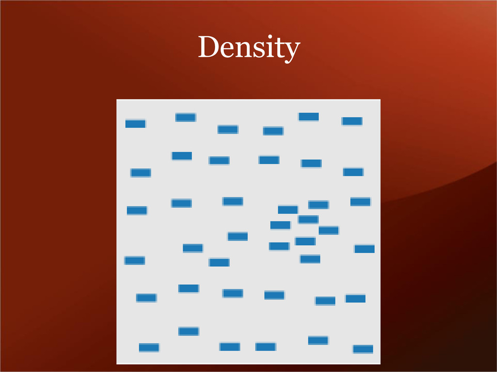
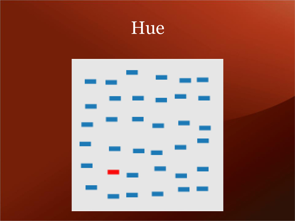
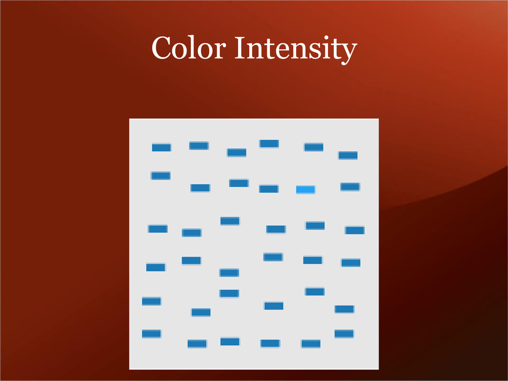
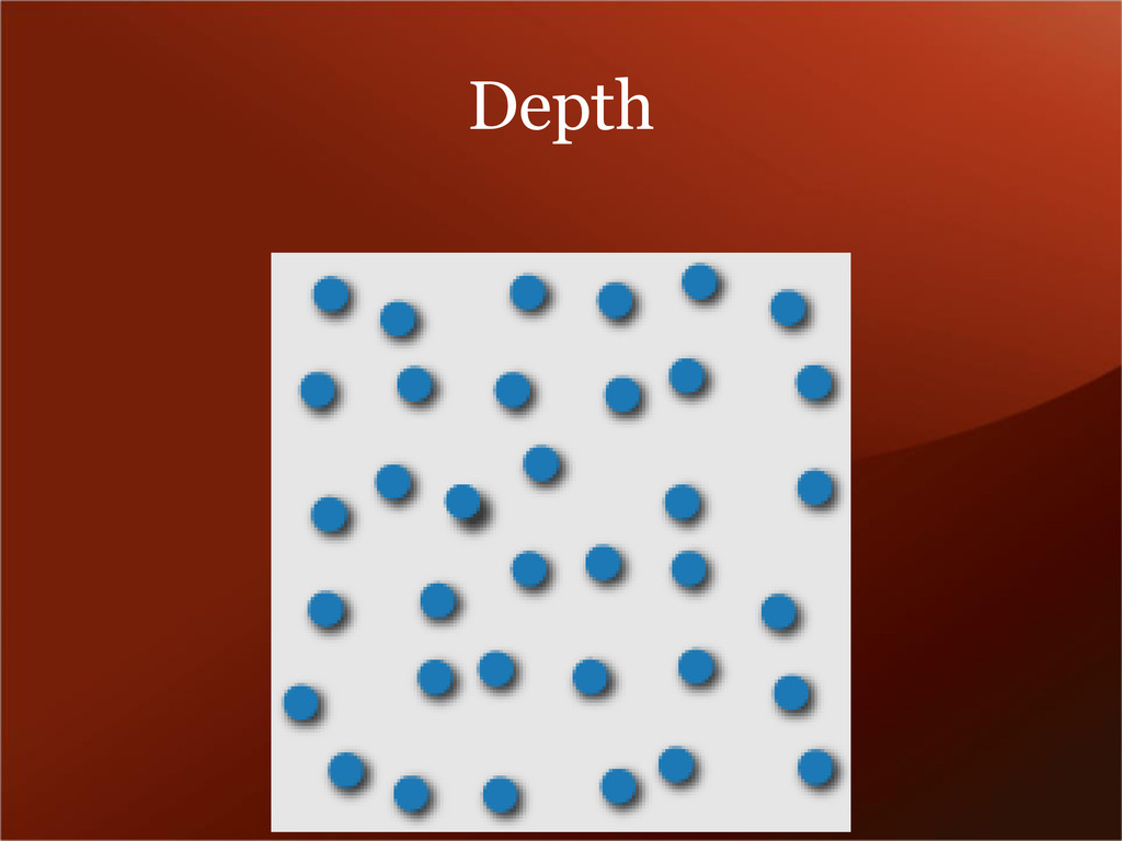
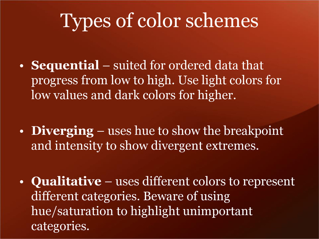
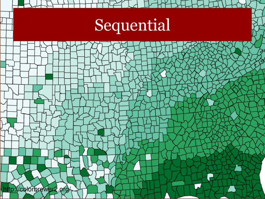
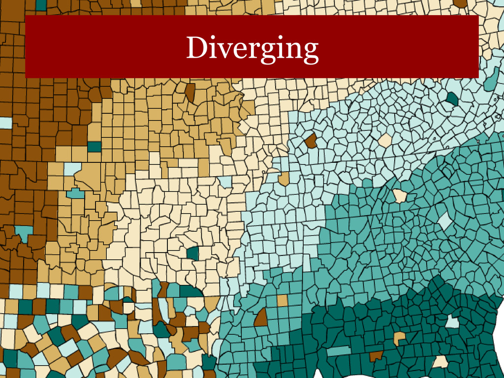
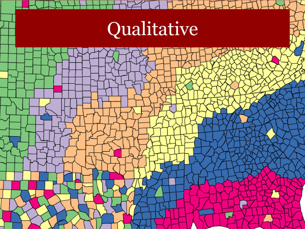
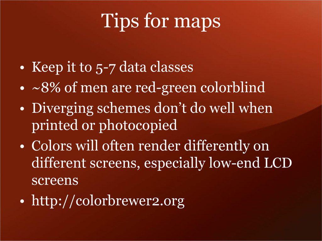
data that
    progress from low to high. Use light colors for
    low values and dark colors for higher.
    • Diverging – uses hue to show the breakpoint
    and intensity to show divergent extremes.
    • Qualitative – uses different colors to represent
    different categories. Beware of using
    hue/saturation to highlight unimportant
    categories.

    View Slide

  25. Sequential
    http://colorbrewer2.org/

    View Slide

  26. Diverging

    View Slide

  27. Qualitative

    View Slide

  28. Tips for maps
    • Keep it to 5-7 data classes
    • ~8% of men are red-green colorblind
    • Diverging schemes don’t do well when
    printed or photocopied
    • Colors will often render differently on
    different screens, especially low-end LCD
    screens
    • http://colorbrewer2.org

    View Slide

  29. Part 2
    Introduction to R

    View Slide

  30. Why R?
    • Open source tool
    • Huge variety of packages for any kind of
    analysis
    • Saves time repeating data processing steps
    • Allows working with more diverse types of
    data and much larger datasets than Excel
    • Processing is much faster than Excel
    • Scripts are easily shareable, promoting
    reproducible work

    View Slide

  31. .csv and .xls / xlsx
    • Excel files are designed to hold the
    appearance of the spreadsheet in addition
    to the data.
    • R just wants the data, so always save as
    .csv if you have tabular data

    View Slide

  32. data structures
    • x• x
    • length(x)
    • x[1]
    • x[2]
    • x• x

    View Slide

  33. types of data
    • y• y
    • class(y)
    • y[2]
    • length(y)
    • data can be integer (1,2,3,…), numeric (1.0,
    2.3, …), character (a, b, c,…), logical
    (TRUE, FALSE) or other things

    View Slide

  34. Vectors
    • R can hold data organized a few different
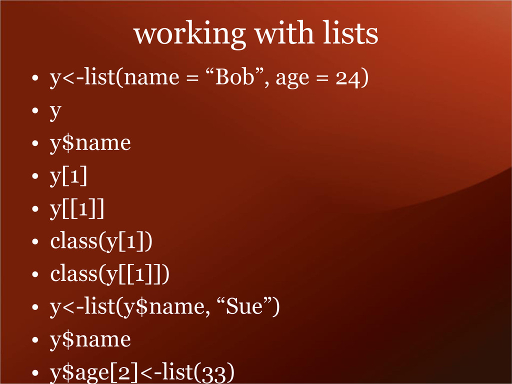
    ways
    • vectors (1,2,3,4) but not (1,2,3,x,y,z)
    • lists – can hold heterogeneous data
    – 1
    – 2
    – a
    • x
    • arrays – multi-dimensional
    • dataframes – lists of vectors - like
    spreadsheets

    View Slide

  35. Vector operations
    • x + 1
    • x
    • sum(x)
    • mean(x)
    • mean(x+1)
    • x[2]• x
    • x+c(2:3)
    • x[2:10] + c(2:3)

    View Slide

  36. working with lists
    • y• y
    • y$name
    • y[1]
    • y[[1]]
    • class(y[1])
    • class(y[[1]])
    • y• y$name
    • y$age[2]

    View Slide

  37. Loading data
    • dataGunn/Desktop/Dropbox/Scripting/Data/t
    raffic_accidents/accidents2010_all.csv",
    header = TRUE, stringsAsFactors =
    FALSE)

    View Slide

  38. Selecting subsets of data
    • “[“
    • “$”
    • which
    • grep and grepl
    • subset

    View Slide

  39. PLOTS
    • ggplot2 – an implementation of the
    “grammar of 
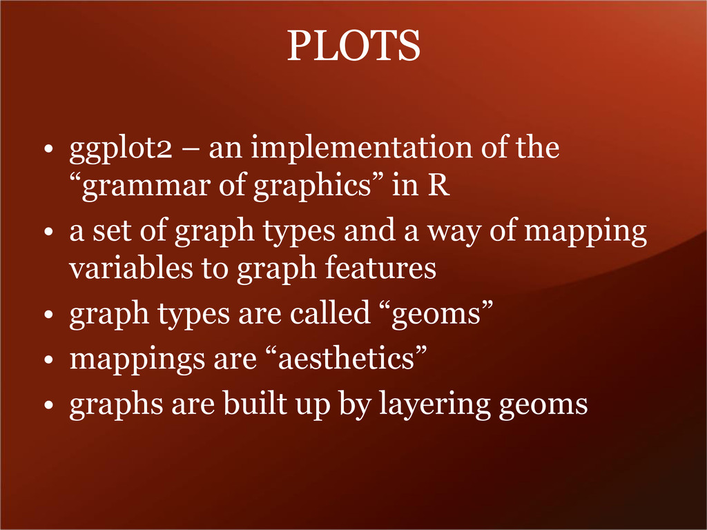
graphics” in R
    • a set of graph types and a way of mapping
    variables to graph features
    • graph types are called “geoms”
    • mappings are “aesthetics”
    • graphs are built up by layering geoms

    View Slide

  40. Types of geoms
    • point – dotplot – takes x,y coords of points
    • abline – line layer – takes slope, intercept
    • line – connect points with a line
    • smooth – fit a curve
    • bar – aka histogram – takes vector of data
    • boxplot – box and whiskers
    • density – to show relative distributions
    • errorbar – what it says on the tin

    View Slide