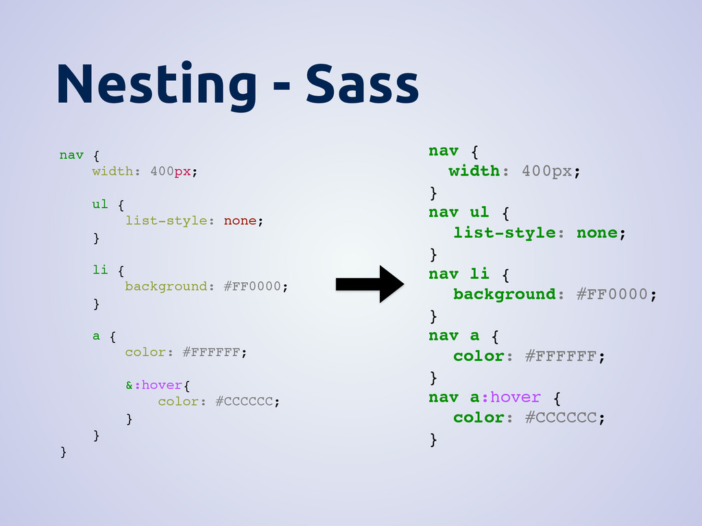
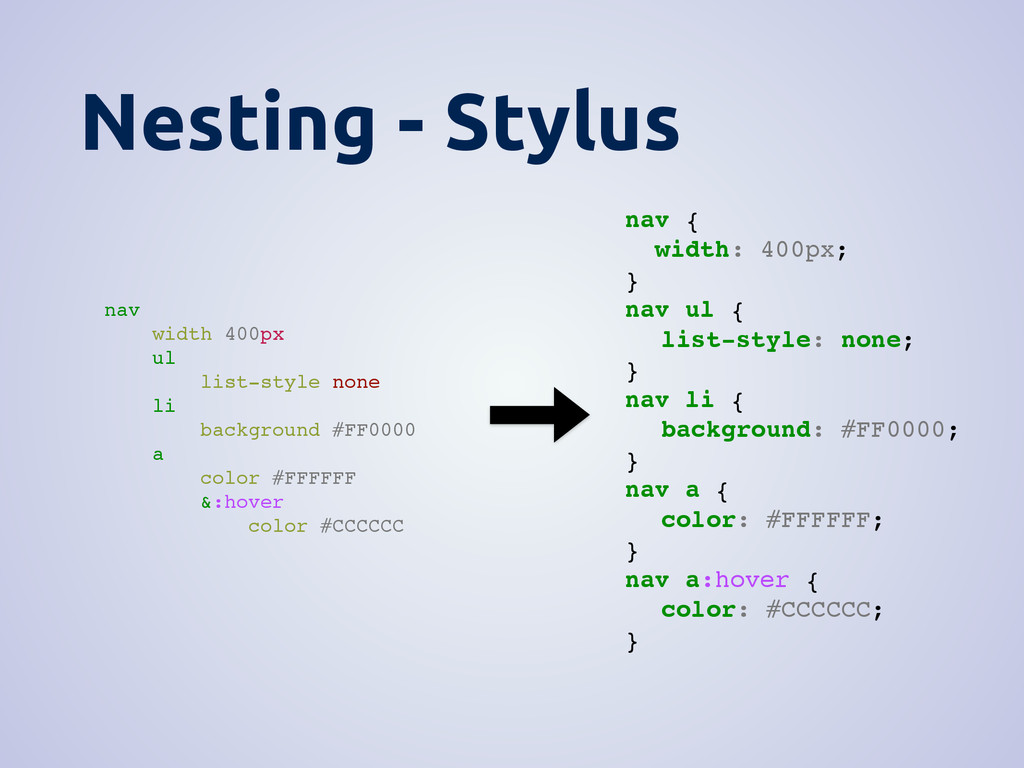
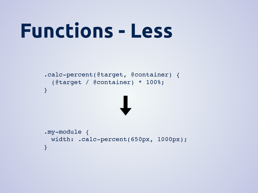
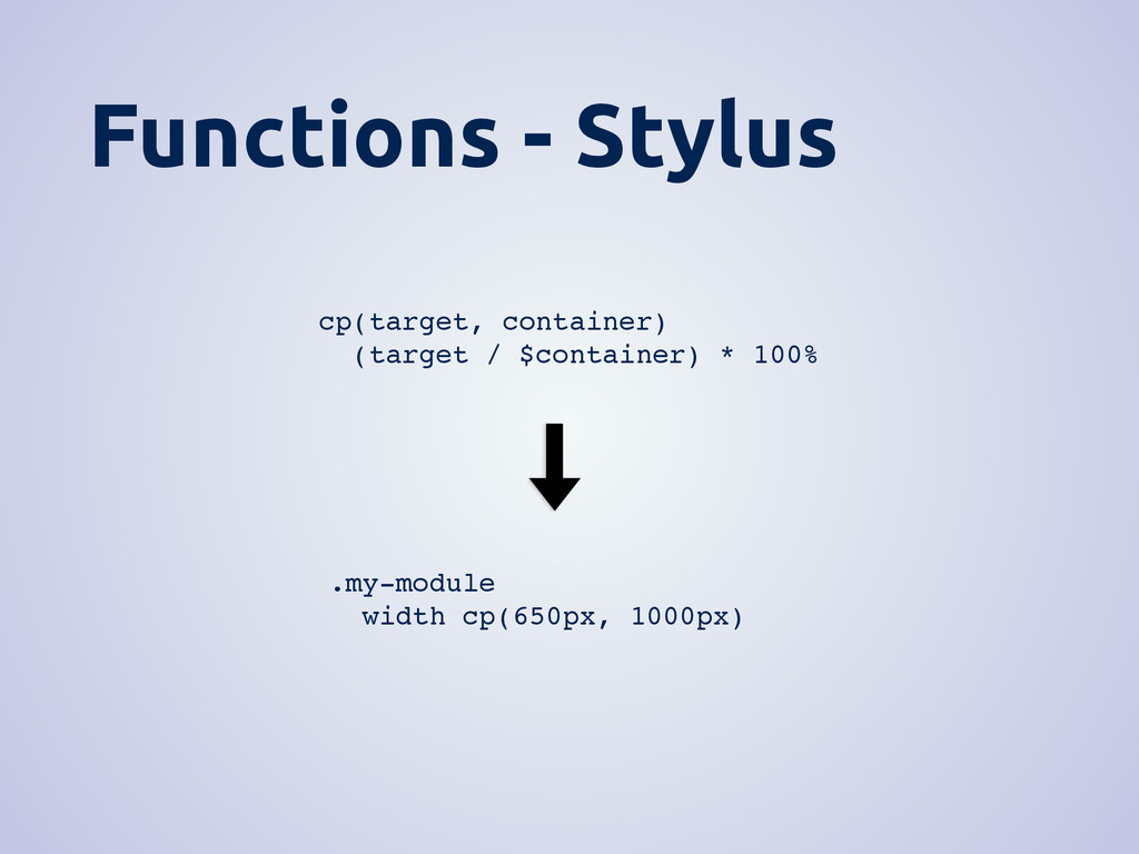
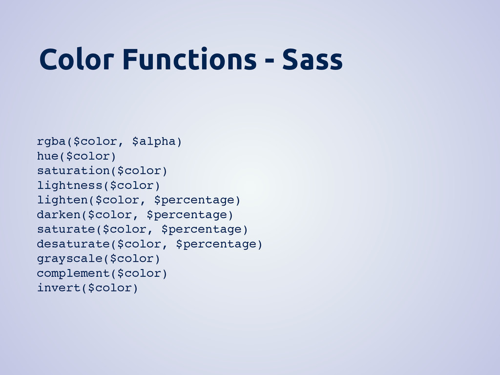
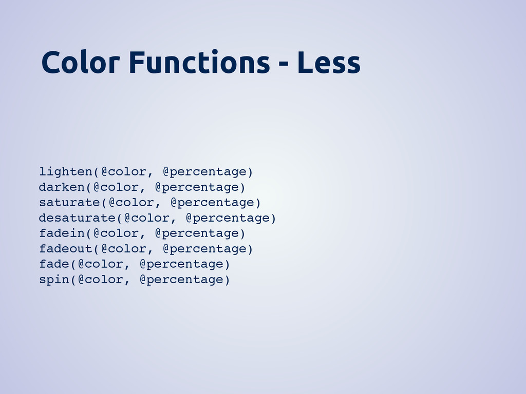
none; } li { background: #FF0000; } a { color: #FFFFFF; &:hover{ color: #CCCCCC; } } } nav { width: 400px; } nav ul { list-style: none; } nav li { background: #FF0000; } nav a { color: #FFFFFF; } nav a:hover { color: #CCCCCC; }
none; } li { background: #FF0000; } a { color: #FFFFFF; &:hover{ color: #CCCCCC; } } } nav { width: 400px; } nav ul { list-style: none; } nav li { background: #FF0000; } nav a { color: #FFFFFF; } nav a:hover { color: #CCCCCC; }
background #FF0000 a color #FFFFFF &:hover color #CCCCCC nav { width: 400px; } nav ul { list-style: none; } nav li { background: #FF0000; } nav a { color: #FFFFFF; } nav a:hover { color: #CCCCCC; }
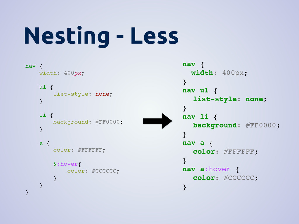
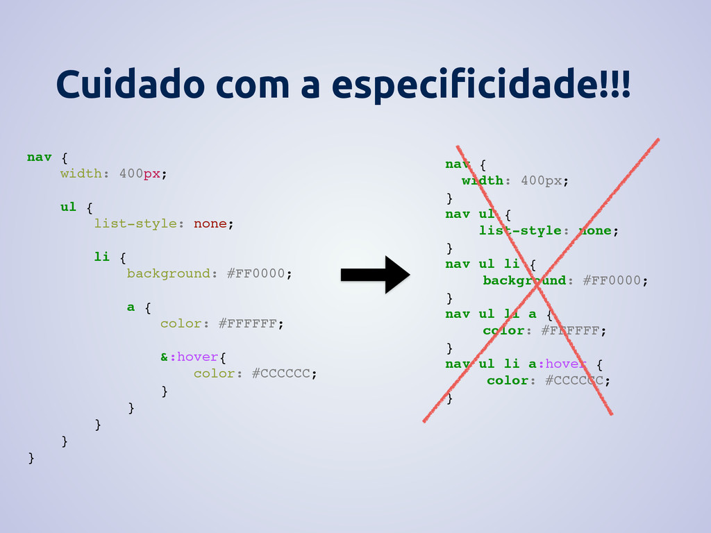
list-style: none; li { background: #FF0000; a { color: #FFFFFF; &:hover{ color: #CCCCCC; } } } } } nav { width: 400px; } nav ul { list-style: none; } nav ul li { background: #FF0000; } nav ul li a { color: #FFFFFF; } nav ul li a:hover { color: #CCCCCC; }
 willianjusten
 shimomura
 otakakot
 danielsogl
 line_developers_tw
 ivargrimstad
 josepaumard
 slecache
 kumorn5s
 kiichisugihara
 o0h
o0h
 tomoeng11
 k0kubun
 carmenintech
 reverentgeek
 minecr
 mongodb
 mayunak
 dougneiner
 chikuwait
 axbom
axbom
 eileencodes
 marketingsoph
 coloredviolet