Upgrade to Pro
— share decks privately, control downloads, hide ads and more …
Speaker Deck
Features
Speaker Deck
PRO
Sign in
Sign up for free
Search
Search
はじめてのMaterial3 Expressive
Search
yume
September 11, 2025
Programming
3.1k
2
Share
Embed
Copy iframe code
Copy JS code
Copy link
Start on current slide
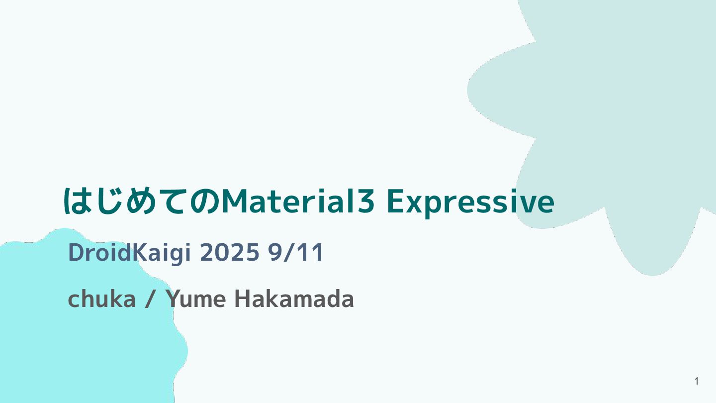
はじめてのMaterial3 Expressive
DroidKaigi 2025 9/11 登壇資料です。
yume
September 11, 2025
More Decks by yume
See All by yume
Jetpack Composeで作る楽しい金額入力画面! / Creating a fun register screen with jetpack compose!
ym223
0
2.2k
色んなライブラリを眺める
ym223
1
190
Other Decks in Programming
See All in Programming
霧の中の代数的エフェクト
funnyycat
1
380
初めてのKubernetes 本番運用でハマった話
oku053
0
130
Even G2とAWSで推しのエージェントを召喚しよう!
har1101
1
170
【SRE NEXT 2026 Lunch Session】一人目専任SREの立ち上げを加速する ― AIと進めたオンボーディングで2分を0.04秒にした話
pkshadeck
PRO
0
2.6k
Welcome to the "Parametricity" 🏙️ − Generic だけど Specific な世界 −
guvalif
PRO
1
170
AIキャラアプリkaiwaの低遅延音声通話基盤をどう作ったか - AWS Gravitonで支える低遅延・低コストAI Agent基盤
mogamit
0
170
Claude Team Plan導入・ガイド
tk3fftk
0
200
使用 Meilisearch 建立新聞搜尋工具
johnroyer
0
150
Hatena Engineer Seminar #37「言語モデルの活用に関する研究」
slashnephy
0
520
エンジニア向け会社紹介/Findy Company Profile
findyinc
6
360k
はてなアカウント基盤 State of the Union
cockscomb
1
1.3k
SLOをサービス品質の共通言語にするために 取り組んできたこと
wakana0222
0
500
Featured
See All Featured
How STYLIGHT went responsive
nonsquared
100
6.2k
ピンチをチャンスに:未来をつくるプロダクトロードマップ #pmconf2020
aki_iinuma
128
56k
HU Berlin: Industrial-Strength Natural Language Processing with spaCy and Prodigy
inesmontani
PRO
0
510
The Web Performance Landscape in 2024 [PerfNow 2024]
tammyeverts
12
1.2k
Paper Plane
katiecoart
PRO
2
52k
Sharpening the Axe: The Primacy of Toolmaking
bcantrill
46
2.9k
How to optimise 3,500 product descriptions for ecommerce in one day using ChatGPT
katarinadahlin
PRO
1
3.7k
A better future with KSS
kneath
240
18k
CSS Pre-Processors: Stylus, Less & Sass
bermonpainter
360
30k
No one is an island. Learnings from fostering a developers community.
thoeni
21
3.8k
30 Presentation Tips
portentint
PRO
1
350
Typedesign – Prime Four
hannesfritz
42
3.1k
Transcript
はじめてのMaterial3 Expressive chuka / Yume Hakamada 1 DroidKaigi 2025 9/11
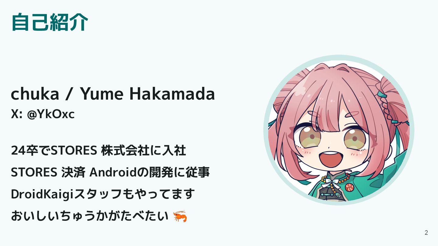
自己紹介 2 chuka / Yume Hakamada X: @YkOxc 24卒でSTORES 株式会社に入社
STORES 決済 Androidの開発に従事 DroidKaigiスタッフもやってます おいしいちゅうかがたべたい 🦐
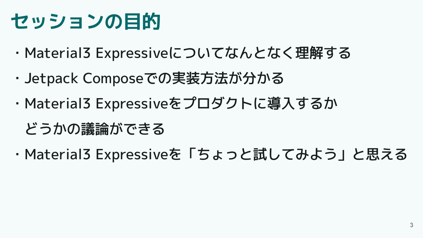
セッションの目的 ・Material3 Expressiveについてなんとなく理解する ・Jetpack Composeでの実装方法が分かる ・Material3 Expressiveをプロダクトに導入するか どうかの議論ができる ・Material3 Expressiveを「ちょっと試してみよう」と思える
3
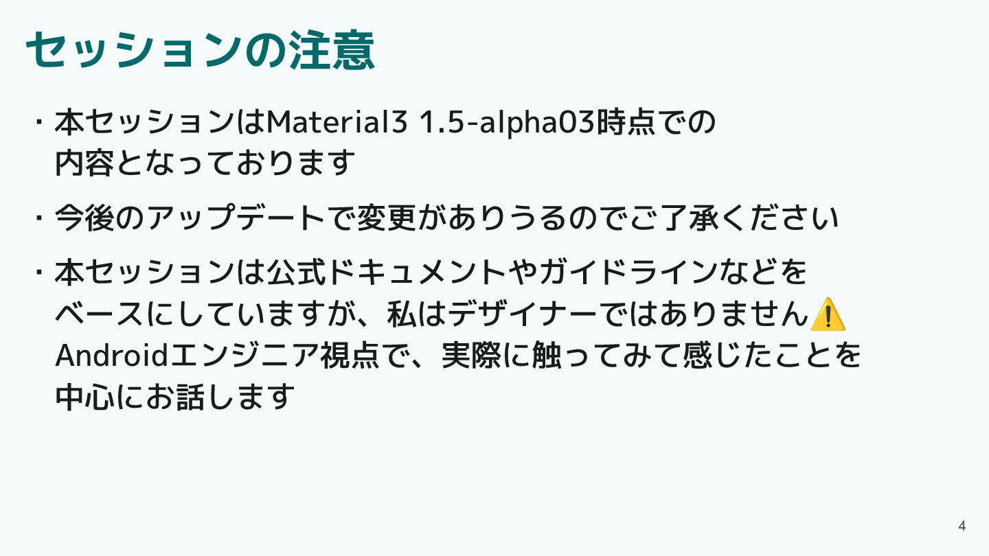
セッションの注意 ・本セッションはMaterial3 1.5-alpha03時点での 内容となっております ・今後のアップデートで変更がありうるのでご了承ください ・本セッションは公式ドキュメントやガイドラインなどを ベースにしていますが、私はデザイナーではありません⚠ Androidエンジニア視点で、実際に触ってみて感じたことを 中心にお話します 4
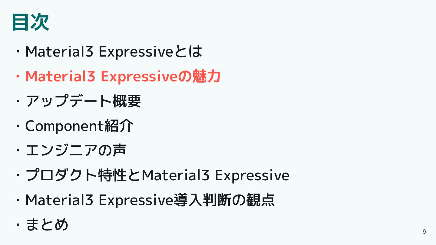
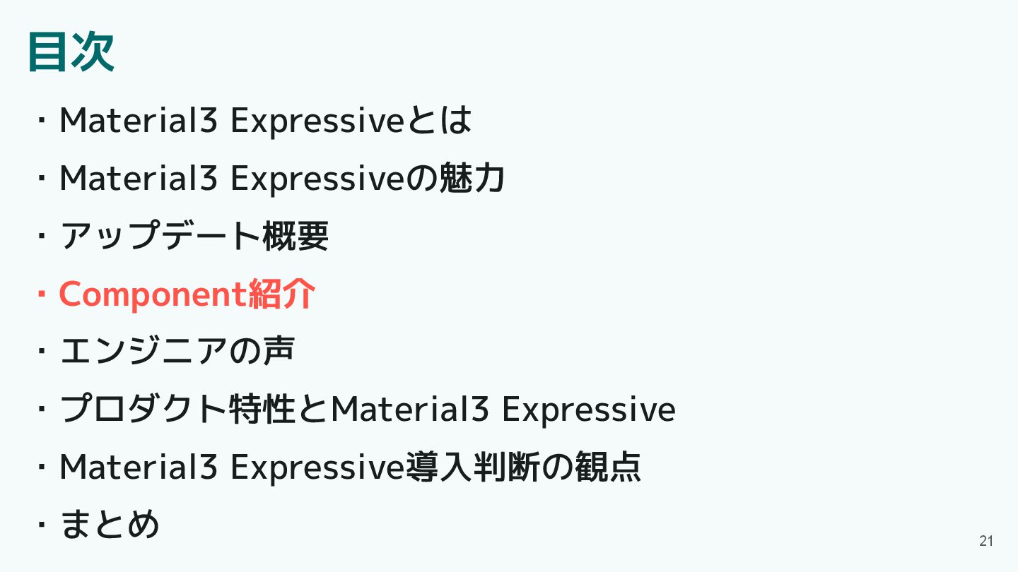
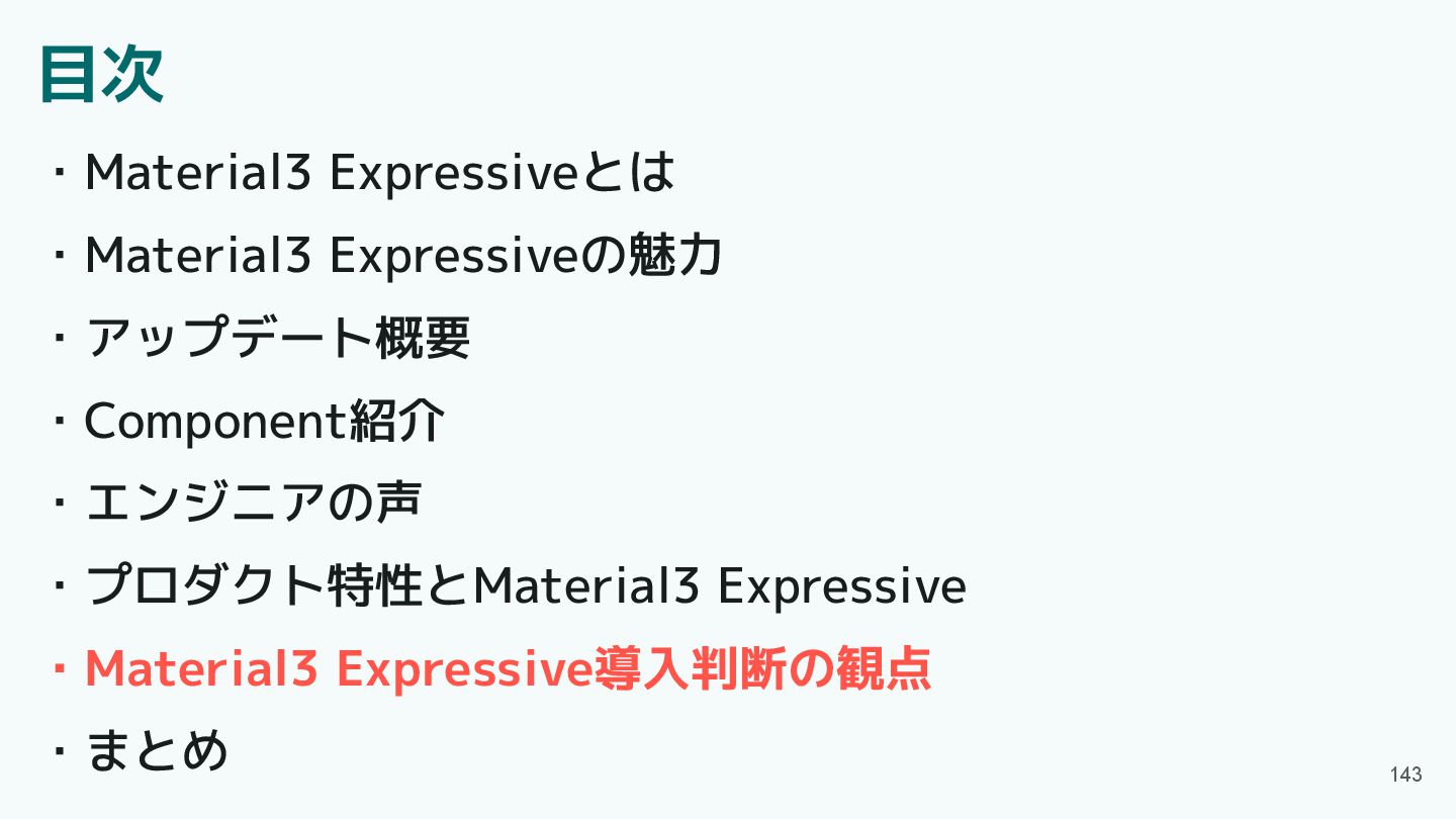
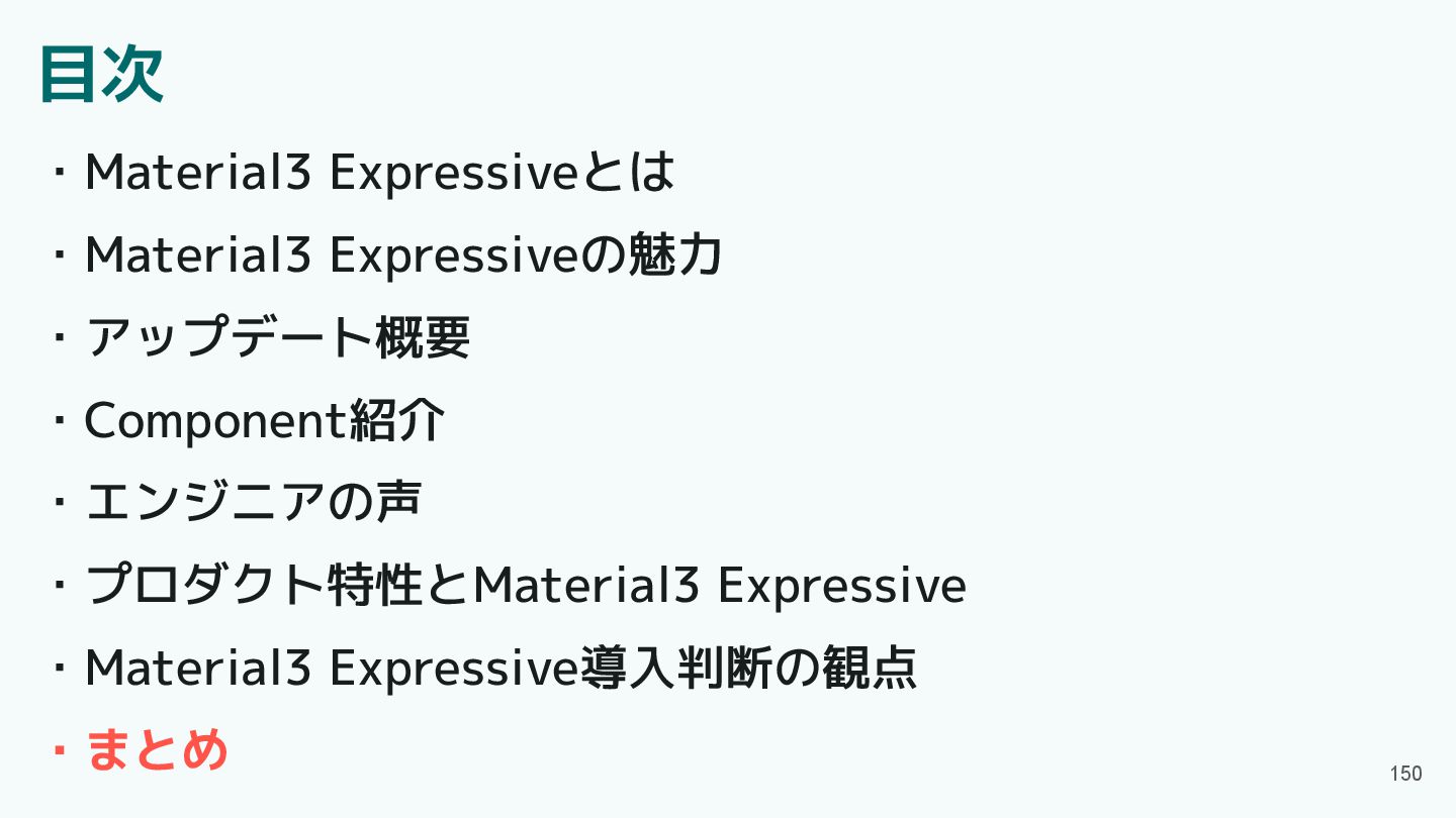
目次 ・Material3 Expressiveとは ・Material3 Expressiveの魅力 ・アップデート概要 ・Component紹介 ・エンジニアの声 ・プロダクト特性とMaterial3 Expressive
・Material3 Expressive導入判断の観点 ・まとめ 5
目次 ・Material3 Expressiveとは ・Material3 Expressiveの魅力 ・アップデート概要 ・Component紹介 ・エンジニアの声 ・プロダクト特性とMaterial3 Expressive
・Material3 Expressive導入判断の観点 ・まとめ 6
Material3 Expressiveとは 2025年5月にGoogle I/Oで公開された新しいデザインシステム 従来の「クリーン」で「退屈」なデザインから脱却し、 「表現力豊か」で「より感情に訴えかける」UXを目指している ComponentやShape, Motionなどのアップデートがされた 7
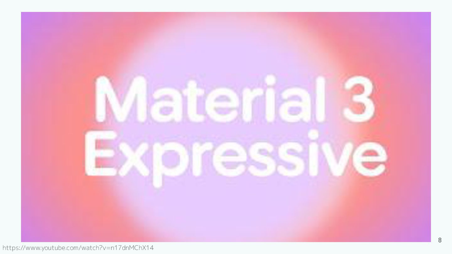
8 https://www.youtube.com/watch?v=n17dnMChX14
目次 ・Material3 Expressiveとは ・Material3 Expressiveの魅力 ・アップデート概要 ・Component紹介 ・エンジニアの声 ・プロダクト特性とMaterial3 Expressive
・Material3 Expressive導入判断の観点 ・まとめ 9
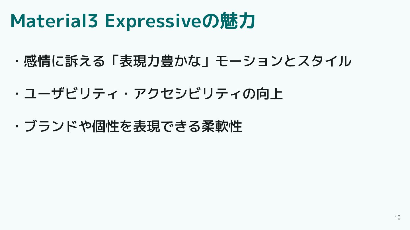
Material3 Expressiveの魅力 10 ・感情に訴える「表現力豊かな」モーションとスタイル ・ユーザビリティ・アクセシビリティの向上 ・ブランドや個性を表現できる柔軟性
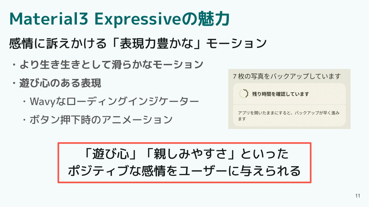
Material3 Expressiveの魅力 ・より生き生きとして滑らかなモーション ・遊び心のある表現 ・Wavyなローディングインジケーター ・ボタン押下時のアニメーション 11 感情に訴えかける「表現力豊かな」モーション 「遊び心」「親しみやすさ」といった ポジティブな感情をユーザーに与えられる
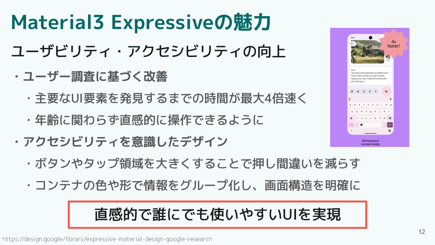
Material3 Expressiveの魅力 ・ユーザー調査に基づく改善 ・主要なUI要素を発見するまでの時間が最大4倍速く ・年齢に関わらず直感的に操作できるように ・アクセシビリティを意識したデザイン ・ボタンやタップ領域を大きくすることで押し間違いを減らす ・コンテナの色や形で情報をグループ化し、画面構造を明確に 12 ユーザビリティ・アクセシビリティの向上
直感的で誰にでも使いやすいUIを実現 https://design.google/library/expressive-material-design-google-research
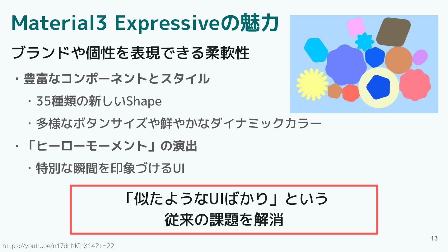
Material3 Expressiveの魅力 ・豊富なコンポーネントとスタイル ・35種類の新しいShape ・多様なボタンサイズや鮮やかなダイナミックカラー ・「ヒーローモーメント」の演出 ・特別な瞬間を印象づけるUI 13 ブランドや個性を表現できる柔軟性 「似たようなUIばかり」という
従来の課題を解消 https://youtu.be/n17dnMChX14?t=22
目次 ・Material3 Expressiveとは ・Material3 Expressiveの魅力 ・アップデート概要 ・Component紹介 ・エンジニアの声 ・プロダクト特性とMaterial3 Expressive
・Material3 Expressive導入判断の観点 ・まとめ 14
M3 Expressiveのアップデート 15 ・Component ・Motion ・Shape ・Typography ・Color System 5つのアップデート
M3 Expressiveのアップデート 16 ・Component ・Motion ・Shape ・Typography ・Color System 5つのアップデート
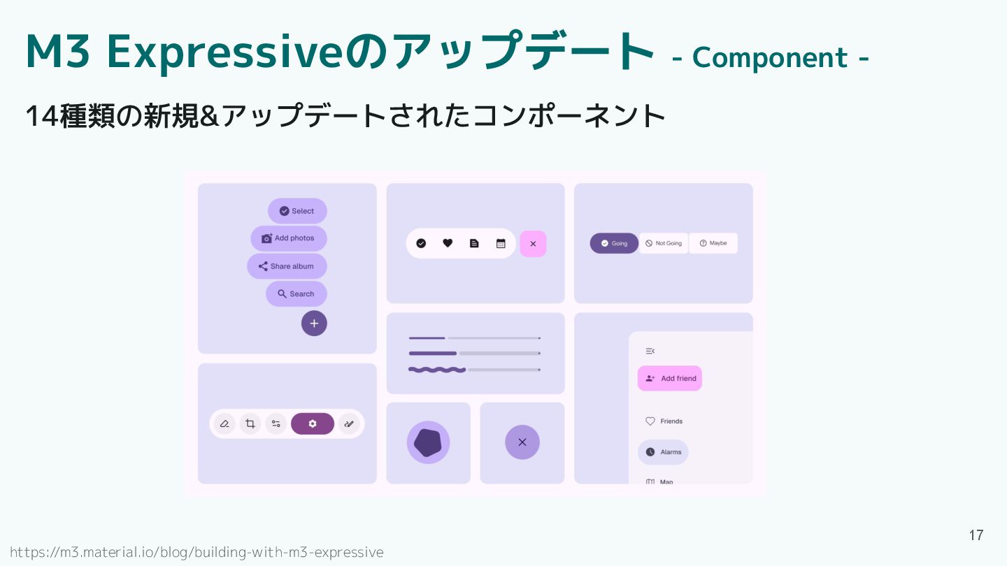
M3 Expressiveのアップデート - Component - 14種類の新規&アップデートされたコンポーネント 17 https://m3.material.io/blog/building-with-m3-expressive
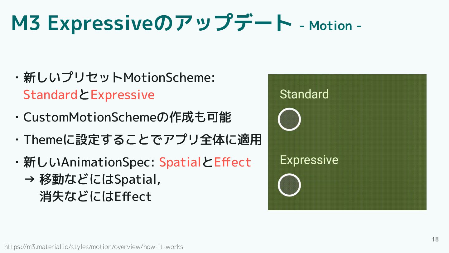
・新しいプリセットMotionScheme: StandardとExpressive ・CustomMotionSchemeの作成も可能 ・Themeに設定することでアプリ全体に適用 ・新しいAnimationSpec: SpatialとEffect → 移動などにはSpatial, 消失などにはEffect
18 M3 Expressiveのアップデート - Motion - https://m3.material.io/styles/motion/overview/how-it-works
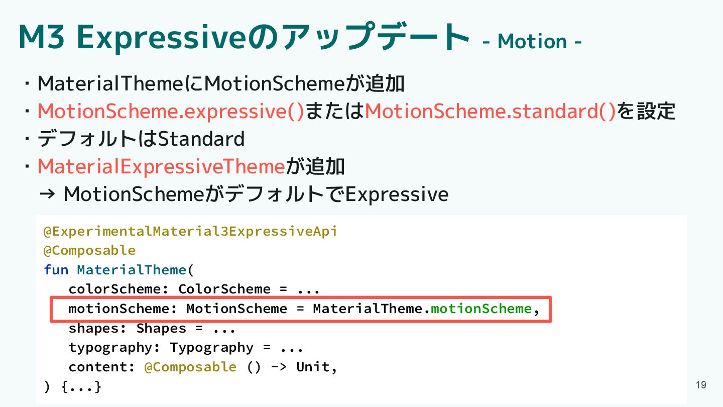
@ExperimentalMaterial3ExpressiveApi @Composable fun MaterialTheme( colorScheme: ColorScheme = ... motionScheme: MotionScheme
= MaterialTheme.motionScheme, shapes: Shapes = ... typography: Typography = ... content: @Composable () -> Unit, ) {...} 19 ・MaterialThemeにMotionSchemeが追加 ・MotionScheme.expressive()またはMotionScheme.standard()を設定 ・デフォルトはStandard ・MaterialExpressiveThemeが追加 → MotionSchemeがデフォルトでExpressive M3 Expressiveのアップデート - Motion -
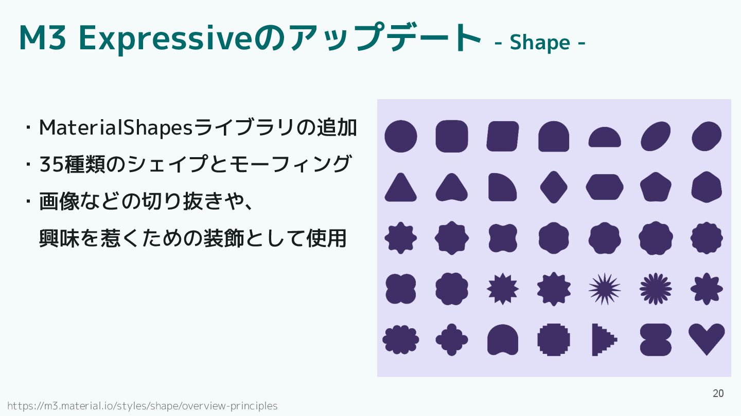
20 https://m3.material.io/styles/shape/overview-principles M3 Expressiveのアップデート - Shape - ・MaterialShapesライブラリの追加 ・35種類のシェイプとモーフィング ・画像などの切り抜きや、
興味を惹くための装飾として使用
目次 ・Material3 Expressiveとは ・Material3 Expressiveの魅力 ・アップデート概要 ・Component紹介 ・エンジニアの声 ・プロダクト特性とMaterial3 Expressive
・Material3 Expressive導入判断の観点 ・まとめ 21
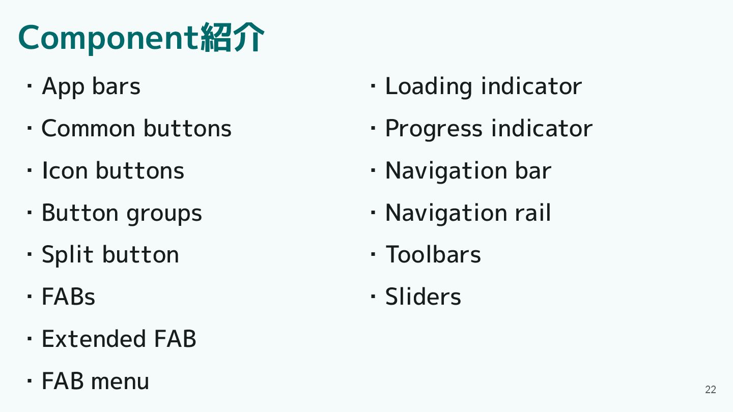
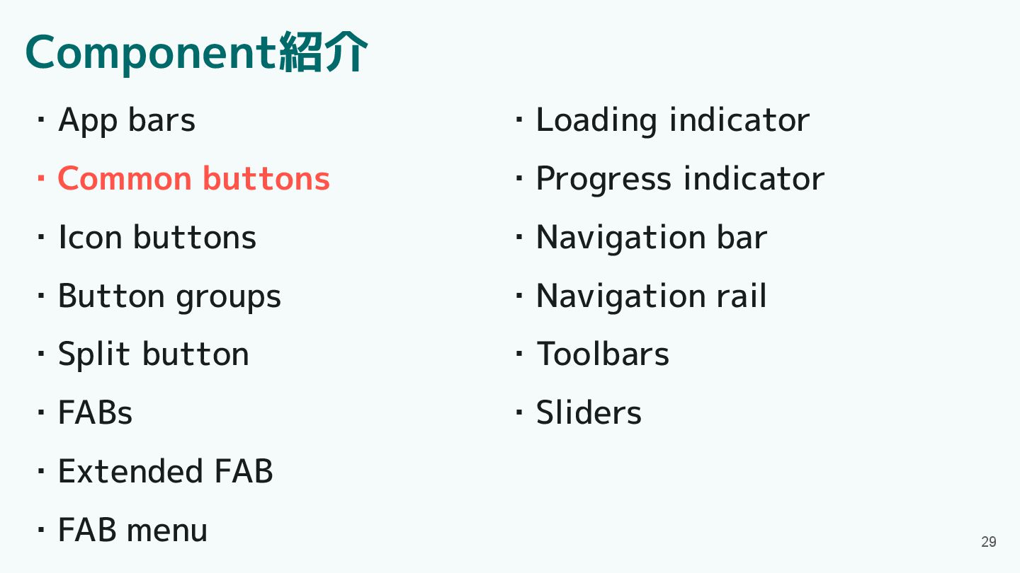
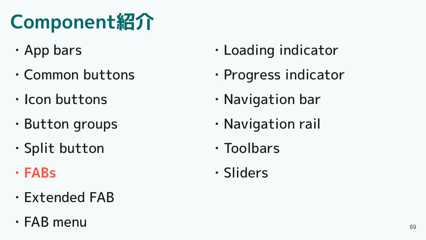
Component紹介 ・App bars ・Common buttons ・Icon buttons ・Button groups ・Split
button ・FABs ・Extended FAB ・FAB menu 22 ・Loading indicator ・Progress indicator ・Navigation bar ・Navigation rail ・Toolbars ・Sliders
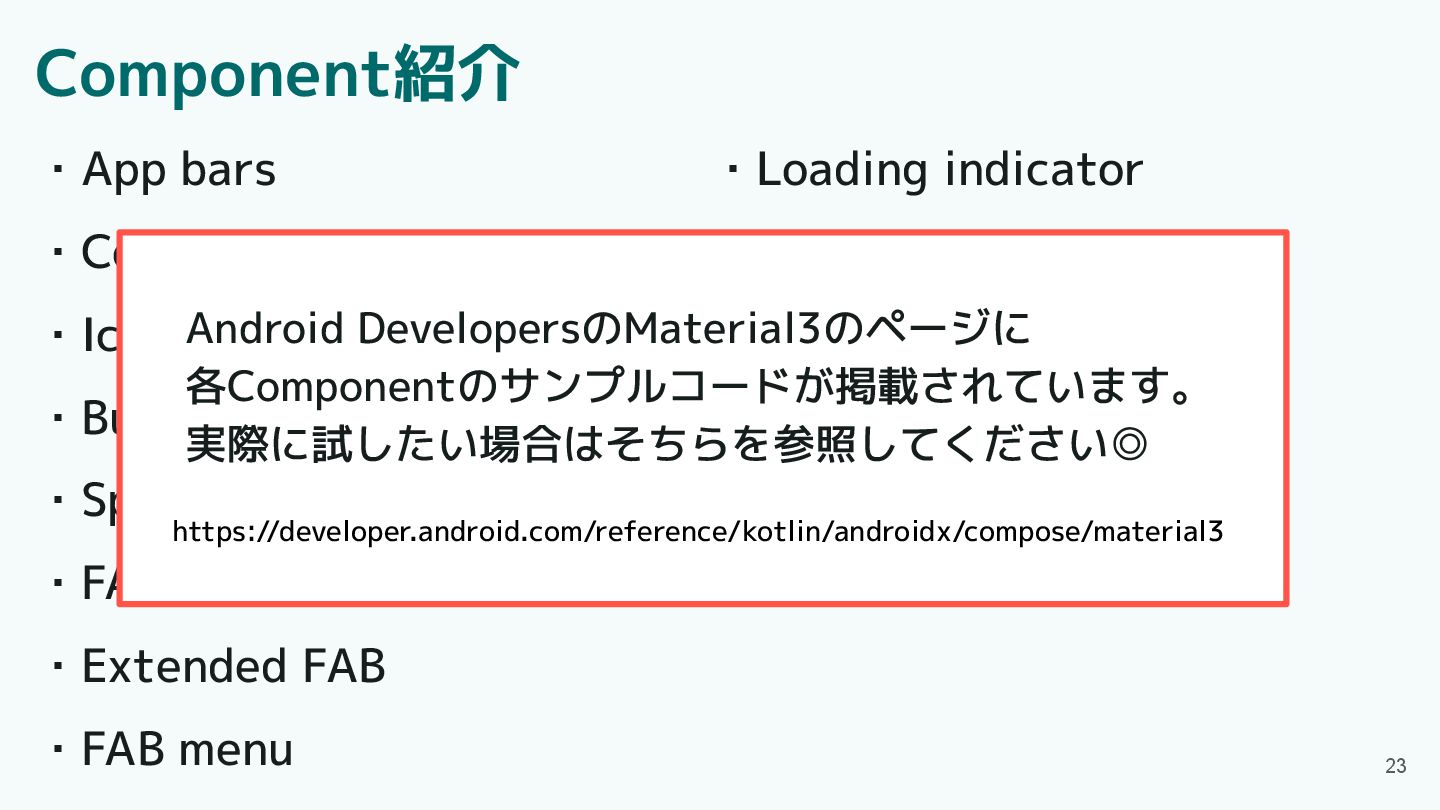
Component紹介 ・App bars ・Common buttons ・Icon buttons ・Button groups ・Split
button ・FABs ・Extended FAB ・FAB menu 23 ・Loading indicator ・Progress indicator ・Navigation bar ・Navigation rail ・Toolbars ・Sliders https://developer.android.com/reference/kotlin/androidx/compose/material3 Android DevelopersのMaterial3のページに 各Componentのサンプルコードが掲載されています。 実際に試したい場合はそちらを参照してください◎
Component紹介 ・App bars ・Common buttons ・Icon buttons ・Button groups ・Split
button ・FABs ・Extended FAB ・FAB menu 24 ・Loading indicator ・Progress indicator ・Navigation bar ・Navigation rail ・Toolbars ・Sliders
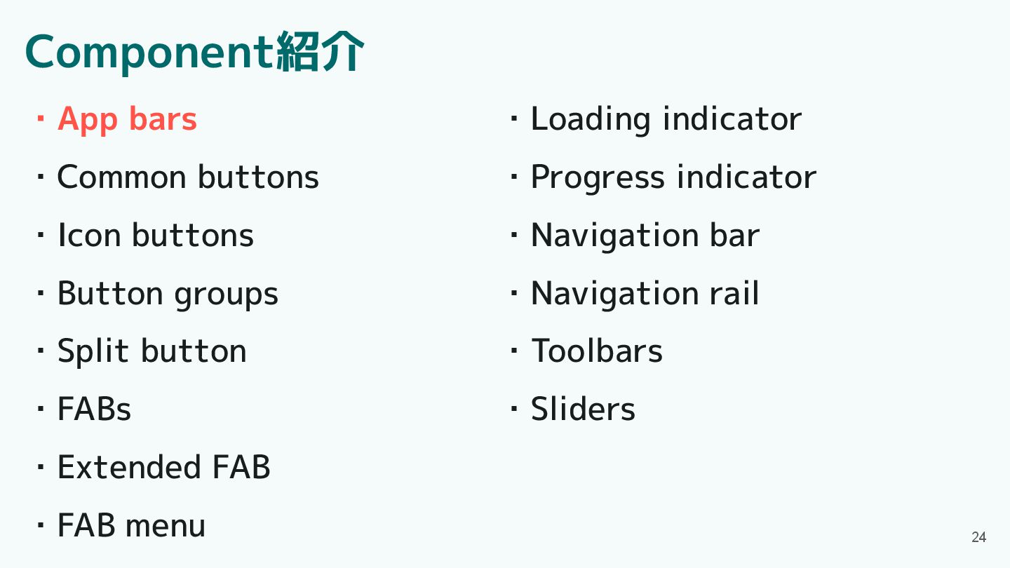
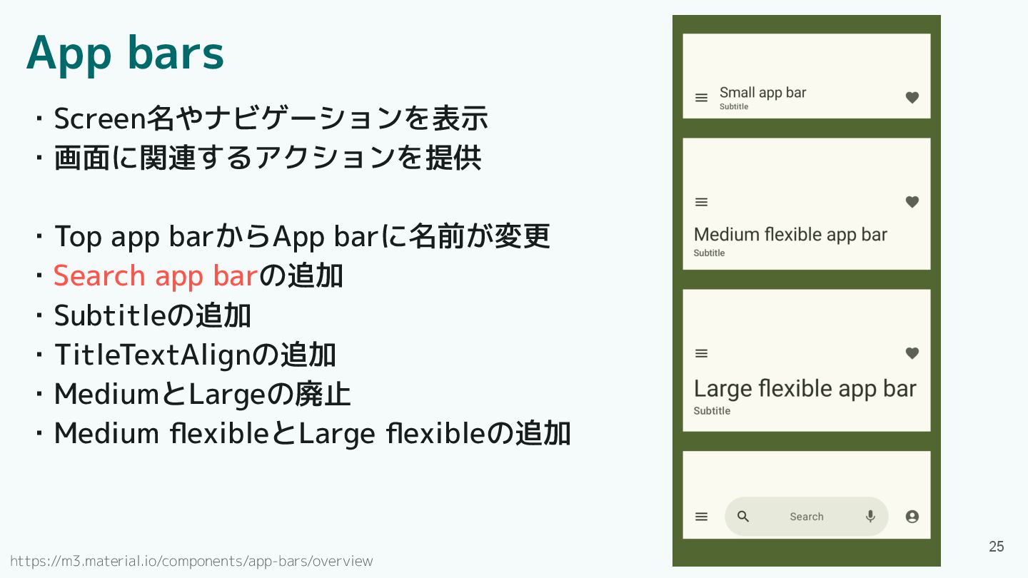
App bars ・Screen名やナビゲーションを表示 ・画面に関連するアクションを提供 ・Top app barからApp barに名前が変更 ・Search app
barの追加 ・Subtitleの追加 ・TitleTextAlignの追加 ・MediumとLargeの廃止 ・Medium flexibleとLarge flexibleの追加 https://m3.material.io/components/app-bars/overview 25
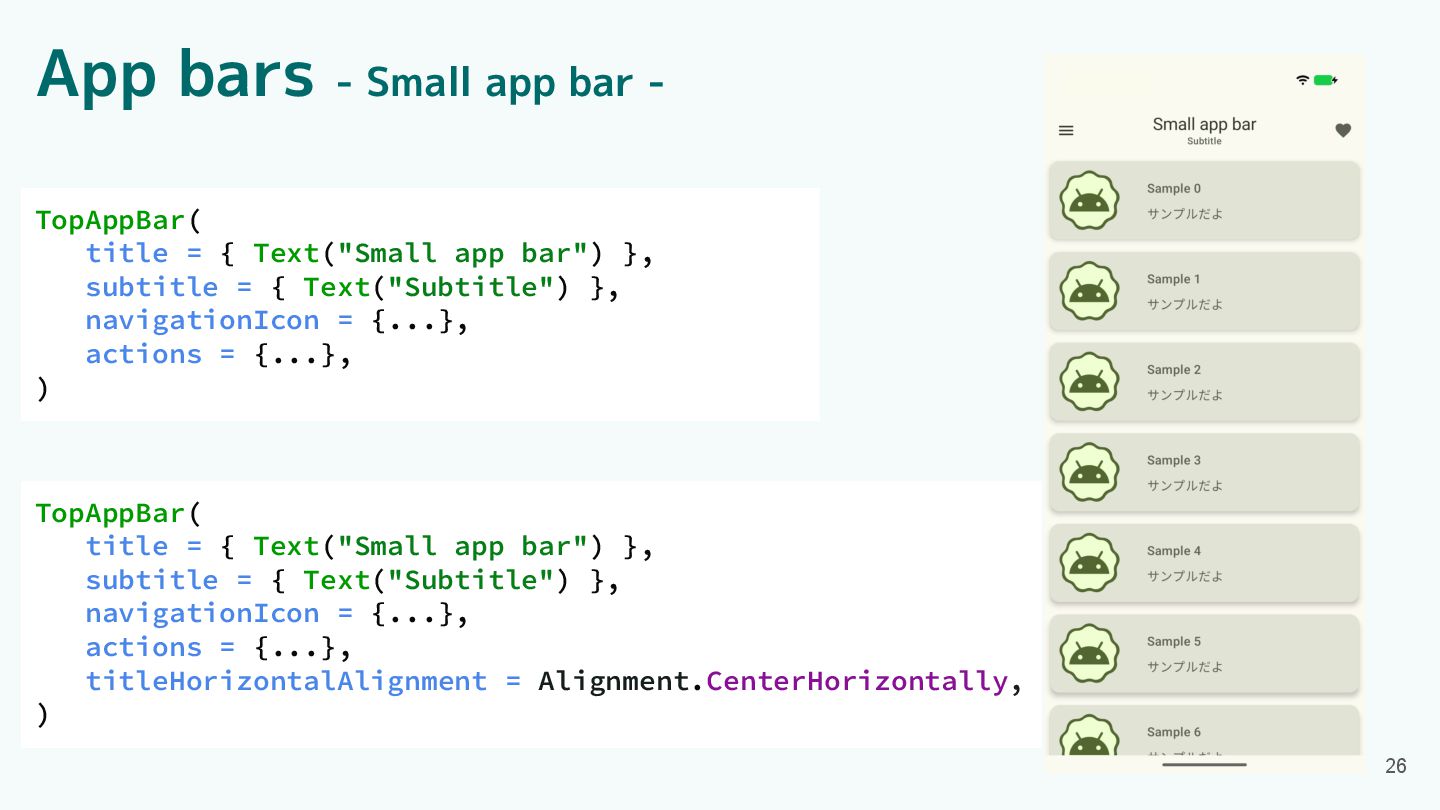
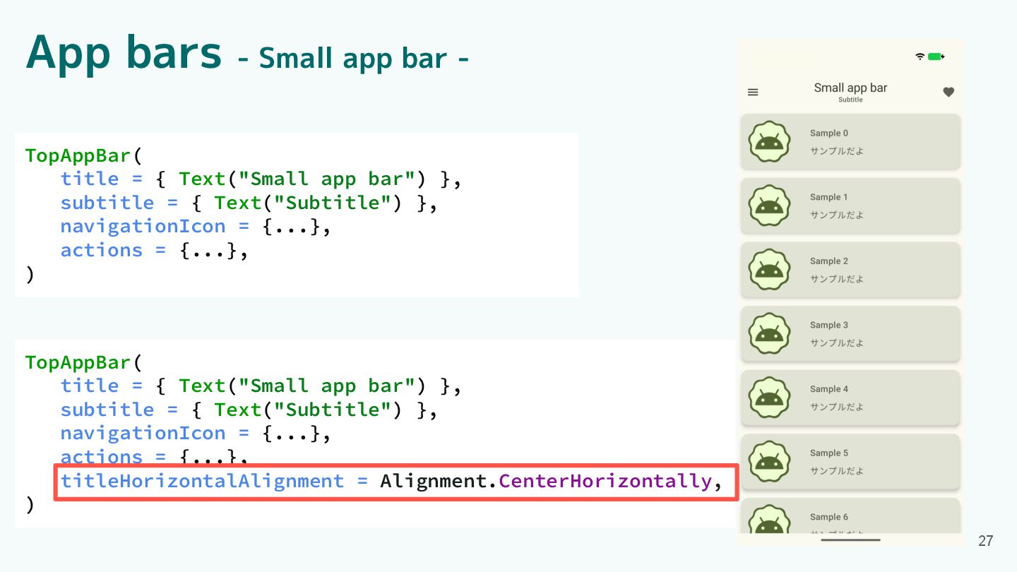
App bars - Small app bar - TopAppBar( title =
{ Text("Small app bar") }, subtitle = { Text("Subtitle") }, navigationIcon = {...}, actions = {...}, titleHorizontalAlignment = Alignment.CenterHorizontally, ) TopAppBar( title = { Text("Small app bar") }, subtitle = { Text("Subtitle") }, navigationIcon = {...}, actions = {...}, ) 26
TopAppBar( title = { Text("Small app bar") }, subtitle =
{ Text("Subtitle") }, navigationIcon = {...}, actions = {...}, titleHorizontalAlignment = Alignment.CenterHorizontally, ) TopAppBar( title = { Text("Small app bar") }, subtitle = { Text("Subtitle") }, navigationIcon = {...}, actions = {...}, ) 27 App bars - Small app bar -
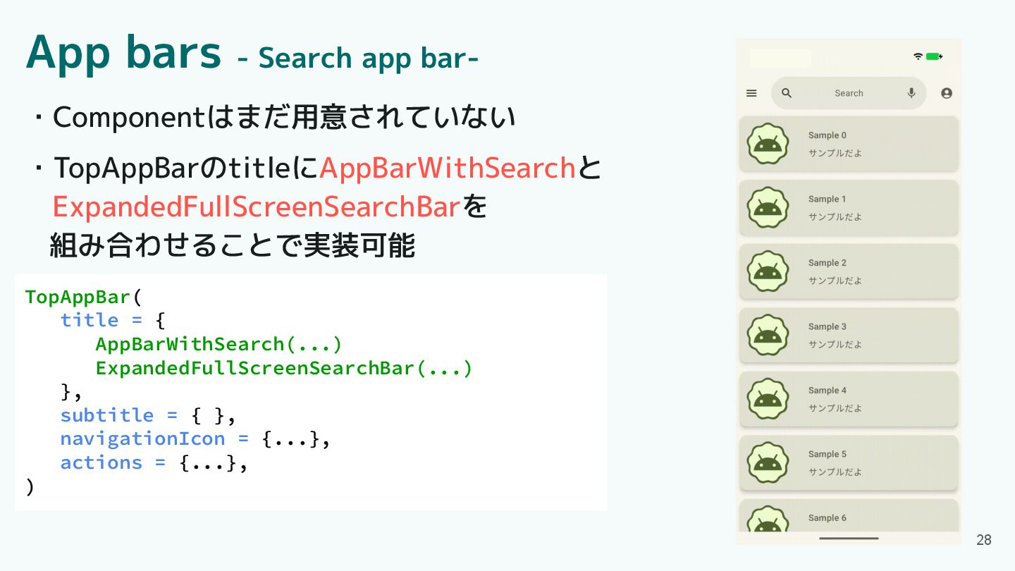
App bars - Search app bar- TopAppBar( title = {
AppBarWithSearch(...) ExpandedFullScreenSearchBar(...) }, subtitle = { }, navigationIcon = {...}, actions = {...}, ) ・Componentはまだ用意されていない ・TopAppBarのtitleにAppBarWithSearchと ExpandedFullScreenSearchBarを 組み合わせることで実装可能 28
Component紹介 ・App bars ・Common buttons ・Icon buttons ・Button groups ・Split
button ・FABs ・Extended FAB ・FAB menu 29 ・Loading indicator ・Progress indicator ・Navigation bar ・Navigation rail ・Toolbars ・Sliders
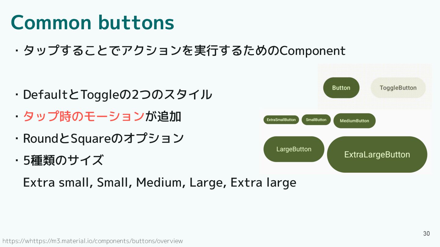
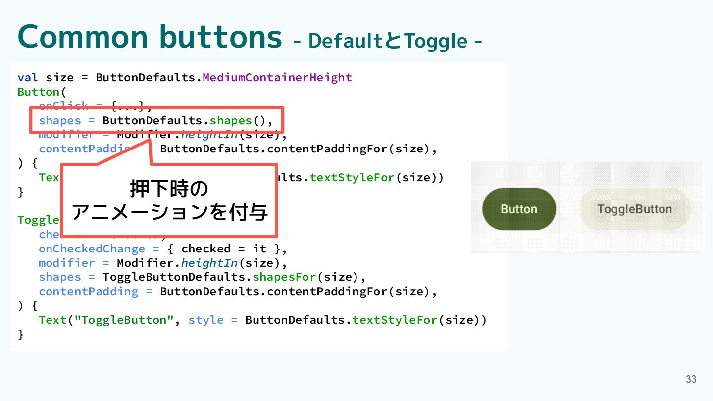
Common buttons ・タップすることでアクションを実行するためのComponent ・DefaultとToggleの2つのスタイル ・タップ時のモーションが追加 ・RoundとSquareのオプション ・5種類のサイズ Extra small, Small,
Medium, Large, Extra large 30 https://whttps://m3.material.io/components/buttons/overview
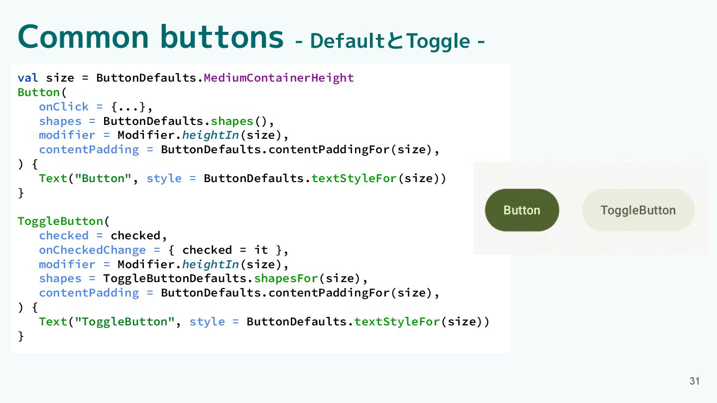
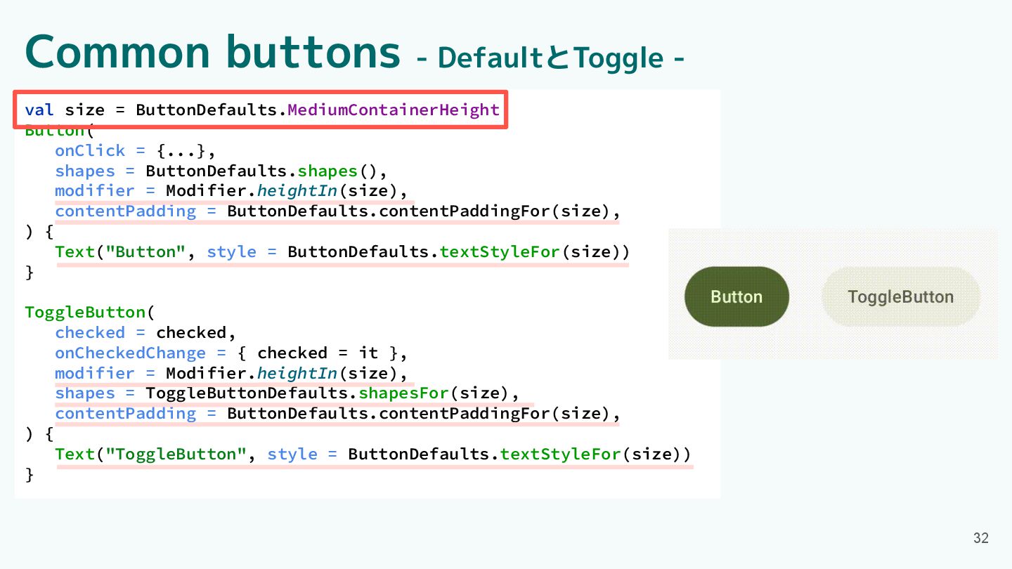
31 val size = ButtonDefaults.MediumContainerHeight Button( onClick = {...}, shapes
= ButtonDefaults.shapes(), modifier = Modifier.heightIn(size), contentPadding = ButtonDefaults.contentPaddingFor(size), ) { Text("Button", style = ButtonDefaults.textStyleFor(size)) } ToggleButton( checked = checked, onCheckedChange = { checked = it }, modifier = Modifier.heightIn(size), shapes = ToggleButtonDefaults.shapesFor(size), contentPadding = ButtonDefaults.contentPaddingFor(size), ) { Text("ToggleButton", style = ButtonDefaults.textStyleFor(size)) } Common buttons - DefaultとToggle -
32 val size = ButtonDefaults.MediumContainerHeight Button( onClick = {...}, shapes
= ButtonDefaults.shapes(), modifier = Modifier.heightIn(size), contentPadding = ButtonDefaults.contentPaddingFor(size), ) { Text("Button", style = ButtonDefaults.textStyleFor(size)) } ToggleButton( checked = checked, onCheckedChange = { checked = it }, modifier = Modifier.heightIn(size), shapes = ToggleButtonDefaults.shapesFor(size), contentPadding = ButtonDefaults.contentPaddingFor(size), ) { Text("ToggleButton", style = ButtonDefaults.textStyleFor(size)) } Common buttons - DefaultとToggle -
33 val size = ButtonDefaults.MediumContainerHeight Button( onClick = {...}, shapes
= ButtonDefaults.shapes(), modifier = Modifier.heightIn(size), contentPadding = ButtonDefaults.contentPaddingFor(size), ) { Text("Button", style = ButtonDefaults.textStyleFor(size)) } ToggleButton( checked = checked, onCheckedChange = { checked = it }, modifier = Modifier.heightIn(size), shapes = ToggleButtonDefaults.shapesFor(size), contentPadding = ButtonDefaults.contentPaddingFor(size), ) { Text("ToggleButton", style = ButtonDefaults.textStyleFor(size)) } 押下時の アニメーションを付与 Common buttons - DefaultとToggle -
34 Button( onClick = {...}, shapes = ButtonDefaults.shapes(), ) {
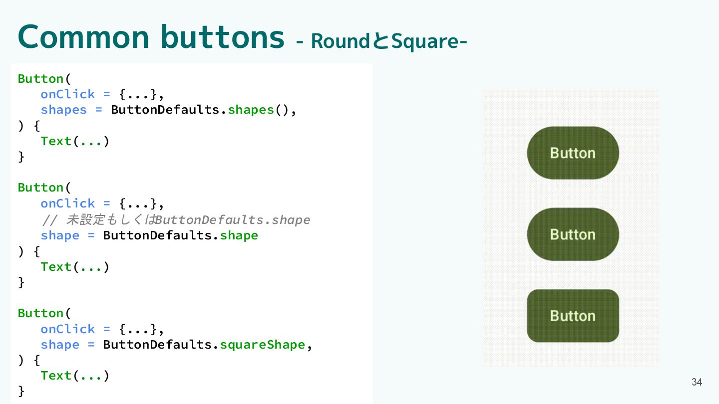
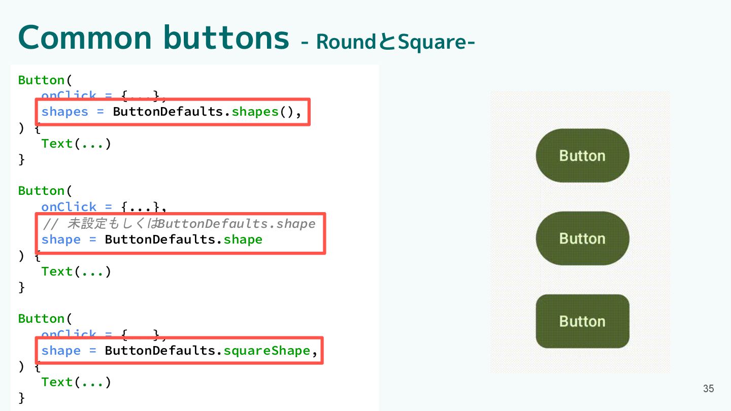
Text(...) } Button( onClick = {...}, // 未設定もしくはButtonDefaults.shape shape = ButtonDefaults.shape ) { Text(...) } Button( onClick = {...}, shape = ButtonDefaults.squareShape, ) { Text(...) } Common buttons - RoundとSquare-
35 Button( onClick = {...}, shapes = ButtonDefaults.shapes(), ) {
Text(...) } Button( onClick = {...}, // 未設定もしくはButtonDefaults.shape shape = ButtonDefaults.shape ) { Text(...) } Button( onClick = {...}, shape = ButtonDefaults.squareShape, ) { Text(...) } Common buttons - RoundとSquare-
Component紹介 ・App bars ・Common buttons ・Icon buttons ・Button groups ・Split
button ・FABs ・Extended FAB ・FAB menu 36 ・Loading indicator ・Progress indicator ・Navigation bar ・Navigation rail ・Toolbars ・Sliders
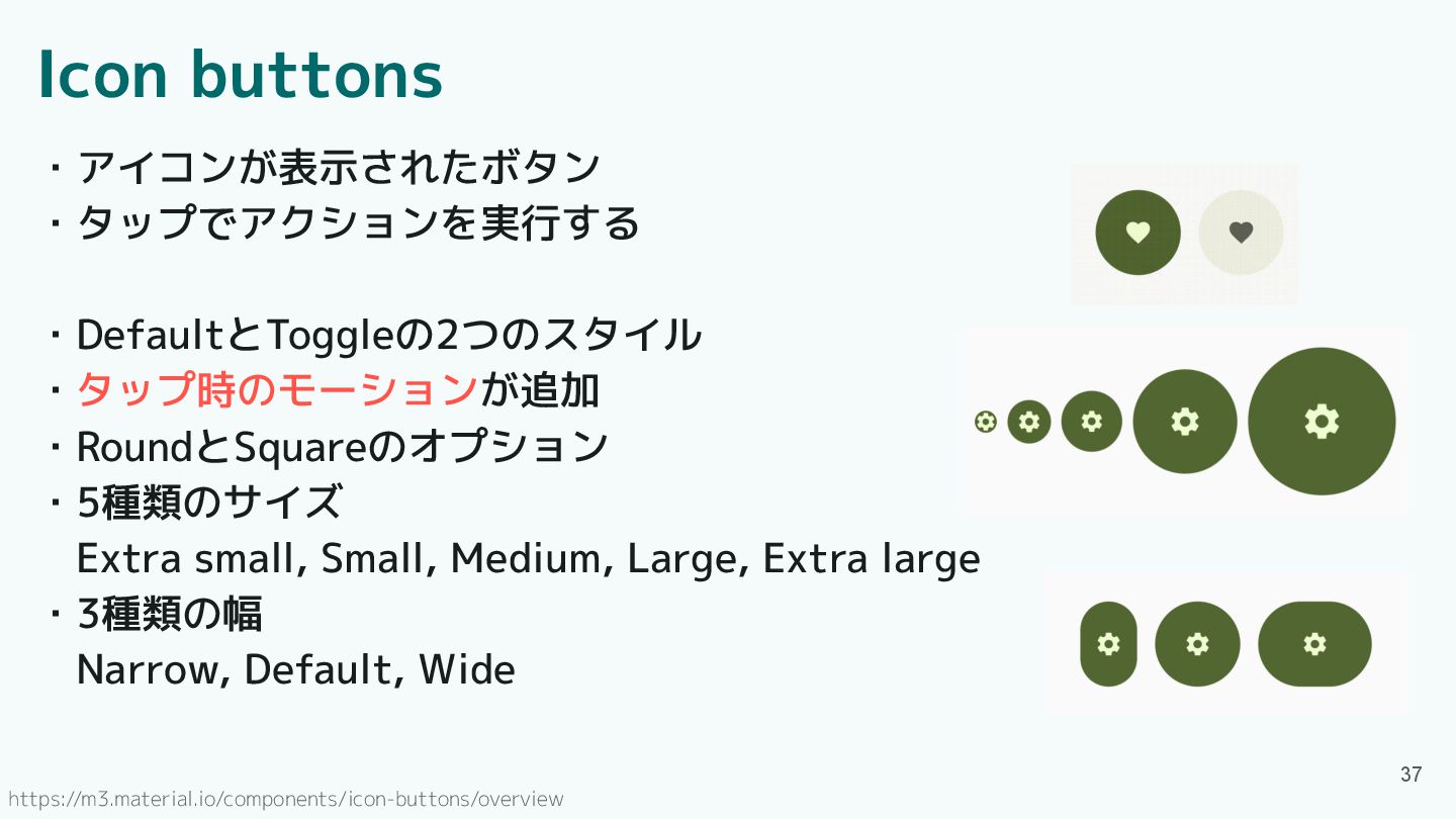
Icon buttons ・アイコンが表示されたボタン ・タップでアクションを実行する ・DefaultとToggleの2つのスタイル ・タップ時のモーションが追加 ・RoundとSquareのオプション ・5種類のサイズ Extra small,
Small, Medium, Large, Extra large ・3種類の幅 Narrow, Default, Wide 37 https://m3.material.io/components/icon-buttons/overview
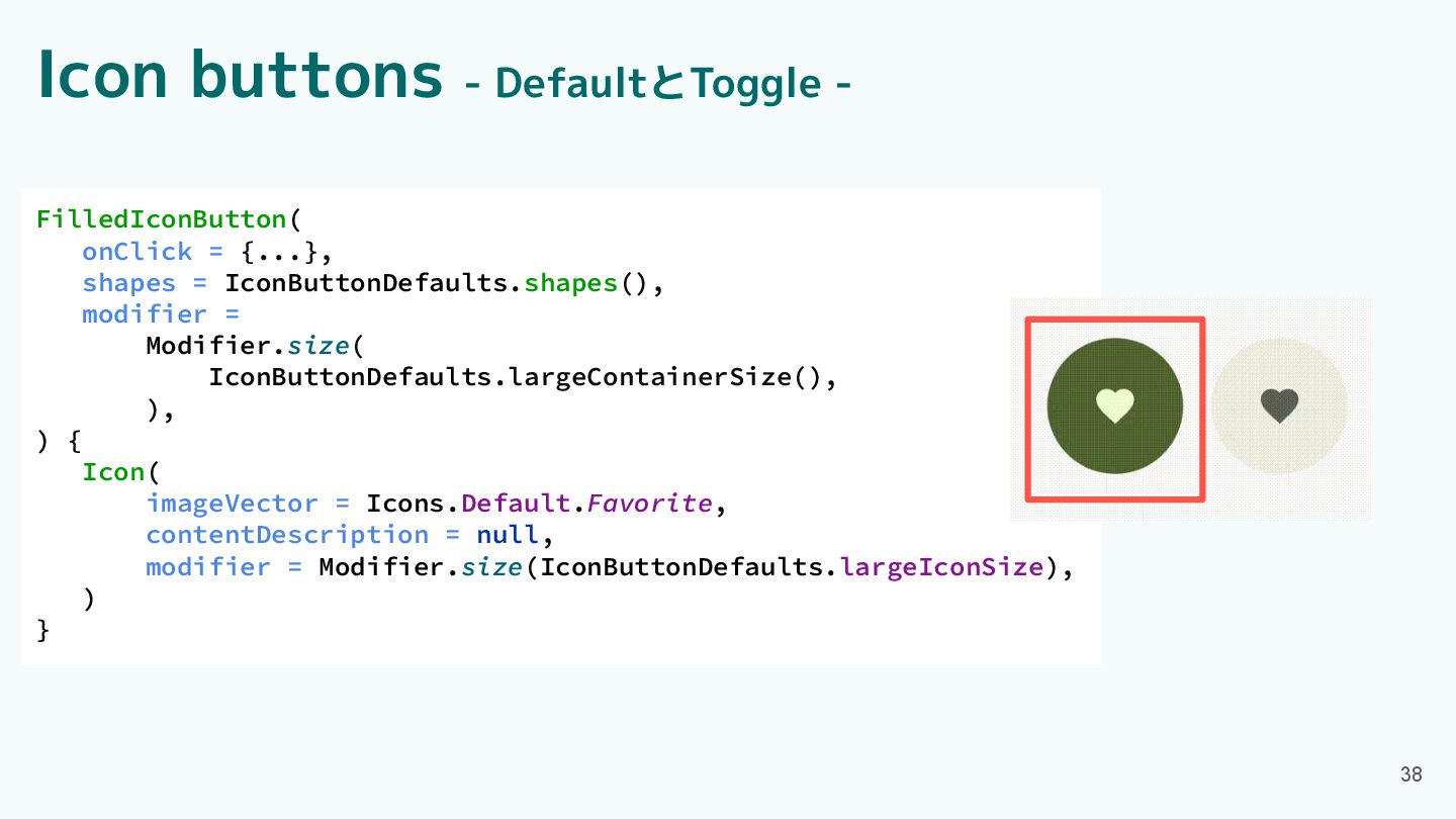
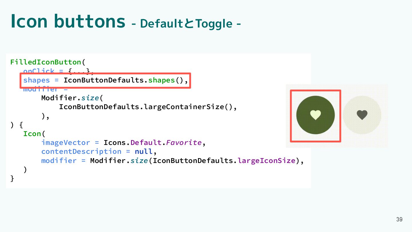
Icon buttons - DefaultとToggle - 38 FilledIconButton( onClick = {...},
shapes = IconButtonDefaults.shapes(), modifier = Modifier.size( IconButtonDefaults.largeContainerSize(), ), ) { Icon( imageVector = Icons.Default.Favorite, contentDescription = null, modifier = Modifier.size(IconButtonDefaults.largeIconSize), ) }
Icon buttons - DefaultとToggle - 39 FilledIconButton( onClick = {...},
shapes = IconButtonDefaults.shapes(), modifier = Modifier.size( IconButtonDefaults.largeContainerSize(), ), ) { Icon( imageVector = Icons.Default.Favorite, contentDescription = null, modifier = Modifier.size(IconButtonDefaults.largeIconSize), ) }
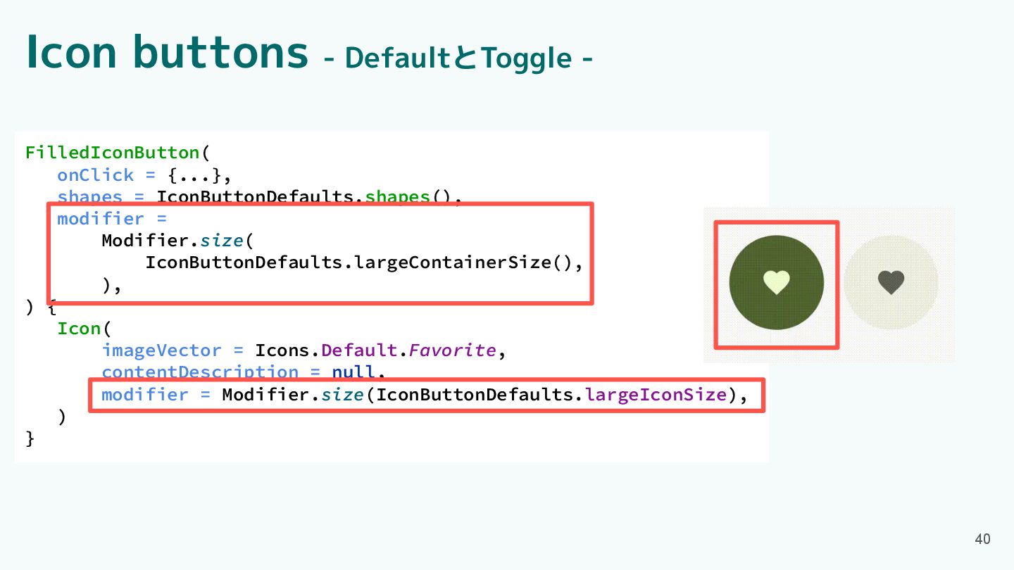
40 FilledIconButton( onClick = {...}, shapes = IconButtonDefaults.shapes(), modifier =
Modifier.size( IconButtonDefaults.largeContainerSize(), ), ) { Icon( imageVector = Icons.Default.Favorite, contentDescription = null, modifier = Modifier.size(IconButtonDefaults.largeIconSize), ) } Icon buttons - DefaultとToggle -
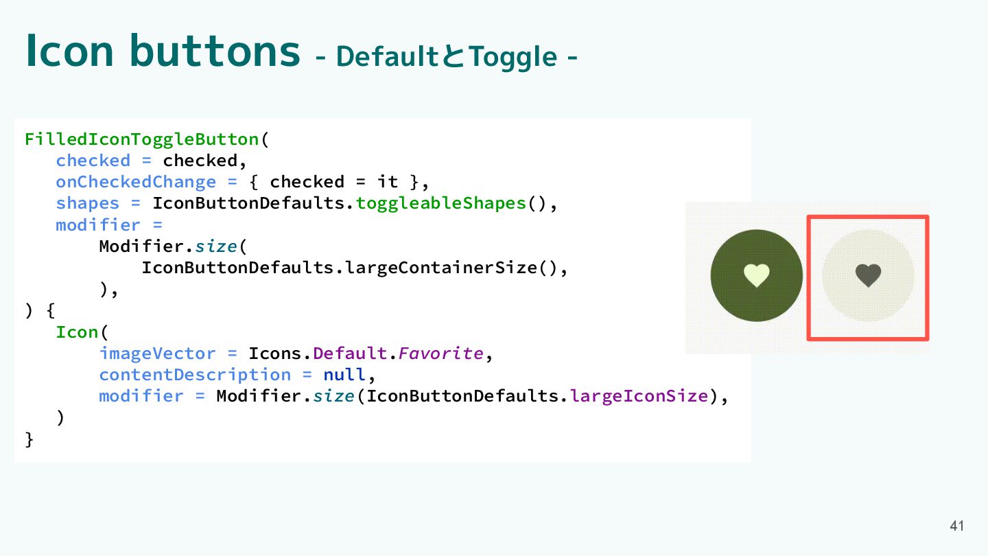
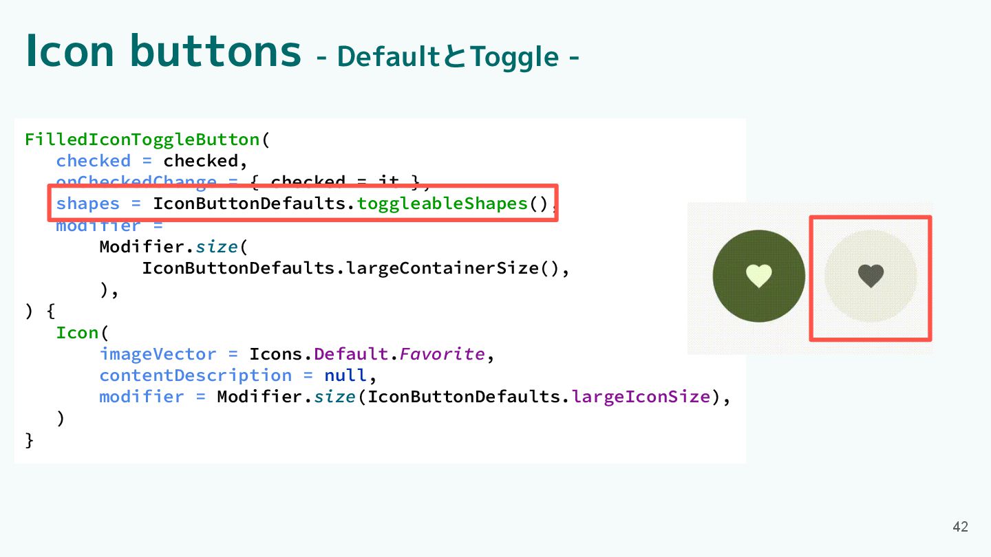
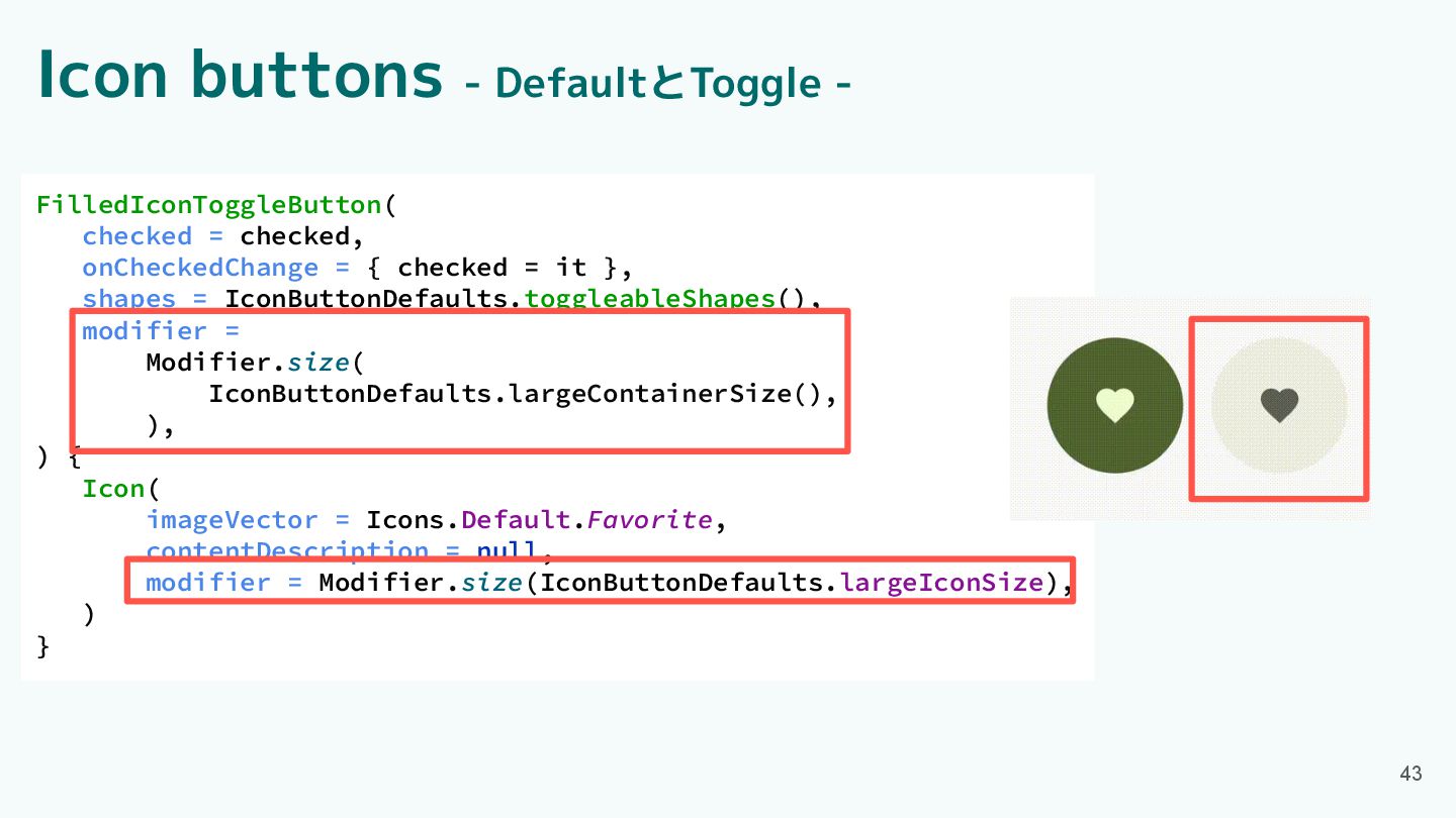
41 FilledIconToggleButton( checked = checked, onCheckedChange = { checked =
it }, shapes = IconButtonDefaults.toggleableShapes(), modifier = Modifier.size( IconButtonDefaults.largeContainerSize(), ), ) { Icon( imageVector = Icons.Default.Favorite, contentDescription = null, modifier = Modifier.size(IconButtonDefaults.largeIconSize), ) } Icon buttons - DefaultとToggle -
42 FilledIconToggleButton( checked = checked, onCheckedChange = { checked =
it }, shapes = IconButtonDefaults.toggleableShapes(), modifier = Modifier.size( IconButtonDefaults.largeContainerSize(), ), ) { Icon( imageVector = Icons.Default.Favorite, contentDescription = null, modifier = Modifier.size(IconButtonDefaults.largeIconSize), ) } Icon buttons - DefaultとToggle -
43 FilledIconToggleButton( checked = checked, onCheckedChange = { checked =
it }, shapes = IconButtonDefaults.toggleableShapes(), modifier = Modifier.size( IconButtonDefaults.largeContainerSize(), ), ) { Icon( imageVector = Icons.Default.Favorite, contentDescription = null, modifier = Modifier.size(IconButtonDefaults.largeIconSize), ) } Icon buttons - DefaultとToggle -
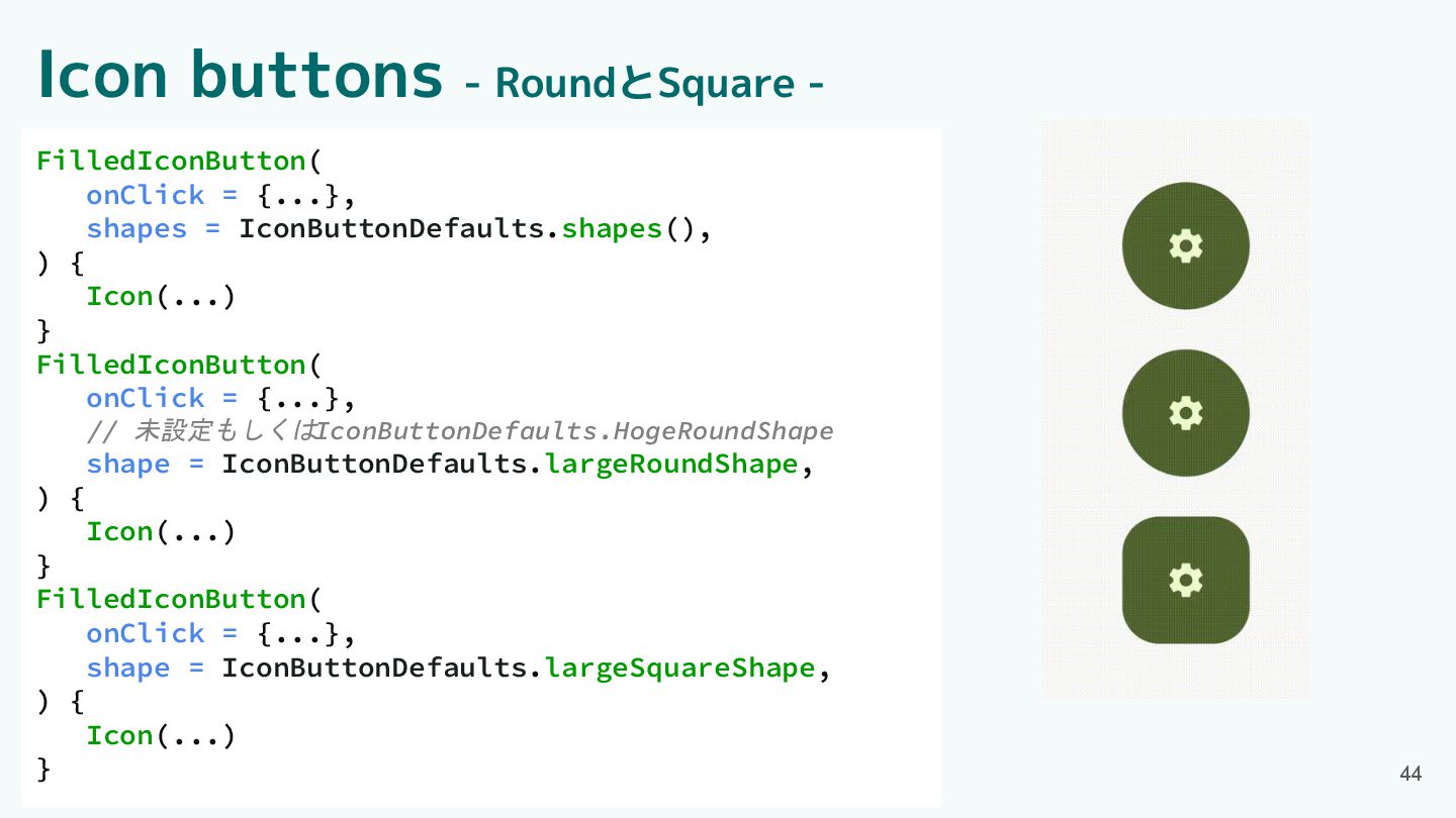
FilledIconButton( onClick = {...}, shapes = IconButtonDefaults.shapes(), ) { Icon(...)
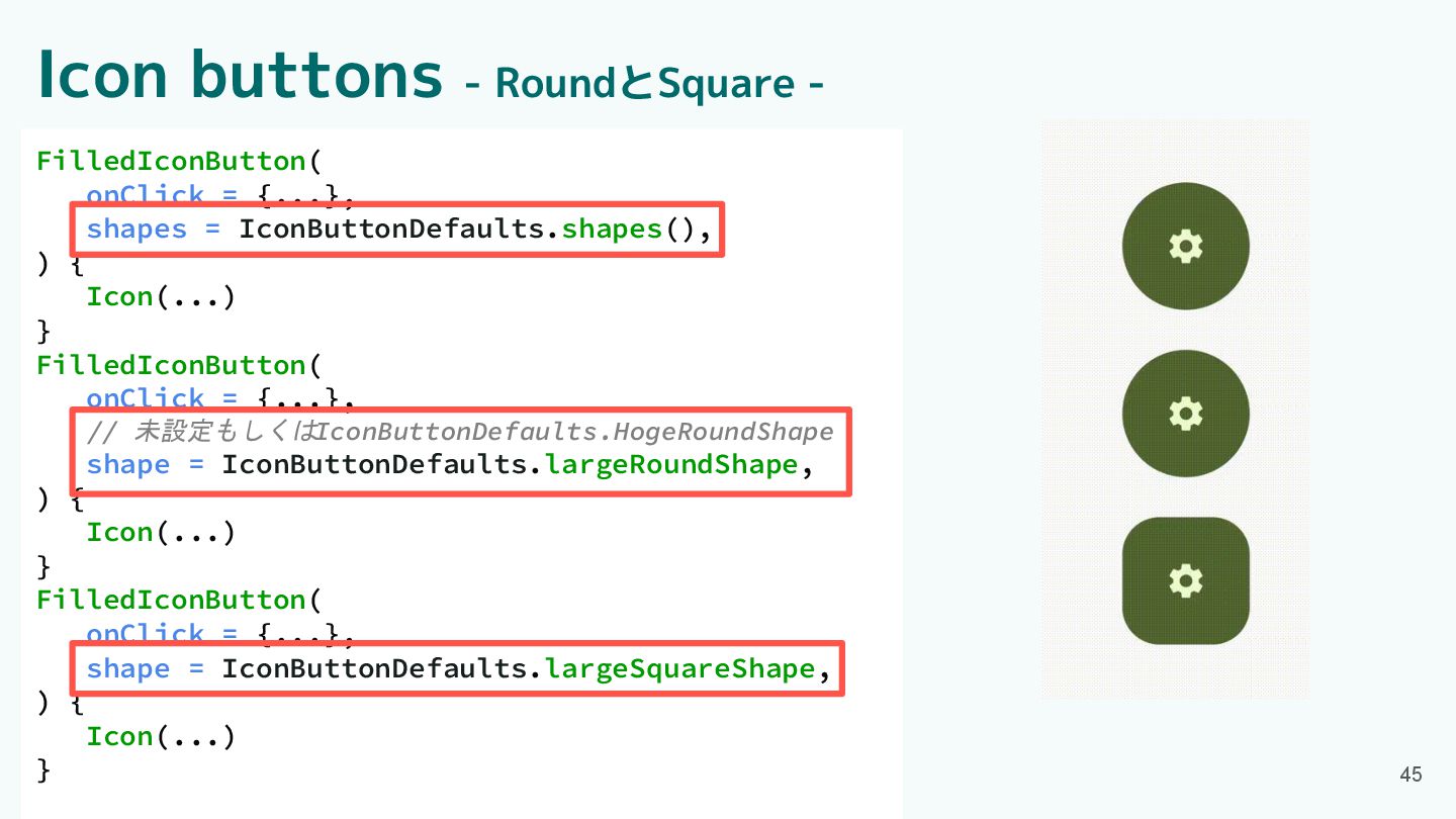
} FilledIconButton( onClick = {...}, // 未設定もしくはIconButtonDefaults.HogeRoundShape shape = IconButtonDefaults.largeRoundShape, ) { Icon(...) } FilledIconButton( onClick = {...}, shape = IconButtonDefaults.largeSquareShape, ) { Icon(...) } 44 Icon buttons - RoundとSquare -
FilledIconButton( onClick = {...}, shapes = IconButtonDefaults.shapes(), ) { Icon(...)
} FilledIconButton( onClick = {...}, // 未設定もしくはIconButtonDefaults.HogeRoundShape shape = IconButtonDefaults.largeRoundShape, ) { Icon(...) } FilledIconButton( onClick = {...}, shape = IconButtonDefaults.largeSquareShape, ) { Icon(...) } 45 Icon buttons - RoundとSquare -
Component紹介 ・App bars ・Common buttons ・Icon buttons ・Button groups ・Split
button ・FABs ・Extended FAB ・FAB menu 46 ・Loading indicator ・Progress indicator ・Navigation bar ・Navigation rail ・Toolbars ・Sliders
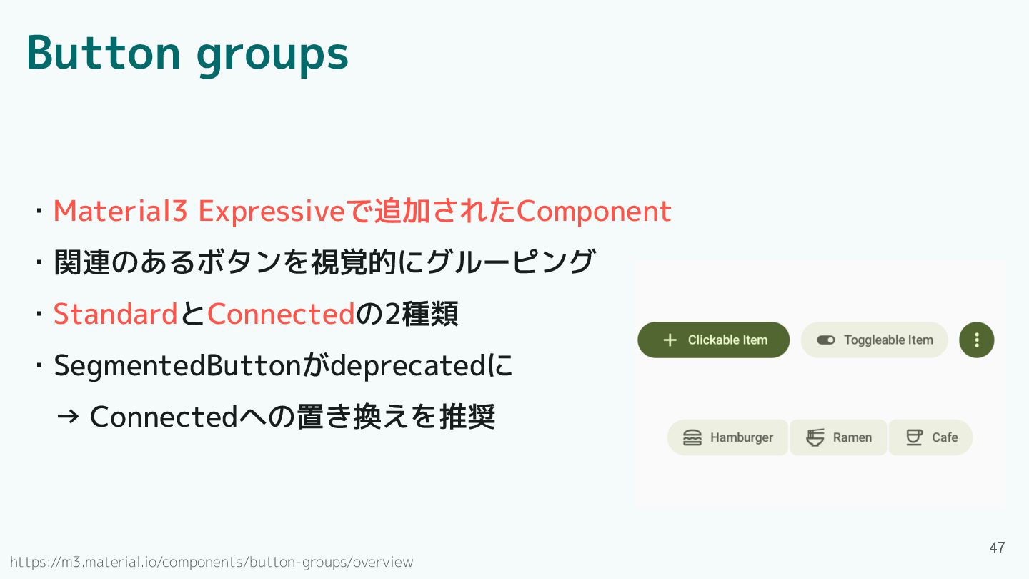
Button groups ・Material3 Expressiveで追加されたComponent ・関連のあるボタンを視覚的にグルーピング ・StandardとConnectedの2種類 ・SegmentedButtonがdeprecatedに → Connectedへの置き換えを推奨 https://m3.material.io/components/button-groups/overview
47
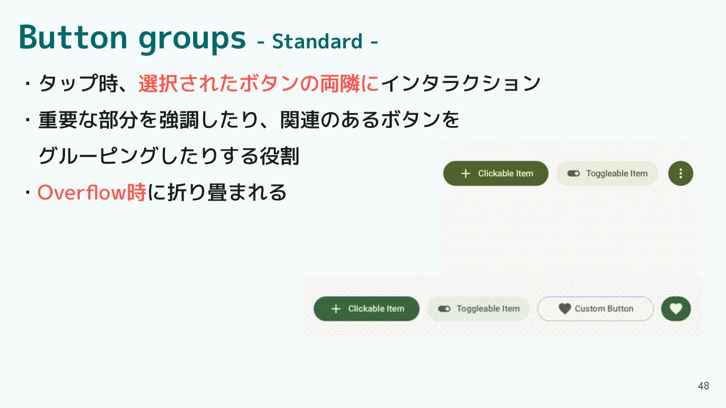
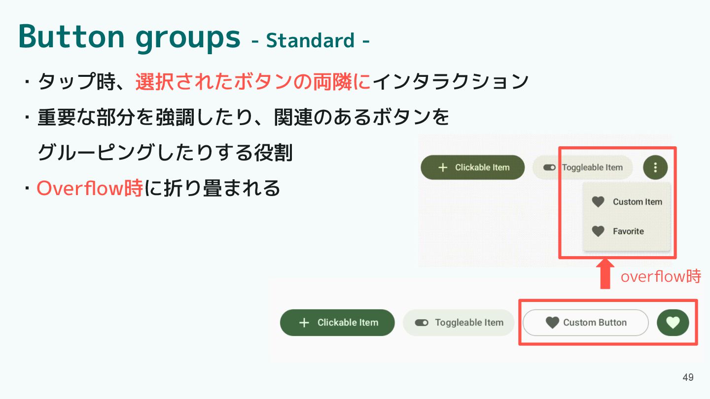
Button groups - Standard - ・タップ時、選択されたボタンの両隣にインタラクション ・重要な部分を強調したり、関連のあるボタンを グルーピングしたりする役割 ・Overflow時に折り畳まれる 48
Button groups - Standard - 49 overflow時 ・タップ時、選択されたボタンの両隣にインタラクション ・重要な部分を強調したり、関連のあるボタンを グルーピングしたりする役割
・Overflow時に折り畳まれる
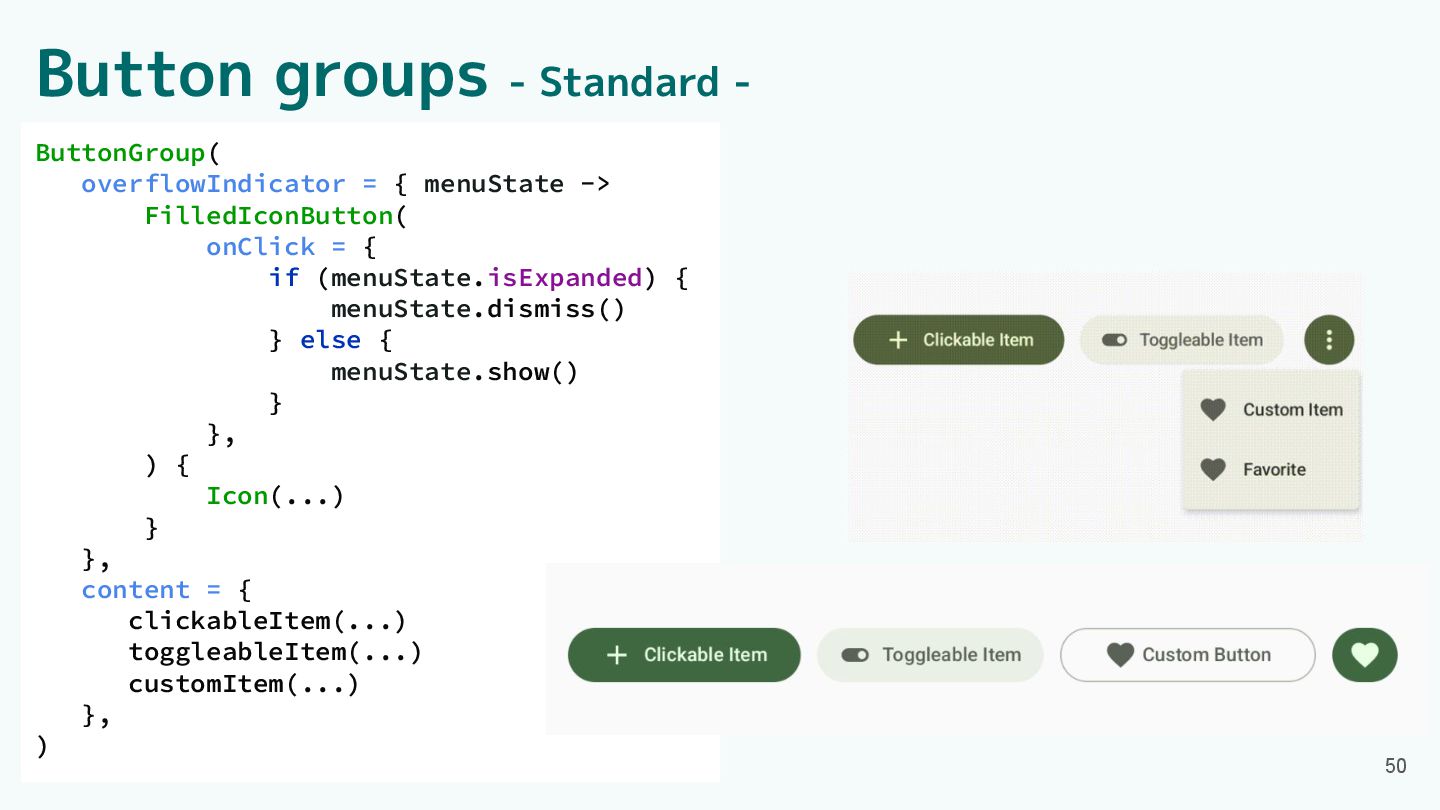
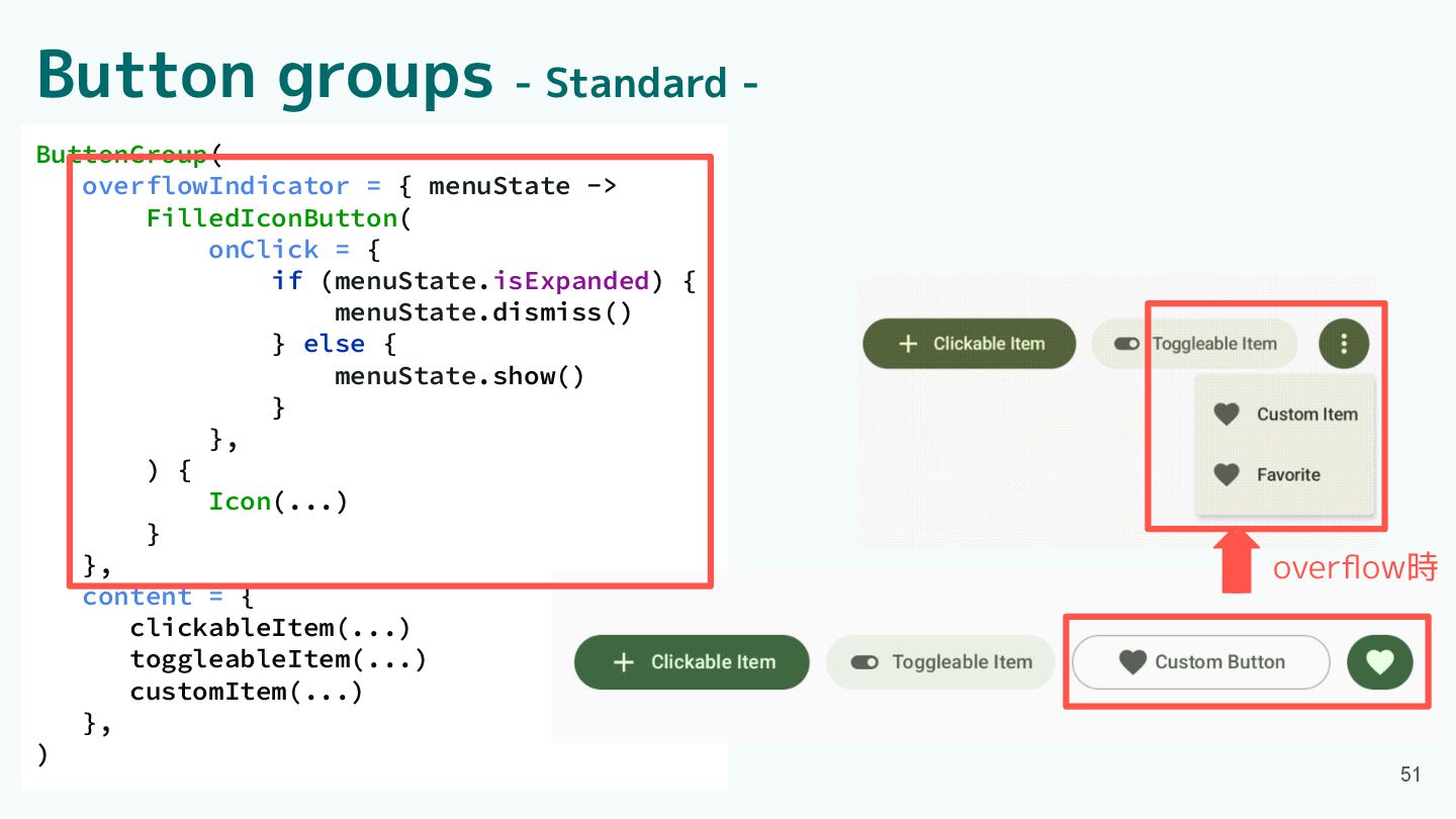
ButtonGroup( overflowIndicator = { menuState -> FilledIconButton( onClick = {
if (menuState.isExpanded) { menuState.dismiss() } else { menuState.show() } }, ) { Icon(...) } }, content = { clickableItem(...) toggleableItem(...) customItem(...) }, ) Button groups - Standard - 50
ButtonGroup( overflowIndicator = { menuState -> FilledIconButton( onClick = {
if (menuState.isExpanded) { menuState.dismiss() } else { menuState.show() } }, ) { Icon(...) } }, content = { clickableItem(...) toggleableItem(...) customItem(...) }, ) overflow時 Button groups - Standard - 51
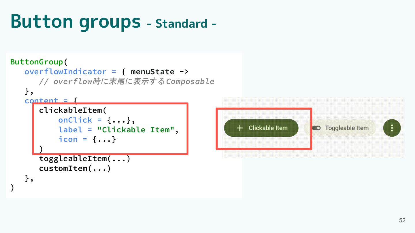
Button groups - Standard - ButtonGroup( overflowIndicator = { menuState
-> // overflow時に末尾に表示する Composable }, content = { clickableItem( onClick = {...}, label = "Clickable Item", icon = {...} ) toggleableItem(...) customItem(...) }, ) 52
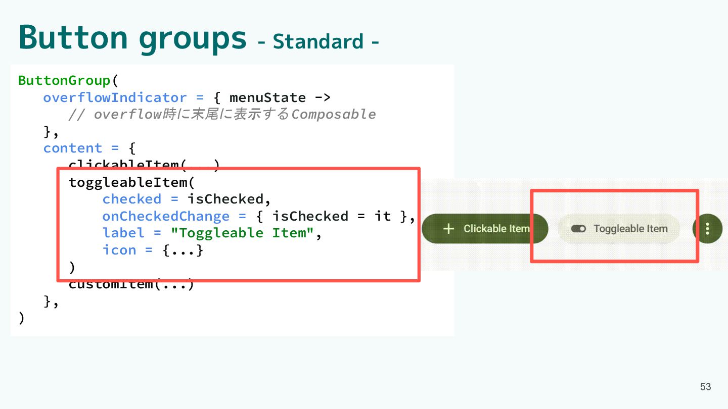
ButtonGroup( overflowIndicator = { menuState -> // overflow時に末尾に表示する Composable },
content = { clickableItem(...) toggleableItem( checked = isChecked, onCheckedChange = { isChecked = it }, label = "Toggleable Item", icon = {...} ) customItem(...) }, ) Button groups - Standard - 53
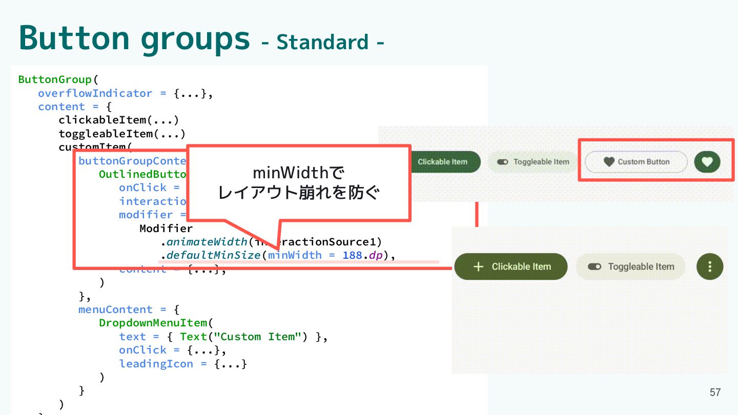
Button groups - Standard - ButtonGroup( overflowIndicator = {...}, content
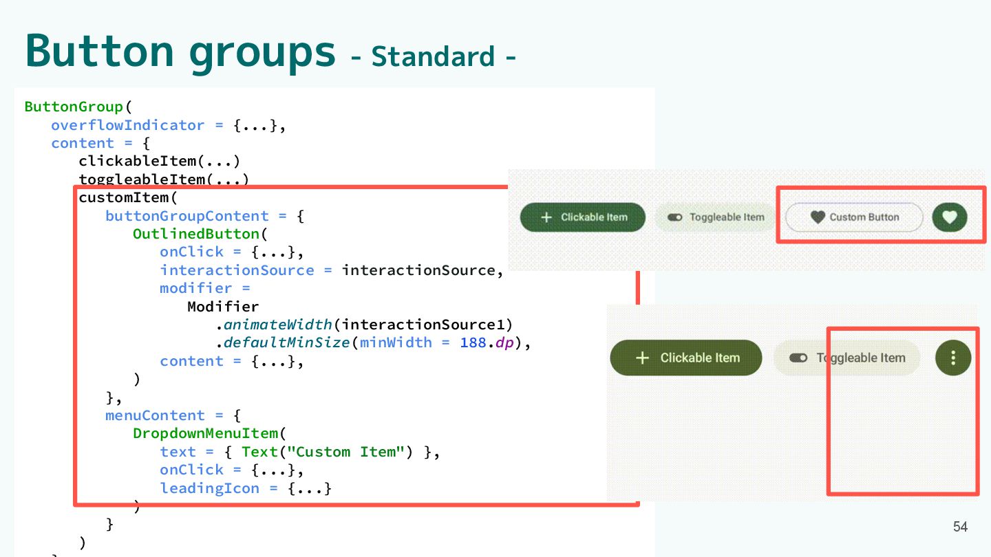
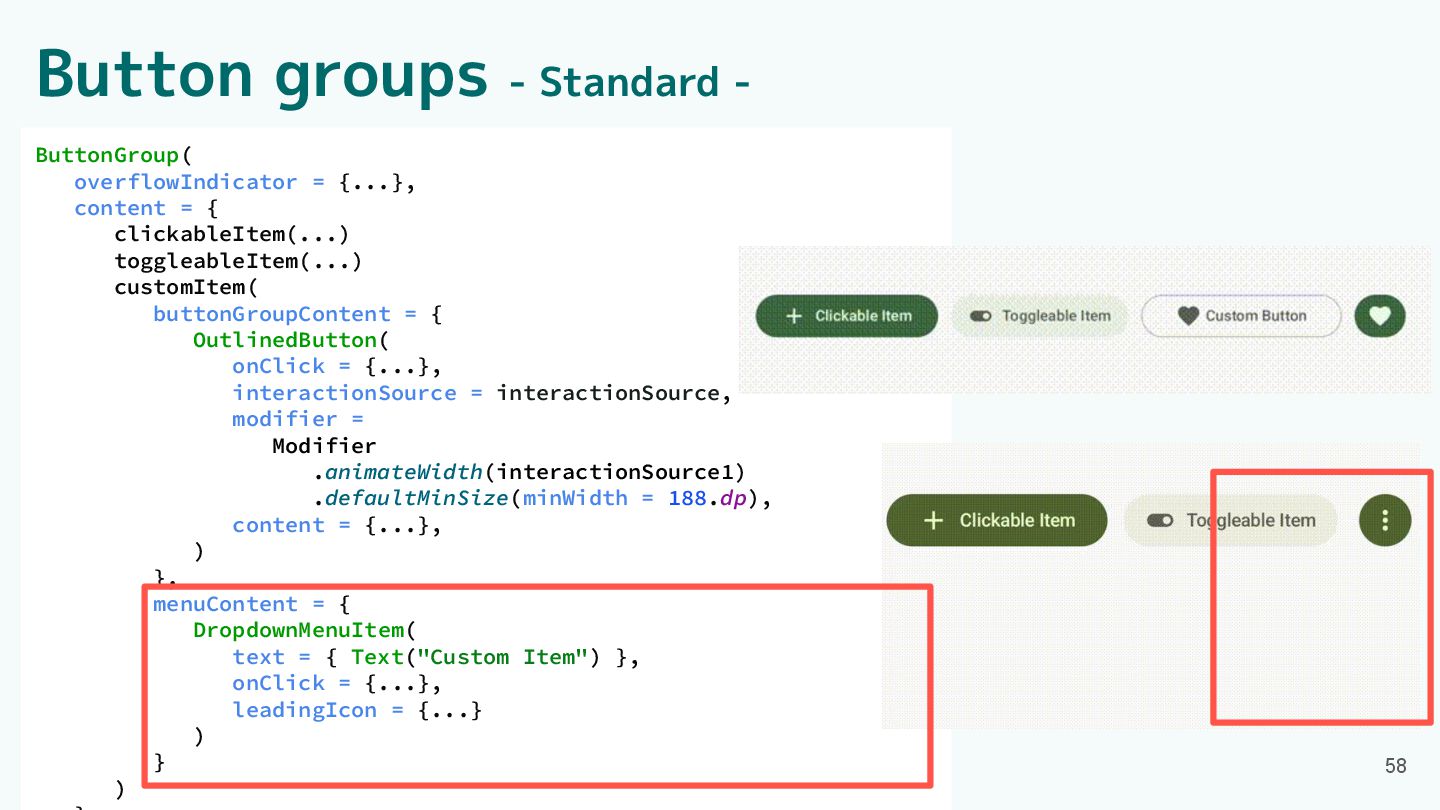
= { clickableItem(...) toggleableItem(...) customItem( buttonGroupContent = { OutlinedButton( onClick = {...}, interactionSource = interactionSource, modifier = Modifier .animateWidth(interactionSource1) .defaultMinSize(minWidth = 188.dp), content = {...}, ) }, menuContent = { DropdownMenuItem( text = { Text("Custom Item") }, onClick = {...}, leadingIcon = {...} ) } ) 54
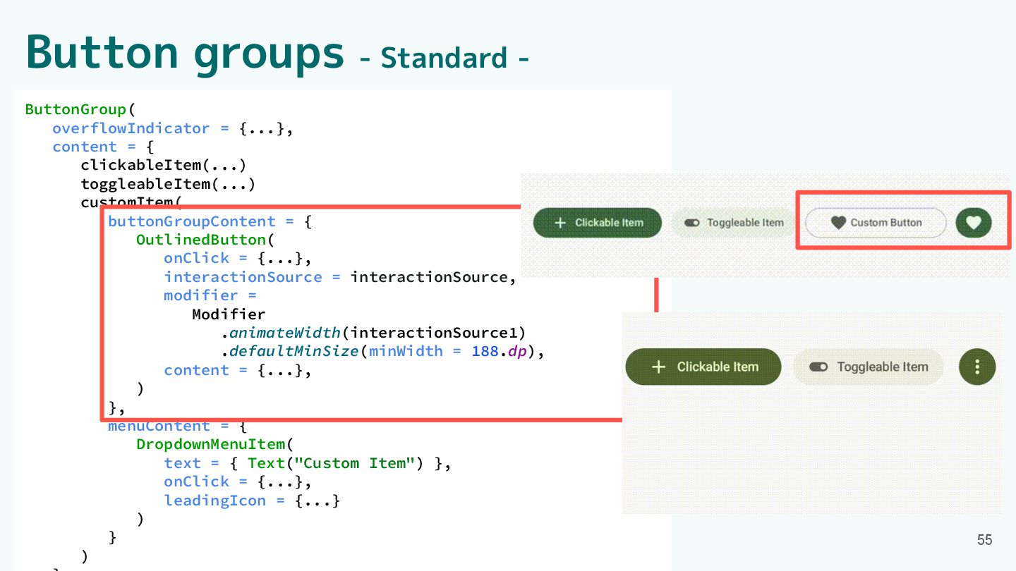
ButtonGroup( overflowIndicator = {...}, content = { clickableItem(...) toggleableItem(...) customItem(
buttonGroupContent = { OutlinedButton( onClick = {...}, interactionSource = interactionSource, modifier = Modifier .animateWidth(interactionSource1) .defaultMinSize(minWidth = 188.dp), content = {...}, ) }, menuContent = { DropdownMenuItem( text = { Text("Custom Item") }, onClick = {...}, leadingIcon = {...} ) } ) Button groups - Standard - 55
ButtonGroup( overflowIndicator = {...}, content = { clickableItem(...) toggleableItem(...) customItem(
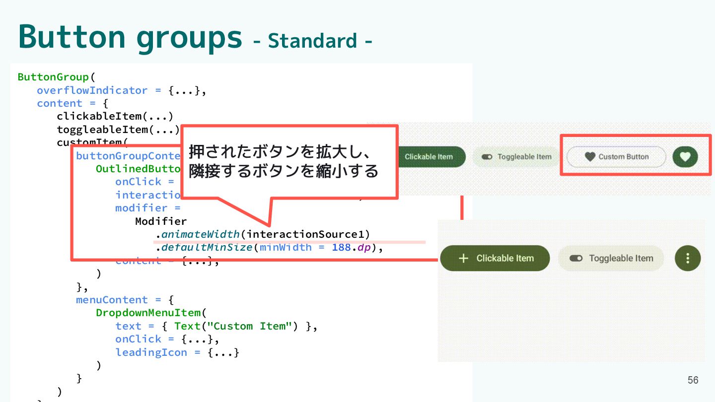
buttonGroupContent = { OutlinedButton( onClick = {...}, interactionSource = interactionSource, modifier = Modifier .animateWidth(interactionSource1) .defaultMinSize(minWidth = 188.dp), content = {...}, ) }, menuContent = { DropdownMenuItem( text = { Text("Custom Item") }, onClick = {...}, leadingIcon = {...} ) } ) Button groups - Standard - 56 押されたボタンを拡大し、 隣接するボタンを縮小する
ButtonGroup( overflowIndicator = {...}, content = { clickableItem(...) toggleableItem(...) customItem(
buttonGroupContent = { OutlinedButton( onClick = {...}, interactionSource = interactionSource, modifier = Modifier .animateWidth(interactionSource1) .defaultMinSize(minWidth = 188.dp), content = {...}, ) }, menuContent = { DropdownMenuItem( text = { Text("Custom Item") }, onClick = {...}, leadingIcon = {...} ) } ) Button groups - Standard - 57 minWidthで レイアウト崩れを防ぐ
ButtonGroup( overflowIndicator = {...}, content = { clickableItem(...) toggleableItem(...) customItem(
buttonGroupContent = { OutlinedButton( onClick = {...}, interactionSource = interactionSource, modifier = Modifier .animateWidth(interactionSource1) .defaultMinSize(minWidth = 188.dp), content = {...}, ) }, menuContent = { DropdownMenuItem( text = { Text("Custom Item") }, onClick = {...}, leadingIcon = {...} ) } ) Button groups - Standard - 58
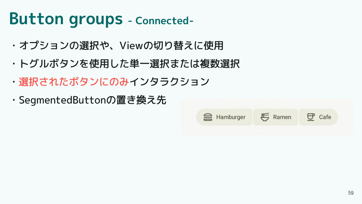
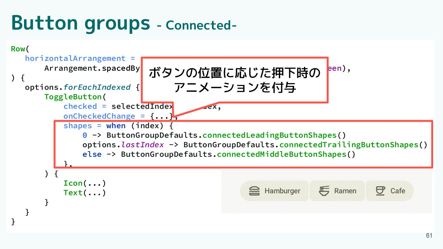
Button groups - Connected- ・オプションの選択や、Viewの切り替えに使用 ・トグルボタンを使用した単一選択または複数選択 ・選択されたボタンにのみインタラクション ・SegmentedButtonの置き換え先 59
Button groups - Connected- Row( horizontalArrangement = Arrangement.spacedBy(ButtonGroupDefaults.ConnectedSpaceBetween), ) {
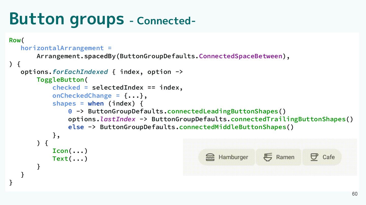
options.forEachIndexed { index, option -> ToggleButton( checked = selectedIndex == index, onCheckedChange = {...}, shapes = when (index) { 0 -> ButtonGroupDefaults.connectedLeadingButtonShapes() options.lastIndex -> ButtonGroupDefaults.connectedTrailingButtonShapes() else -> ButtonGroupDefaults.connectedMiddleButtonShapes() }, ) { Icon(...) Text(...) } } } 60
Row( horizontalArrangement = Arrangement.spacedBy(ButtonGroupDefaults.ConnectedSpaceBetween), ) { options.forEachIndexed { index, option
-> ToggleButton( checked = selectedIndex == index, onCheckedChange = {...}, shapes = when (index) { 0 -> ButtonGroupDefaults.connectedLeadingButtonShapes() options.lastIndex -> ButtonGroupDefaults.connectedTrailingButtonShapes() else -> ButtonGroupDefaults.connectedMiddleButtonShapes() }, ) { Icon(...) Text(...) } } } Button groups - Connected- 61 ボタンの位置に応じた押下時の アニメーションを付与
Component紹介 ・App bars ・Common buttons ・Icon buttons ・Button groups ・Split
button ・FABs ・Extended FAB ・FAB menu 62 ・Loading indicator ・Progress indicator ・Navigation bar ・Navigation rail ・Toolbars ・Sliders
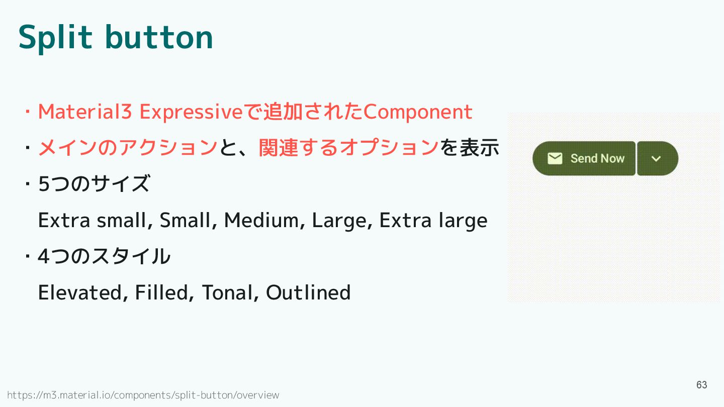
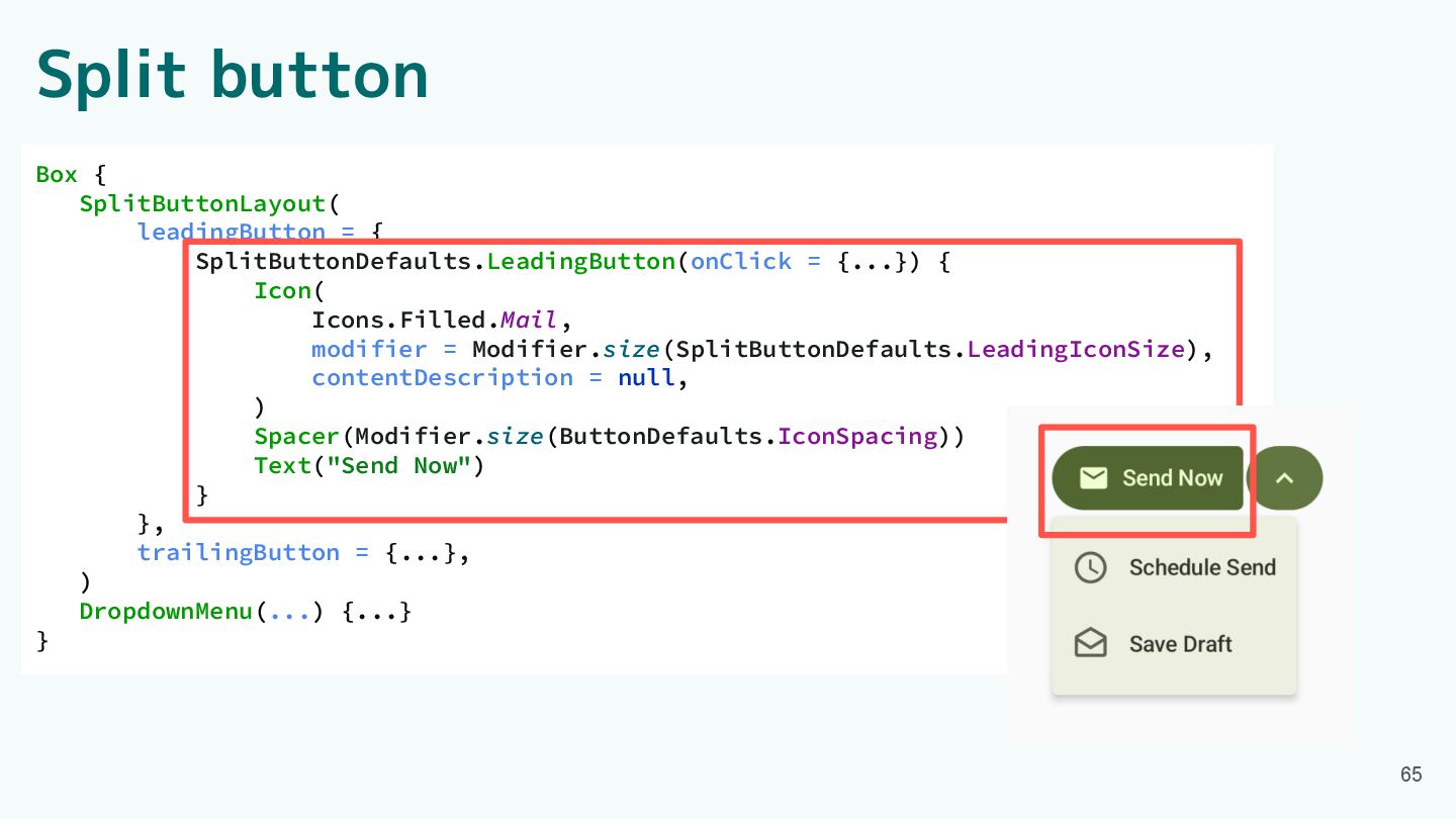
Split button ・Material3 Expressiveで追加されたComponent ・メインのアクションと、関連するオプションを表示 ・5つのサイズ Extra small, Small, Medium,
Large, Extra large ・4つのスタイル Elevated, Filled, Tonal, Outlined 63 https://m3.material.io/components/split-button/overview
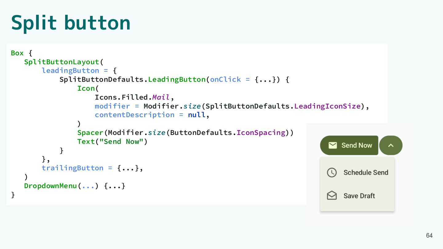
Split button Box { SplitButtonLayout( leadingButton = { SplitButtonDefaults.LeadingButton(onClick =
{...}) { Icon( Icons.Filled.Mail, modifier = Modifier.size(SplitButtonDefaults.LeadingIconSize), contentDescription = null, ) Spacer(Modifier.size(ButtonDefaults.IconSpacing)) Text("Send Now") } }, trailingButton = {...}, ) DropdownMenu(...) {...} } 64
Split button Box { SplitButtonLayout( leadingButton = { SplitButtonDefaults.LeadingButton(onClick =
{...}) { Icon( Icons.Filled.Mail, modifier = Modifier.size(SplitButtonDefaults.LeadingIconSize), contentDescription = null, ) Spacer(Modifier.size(ButtonDefaults.IconSpacing)) Text("Send Now") } }, trailingButton = {...}, ) DropdownMenu(...) {...} } 65
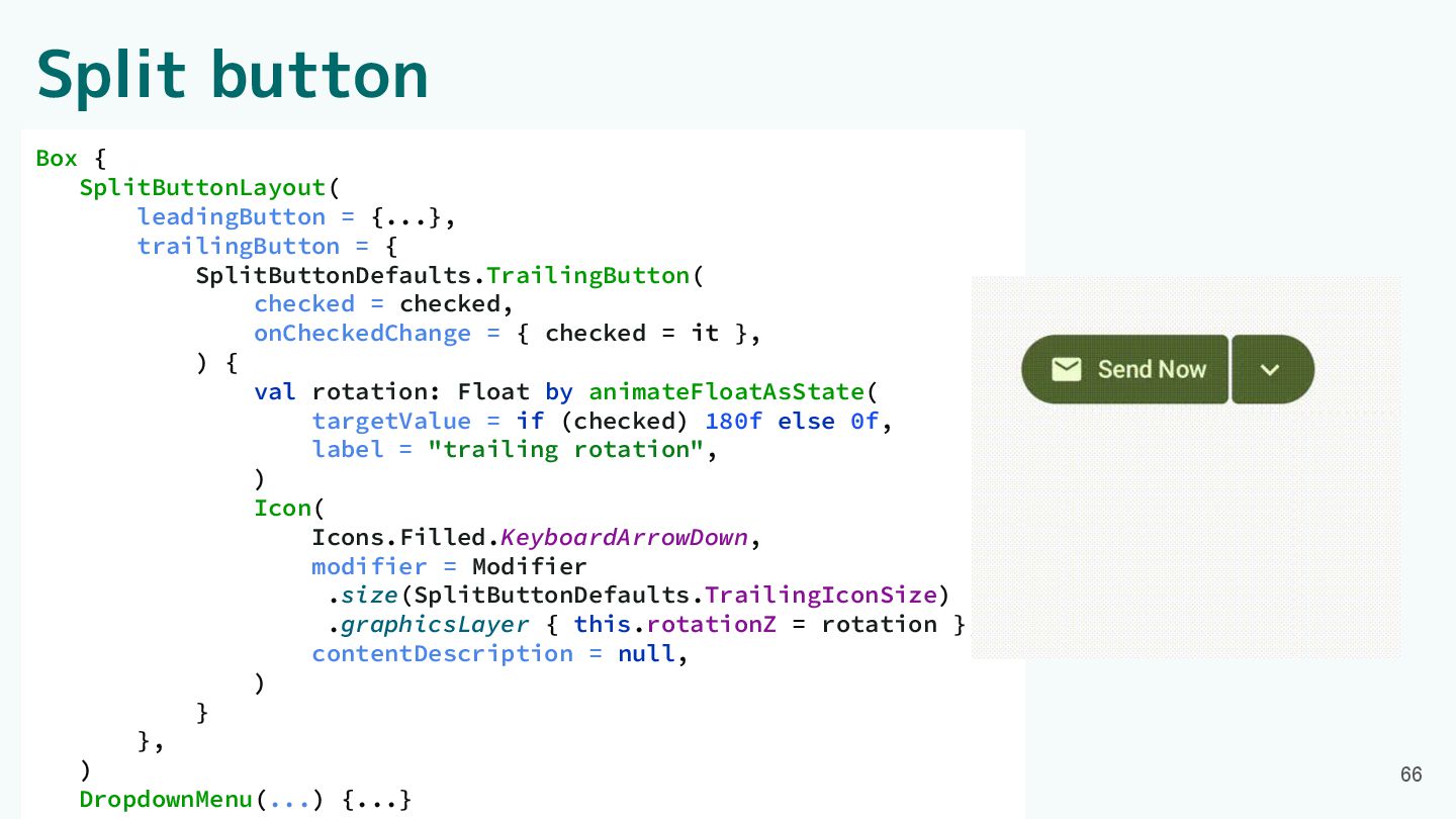
Split button Box { SplitButtonLayout( leadingButton = {...}, trailingButton =
{ SplitButtonDefaults.TrailingButton( checked = checked, onCheckedChange = { checked = it }, ) { val rotation: Float by animateFloatAsState( targetValue = if (checked) 180f else 0f, label = "trailing rotation", ) Icon( Icons.Filled.KeyboardArrowDown, modifier = Modifier .size(SplitButtonDefaults.TrailingIconSize) .graphicsLayer { this.rotationZ = rotation }, contentDescription = null, ) } }, ) DropdownMenu(...) {...} 66
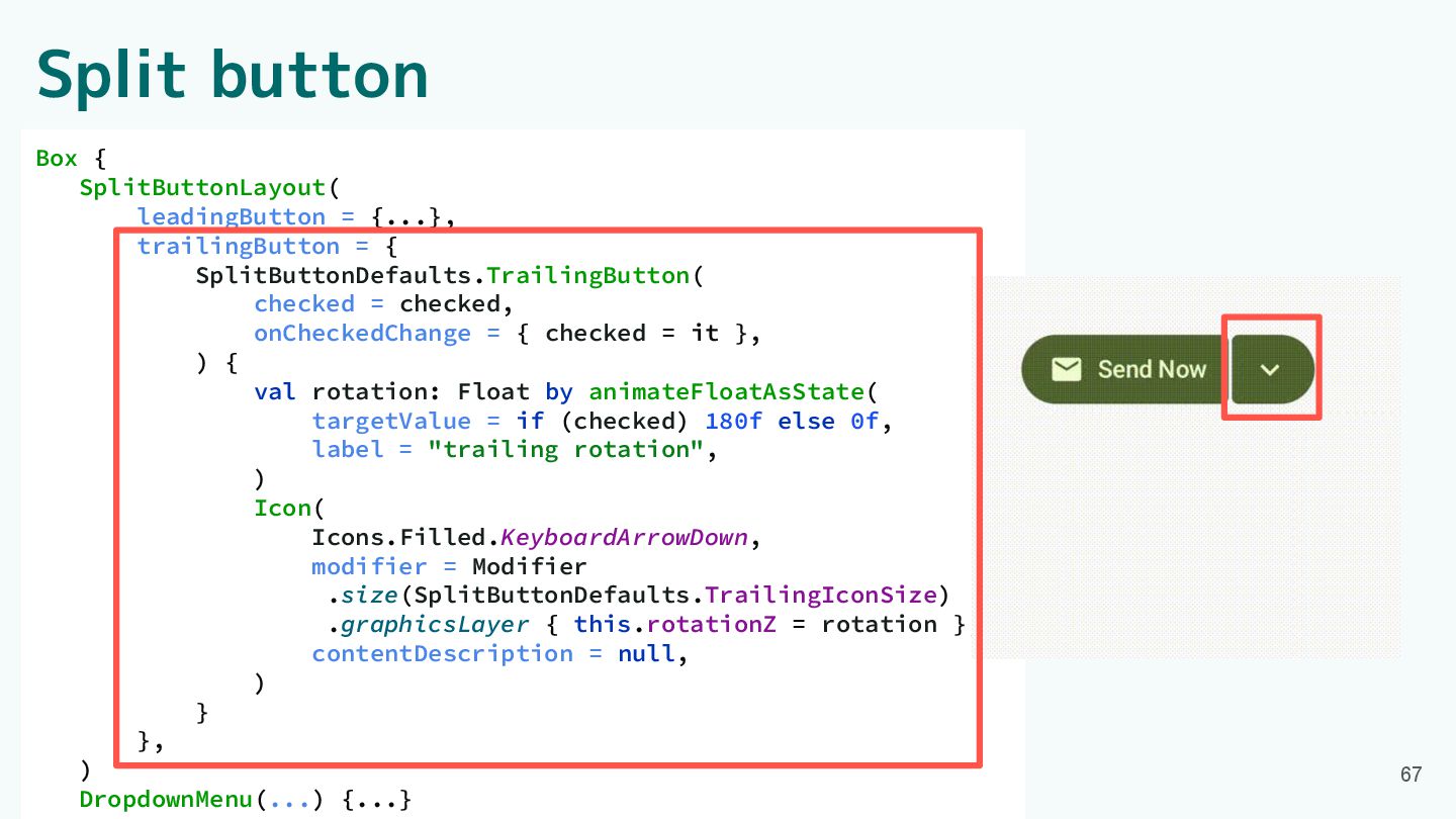
Split button Box { SplitButtonLayout( leadingButton = {...}, trailingButton =
{ SplitButtonDefaults.TrailingButton( checked = checked, onCheckedChange = { checked = it }, ) { val rotation: Float by animateFloatAsState( targetValue = if (checked) 180f else 0f, label = "trailing rotation", ) Icon( Icons.Filled.KeyboardArrowDown, modifier = Modifier .size(SplitButtonDefaults.TrailingIconSize) .graphicsLayer { this.rotationZ = rotation }, contentDescription = null, ) } }, ) DropdownMenu(...) {...} 67
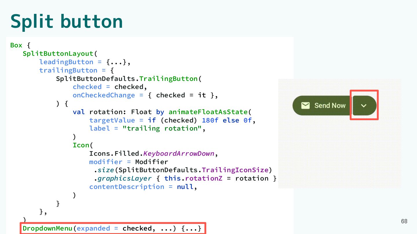
Split button Box { SplitButtonLayout( leadingButton = {...}, trailingButton =
{ SplitButtonDefaults.TrailingButton( checked = checked, onCheckedChange = { checked = it }, ) { val rotation: Float by animateFloatAsState( targetValue = if (checked) 180f else 0f, label = "trailing rotation", ) Icon( Icons.Filled.KeyboardArrowDown, modifier = Modifier .size(SplitButtonDefaults.TrailingIconSize) .graphicsLayer { this.rotationZ = rotation }, contentDescription = null, ) } }, ) DropdownMenu(expanded = checked, ...) {...} 68
Component紹介 ・App bars ・Common buttons ・Icon buttons ・Button groups ・Split
button ・FABs ・Extended FAB ・FAB menu 69 ・Loading indicator ・Progress indicator ・Navigation bar ・Navigation rail ・Toolbars ・Sliders
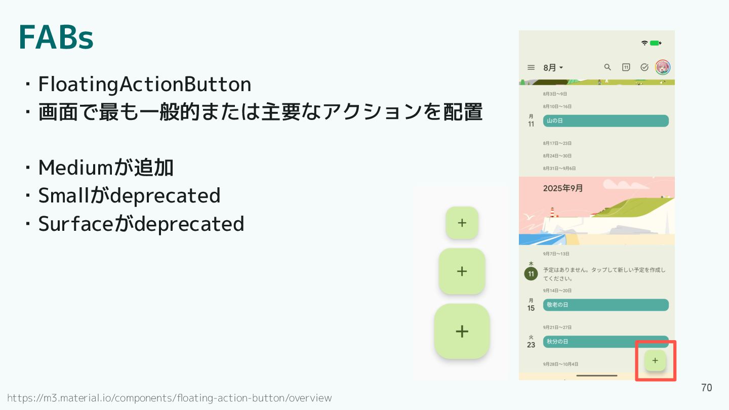
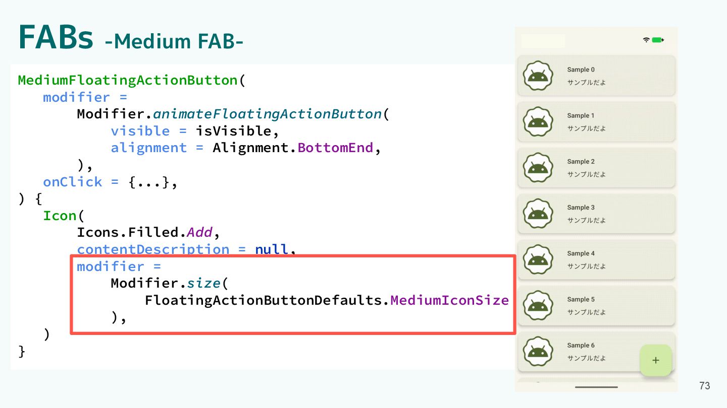
FABs ・FloatingActionButton ・画面で最も一般的または主要なアクションを配置 ・Mediumが追加 ・Smallがdeprecated ・Surfaceがdeprecated 70 https://m3.material.io/components/floating-action-button/overview
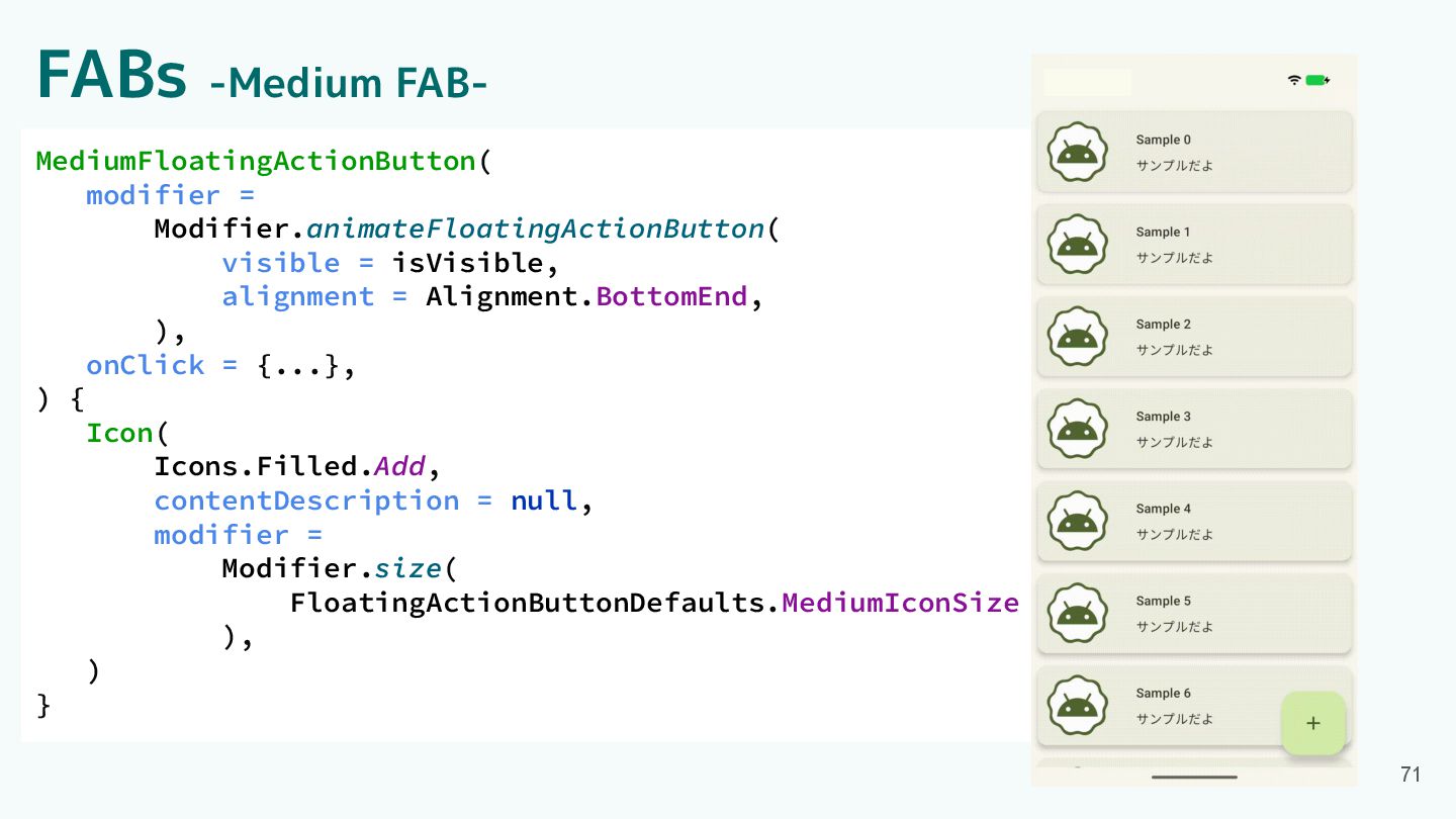
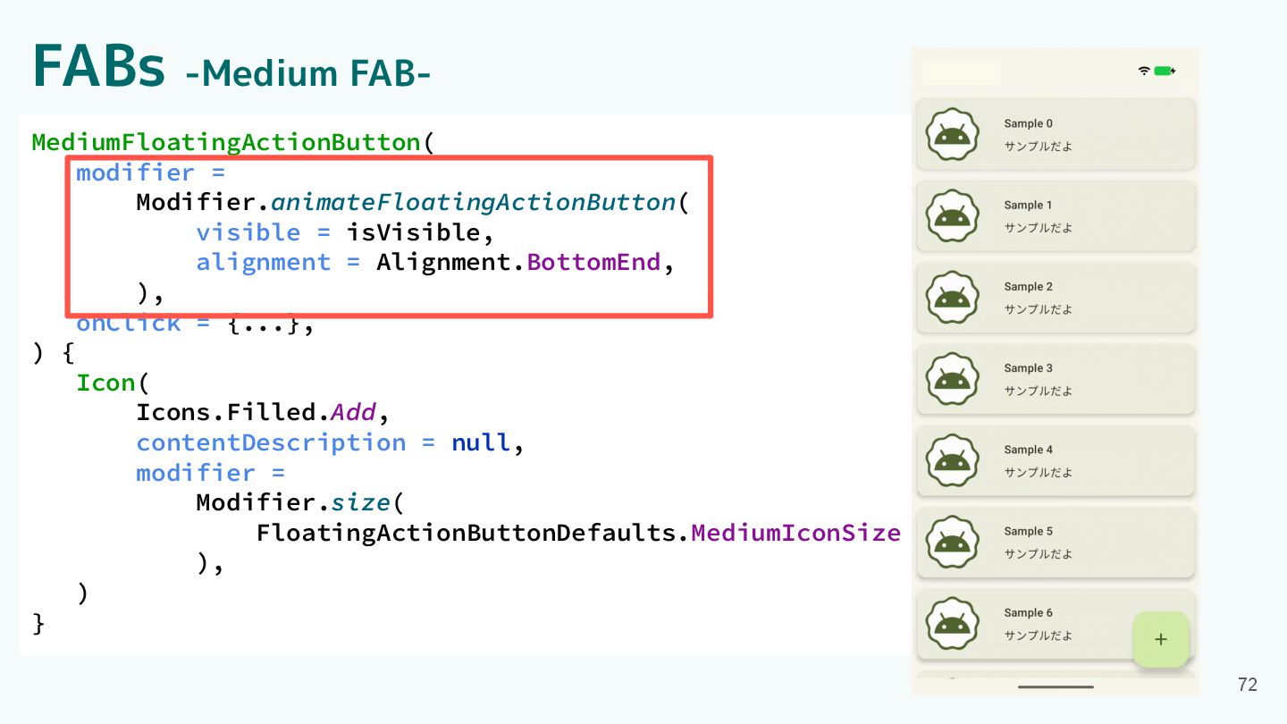
FABs -Medium FAB- 71 MediumFloatingActionButton( modifier = Modifier.animateFloatingActionButton( visible =
isVisible, alignment = Alignment.BottomEnd, ), onClick = {...}, ) { Icon( Icons.Filled.Add, contentDescription = null, modifier = Modifier.size( FloatingActionButtonDefaults.MediumIconSize ), ) }
FABs -Medium FAB- 72 MediumFloatingActionButton( modifier = Modifier.animateFloatingActionButton( visible =
isVisible, alignment = Alignment.BottomEnd, ), onClick = {...}, ) { Icon( Icons.Filled.Add, contentDescription = null, modifier = Modifier.size( FloatingActionButtonDefaults.MediumIconSize ), ) }
FABs -Medium FAB- 73 MediumFloatingActionButton( modifier = Modifier.animateFloatingActionButton( visible =
isVisible, alignment = Alignment.BottomEnd, ), onClick = {...}, ) { Icon( Icons.Filled.Add, contentDescription = null, modifier = Modifier.size( FloatingActionButtonDefaults.MediumIconSize ), ) }
Component紹介 ・App bars ・Common buttons ・Icon buttons ・Button groups ・Split
button ・FABs ・Extended FAB ・FAB menu 74 ・Loading indicator ・Progress indicator ・Navigation bar ・Navigation rail ・Toolbars ・Sliders
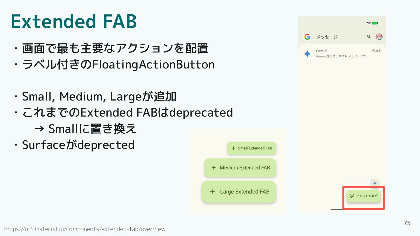
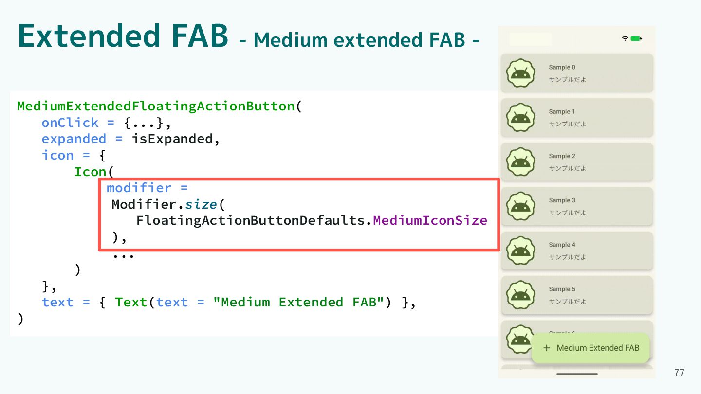
Extended FAB ・画面で最も主要なアクションを配置 ・ラベル付きのFloatingActionButton ・Small, Medium, Largeが追加 ・これまでのExtended FABはdeprecated →
Smallに置き換え ・Surfaceがdeprected 75 https://m3.material.io/components/extended-fab/overview
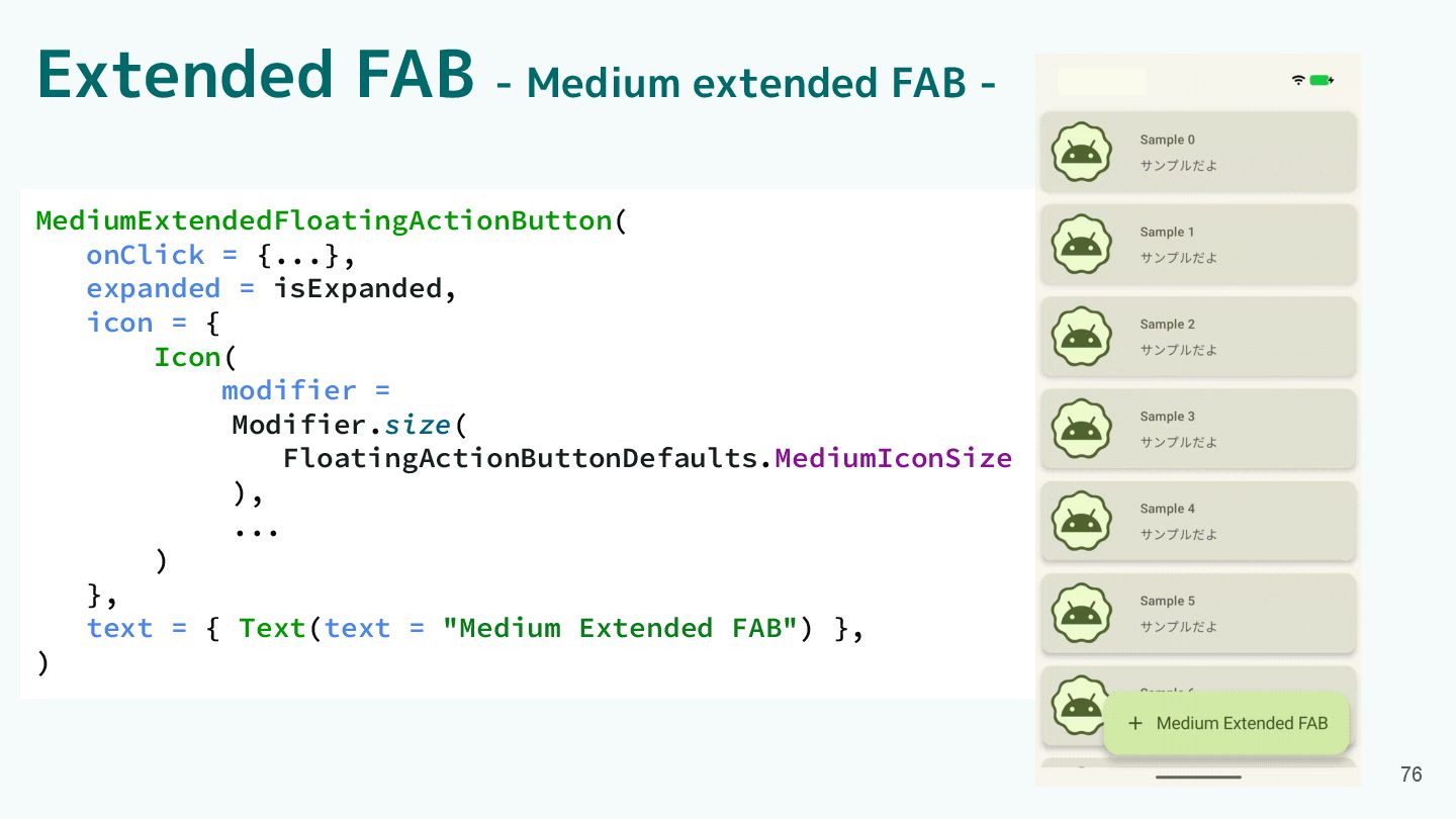
Extended FAB - Medium extended FAB - MediumExtendedFloatingActionButton( onClick =
{...}, expanded = isExpanded, icon = { Icon( modifier = Modifier.size( FloatingActionButtonDefaults.MediumIconSize ), ... ) }, text = { Text(text = "Medium Extended FAB") }, ) 76
Extended FAB - Medium extended FAB - MediumExtendedFloatingActionButton( onClick =
{...}, expanded = isExpanded, icon = { Icon( modifier = Modifier.size( FloatingActionButtonDefaults.MediumIconSize ), ... ) }, text = { Text(text = "Medium Extended FAB") }, ) 77
Component紹介 ・App bars ・Common buttons ・Icon buttons ・Button groups ・Split
button ・FABs ・Extended FAB ・FAB menu 78 ・Loading indicator ・Progress indicator ・Navigation bar ・Navigation rail ・Toolbars ・Sliders
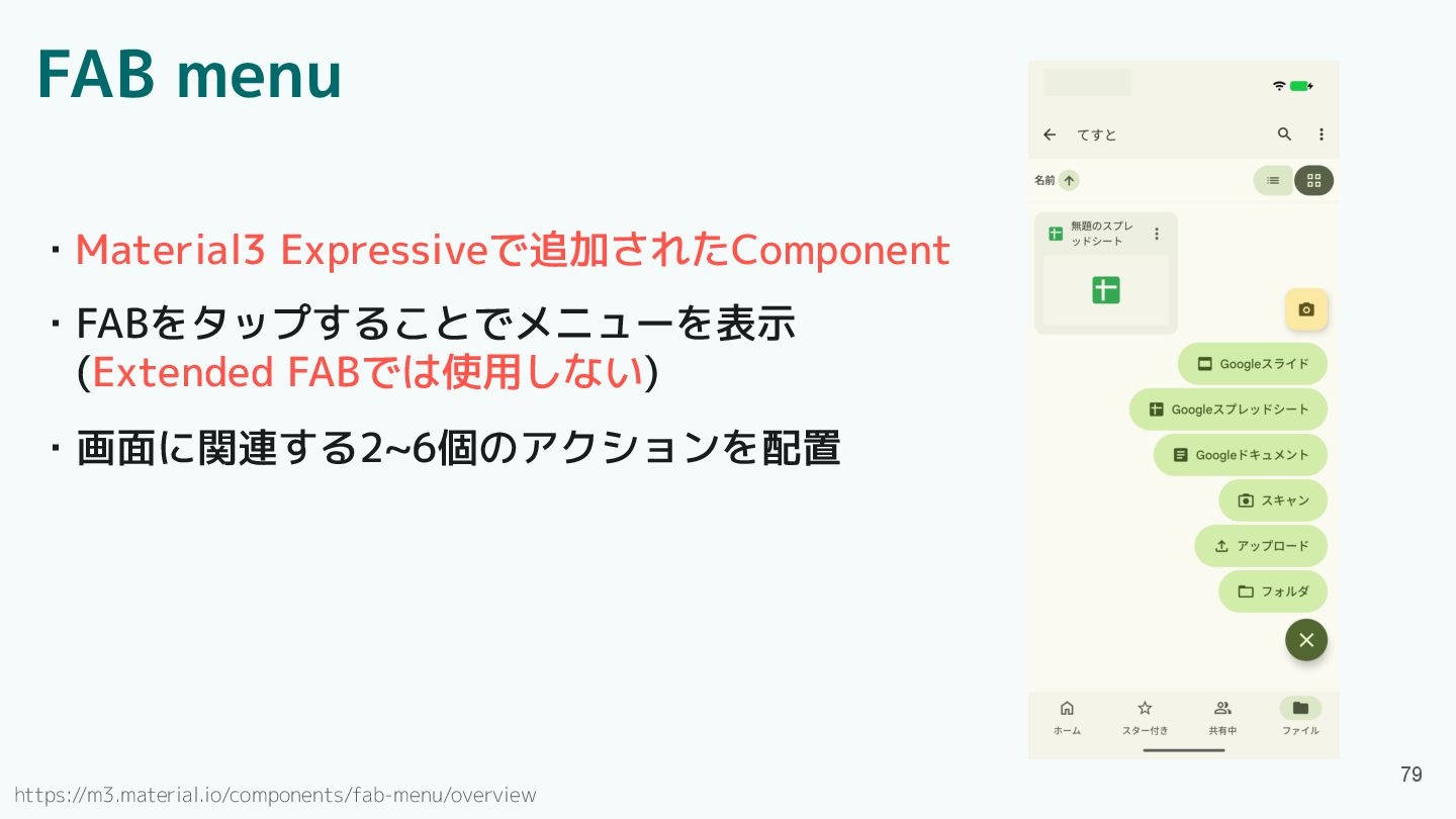
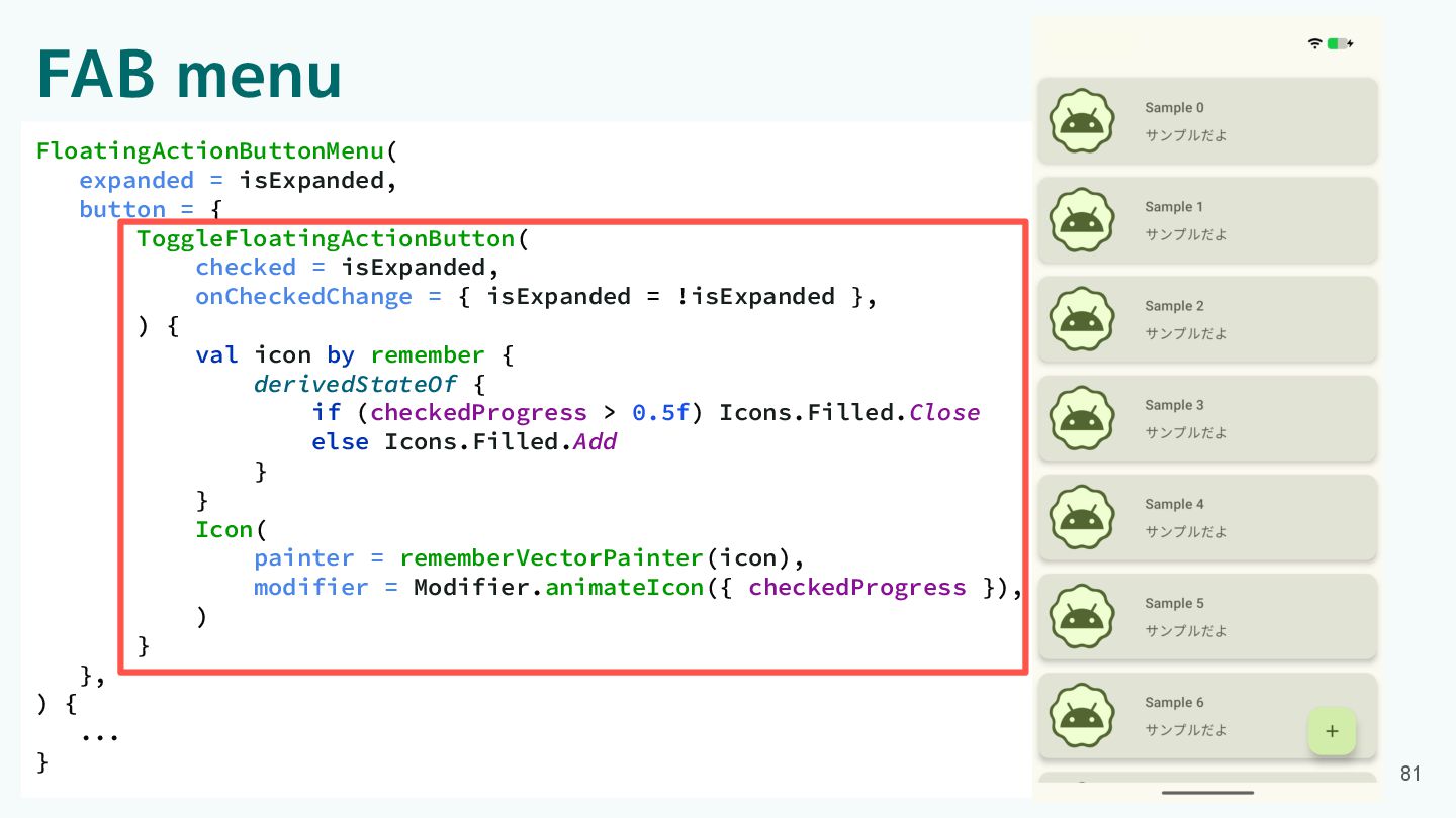
FAB menu ・FABをタップすることでメニューを表示 (Extended FABでは使用しない) ・Material3 Expressiveで追加されたComponent ・画面に関連する2~6個のアクションを配置 79 https://m3.material.io/components/fab-menu/overview
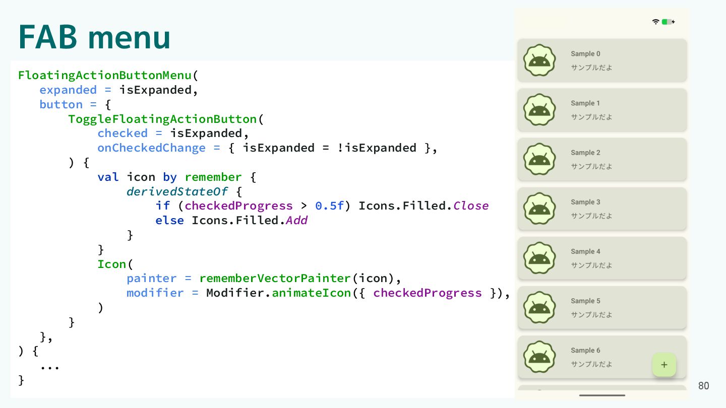
FAB menu FloatingActionButtonMenu( expanded = isExpanded, button = { ToggleFloatingActionButton(
checked = isExpanded, onCheckedChange = { isExpanded = !isExpanded }, ) { val icon by remember { derivedStateOf { if (checkedProgress > 0.5f) Icons.Filled.Close else Icons.Filled.Add } } Icon( painter = rememberVectorPainter(icon), modifier = Modifier.animateIcon({ checkedProgress }), ) } }, ) { ... } 80
FAB menu FloatingActionButtonMenu( expanded = isExpanded, button = { ToggleFloatingActionButton(
checked = isExpanded, onCheckedChange = { isExpanded = !isExpanded }, ) { val icon by remember { derivedStateOf { if (checkedProgress > 0.5f) Icons.Filled.Close else Icons.Filled.Add } } Icon( painter = rememberVectorPainter(icon), modifier = Modifier.animateIcon({ checkedProgress }), ) } }, ) { ... } 81
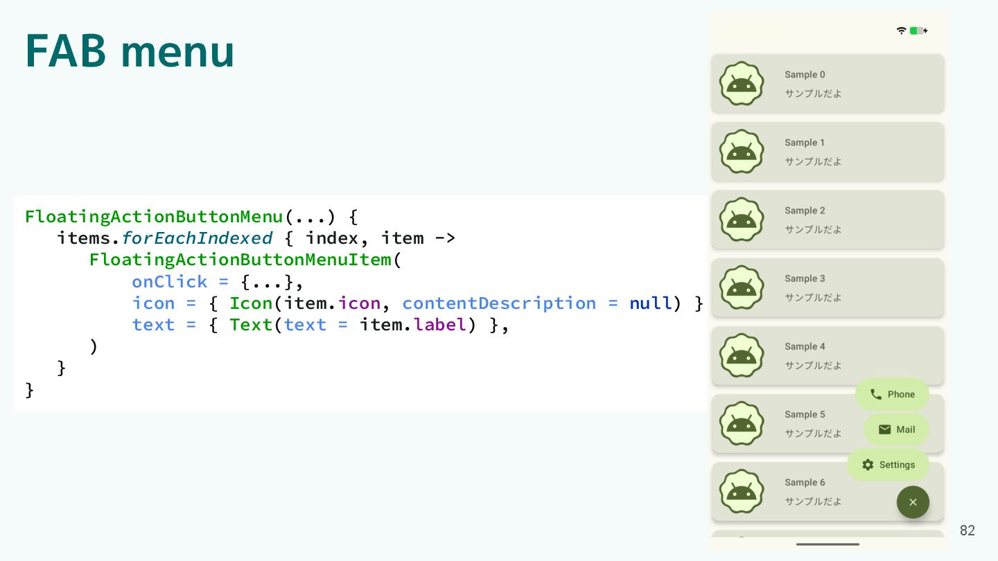
FAB menu FloatingActionButtonMenu(...) { items.forEachIndexed { index, item -> FloatingActionButtonMenuItem(
onClick = {...}, icon = { Icon(item.icon, contentDescription = null) }, text = { Text(text = item.label) }, ) } } 82
Component紹介 ・App bars ・Common buttons ・Icon buttons ・Button groups ・Split
button ・FABs ・Extended FAB ・FAB menu 83 ・Loading indicator ・Progress indicator ・Navigation bar ・Navigation rail ・Toolbars ・Sliders
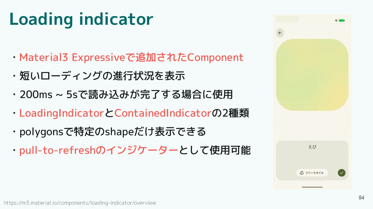
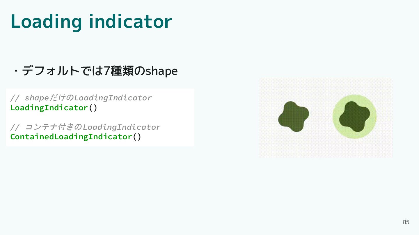
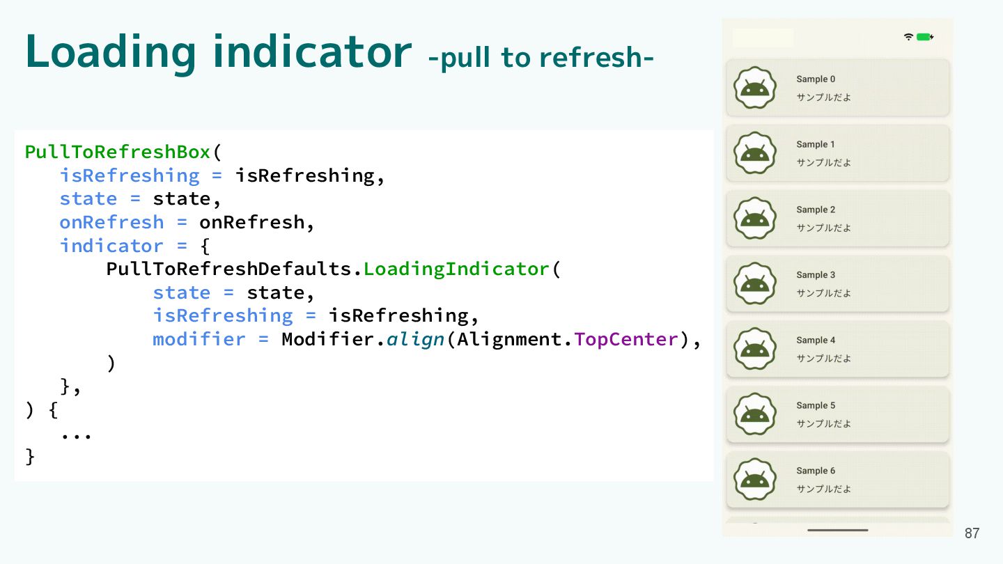
Loading indicator ・Material3 Expressiveで追加されたComponent ・短いローディングの進行状況を表示 ・200ms ~ 5sで読み込みが完了する場合に使用 ・LoadingIndicatorとContainedIndicatorの2種類 ・polygonsで特定のshapeだけ表示できる
・pull-to-refreshのインジケーターとして使用可能 84 https://m3.material.io/components/loading-indicator/overview
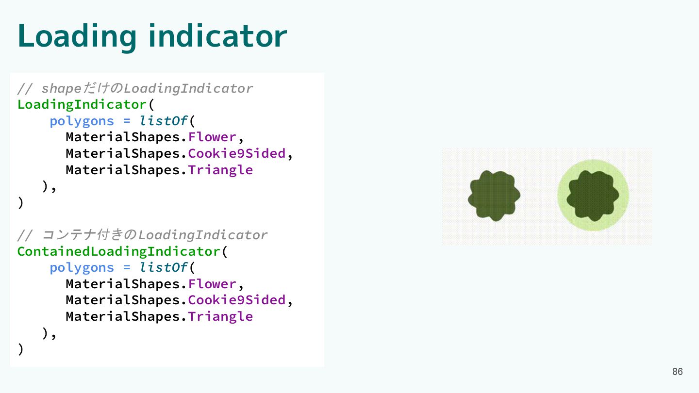
Loading indicator // shapeだけのLoadingIndicator LoadingIndicator() // コンテナ付きのLoadingIndicator ContainedLoadingIndicator() 85 ・デフォルトでは7種類のshape
Loading indicator // shapeだけのLoadingIndicator LoadingIndicator( polygons = listOf( MaterialShapes.Flower, MaterialShapes.Cookie9Sided,
MaterialShapes.Triangle ), ) // コンテナ付きのLoadingIndicator ContainedLoadingIndicator( polygons = listOf( MaterialShapes.Flower, MaterialShapes.Cookie9Sided, MaterialShapes.Triangle ), ) 86
Loading indicator -pull to refresh- 87 PullToRefreshBox( isRefreshing = isRefreshing,
state = state, onRefresh = onRefresh, indicator = { PullToRefreshDefaults.LoadingIndicator( state = state, isRefreshing = isRefreshing, modifier = Modifier.align(Alignment.TopCenter), ) }, ) { ... }
Component紹介 ・App bars ・Common button ・Icon buttons ・Button groups ・Split
button ・FABs ・Extended FAB ・FAB menu 88 ・Loading indicator ・Progress indicator ・Navigation bar ・Navigation rail ・Toolbars ・Sliders
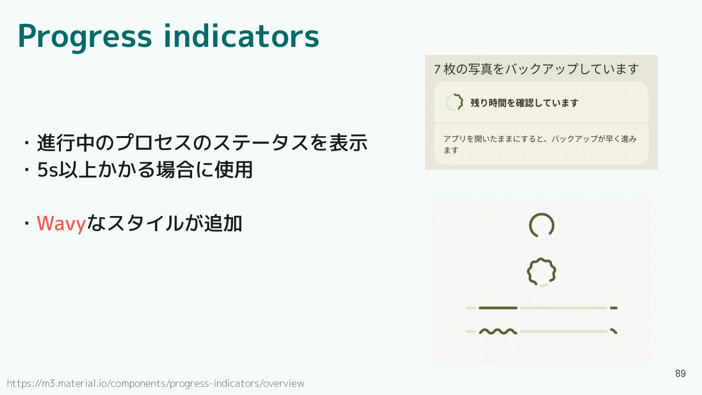
Progress indicators ・進行中のプロセスのステータスを表示 ・5s以上かかる場合に使用 ・Wavyなスタイルが追加 89 https://m3.material.io/components/progress-indicators/overview
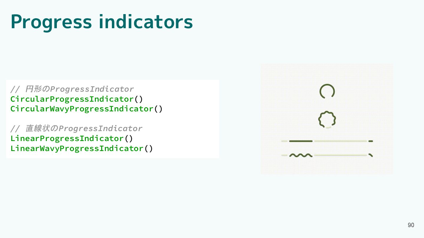
Progress indicators // 円形のProgressIndicator CircularProgressIndicator() CircularWavyProgressIndicator() // 直線状のProgressIndicator LinearProgressIndicator() LinearWavyProgressIndicator()
90
Component紹介 ・App bars ・Common buttons ・Icon buttons ・Button groups ・Split
button ・FABs ・Extended FAB ・FAB menu 91 ・Loading indicator ・Progress indicator ・Navigation bar ・Navigation rail ・Toolbars ・Sliders
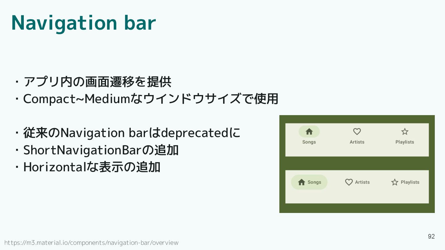
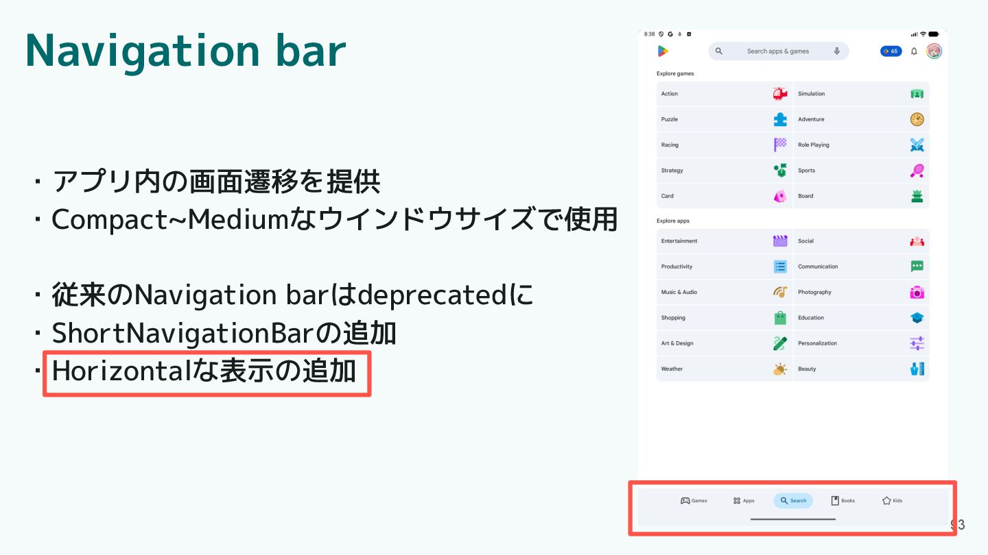
Navigation bar ・アプリ内の画面遷移を提供 ・Compact~Mediumなウインドウサイズで使用 ・従来のNavigation barはdeprecatedに ・ShortNavigationBarの追加 ・Horizontalな表示の追加 92 https://m3.material.io/components/navigation-bar/overview
Navigation bar ・アプリ内の画面遷移を提供 ・Compact~Mediumなウインドウサイズで使用 ・従来のNavigation barはdeprecatedに ・ShortNavigationBarの追加 ・Horizontalな表示の追加 93
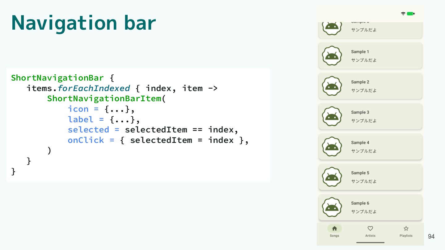
Navigation bar ShortNavigationBar { items.forEachIndexed { index, item -> ShortNavigationBarItem(
icon = {...}, label = {...}, selected = selectedItem == index, onClick = { selectedItem = index }, ) } } 94
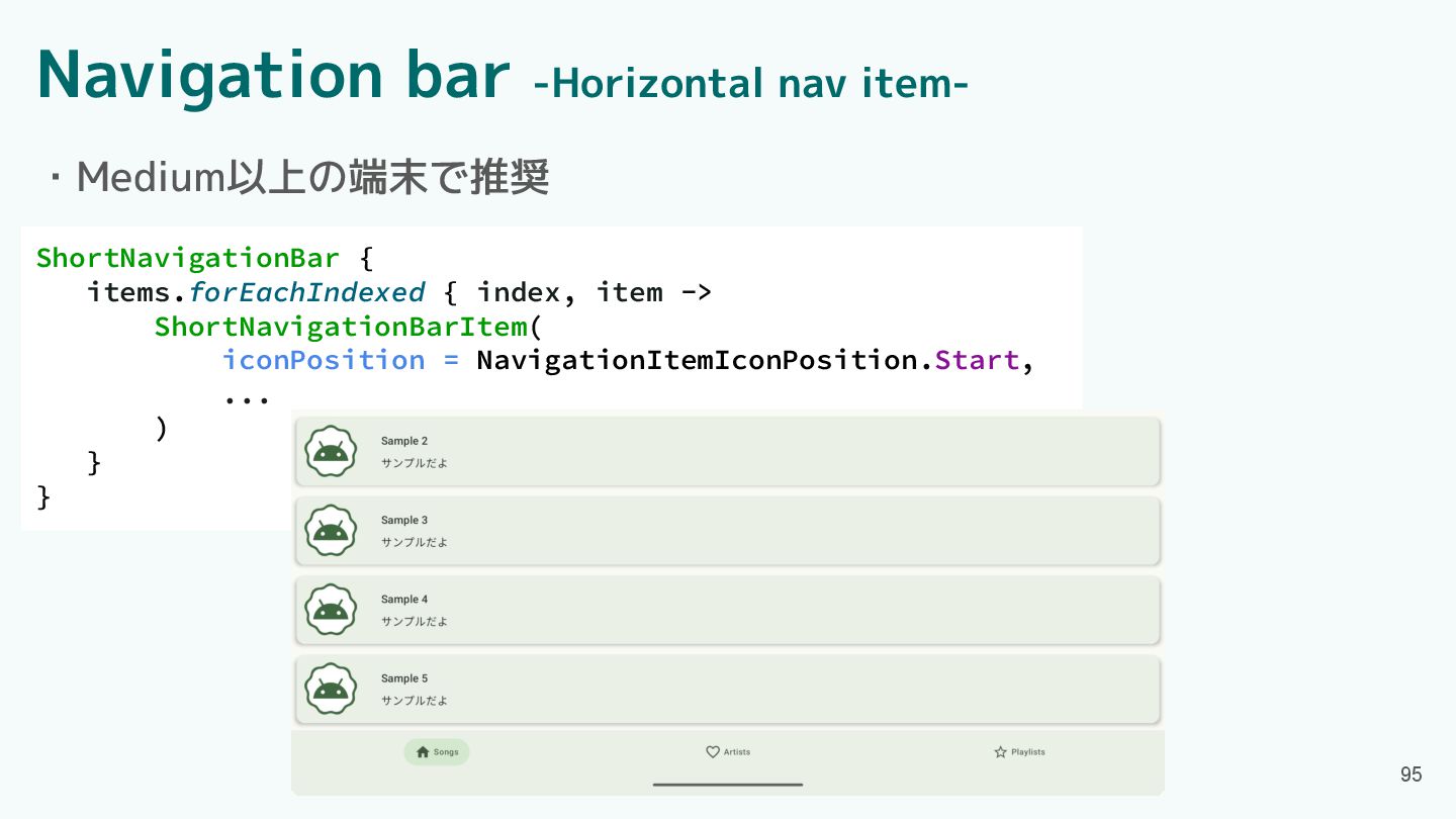
Navigation bar -Horizontal nav item- ShortNavigationBar { items.forEachIndexed { index,
item -> ShortNavigationBarItem( iconPosition = NavigationItemIconPosition.Start, ... ) } } 95 ・Medium以上の端末で推奨
Component紹介 ・App bars ・Common buttons ・Icon buttons ・Button groups ・Split
button ・FABs ・Extended FAB ・FAB menu 96 ・Loading indicator ・Progress indicator ・Navigation bar ・Navigation rail ・Toolbars ・Sliders
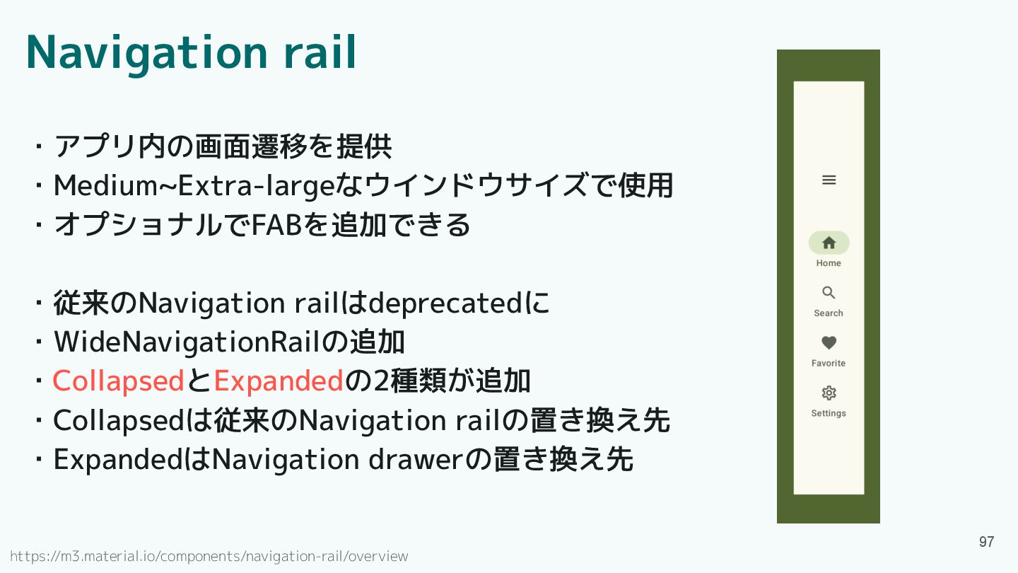
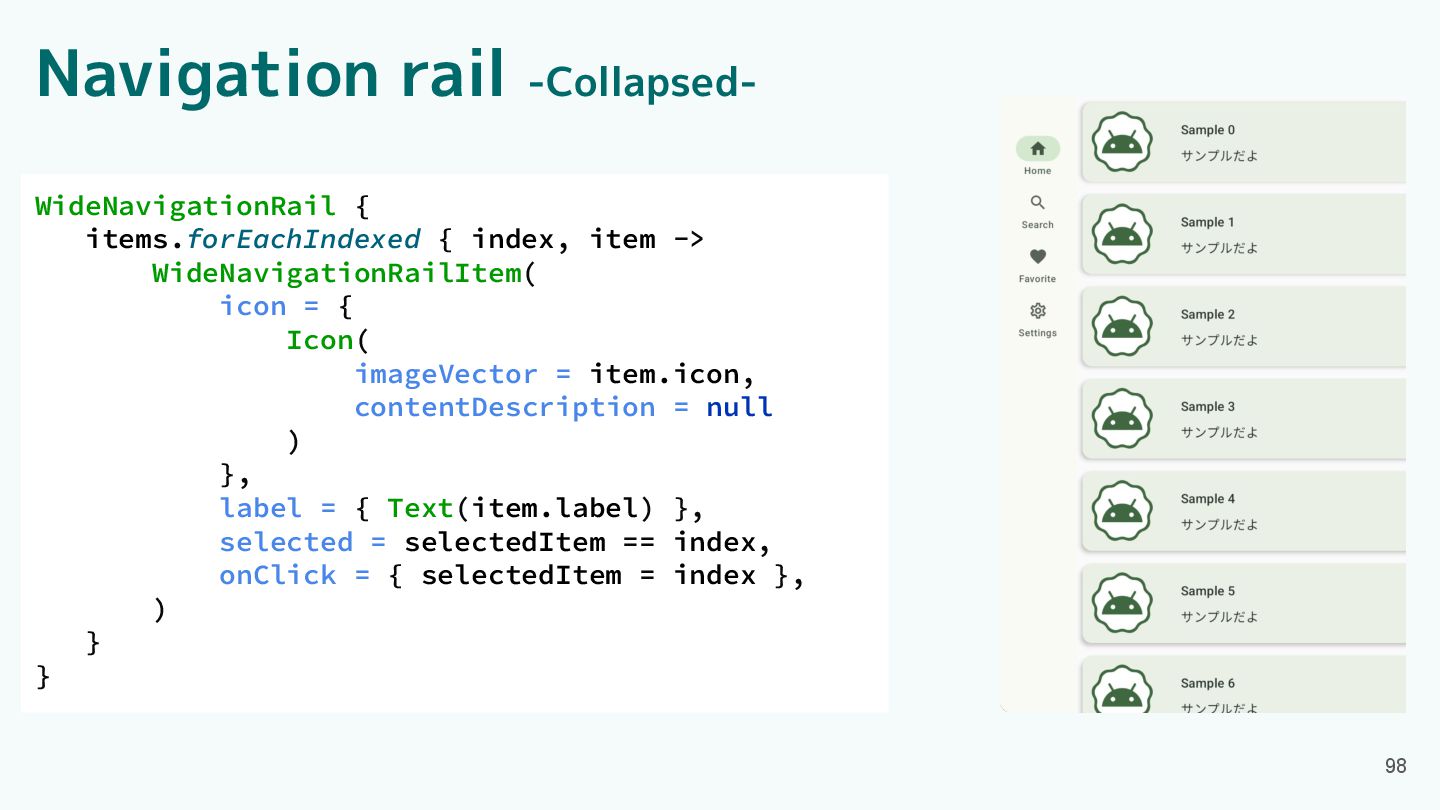
Navigation rail ・アプリ内の画面遷移を提供 ・Medium~Extra-largeなウインドウサイズで使用 ・オプショナルでFABを追加できる ・従来のNavigation railはdeprecatedに ・WideNavigationRailの追加 ・CollapsedとExpandedの2種類が追加 ・Collapsedは従来のNavigation
railの置き換え先 ・ExpandedはNavigation drawerの置き換え先 97 https://m3.material.io/components/navigation-rail/overview
Navigation rail -Collapsed- 98 WideNavigationRail { items.forEachIndexed { index, item
-> WideNavigationRailItem( icon = { Icon( imageVector = item.icon, contentDescription = null ) }, label = { Text(item.label) }, selected = selectedItem == index, onClick = { selectedItem = index }, ) } }
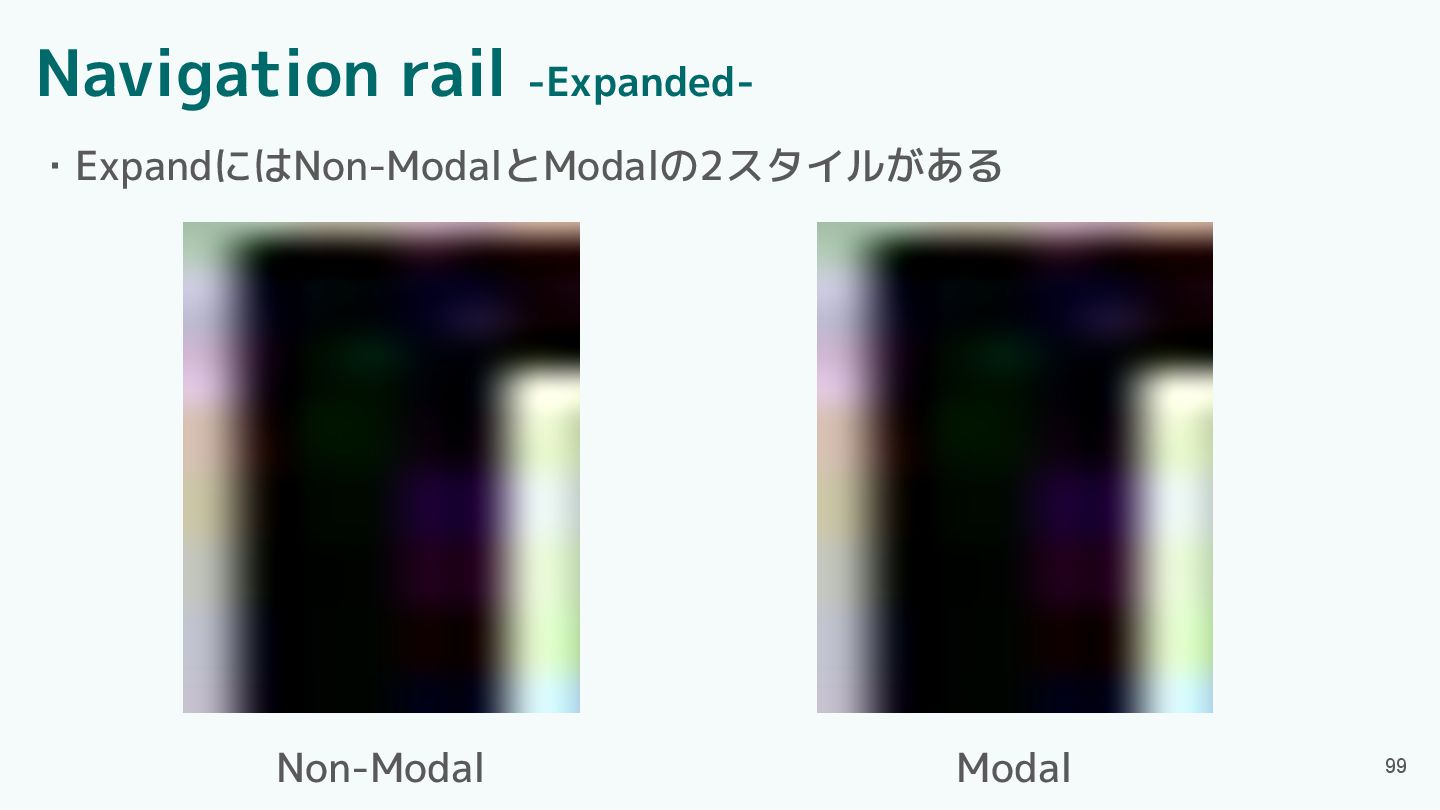
Navigation rail -Expanded- ・ExpandにはNon-ModalとModalの2スタイルがある 99 Non-Modal Modal
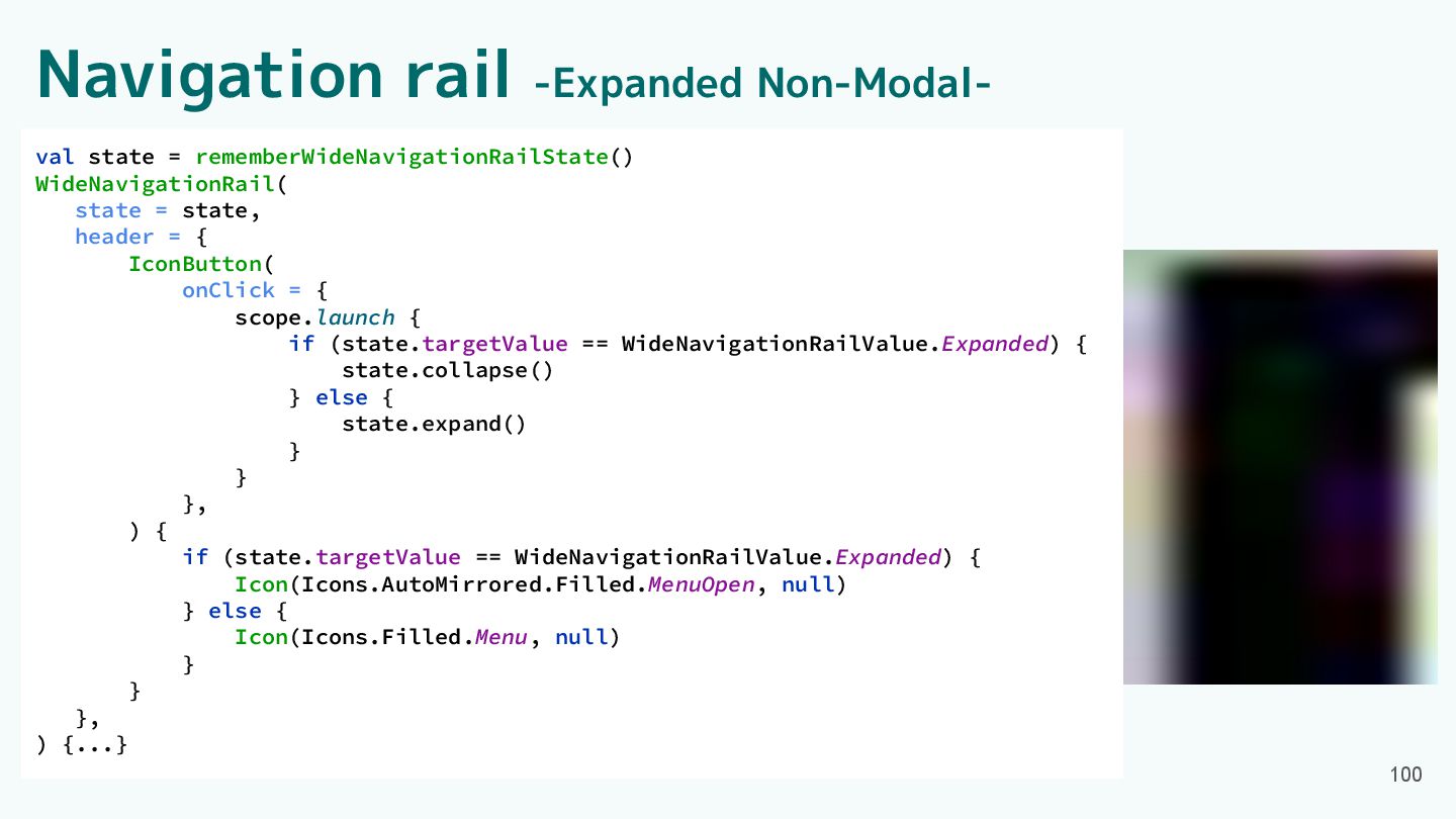
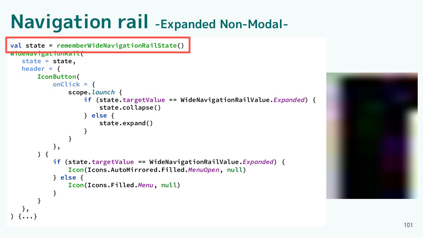
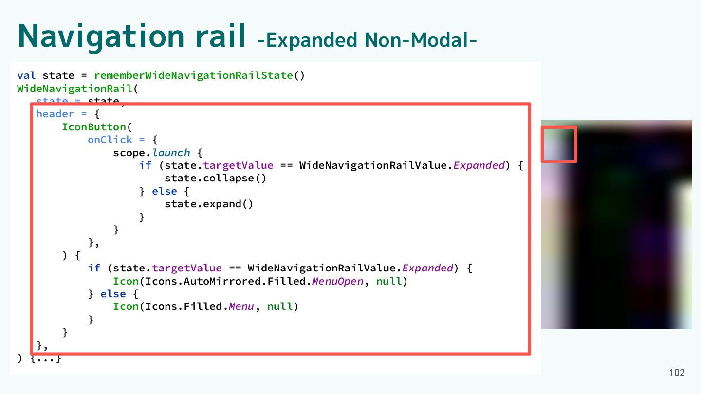
Navigation rail -Expanded Non-Modal- 100 val state = rememberWideNavigationRailState() WideNavigationRail(
state = state, header = { IconButton( onClick = { scope.launch { if (state.targetValue == WideNavigationRailValue.Expanded) { state.collapse() } else { state.expand() } } }, ) { if (state.targetValue == WideNavigationRailValue.Expanded) { Icon(Icons.AutoMirrored.Filled.MenuOpen, null) } else { Icon(Icons.Filled.Menu, null) } } }, ) {...}
Navigation rail -Expanded Non-Modal- 101 val state = rememberWideNavigationRailState() WideNavigationRail(
state = state, header = { IconButton( onClick = { scope.launch { if (state.targetValue == WideNavigationRailValue.Expanded) { state.collapse() } else { state.expand() } } }, ) { if (state.targetValue == WideNavigationRailValue.Expanded) { Icon(Icons.AutoMirrored.Filled.MenuOpen, null) } else { Icon(Icons.Filled.Menu, null) } } }, ) {...}
Navigation rail -Expanded Non-Modal- 102 val state = rememberWideNavigationRailState() WideNavigationRail(
state = state, header = { IconButton( onClick = { scope.launch { if (state.targetValue == WideNavigationRailValue.Expanded) { state.collapse() } else { state.expand() } } }, ) { if (state.targetValue == WideNavigationRailValue.Expanded) { Icon(Icons.AutoMirrored.Filled.MenuOpen, null) } else { Icon(Icons.Filled.Menu, null) } } }, ) {...}
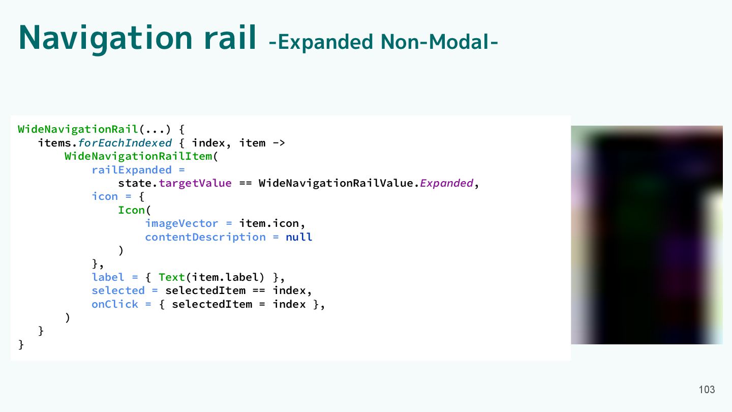
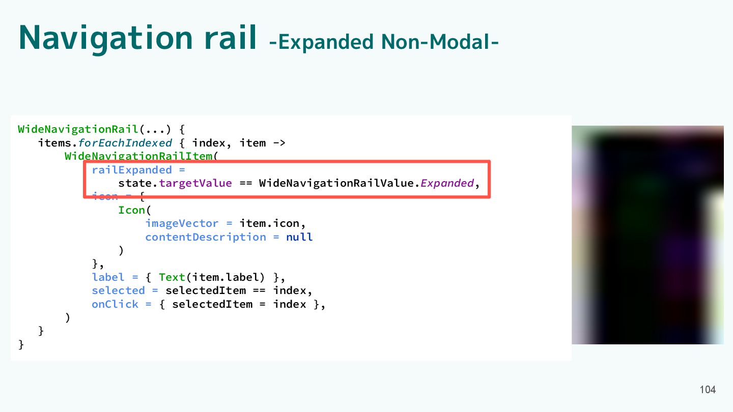
Navigation rail -Expanded Non-Modal- 103 WideNavigationRail(...) { items.forEachIndexed { index,
item -> WideNavigationRailItem( railExpanded = state.targetValue == WideNavigationRailValue.Expanded, icon = { Icon( imageVector = item.icon, contentDescription = null ) }, label = { Text(item.label) }, selected = selectedItem == index, onClick = { selectedItem = index }, ) } }
Navigation rail -Expanded Non-Modal- 104 WideNavigationRail(...) { items.forEachIndexed { index,
item -> WideNavigationRailItem( railExpanded = state.targetValue == WideNavigationRailValue.Expanded, icon = { Icon( imageVector = item.icon, contentDescription = null ) }, label = { Text(item.label) }, selected = selectedItem == index, onClick = { selectedItem = index }, ) } }
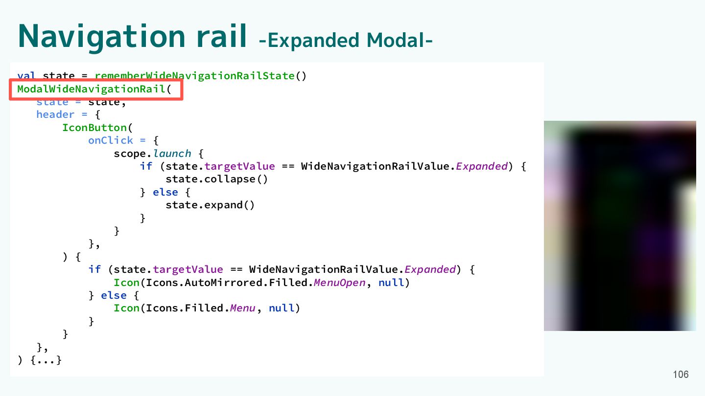
Navigation rail -Expanded Modal- 105 val state = rememberWideNavigationRailState() ModalWideNavigationRail(
state = state, header = { IconButton( onClick = { scope.launch { if (state.targetValue == WideNavigationRailValue.Expanded) { state.collapse() } else { state.expand() } } }, ) { if (state.targetValue == WideNavigationRailValue.Expanded) { Icon(Icons.AutoMirrored.Filled.MenuOpen, null) } else { Icon(Icons.Filled.Menu, null) } } }, ) {...}
Navigation rail -Expanded Modal- 106 val state = rememberWideNavigationRailState() ModalWideNavigationRail(
state = state, header = { IconButton( onClick = { scope.launch { if (state.targetValue == WideNavigationRailValue.Expanded) { state.collapse() } else { state.expand() } } }, ) { if (state.targetValue == WideNavigationRailValue.Expanded) { Icon(Icons.AutoMirrored.Filled.MenuOpen, null) } else { Icon(Icons.Filled.Menu, null) } } }, ) {...}
Component紹介 ・App bars ・Common buttons ・Icon buttons ・Button groups ・Split
button ・FABs ・Extended FAB ・FAB menu 107 ・Loading indicator ・Progress indicator ・Navigation bar ・Navigation rail ・Toolbars ・Sliders
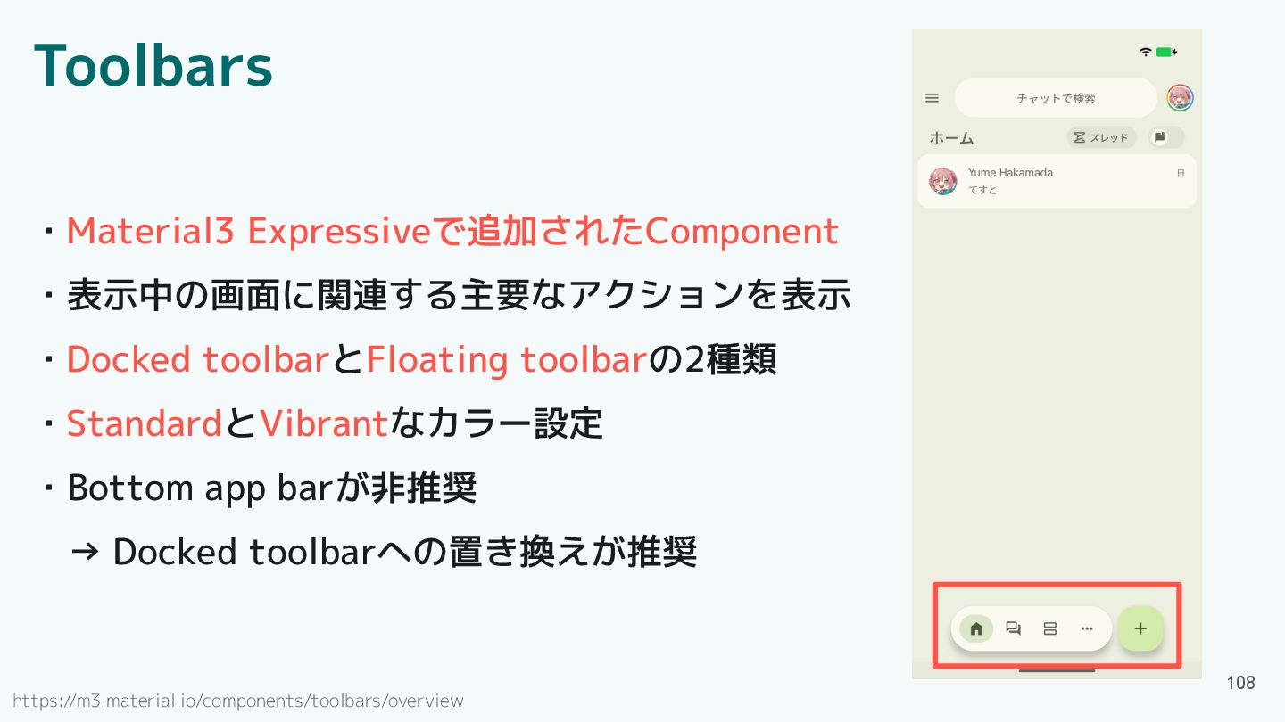
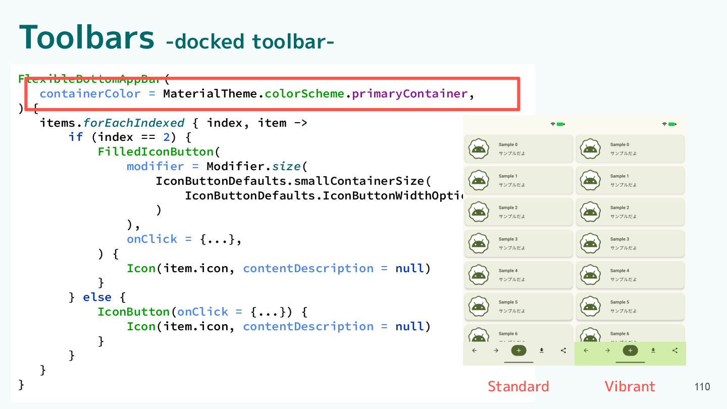
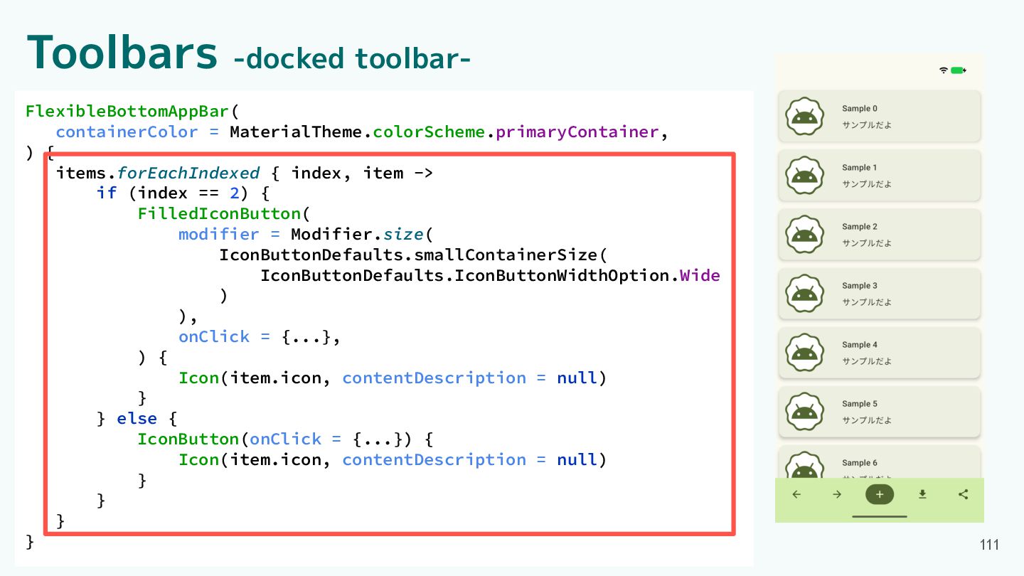
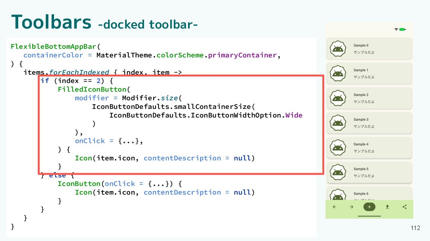
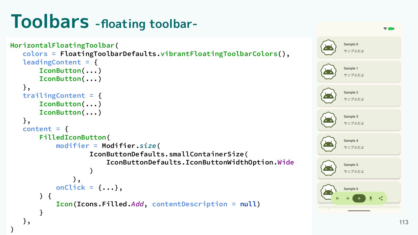
Toolbars ・Material3 Expressiveで追加されたComponent ・表示中の画面に関連する主要なアクションを表示 ・Docked toolbarとFloating toolbarの2種類 ・StandardとVibrantなカラー設定 ・Bottom app
barが非推奨 → Docked toolbarへの置き換えが推奨 108 https://m3.material.io/components/toolbars/overview
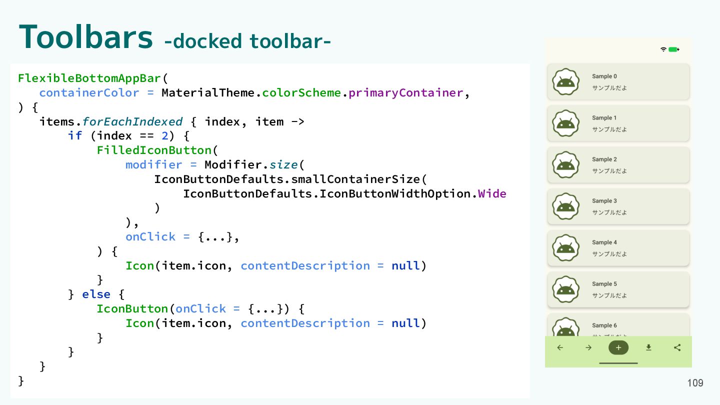
Toolbars -docked toolbar- FlexibleBottomAppBar( containerColor = MaterialTheme.colorScheme.primaryContainer, ) { items.forEachIndexed
{ index, item -> if (index == 2) { FilledIconButton( modifier = Modifier.size( IconButtonDefaults.smallContainerSize( IconButtonDefaults.IconButtonWidthOption.Wide ) ), onClick = {...}, ) { Icon(item.icon, contentDescription = null) } } else { IconButton(onClick = {...}) { Icon(item.icon, contentDescription = null) } } } } 109
FlexibleBottomAppBar( containerColor = MaterialTheme.colorScheme.primaryContainer, ) { items.forEachIndexed { index, item
-> if (index == 2) { FilledIconButton( modifier = Modifier.size( IconButtonDefaults.smallContainerSize( IconButtonDefaults.IconButtonWidthOption.Wide ) ), onClick = {...}, ) { Icon(item.icon, contentDescription = null) } } else { IconButton(onClick = {...}) { Icon(item.icon, contentDescription = null) } } } } Toolbars -docked toolbar- 110 Standard Vibrant
FlexibleBottomAppBar( containerColor = MaterialTheme.colorScheme.primaryContainer, ) { items.forEachIndexed { index, item
-> if (index == 2) { FilledIconButton( modifier = Modifier.size( IconButtonDefaults.smallContainerSize( IconButtonDefaults.IconButtonWidthOption.Wide ) ), onClick = {...}, ) { Icon(item.icon, contentDescription = null) } } else { IconButton(onClick = {...}) { Icon(item.icon, contentDescription = null) } } } } Toolbars -docked toolbar- 111
FlexibleBottomAppBar( containerColor = MaterialTheme.colorScheme.primaryContainer, ) { items.forEachIndexed { index, item
-> if (index == 2) { FilledIconButton( modifier = Modifier.size( IconButtonDefaults.smallContainerSize( IconButtonDefaults.IconButtonWidthOption.Wide ) ), onClick = {...}, ) { Icon(item.icon, contentDescription = null) } } else { IconButton(onClick = {...}) { Icon(item.icon, contentDescription = null) } } } } Toolbars -docked toolbar- 112
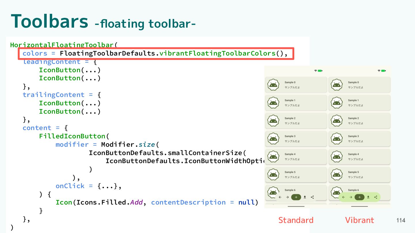
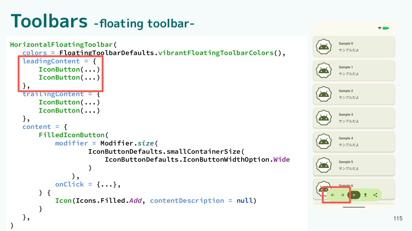
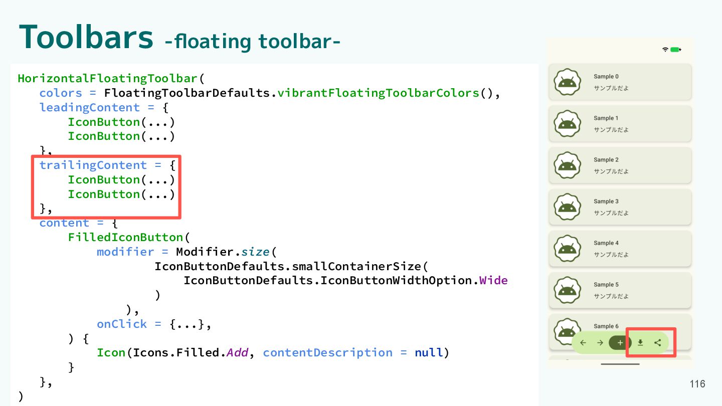
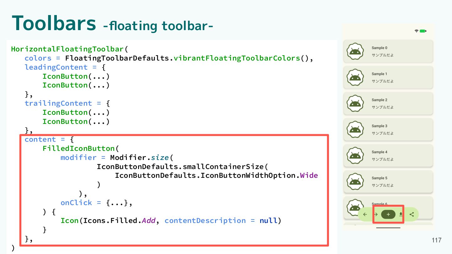
Toolbars -floating toolbar- 113 HorizontalFloatingToolbar( colors = FloatingToolbarDefaults.vibrantFloatingToolbarColors(), leadingContent =
{ IconButton(...) IconButton(...) }, trailingContent = { IconButton(...) IconButton(...) }, content = { FilledIconButton( modifier = Modifier.size( IconButtonDefaults.smallContainerSize( IconButtonDefaults.IconButtonWidthOption.Wide ) ), onClick = {...}, ) { Icon(Icons.Filled.Add, contentDescription = null) } }, )
Toolbars -floating toolbar- 114 HorizontalFloatingToolbar( colors = FloatingToolbarDefaults.vibrantFloatingToolbarColors(), leadingContent =
{ IconButton(...) IconButton(...) }, trailingContent = { IconButton(...) IconButton(...) }, content = { FilledIconButton( modifier = Modifier.size( IconButtonDefaults.smallContainerSize( IconButtonDefaults.IconButtonWidthOption.Wide ) ), onClick = {...}, ) { Icon(Icons.Filled.Add, contentDescription = null) } }, ) Standard Vibrant
Toolbars -floating toolbar- 115 HorizontalFloatingToolbar( colors = FloatingToolbarDefaults.vibrantFloatingToolbarColors(), leadingContent =
{ IconButton(...) IconButton(...) }, trailingContent = { IconButton(...) IconButton(...) }, content = { FilledIconButton( modifier = Modifier.size( IconButtonDefaults.smallContainerSize( IconButtonDefaults.IconButtonWidthOption.Wide ) ), onClick = {...}, ) { Icon(Icons.Filled.Add, contentDescription = null) } }, )
Toolbars -floating toolbar- 116 HorizontalFloatingToolbar( colors = FloatingToolbarDefaults.vibrantFloatingToolbarColors(), leadingContent =
{ IconButton(...) IconButton(...) }, trailingContent = { IconButton(...) IconButton(...) }, content = { FilledIconButton( modifier = Modifier.size( IconButtonDefaults.smallContainerSize( IconButtonDefaults.IconButtonWidthOption.Wide ) ), onClick = {...}, ) { Icon(Icons.Filled.Add, contentDescription = null) } }, )
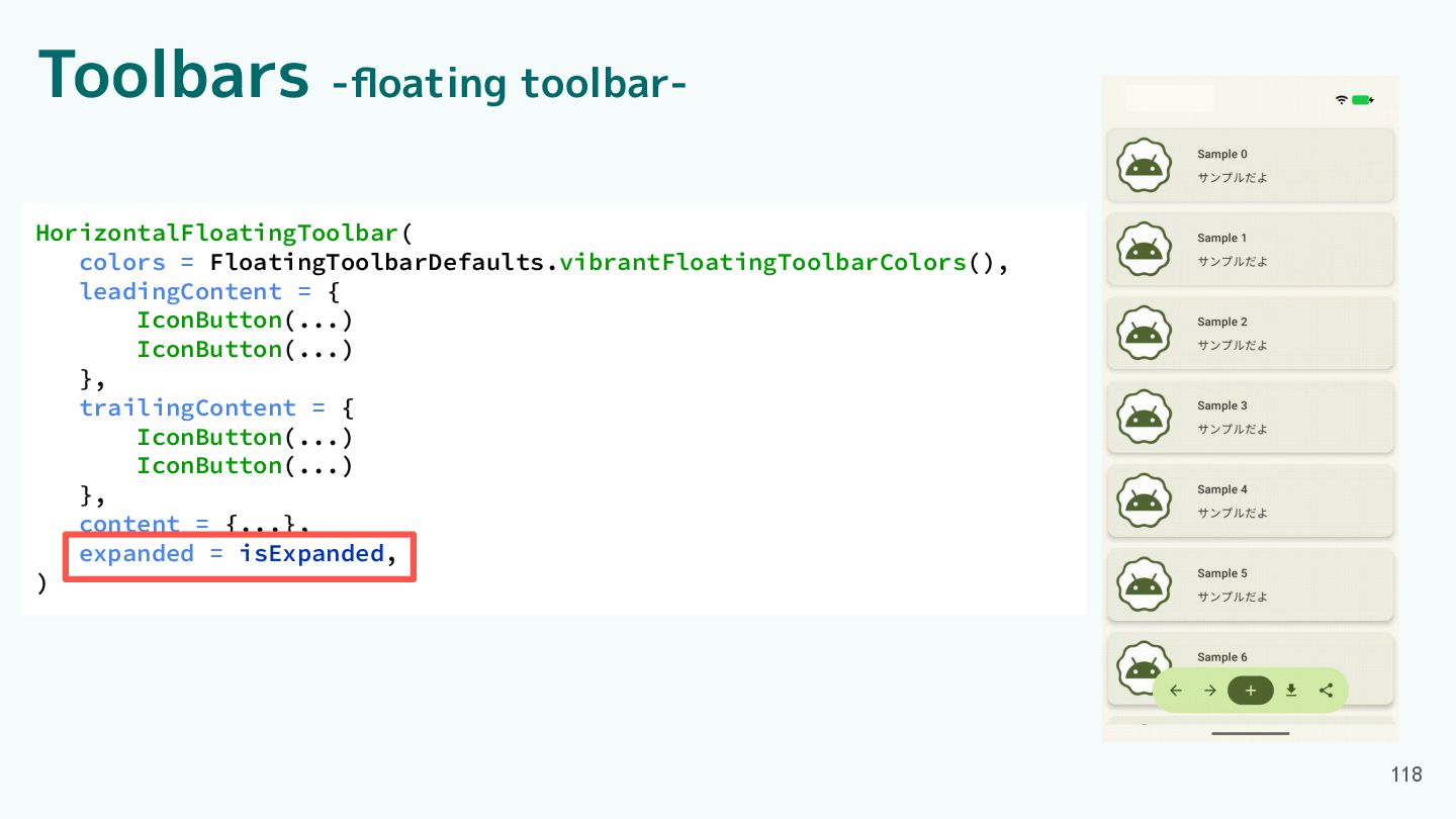
Toolbars -floating toolbar- 117 HorizontalFloatingToolbar( colors = FloatingToolbarDefaults.vibrantFloatingToolbarColors(), leadingContent =
{ IconButton(...) IconButton(...) }, trailingContent = { IconButton(...) IconButton(...) }, content = { FilledIconButton( modifier = Modifier.size( IconButtonDefaults.smallContainerSize( IconButtonDefaults.IconButtonWidthOption.Wide ) ), onClick = {...}, ) { Icon(Icons.Filled.Add, contentDescription = null) } }, )
Toolbars -floating toolbar- 118 HorizontalFloatingToolbar( colors = FloatingToolbarDefaults.vibrantFloatingToolbarColors(), leadingContent =
{ IconButton(...) IconButton(...) }, trailingContent = { IconButton(...) IconButton(...) }, content = {...}, expanded = isExpanded, )
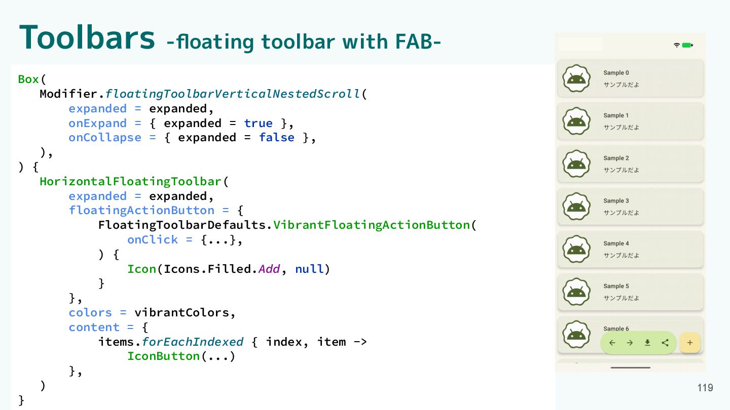
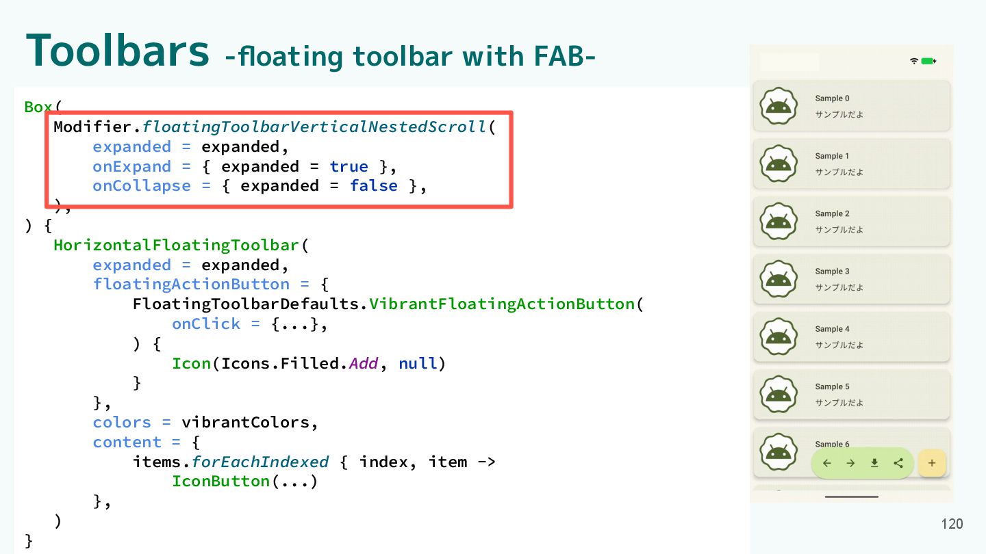
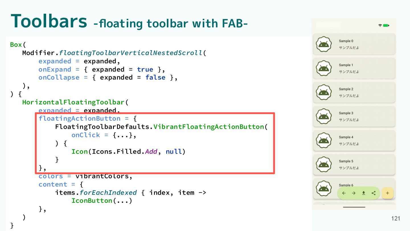
Toolbars -floating toolbar with FAB- Box( Modifier.floatingToolbarVerticalNestedScroll( expanded = expanded,
onExpand = { expanded = true }, onCollapse = { expanded = false }, ), ) { HorizontalFloatingToolbar( expanded = expanded, floatingActionButton = { FloatingToolbarDefaults.VibrantFloatingActionButton( onClick = {...}, ) { Icon(Icons.Filled.Add, null) } }, colors = vibrantColors, content = { items.forEachIndexed { index, item -> IconButton(...) }, ) } 119
Toolbars -floating toolbar with FAB- Box( Modifier.floatingToolbarVerticalNestedScroll( expanded = expanded,
onExpand = { expanded = true }, onCollapse = { expanded = false }, ), ) { HorizontalFloatingToolbar( expanded = expanded, floatingActionButton = { FloatingToolbarDefaults.VibrantFloatingActionButton( onClick = {...}, ) { Icon(Icons.Filled.Add, null) } }, colors = vibrantColors, content = { items.forEachIndexed { index, item -> IconButton(...) }, ) } 120
Toolbars -floating toolbar with FAB- Box( Modifier.floatingToolbarVerticalNestedScroll( expanded = expanded,
onExpand = { expanded = true }, onCollapse = { expanded = false }, ), ) { HorizontalFloatingToolbar( expanded = expanded, floatingActionButton = { FloatingToolbarDefaults.VibrantFloatingActionButton( onClick = {...}, ) { Icon(Icons.Filled.Add, null) } }, colors = vibrantColors, content = { items.forEachIndexed { index, item -> IconButton(...) }, ) } 121
Component紹介 ・App bars ・Common buttons ・Icon buttons ・Button groups ・Split
button ・FABs ・Extended FAB ・FAB menu 122 ・Loading indicator ・Progress indicator ・Navigation bar ・Navigation rail ・Toolbars ・Sliders
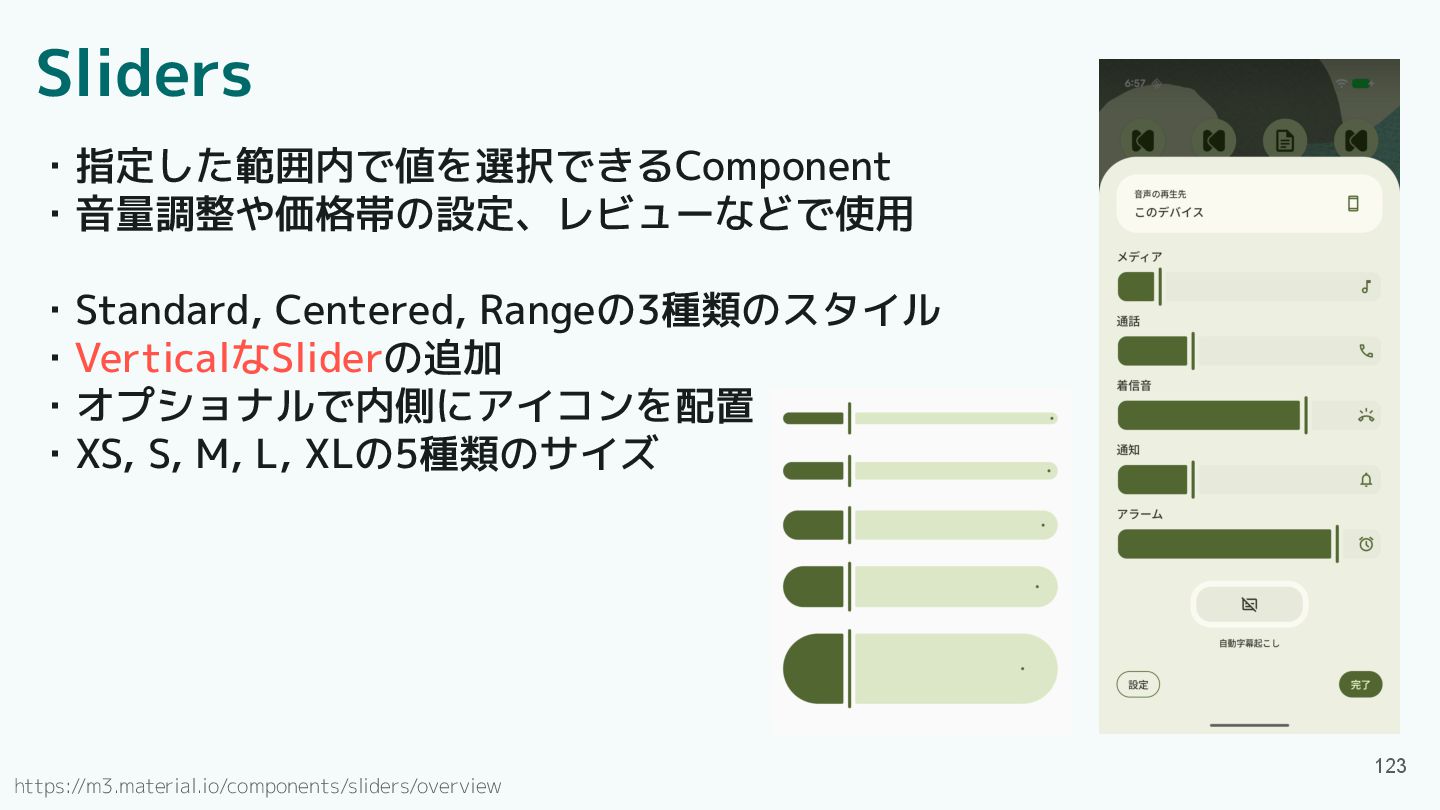
Sliders ・指定した範囲内で値を選択できるComponent ・音量調整や価格帯の設定、レビューなどで使用 ・Standard, Centered, Rangeの3種類のスタイル ・VerticalなSliderの追加 ・オプショナルで内側にアイコンを配置 ・XS, S,
M, L, XLの5種類のサイズ 123 https://m3.material.io/components/sliders/overview
Sliders ・指定した範囲内で値を選択できるComponent ・音量調整や価格帯の設定、レビューなどで使用 ・Standard, Centered, Rangeの3種類のスタイル ・VerticalなSliderの追加 ・オプショナルで内側にアイコンを配置 ・XS, S,
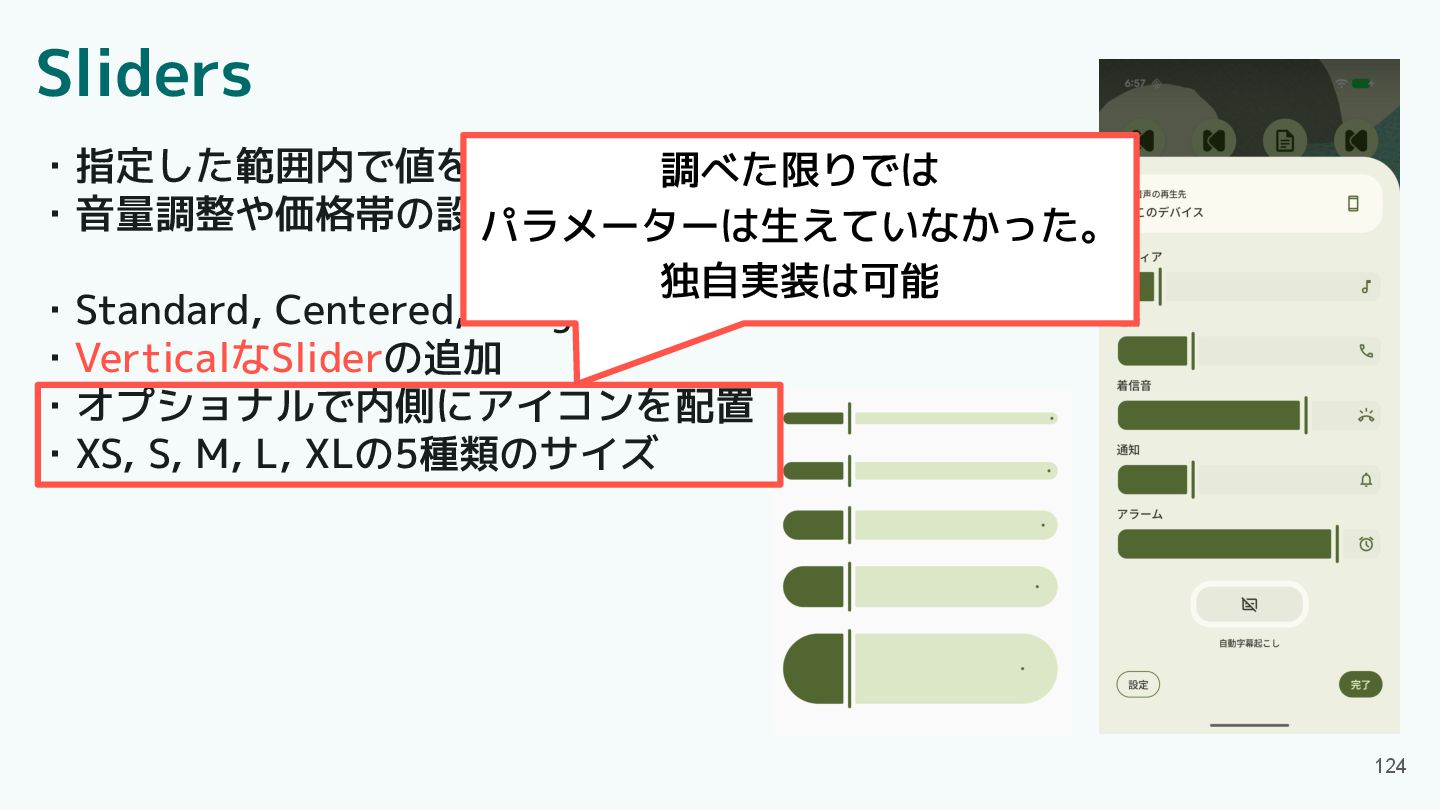
M, L, XLの5種類のサイズ 124 調べた限りでは パラメーターは生えていなかった。 独自実装は可能
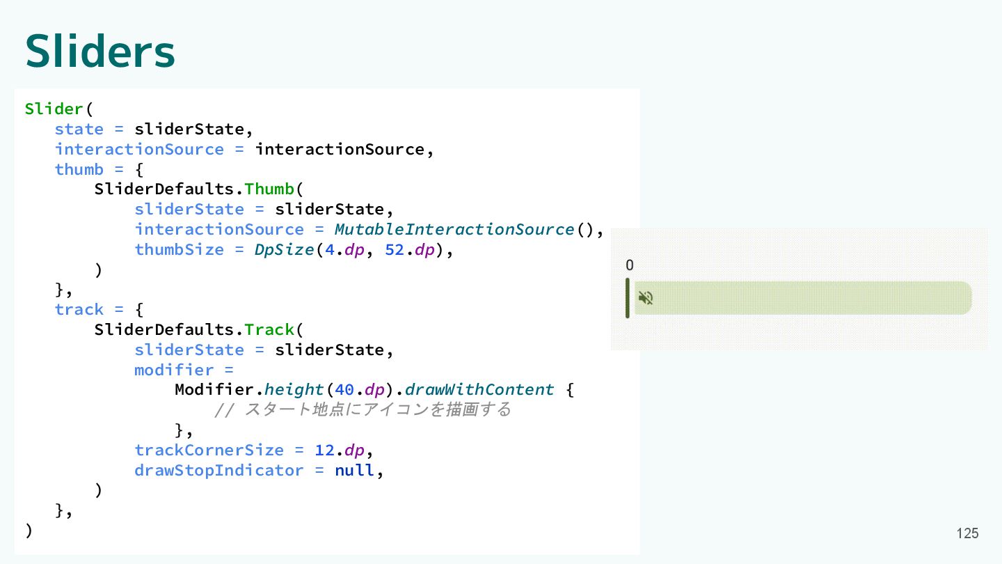
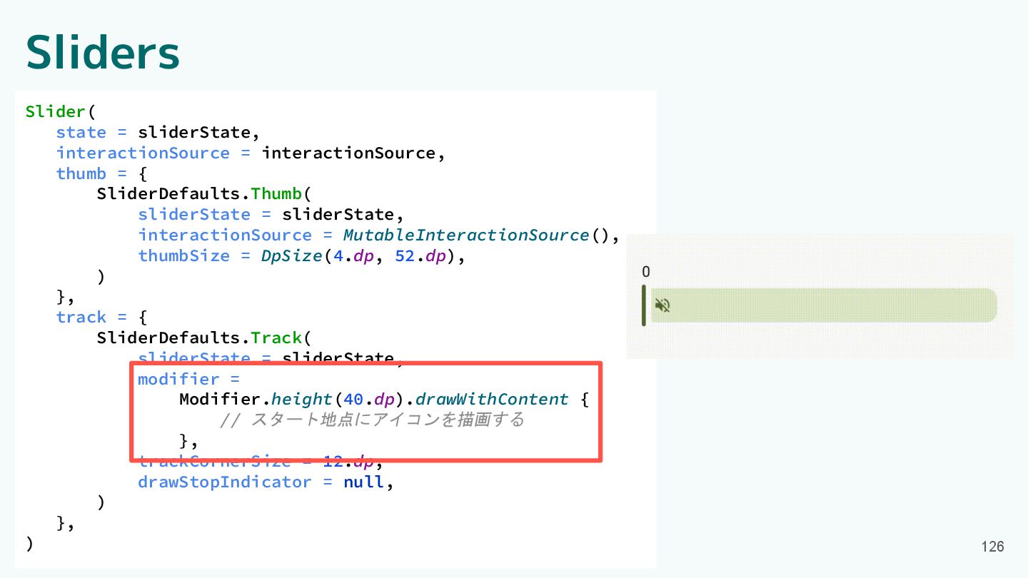
Sliders 125 Slider( state = sliderState, interactionSource = interactionSource, thumb
= { SliderDefaults.Thumb( sliderState = sliderState, interactionSource = MutableInteractionSource(), thumbSize = DpSize(4.dp, 52.dp), ) }, track = { SliderDefaults.Track( sliderState = sliderState, modifier = Modifier.height(40.dp).drawWithContent { // スタート地点にアイコンを描画する }, trackCornerSize = 12.dp, drawStopIndicator = null, ) }, )
Sliders 126 Slider( state = sliderState, interactionSource = interactionSource, thumb
= { SliderDefaults.Thumb( sliderState = sliderState, interactionSource = MutableInteractionSource(), thumbSize = DpSize(4.dp, 52.dp), ) }, track = { SliderDefaults.Track( sliderState = sliderState, modifier = Modifier.height(40.dp).drawWithContent { // スタート地点にアイコンを描画する }, trackCornerSize = 12.dp, drawStopIndicator = null, ) }, )
Sliders 127 Slider( state = sliderState, interactionSource = interactionSource, thumb
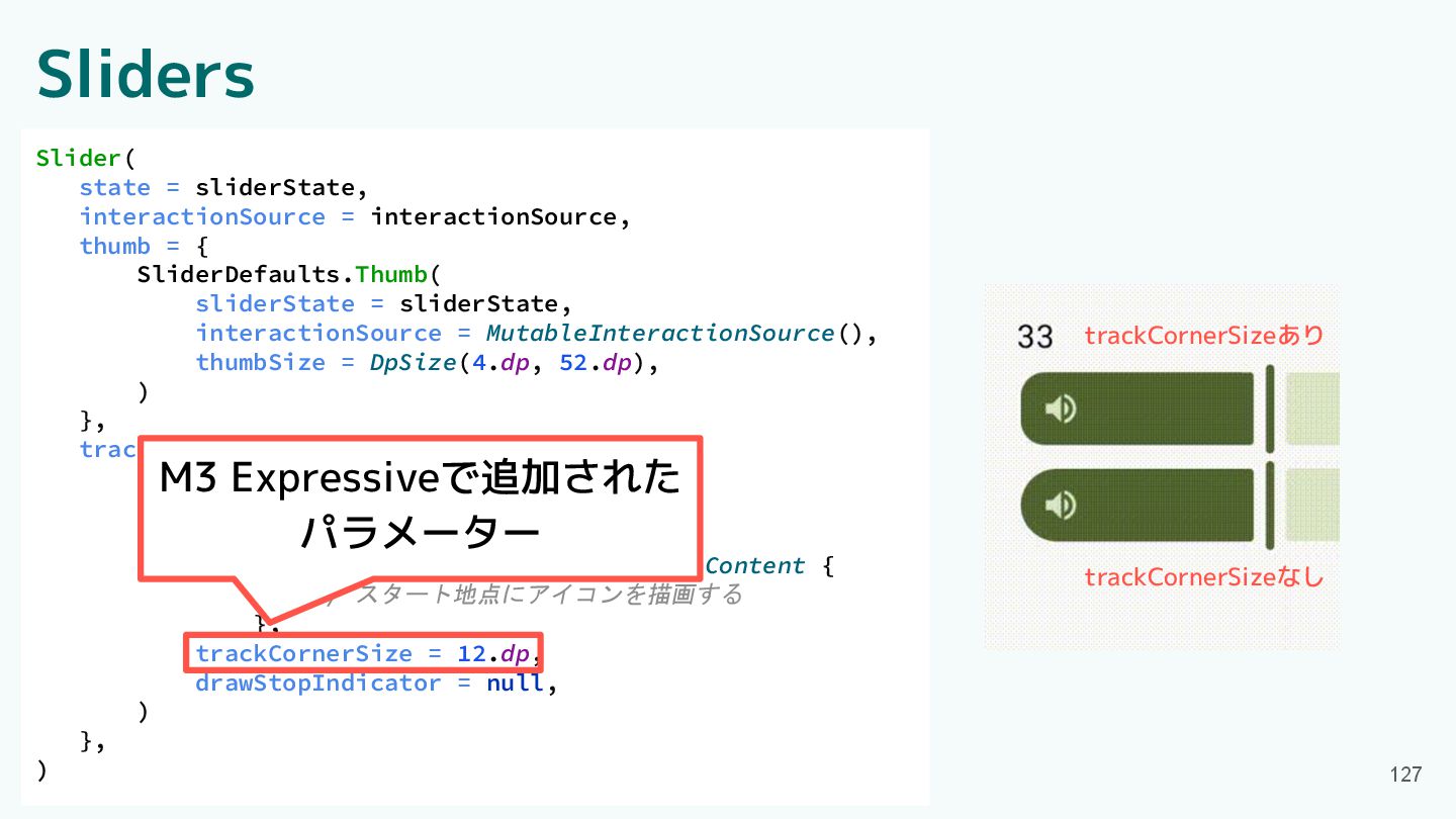
= { SliderDefaults.Thumb( sliderState = sliderState, interactionSource = MutableInteractionSource(), thumbSize = DpSize(4.dp, 52.dp), ) }, track = { SliderDefaults.Track( sliderState = sliderState, modifier = Modifier.height(40.dp).drawWithContent { // スタート地点にアイコンを描画する }, trackCornerSize = 12.dp, drawStopIndicator = null, ) }, ) M3 Expressiveで追加された パラメーター trackCornerSizeあり trackCornerSizeなし
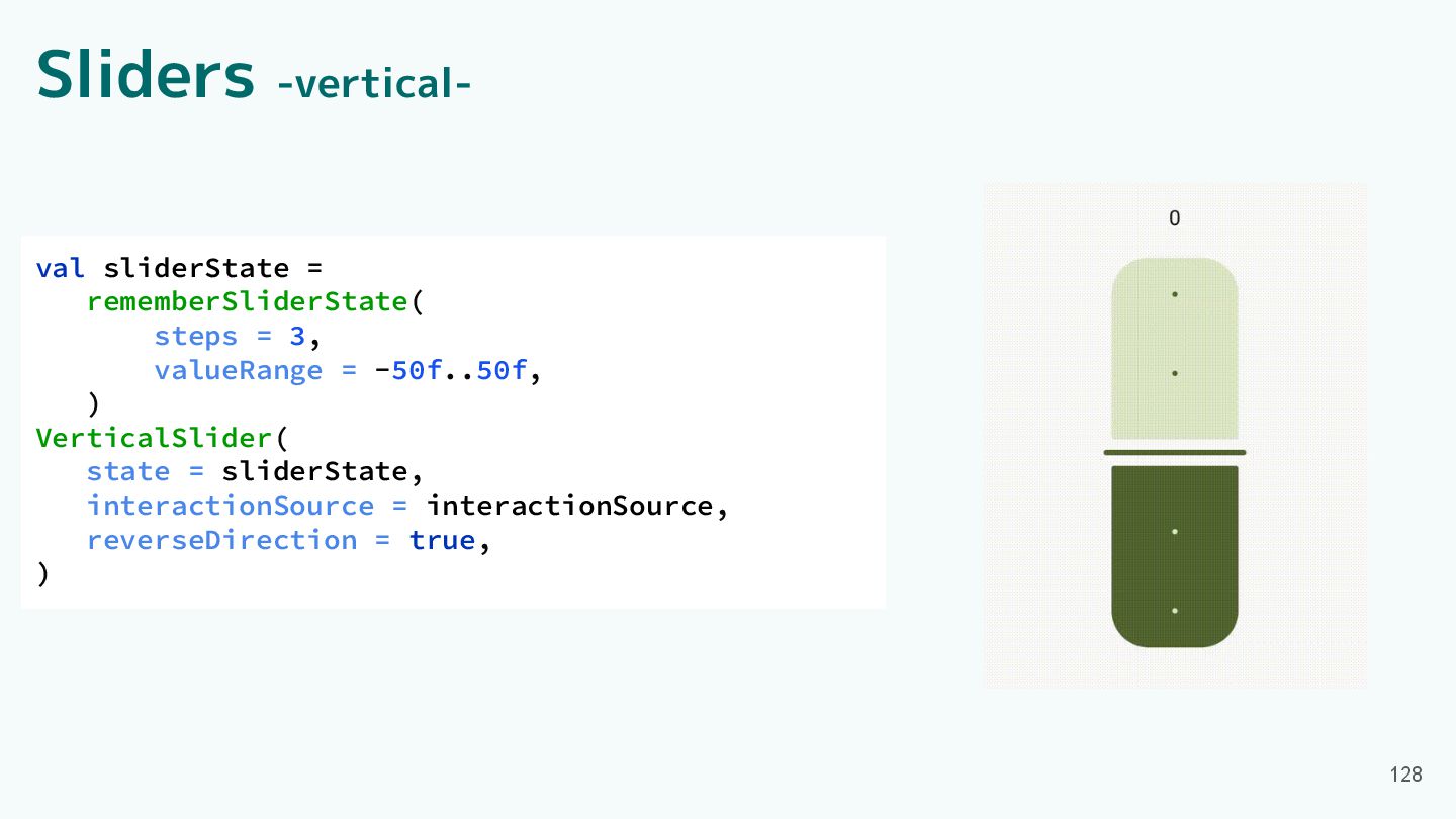
Sliders -vertical- 128 val sliderState = rememberSliderState( steps = 3,
valueRange = -50f..50f, ) VerticalSlider( state = sliderState, interactionSource = interactionSource, reverseDirection = true, )
Component紹介 ・App bars ・Common buttons ・Icon buttons ・Button groups ・Split
button ・FABs ・Extended FAB ・FAB menu 129 ・Loading indicator ・Progress indicator ・Navigation bar ・Navigation rail ・Toolbars ・Sliders
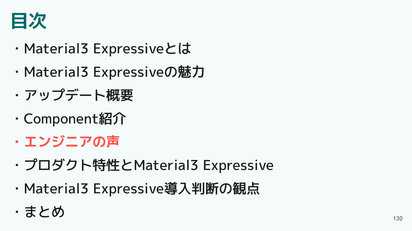
目次 ・Material3 Expressiveとは ・Material3 Expressiveの魅力 ・アップデート概要 ・Component紹介 ・エンジニアの声 ・プロダクト特性とMaterial3 Expressive
・Material3 Expressive導入判断の観点 ・まとめ 130
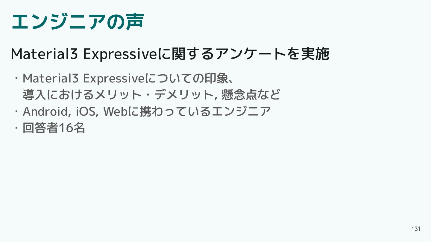
エンジニアの声 131 ・Material3 Expressiveについての印象、 導入におけるメリット・デメリット, 懸念点など ・Android, iOS, Webに携わっているエンジニア ・回答者16名
Material3 Expressiveに関するアンケートを実施
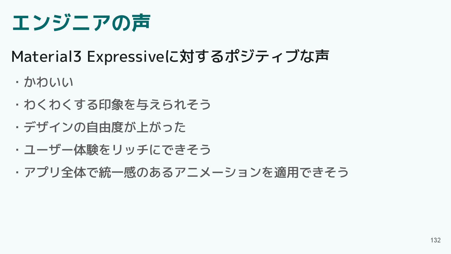
エンジニアの声 132 ・かわいい ・わくわくする印象を与えられそう ・デザインの自由度が上がった ・ユーザー体験をリッチにできそう ・アプリ全体で統一感のあるアニメーションを適用できそう Material3 Expressiveに対するポジティブな声
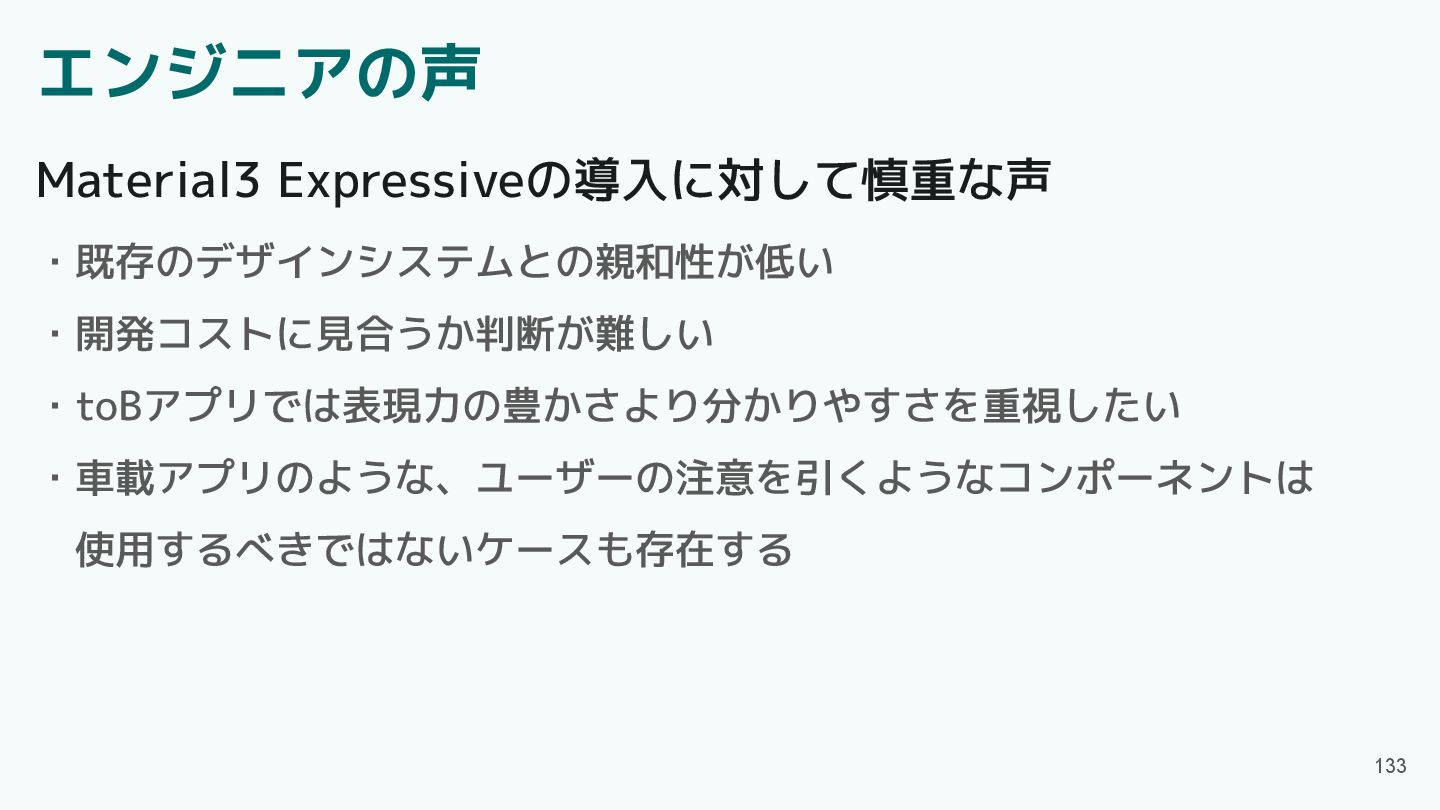
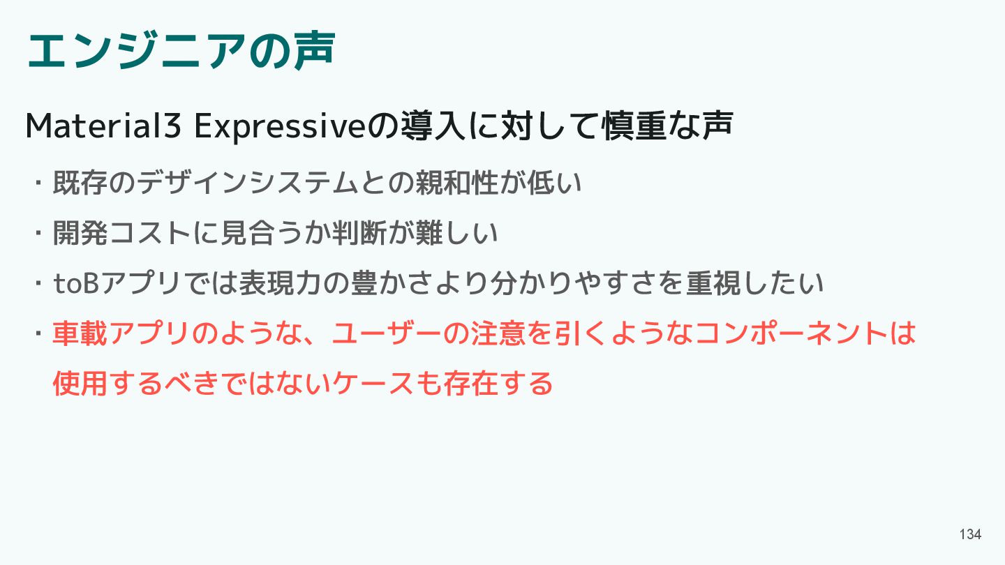
エンジニアの声 133 ・既存のデザインシステムとの親和性が低い ・開発コストに見合うか判断が難しい ・toBアプリでは表現力の豊かさより分かりやすさを重視したい ・車載アプリのような、ユーザーの注意を引くようなコンポーネントは 使用するべきではないケースも存在する Material3 Expressiveの導入に対して慎重な声
エンジニアの声 134 ・既存のデザインシステムとの親和性が低い ・開発コストに見合うか判断が難しい ・toBアプリでは表現力の豊かさより分かりやすさを重視したい ・車載アプリのような、ユーザーの注意を引くようなコンポーネントは 使用するべきではないケースも存在する Material3 Expressiveの導入に対して慎重な声
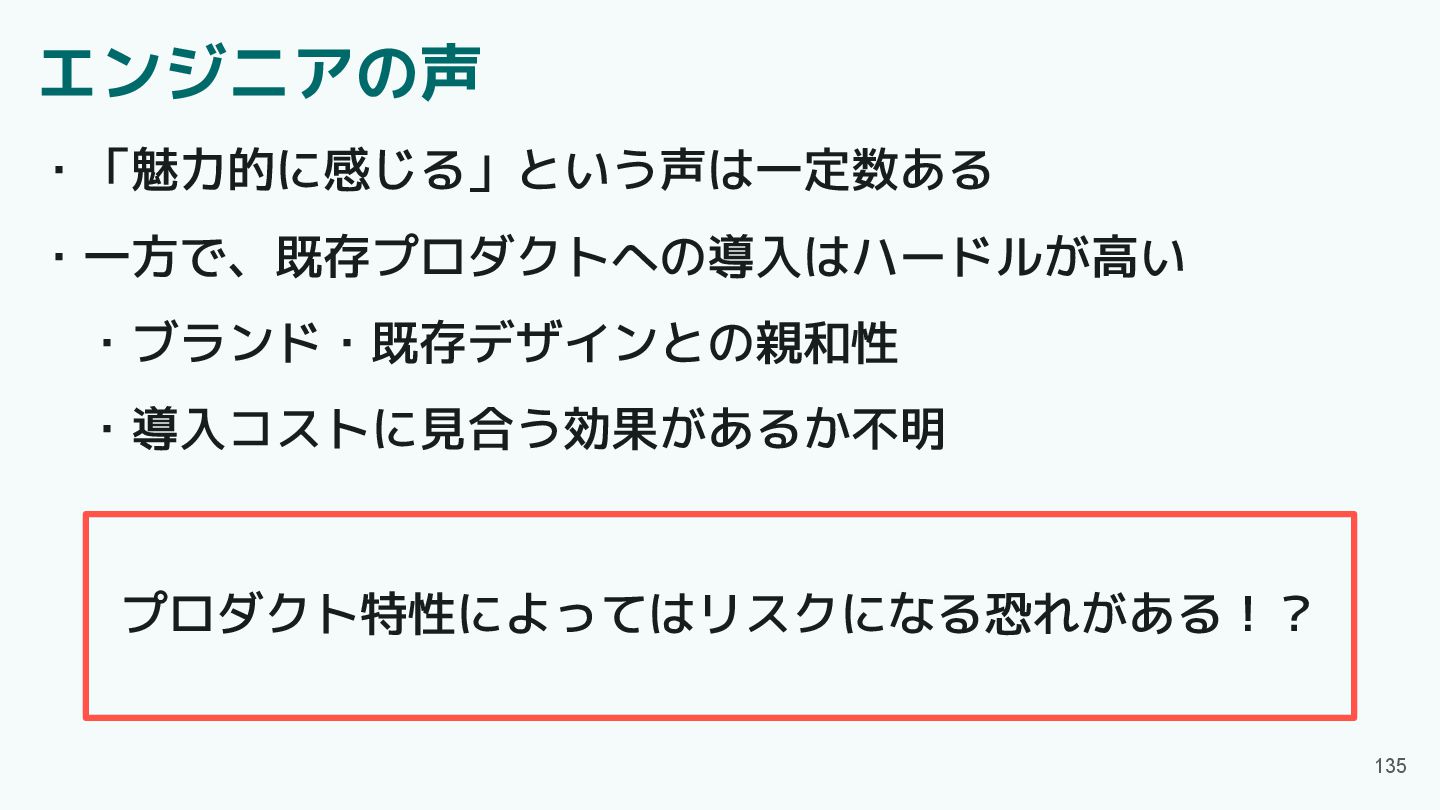
エンジニアの声 135 ・「魅力的に感じる」という声は一定数ある ・一方で、既存プロダクトへの導入はハードルが高い ・ブランド・既存デザインとの親和性 ・導入コストに見合う効果があるか不明 プロダクト特性によってはリスクになる恐れがある!?
目次 ・Material3 Expressiveとは ・Material3 Expressiveの魅力 ・アップデート概要 ・Component紹介 ・エンジニアの声 ・プロダクト特性とMaterial3 Expressive
・Material3 Expressive導入判断の観点 ・まとめ 136
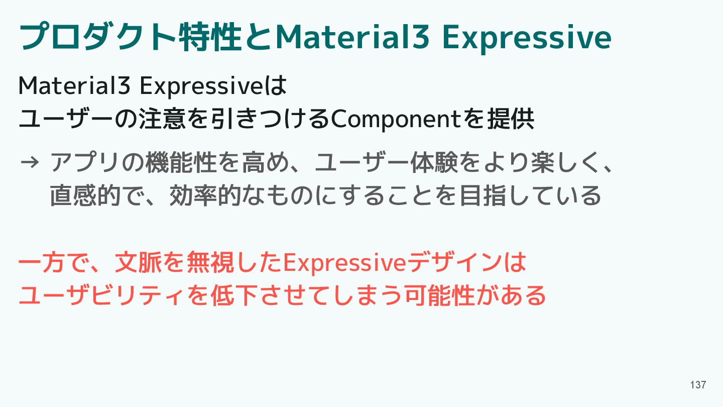
プロダクト特性とMaterial3 Expressive 137 Material3 Expressiveは ユーザーの注意を引きつけるComponentを提供 → アプリの機能性を高め、ユーザー体験をより楽しく、 直感的で、効率的なものにすることを目指している
一方で、文脈を無視したExpressiveデザインは ユーザビリティを低下させてしまう可能性がある
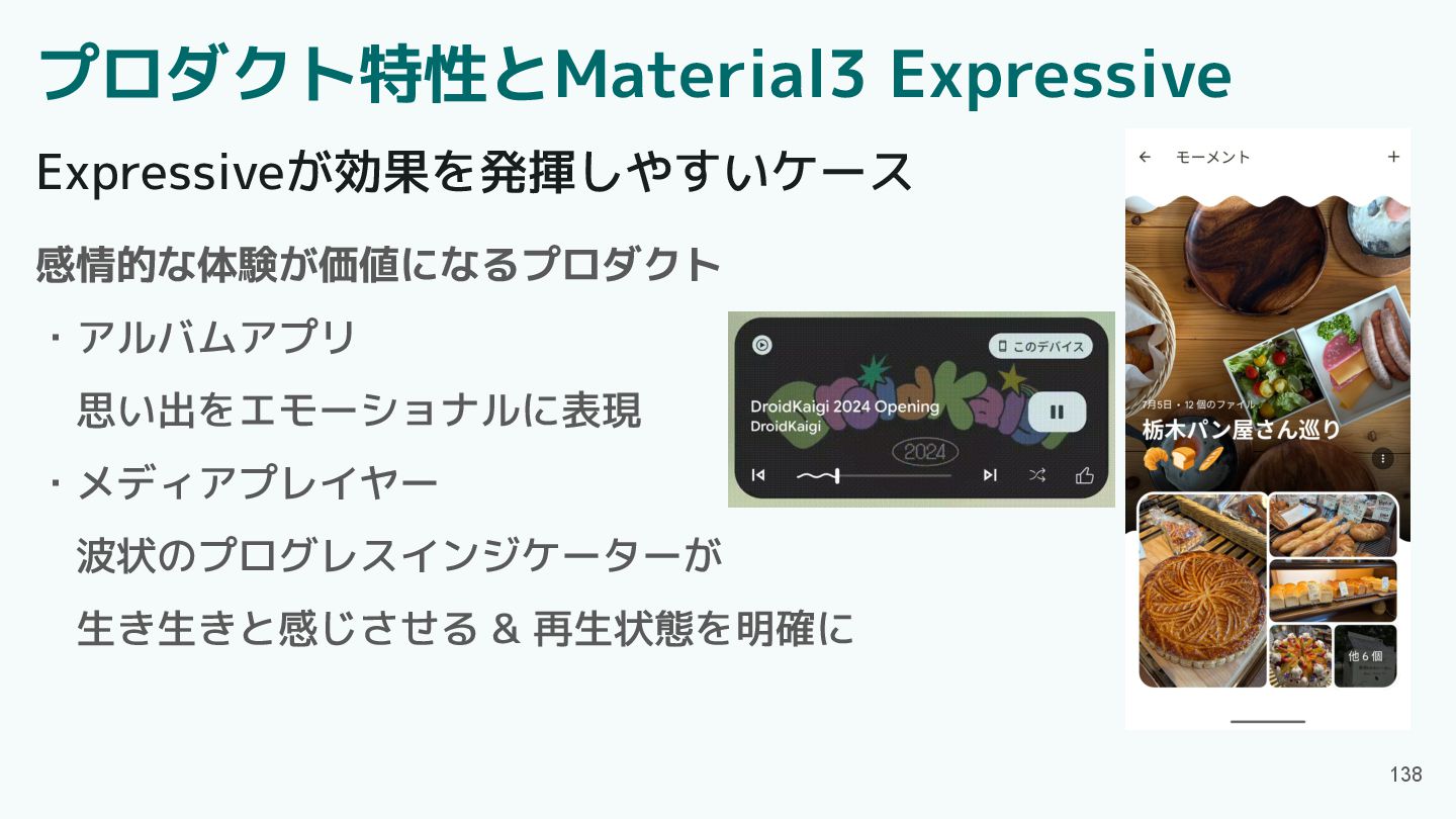
プロダクト特性とMaterial3 Expressive 138 Expressiveが効果を発揮しやすいケース 感情的な体験が価値になるプロダクト ・アルバムアプリ 思い出をエモーショナルに表現 ・メディアプレイヤー 波状のプログレスインジケーターが 生き生きと感じさせる
& 再生状態を明確に
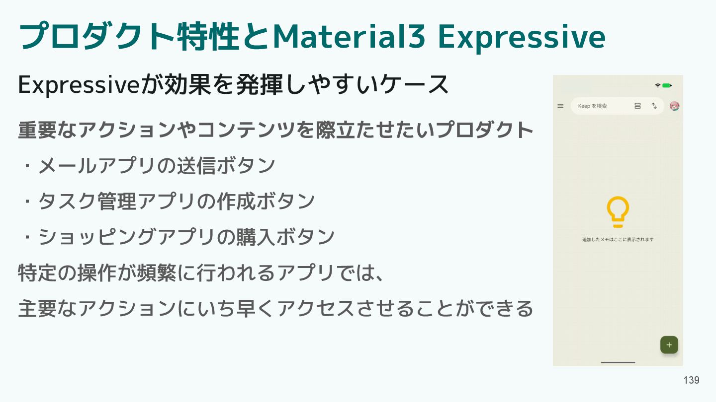
プロダクト特性とMaterial3 Expressive 139 Expressiveが効果を発揮しやすいケース 重要なアクションやコンテンツを際立たせたいプロダクト ・メールアプリの送信ボタン ・タスク管理アプリの作成ボタン ・ショッピングアプリの購入ボタン 特定の操作が頻繁に行われるアプリでは、 主要なアクションにいち早くアクセスさせることができる
プロダクト特性とMaterial3 Expressive 140 Expressiveがリスクになりやすいケース 機能性・信頼性・正確性が優先されるプロダクト ・銀行アプリ ・toB向けの業務アプリ ユーザーの目的は「素早く・正確に仕事を完了すること」 余計なアニメーションや派手なモーションは操作速度に影響を及ぼす 派手さがブランドイメージを損なう可能性もある
キーアクションの発見性向上に限定して導入するのは有効
プロダクト特性とMaterial3 Expressive 141 Expressiveがリスクになりやすいケース 安全性・即時性が優先されるプロダクト ・車載アプリ ・災害通知アプリ 「現実世界の状況把握」や「即時の判断」が最優先 表現豊かなUIが注意を奪うと、事故・誤操作・行動遅れにつながる Expressiveな要素は基本的に控えるべき
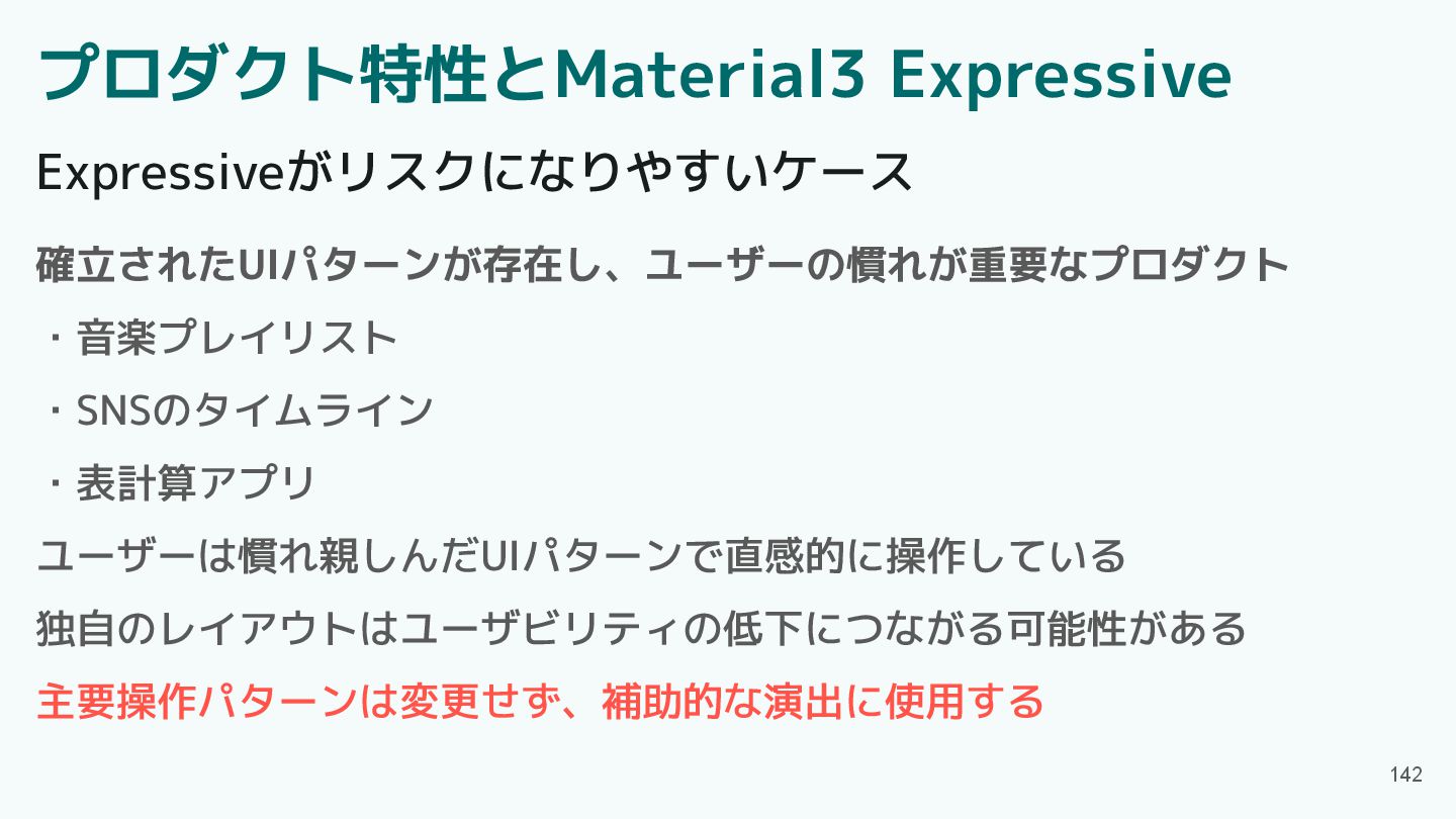
プロダクト特性とMaterial3 Expressive 142 Expressiveがリスクになりやすいケース 確立されたUIパターンが存在し、ユーザーの慣れが重要なプロダクト ・音楽プレイリスト ・SNSのタイムライン ・表計算アプリ ユーザーは慣れ親しんだUIパターンで直感的に操作している 独自のレイアウトはユーザビリティの低下につながる可能性がある
主要操作パターンは変更せず、補助的な演出に使用する
目次 ・Material3 Expressiveとは ・Material3 Expressiveの魅力 ・アップデート概要 ・Component紹介 ・エンジニアの声 ・プロダクト特性とMaterial3 Expressive
・Material3 Expressive導入判断の観点 ・まとめ 143
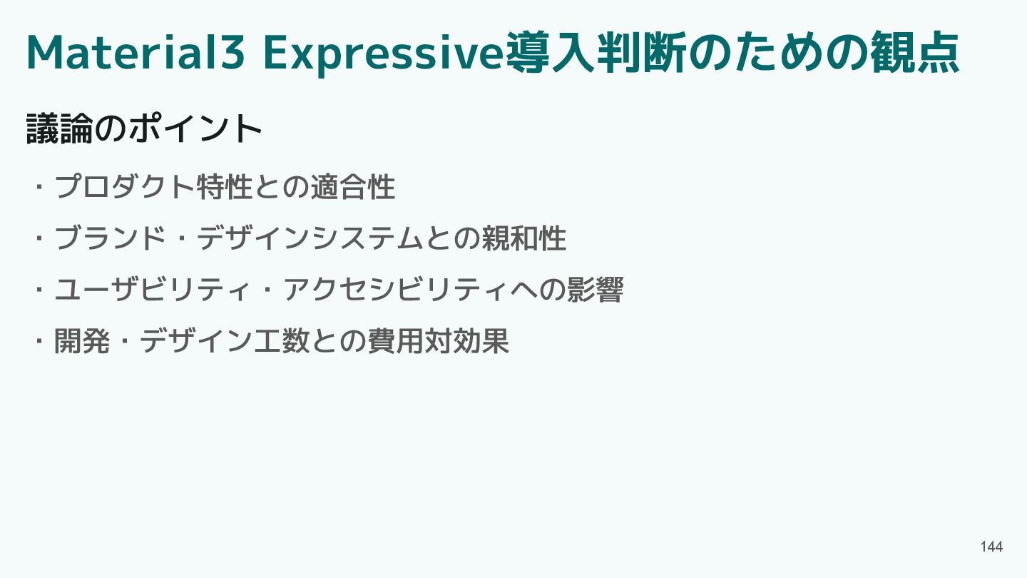
Material3 Expressive導入判断のための観点 144 議論のポイント ・プロダクト特性との適合性 ・ブランド・デザインシステムとの親和性 ・ユーザビリティ・アクセシビリティへの影響 ・開発・デザイン工数との費用対効果
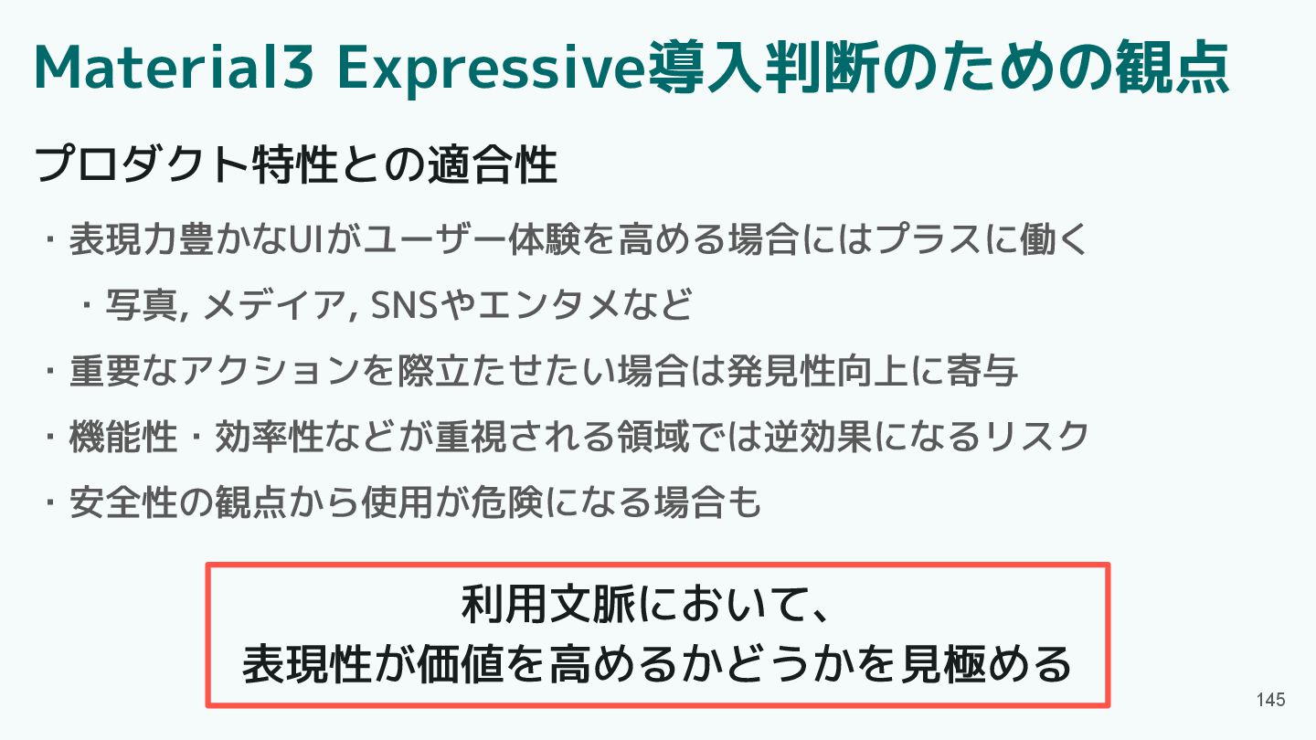
145 プロダクト特性との適合性 ・表現力豊かなUIがユーザー体験を高める場合にはプラスに働く ・写真, メデイア, SNSやエンタメなど ・重要なアクションを際立たせたい場合は発見性向上に寄与 ・機能性・効率性などが重視される領域では逆効果になるリスク ・安全性の観点から使用が危険になる場合も 利用文脈において、
表現性が価値を高めるかどうかを見極める Material3 Expressive導入判断のための観点
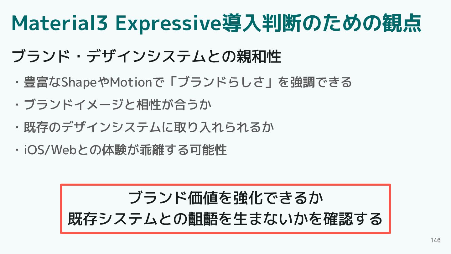
146 ブランド・デザインシステムとの親和性 ・豊富なShapeやMotionで「ブランドらしさ」を強調できる ・ブランドイメージと相性が合うか ・既存のデザインシステムに取り入れられるか ・iOS/Webとの体験が乖離する可能性 ブランド価値を強化できるか 既存システムとの齟齬を生まないかを確認する Material3 Expressive導入判断のための観点
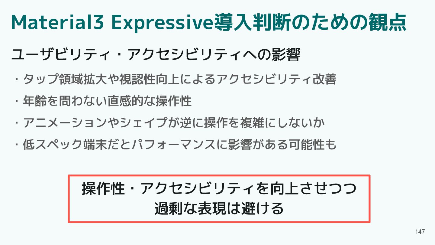
147 ユーザビリティ・アクセシビリティへの影響 ・タップ領域拡大や視認性向上によるアクセシビリティ改善 ・年齢を問わない直感的な操作性 ・アニメーションやシェイプが逆に操作を複雑にしないか ・低スペック端末だとパフォーマンスに影響がある可能性も 操作性・アクセシビリティを向上させつつ 過剰な表現は避ける Material3 Expressive導入判断のための観点
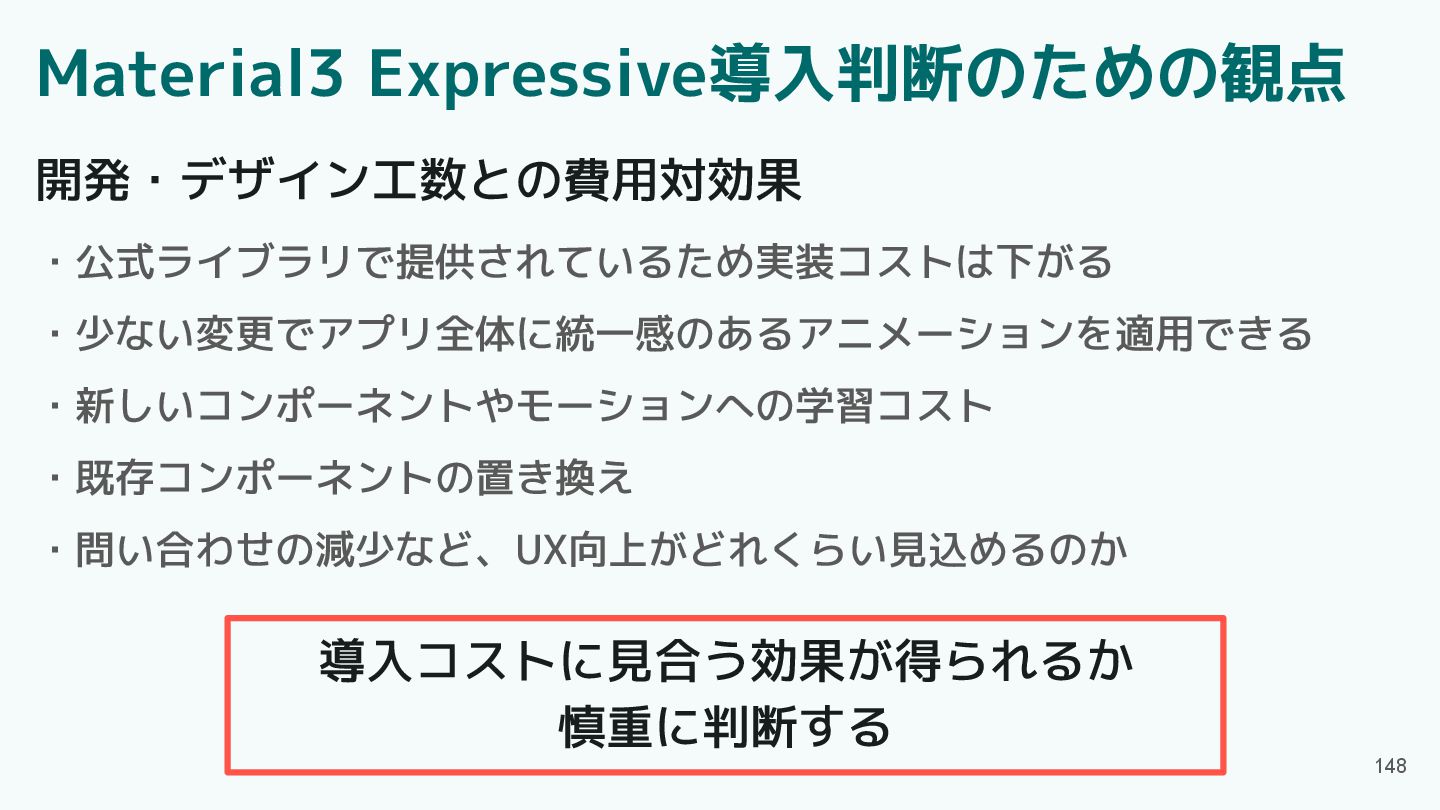
148 開発・デザイン工数との費用対効果 ・公式ライブラリで提供されているため実装コストは下がる ・少ない変更でアプリ全体に統一感のあるアニメーションを適用できる ・新しいコンポーネントやモーションへの学習コスト ・既存コンポーネントの置き換え ・問い合わせの減少など、UX向上がどれくらい見込めるのか 導入コストに見合う効果が得られるか 慎重に判断する Material3
Expressive導入判断のための観点
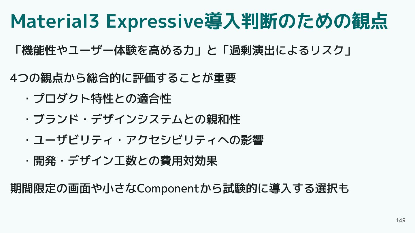
149 「機能性やユーザー体験を高める力」と「過剰演出によるリスク」 4つの観点から総合的に評価することが重要 ・プロダクト特性との適合性 ・ブランド・デザインシステムとの親和性 ・ユーザビリティ・アクセシビリティへの影響 ・開発・デザイン工数との費用対効果 期間限定の画面や小さなComponentから試験的に導入する選択も Material3 Expressive導入判断のための観点
目次 150 ・Material3 Expressiveとは ・Material3 Expressiveの魅力 ・アップデート概要 ・Component紹介 ・エンジニアの声 ・プロダクト特性とMaterial3
Expressive ・Material3 Expressive導入判断の観点 ・まとめ
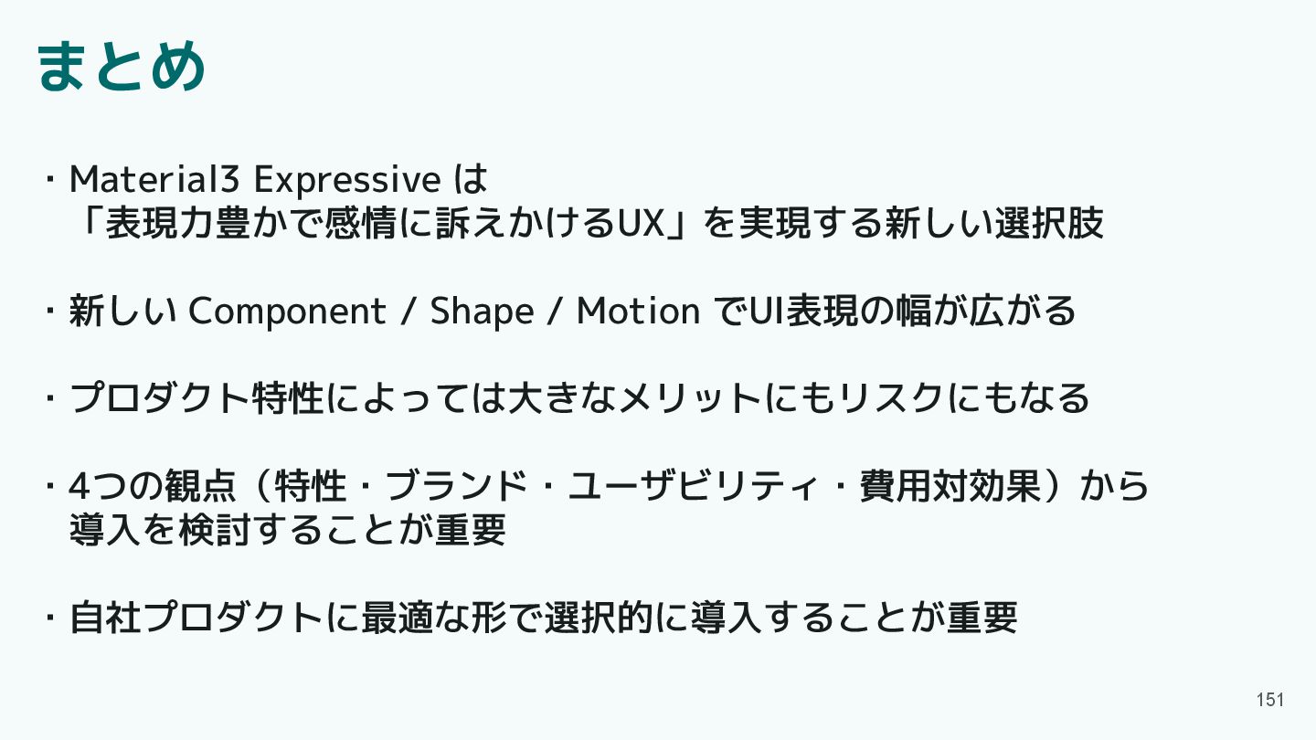
まとめ 151 ・Material3 Expressive は 「表現力豊かで感情に訴えかけるUX」を実現する新しい選択肢 ・新しい Component / Shape
/ Motion でUI表現の幅が広がる ・プロダクト特性によっては大きなメリットにもリスクにもなる ・4つの観点(特性・ブランド・ユーザビリティ・費用対効果)から 導入を検討することが重要 ・自社プロダクトに最適な形で選択的に導入することが重要
 ym223
ym223
 funnyycat
 oku053
 har1101
 pkshadeck
 guvalif
 mogamit
 tk3fftk
 johnroyer
 slashnephy
 findyinc
 cockscomb
 wakana0222
 nonsquared
 aki_iinuma
 inesmontani
 tammyeverts
 katiecoart
 bcantrill
 katarinadahlin
 kneath
 bermonpainter
 thoeni
 portentint
 hannesfritz