Upgrade to Pro — share decks privately, control downloads, hide ads and more …

Design for Comfortable Use

Yuan Wang
July 31, 2013

Design for Comfortable Use

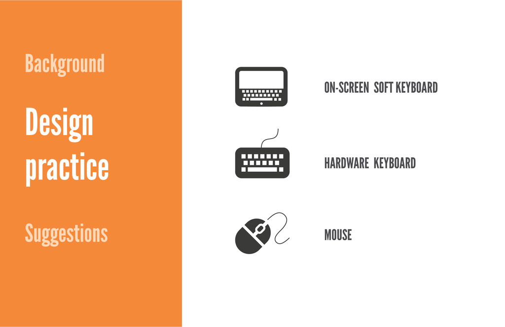
Hybrids are digital devices that accept multiple channels of input methods, for example touch, mouse, stylus, etc. People buy keyboard trays, styluses, wireless mouse to customize their workflows on touch devices. How to design a product that supports multiple inputs for comfortable use?

This presentation is created to share the tips that I gained from designing for Windows 8 with Firefox Android team.

Yuan Wang

July 31, 2013
Tweet

More Decks by Yuan Wang

Other Decks in Design

Transcript

  1. Designing for comfortable use Page 3 TV Desktop Tablet Smart

    Phone Context of use Input Screen-size 10 foot lean-back on the coach Long period of use at desk Casual bed or coach use Quick bursts of activity in various locations Remote control/ motion gestures Mouse/keyboard Touch Touch Wall-size Desk-size (11-20 inches) Lap-size (7-10 inches) Palm-size (3-5 inches) Traditional definition of device experiences Device experience by LukeW: https://developers.facebook.com/blog/post/2012/01/24/device-experiences---responsive-design/
  2. Designing for comfortable use Page 4 TV as computer monitor

    Touchscreen laptop, tablet deck Over palm size touchscreen with stylus What was once targeted to specific activities, is a highly customizable always on, always connected canvas. TV Desktop Tablet Smart Phone
  3. Designing for comfortable use Page 5 74% A Q1 2012

    study by Viacom of US tablet owners: http://www.emarketer.com/Article/Home-Where-Tablet/1009027 Google tablet study in 2011: http://www.google.com/think/research-studies/understanding-tablet-device-users.html tablet users are most likely to use their tablet at home of them use it in the living room of them use it in the bedroom of them are likely to use tablets in their home office 96% 94% 75% Tablets are used mostly on weekdays and in the night 77% reported that their desktop/laptop usage decreased after getting a tablet
  4. Designing for comfortable use Page 6 2010 2011 2012 2013

    14 inch 13 inch 12 inch 11 inch 10 inch 9 inch 8 inch 7 inch 6 inch Windows 8 Android Android and Windows 8 tablet screen-sizes are merging Data source: Android devices: http://en.wikipedia.org/wiki/Comparison_of_Android_devices Data source: Windows 8 devices: http://en.wikipedia.org/wiki/List_of_Windows_8_and_RT_tablet_devices
  5. Designing for comfortable use Page 7 TV Desktop Tablet Smart

    Phone Windows 8 Desktop machines Android Phone: Nexus 4 Windows Phone 8 Windows 8 7-inch tablets Android 7-inch tablets: Nexus 7 Android 10-inch tablets: Nexus 10 Windows 8 on Xbox Android based TV console Windows 8 hybrid and convertible devices Android hybrid devices? Chrome OS
  6. Designing for comfortable use Page 8 Windows 8 hybrid and

    convertible devices http://reviews.cnet.com/8301-33642_7-57531562-292/hybrids-vs-convertibles-cnets-field-guide-to-windows-8-hardware/ http://reviews.cnet.com/8301-33642_7-57531562-292/hybrids-vs-convertibles-cnets-field-guide-to-windows-8-hardware/ HP Envy X2 Surface Pro Lenovo IdeaPad Yoga The hybrid The hybrid lite The convertible
  7. Designing for comfortable use Page 9 Windows 8 hybrid and

    convertible devices http://reviews.cnet.com/8301-33642_7-57531562-292/hybrids-vs-convertibles-cnets-field-guide-to-windows-8-hardware/ Sony Vaio Duo 11 Sony Vaio T13 Touch The slider The touch-screen laptop
  8. Designing for comfortable use Page 10 http://reviews.cnet.com/8301-33642_7-57531562-292/hybrids-vs-convertibles-cnets-field-guide-to-windows-8-hardware/ Windows 8 hybrid

    and convertible devices Acer Aspire 7600 (27-inch) Sony Vaio Tap 20 All-in-one high-end Very large tablet (all-in-one)
  9. Designing for comfortable use Page 11 Android hybrid and convertible

    devices ASUS Transformer Series (10.1-inch) The hybrid ASUS Slider Pad (10.1-inch) The slider ASUS transformer: http://www.asus.com/Tablets_Mobile/ASUS_Transformer_Pad_Infinity_TF700T/ ASUS slider pad: http://www.asus.com/Tablets_Mobile/Eee_Pad_Slider_SL101/
  10. Designing for comfortable use Page 12 Android + Windows 8

    hybrid! The convertible + the slider Samsung ATIV Q (13-inch) Multi functional design adapts on the go: http://www.ztechx.com/wp-content/uploads/2013/07/Ativ-Q.jpg
  11. ON-SCREEN SOFT KEYBOARD 1. Adaptive layout 2. Design for limited

    space first 3. Customize keyboard keys 4. Easy to reach main input fields
  12. Designing for comfortable use Page 15 1 Adaptive layout On-screen

    keyboard should not block users from getting their tasks done. In the message app on Windows 8, input fields move up and sit on top of the on-screen keyboard.
  13. Designing for comfortable use Page 16 Adaptive layout 1 Provide

    additional value for additional space In the Bing search app, there are more search results when on- screen keyboard is not in use
  14. Designing for comfortable use Page 17 2 Design for limited

    space first Firefox Metro: Explorations on auto-complete snap view Exploration #1: Managed to fit all the content. But the tiles are not identifiable since no space is left to display to full title Exploration #2: Enough space to display the full title. The trade-off is to add a vertical scroll bar for auto- complete snap view
  15. Designing for comfortable use Page 18 3 Customize keyboard keys

    Google Chrome iPad app shows a customized keyboard to make typing and editing URL easier
  16. Designing for comfortable use Page 19 4 Easy to reach

    main input fields An eye-tracking testing on Windows 8 tablet Input fields receive the most amount of focus when participant types on soft keyboard. The bigger the screen is, the further distance eyes have to travel. http://blogs.msdn.com/cfs-filesystemfile.ashx/__key/communityserver-blogs-components-weblogfiles/00-00-01-29-43-metablogapi/5722.Eye_2D00_track- ing_2D00_study_5F00_3F7CFB7A.png
  17. Designing for comfortable use Page 21 1 Functional without touch

    or mouse Each UI element that can be clicked can also be invoked with the keyboard. Navigate among interactive UI elements (links, drop downs) by using the Tab key. http://www.dsquaredmedia.net/wp-content/uploads/2013/03/website-accessibility.png
  18. Designing for comfortable use Page 22 2 Support common keyboard

    commands https://etherpad.mozilla.org/metro-shortcuts http://cloud.addictivetips.com/wp-content/uploads/2012/11/Firefox-keyboard-shortcuts_ft.jpg
  19. Designing for comfortable use Page 24 1 Take advantage of

    hover-over Hover to learn more: Display more detailed info or teaching visuals (such as a tool-tip) without a commitment to an action In the Mail app, hovering over main commands reveals the label and also keyboard short-cut
  20. Designing for comfortable use Page 25 2 Consider mouse device

    capabilities Microsoft Touch Mouse supports swiping gestures by thumb, two fingers, and three fingers. It’s worthy checking how the app reacts to those swiping gestures.
  21. Designing for comfortable use Page 26 3 Provide affordance for

    the cursor A screen-shot of my Firefox Metro Start Page Right now the tiles don’t have affordances when the cursor is on top of tiles. They don’t feel live and inviting yet.
  22. Designing for comfortable use Page 27 How is Firefox for

    Metro doing on these practices? Easy to reach main input fields Design for limited space first Set up an adaptive layout Customize keyboard keys Support common keyboard commands Functional without touch or mouse Consider mouse device capabilities Take advantage of hover-over Provide affordance for the cursor Done In progress To explore
  23. Designing for comfortable use Page 29 Main themes Set up

    an adaptive layout Design for limited space first Support common keyboard commands Functional without touch or mouse Customized keyboard keys Consider mouse capabilities [New]Track-pad gestures Take advantage of hover-over Provide affordance for the cursor UI Optimizations Affordance Efficiency Ergonomics Easy to reach main input fields
  24. Designing for comfortable use Page 30 Favorites and priorities Set

    up an adaptive layout Design for limited space first Support common keyboard commands Functional without touch or mouse Customized keyboard keys Consider mouse capabilities [New]Trackpad gestures Take advantage of hover-over Provide affordance for the cursor UI Optimizations Affordance Efficiency Ergonomics Easy to reach main input fields
  25. Designing for comfortable use Page 31 Planning next steps Unknown

    solution Unknown problem To execute To apply To invent To explore Known problem known solution Functional without touch or mouse Support common keyboard command Provide affordance for the cursor Trackpad gestures Take advantage of hover-over Easy to reach main input fields Set up an adaptive layout Consider mouse capabilities Design for limited space first Customized keyboard keys
  26. Designing for comfortable use Page 32 Quick wins Provide affordance

    for the cursor Trackpad gestures auto crosshair default e-resize help move n-resize ne-resize nw-resize pointer progress s-resize se-resize sw-resize text w-resize wait Back Forward Scroll to top Scroll to bottom Pinch to zoom Double tap to zoom Functional without touch or mouse Tab key Input focus Right, left arrow key Home, End, Up, and Down key Default actions for Enter key Spacebar Access keys Customized keyboard keys .com www. form assistance: “Next” key CSS cusor property: http://www.w3schools.com/cssref/pr_class_cursor.asp