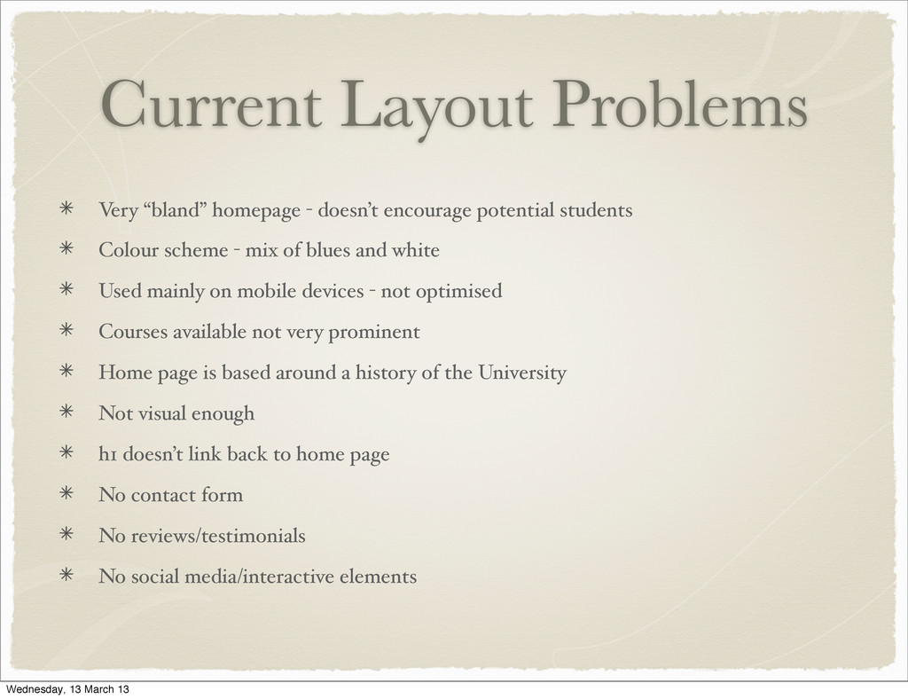
students Colour scheme - mix of blues and white Used mainly on mobile devices - not optimised Courses available not very prominent Home page is based around a history of the University Not visual enough h1 doesn’t link back to home page No contact form No reviews/testimonials No social media/interactive elements Wednesday, 13 March 13
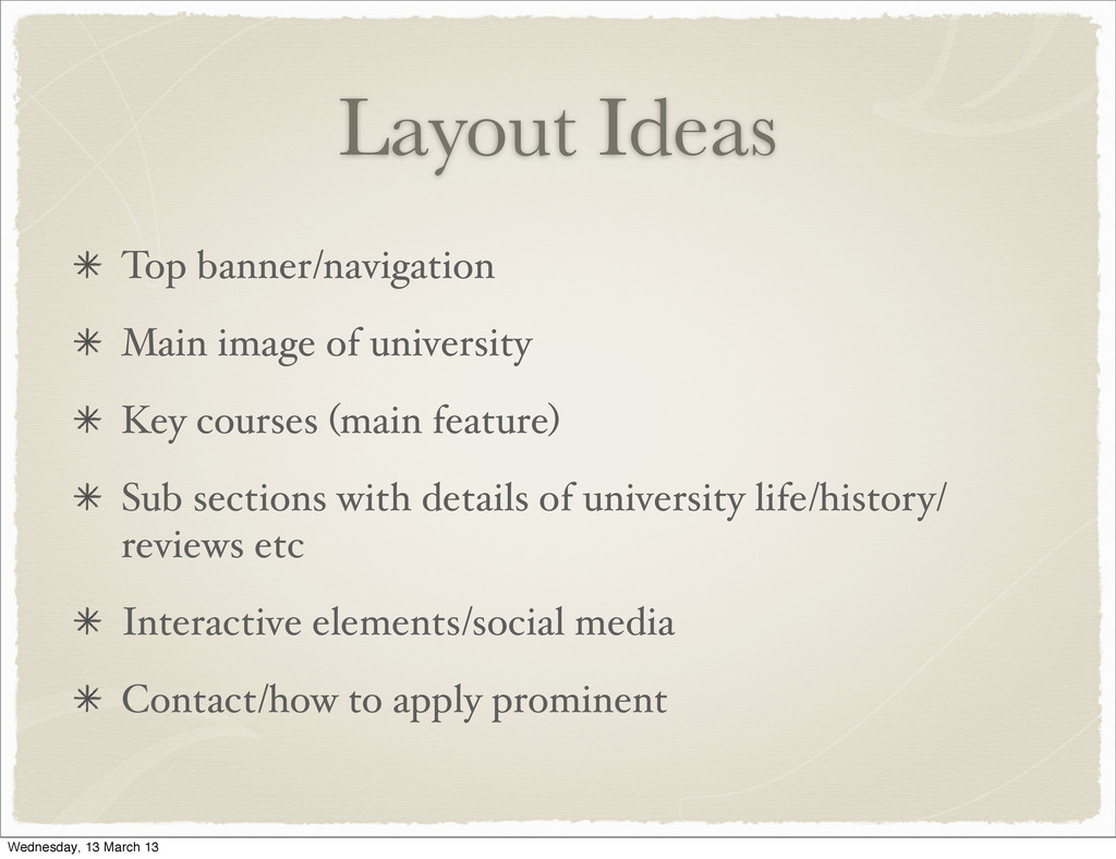
(main feature) Sub sections with details of university life/history/ reviews etc Interactive elements/social media Contact/how to apply prominent Wednesday, 13 March 13
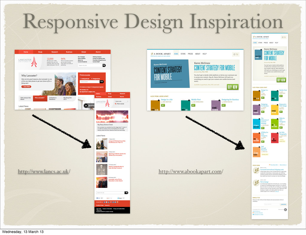