• Domain Specific Questions • Description of the System • Future Work • Problems/Things Learned • Application of What-Why-How Framework • Concluding Thoughts
getting into academia in the near future. • We are also curious to know which department pays the best for a given job description and how does it compare with that of the industry’s salary. • Project results will be published on ODU’s magazine either online or in print.
Crown • ODU Staff Directory (https://www.odu.edu/directory) • Median salaries from Salary.com and Payscale.com • Average salaries for each university from the Chronicle of Higher Education (http://chronicle.com/article/2013-14-AAUP-Faculty-Salary/145679)
handled in ruby script. • There were a lot of missing fields such as degree obtained, department, university, date of obtaining the highest degree. A lot of manual work went into this in finding the missing fields. (Personal blogs, LinkedIn etc.) • State fields were also missing and again, this was handled in the ruby script by getting the complete database of the US universities. States for other countries were extracted manually.
each department by position? How does it compare with that of the median salary for each department in other universities in U.S.A? • Geographic diversity of the faculty working at ODU. From which state/ country did they obtain their degree from? • How does the faculty salary compare with that of the industry salary, both holding the same degree? • Which department has the highest median salary?
using Tableau and a part of it was designed using D3. • We first tried to find out the geographical diversity of the ODU’s faculty members and explore where they obtained their degree from. • Later we compared the average salary across each department inside ODU and we also tried to find if a faculty’s tenure has a major impact on their salary. • Finally, we do a comparison between academic salary and the industry’s salary for people holding the same degree. Also, find out how ODU’s faculty salary compares with that of the salaries of faculty members from other universities across U.S.A.
staff types like people who hold administrative jobs, part-time jobs, assistantships etc. • More departments can be taken into consideration since the current data set is limited to few departments only. • Compare and contrast some factors like cost of living, quality of education, number of universities in each state and how this affect’s faculty’s salary.
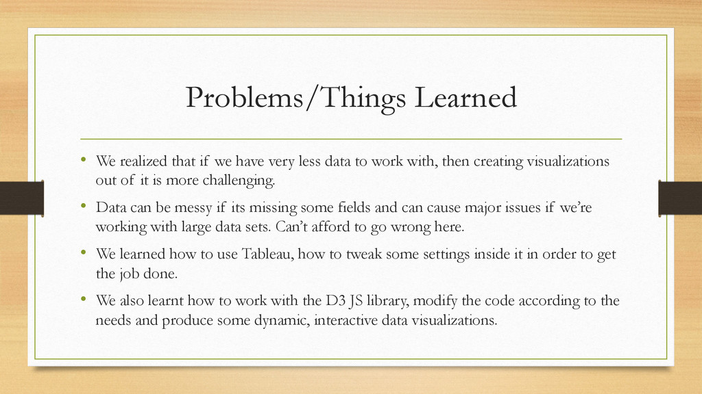
less data to work with, then creating visualizations out of it is more challenging. • Data can be messy if its missing some fields and can cause major issues if we’re working with large data sets. Can’t afford to go wrong here. • We learned how to use Tableau, how to tweak some settings inside it in order to get the job done. • We also learnt how to work with the D3 JS library, modify the code according to the needs and produce some dynamic, interactive data visualizations.
& Attributes. Here the attributes will be used as filters and items are the values for each attribute. • The attribute types were mostly categorical and quantitative. • The entire dataset was a static file. • What : Derived – Combination of original attributes to form new attributes. For example combining all Masters and Doctorate degrees into just two different attributes.
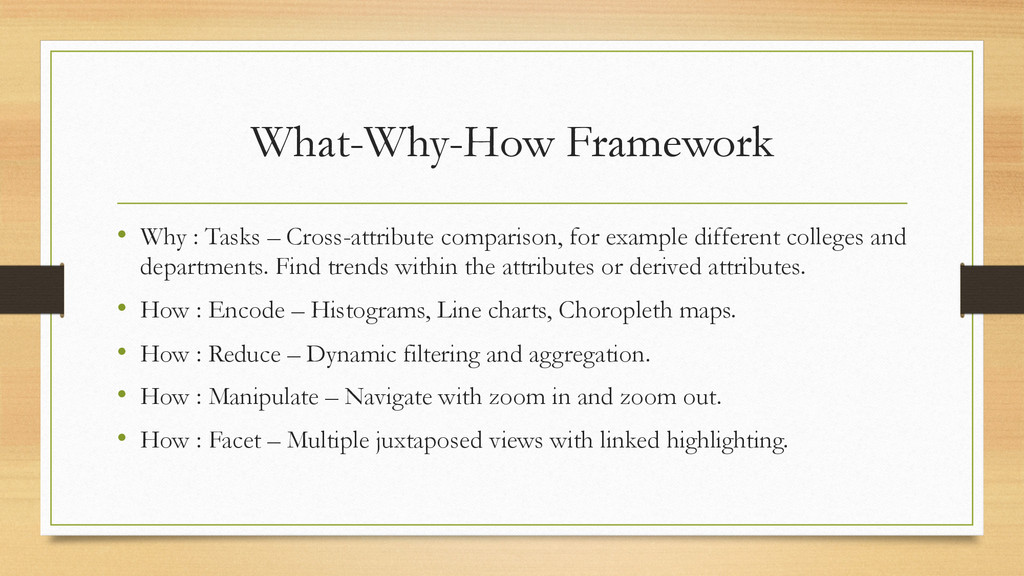
example different colleges and departments. Find trends within the attributes or derived attributes. • How : Encode – Histograms, Line charts, Choropleth maps. • How : Reduce – Dynamic filtering and aggregation. • How : Manipulate – Navigate with zoom in and zoom out. • How : Facet – Multiple juxtaposed views with linked highlighting.
directly proportional to their tenure since some of the faculty with less tenure earned way more than faculty with more tenure. • In some cases, an Eminent Scholar & a professor earned more than the department’s chair. • In almost all the fields of study, industry salary was much more higher than the academic salary. • Salary of a faculty member varies from location to location, maybe due to factors such as cost of living, student : faculty ratio, quality of education etc.