Upgrade to Pro — share decks privately, control downloads, hide ads and more …

Introduction to data visualization

abdou
March 23, 2018

Introduction to data visualization

This presentation was delivered in the scope of a social business training in the us embassy of Tunisia

abdou

March 23, 2018
Tweet

More Decks by abdou

Other Decks in Technology

Transcript

  1. Who am I ? • Software Engineer @ DI Tunis

    • Studied business in Indiana University (cocacola-scholarship) • Full stack Javascript developer • #React.js #node.js #mongoDB #cartography • You can find me on Github : https://github.com/hunter-x Or Linkedin : https://linkedin.com/in/gharsallah/ Some « Rules » : If anything is unclear please stop me There isn’t stupid questions ! Enjoy !!
  2. Principles of good data visualisation 1.Trustworthy A good data vizualisation

    should be honest, and show the real version of data without manipulations 3. Obtain feedback early and often This will make the process of the data viz faster specially if you’re working for a client 2. Elegent The elegance principle is important to make the viz more appealing and catchy to the readers
  3. Exploratory vs. explanatory visualization Exploratory Discover hidden patterns. Exploratory analysis

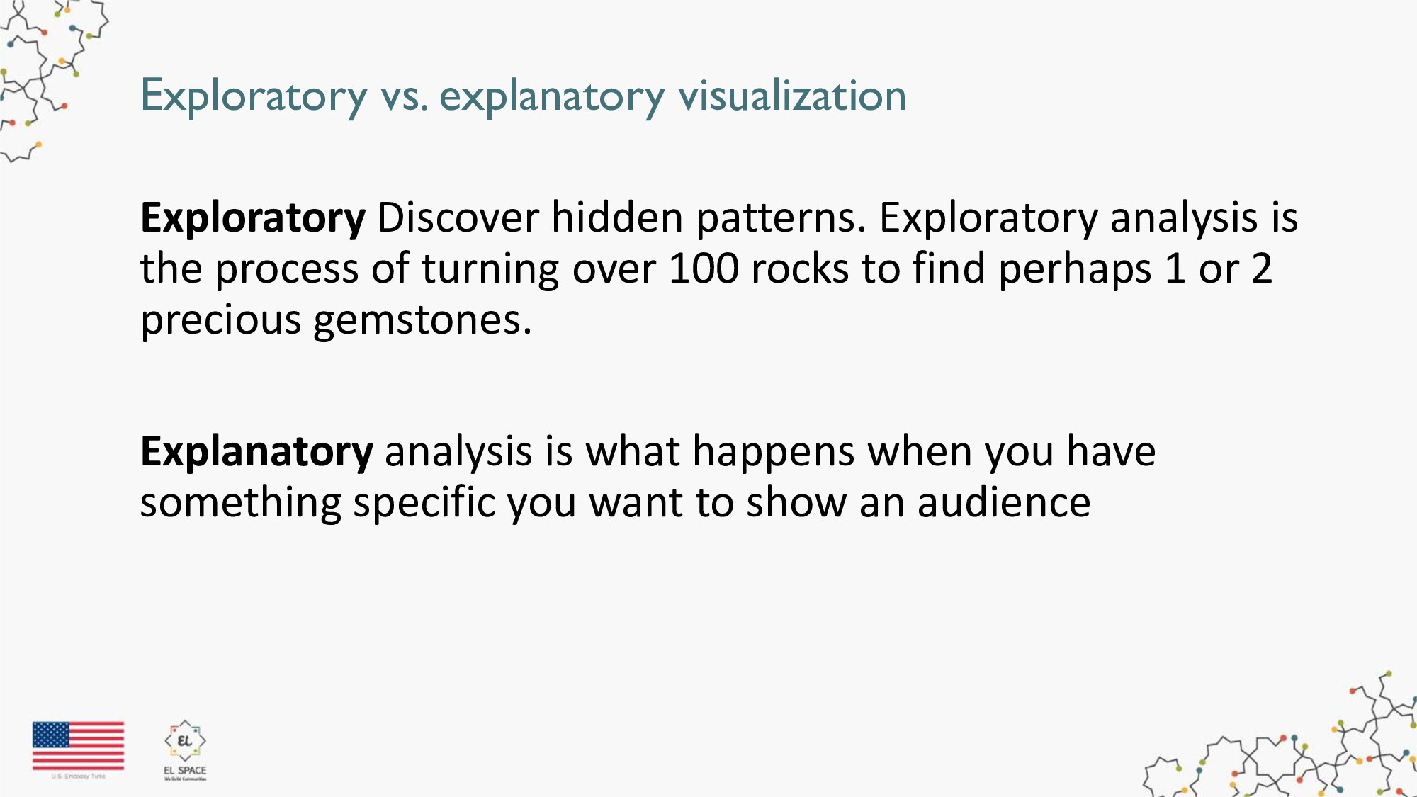
    is the process of turning over 100 rocks to find perhaps 1 or 2 precious gemstones. Explanatory analysis is what happens when you have something specific you want to show an audience
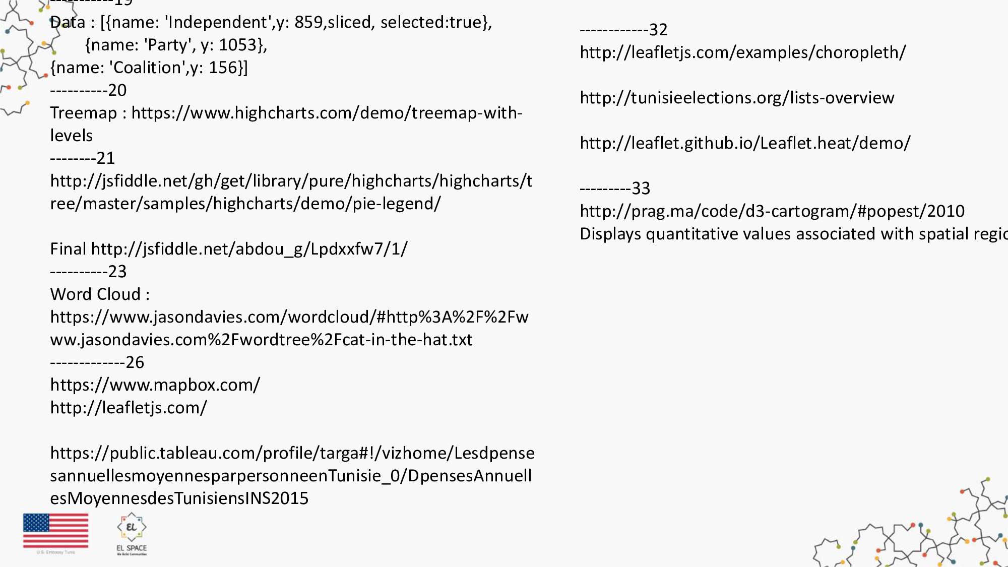
  4. Let’s talk about JSON first : JSON: JavaScript Object Notation.

    var data = { "name":“Ahmad", "age":31, "city":“Tunis" }; data.name; //return Ahmed : person.name = “Sami"; //modify name
  5. Let’s talk about JSON first : Data Types In JSON

    values could be one of the following { "name":"Ahmed", "middlename":null, "age":31, "married":"true", "children":["Sarah","Sami"] };
  6. There is a lot of visualizations which one to chose

    ? Visualisation methods that help show the differences or similarities between values. Comparison
  7. Bar Chart : Let’s start first by collecting and cleaning

    our data Pick a ready Model from Highcharts Update it
  8. Bubble Chart Bubble Charts are typically used to compare and

    show the relationships between categorised circles, by the use of positioning and proportions
  9. There is a lot of visualizations which one to chose

    ? Visualisation methods that show part of a variable to it's total. Part to a whole
  10. There is a lot of visualizations which one to chose

    ? Shows how data is organized in a certain way Hierarchy
  11. There is a lot of visualizations which one to chose

    ? Visualisation methods that reveal patterns and insights from a body of text. Text Analysis
  12. Benifits • Have a clear Insight about your target market

    • Easier decision making and improved focus • Determine what is trendy • Enhance your business strategy • Visualize patterns and relationships
  13. Let’s talk about GEOJSON first : GeoJSON is a format

    for encoding a variety of geographic data structures.
  14. ------6 Exploratory let people explore Ideas and test different techniques

    : http://opensource.datacratic.com/mtlpy50/ Explain to people what is going on ! We mostly find those viz in news papers articles : http://www.nytimes.com/interactive/2012/02/13/us/politics/2 013-budget-proposal-graphic.html https://www.nytimes.com/interactive/2014/11/04/upshot/sen ate-maps.html http://vallandingham.me/vis/ ----------8 https://jsfiddle.net/afabbro/vrVAP/ https://codepen.io/2017/popular/pens/ https://bl.ocks.org/auremoser ---------9 https://www.zingchart.com/ http://www.chartjs.org/ https://uber.github.io/react-vis/examples/showcases/plots https://emeeks.github.io/semiotic/#/ ---------10 https://jsfiddle.net/abdou_g/d5h21s2b/5/ -------11 https://jsfiddle.net/abdou_g/q17jhamt/ ------------13 Start : https://www.highcharts.com/demo/column-drilldown Final http://jsfiddle.net/abdou_g/91047spf/23/ Ggl : change bar color highcharts Ggl : Highchart exporting --------------14 [{name:"less than 35",num:28044,per:52.07}, {name:"Between 36-45",num:12834,per:23.83}, {name:"Between46-60",num:10600,per:19.68}, {name:"More than 60",num:2377,per:4.41}] ----------15 http://jsfiddle.net/gh/get/library/pure/highcharts/highcharts ---------16 https://www.highcharts.com/demo/bar-negative-stack ---------17 Sunburst Diagram : https://www.highcharts.com/demo/sunb Pie Chart : https://www.highcharts.com/demo/pie-legend Treemap : https://www.highcharts.com/demo/treemap-with --------18 http://jsfiddle.net/gh/get/library/pure/highcharts/highcharts Final http://jsfiddle.net/abdou_g/qnk57ue2/7/
  15. -----------19 Data : [{name: 'Independent',y: 859,sliced, selected:true}, {name: 'Party', y:

    1053}, {name: 'Coalition',y: 156}] ----------20 Treemap : https://www.highcharts.com/demo/treemap-with- levels --------21 http://jsfiddle.net/gh/get/library/pure/highcharts/highcharts/t ree/master/samples/highcharts/demo/pie-legend/ Final http://jsfiddle.net/abdou_g/Lpdxxfw7/1/ ----------23 Word Cloud : https://www.jasondavies.com/wordcloud/#http%3A%2F%2Fw ww.jasondavies.com%2Fwordtree%2Fcat-in-the-hat.txt -------------26 https://www.mapbox.com/ http://leafletjs.com/ https://public.tableau.com/profile/targa#!/vizhome/Lesdpense sannuellesmoyennesparpersonneenTunisie_0/DpensesAnnuell esMoyennesdesTunisiensINS2015 ------------32 http://leafletjs.com/examples/choropleth/ http://tunisieelections.org/lists-overview http://leaflet.github.io/Leaflet.heat/demo/ ---------33 http://prag.ma/code/d3-cartogram/#popest/2010 Displays quantitative values associated with spatial regio