$30 off During Our Annual Pro Sale. View Details »

Bootstrap: Mobile Sites in Minutes

Bootstrap: Mobile Sites in Minutes

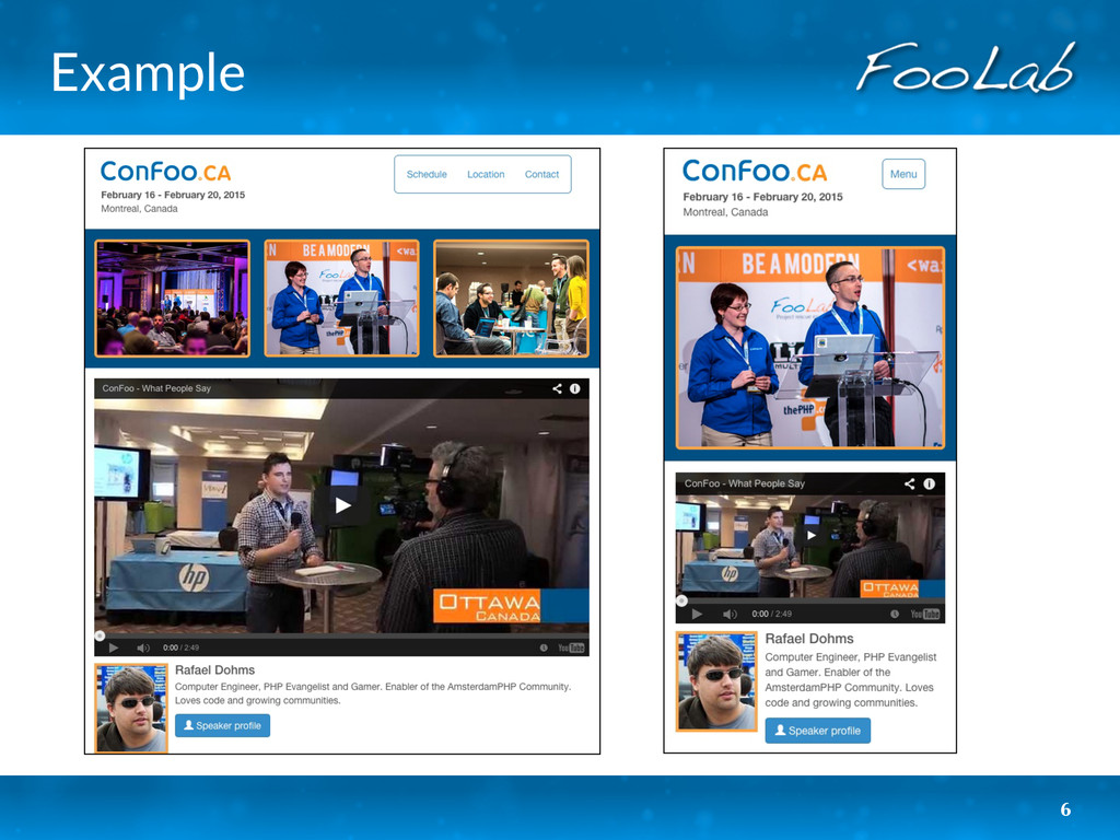
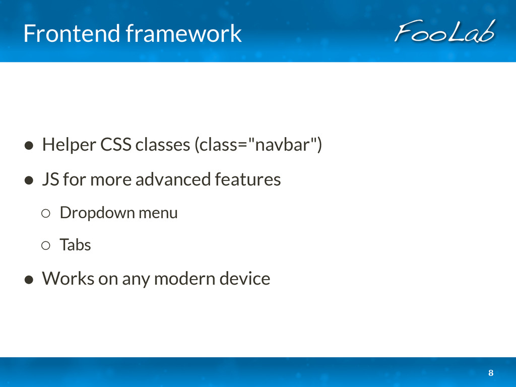
Bootstrap is a front-end framework that allows you to create responsive layouts, meaning that they automatically adjust to any screen size. It's easy to use, fast to integrate and looks amazing. This presentation will teach you how to quickly create an adaptive layout and with little effort. It will also feature a case study of transforming an existing web application.

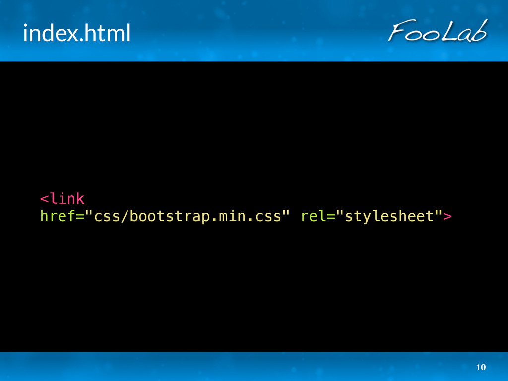
Code: https://github.com/afilina/bootstrap-intro

Anna Filina
PRO

August 23, 2014
Tweet

More Decks by Anna Filina

Other Decks in Technology

Transcript

  1. foolab.ca | @foolabca
    Bootstrap:
    Mobile Sites in Minutes
    CakeFest, Madrid - August 23, 2014

    View Slide

  2. Anna Filina
    • Developer
    • Problem solver
    • Coach
    • Advisor
    2

    View Slide

  3. Objectives
    • Create mobile sites faster
    • Introduce Bootsrap
    • Transform your site
    3

    View Slide

  4. Alternatives
    • Application
    ◦ Requires download
    ◦ Development effort & maintenance
    • Alternative site
    ◦ Redirects
    ◦ Development effort & maintenance
    4

    View Slide

  5. Responsive design
    • No redirects
    • Adjusts to size
    • Minimal development effort
    • Single website maintenance
    5

    View Slide

  6. Example
    6

    View Slide

  7. What is Bootstrap?

    View Slide

  8. Frontend framework
    • Helper CSS classes (class="navbar")
    • JS for more advanced features
    ◦ Dropdown menu
    ◦ Tabs
    • Works on any modern device
    8

    View Slide

  9. Advantages
    • Widely used
    • Rich documentation
    • Many themes
    • Easy to learn and use
    9

    View Slide

  10. index.html
    href="css/bootstrap.min.css" rel="stylesheet">
    10

    View Slide

  11. index.html


    ...
    ...


    11

    View Slide

  12. Output comparison
    Small:
    Extra
    small:
    12

    View Slide

  13. index.html

    ...


    ...


    13

    View Slide

  14. layout.css
    @media (max-width: 767px) {
    div.example {
    border: none;
    border-bottom: 1px solid #ccc;
    padding: 0 0 10px 0;
    }
    }
    @media (min-width: 768px) {
    div.example {
    border: 1px solid #ccc;
    padding: 10px;
    }
    }
    14

    View Slide

  15. 4 sizes
    • xs
    ◦ 767-
    ◦ Phones
    • sm
    ◦ 768+
    ◦ Tablets
    • md
    ◦ 992+
    ◦ Desktops
    • lg
    ◦ 1200+
    ◦ Large desktops
    15

    View Slide

  16. Building a
    complete site

    View Slide

  17. Header
    17
    Extra
    small:
    Small:

    View Slide

  18. Header - small
    18
    6 6
    col-sm-6 col-sm-6

    View Slide

  19. Header - extra small
    19
    8 4
    col-xs-8 col-xs-4

    View Slide

  20. header.html

    ...


    ...


    20

    View Slide

  21. header.html


    data-toggle="collapse"
    data-target=".navbar-collapse">...


    ...

    21

    View Slide

  22. Spotlight
    22
    Extra
    small:
    Small:

    View Slide

  23. spotlight.html
    ...


    ...
    23

    View Slide

  24. Content
    24
    Responsive video
    Left-aligned image
    Button with icon

    View Slide

  25. content.html
    25


    View Slide

  26. content.html
    26


    ...

    View Slide

  27. content.html
    27

    View Slide

  28. Glyphicons
    28
    Color, background, size, shadow, etc.

    View Slide

  29. Final result
    29

    View Slide

  30. Useful links
    • What is supported?
    http://getbootstrap.com/getting-started/#support
    • Responsive image replacement:
    https://github.com/kvendrik/responsive-images.js
    • @afilina
    30

    View Slide

  31. Services
    • Development: PHP, JS, etc.
    • Fix problems: bugs, performance, etc.
    • Coaching & workshops.
    • Advisor: testing strategy, architecture, etc.
    31

    View Slide