Upgrade to Pro — share decks privately, control downloads, hide ads and more …

December 2016 Meetup - Importance of Mobile Friendly Website and What is AMP?

December 2016 Meetup - Importance of Mobile Friendly Website and What is AMP?

The presentation was lead by Mayur Keshwani @ Ahmedabad WordPress Meetup on 11th December 2016.

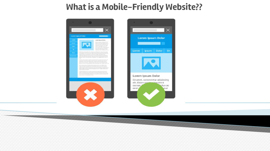
What is a Mobile-Friendly website?
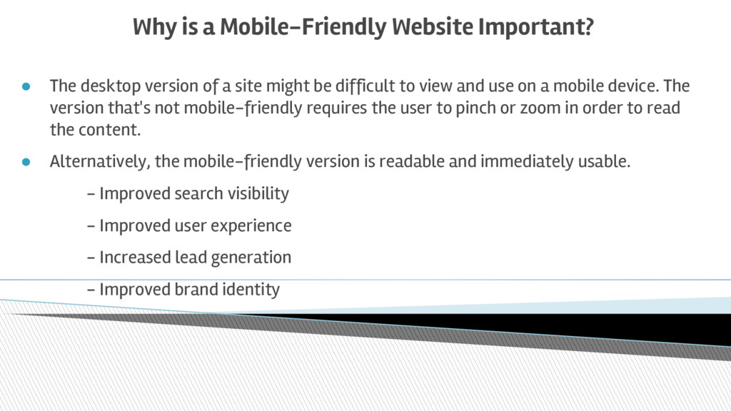
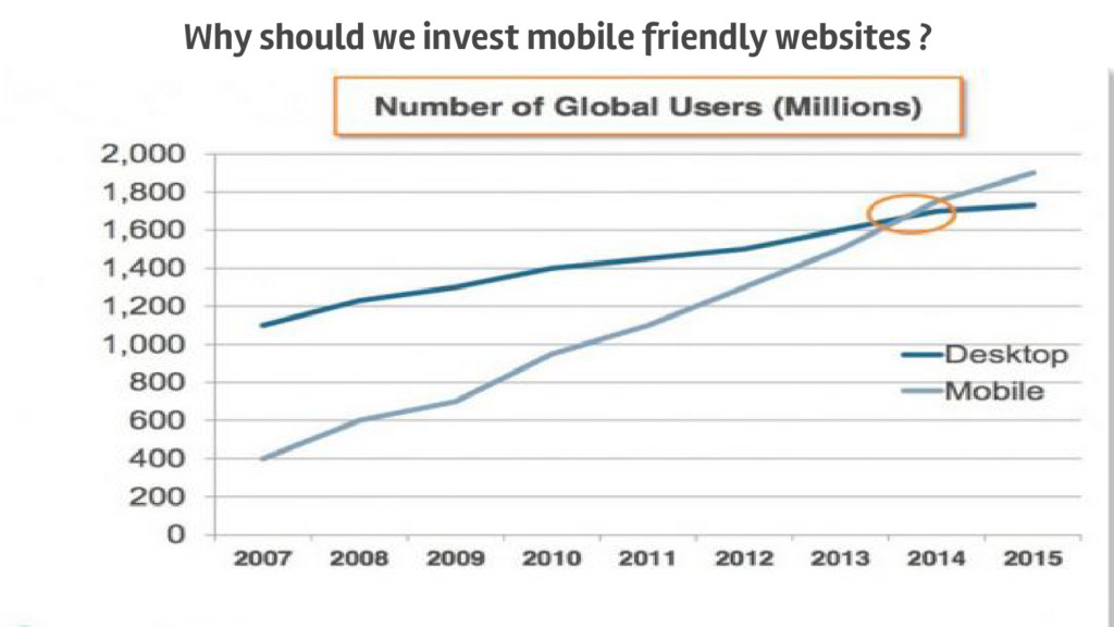
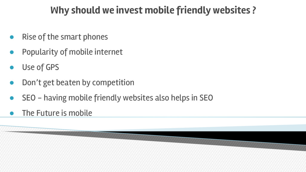
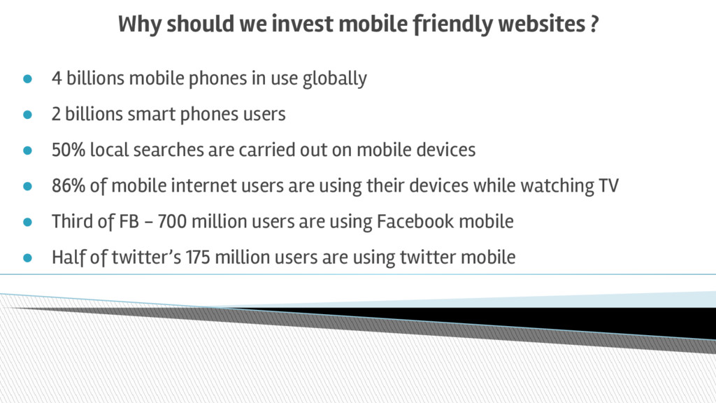
Why is a Mobile-Friendly website Important?
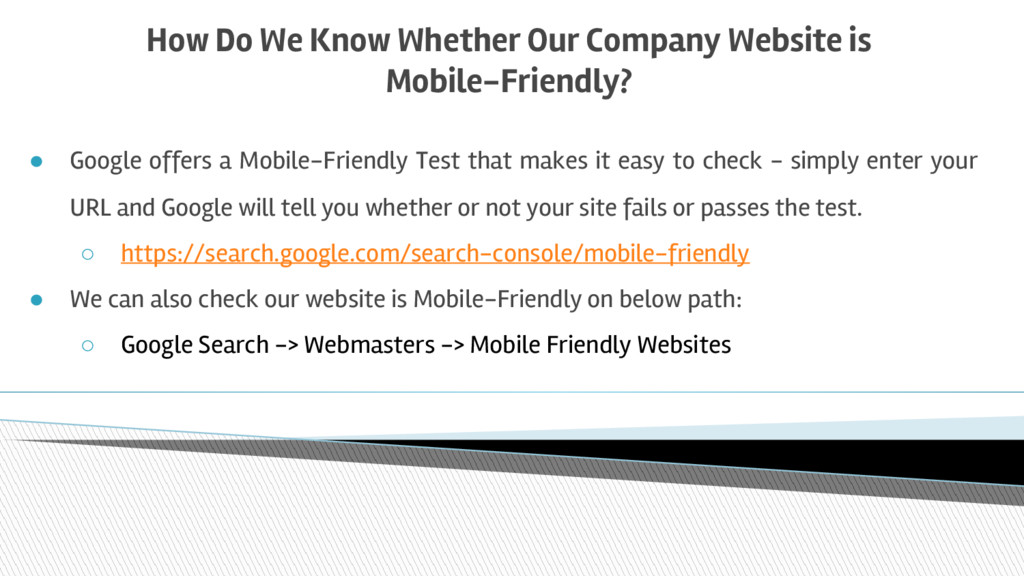
How Do We Know whether a website is Mobile-Friendly?
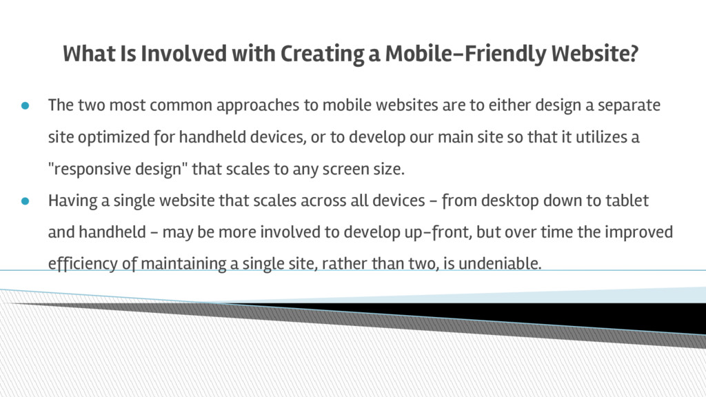
What Is involved with creating a Mobile-Friendly Website?

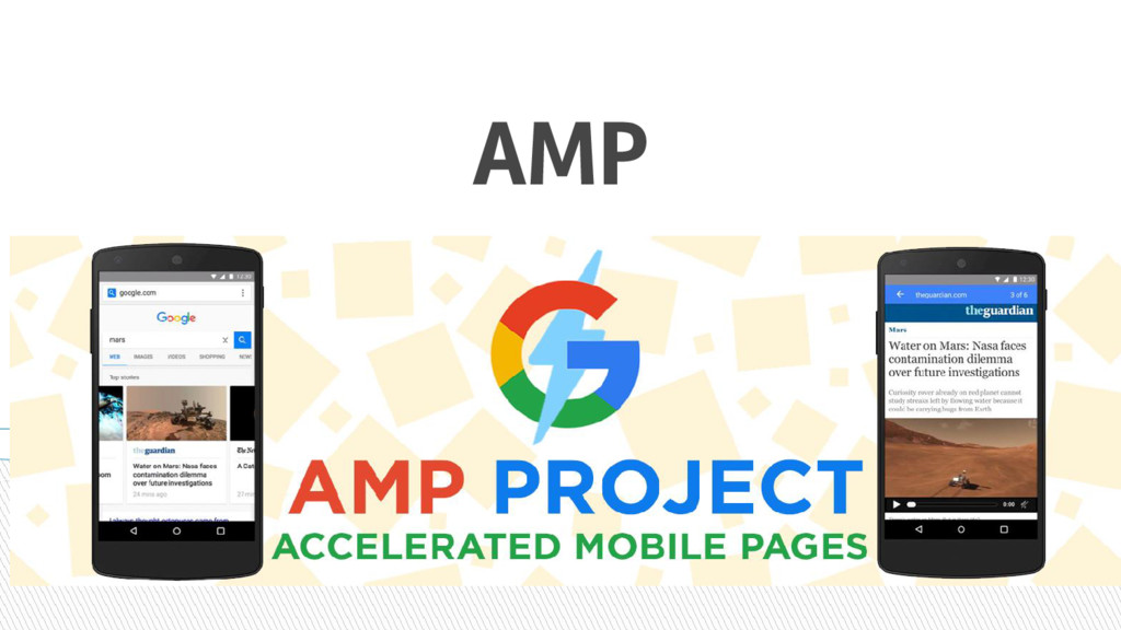
What Is AMP (Accelerated Mobile Pages) ?

• AMP Introduction
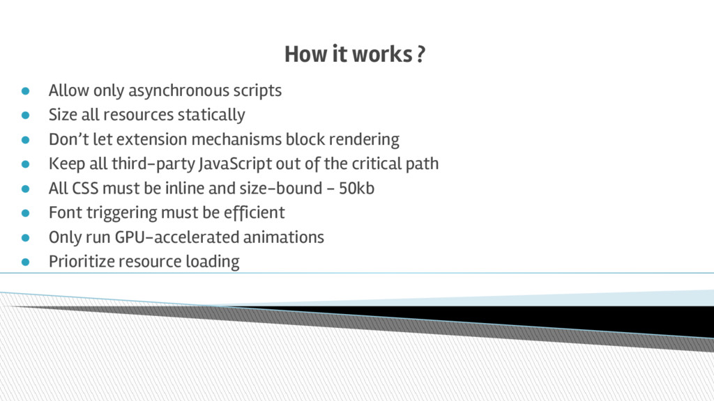
• How AMP works ? [ Technical Overview ]
• Rules/Standard
• Component/Tags
• How to create AMP HTML Page
• How to check error(s)
• Supported Browsers/Platforms
• pro(s) & con(s)
• Case-studies over how this can be integrated in WP.

Resources

https://developers.google.com/webmasters/mobile-sites/get-started
https://developers.google.com/webmasters/mobile-sites/
https://www.smashingmagazine.com/2013/04/build-fast-loading-mobi
https://www.ampproject.org/

Ahmedabad WordPress Meetup

December 11, 2016
Tweet

More Decks by Ahmedabad WordPress Meetup

Other Decks in Technology

Transcript

  1. Importance of Mobile Friendly Website - Special focus on AMP

    By: Mayur Keshwani, Project Coordinator, Multidots
  2. What is a Mobile-Friendly Website? A mobile-friendly website is one

    that displays correctly on handheld devices such as smartphones, iPhones, iPads, and tablets. It also has these features: • Loads fast – bloated sites cost more money to access • Easy to read – mobile phone screens are 1/5th the size of desktop computers • Easy to navigate – menus have limited space on mobile devices • Minimal scrolling - not just vertically but also horizontally • Avoids using Flash – because Apple products do not support Flash
  3. Why is a Mobile-Friendly Website Important? • The desktop version

    of a site might be difficult to view and use on a mobile device. The version that's not mobile-friendly requires the user to pinch or zoom in order to read the content. • Alternatively, the mobile-friendly version is readable and immediately usable. - Improved search visibility - Improved user experience - Increased lead generation - Improved brand identity
  4. Why should we invest mobile friendly websites ? • Rise

    of the smart phones • Popularity of mobile internet • Use of GPS • Don’t get beaten by competition • SEO - having mobile friendly websites also helps in SEO • The Future is mobile
  5. Why should we invest mobile friendly websites ? • 4

    billions mobile phones in use globally • 2 billions smart phones users • 50% local searches are carried out on mobile devices • 86% of mobile internet users are using their devices while watching TV • Third of FB - 700 million users are using Facebook mobile • Half of twitter’s 175 million users are using twitter mobile
  6. How Do We Know Whether Our Company Website is Mobile-Friendly?

    • Google offers a Mobile-Friendly Test that makes it easy to check - simply enter your URL and Google will tell you whether or not your site fails or passes the test. ◦ https://search.google.com/search-console/mobile-friendly • We can also check our website is Mobile-Friendly on below path: ◦ Google Search -> Webmasters -> Mobile Friendly Websites
  7. What Is Involved with Creating a Mobile-Friendly Website? • The

    two most common approaches to mobile websites are to either design a separate site optimized for handheld devices, or to develop our main site so that it utilizes a "responsive design" that scales to any screen size. • Having a single website that scales across all devices - from desktop down to tablet and handheld - may be more involved to develop up-front, but over time the improved efficiency of maintaining a single site, rather than two, is undeniable.
  8. limitations - Mobile Friendly Sites • Load Time is more

    due to ◦ Heavy images ◦ Heavy content ◦ Multiple HTTP Requests ◦ Attractive design • What is the solution to this?
  9. AMP

  10. AMP • The Accelerated Mobile Pages (“AMP”) Project is an

    open source initiative that came out of discussions between publishers and technology companies about the need to improve the entire mobile content ecosystem for everyone -- publishers, consumer platforms, creators, and users. • Today, the expectation is that content should load super fast and be easy to explore. The reality is that content can take several seconds to load, or, because the user abandons the slow page, never fully loads at all. Accelerated Mobile Pages are web pages designed to load near instantaneously -- they are a step towards a better mobile web for all. •
  11. History - AMP • AMP stands for Accelerated Mobile Pages,

    a Google-backed project intended as an open standard for any publisher to have pages load quickly on mobile devices. • The AMP Project was formally announced on Oct. 7, 2015, with support from Google, Twitter, WordPress and several publishers and other companies https://googleblog.blogspot.in/2015/10/introducing-accelerated-mobile-pages.html http://searchengineland.com/library/google/google-amp-project • Those using AMP will already have their pages load fast within Twitter, the company has said. On Feb. 24, 2016, • Google integrated AMP listings into its mobile search results. • http://searchengineland.com/amp-top-stories-now-live-243314
  12. What Is AMP ? • AMP is a way to

    build web pages for static content that render fast. AMP in action consists of three different parts: ◦ AMP HTML : AMP HTML is HTML with some restrictions for reliable performance and some extensions for building rich content beyond basic HTML. AMP HTML is basically HTML extended with custom AMP properties. ◦ AMP JS : AMP JS library ensures the fast rendering of AMP HTML pages. ◦ Google AMP Cache : Google AMP Cache can be used to serve cached AMP HTML pages. The Google AMP Cache is a proxy-based content delivery network for delivering all valid AMP documents. It fetches AMP HTML pages, caches them, and improves page performance automatically.
  13. Create AMP HTML Page • AMP HTML works by including

    the AMP JS library and adding a bit of boilerplate to a web page, so that it meets the AMP HTML Specification. • https://www.ampproject.org/docs/get_started/create/basic_markup • Live example
  14. How it works ? • Allow only asynchronous scripts •

    Size all resources statically • Don’t let extension mechanisms block rendering • Keep all third-party JavaScript out of the critical path • All CSS must be inline and size-bound - 50kb • Font triggering must be efficient • Only run GPU-accelerated animations • Prioritize resource loading
  15. Supported Browsers/Platforms • Supported Browser: ◦ 2 latest versions of

    major browsers like Chrome, Firefox, Edge, Safari and Opera. ◦ desktop, phone, tablet and the web view version of these respective browsers. • Supported Platforms: ◦ Ads : Yahoo, YahooJP ◦ Analytics : Google Analytics, Clicky Web Analytics ◦ Content Platforms : Google, LinkedIn, Pinterest, Twitter ◦ CMS : WordPress, Drupal ◦ Audio/Video : YouTube, Vimeo
  16. Websites using Accelerated Mobile Pages • NYTIMES.COM • Theblaze.com •

    Dailycaller.com • Theatlantic.com • And Many more…..