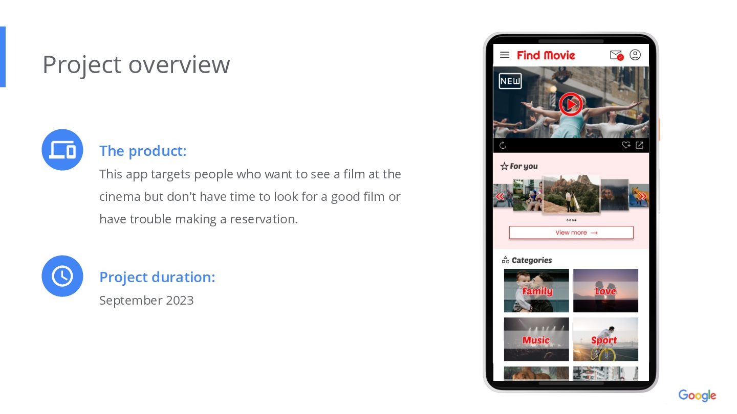
a film at the cinema but don't have time to look for a good film or have trouble making a reservation. Project overview Project duration: September 2023
App Project overview Responsibilities: Conducting interviews, paper and digital wireframing, low and high-fidelity prototyping, conducting usability studies, accounting for accessibility, and iterating on designs.
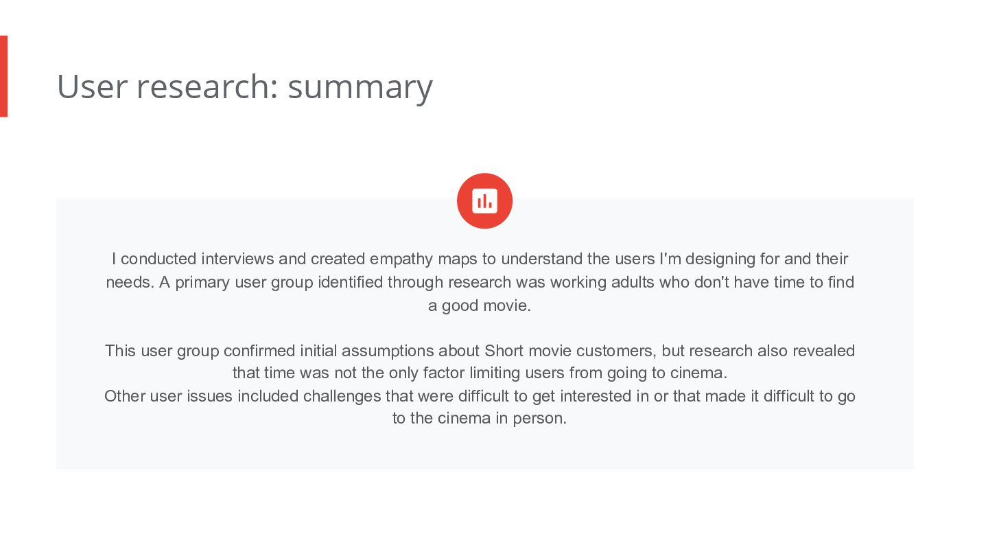
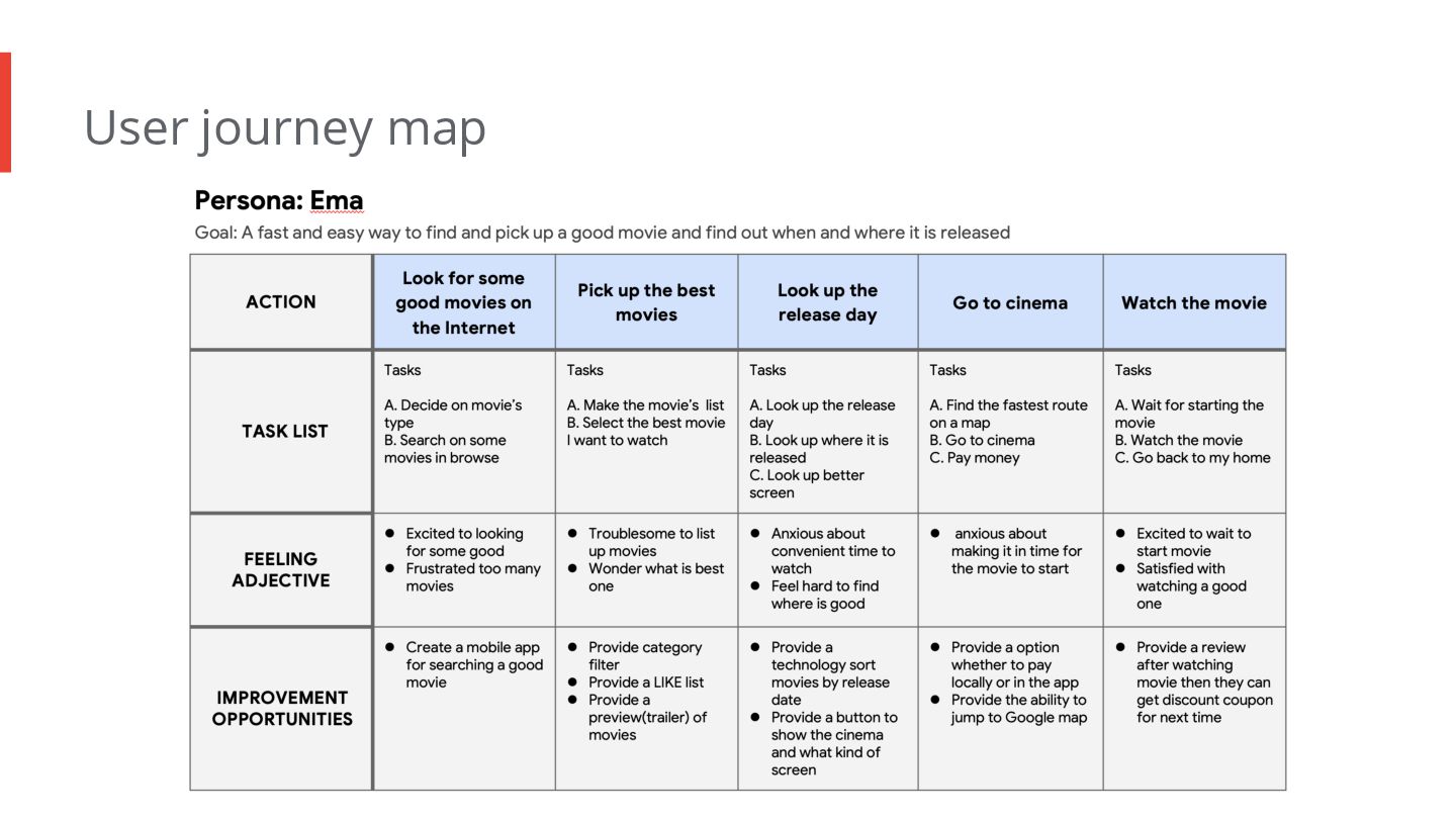
to understand the users I'm designing for and their needs. A primary user group identified through research was working adults who don't have time to find a good movie. This user group confirmed initial assumptions about Short movie customers, but research also revealed that time was not the only factor limiting users from going to cinema. Other user issues included challenges that were difficult to get interested in or that made it difficult to go to the cinema in person.
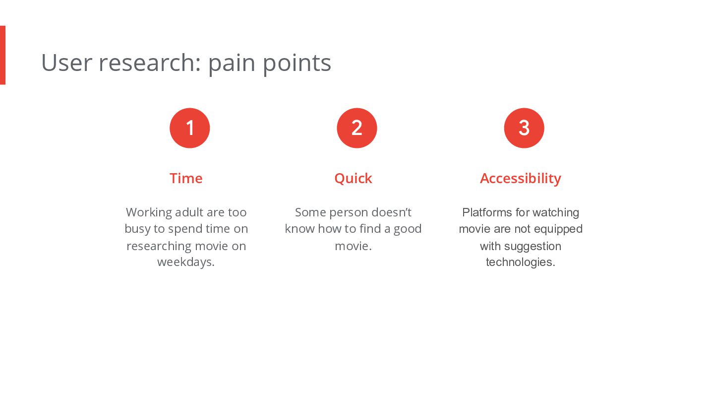
to spend time on researching movie on weekdays. Quick Some person doesn’t know how to find a good movie. Accessibility Platforms for watching movie are not equipped with suggestion technologies. 1 2 3
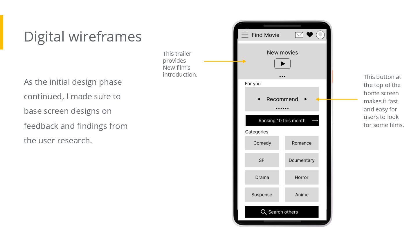
sure to base screen designs on feedback and findings from the user research. This trailer provides New film’s introduction. This button at the top of the home screen makes it fast and easy for users to look for some films.
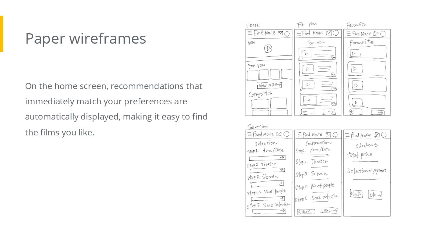
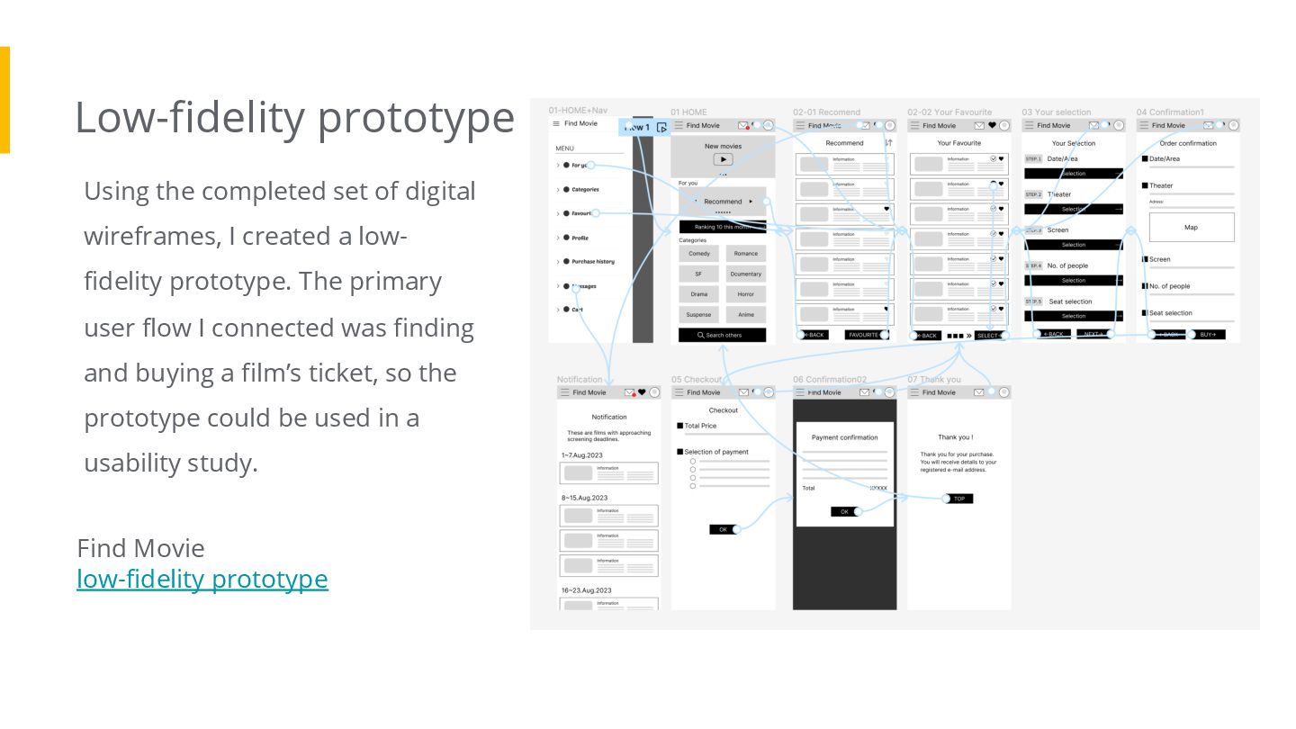
created a low- fidelity prototype. The primary user flow I connected was finding and buying a film’s ticket, so the prototype could be used in a usability study. Find Movie low-fidelity prototype
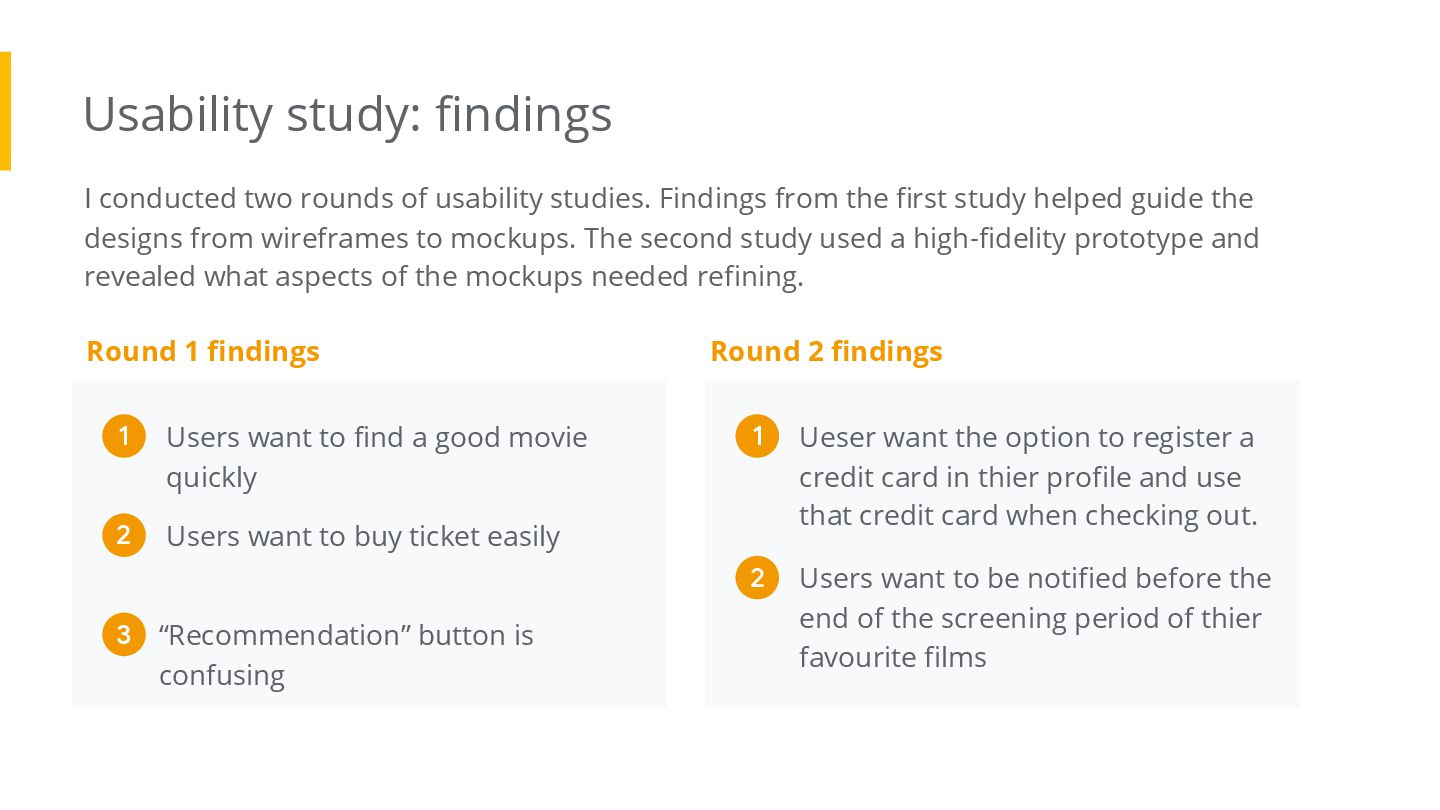
Findings from the first study helped guide the designs from wireframes to mockups. The second study used a high-fidelity prototype and revealed what aspects of the mockups needed refining. Round 1 findings Ueser want the option to register a credit card in thier profile and use that credit card when checking out. 1 Users want to be notified before the end of the screening period of thier favourite films 2 Round 2 findings Users want to find a good movie quickly 1 Users want to buy ticket easily 2 “Recommendation” button is confusing 3
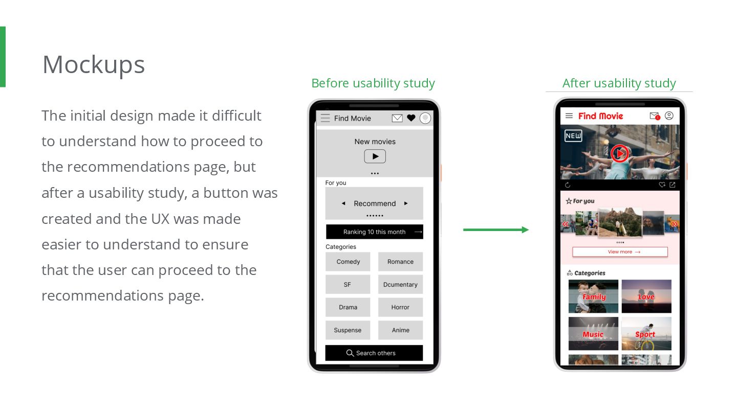
to proceed to the recommendations page, but after a usability study, a button was created and the UX was made easier to understand to ensure that the user can proceed to the recommendations page. Before usability study After usability study
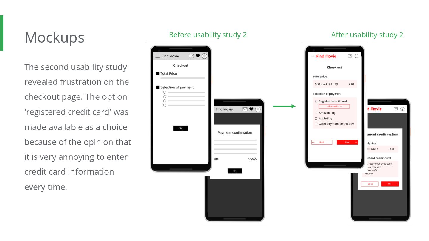
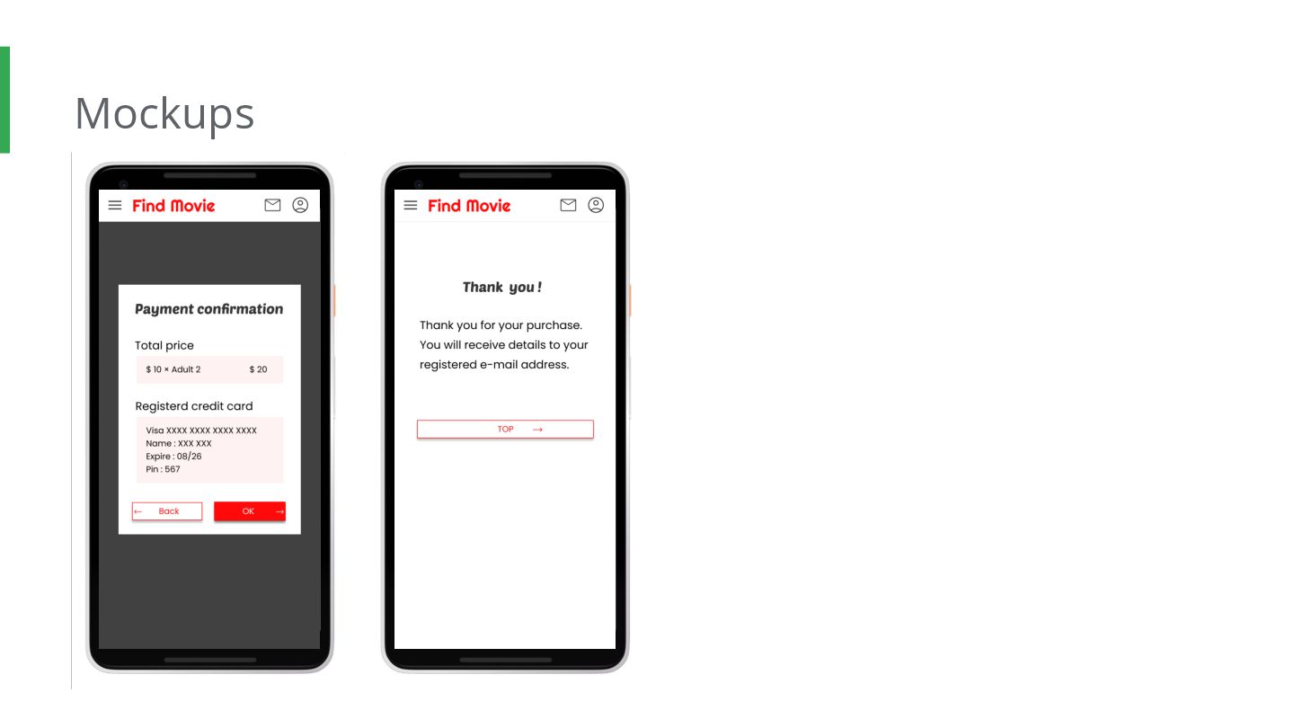
page. The option 'registered credit card' was made available as a choice because of the opinion that it is very annoying to enter credit card information every time. Before usability study 2 After usability study 2
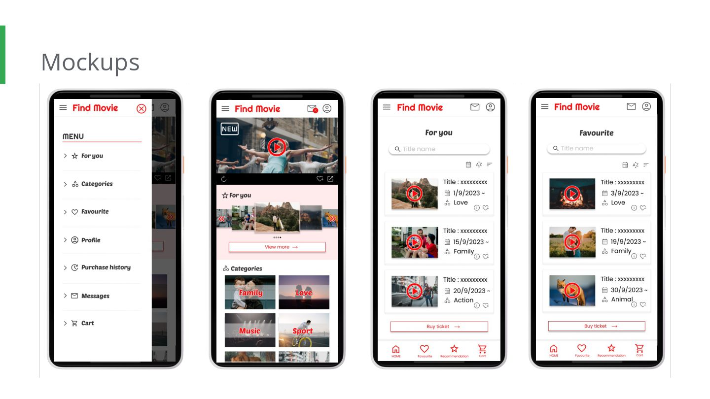
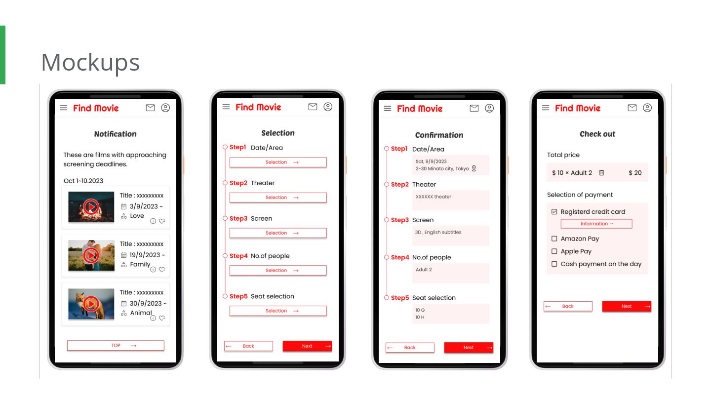
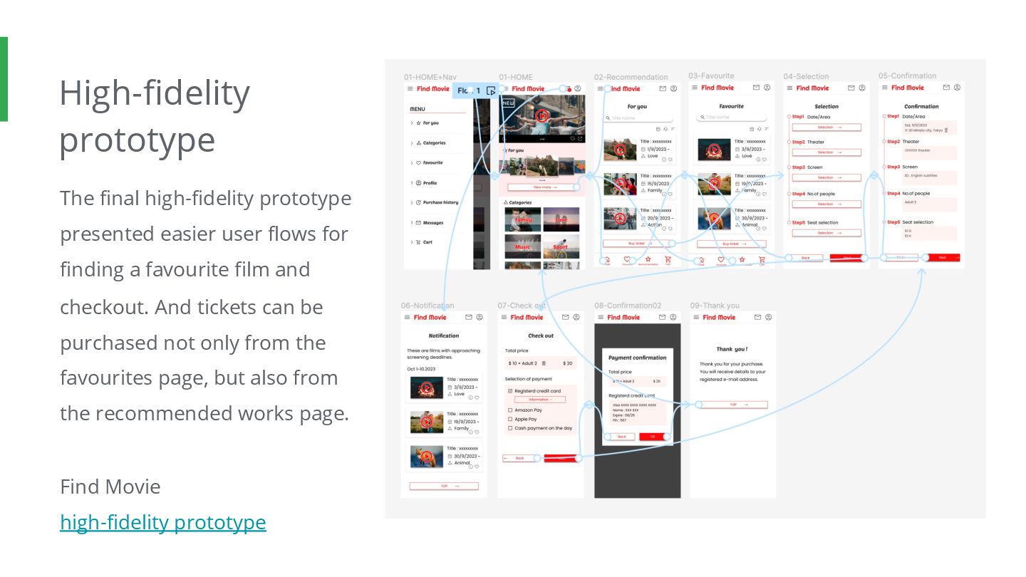
for finding a favourite film and checkout. And tickets can be purchased not only from the favourites page, but also from the recommended works page. Find Movie high-fidelity prototype
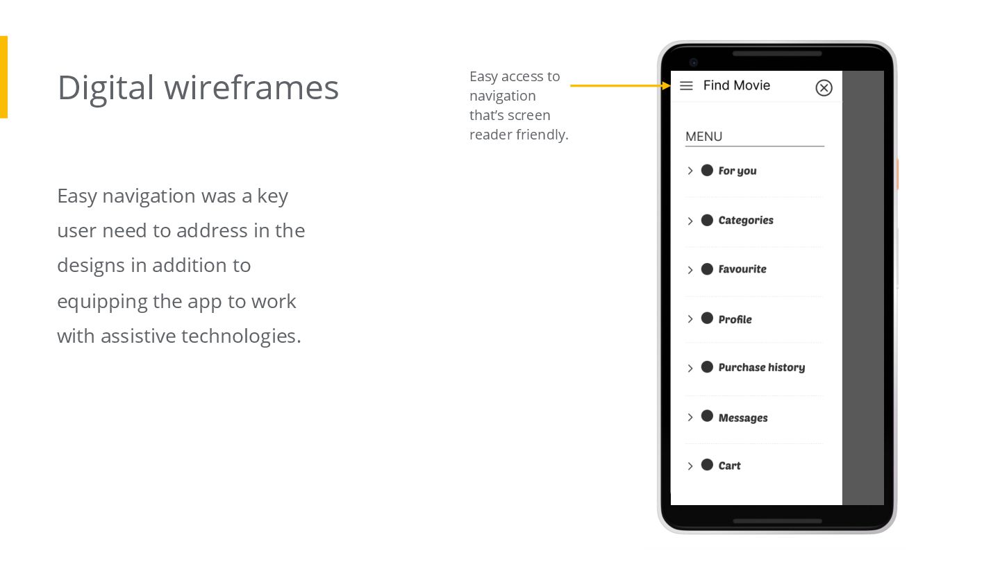
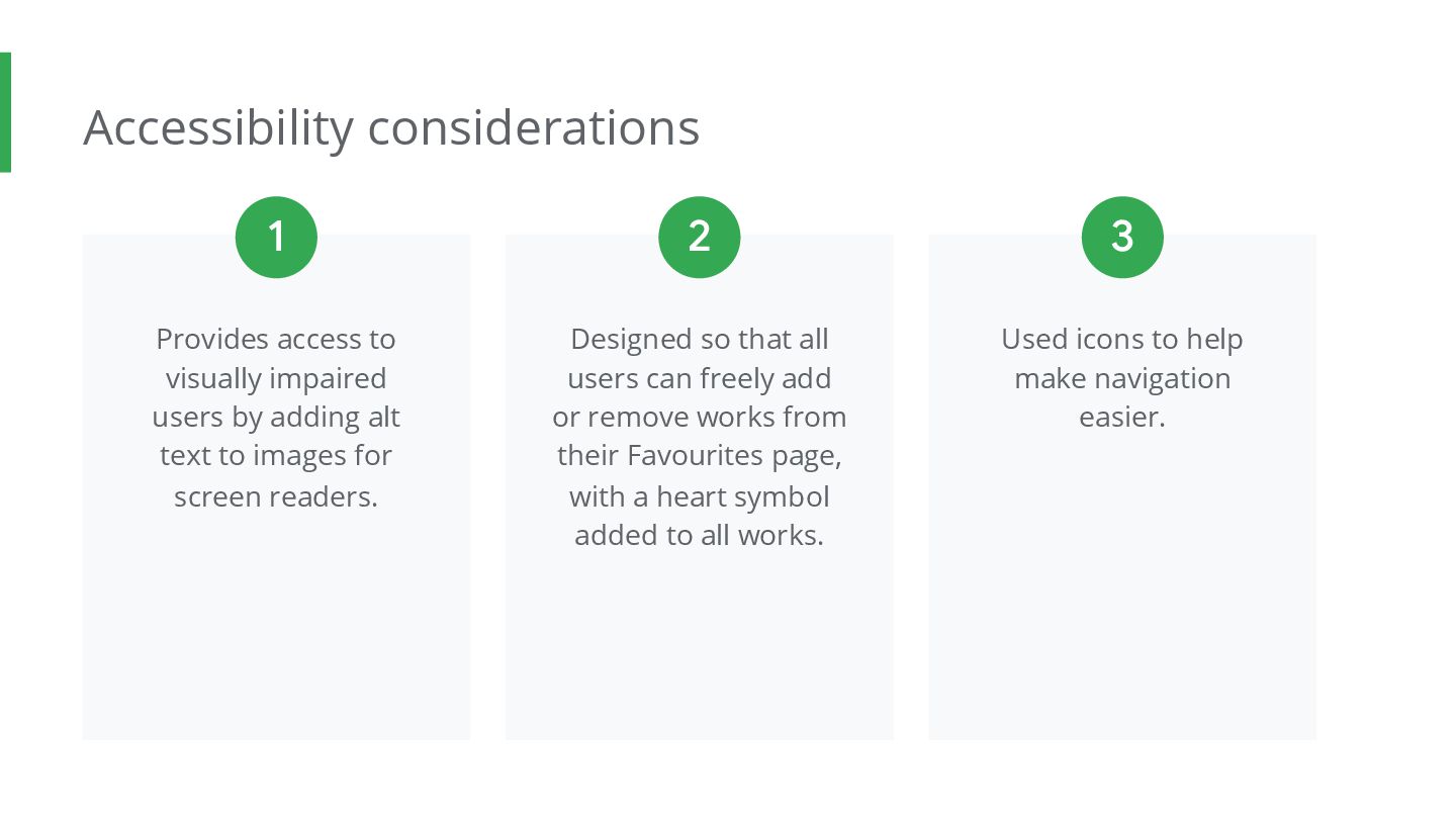
alt text to images for screen readers. Designed so that all users can freely add or remove works from their Favourites page, with a heart symbol added to all works. Used icons to help make navigation easier. 1 2 3
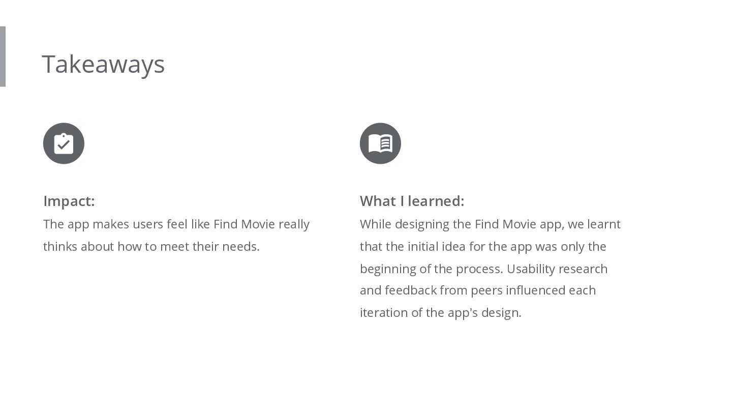
really thinks about how to meet their needs. What I learned: While designing the Find Movie app, we learnt that the initial idea for the app was only the beginning of the process. Usability research and feedback from peers influenced each iteration of the app's design.


 r5ni4
 fumink7
 quoitworks999
 mhand01
 nishame
 bebe
 toshihidemurata
 sugi2000
 muture
 ayumidesign
 ryu1013
 omy
 konakalab
 eileencodes
 thekraken
 addyosmani
 andyhume
 jct
 retrage
 mojombo
 geshan
 baasie
 takai
 garrettdimon