Introducing Jetpack Compose into your existing app
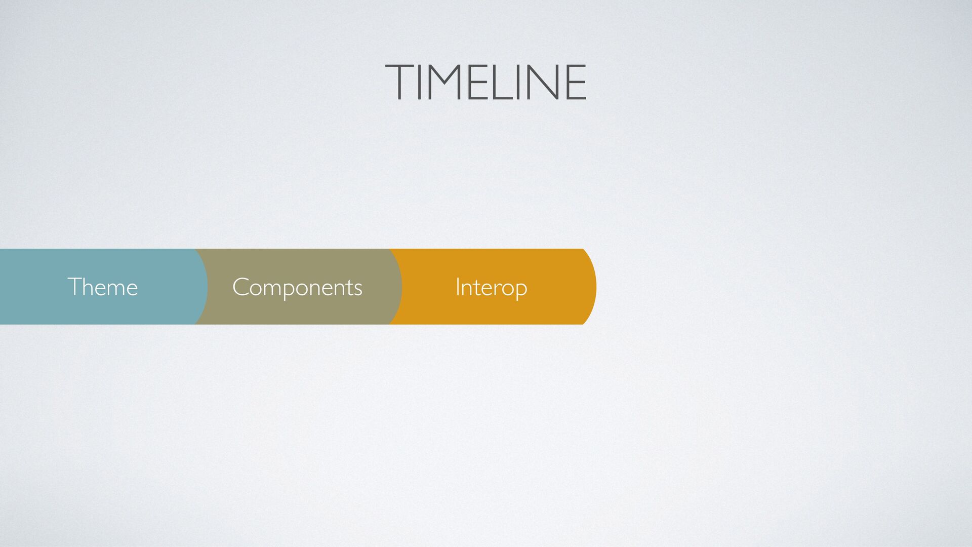
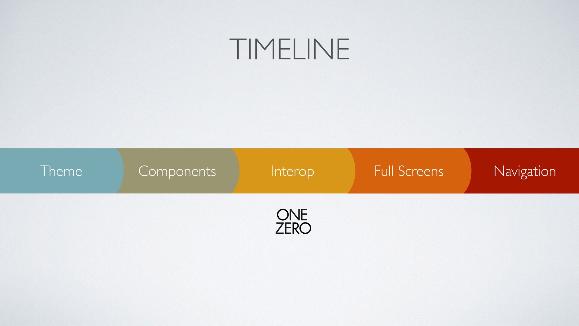
In this talk I am explaining how to introduce Jetpack Compose into your existing app by following those steps:
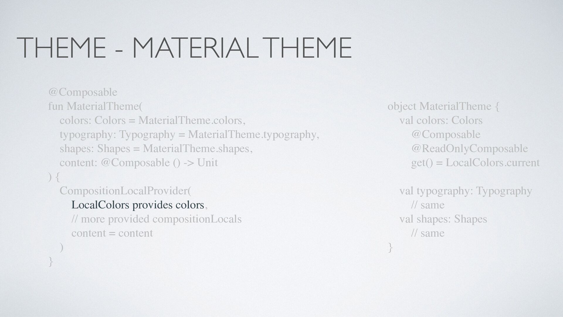
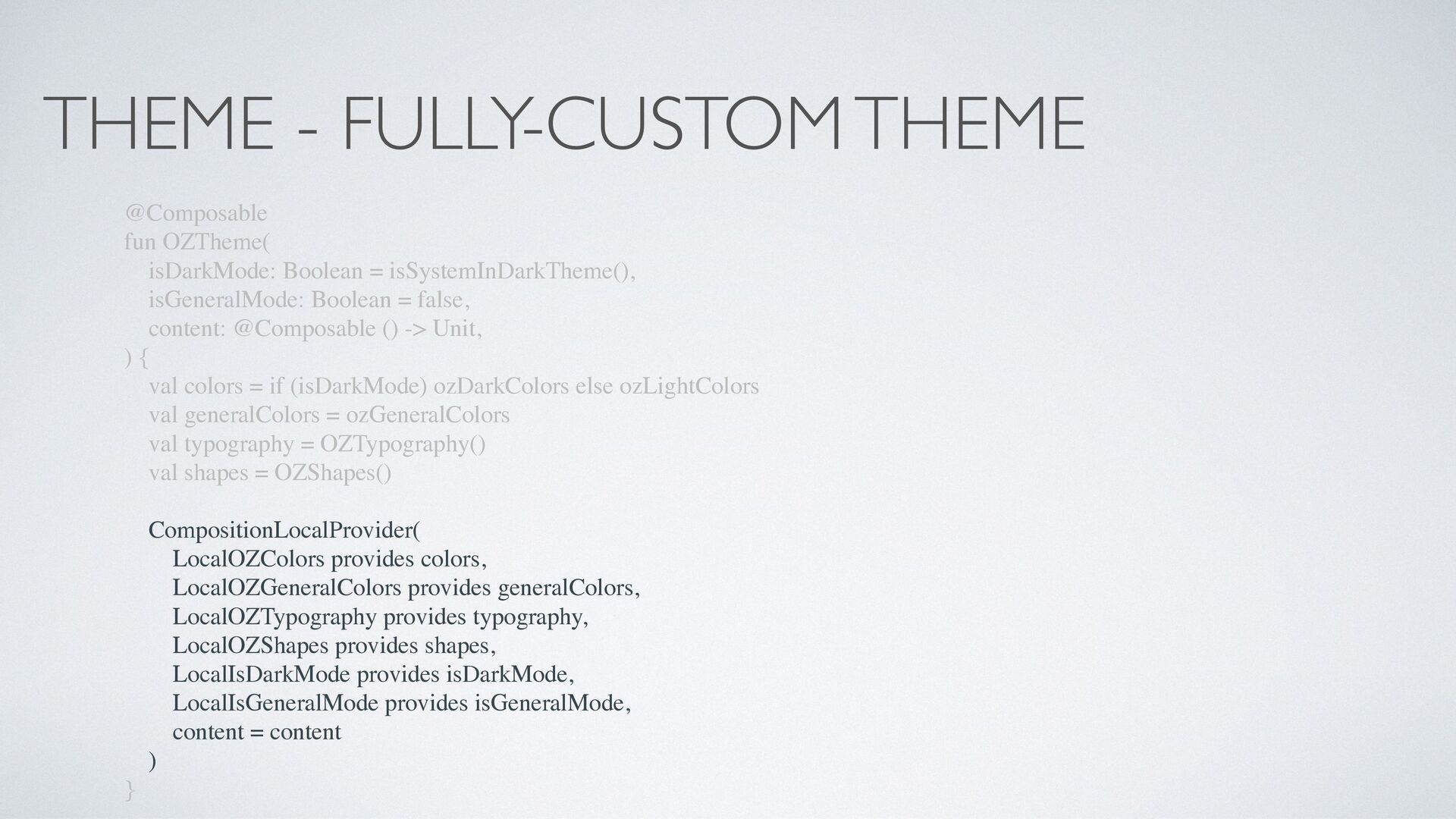
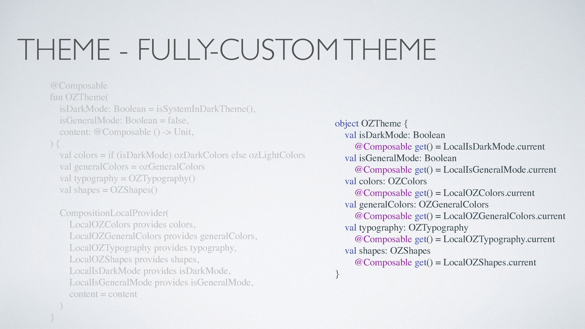
- Theme
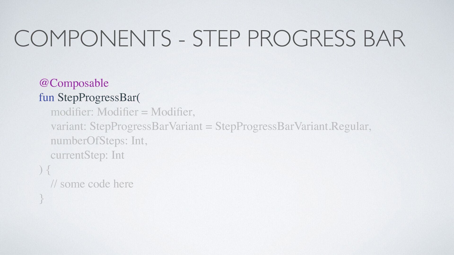
- Components
- Interop (with the old UI Toolkit)
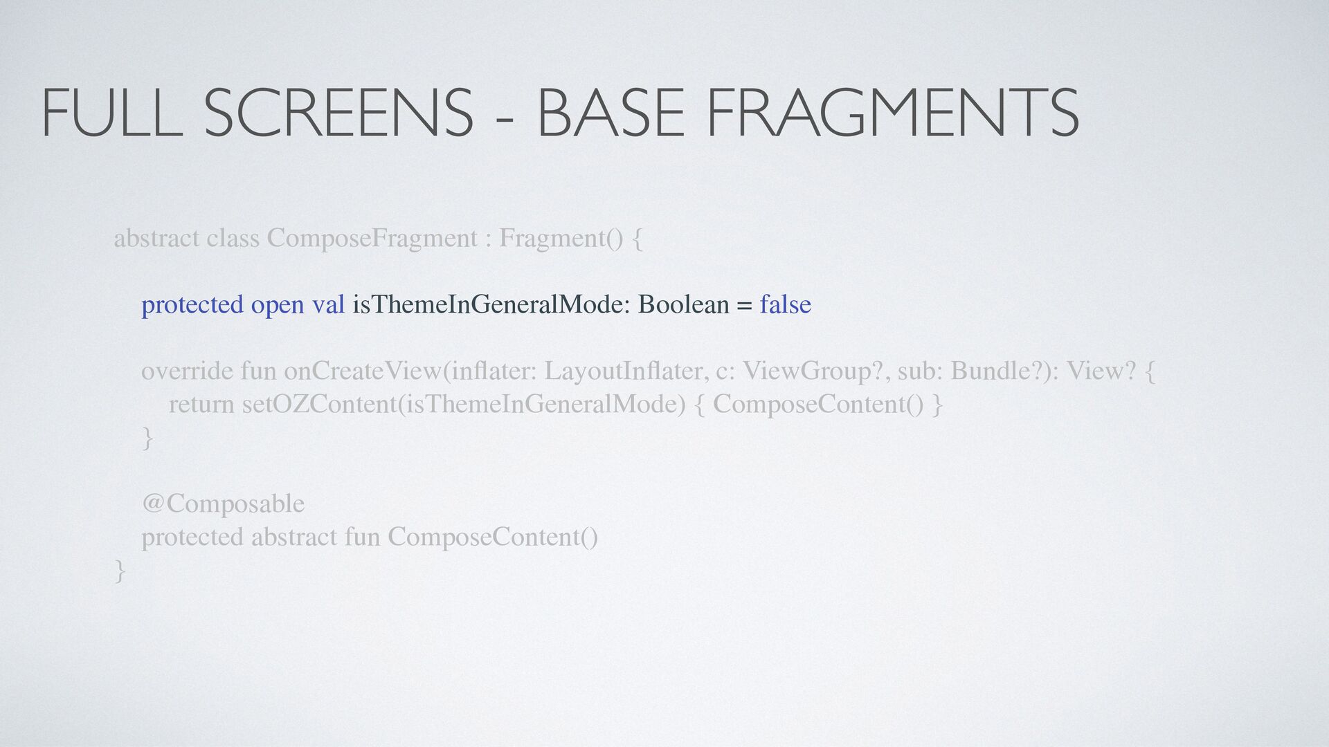
- Full Screens
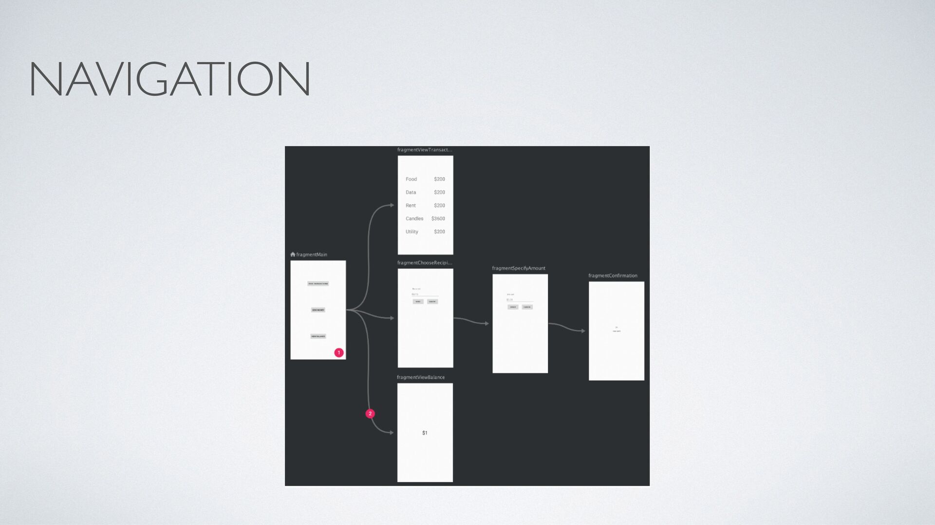
- Navigation
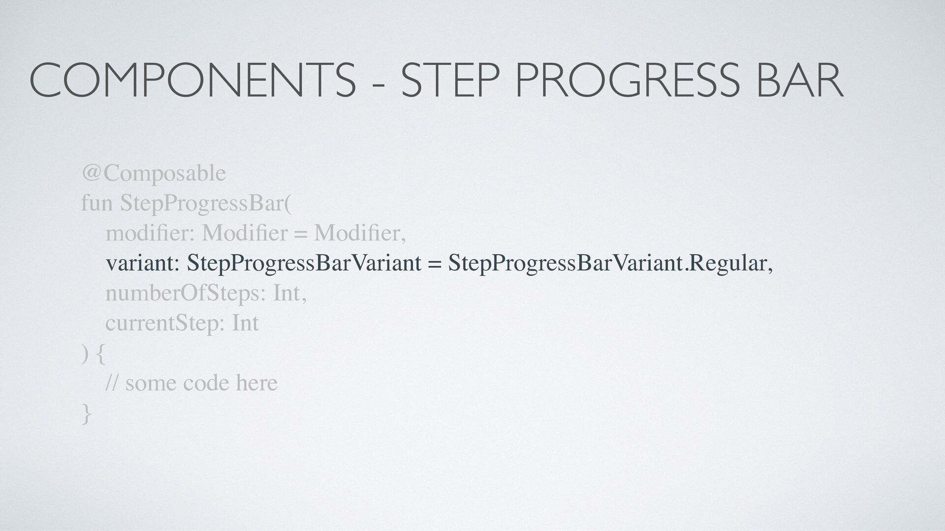
er: Modi fi er = Modi fi er, variant: StepProgressBarVariant = StepProgressBarVariant.Regular, numberOfSteps: Int, currentStep: Int ) { // some code here }
er: Modi fi er = Modi fi er, variant: StepProgressBarVariant = StepProgressBarVariant.Regular, numberOfSteps: Int, currentStep: Int ) { // some code here }
er: Modi fi er = Modi fi er, variant: StepProgressBarVariant = StepProgressBarVariant.Regular, numberOfSteps: Int, currentStep: Int ) { // some code here }
er: Modi fi er = Modi fi er, variant: StepProgressBarVariant = StepProgressBarVariant.Regular, numberOfSteps: Int, currentStep: Int ) { // some code here }
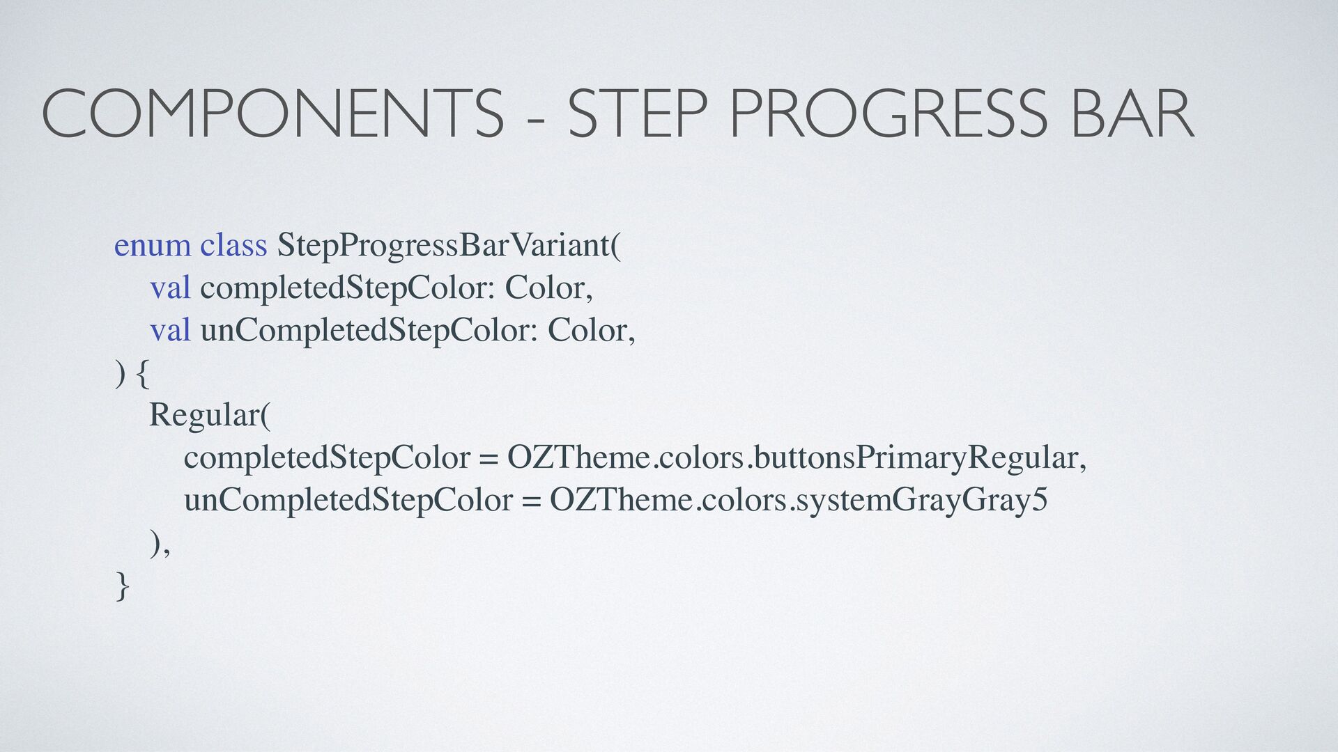
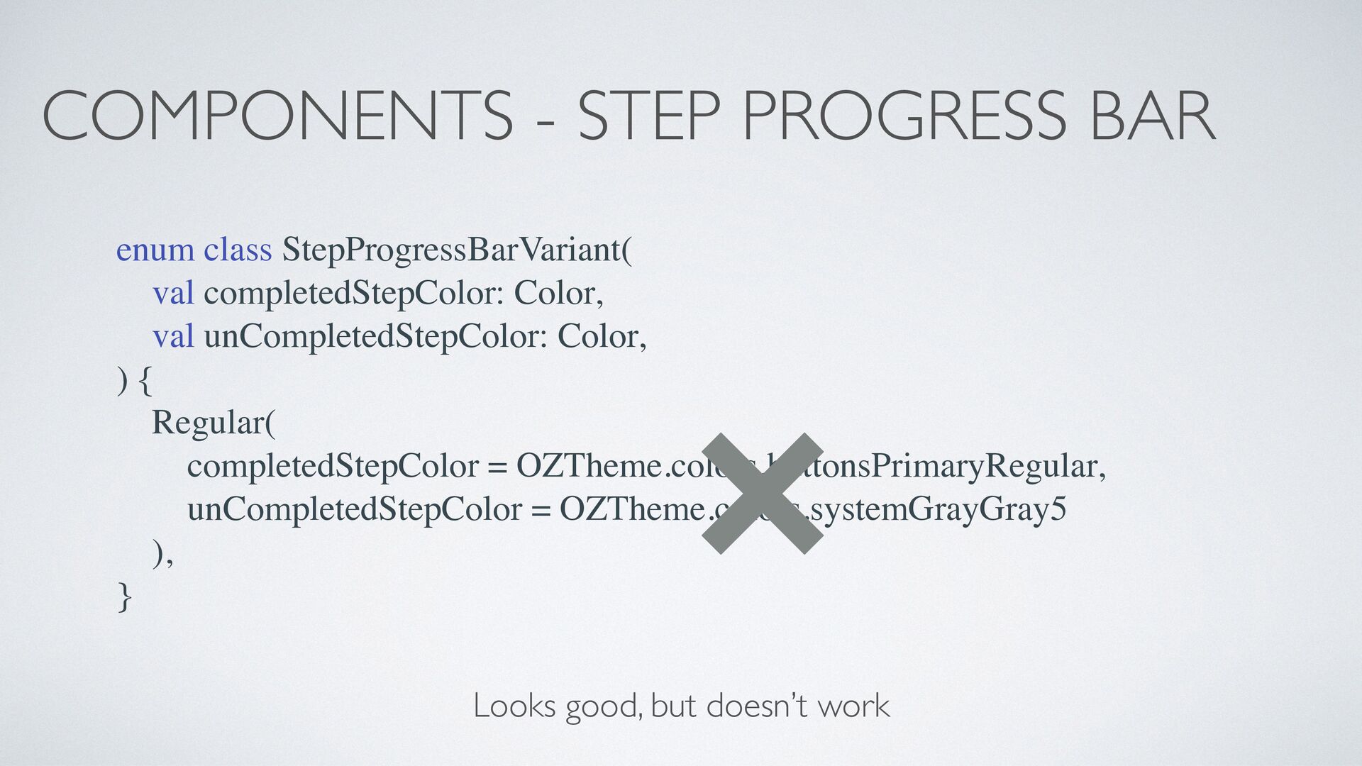
Color, val unCompletedStepColor: Color, ) { Regular( completedStepColor = OZTheme.colors.buttonsPrimaryRegular, unCompletedStepColor = OZTheme.colors.systemGrayGray5 ), } HOW DO WE FIX THIS?
er: Modi fi er = Modi fi er, variant: StepProgressBarVariant = StepProgressBarVariant.Regular, numberOfSteps: Int, currentStep: Int ) { // some code here }
er: Modi fi er = Modi fi er, variant: StepProgressBarVariant = StepProgressBarVariant.Regular, numberOfSteps: Int, currentStep: Int ) { // some code here }
er: Modi fi er = Modi fi er, variant: StepProgressBarVariant = StepProgressBarVariant.Regular, numberOfSteps: Int, currentStep: Int ) { // some code here }
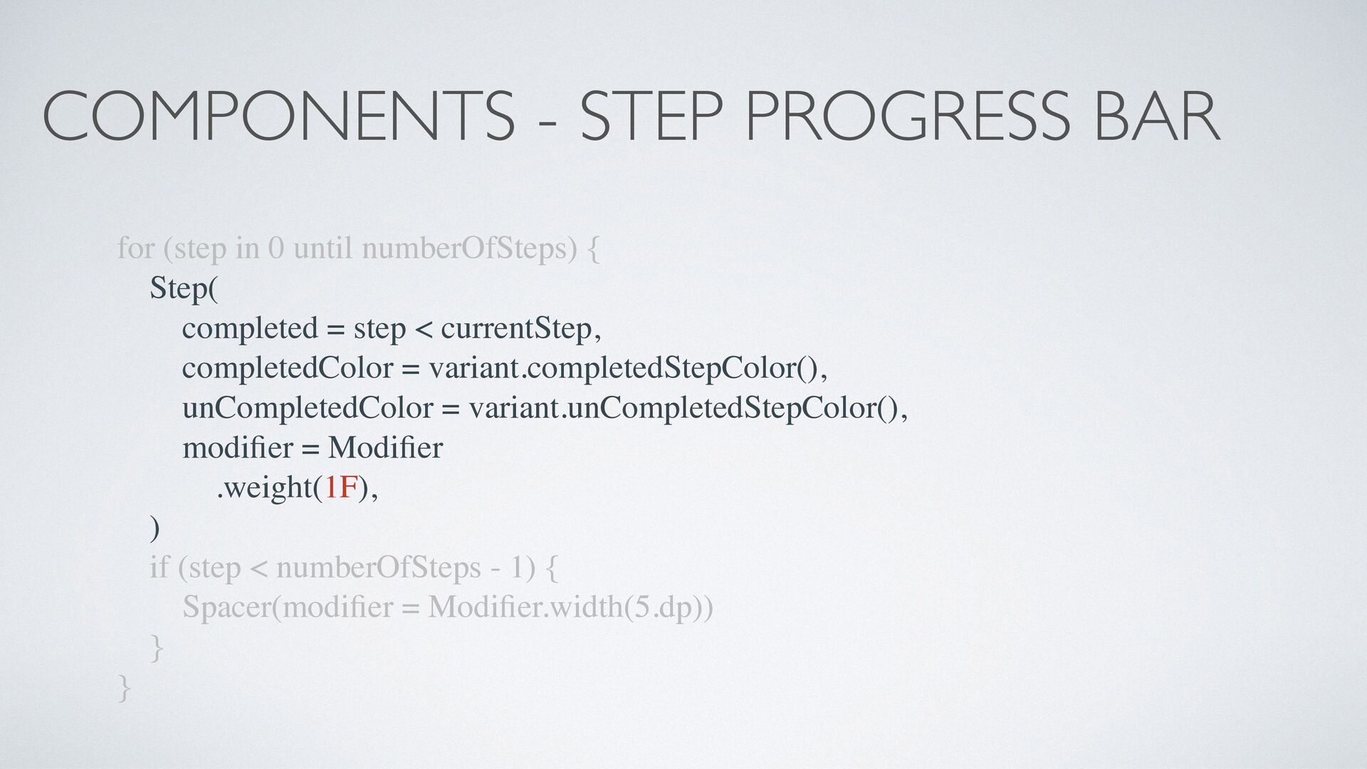
numberOfSteps) { Step( completed = step < currentStep, completedColor = variant.completedStepColor(), unCompletedColor = variant.unCompletedStepColor(), modi fi er = Modi fi er .weight(1F), ) if (step < numberOfSteps - 1) { Spacer(modi fi er = Modi fi er.width(5.dp)) } }
numberOfSteps) { Step( completed = step < currentStep, completedColor = variant.completedStepColor(), unCompletedColor = variant.unCompletedStepColor(), modi fi er = Modi fi er .weight(1F), ) if (step < numberOfSteps - 1) { Spacer(modi fi er = Modi fi er.width(5.dp)) } }
numberOfSteps) { Step( completed = step < currentStep, completedColor = variant.completedStepColor(), unCompletedColor = variant.unCompletedStepColor(), modi fi er = Modi fi er .weight(1F), ) if (step < numberOfSteps - 1) { Spacer(modi fi er = Modi fi er.width(5.dp)) } }
numberOfSteps) { Step( completed = step < currentStep, completedColor = variant.completedStepColor(), unCompletedColor = variant.unCompletedStepColor(), modi fi er = Modi fi er .weight(1F), ) if (step < numberOfSteps - 1) { Spacer(modi fi er = Modi fi er.width(5.dp)) } }
numberOfSteps) { Step( completed = step < currentStep, completedColor = variant.completedStepColor(), unCompletedColor = variant.unCompletedStepColor(), modi fi er = Modi fi er .weight(1F), ) if (step < numberOfSteps - 1) { Spacer(modi fi er = Modi fi er.width(5.dp)) } }
numberOfSteps) { Step( completed = step < currentStep, completedColor = variant.completedStepColor(), unCompletedColor = variant.unCompletedStepColor(), modi fi er = Modi fi er .weight(1F), ) if (step < numberOfSteps - 1) { Spacer(modi fi er = Modi fi er.width(5.dp)) } }
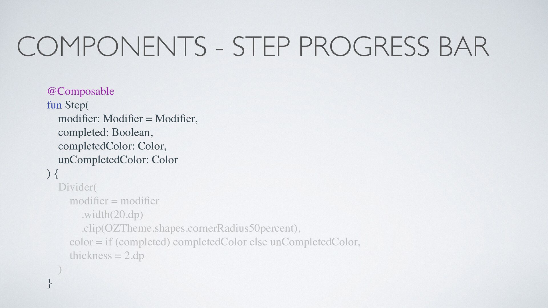
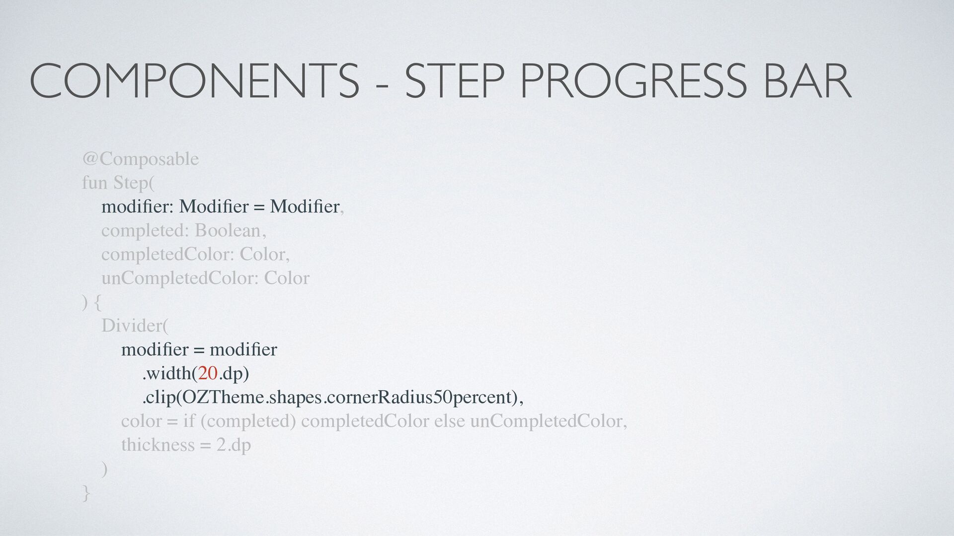
er: Modi fi er = Modi fi er, completed: Boolean, completedColor: Color, unCompletedColor: Color ) { Divider( modi fi er = modi fi er .width(20.dp) .clip(OZTheme.shapes.cornerRadius50percent), color = if (completed) completedColor else unCompletedColor, thickness = 2.dp ) }
er: Modi fi er = Modi fi er, completed: Boolean, completedColor: Color, unCompletedColor: Color ) { Divider( modi fi er = modi fi er .width(20.dp) .clip(OZTheme.shapes.cornerRadius50percent), color = if (completed) completedColor else unCompletedColor, thickness = 2.dp ) }
er: Modi fi er = Modi fi er, completed: Boolean, completedColor: Color, unCompletedColor: Color ) { Divider( modi fi er = modi fi er .width(20.dp) .clip(OZTheme.shapes.cornerRadius50percent), color = if (completed) completedColor else unCompletedColor, thickness = 2.dp ) }
er: Modi fi er = Modi fi er, completed: Boolean, completedColor: Color, unCompletedColor: Color ) { Divider( modi fi er = modi fi er .width(20.dp) .clip(OZTheme.shapes.cornerRadius50percent), color = if (completed) completedColor else unCompletedColor, thickness = 2.dp ) }
er: Modi fi er = Modi fi er, completed: Boolean, completedColor: Color, unCompletedColor: Color ) { Divider( modi fi er = modi fi er .width(20.dp) .clip(OZTheme.shapes.cornerRadius50percent), color = if (completed) completedColor else unCompletedColor, thickness = 2.dp ) }
er: Modi fi er = Modi fi er, completed: Boolean, completedColor: Color, unCompletedColor: Color ) { Divider( modi fi er = modi fi er .width(20.dp) .clip(OZTheme.shapes.cornerRadius50percent), color = if (completed) completedColor else unCompletedColor, thickness = 2.dp ) }
{ Column( verticalArrangement = Arrangement.Center, horizontalAlignment = Alignment.CenterHorizontally, modi fi er = Modi fi er . fi llMaxSize() .background(backgroundColor), ) { StepProgressBar( modi fi er = Modi fi er.background(componentBackgroundColor), numberOfSteps = 6, currentStep = 2, ) } } } }
{ Column( verticalArrangement = Arrangement.Center, horizontalAlignment = Alignment.CenterHorizontally, modi fi er = Modi fi er . fi llMaxSize() .background(backgroundColor), ) { StepProgressBar( modi fi er = Modi fi er.background(componentBackgroundColor), numberOfSteps = 6, currentStep = 2, ) } } } }
{ Column( verticalArrangement = Arrangement.Center, horizontalAlignment = Alignment.CenterHorizontally, modi fi er = Modi fi er . fi llMaxSize() .background(backgroundColor), ) { StepProgressBar( modi fi er = Modi fi er.background(componentBackgroundColor), numberOfSteps = 6, currentStep = 2, ) } } } }
{ Column( verticalArrangement = Arrangement.Center, horizontalAlignment = Alignment.CenterHorizontally, modi fi er = Modi fi er . fi llMaxSize() .background(backgroundColor), ) { StepProgressBar( modi fi er = Modi fi er.background(componentBackgroundColor), numberOfSteps = 6, currentStep = 2, ) } } } }
{ Column( verticalArrangement = Arrangement.Center, horizontalAlignment = Alignment.CenterHorizontally, modi fi er = Modi fi er . fi llMaxSize() .background(backgroundColor), ) { StepProgressBar( modi fi er = Modi fi er.background(componentBackgroundColor), numberOfSteps = 6, currentStep = 2, ) } } } }
{ Column( verticalArrangement = Arrangement.Center, horizontalAlignment = Alignment.CenterHorizontally, modi fi er = Modi fi er . fi llMaxSize() .background(backgroundColor), ) { StepProgressBar( modi fi er = Modi fi er.background(componentBackgroundColor), numberOfSteps = 6, currentStep = 2, ) } } } }
{ Column( verticalArrangement = Arrangement.Center, horizontalAlignment = Alignment.CenterHorizontally, modi fi er = Modi fi er . fi llMaxSize() .background(backgroundColor), ) { StepProgressBar( modi fi er = Modi fi er.background(componentBackgroundColor), numberOfSteps = 6, currentStep = 2, ) } } } }
{ Column( verticalArrangement = Arrangement.Center, horizontalAlignment = Alignment.CenterHorizontally, modi fi er = Modi fi er . fi llMaxSize() .background(backgroundColor), ) { StepProgressBar( modi fi er = Modi fi er.background(componentBackgroundColor), numberOfSteps = 6, currentStep = 2, ) } } } }
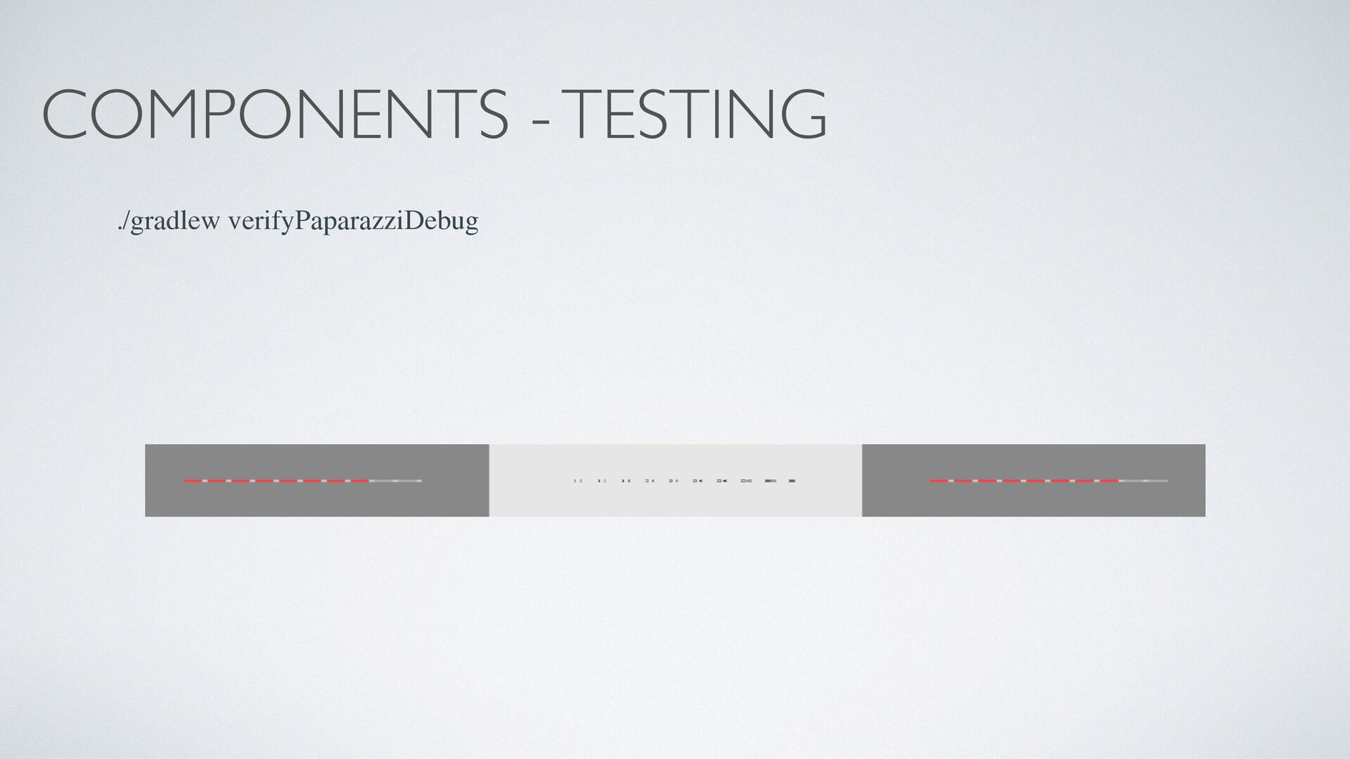
parameters like a “Variant” • We can’t call something @Composable inside enums or classes but we can hold a Composable lambda • Use cashapp/paparazzi to screenshot-test your components
viewModel()) { val uiState by testViewModel.uiState.collectAsState() Column(modi fi er = Modi fi er. fi llMaxSize()) { when (uiState) { TestUiState.Initial -> Text("Initial State") TestUiState.SecondState -> Text("Second State") } } }
viewModel()) { val uiState by testViewModel.uiState.collectAsState() Column(modi fi er = Modi fi er. fi llMaxSize()) { when (uiState) { TestUiState.Initial -> Text("Initial State") TestUiState.SecondState -> Text("Second State") } } }
viewModel()) { val uiState by testViewModel.uiState.collectAsState() Column(modi fi er = Modi fi er. fi llMaxSize()) { when (uiState) { TestUiState.Initial -> Text("Initial State") TestUiState.SecondState -> Text("Second State") } } }
viewModel()) { val uiState by testViewModel.uiState.collectAsState() Column(modi fi er = Modi fi er. fi llMaxSize()) { when (uiState) { TestUiState.Initial -> Text("Initial State") TestUiState.SecondState -> Text("Second State") } } }
viewModel()) { val uiState by testViewModel.uiState.collectAsState() Column(modi fi er = Modi fi er. fi llMaxSize()) { when (uiState) { TestUiState.Initial -> Text("Initial State") TestUiState.SecondState -> Text("Second State") } } }
ZERO Digital Bank Blog - https://galex.co.il/ Twitter - https://twitter.com/galex Github - https://github.com/galex Linkedin - https://www.linkedin.com/in/agherschon/
 alexgherschon
 y0hgi
y0hgi
 vinceamstoutz
 wakana0222
 j5ik2o
 licux
licux
 daitasu
 yukikurage
 jame2408
 minodriven
 guaca
guaca
 suikabar
 akihisaikeda
 katiecoart
 cassininazir
 sabderemane
 rasmusluckow
 mkilby
 greggifford
 ivargrimstad
 shlominoach
 baasie
 scottboms
 addyosmani
 jnunemaker