Upgrade to Pro — share decks privately, control downloads, hide ads and more …

Website and UX Design

Amy Kvistad
July 22, 2017

Website and UX Design

Updated presentation given at WordCamp Boston, July 2017.

Amy Kvistad

July 22, 2017
Tweet

More Decks by Amy Kvistad

Other Decks in Design

Transcript

  1. Website and UX Design –
    From a Designer's Perspective
    WordCamp Boston| July 2017
    @amykvistad | Amy Kvistad

    View Slide

  2. Outline
    • Overview
    • Research and discovery
    • Design and development
    • Deliver and after launch
    • Designing for performance
    • Tools of the trade
    • Implementing in WordPress

    View Slide

  3. VISUAL
    DESIGN
    Typography
    Color
    Space
    Texture
    Imagery

    View Slide

  4. Usability.gov defines visual design as “strategically
    implementing images, colors, fonts, and other elements,” in
    order to enhance a design or interaction, and engage users.

    View Slide

  5. Example of visual design from usability.gov

    View Slide

  6. USER
    EXPERIENCE
    DESIGN
    User needs
    User behaviors
    Site usefulness
    Ease of use
    Enjoyable

    View Slide

  7. User Experience Honeycomb − Peter Morville
    User Experience
    Honeycomb

    View Slide

  8. Web Design Process

    View Slide

  9. Double diamond design process model from the UK Design Council.

    View Slide

  10. DISCOVER
    insights into the problem
    Research and discovery
    Understanding the project and audience

    View Slide

  11. Discovering client objectives
    The process starts with discovering client objectives
    Learn about the website requirements

    View Slide

  12. Discovering the website audience
    • Discovering the website users
    • Are you reaching the right
    users?

    View Slide

  13. Content Audit

    View Slide

  14. DEFINE
    the area to focus upon
    Information architecture and UX design

    View Slide

  15. View Slide

  16. Navigation
    A key part of information architecture is navigation.

    View Slide

  17. Navigation Guidelines
    Keep it simple
    Card sorting
    Internal page links
    Search

    View Slide

  18. Content Strategy
    The creation, curation, and
    maintenance of text, images,
    audio, and video.

    View Slide

  19. Deliverables

    View Slide

  20. Deliverables

    View Slide

  21. DEVELOP
    potential solutions
    Content development, implementation and review

    View Slide

  22. View Slide

  23. View Slide

  24. View Slide

  25. View Slide

  26. View Slide

  27. View Slide

  28. Deliverables
    Wireframes focus on space allocation
    and prioritizing of content
    Source: Usability.gov

    View Slide

  29. Deliverables

    View Slide

  30. Case Study

    View Slide

  31. View Slide

  32. View Slide

  33. View Slide

  34. View Slide

  35. View Slide

  36. View Slide

  37. View Slide

  38. View Slide

  39. DELIVER
    solutions that work
    Launch website and performance optimization

    View Slide

  40. View Slide

  41. Designing for Performance

    View Slide

  42. Images are the biggest culprit for bloated web pages.
    − Ethan Marcotte

    View Slide

  43. View Slide

  44. View Slide

  45. View Slide

  46. View Slide

  47. View Slide

  48. Designing for Accessibility

    View Slide

  49. Accessibility for Visual Design − Nick Babich
    As the W3C 
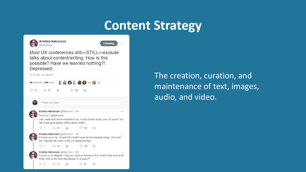
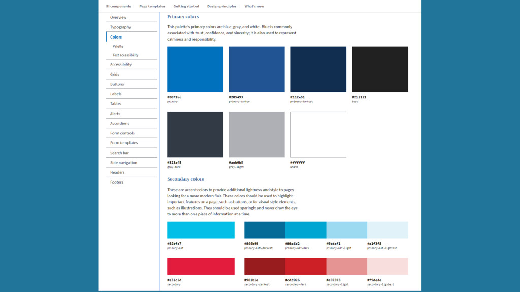
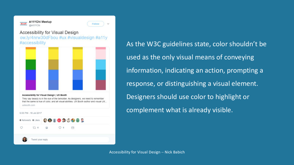
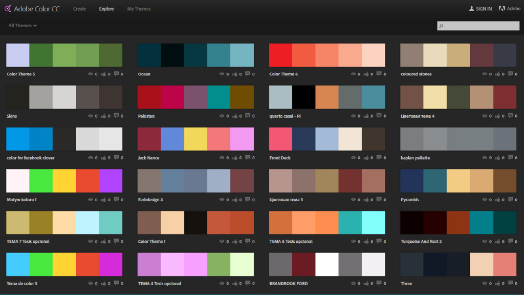
guidelines state, color shouldn’t be
    used as the only visual means of conveying
    information, indicating an action, prompting a
    response, or distinguishing a visual element.
    Designers should use color to highlight or
    complement what is already visible.

    View Slide

  50. 1. Provide equivalent alternatives to auditory and
    visual content.
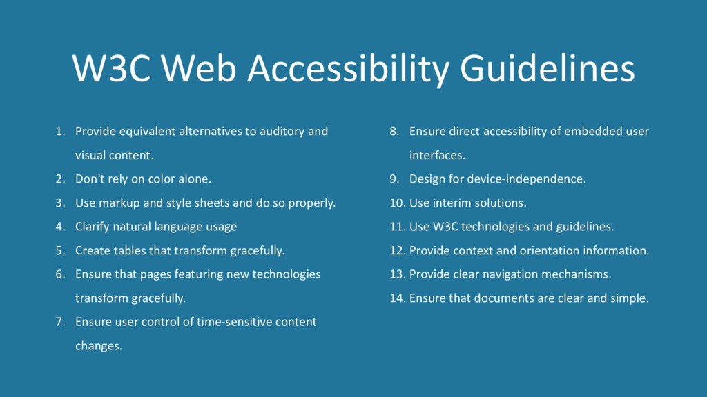
    2. Don't rely on color alone.
    3. Use markup and style sheets and do so properly.
    4. Clarify natural language usage
    5. Create tables that transform gracefully.
    6. Ensure that pages featuring new technologies
    transform gracefully.
    7. Ensure user control of time-sensitive content
    changes.
    8. Ensure direct accessibility of embedded user
    interfaces.
    9. Design for device-independence.
    10. Use interim solutions.
    11. Use W3C technologies and guidelines.
    12. Provide context and orientation information.
    13. Provide clear navigation mechanisms.
    14. Ensure that documents are clear and simple.
    W3C Web Accessibility Guidelines

    View Slide

  51. Tools of the Trade

    View Slide

  52. View Slide

  53. View Slide

  54. View Slide

  55. View Slide

  56. View Slide

  57. View Slide

  58. View Slide

  59. View Slide

  60. View Slide

  61. Photon is an image acceleration and editing service for sites hosted
    on WordPress.com or on Jetpack-connected WordPress sites.
    That means less load on your host and faster images for your readers.

    View Slide

  62. View Slide

  63. View Slide

  64. View Slide

  65. View Slide

  66. View Slide

  67. View Slide

  68. View Slide

  69. View Slide

  70. View Slide

  71. Implementing in WordPress

    View Slide

  72. Child Theme WordPress customizer

    View Slide

  73. View Slide

  74. View Slide

  75. View Slide

  76. View Slide

  77. Research and discovery
    Design and development
    Deliver and after launch
    Designing for performance
    Tools of the trade
    Implementing in WordPress

    View Slide

  78. Information Architecture vs Interaction Design – What Are the Differences? By Norbert Chong

    View Slide

  79. Thank You!
    WordCamp Boston| July 2017
    @amykvistad | Amy Kvistad

    View Slide