Upgrade to Pro — share decks privately, control downloads, hide ads and more …

Tablets and Hybrids Need Mobile-Optimized Websites, Too!

Tablets and Hybrids Need Mobile-Optimized Websites, Too!

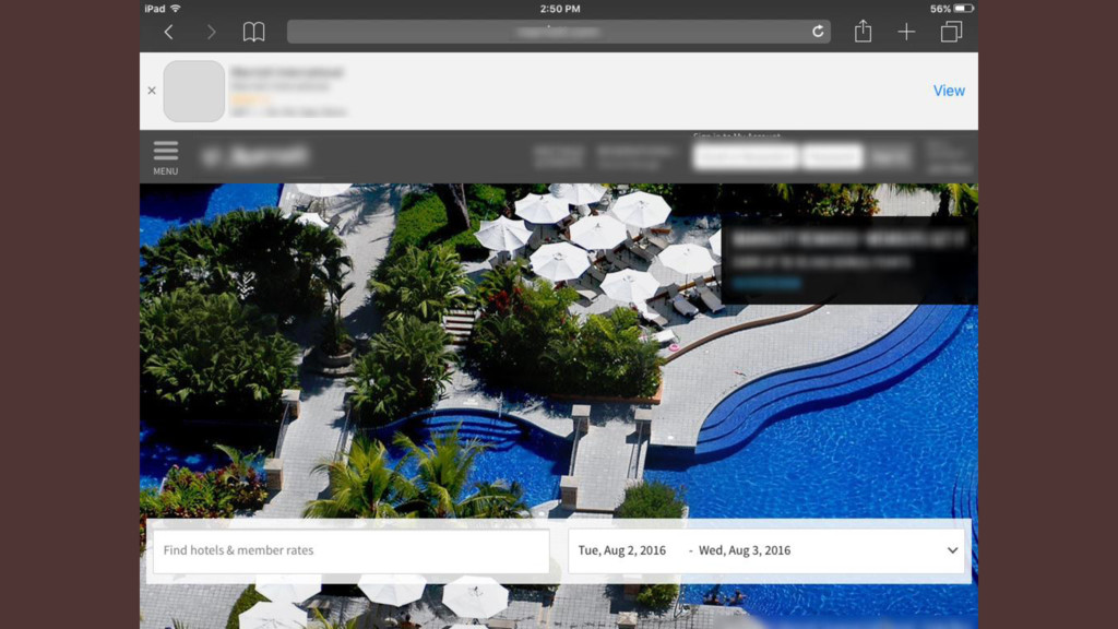
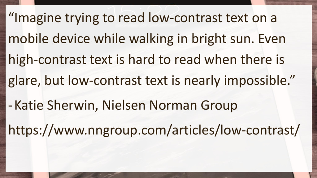
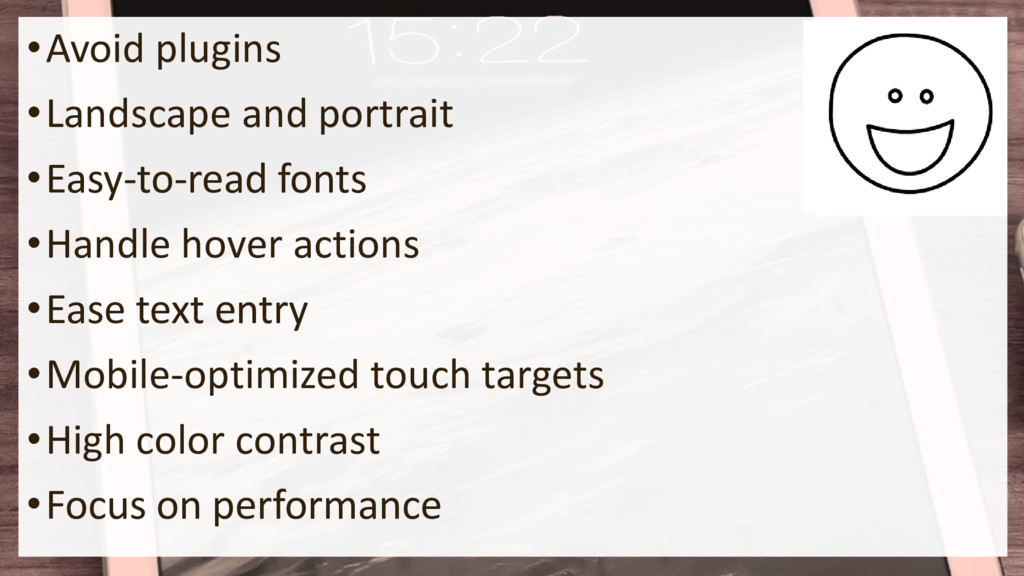
It takes extra work to deliver a truly responsive website. Since larger tablets and hybrids such as iPad Pros and Windows Surface devices can fit the full size of a standard laptop/desktop website, a tempting thought is to deliver to them the exact same experience. Why spend extra effort providing different navigation or content since their screen resolutions equal, or exceed, that of many monitors?

Andrew Malek

March 11, 2018
Tweet

More Decks by Andrew Malek

Other Decks in Programming

Transcript

  1. “As a real estate agent, I am expected to have

    a lot of information in my head, and I do but I have a constant need to look things up, especially when I am out with clients. The screen on my phone just isn’t big enough to poke through tax records and other information on websites that are still not optimized for mobile devices.” - Teresa Boardman, Inman http://www.inman.com/2015/05/01/ipads-are-5-years-old- heres-how-i-learned-to-use-mine-for-real-estate/
  2. “We needed to connect mothers to their babies’ care when

    they couldn’t physically be there. This technology proved the best solution,” Caceres said. “When doctors and nurses are treating a newborn in the NICU, mom now can be right there asking questions and getting updates, even if she’s on a different floor.” - https://www.cedars-sinai.edu/About-Us/HH-Landing- Pages/iPads-Help-New-Moms-Connect-With-Their-Infants- in-the-Neonatal-Intensive-Care-Unit.aspx
  3. •Maximizing the Effectiveness of the iPad for People with Autism

    •“Using Your iPad for Encouraging Communication” •“Using Your iPad for Daily Activities” •“Using Your iPad as a Reward” -Autism Speaks https://www.autismspeaks.org/family- services/technology/maximizing-use-ipad
  4. “The fourth quarter of 2016 (4Q16) marked the ninth consecutive

    quarter that tablet shipments have declined.” Vendors “shipped 52.9 million tablets in the fourth quarter, which was a decline of 20.1% from the same quarter one year ago.” - IDC Research http://www.idc.com/getdoc.jsp?containerId=prUS42272117
  5. “The iPad 2 is still in use today,” IDC Senior

    Analyst Jitesh Ubrani tells TechCrunch. “The [original] iPad Minis and Air are all still in use today. They were being supported by Apple until very recently. People have been hanging onto these devices and they’re finding that they work just as well as they did when they were released.” - Brian Heater, TechCrunch https://techcrunch.com/2017/03/21/what-happened-to- tablet-sales/
  6. Just Use the Desktop Website? •Tablet resolutions usually >=1024 pixel

    width (with a catch…) •More room for text & graphics than cell phones; sites designed for those may result in too much whitespace on tablets •Reduce development time – concentrate on desktop/laptop and cell phone users
  7. Desktop / Laptop Websites, Too… “Microsoft's Windows 10 Edge browser

    automatically pauses Flash content not central to a webpage. Google's Chrome browser will block Flash on virtually all websites. And Mozilla's Firefox blocks any old and potentially unsecure version of Flash and offers a "click to play" option that requires you to manually activate Flash should you need it.” - Lance Whitney, CNET http://www.cnet.com/news/apple-to-neutralize-adobe-flash-by-default- in-next-version-of-safari/
  8. Fixed Width / Fixed Grid •Shrunken text and images •Manually

    pan through website, or pinch-and- zoom •Text / images reach outside containers
  9. Responsive Grids •Unsemantic http://unsemantic.com/ •Pure.css, supporting regular and responsive grids

    https://purecss.io/ •Bootstrap framework, supporting a 12-column grid system (columns can stack on tablets and below) http://getbootstrap.com/
  10. “Illusion of Completeness” •User cannot tell there is more to

    scroll •Often due to whitespace between elements (but whitespace is good?) •Two different tablet orientations to test - Kim Flaherty, Nielsen Norman Group https://www.nngroup.com/articles/illusion-of- completeness/
  11. •Example: Gill Sans MT vs. Gill Sans MT Condensed •“Avoid

    horizontally-condensed fonts, especially in small sizes” http://ux.stackexchange.com/questions/56125/ •“As a general rule, condensed fonts do not lend themselves to readability.” http://tympanus.net/codrops/2012/03/20/conde nsed-fonts-the-good-the-bad-the-ugly/
  12. The Serif vs. Sans Serif Debate “Letterforms that are too

    intricate and thin are not only hard to read, especially for those with dyslexia or visual disabilities but also tend to break down at smaller sizes… To avoid this problem, many designers have opted to use sans-serif fonts… The simple, straightforward letterforms of sans-serifs tend to scale better and make for a more readable presentation…” http://www.creativebloq.com/web-design/how-choose-right-fonts- small-screens-91516966
  13. The Serif vs. Sans Serif Debate “While the average reading

    speed was 9% faster for the group that read the sans serif passage, that difference was not statistically significant.” “The only notable difference between the two groups was that the serif group complained about the text twice as often as the sans serif group.“ - Hannah Alvarez https://www.usertesting.com/blog/2014/08/06/choosing-the-right- font-a-guide-to-typography-and-user-experience/
  14. •1 Ill ocean (Bauhaus 93) •1 Ill ocean (Rockwell) •1

    Ill ocean (Gill Sans® Monotype) •1 Ill ocean (Source Sans Pro) - ‘5 Faces for UI Design’ - Dan Eden http://typecast.com/blog/type-on-screen-5-faces-for- ui-design
  15. Consider using device system font in Safari for iOS body

    { font-family: -apple-system, "Arial", sans-serif } - Using the System Font in Web Content https://webkit.org/blog/3709/using-the-system- font-in-web-content/
  16. •For other devices, call out system font names: •“Segoe UI”

    - Surface/Edge •“Roboto” then “Droid Sans” - Android -Marcin Wichary, Smashing Magazine https://www.smashingmagazine.com/2015/11/usi ng-system-ui-fonts-practical-guide/
  17. •Cannot guarantee reliable hover support •Animation on hover? •Popup text

    or details on hover? •Is a finger press meant to activate the hover event, or the click event?
  18. •Long press works on some devices / browsers to show

    alt text – if people know… •Could recognize a tap as a press / click and a long press to show “hover” details •Pressure.js to perform other actions on long press or support Apple’s Force Touch / 3D Touch
  19. •Other input types – date, email, time, week, etc. •Support

    not universal – but should degrade to <input type="text"> •Is particular type supported? http://caniuse.com/ http://www.wufoo.com/html5/
  20. •Toggle auto capitalization <input type="text" autocapitalize="on/off" ... > •Turn off

    autocorrect for proper noun input <input type="text" autocorrect="off" ... > •Reduce number of fields •Don’t abuse dropdowns - http://www.lukew.com/ff/entry.asp?1950
  21. Higher Precision with Mice •Whitespace separation between touch points to

    prevent accidental press of wrong touchpoint •Avoid UI interfering with swiping motions (i.e. sliders)
  22. How Large Should Touch Points Be? •“Give tappable controls a

    hit target of about 44 x 44 points.” - iOS Human Interface Guidelines •“[T]ouch targets should be at least 48 x 48 dp. In most cases, there should be 8dp or more space between them.” - Google Material Design guidelines
  23. Cannot Assume Optimum Lighting •Not all tablet use at office

    or desk •Coffee shop •Hotel room •Kitchen •Outdoors in bright sunlight
  24. “Imagine trying to read low-contrast text on a mobile device

    while walking in bright sun. Even high-contrast text is hard to read when there is glare, but low-contrast text is nearly impossible.” -Katie Sherwin, Nielsen Norman Group https://www.nngroup.com/articles/low-contrast/
  25. Increase Color Contrast for Tablets •Increases legibility – don’t do

    this •Focuses user attention •Color contrast between pressable and non- pressable areas to determine what is a button Popup
  26. •Higher color contrast may make website easier to use for

    everyone, not just for those with disabilities… •Good practice for desktop / laptop websites too, not just sites dedicated for tablet or smartphone users
  27. Obvious Performance Tricks… •Minify / Compress JavaScript •Optimize Images •Reduce

    Background Tasks •Reduce DOM and CSS Complexity •Minimize Repaint and Reflow •Optimize JavaScript
  28. Repaint and Reflow •Sitepoint - 10 Ways to Minimize Reflows

    and Improve Performance https://www.sitepoint.com/10-ways-minimize- reflows-improve-performance/ •Google PageSpeed - Minimizing Browser Reflow https://developers.google.com/speed/articles/reflow
  29. JavaScript Optimization • Google - https://developers.google.com/speed/articles/optimizing- javascript • Cubiq (maker

    of iScroll component) – Performance tricks “First of all. Don’t believe “performance tricks” posts. Yes, including this one.” http://cubiq.org/performance-tricks-for-mobile-web- development
  30. Perceived Performance •Show button / link down state •May not

    be visible for small buttons, however •Show spinner for longer operations
  31. •Avoid plugins •Landscape and portrait •Easy-to-read fonts •Handle hover actions

    •Ease text entry •Mobile-optimized touch targets •High color contrast •Focus on performance
  32. •“You’re designing a product for people, and it doesn’t matter

    if it’s on Android or iPhone or Windows Phone.” -Joey Flynn, former product designer, Facebook
  33. “You never know where the next order will come from,

    the next newsletter signup, the next word-of-mouth recommendation or critical review.” @malekontheweb