Upgrade to Pro — share decks privately, control downloads, hide ads and more …

Why Nobody Fills Out My Forms Part 2 - Electric Boogalo

Why Nobody Fills Out My Forms Part 2 - Electric Boogalo

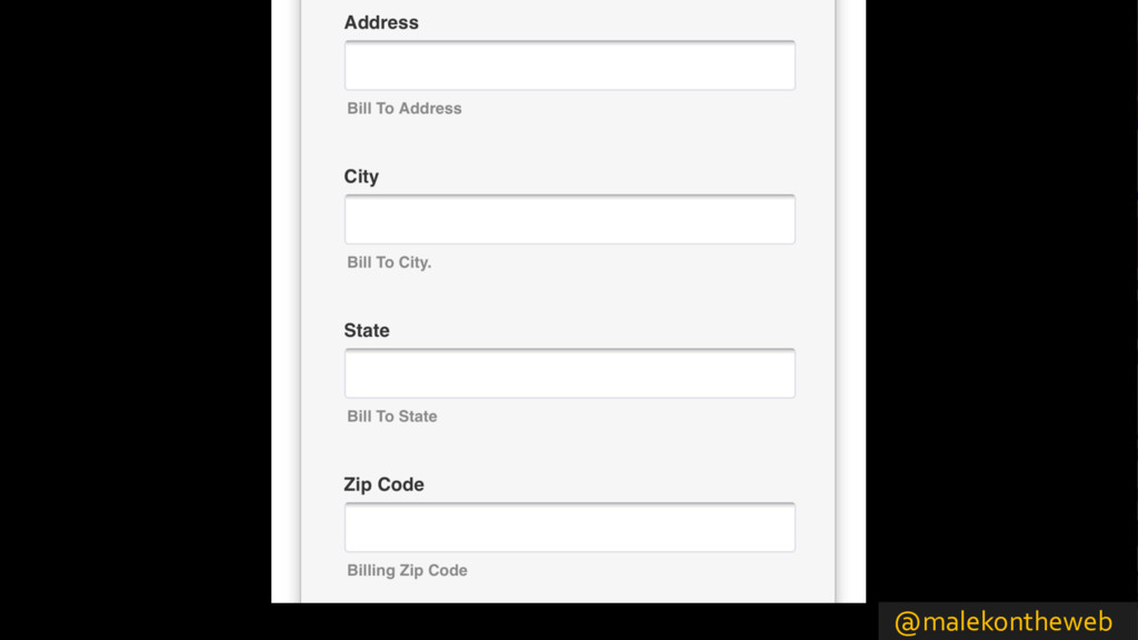
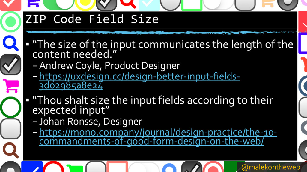
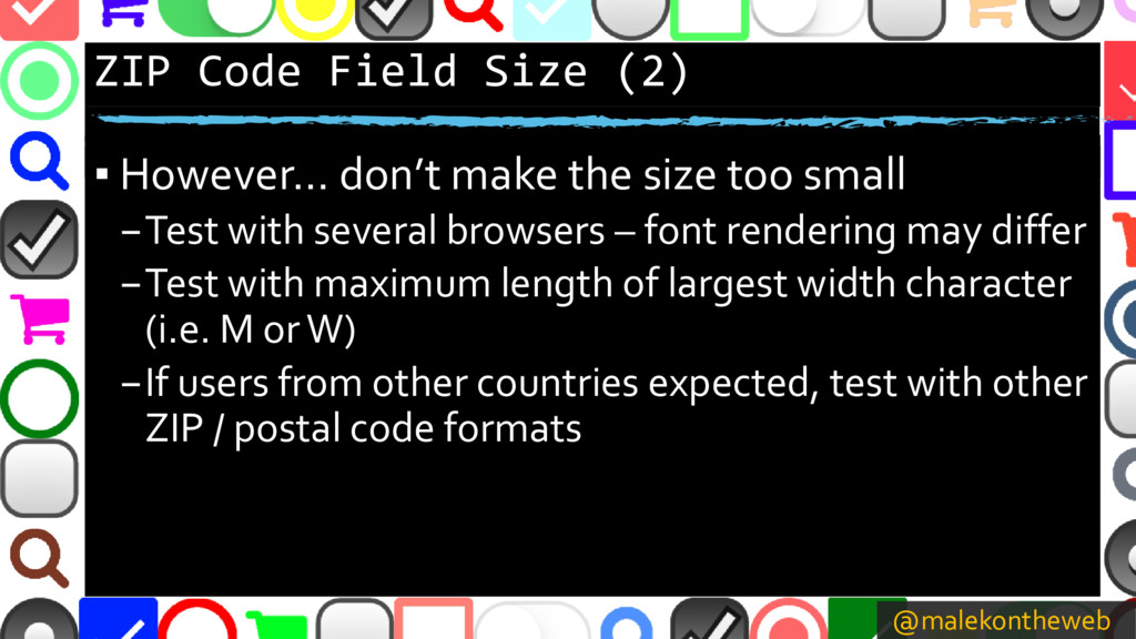
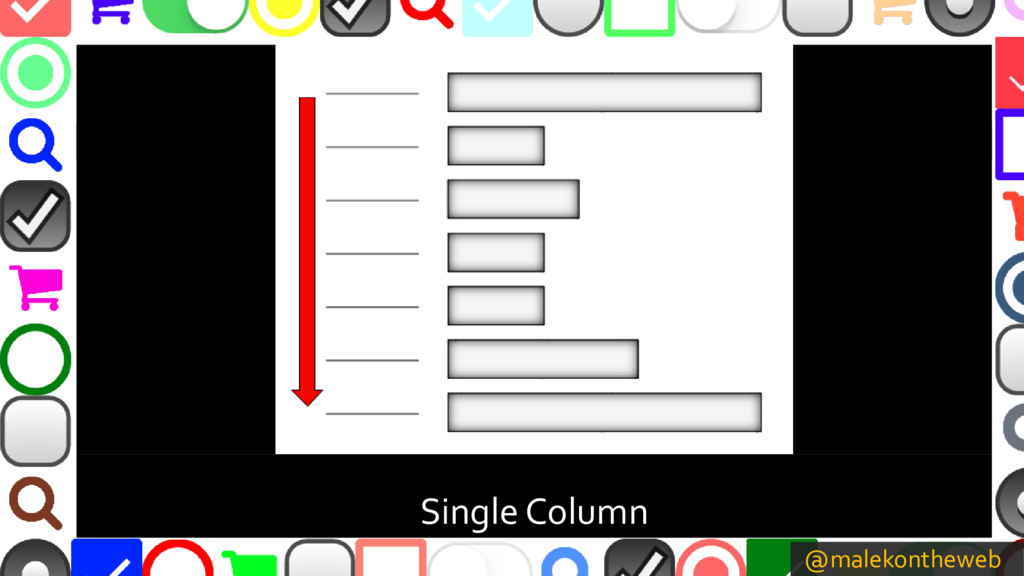
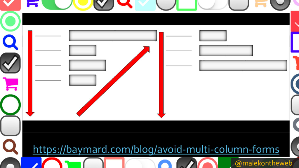
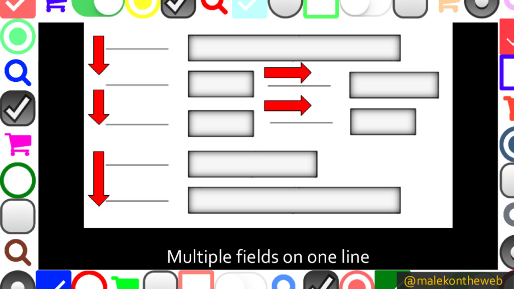
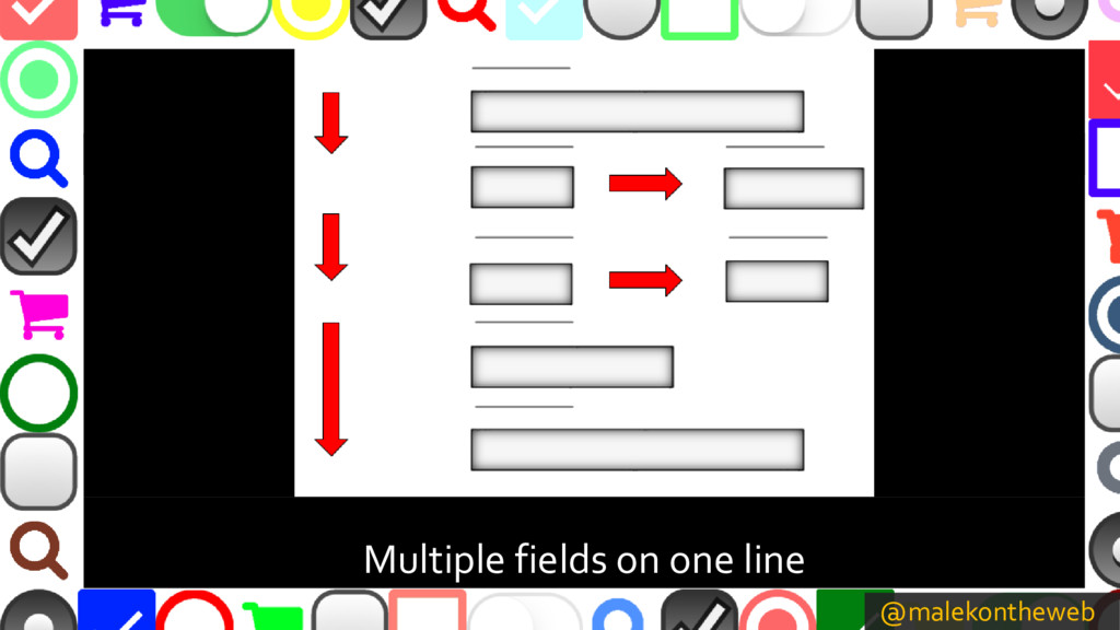
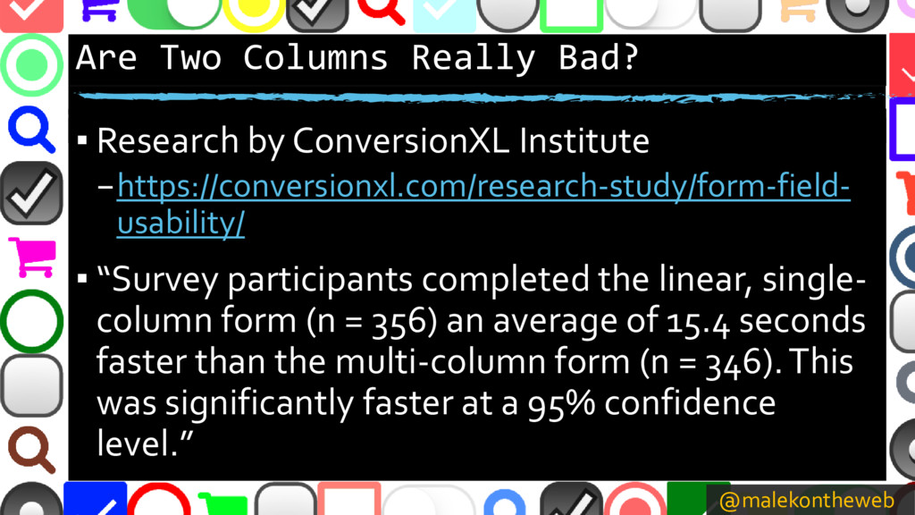
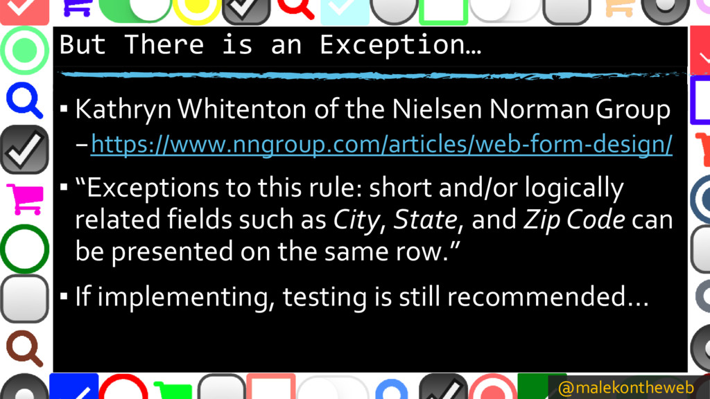
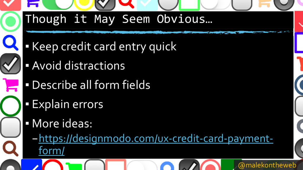
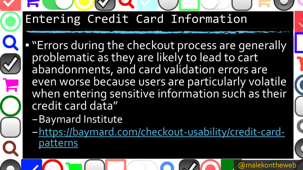
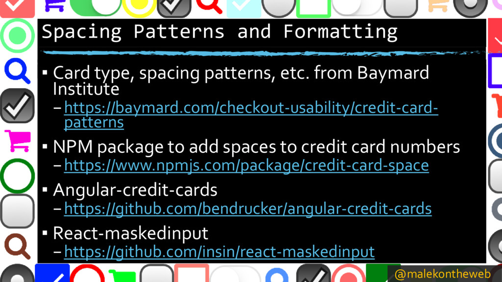
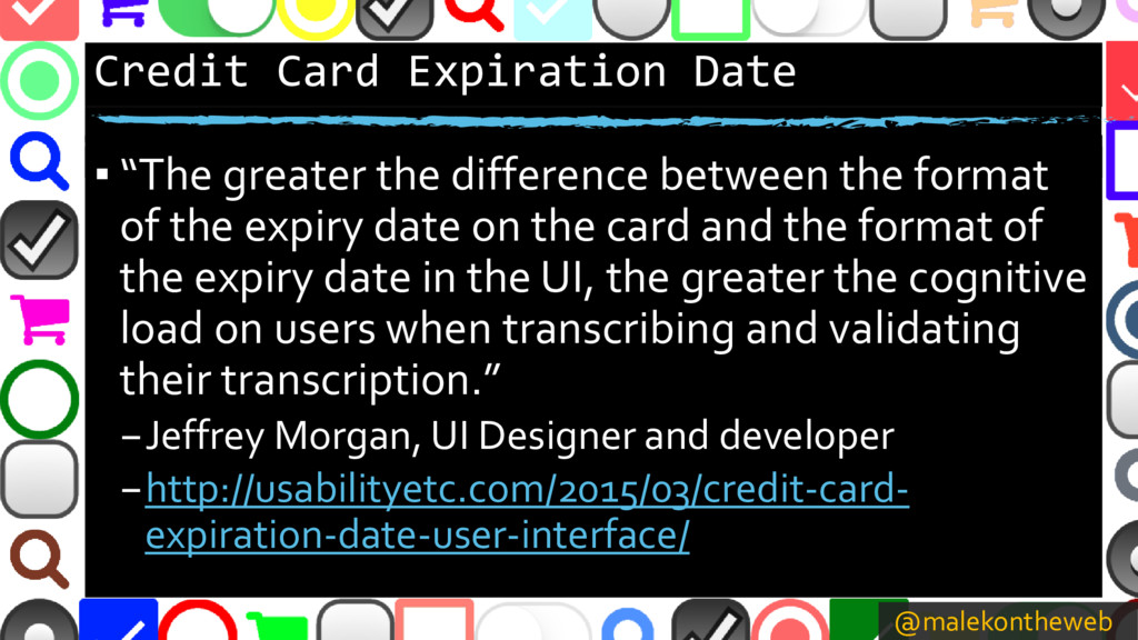
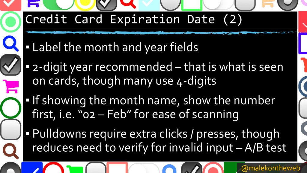
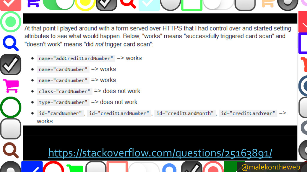
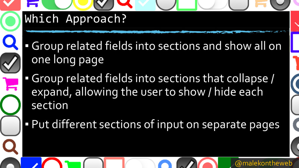
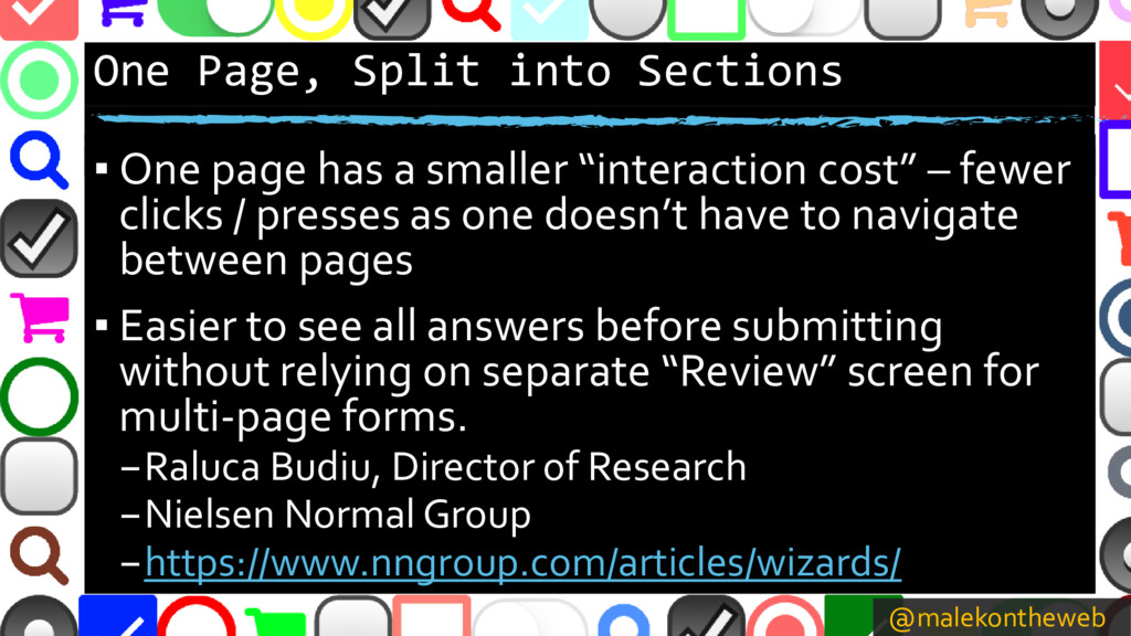
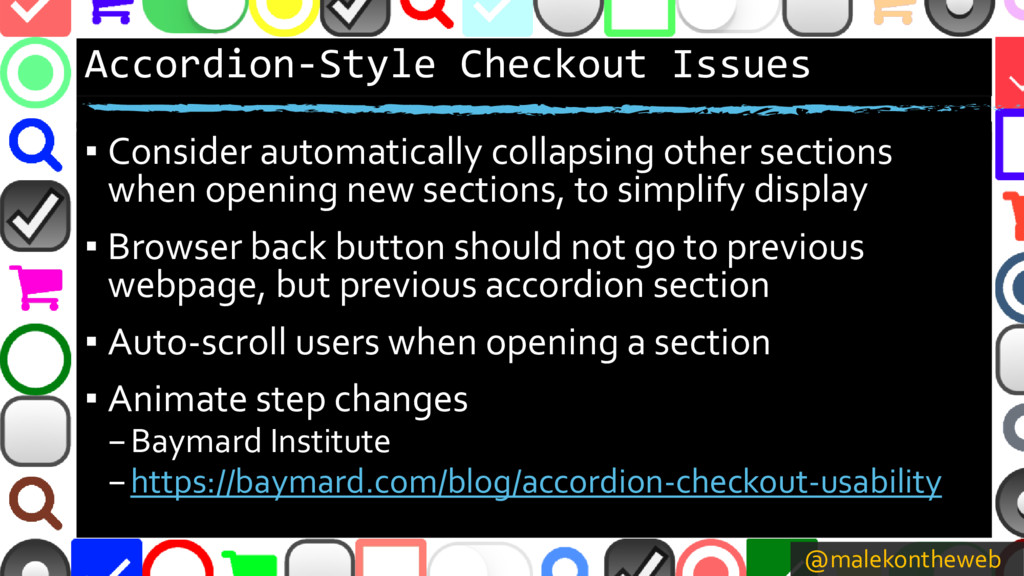
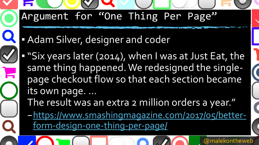
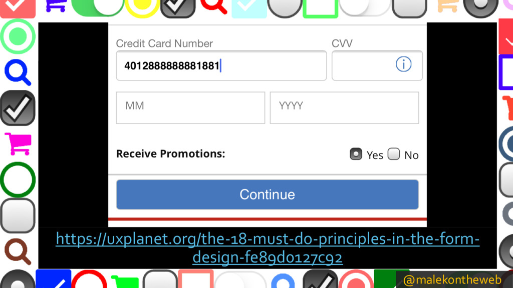
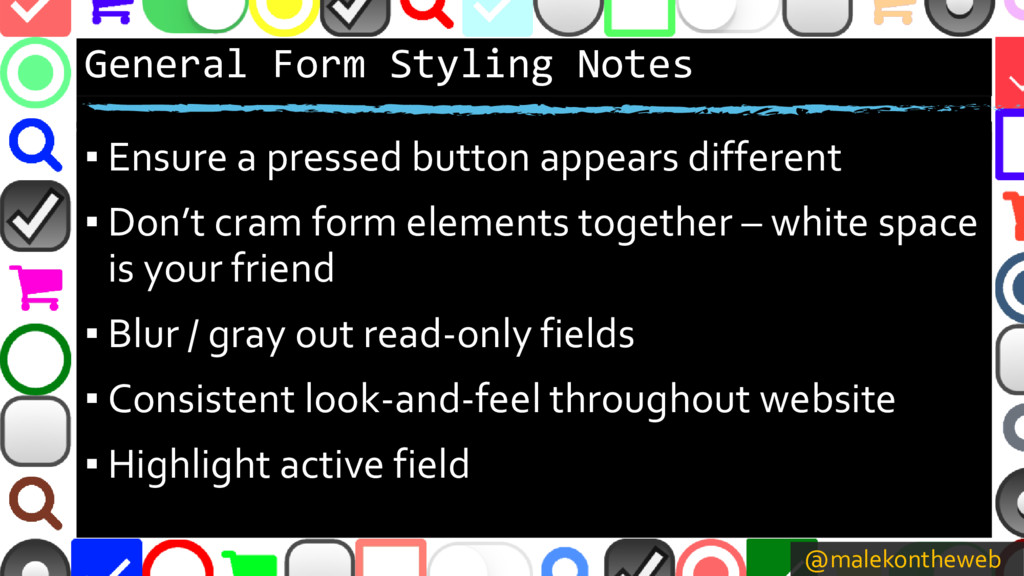
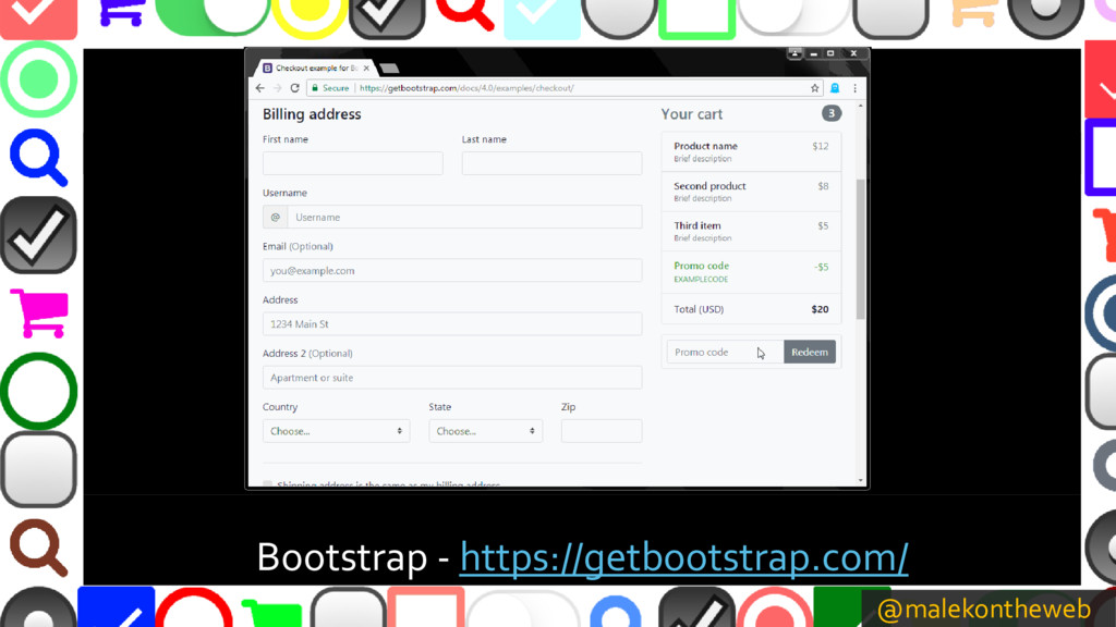
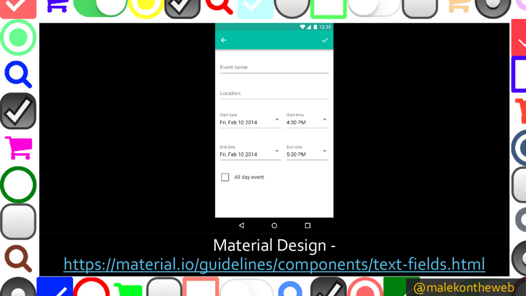
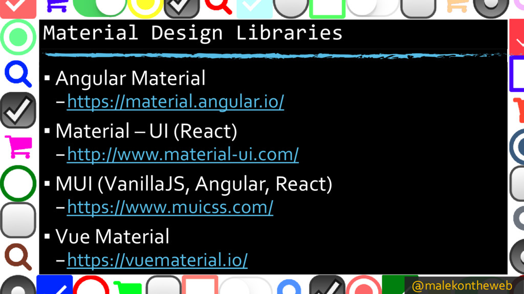
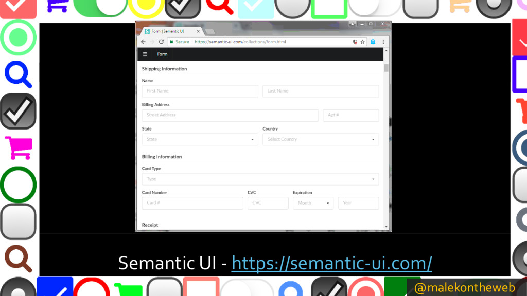
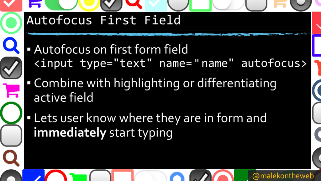
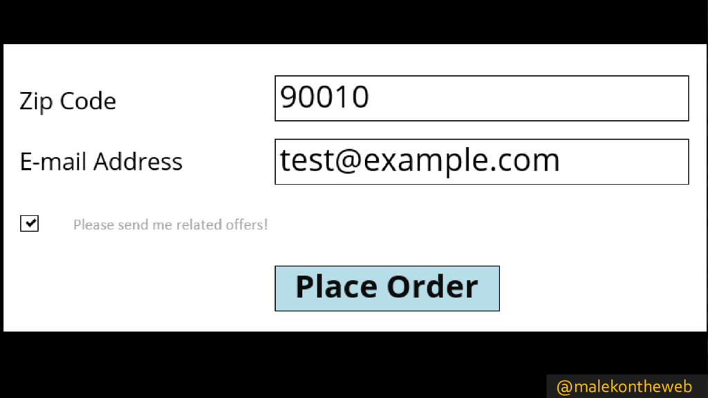
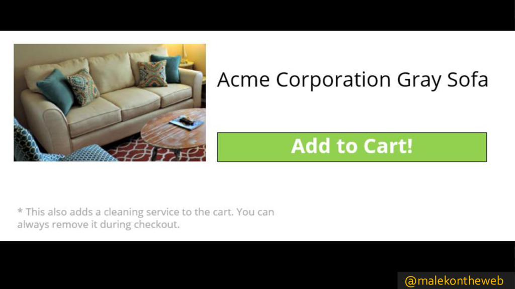
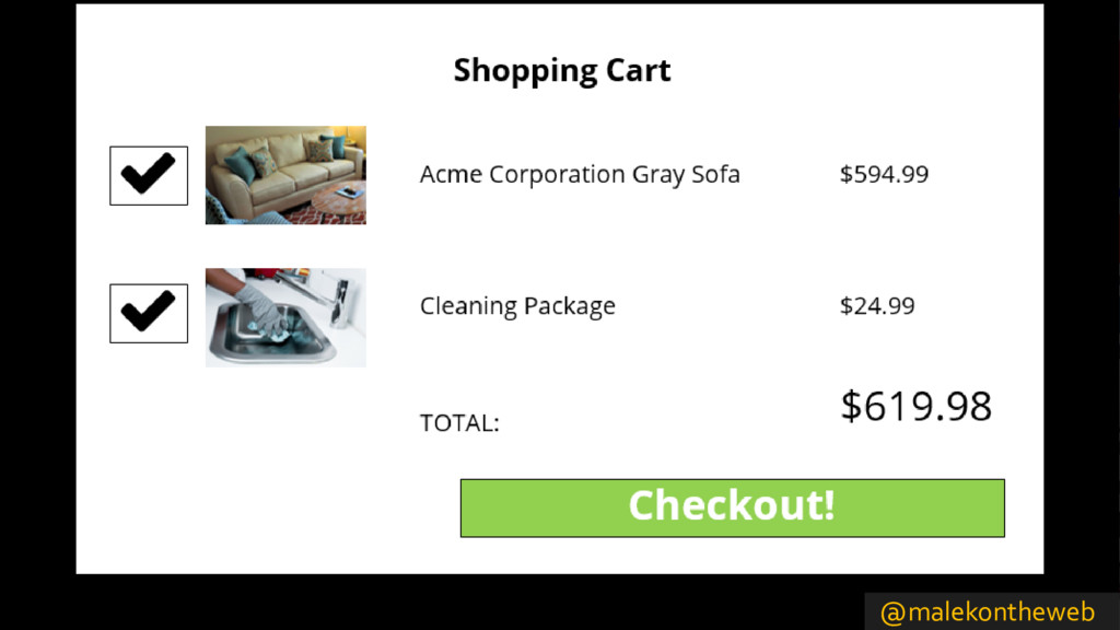
Still having difficulty encouraging people to fill out web forms to sign up for newsletters, apply for jobs, or complete their online shopping orders? Find out even more tips to help keep people from abandoning early, such as making form field widths more convenient, easing credit card entry, grouping related fields into sections to promote scanning, and styling buttons and controls so your webpage does not look like it was written in 2000.

Andrew Malek

March 11, 2018
Tweet

More Decks by Andrew Malek

Other Decks in Design

Transcript

  1. Why Nobody Fills Out My Forms Part 2 Andrew Malek

    http://malektips.com/ @malekontheweb
  2. @malekontheweb ZIP Code Field Size ▪ “The size of the

    input communicates the length of the content needed.” –Andrew Coyle, Product Designer –https://uxdesign.cc/design-better-input-fields- 3d02985a8e24 ▪ “Thou shalt size the input fields according to their expected input” –Johan Ronsse, Designer –https://mono.company/journal/design-practice/the-10- commandments-of-good-form-design-on-the-web/
  3. @malekontheweb ZIP Code Field Size (2) ▪ However… don’t make

    the size too small –Test with several browsers – font rendering may differ –Test with maximum length of largest width character (i.e. M or W) –If users from other countries expected, test with other ZIP / postal code formats
  4. @malekontheweb Are Two Columns Really Bad? ▪ Research by ConversionXL

    Institute –https://conversionxl.com/research-study/form-field- usability/ ▪ “Survey participants completed the linear, single- column form (n = 356) an average of 15.4 seconds faster than the multi-column form (n = 346). This was significantly faster at a 95% confidence level.”
  5. @malekontheweb But There is an Exception… ▪ Kathryn Whitenton of

    the Nielsen Norman Group –https://www.nngroup.com/articles/web-form-design/ ▪ “Exceptions to this rule: short and/or logically related fields such as City, State, and Zip Code can be presented on the same row.” ▪ If implementing, testing is still recommended…
  6. @malekontheweb “Text fields should be about the same size as

    the expected input since it’s extremely error prone when users can’t see their full entry.” - Nielsen Norman Group
  7. @malekontheweb Show Password JavaScript ▪ Angular – Bootstrap – ngx-show-hide-password

    – https://github.com/osahner/ngx-show-hide-password ▪ Bootstrap Show Password – https://github.com/wenzhixin/bootstrap-show-password ▪ jQuery hideShowPassword – https://github.com/cloudfour/hideShowPassword ▪ react-password-mask – https://www.npmjs.com/package/react-password-mask ▪ Vue-password – https://github.com/skegel13/vue-password
  8. @malekontheweb Confirm Password Issues ▪ Jessica Enders, Principal of former

    design consultancy Formulate ▪ “By having double entry for one or more fields on a web form, we are asking the entire user population to do more work, for the sake of preventing what could be a very small number of errors.” –https://www.formulate.com.au/blog/double-entry- form-fields
  9. @malekontheweb Confirm Password Field Case Study ▪ Formisimo, form analytics

    company ▪ “We noticed that over a two month period, our password repeat field … was responsible for over a quarter of all the people that abandoned our sign up process:” –https://www.formisimo.com/blog/case-study-small- changes-lead-to-a-55-increase-in-conversions/
  10. @malekontheweb SMS 2FA (Two-Factor Authentication) ▪ Ensure code changes every

    time ▪ Keep verification code page free from distractions ▪ 4-6 digits to be typed typically fine; longer may frustrate users ▪ Do not show the whole phone number – just couple of digits
  11. @malekontheweb Though it May Seem Obvious… ▪ Keep credit card

    entry quick ▪ Avoid distractions ▪ Describe all form fields ▪ Explain errors ▪ More ideas: –https://designmodo.com/ux-credit-card-payment- form/
  12. @malekontheweb Auto Detect Credit Card Type ▪ Stack Overflow discussion

    –https://stackoverflow.com/questions/72768/ ▪ credit-card-type –https://github.com/braintree/credit-card-type ▪ jQuery Credit Card Validator –https://github.com/PawelDecowski/jQuery- CreditCardValidator/
  13. @malekontheweb Entering Credit Card Information ▪ “Errors during the checkout

    process are generally problematic as they are likely to lead to cart abandonments, and card validation errors are even worse because users are particularly volatile when entering sensitive information such as their credit card data” –Baymard Institute –https://baymard.com/checkout-usability/credit-card- patterns
  14. @malekontheweb Spacing Patterns and Formatting ▪ Card type, spacing patterns,

    etc. from Baymard Institute –https://baymard.com/checkout-usability/credit-card- patterns ▪ NPM package to add spaces to credit card numbers –https://www.npmjs.com/package/credit-card-space ▪ Angular-credit-cards –https://github.com/bendrucker/angular-credit-cards ▪ React-maskedinput –https://github.com/insin/react-maskedinput
  15. @malekontheweb Don’t Use Four Fields! ▪ ‘With split fields …

    it adds in an extra cognitive load to the user. "Do I need to manually jump to each field?“ "Will the system do it for me?“ "What if I hit tab myself but the form automatically jumped - will it have jumped into the 3rd field instead...?“’ –https://ux.stackexchange.com/questions/98914/
  16. @malekontheweb Credit Card Expiration Date ▪ “The greater the difference

    between the format of the expiry date on the card and the format of the expiry date in the UI, the greater the cognitive load on users when transcribing and validating their transcription.” –Jeffrey Morgan, UI Designer and developer –http://usabilityetc.com/2015/03/credit-card- expiration-date-user-interface/
  17. @malekontheweb Credit Card Expiration Date (2) ▪ Label the month

    and year fields ▪ 2-digit year recommended – that is what is seen on cards, though many use 4-digits ▪ If showing the month name, show the number first, i.e. “02 – Feb” for ease of scanning ▪ Pulldowns require extra clicks / presses, though reduces need to verify for invalid input – A/B test
  18. @malekontheweb Which Approach? ▪ Group related fields into sections and

    show all on one long page ▪ Group related fields into sections that collapse / expand, allowing the user to show / hide each section ▪ Put different sections of input on separate pages
  19. @malekontheweb One Page, Split into Sections ▪ One page has

    a smaller “interaction cost” – fewer clicks / presses as one doesn’t have to navigate between pages ▪ Easier to see all answers before submitting without relying on separate “Review” screen for multi-page forms. –Raluca Budiu, Director of Research –Nielsen Normal Group –https://www.nngroup.com/articles/wizards/
  20. @malekontheweb Accordion-Style Checkout Issues ▪ Consider automatically collapsing other sections

    when opening new sections, to simplify display ▪ Browser back button should not go to previous webpage, but previous accordion section ▪ Auto-scroll users when opening a section ▪ Animate step changes –Baymard Institute –https://baymard.com/blog/accordion-checkout-usability
  21. @malekontheweb Argument for “One Thing Per Page” ▪ Adam Silver,

    designer and coder ▪ “Six years later (2014), when I was at Just Eat, the same thing happened. We redesigned the single- page checkout flow so that each section became its own page. … The result was an extra 2 million orders a year.” –https://www.smashingmagazine.com/2017/05/better- form-design-one-thing-per-page/
  22. @malekontheweb Accessibility Argument – Multi-Page ▪ “This helps make long

    forms less daunting and easier to understand, particularly for people who are less experienced using computers or who have various cognitive disabilities.” –W3C Web Accessibility Initiative –https://www.w3.org/WAI/tutorials/forms/multi-page/
  23. @malekontheweb Let Users Save Their Work ▪ Provide a “Save”

    button so users can fill out the form later ▪ Ensure it stands out from “Continue” button, but placed near button so user can find it easily –Raluca Budiu, Nielsen Normal Group –https://www.nngroup.com/articles/wizards/
  24. @malekontheweb One More Thing… Prepare Users ▪ Depending on purpose,

    warn users of approximate time needed ▪ If IDs, cards, information needed, prompt users –Biz Testy –https://bitzesty.com/2017/03/20/web-form-ux- making-long-complex-forms-easier-users/
  25. @malekontheweb General Form Styling Notes ▪ Ensure a pressed button

    appears different ▪ Don’t cram form elements together – white space is your friend ▪ Blur / gray out read-only fields ▪ Consistent look-and-feel throughout website ▪ Highlight active field
  26. @malekontheweb Material Design Libraries ▪ Angular Material –https://material.angular.io/ ▪ Material

    – UI (React) –http://www.material-ui.com/ ▪ MUI (VanillaJS, Angular, React) –https://www.muicss.com/ ▪ Vue Material –https://vuematerial.io/
  27. @malekontheweb Autofocus First Field ▪ Autofocus on first form field

    <input type="text" name= " name" autofocus> ▪ Combine with highlighting or differentiating active field ▪ Lets user know where they are in form and immediately start typing
  28. @malekontheweb Which Would You Prefer? ▪ “The form has been

    submitted. A newsletter should arrive shortly.” ▪ “Thank you for taking the time to sign up for our newsletter! You should receive your first newsletter soon!” ▪ “Design Better Form” –https://lollypop.biz/blog/2017/august/design-better- form
  29. @malekontheweb WHY NOT ALL CAPS? ▪ “The more nonparallel edges

    your text has, the higher the shape contrast it has. High shape contrast makes words easier for users to recognize.” –Anthony, UX Movement –http://uxmovement.com/content/all-caps-hard-for- users-to-read/
  30. @malekontheweb Remember Everything During a Process ▪ Retyping information frustrates

    users ▪ Too much may drive them elsewhere ▪ For complicated, multi-step forms, users will try different paths than what you expected
  31. @malekontheweb What are “Dark Patterns”? ▪ According to Harry Brignull

    of http://darkpatterns.com/ : –“Dark Patterns are tricks used in websites and apps that make you buy or sign up for things that you didn't mean to.”