Upgrade to Pro — share decks privately, control downloads, hide ads and more …

Icons Behaving Badly

Andrew Malek
March 11, 2018

Icons Behaving Badly

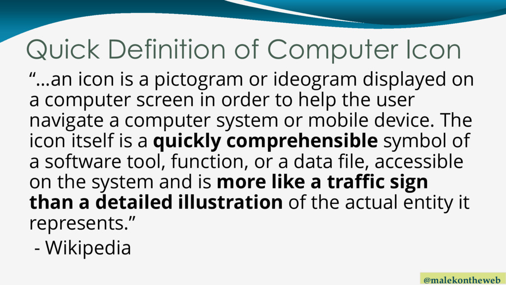
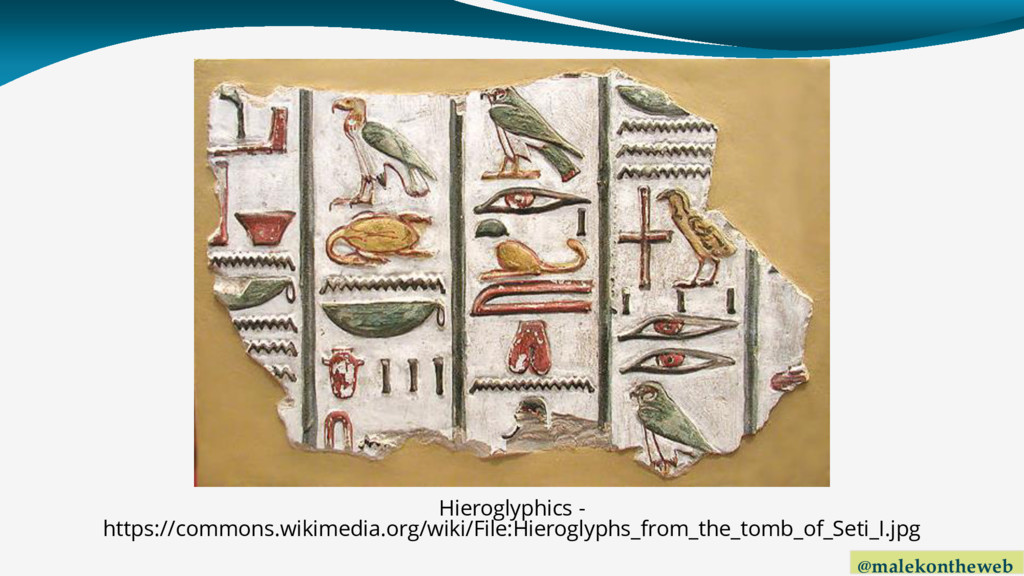
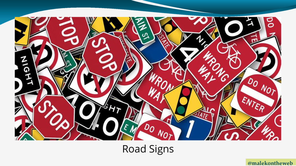
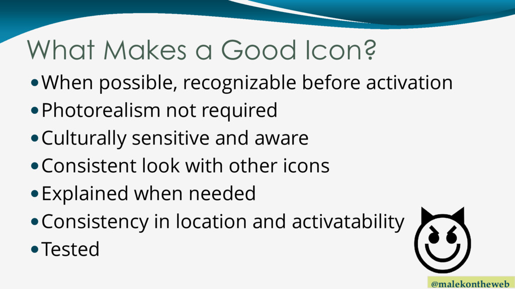
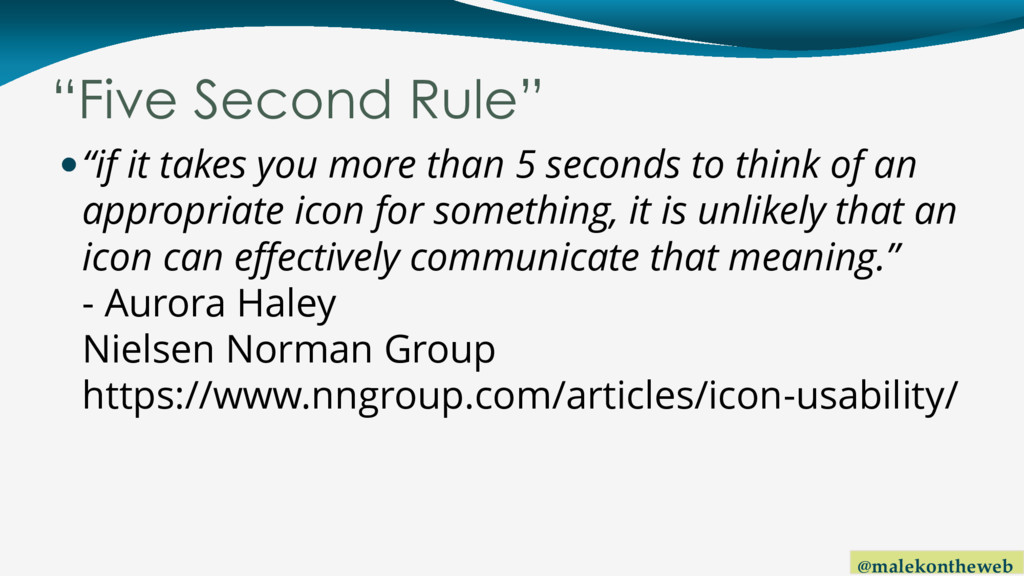
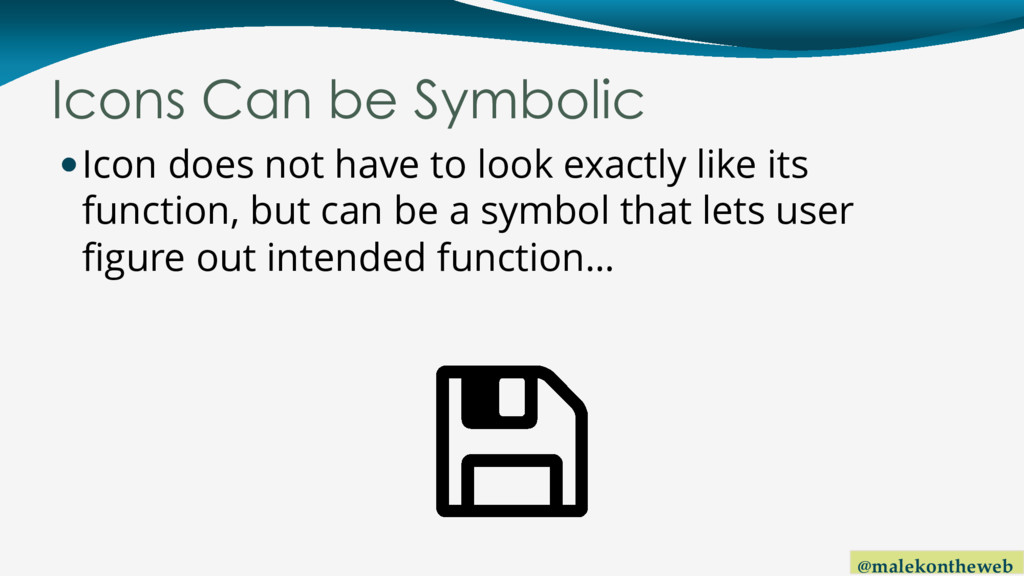
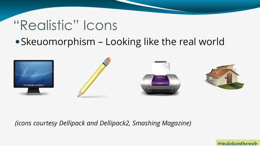
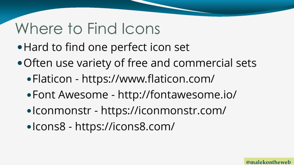
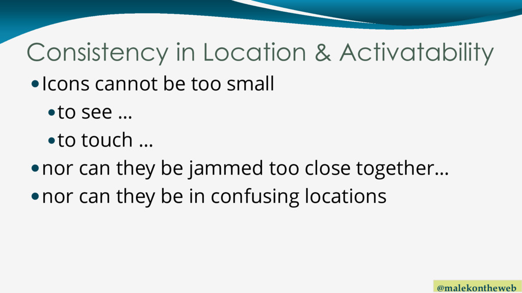
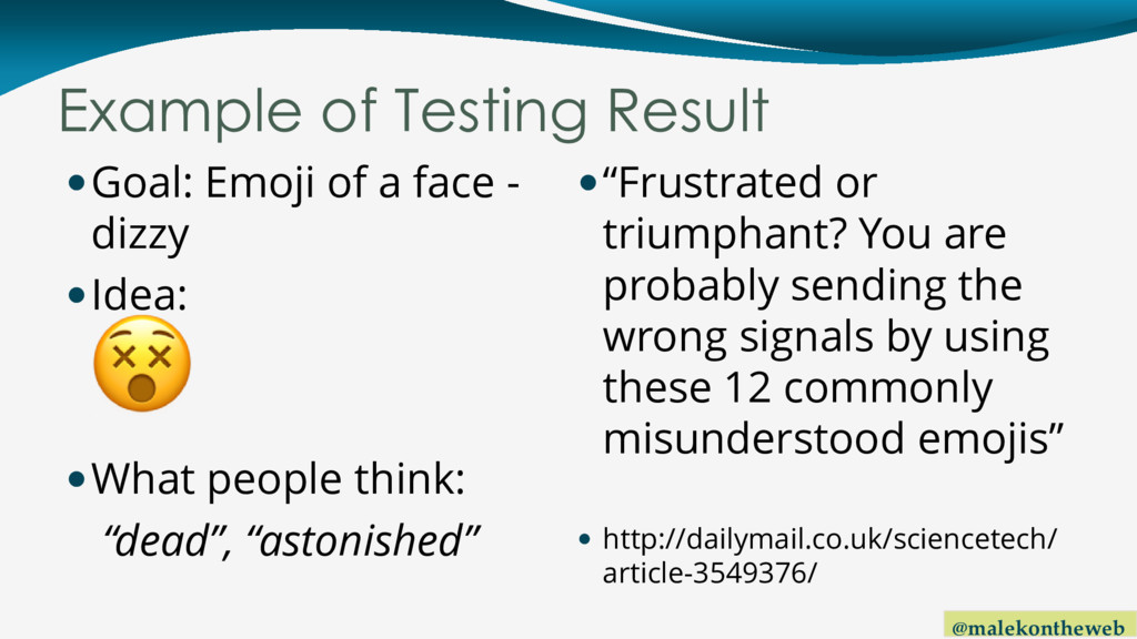
The design behind adding interactivity to an application or website seems trivial; download a free icon collection from sites such as Flaticon, Font Awesome, or iconmonstr, pick an appropriate icon, and add the image to your work. However, should there be more to this process, especially if you are concerned about people understanding how to use what you develop? Learn why the "5-second rule" doesn't apply just to picking food off the floor, how the wrong icon can show cultural insensitivity, why the manner icons are placed in a website or app may be as important as the images themselves, and how to perform icon usability tests. You may be surprised which icons users find to be generally instantly recognizable as to what functions they relate, and which others not so much.

Andrew Malek

March 11, 2018
Tweet

More Decks by Andrew Malek

Other Decks in Design

Transcript

  1. @malekontheweb Quick Definition of Computer Icon “…an icon is a

    pictogram or ideogram displayed on a computer screen in order to help the user navigate a computer system or mobile device. The icon itself is a quickly comprehensible symbol of a software tool, function, or a data file, accessible on the system and is more like a traffic sign than a detailed illustration of the actual entity it represents.” - Wikipedia
  2. @malekontheweb What Makes a Good Icon? When possible, recognizable before

    activation Photorealism not required Culturally sensitive and aware Consistent look with other icons Explained when needed Consistency in location and activatability Tested
  3. @malekontheweb Recognizable Before Activation User has general idea of icon

    function “Five Second Rule” Avoids fear of unknown Very few are close to 100% recognizable… Recognition may depend on context Recognition can be symbolic Once recognized, keep functionality static
  4. @malekontheweb “Five Second Rule” “if it takes you more than

    5 seconds to think of an appropriate icon for something, it is unlikely that an icon can effectively communicate that meaning.” - Aurora Haley Nielsen Norman Group https://www.nngroup.com/articles/icon-usability/
  5. @malekontheweb Hamburger Menu 2015 study: Ages 18-44, 80.6% understand Ages

    45-64, 52.4% understand http://www.catalystnyc.com/2015/02/navigating- mobile-hamburger-menu-anyone-get/ “The MENU button was clicked by 20% more unique visitors than the HAMBURGER button.” https://sitesforprofit.com/menu-eats-hamburger
  6. @malekontheweb Hamburger Menu (continued) 240,000 users, 6 weeks 4 variations

    of the hamburger menu all brought more conversions (menu in different color, text- only, hamburger menu + text, etc.) https://conversionxl.com/blog/testing- hamburger-icon-revenue/
  7. @malekontheweb Icons Can be Symbolic Icon does not have to

    look exactly like its function, but can be a symbol that lets user figure out intended function…
  8. @malekontheweb Floppy Means Save, Still??? Test given in 2013 by

    Lis Pardi, Experience Designer 131 people in the 18-25 year range 96% recognized a floppy disk 80% said it represented save, with even others with answers such as storage, memory, files - http://boxesandarrows.com/icon-survey-results/
  9. @malekontheweb Floppy Disk are Obsolete, but… “Dial” someone on telephone…

    “Page” an employee… Making a “mixtape”…
  10. @malekontheweb Keep Functionality Static Never use an icon for two

    different functions  : add an item to shopping cart, or view shopping cart  : close a dialog, or delete an item  : compose, or edit  : reply, or undo, or go back
  11. @malekontheweb “Realistic” Icons Skeuomorphism – Looking like the real world

    (icons courtesy Dellipack and Dellipack2, Smashing Magazine)
  12. @malekontheweb Photorealism Not Required In flat design, icons do not

    have to be photorealistic, but provide just enough visual detail for someone to ascertain its function Simple geometric shapes – shading not required, but can be 3 dimensional if needed
  13. @malekontheweb Photorealism Not Required (2) Some arguments for: Removes visual

    clutter Allows for more generic icons that can be learned and used across apps Fine details might be lost on tiny icons, especially on mobile devices
  14. @malekontheweb Flat Design Icon Examples  for a camera (image

    edit, view photo, photo capture)  for a credit card (billing, payment)  for a bell (reminder, appointment)  for a person (contact, personal details)
  15. @malekontheweb Flat / Material Design in Vogue Ideas may change

    later … Break mold, … or offer icons now becoming familiar
  16. @malekontheweb Flags: Bad Idea for Language Switch One language –

    many countries One country – many languages Country can change flags “Nationalistic connotations” - http://wplang.org/never-use-flags-language- selection/ - https://www.w3.org/International/questions/qa- link-lang#flags
  17. @malekontheweb Other Ideas James Offer, experience designer, wrote a blog:

    “Flags are Not Languages” http://www.flagsarenotlanguages.com/
  18. @malekontheweb Where to Find Icons Hard to find one perfect

    icon set Often use variety of free and commercial sets Flaticon - https://www.flaticon.com/ Font Awesome - http://fontawesome.io/ Iconmonstr - https://iconmonstr.com/ Icons8 - https://icons8.com/
  19. @malekontheweb Creating Icon Sets Fontello - http://fontello.com/ - Create icon

    fonts FontForge - https://fontforge.github.io/ - Open source editor – Linux, Mac, Windows FortAwesome - https://fortawesome.com/ - Commercial - icons hosted via a CDN IcoMoon - https://icomoon.io/app – SVG and other formats, commercial options available
  20. @malekontheweb Consistent Look with Other Icons  Avoid confusion –

    try to avoid combining:  One color flat  Multicolor flat  Photorealistic  With and without shading / perspective  3D and top-down views  Outline and solid  All circular and all square, etc.  Rotated and non-rotated  Line stroke widths
  21. @malekontheweb More Information… Article “How to Combine Icons from Different

    Sets in Your UI”, written by Andrew Burmistrov of Icons8 “Consistency. Consistency. Consistency.” https://icons8.com/articles/how-to-combine- icons-from-different-sets-in-your-ui/
  22. @malekontheweb Explained When Needed If a standard system icon is

    not applicable If chosen icon fails “five second rule” If audience includes those less tech savvy Especially on mobile, where tooltips do not apply
  23. @malekontheweb “The Importance of Labels” Regarding Outlook 1998 Jensen Harris,

    Microsoft “one change caused a total turnaround…” https://blogs.msdn.microsoft.com/jensenh/2005/ 11/01/the-importance-of-labels/
  24. @malekontheweb “Making Your Icons User-Friendly” “Labels dramatically increase the usability

    of icons.” Hannah Alvarez August 4, 2015 https://www.usertesting.com/blog/2015/08/04/u ser-friendly-ui-icons/
  25. @malekontheweb Icons and Labels “In the battle of clarity between

    icons and labels, labels always win.” Joshua Porter, product designer http://bokardo.com/archives/labels-always-win/ "A word is worth a thousand pictures.“ Bruce Tognazzini http://www.asktog.com/columns/038MacUITrends. html
  26. @malekontheweb Icon and Label Tips Ensure icon and label can

    both be pressed Keep text shown at all times, especially on mobile More tips: https://www.smashingmagazine.com/2016/10/ic ons-as-part-of-a-great-user-experience/
  27. @malekontheweb Consistency in Location & Activatability Icons cannot be too

    small to see … to touch … nor can they be jammed too close together… nor can they be in confusing locations
  28. @malekontheweb Recommended Icon Size Average adult finger is 11mm wide

    https://uxplanet.org/tips-for-using-icons-in-your- app-541a6728e7d4 Some say 16-20mm wide, based on MIT study http://uxmovement.com/mobile/finger-friendly- design-ideal-mobile-touch-target-sizes/
  29. @malekontheweb Recommended Icon Size (2) UWP apps: actual target size

    minimum 7 mm square https://docs.microsoft.com/en- us/windows/uwp/input-and-devices/guidelines-for- targeting Material Design: physical size 9mm square (48x48dp) https://material.io/guidelines/layout/metrics- keylines.html iOS: 44pt x 44pt (~ 7 mm square) https://developer.apple.com/ios/human-interface- guidelines/visual-design/adaptivity-and-layout/
  30. @malekontheweb Recommended Icon Size (3) UWP: 2 mm padding, plus

    2 mm padding between targets, for total size minimum 11 x 11 mm Material Design: 8dp space between icons, total target size 7-10 mm iOS: “Ensure adequate margins and spacing around content”
  31. @malekontheweb Consistent Location As shown earlier, “Bottom navigation”, popularized in

    Material Design https://material.io/guidelines/components/botto m-navigation.html
  32. @malekontheweb Icon and Label / Button Positioning Keep labels very

    close to icons Icons typically appear to the left or above labels, unless icon is purely decorative (LTR) 140 user study showed slower response times if icons were to the right of a label https://www.viget.com/articles/testing-accordion- menu-designs-iconography Same with buttons containing icons (on left) https://ux.stackexchange.com/questions/56023/
  33. @malekontheweb Testing Icons As with the rest of UI, icon

    testing is important As with all tests, try to test a portion of your actual users If impossible (time & money), do hallway testing, but note there will be biases Assure testers there are no wrong answers Can do in person with paper, online form, or remotely
  34. @malekontheweb A/B Testing Describe function, show 2+ icons, ask which

    one is “best”. Example: Download File 1. 2. 3.
  35. @malekontheweb Multiple Choice Testing Show an icon, 3-4 options, ask

    which matches?  1. Change password 2. Security settings 3. Lock account from changes
  36. @malekontheweb Open-Ended Testing Show an icon, ask user to write

    down a very brief meaning on a card At end, sort and tally results Example:
  37. @malekontheweb Find the Icon Testing Describe function, show wireframe /

    screenshot Example: Browse for new music (Screenshot from Spotify, labels cropped)
  38. @malekontheweb Example of Testing Result Goal: View birthdays Idea: What

    people thought: “factory”, “smokestack”, “fire” Decided Upon (with label):
  39. @malekontheweb Example of Testing Result Goal: Emoji of a face

    - dizzy Idea: What people think: “dead”, “astonished” “Frustrated or triumphant? You are probably sending the wrong signals by using these 12 commonly misunderstood emojis”  http://dailymail.co.uk/sciencetech/ article-3549376/
  40. @malekontheweb Keep Icons From “Behaving Badly” As possible, use icons

    already familiar to users Don’t rely on photorealism Be respectful of other cultures Keep a consistent look throughout app/site Label icons Be consistent in location and usability Test, test, test!