Upgrade to Pro — share decks privately, control downloads, hide ads and more …

Composing a Design System

Anton Shilov
February 24, 2021

Composing a Design System

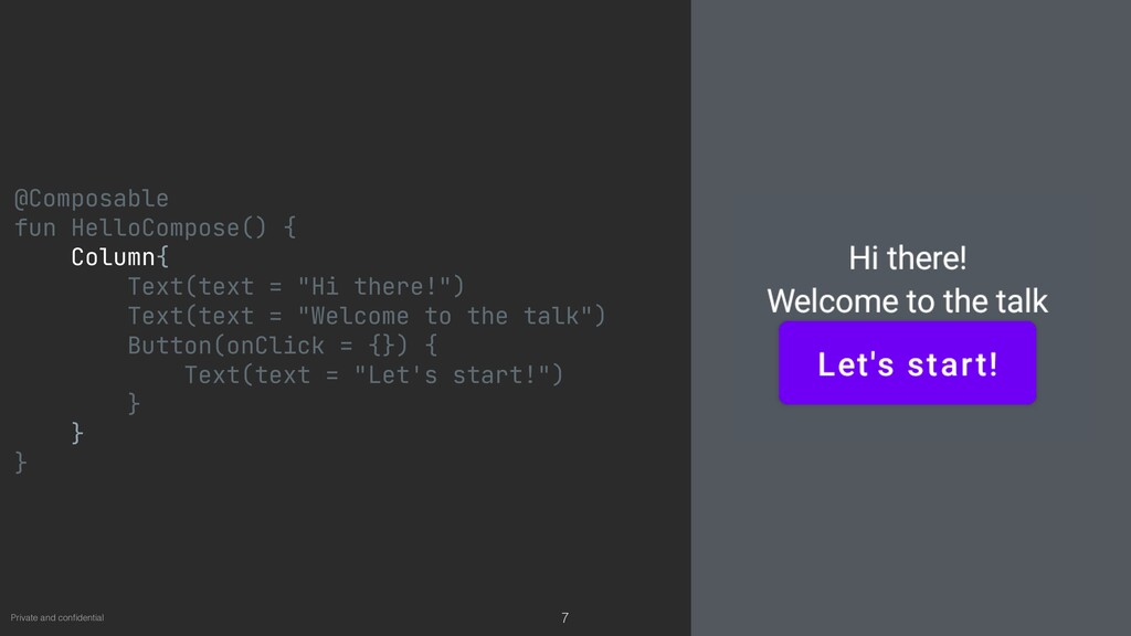
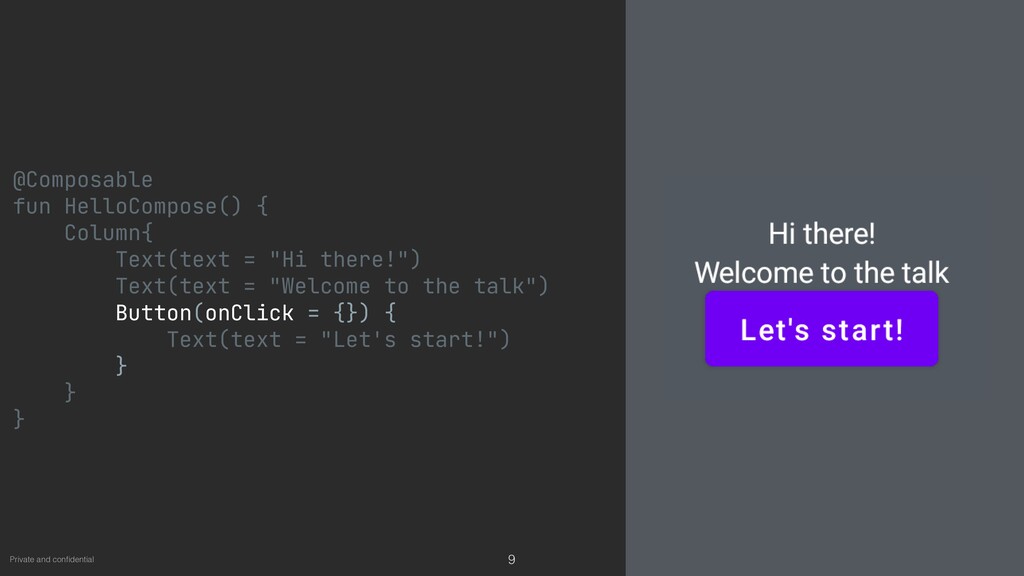
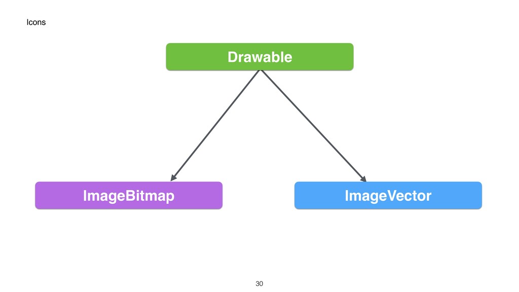
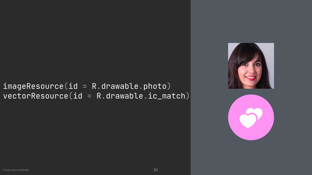
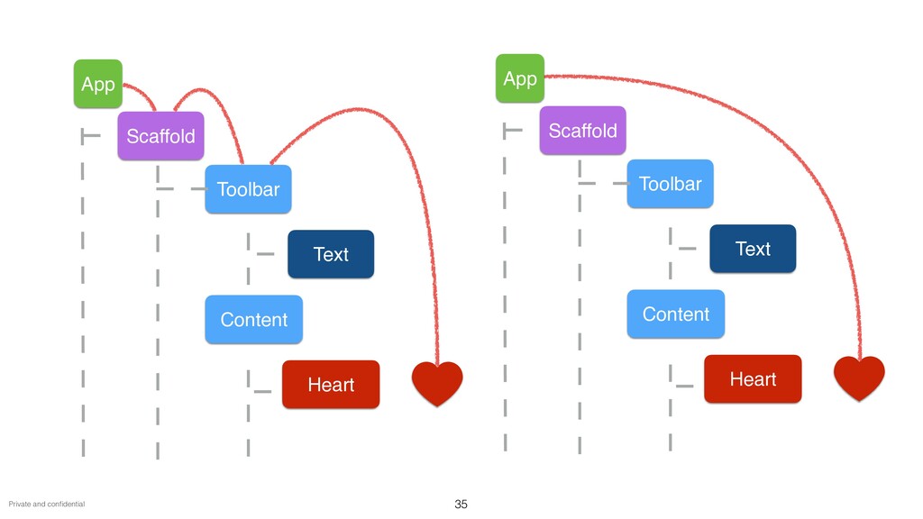
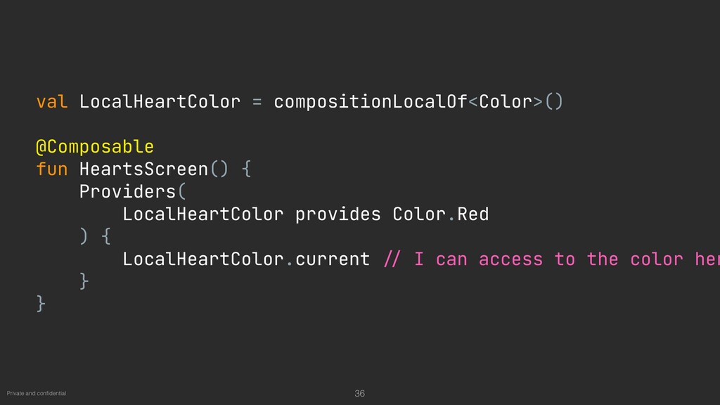
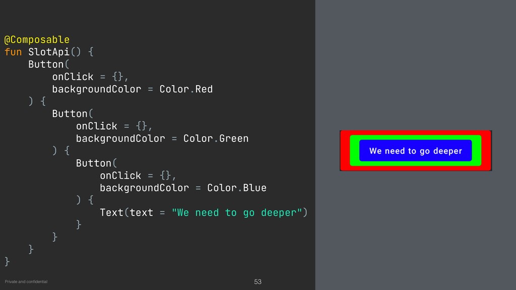
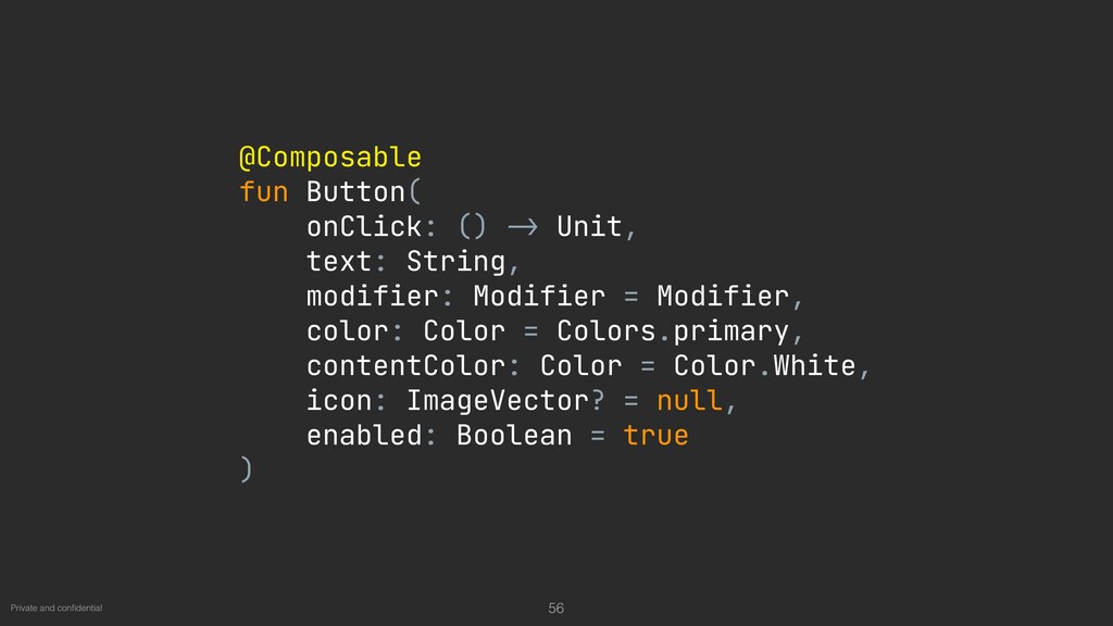
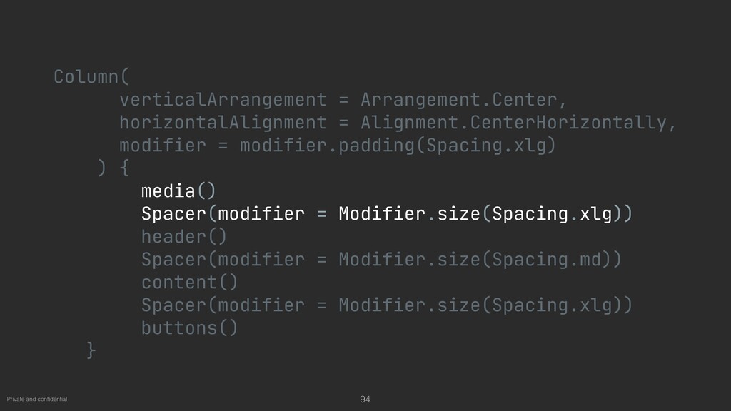
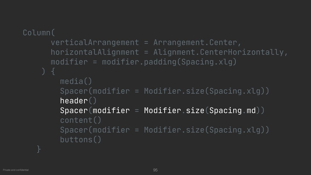
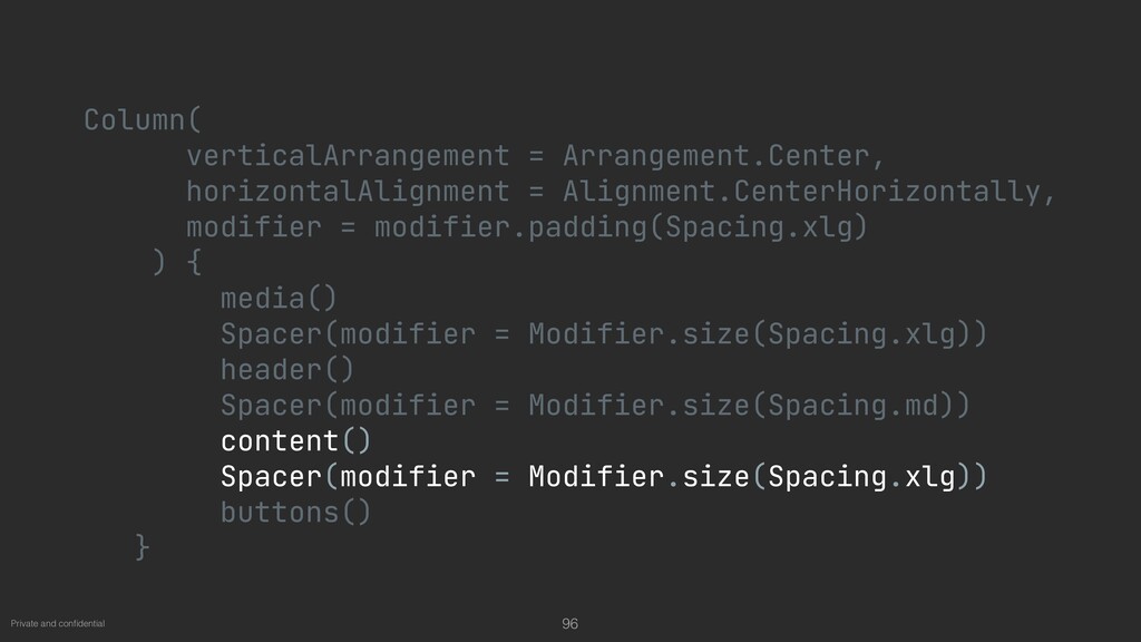
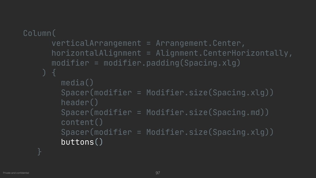
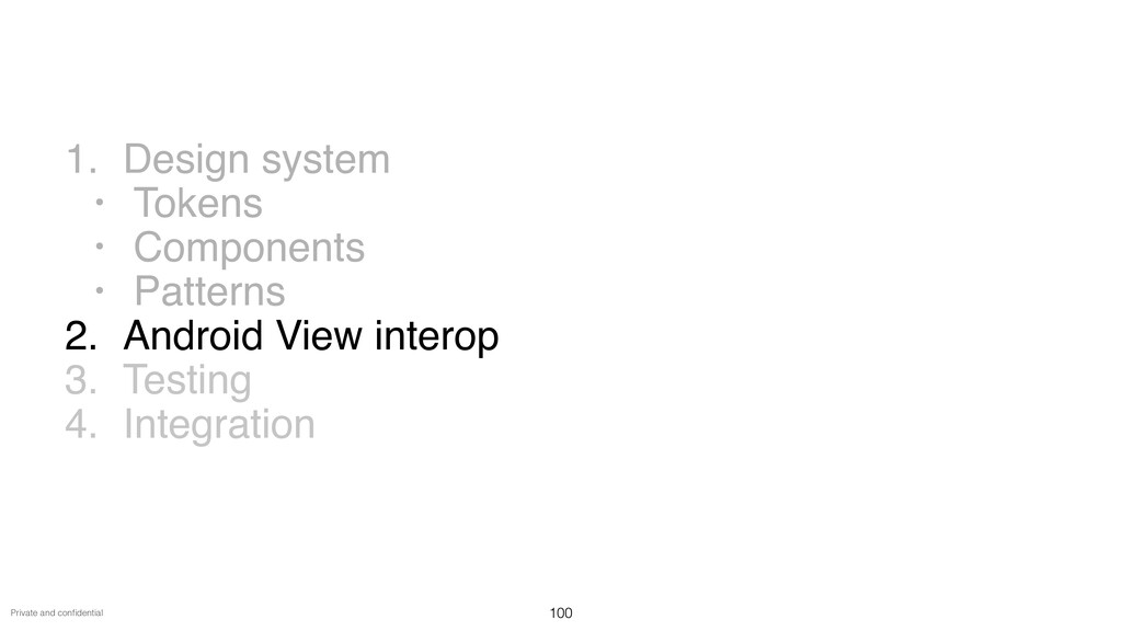
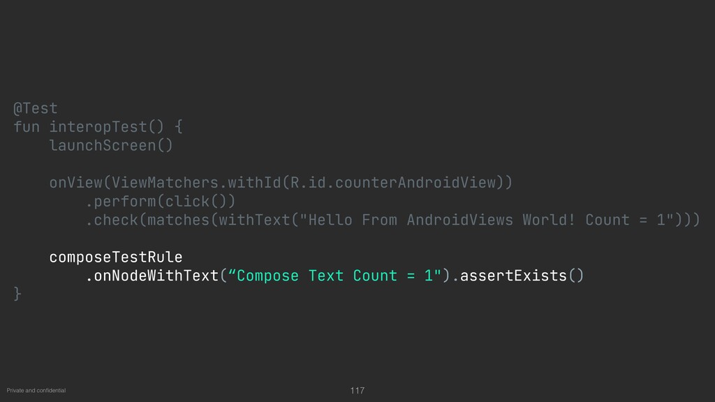
Jetpack Compose - the promise of bringing our app to life with dramatically less code, interactive tools, and intuitive Kotlin APIs. how would we be able to migrate the existing design system to Jetpack Compose? What are the key steps to follow for successful integration with the existing codebase?

Anton Shilov

February 24, 2021
Tweet

Other Decks in Programming

Transcript

  1. Anton Shilov
    Composing a
    Design System
    1

    View Slide

  2. Bumble Badoo
    2

    View Slide

  3. Private and con
    fi
    dential
    ~1
    M

    LoC
    ~500
    0

    UI-tests
    ~10
    0

    UI-components
    3

    View Slide

  4. Private and con
    fi
    dential
    1. Design syste
    m

    • Token
    s

    • Component
    s

    • Pattern
    s

    2. Android View interoperabilit
    y

    3. Testin
    g

    4. Integration
    4

    View Slide

  5. Private and con
    fi
    dential
    Jetpack Compose — declarative UI
    framework for Kotlin
    5

    View Slide

  6. Private and con
    fi
    dential 6
    @Composable

    fun HelloCompose() {

    Column{

    Text(text = "Hi there!")

    Text(text = "Welcome to the talk")

    Button(onClick = {}) {

    Text(text = "Let's start!")

    }

    }

    }

    View Slide

  7. Private and con
    fi
    dential 7
    @Composable

    fun HelloCompose() {

    Column{

    Text(text = "Hi there!")

    Text(text = "Welcome to the talk")

    Button(onClick = {}) {

    Text(text = "Let's start!")

    }

    }

    }

    View Slide

  8. Private and con
    fi
    dential 8
    @Composable

    fun HelloCompose() {

    Column{

    Text(text = "Hi there!")

    Text(text = "Welcome to the talk")

    Button(onClick = {}) {

    Text(text = "Let's start!")

    }

    }

    }

    View Slide

  9. Private and con
    fi
    dential 9
    @Composable

    fun HelloCompose() {

    Column{

    Text(text = "Hi there!")

    Text(text = "Welcome to the talk")

    Button(onClick = {}) {

    Text(text = "Let's start!")

    }

    }

    }

    View Slide

  10. Private and con
    fi
    dential
    • Future of Android U
    I

    • Faster developmen
    t

    • Easy integration with our architecture — MV
    I

    • Our own declarative UI framewor
    k

    • Easy to implement design systems
    Why Compose?
    10

    View Slide

  11. Private and con
    fi
    dential
    Goal 🎯


    Use Compose once the release
    is stable
    11

    View Slide

  12. Private and con
    fi
    dential


    • How to create a design system
    ?

    • How to integrate with the current UI
    ?

    • How to test
    ?

    • How to integrate within the business logic?
    Questions
    12

    View Slide

  13. Design System
    13

    View Slide

  14. Private and con
    fi
    dential
    Design system — set of rules and tools for UI
    design
    14

    View Slide

  15. Private and con
    fi
    dential 15
    Text styles
    Text styles
    Text styles
    Text styles

    View Slide

  16. Private and con
    fi
    dential
    Dimensions
    16
    Colors
    Design tokens

    View Slide

  17. Private and con
    fi
    dential
    Icons
    17

    View Slide

  18. Private and con
    fi
    dential
    Components
    18

    View Slide

  19. Private and con
    fi
    dential
    Patterns
    19

    View Slide

  20. Private and con
    fi
    dential 20

    View Slide

  21. Private and con
    fi
    dential 21
    MatchPhotos
    Text - H1
    Button - Filled - White
    Text - P1
    CtaBox
    ic badge-feature-match

    View Slide

  22. Private and con
    fi
    dential
    data class TextStyle(

    val color: Color = Color.Unspecified,

    val fontSize: TextUnit = TextUnit.Inherit,

    val fontWeight: FontWeight? = null,

    val fontStyle: FontStyle? = null,

    val fontSynthesis: FontSynthesis? = null,

    val fontFamily: FontFamily? = null,

    val fontFeatureSettings: String? = null,

    val letterSpacing: TextUnit = TextUnit.Inherit,

    val baselineShift: BaselineShift? = null,

    val textGeometricTransform: TextGeometricTransform? = null,

    val localeList: LocaleList? = null,

    val background: Color = Color.Unspecified,

    val textDecoration: TextDecoration? = null,

    val shadow: Shadow? = null,

    val textAlign: TextAlign? = null,

    val textDirection: TextDirection? = null,

    val lineHeight: TextUnit = TextUnit.Inherit,

    val textIndent: TextIndent? = null

    )
    22

    View Slide

  23. Private and con
    fi
    dential 23
    H1 = TextStyle(

    fontFamily = FontFamily.Default,

    fontWeight = FontWeight.Medium,

    fontSize = 24.sp,

    lineHeight = 28.sp

    )

    View Slide

  24. Private and con
    fi
    dential 24
    data class Typography(

    val H1: TextStyle,

    val H2: TextStyle,

    val Action: TextStyle,

    val Title: TextStyle,

    val P1: TextStyle,

    val P2: TextStyle,

    val P3: TextStyle

    )

    View Slide

  25. Private and con
    fi
    dential 25
    colorResource(id = R.color.black)

    Color(0xFF783bf9)

    View Slide

  26. Private and con
    fi
    dential 26
    data class Palette(

    val primary: Color,

    val matchPhotosBorder: Color,

    //.
    . .


    )

    View Slide

  27. Private and con
    fi
    dential 27
    val sizeDp = 16.dp

    val sizeSp = 16.sp

    dimensionResource(id = R.dimen.size_lg)

    View Slide

  28. Private and con
    fi
    dential 28
    inline val Int.dp: Dp get() = Dp(value = this)

    View Slide

  29. Private and con
    fi
    dential 29
    data class DimensionsTokens(

    val tokenMatchPhotosPhotoSize: Dp,

    val tokenButtonHeight: Dp,

    val tokenButtonIconSize: Dp,

    val tokenButtonIconTextSpacing: Dp,

    val tokenButtonDisabledOpacity: Float,

    val tokenButtonStrokeBorderWidth: Dp,

    val tokenMatchPhotosBorderWidth: Dp,

    //.
    . .


    )

    View Slide

  30. Icons
    30
    ImageVector
    ImageBitmap
    Drawable

    View Slide

  31. Private and con
    fi
    dential 31
    imageResource(id = R.drawable.photo)

    vectorResource(id = R.drawable.ic_match)

    View Slide

  32. Private and con
    fi
    dential 32
    val Icons.Filled.TestVector: ImageVector

    get() =

    materialIcon(name = "Filled.TestVector") {

    materialPath(fillAlpha = 0.8f) {

    moveTo(20.0f, 10.0f)

    lineToRelative(0.0f, 10.0f)

    lineToRelative(-10.0f, 0.0f)

    close()

    }

    group {

    materialPath(pathFillType = EvenOdd) {

    moveTo(0.0f, 10.0f)

    lineToRelative(-10.0f, 0.0f)

    close()

    }

    }

    }

    View Slide

  33. Styles + Tokens = Theme
    33

    View Slide

  34. Private and con
    fi
    dential 34
    App
    Scaffol
    d

    Toolba
    r

    Tex
    t

    Conten
    t

    Hear
    t

    View Slide

  35. Private and con
    fi
    dential 35
    App
    Scaffol
    d

    Toolba
    r

    Tex
    t

    Conten
    t

    Hear
    t

    App
    Scaffol
    d

    Toolba
    r

    Tex
    t

    Conten
    t

    Hear
    t

    View Slide

  36. Private and con
    fi
    dential 36
    val LocalHeartColor = compositionLocalOf()

    @Composable

    fun HeartsScreen() {

    Providers(

    LocalHeartColor provides Color.Red

    ) {

    LocalHeartColor.current
    //
    I can access to the color her
    }

    }

    View Slide

  37. Private and con
    fi
    dential 37
    val LocalHeartColor = compositionLocalOf()

    @Composable

    fun HeartsScreen() {

    Providers(

    LocalHeartColor provides Color.Red

    ) {

    LocalHeartColor.current
    //
    I can access to the color her
    }

    }

    View Slide

  38. Private and con
    fi
    dential 38
    val LocalHeartColor = compositionLocalOf()

    @Composable

    fun HeartsScreen() {

    Providers(

    LocalHeartColor provides Color.Red

    ) {

    LocalHeartColor.current
    //
    I can access to the color her
    }

    }

    View Slide

  39. Private and con
    fi
    dential 39
    val LocalHeartColor = compositionLocalOf()

    @Composable

    fun HeartsScreen() {

    Providers(

    LocalHeartColor provides Color.Red

    ) {

    LocalHeartColor.current
    //
    I can access to the color her
    }

    }

    View Slide

  40. Private and con
    fi
    dential 40
    Key Value
    LocalHeartColor Color.Red
    LocalContext Context
    LocalLifecycleOwner LifecycleOwner

    View Slide

  41. Private and con
    fi
    dential 41
    val LocalTypography = staticCompositionLocalOf()
    @Composable

    val TextStyles: Typography

    get() = LocalTypography.current

    TextStyles.H1
    //
    LocalTypography.current.H1

    View Slide

  42. Private and con
    fi
    dential 42
    val LocalTypography = staticCompositionLocalOf()
    @Composable

    val TextStyles: Typography

    get() = LocalTypography.current

    TextStyles.H1
    //
    LocalTypography.current.H1

    View Slide

  43. Private and con
    fi
    dential 43
    val LocalTypography = staticCompositionLocalOf()
    @Composable

    val TextStyles: Typography

    get() = LocalTypography.current

    TextStyles.H1
    //
    LocalTypography.current.H1

    View Slide

  44. Private and con
    fi
    dential 44
    val LocalTypography = staticCompositionLocalOf()
    @Composable

    val TextStyles: Typography

    get() = LocalTypography.current

    TextStyles.H1
    //
    LocalTypography.current.H1

    View Slide

  45. Private and con
    fi
    dential 45
    @Composable

    fun Theme(

    typography: Typography,

    colors: Palette,

    dimensions: DimensionsTokens,

    content: @Composable ()
    ->
    Unit

    ) {

    Providers(

    LocalTypography provides typography,

    LocalColors provides colors,

    LocalDimensions provides dimensions,

    ) {

    content()

    }

    }

    View Slide

  46. Private and con
    fi
    dential 46
    @Composable

    fun Theme(

    typography: Typography,

    colors: Palette,

    dimensions: DimensionsTokens,

    content: @Composable ()
    ->
    Unit

    ) {

    Providers(

    LocalTypography provides typography,

    LocalColors provides colors,

    LocalDimensions provides dimensions,

    ) {

    content()

    }

    }

    View Slide

  47. Private and con
    fi
    dential 47
    @Composable

    fun Theme(

    typography: Typography,

    colors: Palette,

    dimensions: DimensionsTokens,

    content: @Composable ()
    ->
    Unit

    ) {

    Providers(

    LocalTypography provides typography,

    LocalColors provides colors,

    LocalDimensions provides dimensions,

    ) {

    content()
    //
    TextStyles.H1

    }

    }

    View Slide

  48. Private and con
    fi
    dential
    Composition Local


    is not a DI framework!
    48

    View Slide

  49. Private and con
    fi
    dential
    1. Design syste
    m

    • Token
    s

    • Component
    s

    • Pattern
    s

    2. Android View intero
    p

    3. Testin
    g

    4. Integration
    49

    View Slide

  50. Private and con
    fi
    dential 50
    MatchPhotos
    Button - Filled - White

    View Slide

  51. Button
    51

    View Slide

  52. Private and con
    fi
    dential 52
    @Composable

    fun MaterialButton() {

    Button(

    onClick = {},

    content = {

    Text(text = "Hello Compose”)

    }

    )

    }

    View Slide

  53. Private and con
    fi
    dential 53
    @Composable

    fun SlotApi() {

    Button(

    onClick = {},

    backgroundColor = Color.Red

    ) {

    Button(

    onClick = {},

    backgroundColor = Color.Green

    ) {

    Button(

    onClick = {},

    backgroundColor = Color.Blue

    ) {

    Text(text = "We need to go deeper")

    }

    }

    }

    }

    View Slide

  54. Private and con
    fi
    dential 54

    View Slide

  55. Private and con
    fi
    dential 55
    Filled Stroke Transparent

    View Slide

  56. Private and con
    fi
    dential 56
    @Composable

    fun Button(

    onClick: ()
    ->
    Unit,

    text: String,

    modifier: Modifier = Modifier,

    color: Color = Colors.primary,

    contentColor: Color = Color.White,

    icon: ImageVector? = null,

    enabled: Boolean = true

    )

    View Slide

  57. Private and con
    fi
    dential 57
    @Composable

    fun Button(

    onClick: ()
    ->
    Unit,

    text: String,

    modifier: Modifier = Modifier,

    color: Color = Colors.primary,

    contentColor: Color = Color.White,

    icon: ImageVector? = null,

    enabled: Boolean = true

    )

    View Slide

  58. Private and con
    fi
    dential 58
    @Composable

    fun Button(

    onClick: ()
    ->
    Unit,

    text: String,

    modifier: Modifier = Modifier,

    color: Color = Colors.primary,

    contentColor: Color = Color.White,

    icon: ImageVector? = null,

    enabled: Boolean = true

    )

    View Slide

  59. Private and con
    fi
    dential 59
    @Composable

    fun Button(

    onClick: ()
    ->
    Unit,

    text: String,

    modifier: Modifier = Modifier,

    color: Color = Colors.primary,

    contentColor: Color = Color.White,

    icon: ImageVector? = null,

    enabled: Boolean = true

    )

    View Slide

  60. Private and con
    fi
    dential 60
    @Composable

    private fun ButtonSkeleton(

    onClick: ()
    ->
    Unit,

    text: String,

    modifier: Modifier = Modifier,

    enabled: Boolean = true,

    shape: Shape = RoundedCornerShape(Dimensions.tokenButtonCornerRadius),

    border: BorderStroke? = null,

    backgroundColor: Color,

    contentColor: Color = Color.White,

    contentPadding: PaddingValues = PaddingValues(

    start = Dimensions.tokenButtonPaddingHorizontal,

    end = Dimensions.tokenButtonPaddingHorizontal,

    top = Dimensions.tokenButtonPaddingVertical,

    bottom = Dimensions.tokenButtonPaddingVertical

    ),

    height: Dp = Dimensions.tokenButtonHeight,

    icon: ImageVector?,

    )

    View Slide

  61. Private and con
    fi
    dential 61
    @Composable

    private fun ButtonSkeleton(

    onClick: ()
    ->
    Unit,

    text: String,

    modifier: Modifier = Modifier,

    enabled: Boolean = true,

    shape: Shape = RoundedCornerShape(Dimensions.tokenButtonCornerRadius),

    border: BorderStroke? = null,

    backgroundColor: Color,

    contentColor: Color = Color.White,

    contentPadding: PaddingValues = PaddingValues(

    start = Dimensions.tokenButtonPaddingHorizontal,

    end = Dimensions.tokenButtonPaddingHorizontal,

    top = Dimensions.tokenButtonPaddingVertical,

    bottom = Dimensions.tokenButtonPaddingVertical

    ),

    height: Dp = Dimensions.tokenButtonHeight,

    icon: ImageVector?

    )

    View Slide

  62. Private and con
    fi
    dential 62
    FilledButton
    ButtonSkeleto
    n

    Surfac
    e

    Ro
    w

    Ico
    n

    Tex
    t

    View Slide

  63. Private and con
    fi
    dential 63
    FilledButton
    ButtonSkeleto
    n

    Surfac
    e

    Ro
    w

    Ico
    n

    Tex
    t

    - Public API

    View Slide

  64. Private and con
    fi
    dential 64
    FilledButton
    ButtonSkeleto
    n

    Surfac
    e

    Ro
    w

    Ico
    n

    Tex
    t

    - private generic button

    View Slide

  65. Private and con
    fi
    dential 65
    FilledButton
    ButtonSkeleto
    n

    Surfac
    e

    Ro
    w

    Ico
    n

    Tex
    t

    - background & clicks

    View Slide

  66. Private and con
    fi
    dential 66
    FilledButton
    ButtonSkeleto
    n

    Surfac
    e

    Ro
    w

    Ico
    n

    Tex
    t

    - content layout

    View Slide

  67. Private and con
    fi
    dential 67
    FilledButton
    ButtonSkeleto
    n

    Surfac
    e

    Ro
    w

    Ico
    n

    Tex
    t

    - content

    View Slide

  68. Private and con
    fi
    dential 68
    Surface(

    shape = shape,

    color = backgroundColor,

    contentColor = contentColor,

    border = border,

    modifier =

    modifier.clickable(

    onClick = onClick,

    enabled = enabled

    ).alpha(

    if (enabled) 1f else Dimensions.tokenButtonDisabledOpacity

    )

    )

    View Slide

  69. Private and con
    fi
    dential 69
    Surface(

    shape = shape,

    color = backgroundColor,

    contentColor = contentColor,

    border = border,

    modifier =

    modifier.clickable(

    onClick = onClick,

    enabled = enabled

    ).alpha(

    if (enabled) 1f else Dimensions.tokenButtonDisabledOpacity

    )

    )

    View Slide

  70. Private and con
    fi
    dential 70
    Surface(

    shape = shape,

    color = backgroundColor,

    contentColor = contentColor,

    border = border,

    modifier =

    modifier.clickable(

    onClick = onClick,

    enabled = enabled

    ).alpha(

    if (enabled) 1f else Dimensions.tokenButtonDisabledOpacity

    )

    )

    View Slide

  71. Private and con
    fi
    dential 71
    Surface(

    shape = shape,

    color = backgroundColor,

    contentColor = contentColor,

    border = border,

    modifier =

    modifier.clickable(

    onClick = onClick,

    enabled = enabled

    ).alpha(

    if (enabled) 1f else Dimensions.tokenButtonDisabledOpacity

    )

    )

    View Slide

  72. Private and con
    fi
    dential 72
    Row(

    Modifier

    .defaultMinSizeConstraints(minHeight = height)

    .padding(contentPadding),

    horizontalArrangement = Arrangement.Center,

    verticalAlignment = Alignment.CenterVertically,

    )

    View Slide

  73. Private and con
    fi
    dential 73
    if (icon
    !=
    null) {

    Icon(

    modifier = Modifier.size(Dimensions.tokenButtonIconSize),

    imageVector = icon,

    tint = contentColor

    )

    Spacer(modifier = Modifier.width(Dimensions.tokenButtonIconTextSpacing))

    }

    Text(

    text = text,

    style = TextStyles.Action,

    color = contentColor,

    maxLines = 1,

    overflow = TextOverflow.Ellipsis

    )

    View Slide

  74. Private and con
    fi
    dential 74
    if (icon
    !=
    null) {

    Icon(

    modifier = Modifier.size(Dimensions.tokenButtonIconSize),

    imageVector = icon,

    tint = contentColor

    )

    Spacer(modifier = Modifier.width(Dimensions.tokenButtonIconTextSpacing))

    }

    Text(

    text = text,

    style = TextStyles.Action,

    color = contentColor,

    maxLines = 1,

    overflow = TextOverflow.Ellipsis

    )

    View Slide

  75. Private and con
    fi
    dential 75
    if (icon
    !=
    null) {

    Icon(

    modifier = Modifier.size(Dimensions.tokenButtonIconSize),

    imageVector = icon,

    tint = contentColor

    )

    Spacer(modifier = Modifier.width(Dimensions.tokenButtonIconTextSpacing))

    }

    Text(

    text = text,

    style = TextStyles.Action,

    color = contentColor,

    maxLines = 1,

    overflow = TextOverflow.Ellipsis

    )

    View Slide

  76. Private and con
    fi
    dential 76
    @Composable

    fun Button(

    onClick: ()
    ->
    Unit,

    text: String,

    modifier: Modifier = Modifier,

    color: Color = Colors.primary,

    contentColor: Color = Color.White,

    icon: ImageVector? = null,

    enabled: Boolean = true

    ) {

    ButtonSkeleton(

    onClick = onClick,

    modifier = modifier,

    backgroundColor = color,

    contentColor = contentColor,

    enabled = enabled,

    icon = icon,

    text = text

    )

    }

    View Slide

  77. MatchPhotos
    77

    View Slide

  78. Private and con
    fi
    dential 78
    @Composable

    fun MatchPhotos(

    leftPhoto: ImageBitmap,

    rightPhoto: ImageBitmap,

    badge: ImageVector,

    modifier: Modifier = Modifier

    )

    View Slide

  79. Private and con
    fi
    dential 79
    MatchPhotos
    Colum
    n

    Ro
    w

    Phot
    o

    Phot
    o

    Badg
    e

    View Slide

  80. Private and con
    fi
    dential 80
    MatchPhotos
    Colum
    n

    Ro
    w

    Phot
    o

    - vertical linear layout
    Phot
    o

    Badg
    e

    View Slide

  81. Private and con
    fi
    dential 81
    MatchPhotos
    Colum
    n

    Ro
    w

    Phot
    o

    - horizontal linear layout
    Phot
    o

    Badg
    e

    View Slide

  82. Private and con
    fi
    dential 82
    MatchPhotos
    Colum
    n

    Ro
    w

    Phot
    o

    Phot
    o

    Badg
    e

    - content

    View Slide

  83. Private and con
    fi
    dential 83
    Image(

    asset = rightPhoto,

    modifier = Modifier

    .graphicsLayer(

    rotationZ = rotationDegrees,

    translationX = rightTranslateX,

    translationY = rightTranslateY

    )

    .zIndex(rightZIndex)

    .size(photoSize)

    .clip(photoShape)

    .border(

    width = borderWidth,

    Colors.matchPhotosBorder,

    photoShape

    )

    )

    View Slide

  84. Private and con
    fi
    dential 84
    Image(

    asset = rightPhoto,

    modifier = Modifier

    .graphicsLayer(

    rotationZ = rotationDegrees,

    translationX = rightTranslateX,

    translationY = rightTranslateY

    )

    .zIndex(rightZIndex)

    .size(photoSize)

    .clip(photoShape)

    .border(

    width = borderWidth,

    Colors.matchPhotosBorder,

    photoShape

    )

    )

    View Slide

  85. Private and con
    fi
    dential 85
    Image(

    asset = rightPhoto,

    modifier = Modifier

    .graphicsLayer(

    rotationZ = rotationDegrees,

    translationX = rightTranslateX,

    translationY = rightTranslateY

    )

    .zIndex(rightZIndex)

    .size(photoSize)

    .clip(photoShape)

    .border(

    width = borderWidth,

    Colors.matchPhotosBorder,

    photoShape

    )

    )

    View Slide

  86. Private and con
    fi
    dential 86
    Image(

    asset = rightPhoto,

    modifier = Modifier

    .graphicsLayer(

    rotationZ = rotationDegrees,

    translationX = rightTranslateX,

    translationY = rightTranslateY

    )

    .zIndex(rightZIndex)

    .size(photoSize)

    .clip(photoShape)

    .border(

    width = borderWidth,

    Colors.matchPhotosBorder,

    photoShape

    )

    )

    View Slide

  87. Private and con
    fi
    dential 87
    Image(

    asset = rightPhoto,

    modifier = Modifier

    .graphicsLayer(

    rotationZ = rotationDegrees,

    translationX = rightTranslateX,

    translationY = rightTranslateY

    )

    .zIndex(rightZIndex)

    .size(photoSize)

    .clip(photoShape)

    .border(

    width = borderWidth,

    Colors.matchPhotosBorder,

    photoShape

    )

    )

    View Slide

  88. Private and con
    fi
    dential 88
    Row {

    Image(

    asset = leftPhoto,

    ...


    )

    Image(

    asset = rightPhoto,

    ...


    )

    }

    View Slide

  89. Private and con
    fi
    dential 89
    Column{

    Row {

    Image()

    Image()

    }

    Image(

    imageVector = badge,

    modifier = Modifier

    .size(iconSize)

    .align(Alignment.CenterHorizontally)

    .shadow(

    elevation = badgeElevation,

    shape = CircleShape

    )

    )

    }

    View Slide

  90. Private and con
    fi
    dential 90
    CtaBox

    View Slide

  91. Private and con
    fi
    dential 91
    @Composable

    fun CtaBox(

    media: @Composable ()
    - >
    Unit,

    header: @Composable ()
    ->
    Unit,

    content: @Composable ()
    - >
    Unit,

    buttons: @Composable()
    ->
    Unit,

    modifier: Modifier = Modifier

    )

    View Slide

  92. Private and con
    fi
    dential 92
    Column(

    verticalArrangement = Arrangement.Center,

    horizontalAlignment = Alignment.CenterHorizontally,

    modifier = modifier.padding(Spacing.xlg)

    ) {

    media()

    Spacer(modifier = Modifier.size(Spacing.xlg))

    header()

    Spacer(modifier = Modifier.size(Spacing.md))

    content()

    Spacer(modifier = Modifier.size(Spacing.xlg))

    buttons()

    }

    View Slide

  93. Private and con
    fi
    dential 93
    Column(

    verticalArrangement = Arrangement.Center,

    horizontalAlignment = Alignment.CenterHorizontally,

    modifier = modifier.padding(Spacing.xlg)

    ) {

    media()

    Spacer(modifier = Modifier.size(Spacing.xlg))

    header()

    Spacer(modifier = Modifier.size(Spacing.md))

    content()

    Spacer(modifier = Modifier.size(Spacing.xlg))

    buttons()

    }

    View Slide

  94. Private and con
    fi
    dential 94
    Column(

    verticalArrangement = Arrangement.Center,

    horizontalAlignment = Alignment.CenterHorizontally,

    modifier = modifier.padding(Spacing.xlg)

    ) {

    media()

    Spacer(modifier = Modifier.size(Spacing.xlg));

    header()

    Spacer(modifier = Modifier.size(Spacing.md))

    content()

    Spacer(modifier = Modifier.size(Spacing.xlg))

    buttons()

    }

    View Slide

  95. Private and con
    fi
    dential 95
    Column(

    verticalArrangement = Arrangement.Center,

    horizontalAlignment = Alignment.CenterHorizontally,

    modifier = modifier.padding(Spacing.xlg)

    ) {

    media()

    Spacer(modifier = Modifier.size(Spacing.xlg))
    ;;


    header()

    Spacer(modifier = Modifier.size(Spacing.md))

    content()

    Spacer(modifier = Modifier.size(Spacing.xlg))

    buttons()

    }

    View Slide

  96. Private and con
    fi
    dential 96
    Column(

    verticalArrangement = Arrangement.Center,

    horizontalAlignment = Alignment.CenterHorizontally,

    modifier = modifier.padding(Spacing.xlg)

    ) {

    media()

    Spacer(modifier = Modifier.size(Spacing.xlg));

    header()

    Spacer(modifier = Modifier.size(Spacing.md))

    content()

    Spacer(modifier = Modifier.size(Spacing.xlg))

    buttons()

    }

    View Slide

  97. Private and con
    fi
    dential 97
    Column(

    verticalArrangement = Arrangement.Center,

    horizontalAlignment = Alignment.CenterHorizontally,

    modifier = modifier.padding(Spacing.xlg)

    ) {

    media()

    Spacer(modifier = Modifier.size(Spacing.xlg))

    header()

    Spacer(modifier = Modifier.size(Spacing.md))

    content()

    Spacer(modifier = Modifier.size(Spacing.xlg))

    buttons()

    }

    View Slide

  98. Private and con
    fi
    dential 98
    @Composable

    fun MatchScreen(config: MatchConfig) {

    CtaBox(

    media = { MatchPhotos(
    ..
    ) },

    header = {

    Text(text="",style=TextStyles.H1)

    },

    content = {

    Text(text="",style=TextStyles.P1)

    },

    buttons = {

    Button(

    text = "
    ...
    ",

    color = Color.White,

    contentColor = Color.Black

    )

    }

    )

    }

    View Slide

  99. Private and con
    fi
    dential 99

    View Slide

  100. Private and con
    fi
    dential
    1. Design syste
    m

    • Token
    s

    • Component
    s

    • Pattern
    s

    2. Android View intero
    p

    3. Testin
    g

    4. Integration
    100

    View Slide

  101. Android Views + Compose
    101

    View Slide

  102. Private and con
    fi
    dential 102
    val count = remember { mutableStateOf(0) }

    Column {

    Text(text = "Compose Text Count = ${count.value}")

    AndroidView(

    viewBlock = { context
    ->


    TextView(context).apply {

    setOnClickListener {

    count.value = count.value + 1

    }

    }

    },

    update = { view
    ->


    view.text = "AndroidViews World! Count = ${count.value}"

    }

    )

    }

    View Slide

  103. Private and con
    fi
    dential 103
    val count = remember { mutableStateOf(0) }

    Column {

    Text(text = "Compose Text Count = ${count.value}")

    AndroidView(

    viewBlock = { context
    ->


    TextView(context).apply {

    setOnClickListener {

    count.value = count.value + 1

    }

    }

    },

    update = { view
    ->


    view.text = "AndroidViews World! Count = ${count.value}"

    }

    )

    }

    View Slide

  104. Private and con
    fi
    dential 104
    val count = remember { mutableStateOf(0) }

    Column {

    Text(text = "Compose Text Count = ${count.value}")

    AndroidView(

    viewBlock = { context
    ->


    TextView(context).apply {

    setOnClickListener {

    count.value = count.value + 1

    }

    }

    },

    update = { view
    ->


    view.text = "AndroidViews World! Count = ${count.value}"

    }

    )

    }

    View Slide

  105. Private and con
    fi
    dential 105
    val count = remember { mutableStateOf(0) }

    Column {

    Text(text = “Compose Count = ${count.value}")

    AndroidView(

    viewBlock = { context
    ->


    TextView(context).apply {

    setOnClickListener {

    count.value = count.value + 1

    }

    }

    },

    update = { view
    ->


    view.text = "
    ..
    .
    Count = ${count.value}"

    }

    )

    }

    View Slide

  106. Compose + Android Views
    106

    View Slide

  107. Private and con
    fi
    dential


    android:id="@+id/composeView"

    .../>


    android:id="@+id/androidView"

    .../>


    LinearLayout>
    107

    View Slide

  108. Private and con
    fi
    dential
    override fun onCreate() {

    val composeView = findViewById(
    ..
    )

    composeView.setContent {

    Text(text = "ComposeText")

    }

    }
    108

    View Slide

  109. Private and con
    fi
    dential
    override fun onCreate() {

    val composeView = findViewById(
    ..
    )

    composeView.setContent {

    Text(text = "ComposeText")

    }

    }
    109

    View Slide

  110. Private and con
    fi
    dential
    1. Design syste
    m

    • Token
    s

    • Component
    s

    • Pattern
    s

    2. Android View intero
    p

    3. Testin
    g

    4. Integration
    110

    View Slide

  111. Testing
    111

    View Slide

  112. Private and con
    fi
    dential 112
    object TestTagMatchScreen {

    const val button = "MatchScreenButton"

    ...


    }

    Button(

    ...


    modifier = Modifier.testTag(TestTagMatchScreen.button)

    )

    View Slide

  113. Private and con
    fi
    dential 113
    @get:Rule

    val composeTestRule = createComposeRule()

    fun launchScreen() {

    composeTestRule.setContent {

    BadooTheme {

    MatchScreen()

    }

    }

    }

    View Slide

  114. Private and con
    fi
    dential 114
    @Test

    fun matchScreenTest() {

    launchScreen()

    composeTestRule

    .onNodeWithTag(TestTagMatchScreen.button)

    .assertIsDisplayed()

    .assertTextEquals("Send Message")

    .performClick()

    }

    }

    View Slide

  115. Private and con
    fi
    dential 115
    @Test

    fun interopTest() {

    launchScreen()

    onView(ViewMatchers.withId(R.dimen.counterAndroidView))

    .perform(click())

    .check(matches(withText("Hello From AndroidViews World! Count = 1")))

    composeTestRule

    .onNodeWithText(“Compose Text Count = 1").assertExists()

    }

    View Slide

  116. Private and con
    fi
    dential 116
    @Test

    fun interopTest() {

    launchScreen()

    onView(ViewMatchers.withId(R.dimen.counterAndroidView))

    .perform(click())

    .check(matches(withText("Hello From AndroidViews World! Count = 1")))

    composeTestRule

    .onNodeWithText(“Compose Text Count = 1").assertExists()

    }

    View Slide

  117. Private and con
    fi
    dential 117
    @Test

    fun interopTest() {

    launchScreen()

    onView(ViewMatchers.withId(R.id.counterAndroidView))

    .perform(click())

    .check(matches(withText("Hello From AndroidViews World! Count = 1")))

    composeTestRule

    .onNodeWithText(“Compose Text Count = 1").assertExists()

    }

    View Slide

  118. Private and con
    fi
    dential
    Screenshot tests
    Karumi — Shot
    118

    View Slide

  119. Private and con
    fi
    dential
    1. Design syste
    m

    • Token
    s

    • Component
    s

    • Pattern
    s

    2. Android View intero
    p

    3. Testin
    g

    4. Integration
    119

    View Slide

  120. Integration
    120

    View Slide

  121. Private and con
    fi
    dential
    Business logic integration — MVI
    121
    Feature
    Compose
    State UI events

    View Slide

  122. Private and con
    fi
    dential
    Business logic integration — MVVM
    122
    ViewModel
    Compose
    LiveData Method calls

    View Slide

  123. Private and con
    fi
    dential
    val value: String by observable.subscribeAsState("initial")

    val value: String by liveData.observeAsState(“initial")

    val value: String? by observable.subscribeAsState(null)

    val value: String? by liveData.observeAsState(null)

    Text("Value is $value")
    123

    View Slide

  124. Private and con
    fi
    dential
    Business logic integration — MVP
    124
    Method Calls
    ViewWrapper Compose
    State
    UI events
    Presenter

    View Slide

  125. Private and con
    fi
    dential


    ✅ How to create a design syste
    m

    ✅ How to integrate with the current U
    I

    ✅ How to tes
    t

    ✅ How to integrate within the business logic
    Summary
    125

    View Slide

  126. Private and con
    fi
    dential
    • Set of main UI-component
    s

    • Experiment
    s

    • Non critical feature
    s

    • Wait for stable releas
    e

    • Ship to prod 🚀🚀🚀
    Next steps
    126

    View Slide

  127. Private and con
    fi
    dential
    • Design system talk
    • Compose pathway
    • Сompose samples
    • Repo from the talk
    • Bumble Tech blog
    Resources
    127

    View Slide

  128. 128
    CHEERS
    !

    antonshilov_


    View Slide