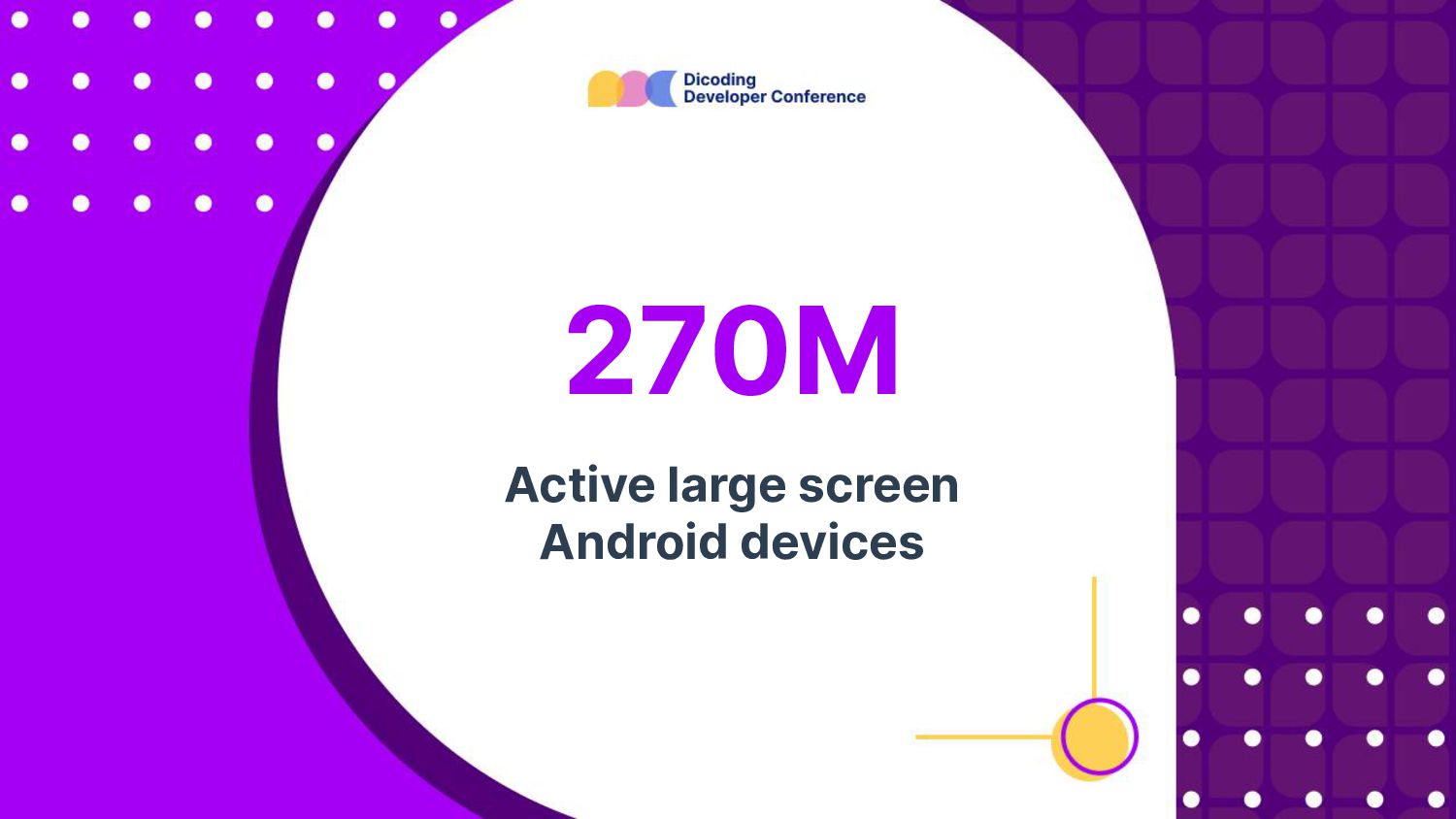
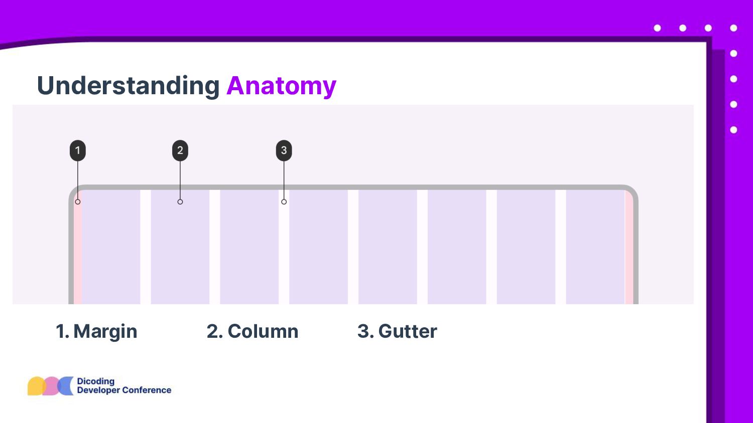
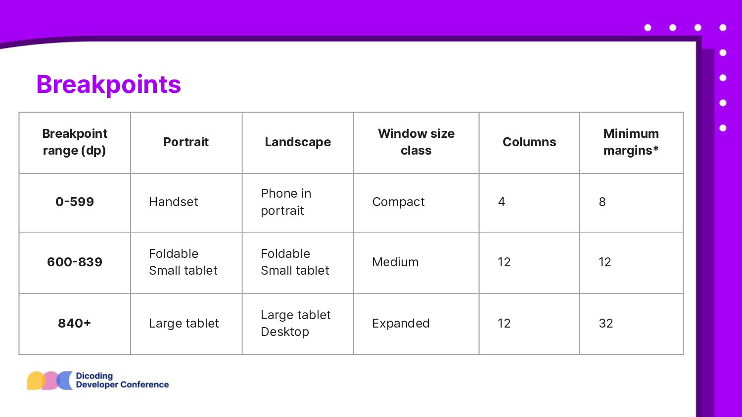
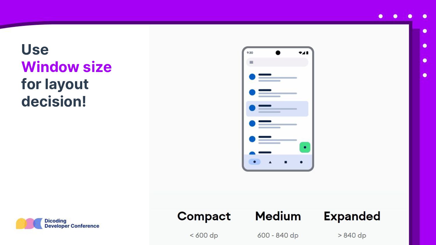
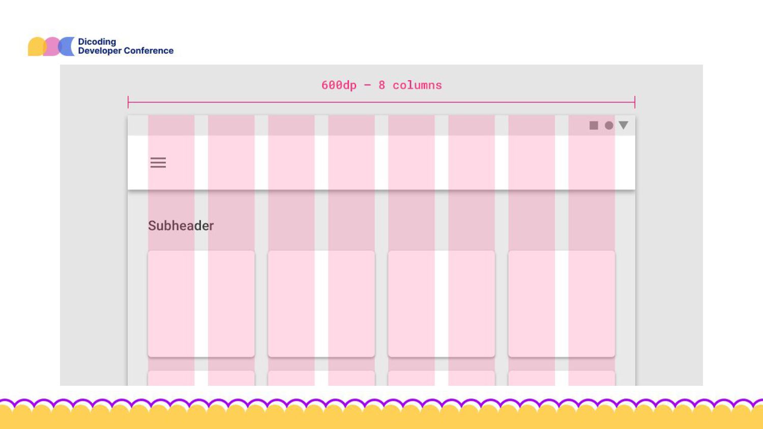
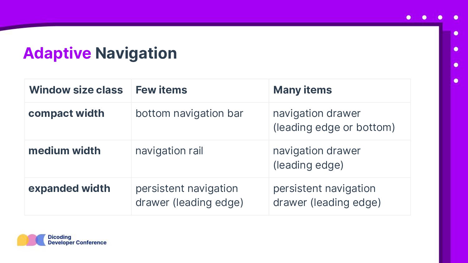
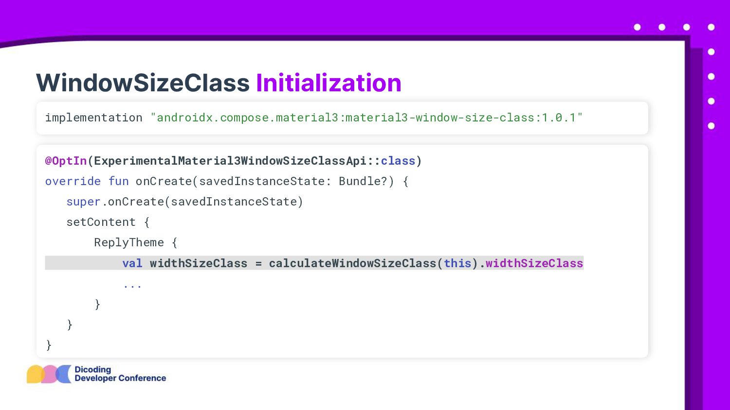
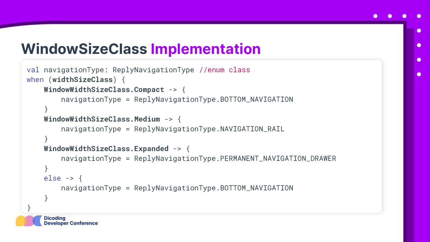
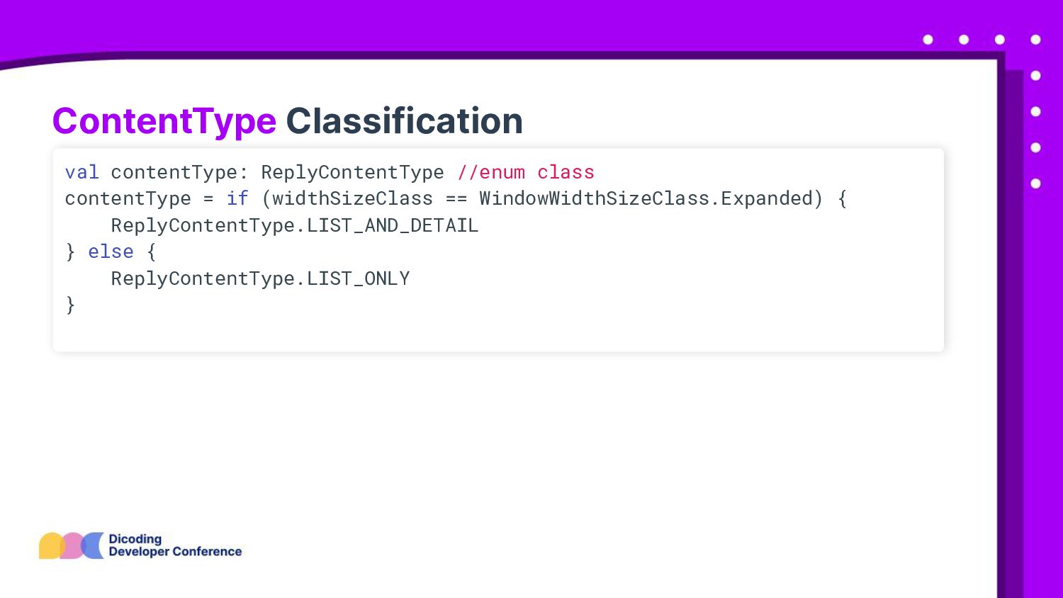
Minimum margins* 0-599 Handset Phone in portrait Compact 4 8 600-839 Foldable Small tablet Foldable Small tablet Medium 12 12 840+ Large tablet Large tablet Desktop Expanded 12 32
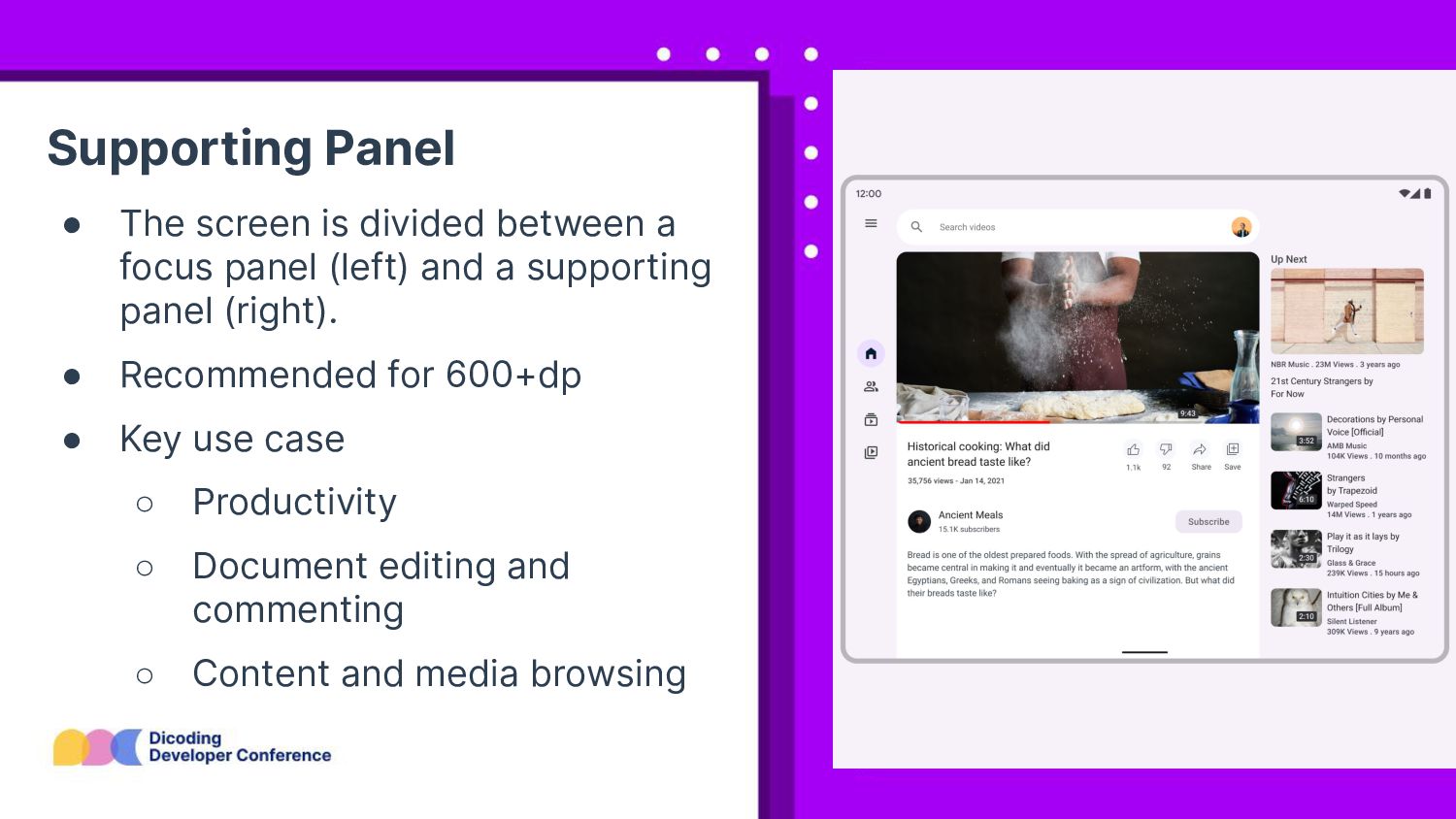
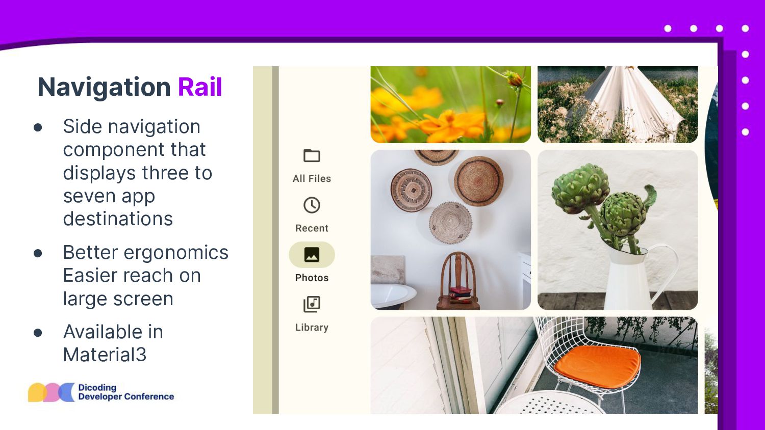
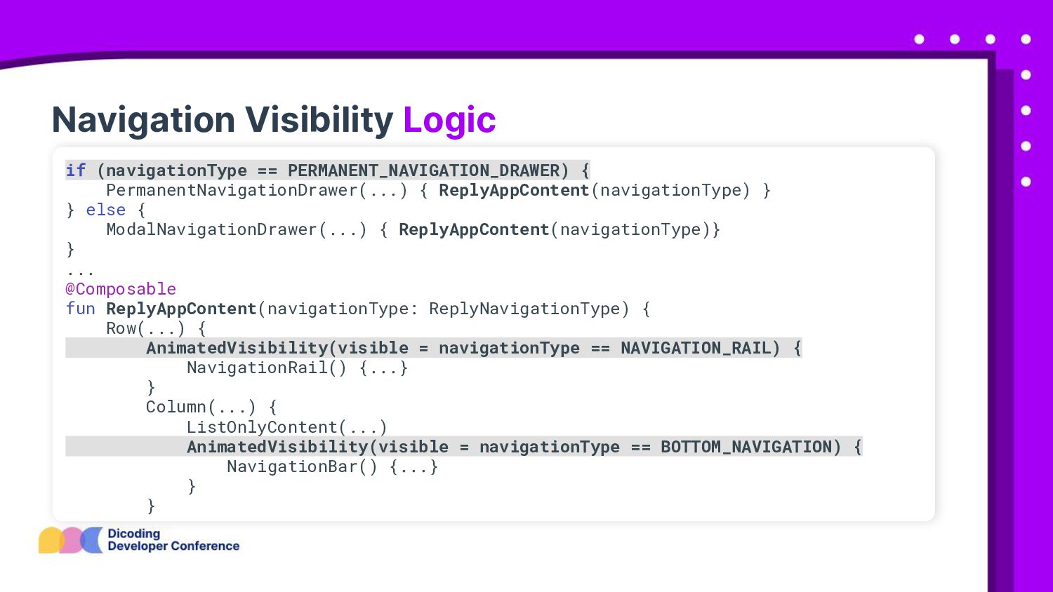
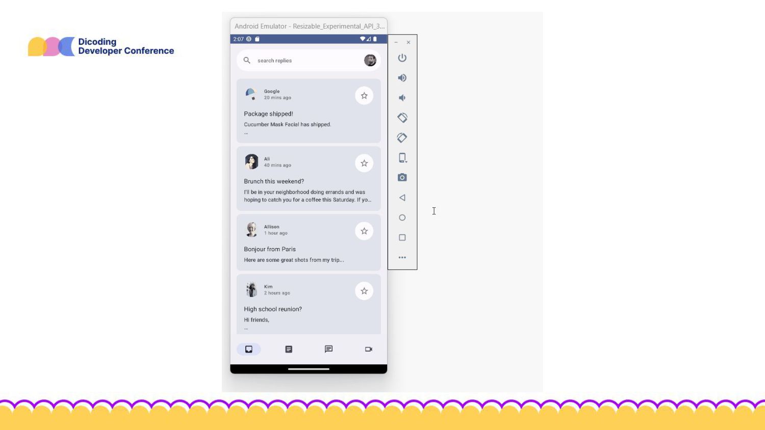
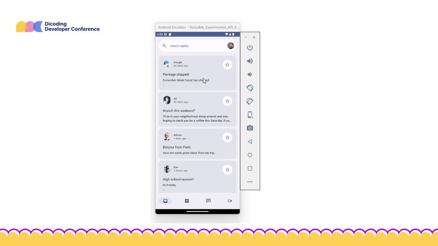
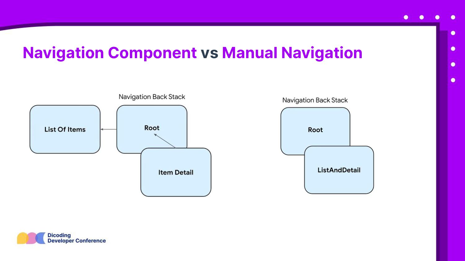
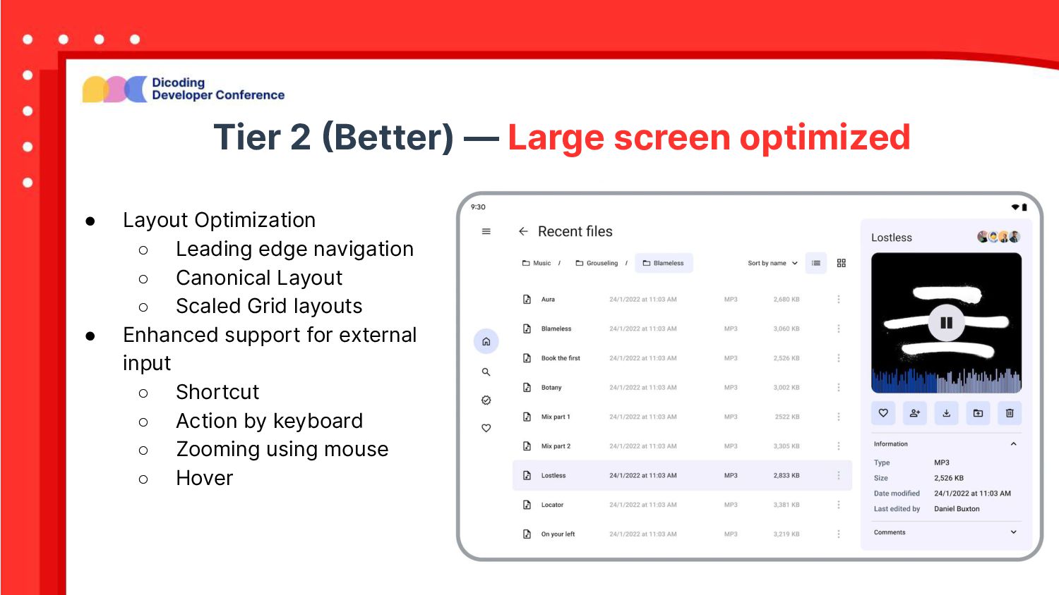
panel (left) and a supporting panel (right). • Recommended for 600+dp • Key use case ◦ Productivity ◦ Document editing and commenting ◦ Content and media browsing
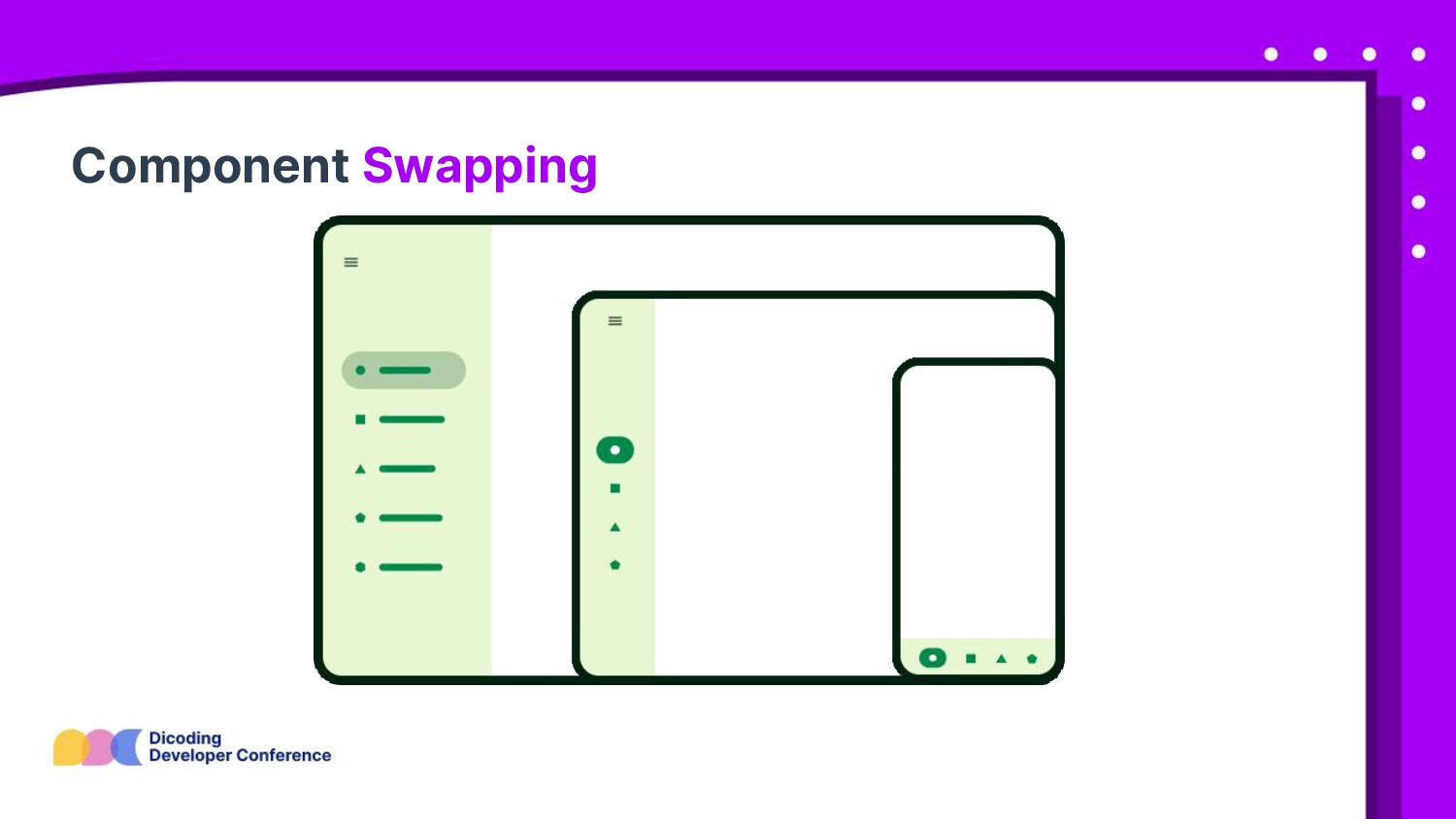
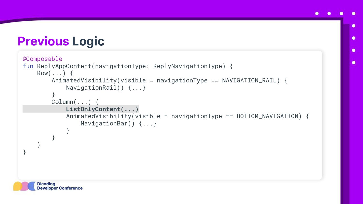
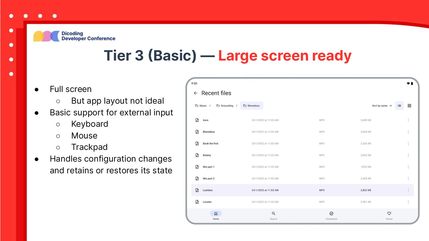
◦ But app layout not ideal • Basic support for external input ◦ Keyboard ◦ Mouse ◦ Trackpad • Handles configuration changes and retains or restores its state
 arifaizin
 torumakabe
 oracle4engineer
 sbspsy
 chmikata
 sansantech
 iwatatomoya
 shirouz
 subroh0508
 ry0_ka
 mtoyoda
 sue445
 maroon8021
 kneath
 aleyda
 mlcsv
mlcsv
 wayneb77
 codingconduct
 hatefulcrawdad
 tmiket
 marcduiker
 62gerente
 tammyeverts
 morganepeng
 eitanlees