Upgrade to Pro
— share decks privately, control downloads, hide ads and more …
Speaker Deck
Features
Speaker Deck
PRO
Sign in
Sign up for free
Search
Search
Using jQuery Mobile to Build Device-Agnostic Pages
Search
asta_gg
September 10, 2013
Programming
0
800
Using jQuery Mobile to Build Device-Agnostic Pages
asta_gg
September 10, 2013
Tweet
Share
Other Decks in Programming
See All in Programming
Grafana:建立系統全知視角的捷徑
blueswen
0
330
MDN Web Docs に日本語翻訳でコントリビュート
ohmori_yusuke
0
650
AIエージェント、”どう作るか”で差は出るか? / AI Agents: Does the "How" Make a Difference?
rkaga
4
2k
Apache Iceberg V3 and migration to V3
tomtanaka
0
170
開発者から情シスまで - 多様なユーザー層に届けるAPI提供戦略 / Postman API Night Okinawa 2026 Winter
tasshi
0
210
ぼくの開発環境2026
yuzneri
0
240
余白を設計しフロントエンド開発を 加速させる
tsukuha
7
2.1k
humanlayerのブログから学ぶ、良いCLAUDE.mdの書き方
tsukamoto1783
0
200
高速開発のためのコード整理術
sutetotanuki
1
410
AWS re:Invent 2025参加 直前 Seattle-Tacoma Airport(SEA)におけるハードウェア紛失インシデントLT
tetutetu214
2
120
責任感のあるCloudWatchアラームを設計しよう
akihisaikeda
3
180
AI & Enginnering
codelynx
0
120
Featured
See All Featured
Designing for Timeless Needs
cassininazir
0
130
The World Runs on Bad Software
bkeepers
PRO
72
12k
Paper Plane (Part 1)
katiecoart
PRO
0
4.3k
The SEO identity crisis: Don't let AI make you average
varn
0
330
Large-scale JavaScript Application Architecture
addyosmani
515
110k
Primal Persuasion: How to Engage the Brain for Learning That Lasts
tmiket
0
260
First, design no harm
axbom
PRO
2
1.1k
Done Done
chrislema
186
16k
Designing for humans not robots
tammielis
254
26k
Ruling the World: When Life Gets Gamed
codingconduct
0
150
Measuring & Analyzing Core Web Vitals
bluesmoon
9
760
Leading Effective Engineering Teams in the AI Era
addyosmani
9
1.6k
Transcript
Using jQuery Mobile to Build Device-Agnostic Pages Asta Gindulyte
About me: where I work http://pubchem.ncbi.nlm.nih.gov/
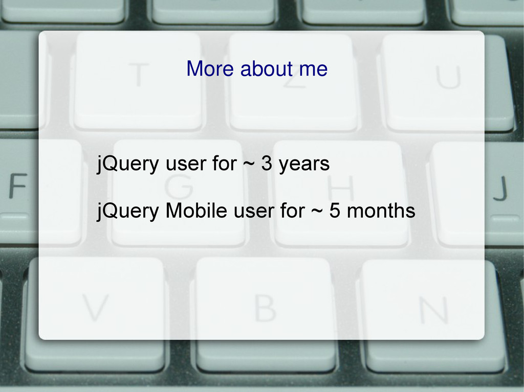
More about me jQuery user for ~ 3 years jQuery
Mobile user for ~ 5 months
I CAN CODEZ jQUERY I CAN CODEZ jQUERY
We need to re-do our website...
Web development What has changed over the past 5 years?
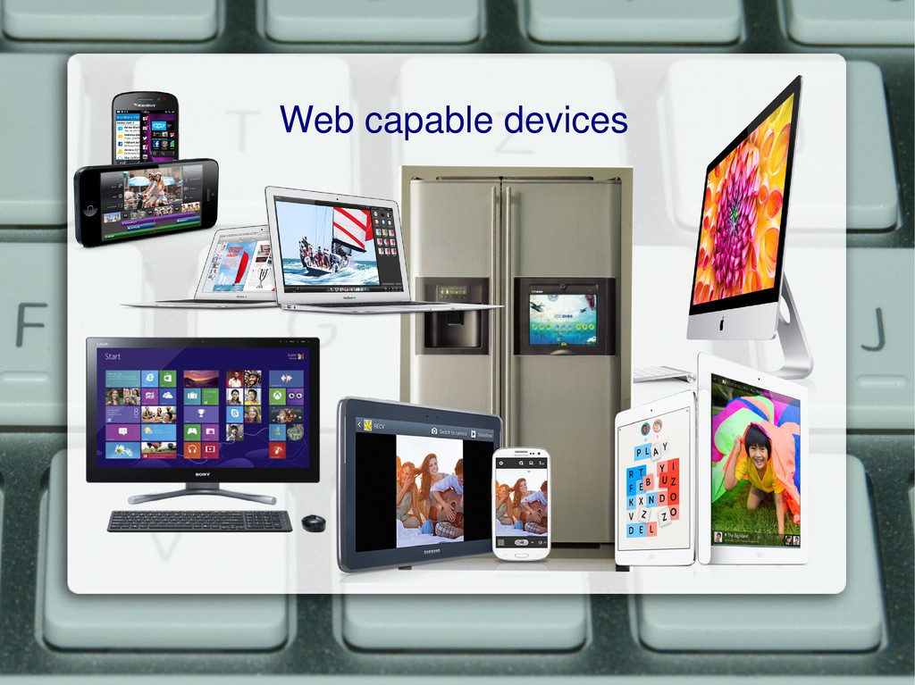
Web capable devices
Make the new website work on all web-capable devices!
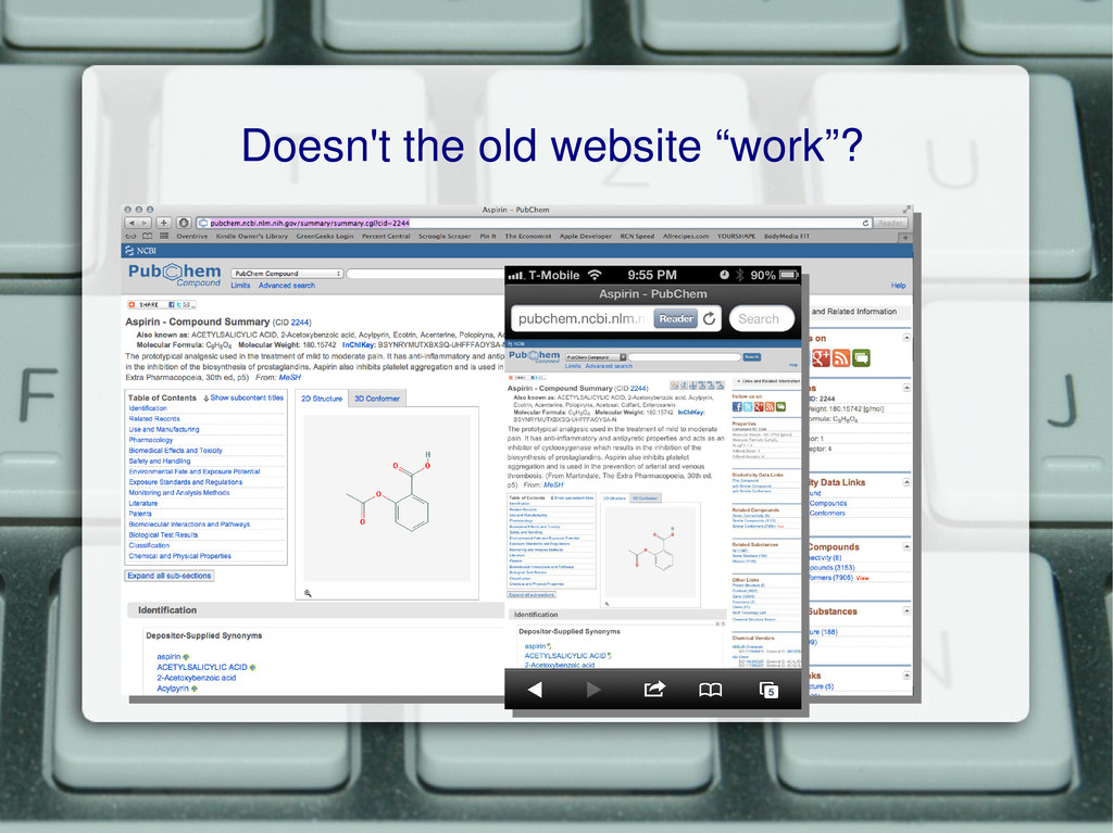
Doesn't the old website “work”?
Works better on some devices than others NOT device-agnostic website
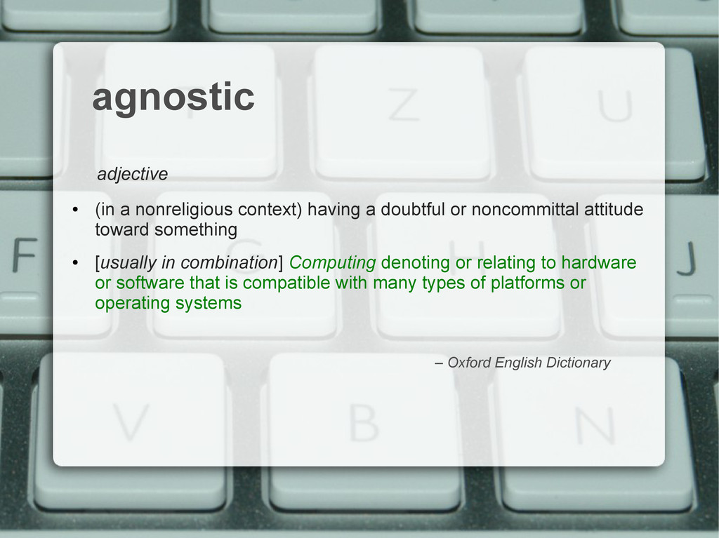
agnostic adjective • (in a nonreligious context) having a doubtful
or noncommittal attitude toward something • [usually in combination] Computing denoting or relating to hardware or software that is compatible with many types of platforms or operating systems – Oxford English Dictionary
Device-agnostic website Works well on all devices
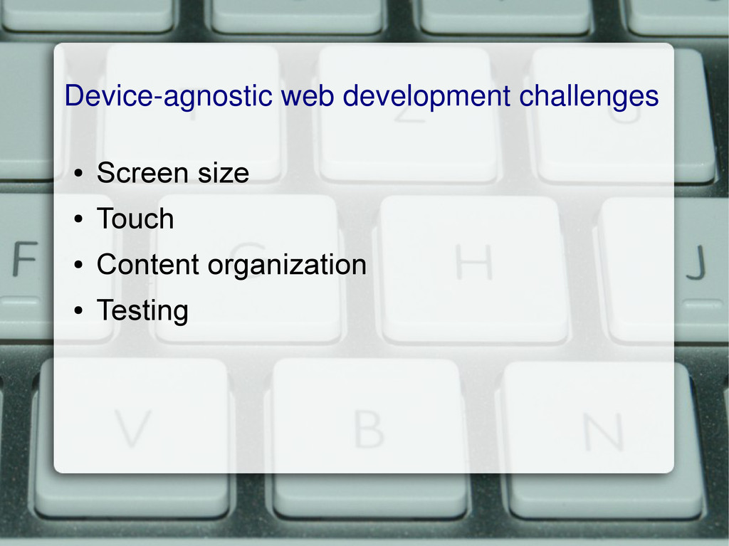
Device-agnostic web development challenges • Screen size • Touch •
Content organization • Testing
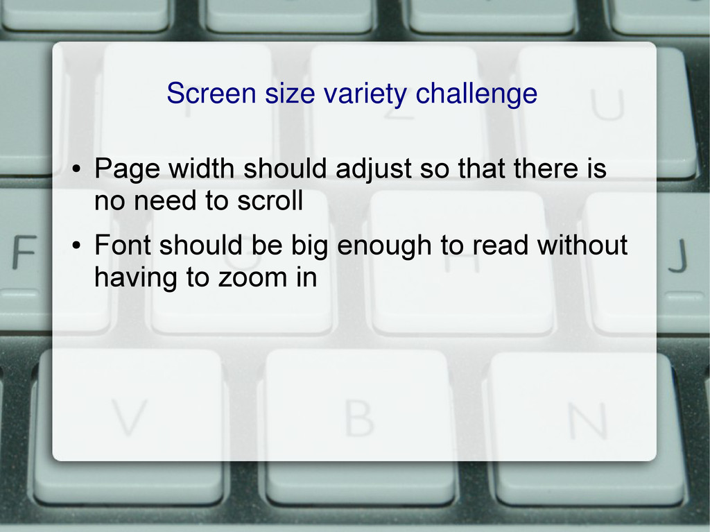
Screen size variety challenge • Page width should adjust so
that there is no need to scroll • Font should be big enough to read without having to zoom in
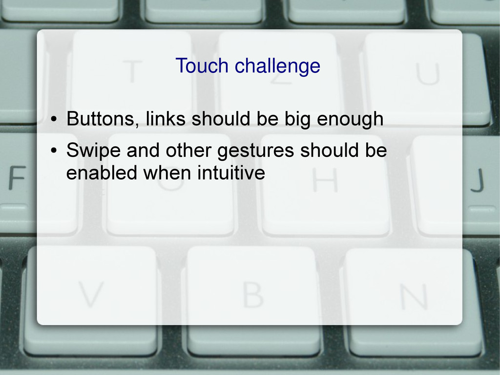
Touch challenge • Buttons, links should be big enough •
Swipe and other gestures should be enabled when intuitive
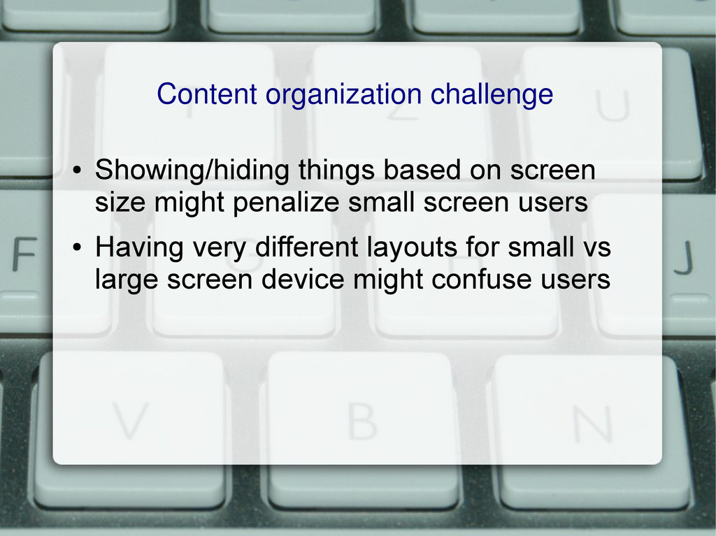
Content organization challenge • Showing/hiding things based on screen size
might penalize small screen users • Having very different layouts for small vs large screen device might confuse users
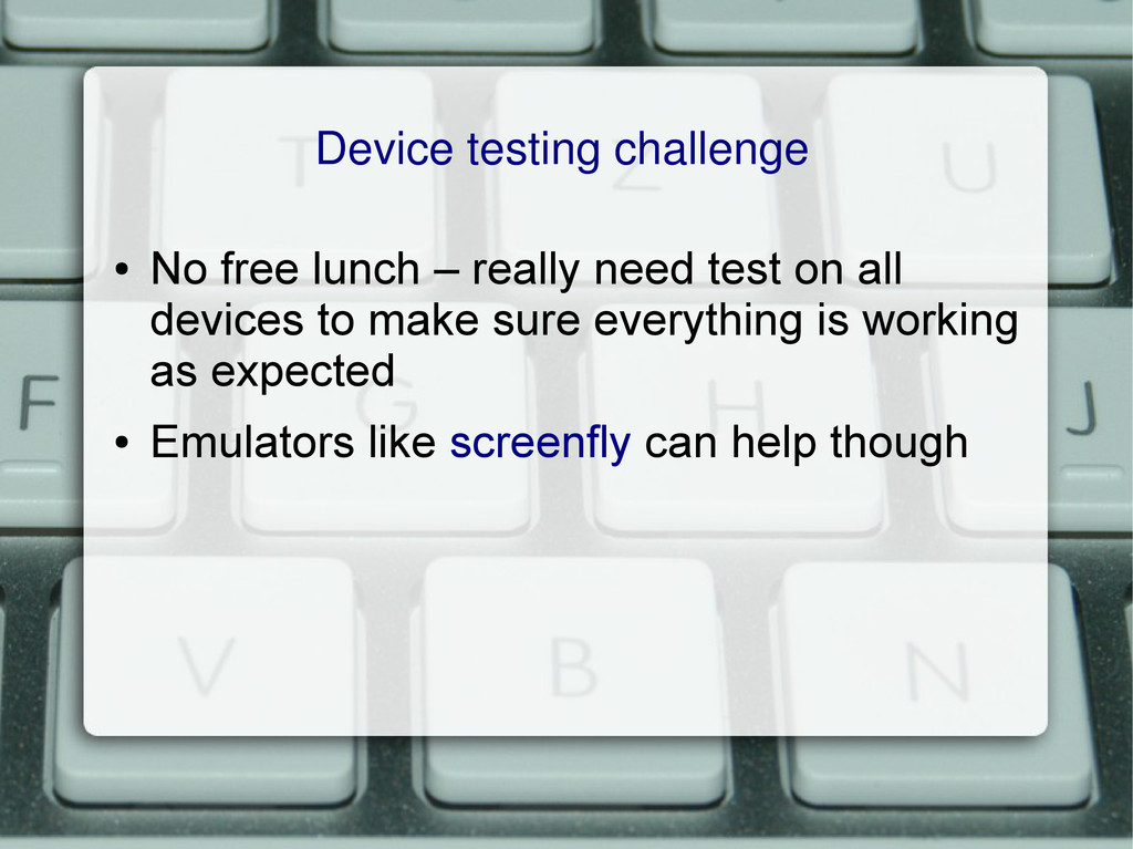
Device testing challenge • No free lunch – really need
test on all devices to make sure everything is working as expected • Emulators like screenfly can help though
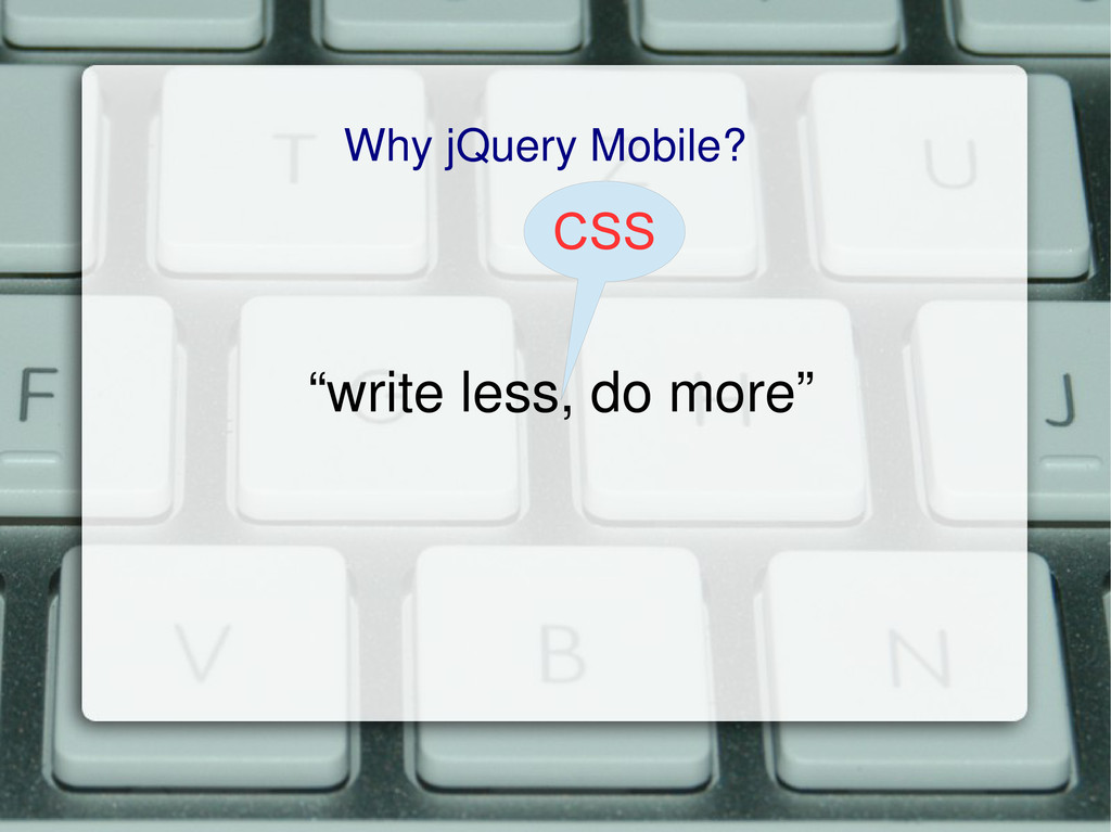
“write less, do more” Why jQuery Mobile? CSS
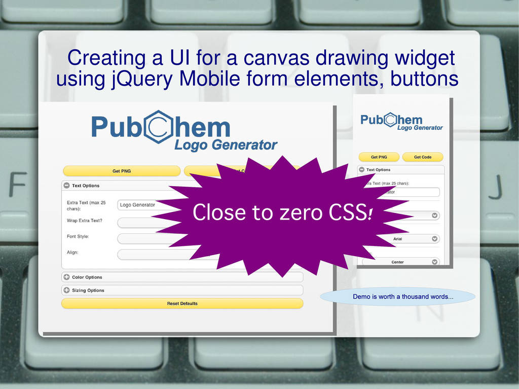
Creating a UI for a canvas drawing widget using jQuery
Mobile form elements, buttons Close to zero CSS!
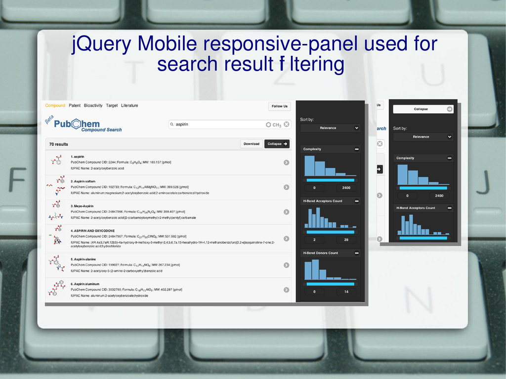
Creating a Search page with jQuery Mobile Listviews
jQuery Mobile responsive-panel used for search result f i ltering
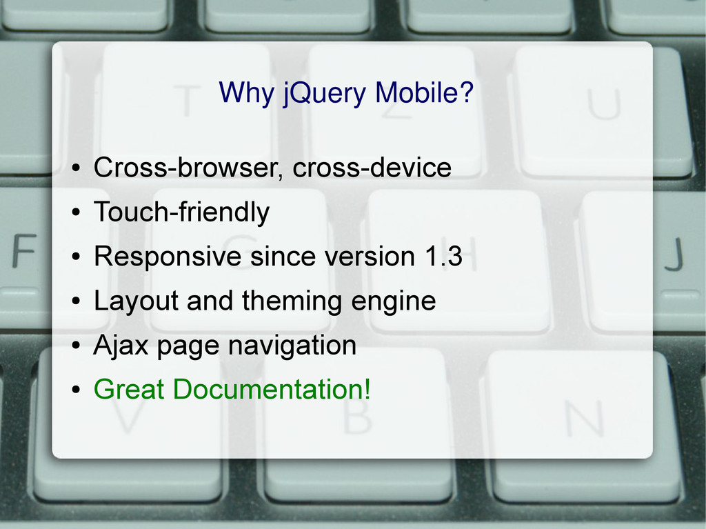
Why jQuery Mobile? • Cross-browser, cross-device • Touch-friendly • Responsive
since version 1.3 • Layout and theming engine • Ajax page navigation • Great Documentation!
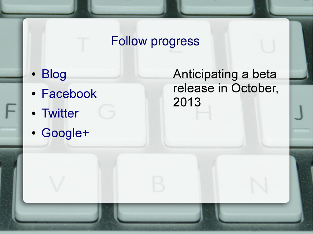
Follow progress • Blog • Facebook • Twitter • Google+
Anticipating a beta release in October, 2013
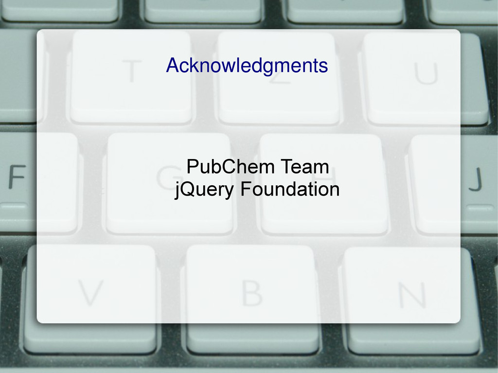
Acknowledgments PubChem Team jQuery Foundation
 blueswen
 ohmori_yusuke
 rkaga
rkaga
 tomtanaka
 tasshi
 yuzneri
 tsukuha
 tsukamoto1783
 sutetotanuki
 tetutetu214
 akihisaikeda
 codelynx
 cassininazir
 bkeepers
 katiecoart
 varn
varn
 addyosmani
 tmiket
 axbom
axbom
 chrislema
 tammielis
 codingconduct
 bluesmoon