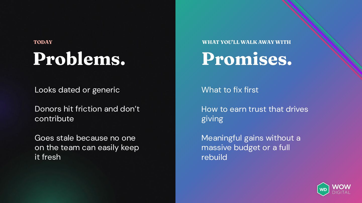
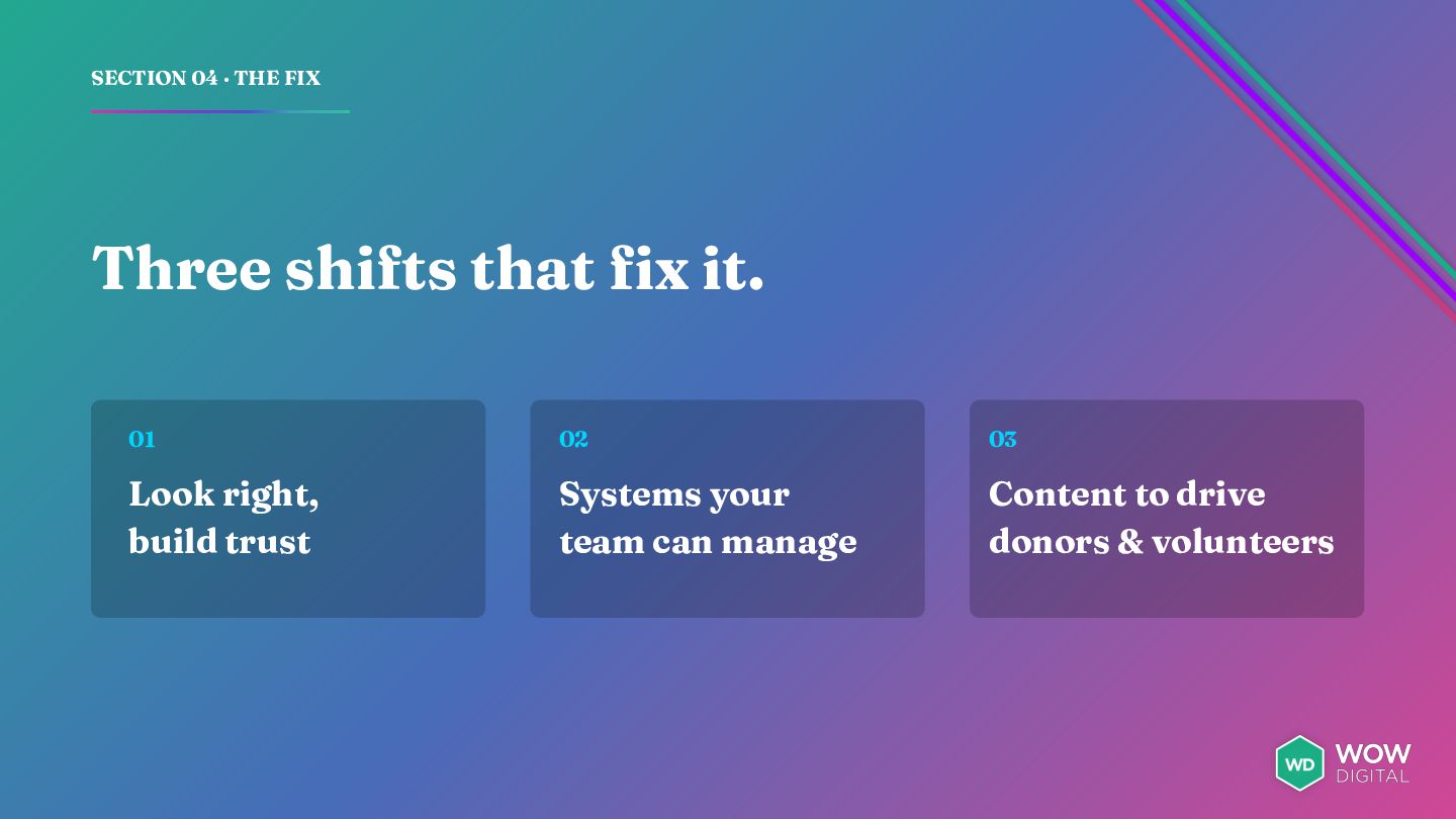
or generic What to fix first Donors hit friction and don’t contribute How to earn trust that drives giving Goes stale because no one on the team can easily keep it fresh Meaningful gains without a massive budget or a full rebuild
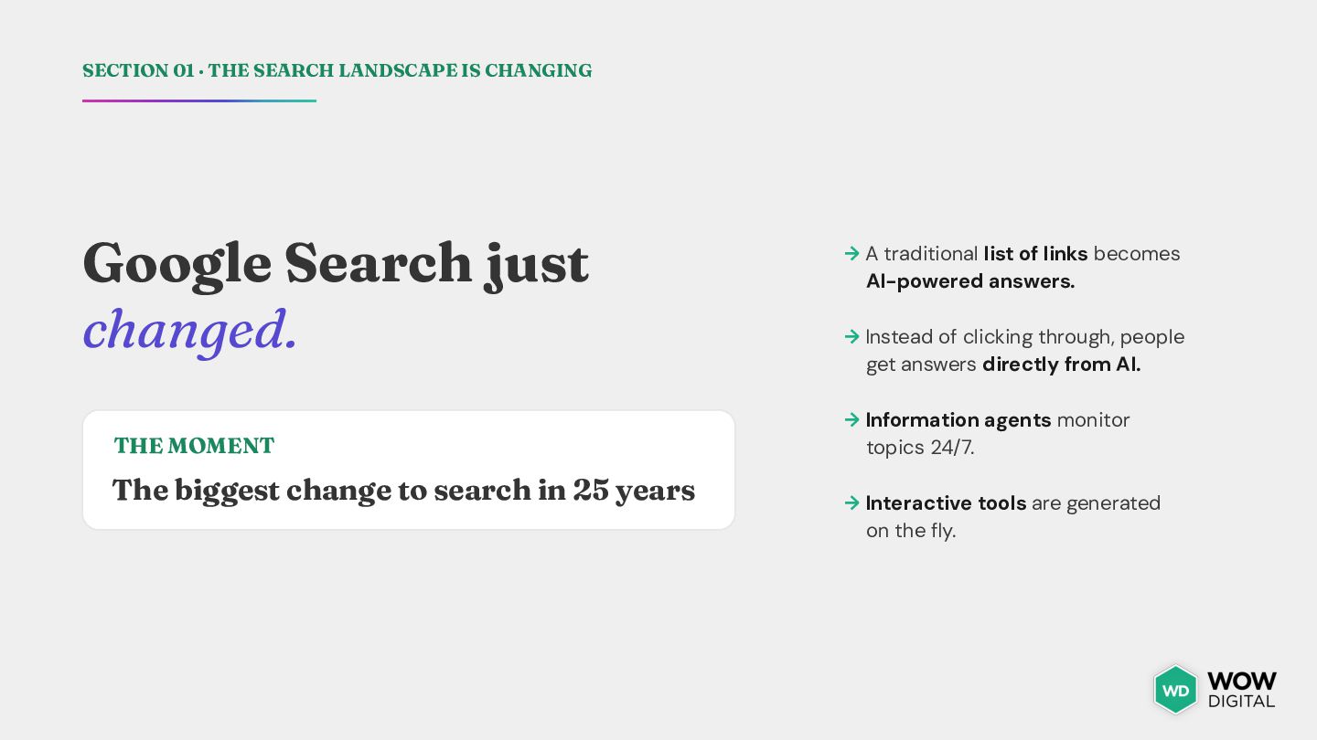
just changed. THE MOMENT The biggest change to search in 25 years → A traditional list of links becomes AI-powered answers. → Instead of clicking through, people get answers directly from AI. → Information agents monitor topics 24/7. → Interactive tools are generated on the fly.
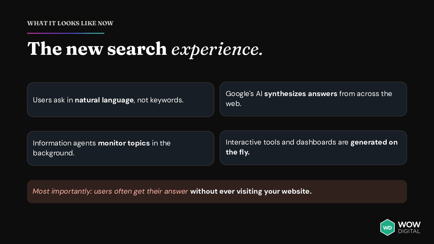
ask in natural language, not keywords. Google's AI synthesizes answers from across the web. Information agents monitor topics in the background. Interactive tools and dashboards are generated on the fly. Most importantly: users often get their answer without ever visiting your website.
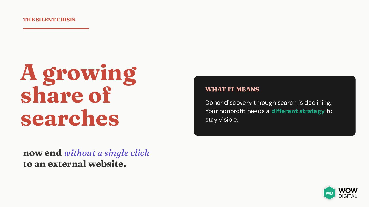
without a single click to an external website. WHAT IT MEANS Donor discovery through search is declining. Your nonprofit needs a different strategy to stay visible.
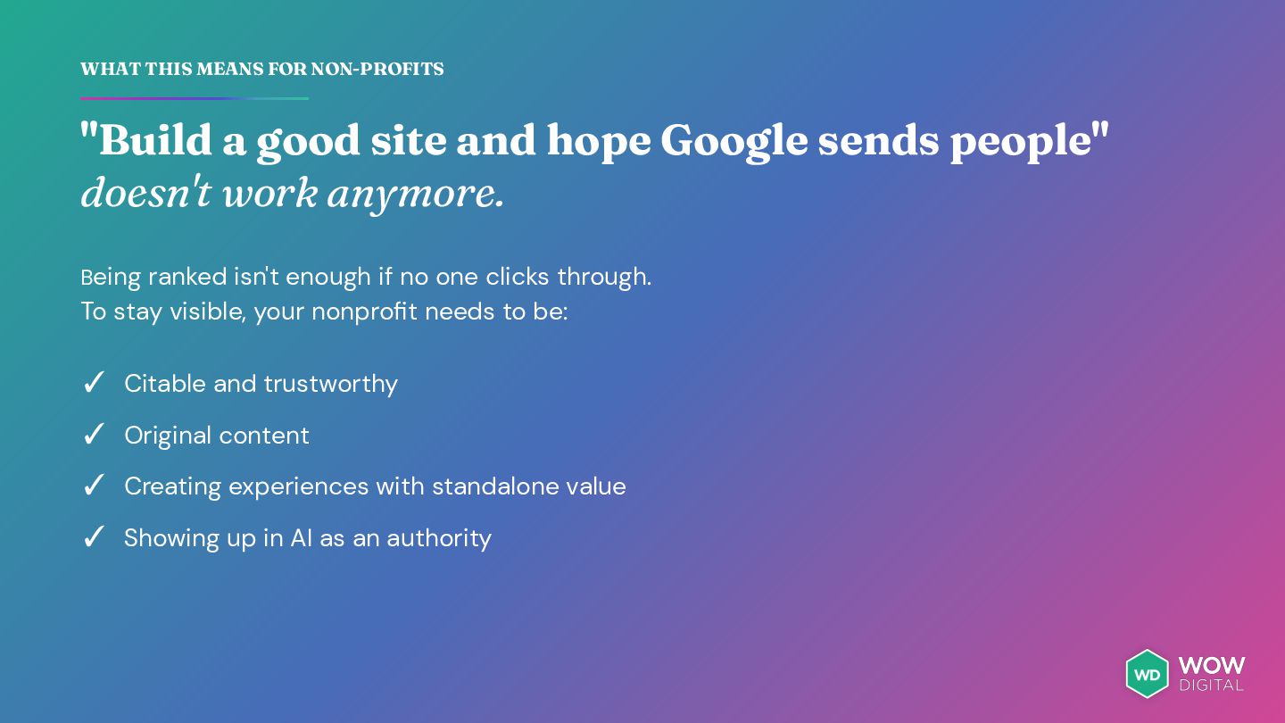
hope Google sends people" doesn't work anymore. Being ranked isn't enough if no one clicks through. To stay visible, your nonprofit needs to be: ✓ Citable and trustworthy ✓ Original content ✓ Creating experiences with standalone value ✓ Showing up in AI as an authority
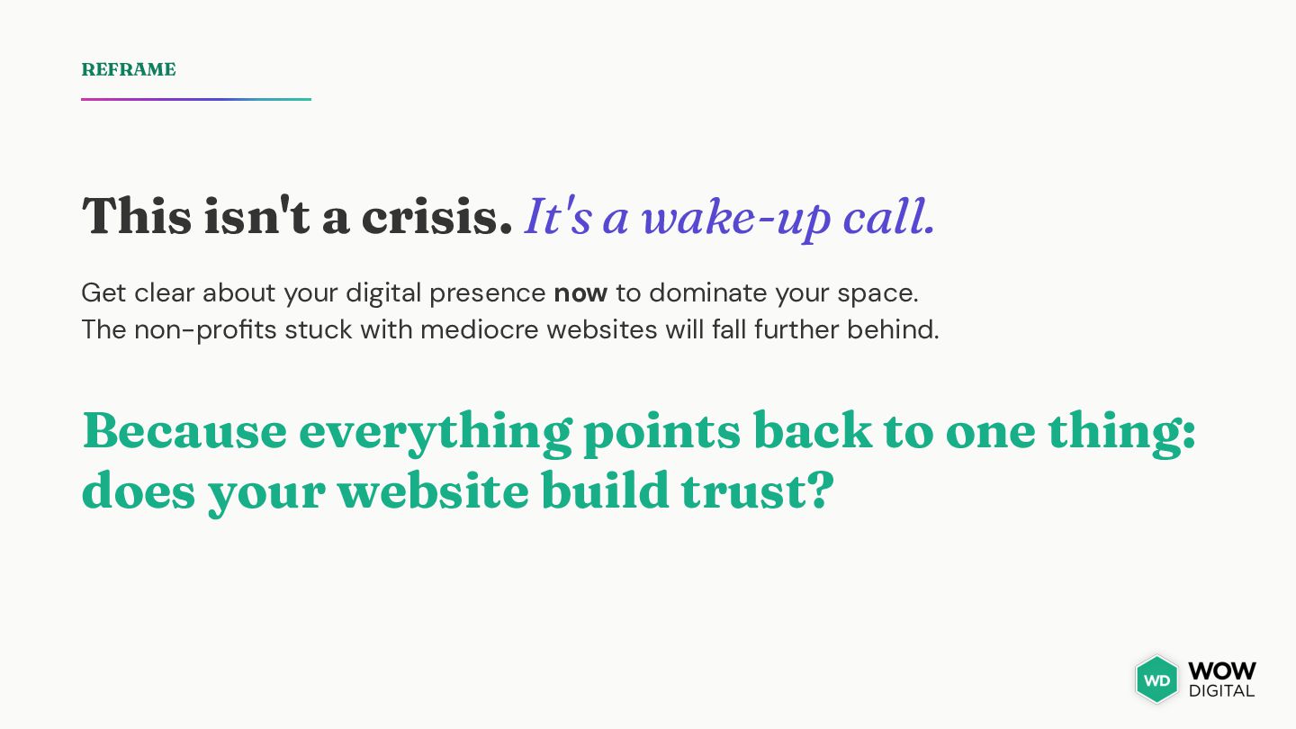
clear about your digital presence now to dominate your space. The non-profits stuck with mediocre websites will fall further behind. Because everything points back to one thing: does your website build trust?
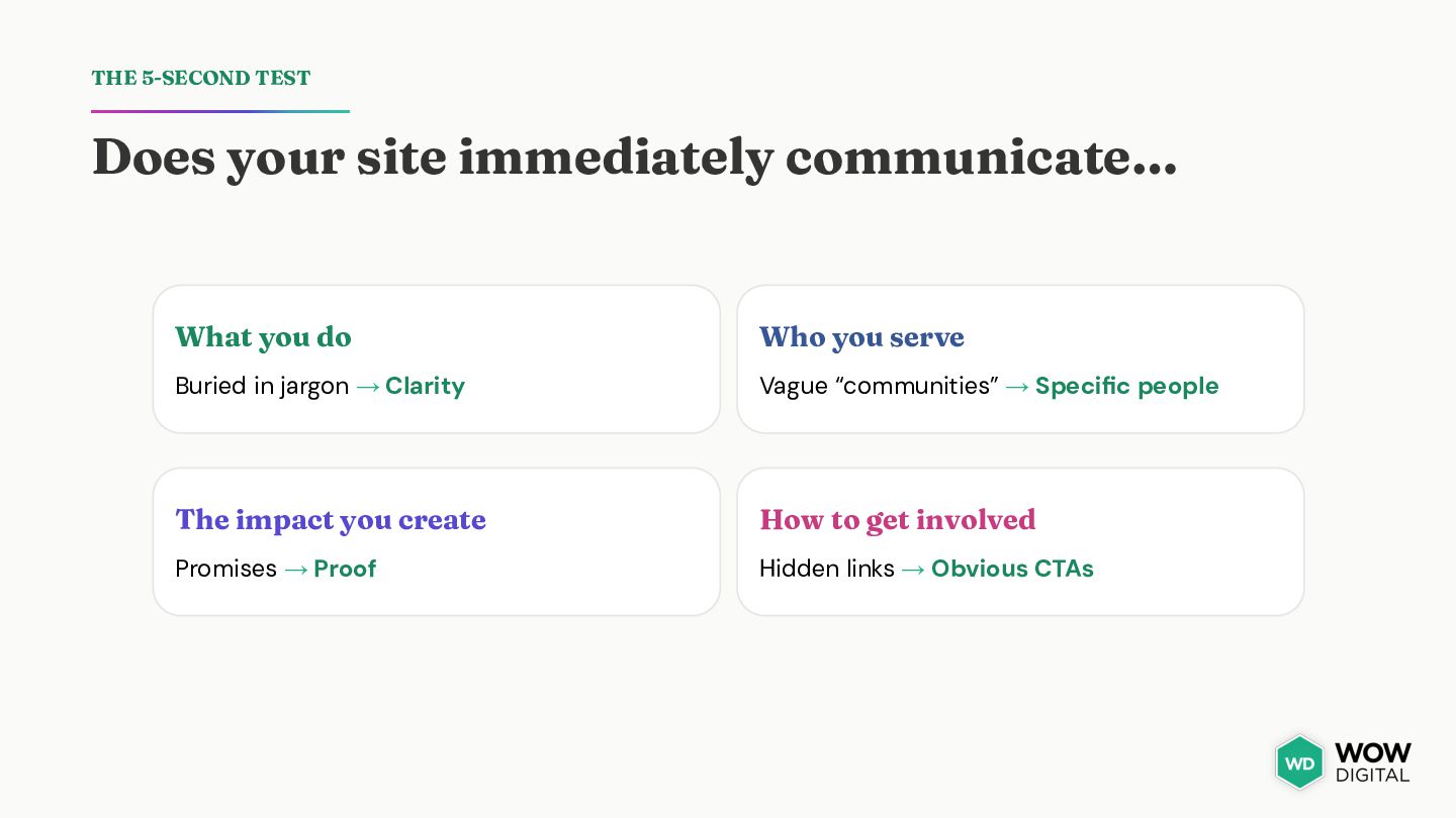
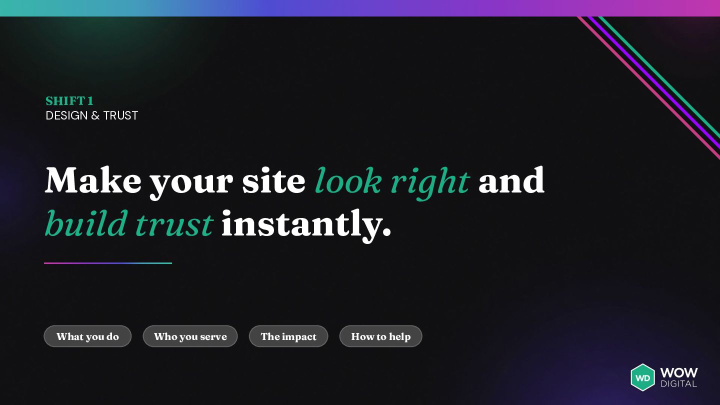
do Who you serve Buried in jargon → Clarity Vague “communities” → Specific people The impact you create How to get involved Promises → Proof Hidden links → Obvious CTAs
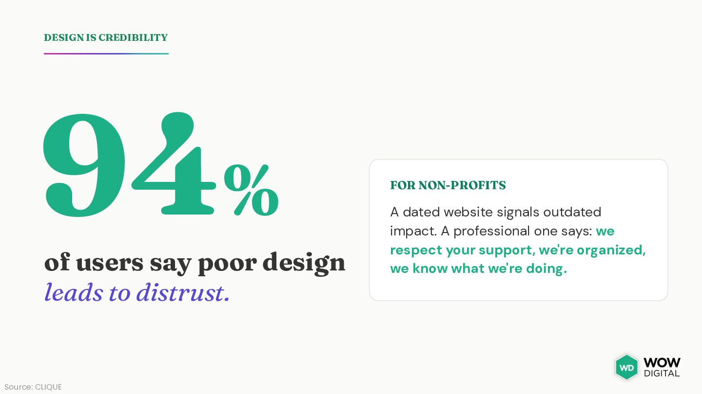
to distrust. Source: CLIQUE FOR NON-PROFITS A dated website signals outdated impact. A professional one says: we respect your support, we're organized, we know what we're doing.
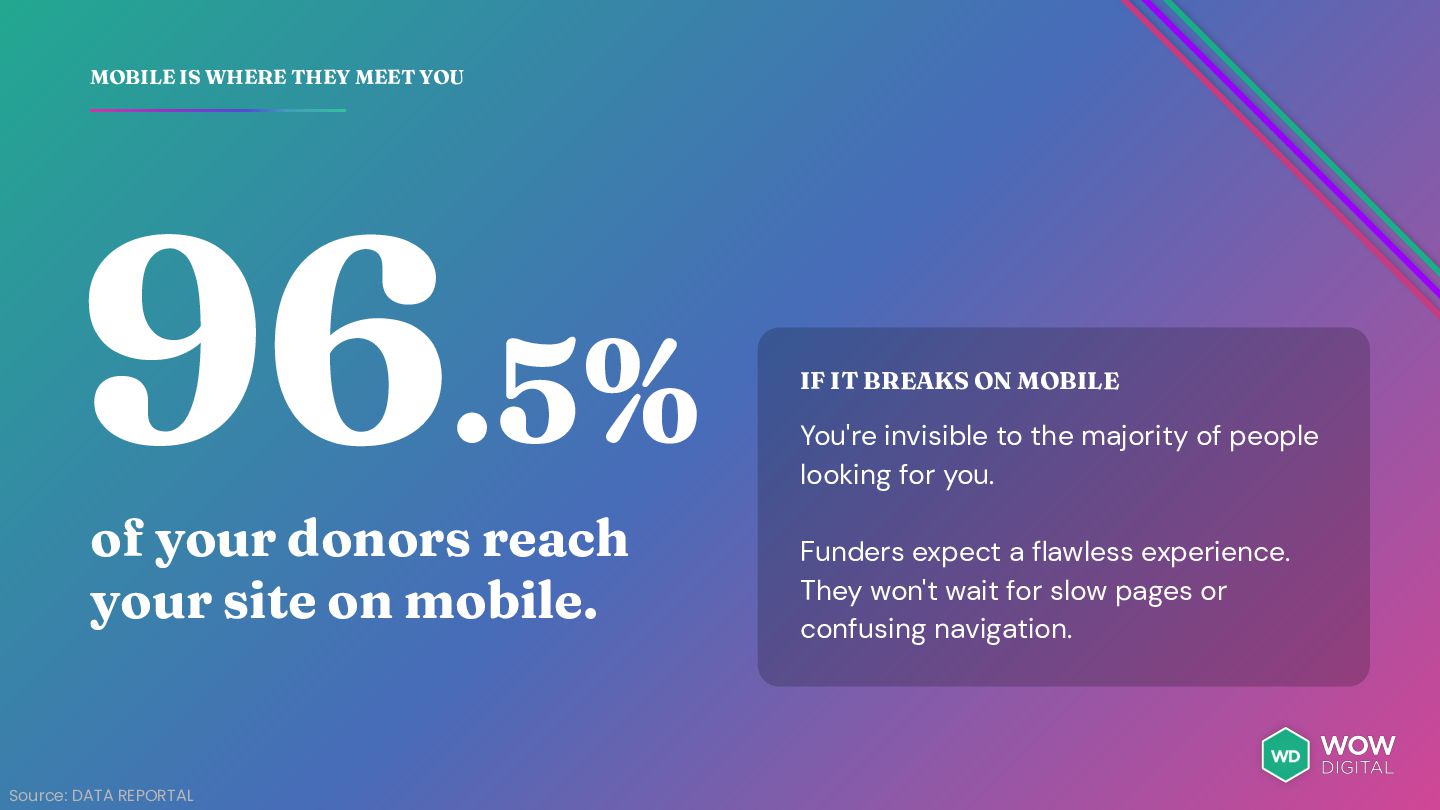
reach your site on mobile. Source: DATA REPORTAL IF IT BREAKS ON MOBILE You're invisible to the majority of people looking for you. Funders expect a flawless experience. They won't wait for slow pages or confusing navigation.
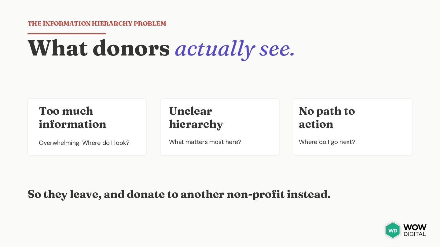
information Unclear hierarchy No path to action Overwhelming. Where do I look? What matters most here? Where do I go next? So they leave, and donate to another non-profit instead.
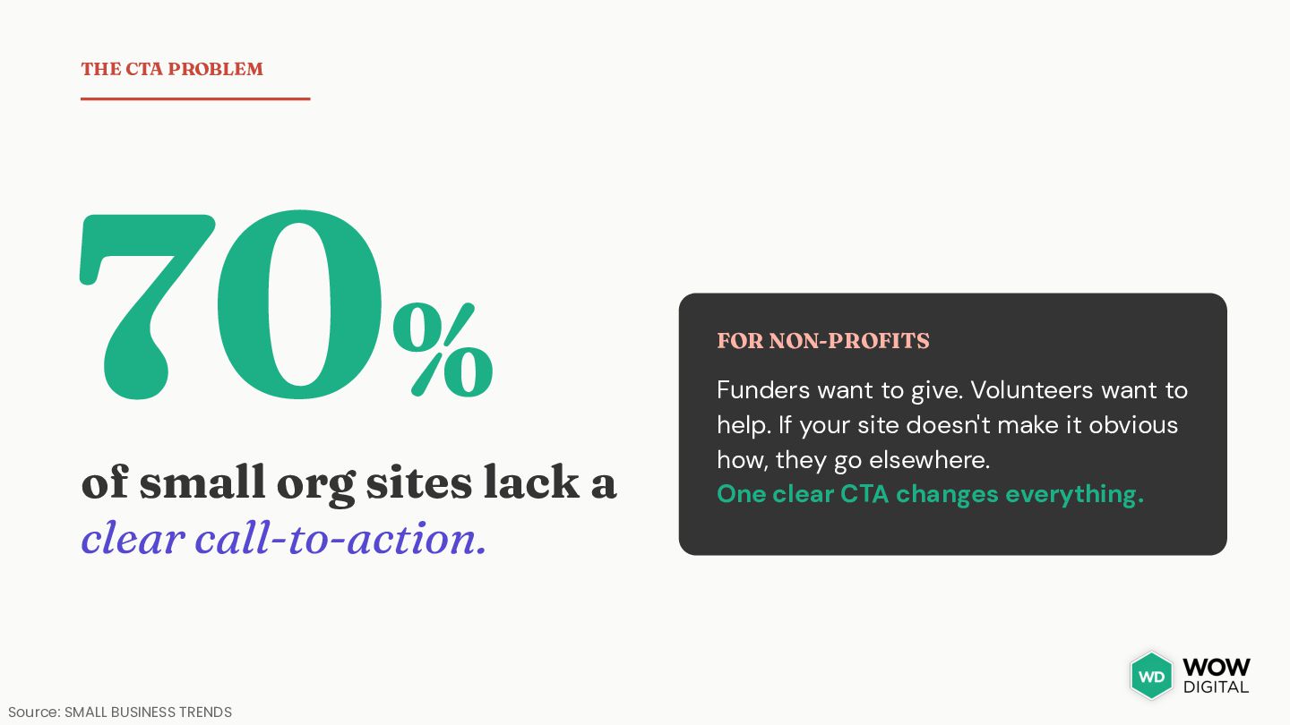
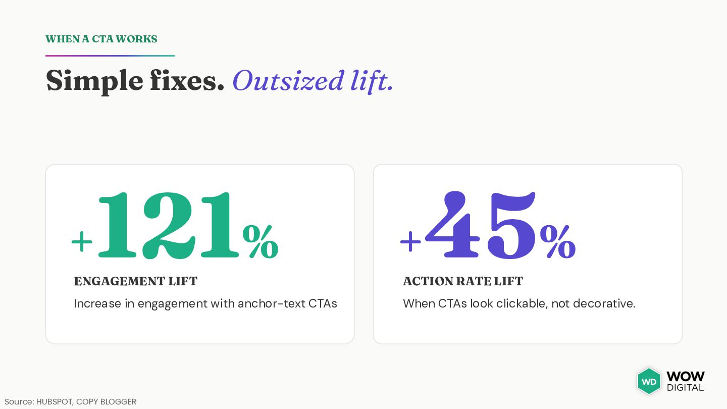
clear call-to-action. Source: SMALL BUSINESS TRENDS FOR NON-PROFITS Funders want to give. Volunteers want to help. If your site doesn't make it obvious how, they go elsewhere. One clear CTA changes everything.
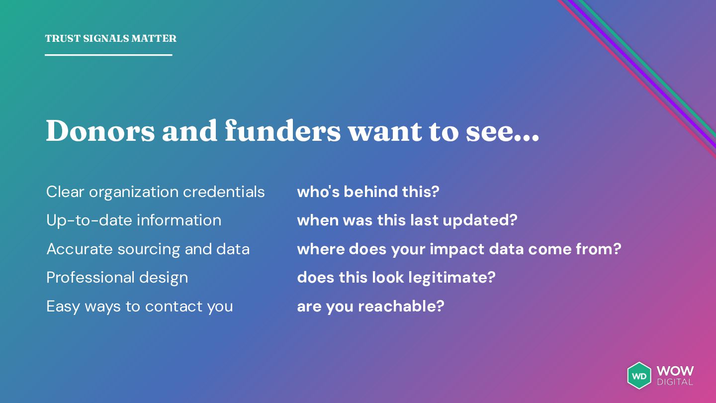
organization credentials who's behind this? Up-to-date information when was this last updated? Accurate sourcing and data where does your impact data come from? Professional design does this look legitimate? Easy ways to contact you are you reachable?
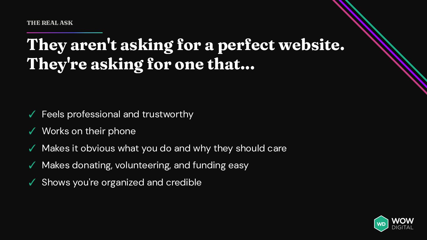
They're asking for one that... ✓ Feels professional and trustworthy ✓ Works on their phone ✓ Makes it obvious what you do and why they should care ✓ Makes donating, volunteering, and funding easy ✓ Shows you're organized and credible
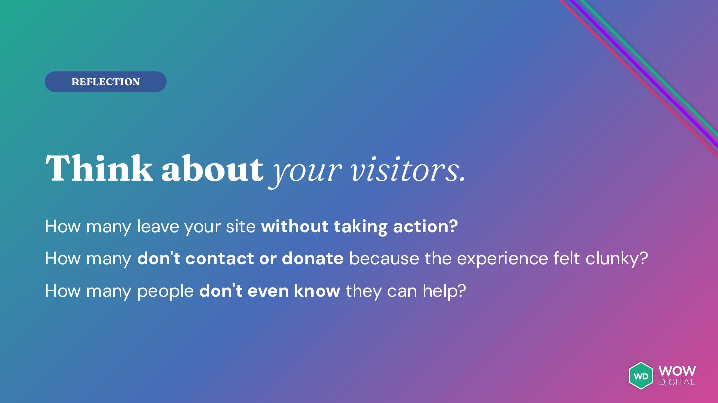
loss. A prospect visits your site. Feels underwhelmed. Leaves without donating. You never know it happened. Now multiply that by hundreds of times per year.
site doesn't instantly communicate your mission or impact. Lost donations from people who were ready to give Donors aren't sure what you do or why it matters, so they bounce to a non-profit that's clearer.
too many clicks or too much info upfront. People who wanted to help decide it’s not worth the effort. Volunteer opportunities are buried 3 levels deep. Grant details are scattered.
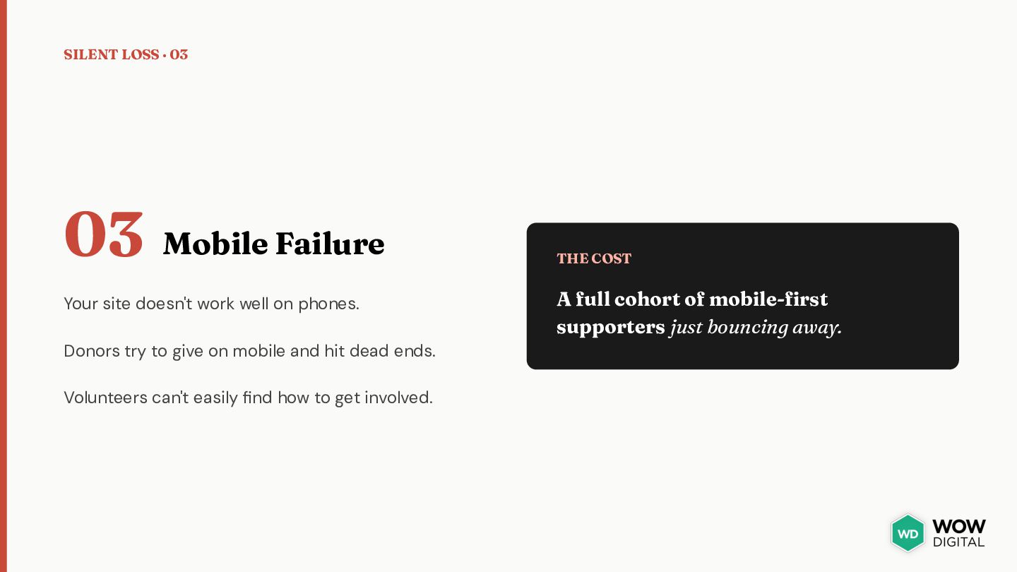
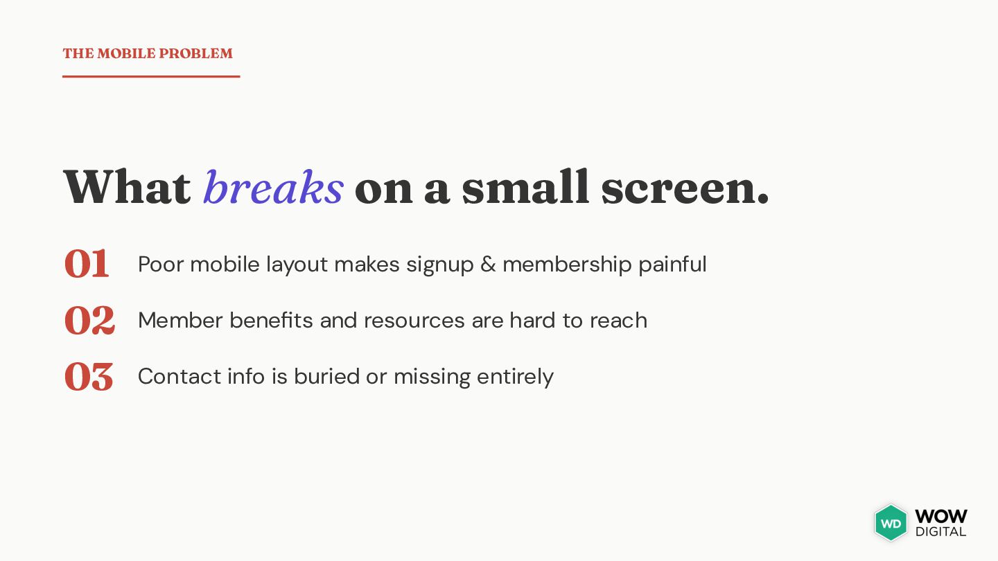
work well on phones. Donors try to give on mobile and hit dead ends. Volunteers can't easily find how to get involved. THE COST A full cohort of mobile-first supporters just bouncing away.
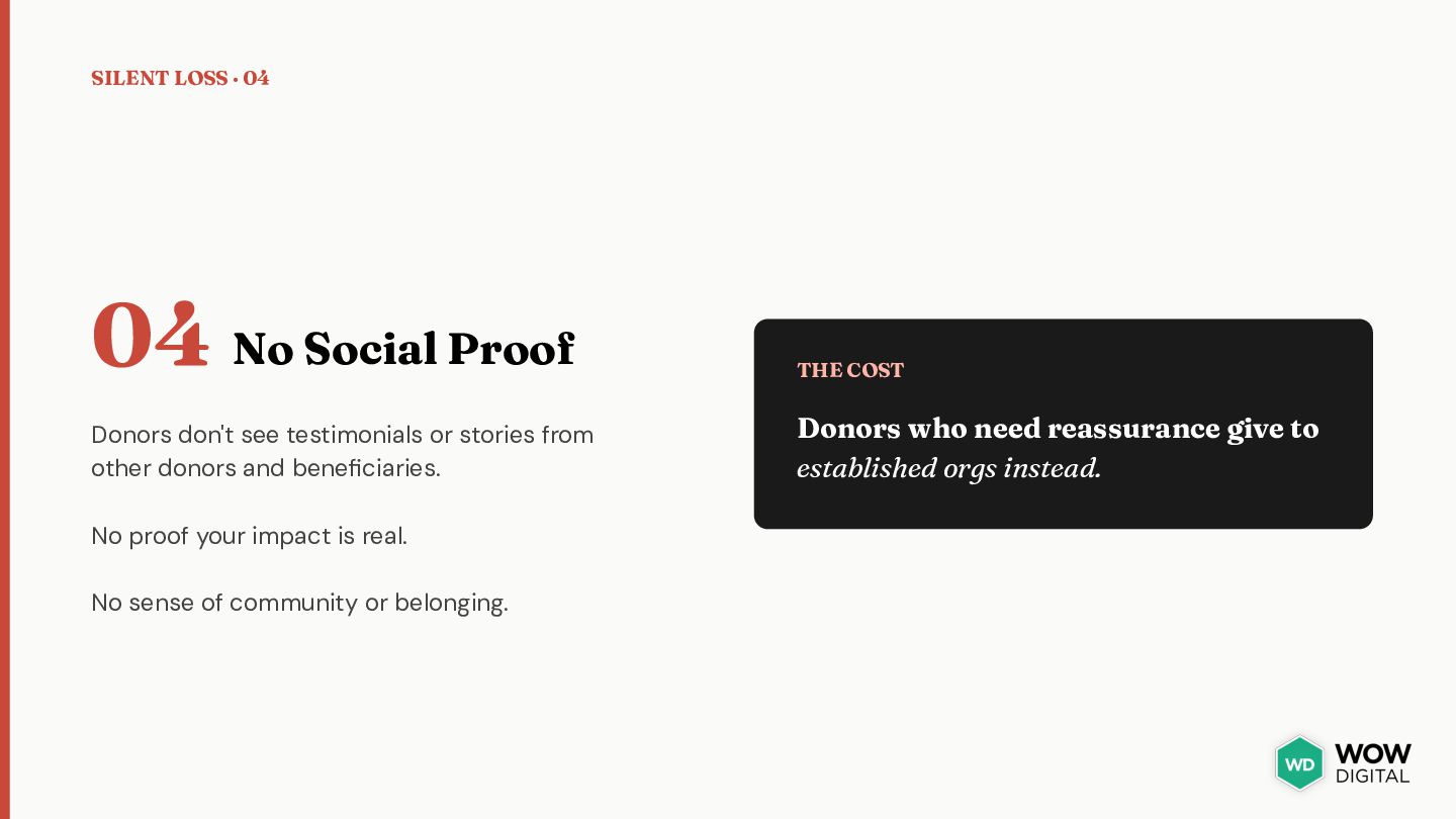
Donors don't see testimonials or stories from other donors and beneficiaries. Donors who need reassurance give to established orgs instead. No proof your impact is real. No sense of community or belonging.
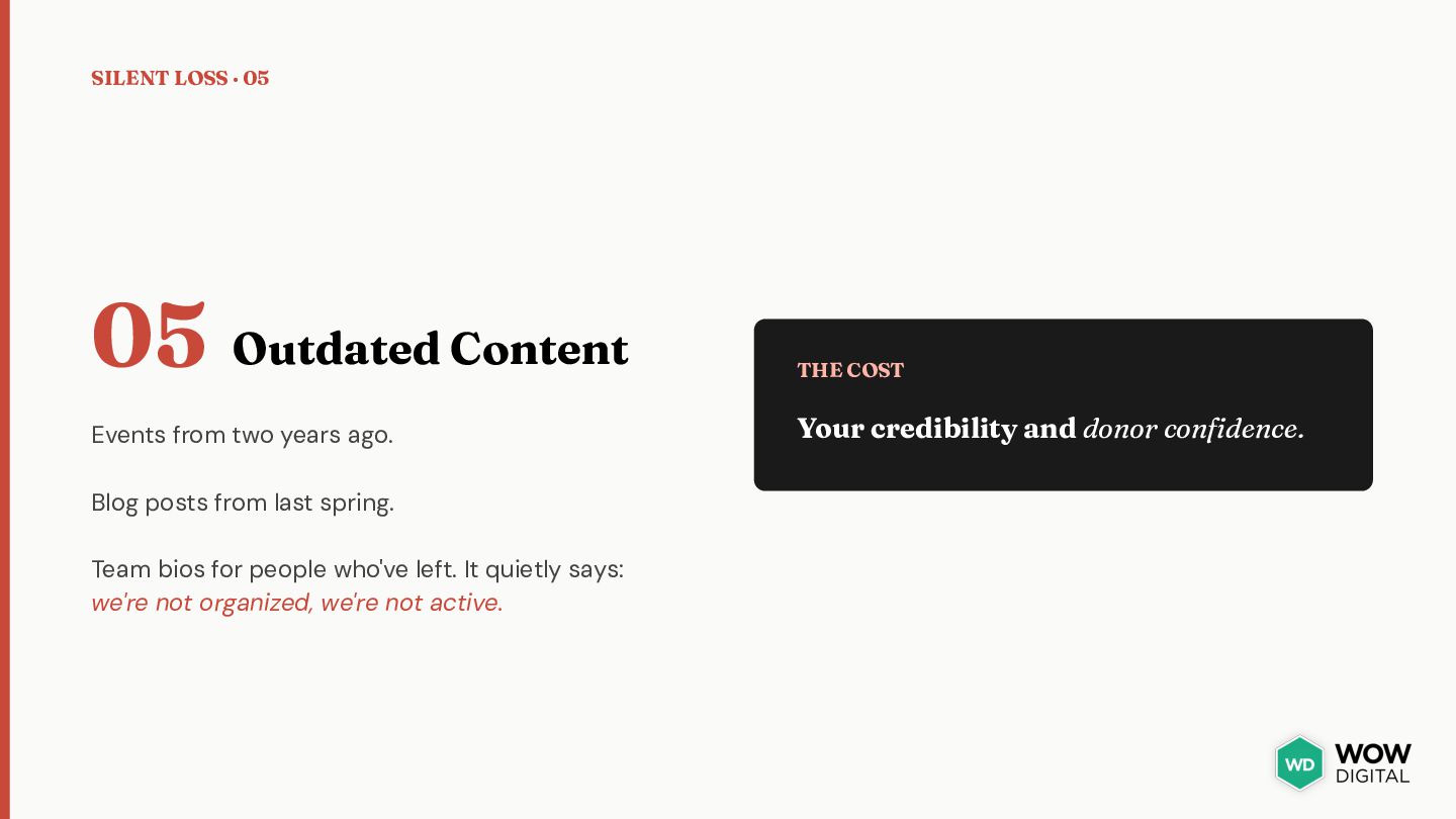
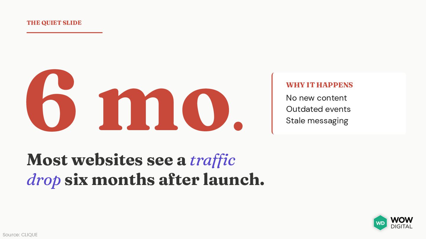
from two years ago. Your credibility and donor confidence. Blog posts from last spring. Team bios for people who've left. It quietly says: we're not organized, we're not active.
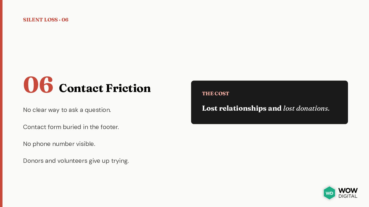
clear way to ask a question. Lost relationships and lost donations. Contact form buried in the footer. No phone number visible. Donors and volunteers give up trying.
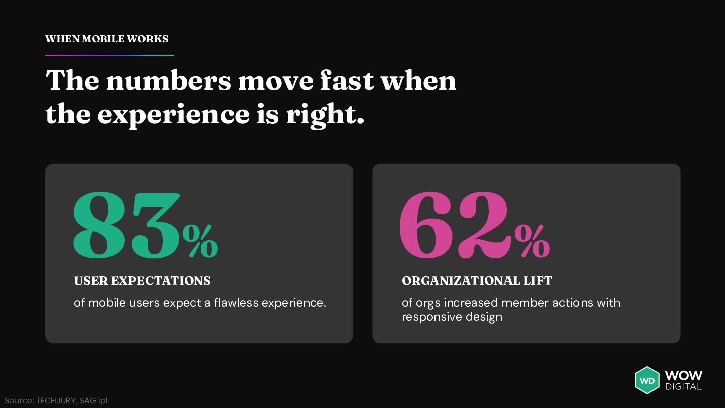
is right. 83% 62% of mobile users expect a flawless experience. of orgs increased member actions with responsive design USER EXPECTATIONS Source: TECHJURY, SAG ipl ORGANIZATIONAL LIFT
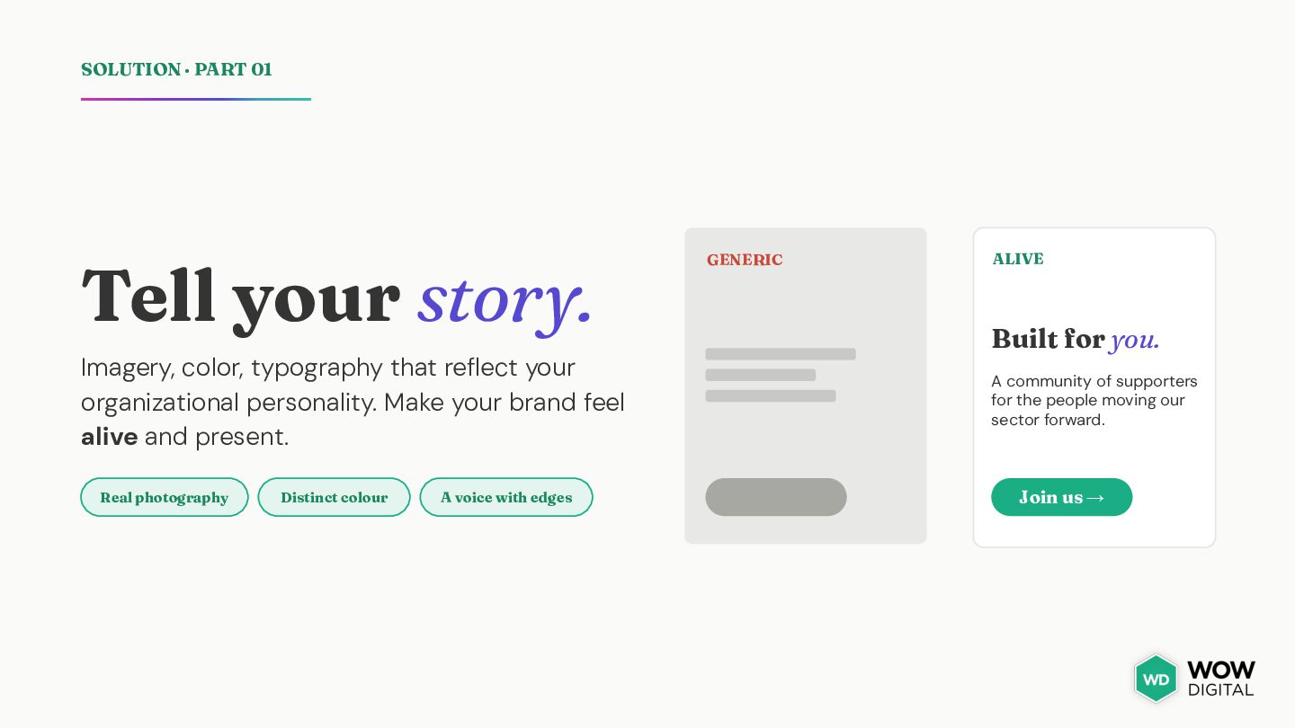
that reflect your organizational personality. Make your brand feel alive and present. Real photography Distinct colour A voice with edges GENERIC ALIVE Built for you. A community of supporters for the people moving our sector forward. Join us →
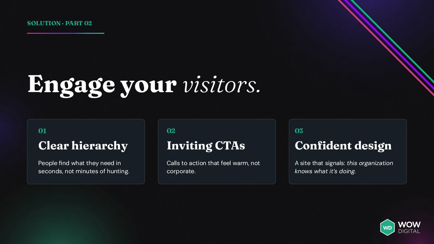
Clear hierarchy Inviting CTAs Confident design People find what they need in seconds, not minutes of hunting. Calls to action that feel warm, not corporate. A site that signals: this organization knows what it’s doing.
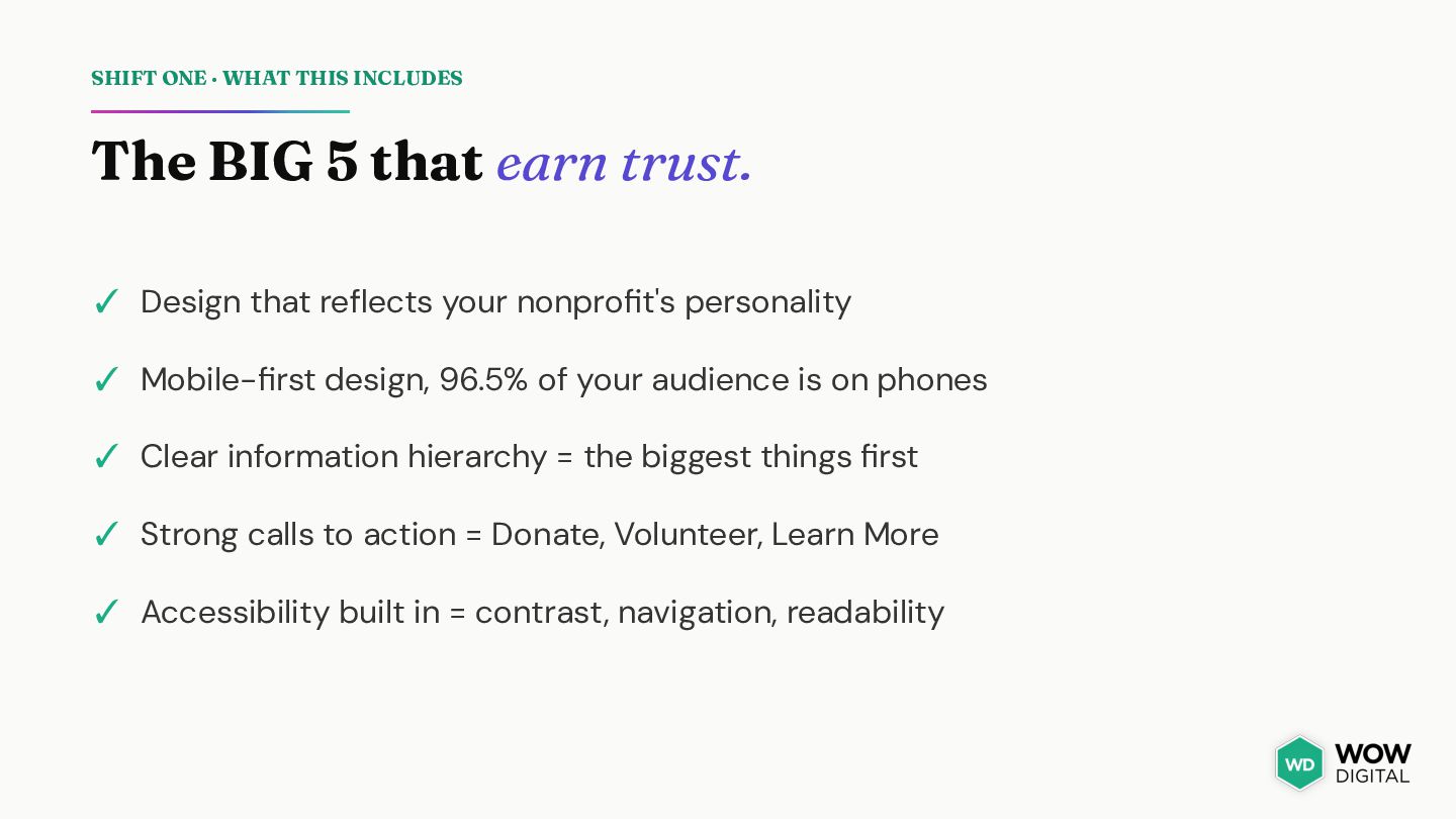
earn trust. ✓ Design that reflects your nonprofit's personality ✓ Mobile-first design, 96.5% of your audience is on phones ✓ Clear information hierarchy = the biggest things first ✓ Strong calls to action = Donate, Volunteer, Learn More ✓ Accessibility built in = contrast, navigation, readability
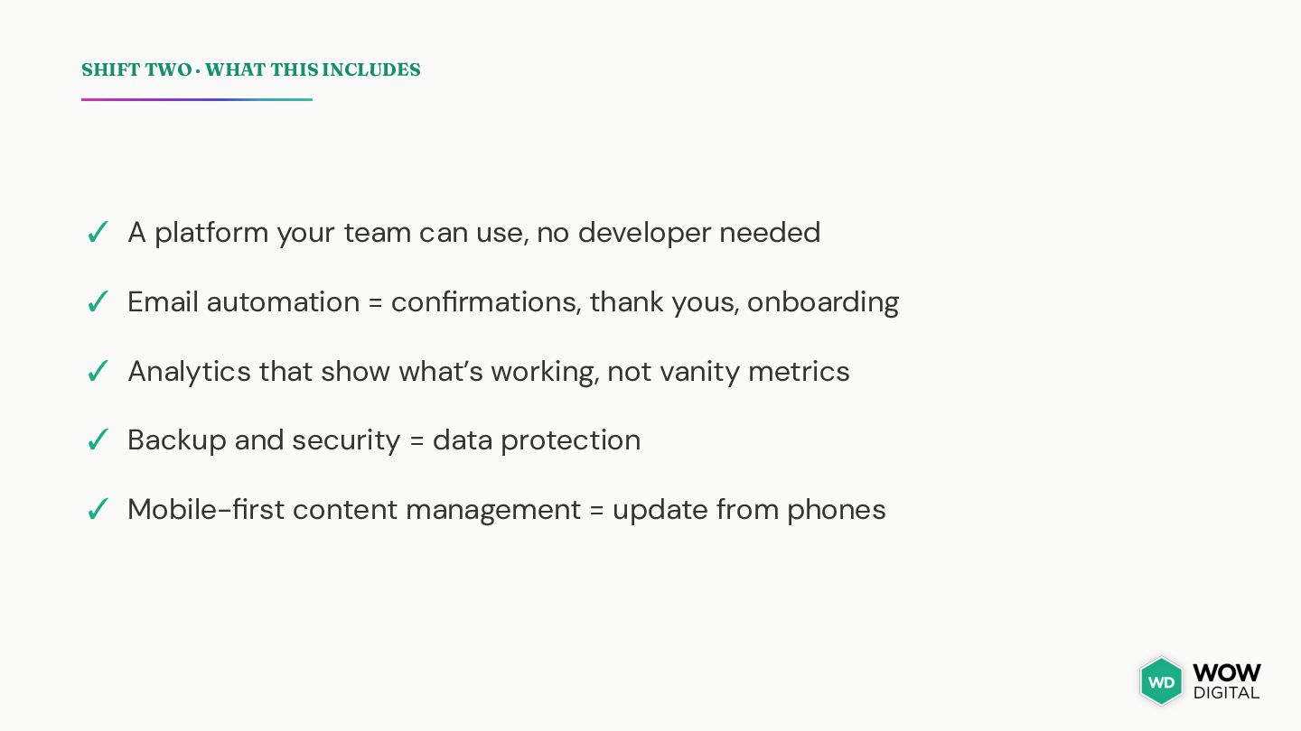
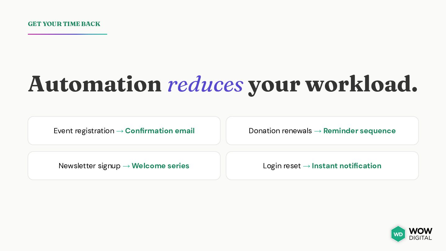
team can use, no developer needed ✓ Email automation = confirmations, thank yous, onboarding ✓ Analytics that show what’s working, not vanity metrics ✓ Backup and security = data protection ✓ Mobile-first content management = update from phones
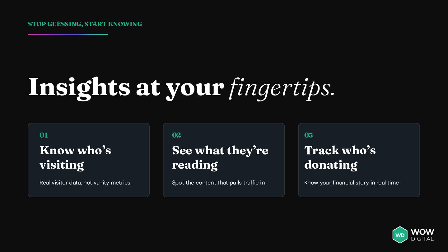
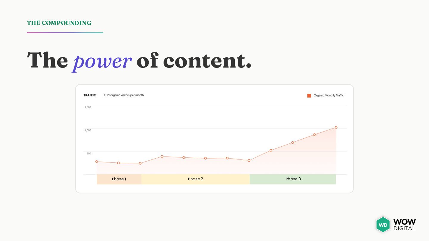
03 Know who’s visiting See what they’re reading Track who’s donating Real visitor data, not vanity metrics Spot the content that pulls traffic in Know your financial story in real time
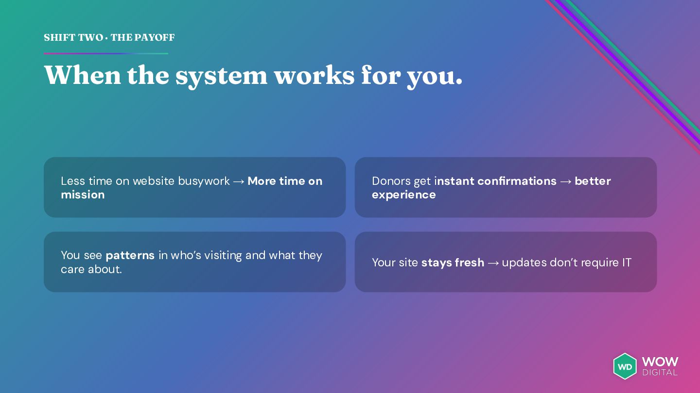
you. Less time on website busywork → More time on mission Donors get instant confirmations → better experience You see patterns in who’s visiting and what they care about. Your site stays fresh → updates don’t require IT
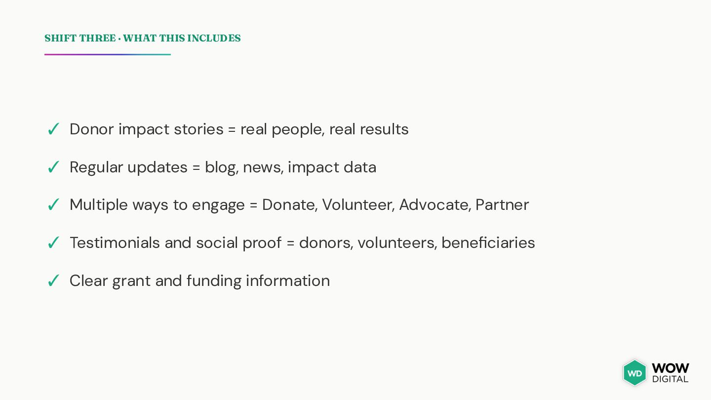
= real people, real results ✓ Regular updates = blog, news, impact data ✓ Multiple ways to engage = Donate, Volunteer, Advocate, Partner ✓ Testimonials and social proof = donors, volunteers, beneficiaries ✓ Clear grant and funding information
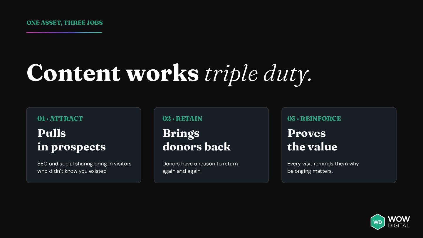
ATTRACT 02 · RETAIN 03 · REINFORCE Pulls in prospects Brings donors back Proves the value SEO and social sharing bring in visitors who didn’t know you existed Donors have a reason to return again and again Every visit reminds them why belonging matters.
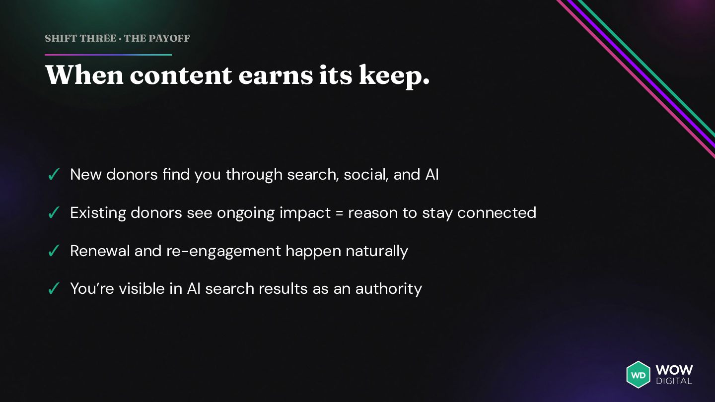
✓ New donors find you through search, social, and AI ✓ Existing donors see ongoing impact = reason to stay connected ✓ Renewal and re-engagement happen naturally ✓ You’re visible in AI search results as an authority
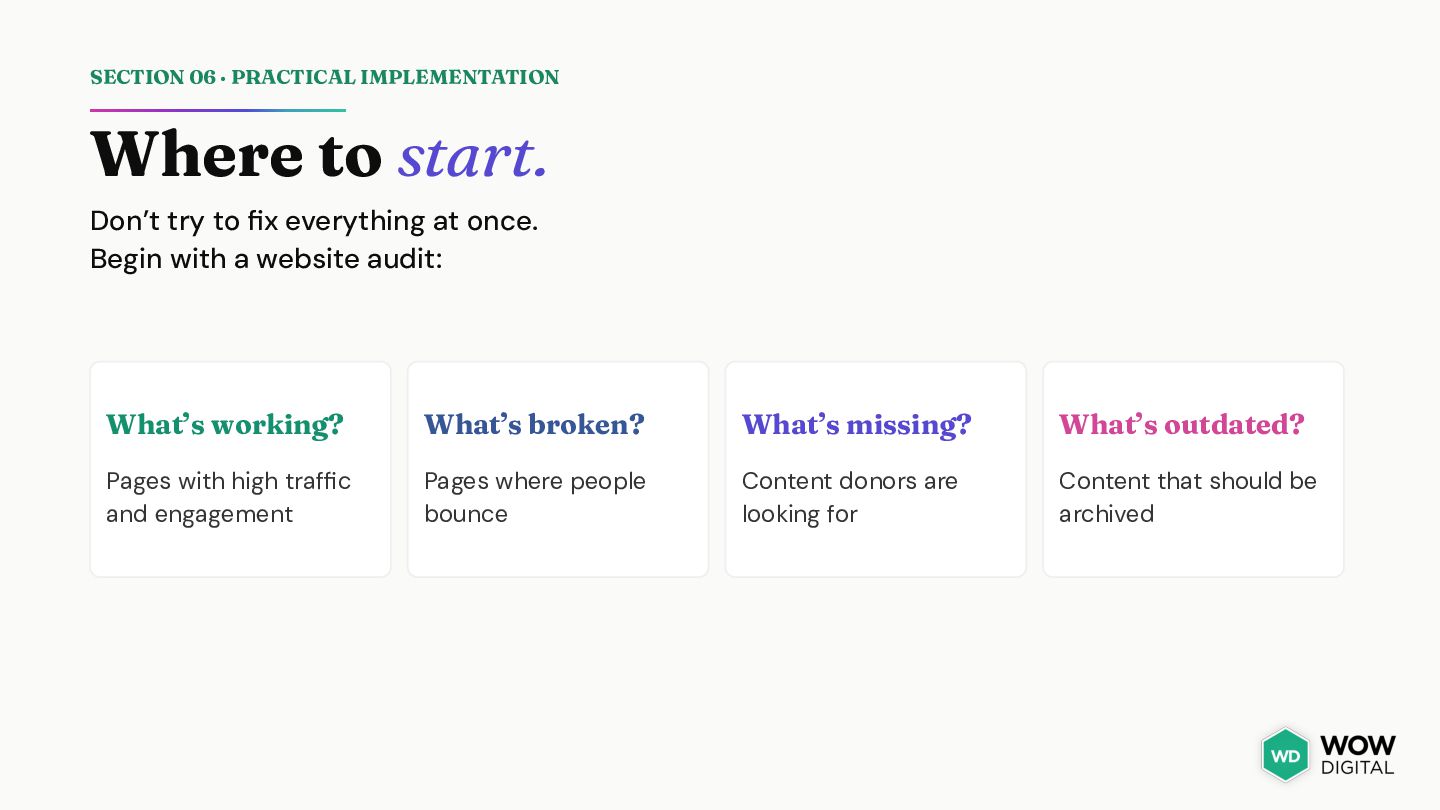
to fix everything at once. Begin with a website audit: What’s working? What’s broken? What’s missing? What’s outdated? Pages with high traffic and engagement Pages where people bounce Content donors are looking for Content that should be archived
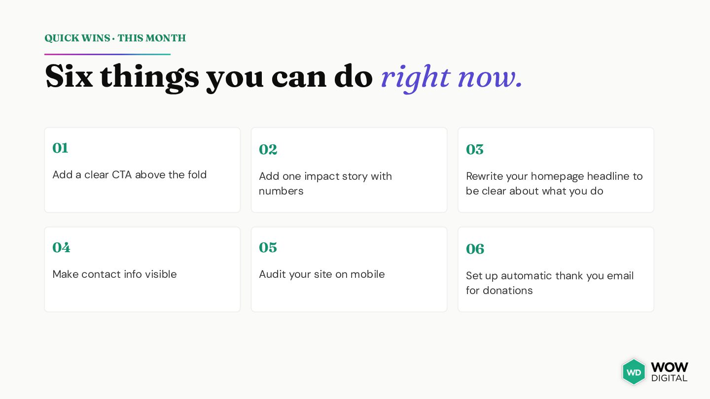
right now. 01 02 03 Add a clear CTA above the fold Add one impact story with numbers Rewrite your homepage headline to be clear about what you do 04 05 06 Make contact info visible Audit your site on mobile Set up automatic thank you email for donations
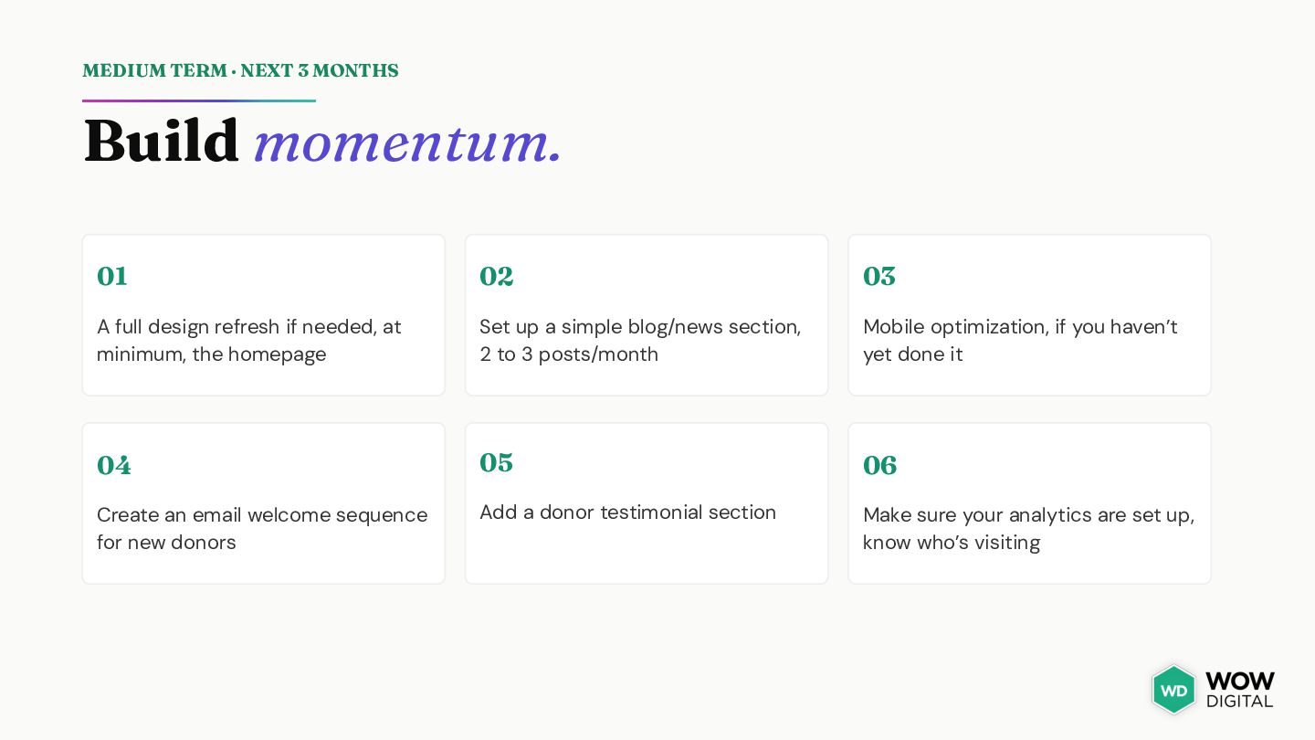
03 A full design refresh if needed, at minimum, the homepage Set up a simple blog/news section, 2 to 3 posts/month Mobile optimization, if you haven’t yet done it 04 05 06 Create an email welcome sequence for new donors Add a donor testimonial section Make sure your analytics are set up, know who’s visiting
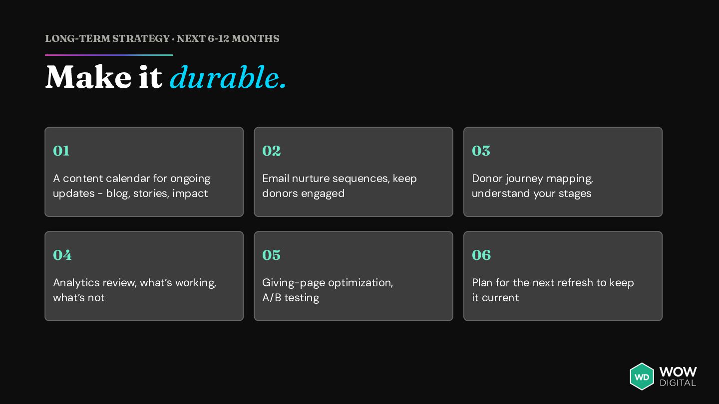
02 03 A content calendar for ongoing updates - blog, stories, impact Email nurture sequences, keep donors engaged Donor journey mapping, understand your stages 04 05 06 Analytics review, what’s working, what’s not Giving-page optimization, A/B testing Plan for the next refresh to keep it current
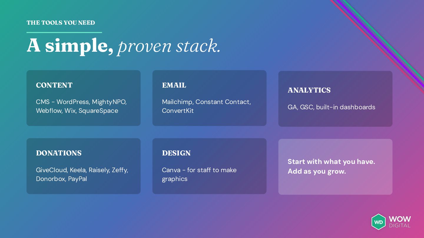
CMS - WordPress, MightyNPO, Webflow, Wix, SquareSpace Mailchimp, Constant Contact, ConvertKit DONATIONS DESIGN GiveCloud, Keela, Raisely, Zeffy, Donorbox, PayPal Canva - for staff to make graphics ANALYTICS GA, GSC, built-in dashboards Start with what you have. Add as you grow.
held back by a website. Donors want to help. Volunteers want to join. Funders want to support you. But only if your website makes it easy, and builds trust.
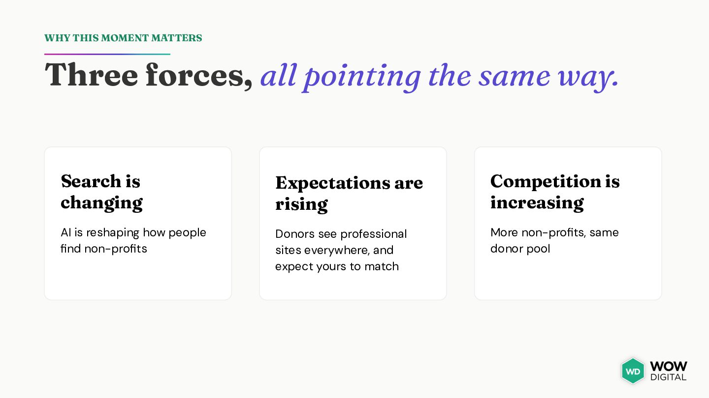
way. Search is changing Expectations are rising Competition is increasing AI is reshaping how people find non-profits Donors see professional sites everywhere, and expect yours to match More non-profits, same donor pool
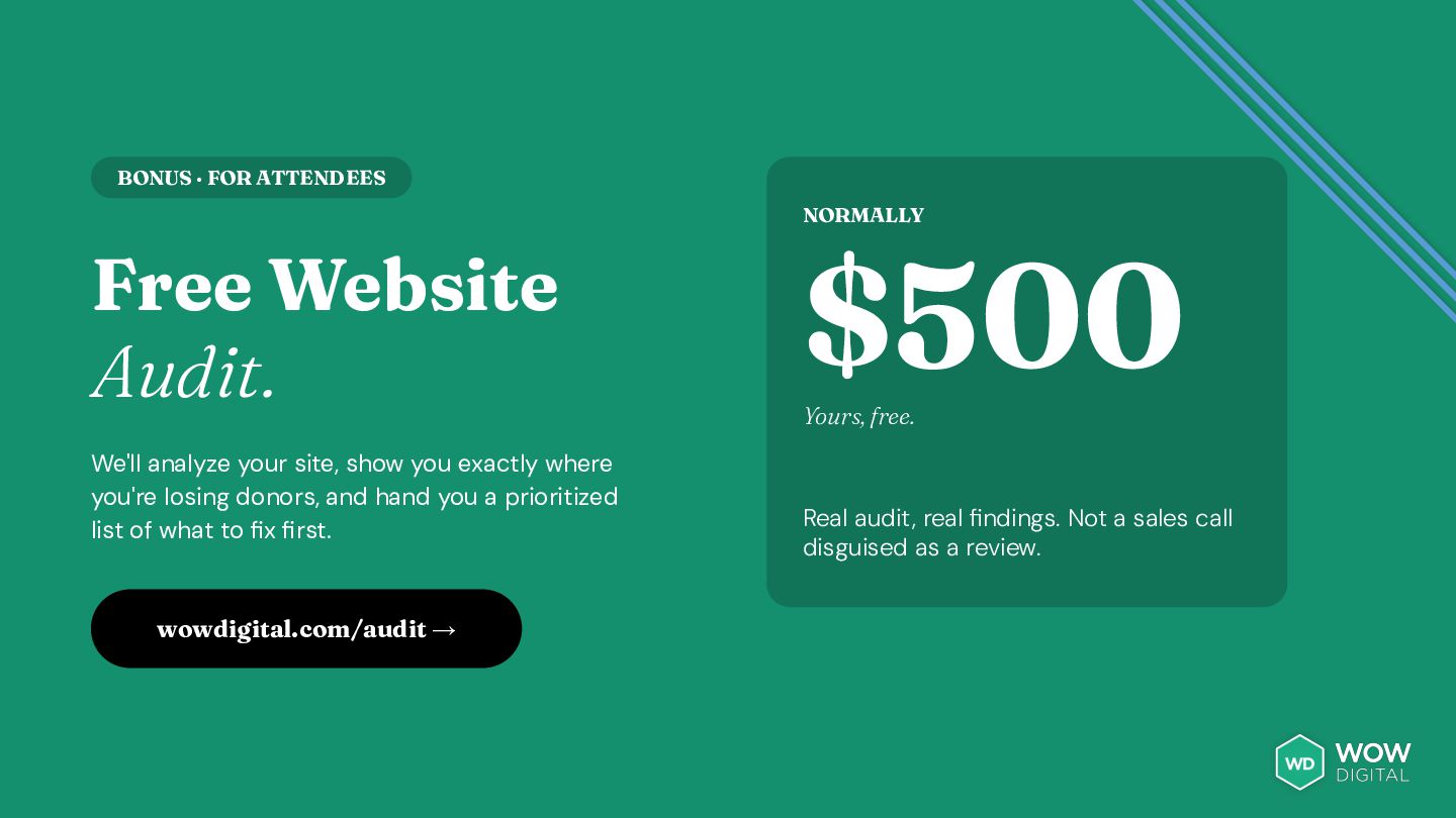
your site, show you exactly where you're losing donors, and hand you a prioritized list of what to fix first. wowdigital.com/audit → $500 Yours, free. Real audit, real findings. Not a sales call disguised as a review.
DO NEXT CEO & Founder 01 02 Reserve your free website audit 03 Let's build something great for your organization Coach & Mentor Visit wowdigital.com/nonprofit for resources & podcast wowdigital.com [email protected] 1.888.238.9679


 auctria
 reverentgeek
 csswizardry
 garrettdimon
 aleyda
 rkaga
rkaga
 notwaldorf
 tapps
tapps
 baasie
 honnibal
 tonyrice
 codingconduct