Upgrade to Pro
— share decks privately, control downloads, hide ads and more …
Speaker Deck
Features
Speaker Deck
PRO
Sign in
Sign up for free
Search
Search
Design Systems and Component Based Frontend
Search
Sponsored
·
Ship Features Fearlessly
Turn features on and off without deploys. Used by thousands of Ruby developers.
→
Bilal Çınarlı
June 27, 2019
Programming
170
0
Share
Embed
Copy iframe code
Copy JS code
Copy link
Start on current slide
Design Systems and Component Based Frontend
Bilal Çınarlı
June 27, 2019
More Decks by Bilal Çınarlı
See All by Bilal Çınarlı
Efficieny and Scaling in Frontend
bcinarli
0
52
Navigating with Unknowns
bcinarli
1
46
Story of a Boring Work
bcinarli
0
28
Refactoring Frontend
bcinarli
0
56
Accessible By Default!
bcinarli
0
110
Aninda Yüklenen Uygulamalar
bcinarli
0
150
Iletisimin Mühendisligi
bcinarli
0
68
Independently together: better developer experience & App performance
bcinarli
1
550
Developer Experience: How happy are your engineers?
bcinarli
0
290
Other Decks in Programming
See All in Programming
継続モナドとリアクティブプログラミング
yukikurage
3
610
地域 SRE コミュニティ最前線 - ホンマでっかSRE勉強会
tk3fftk
0
250
Terraform標準の組織で AWS CDKをどう使うか
mu7889yoon
0
290
なぜ関数型プログラミングで「型」と「証明」が語られるのか #fp_matsuri
kajitack
3
960
PHP Application における Kubernetes 内 gRPC 通信
ganchiku
0
500
【やさしく解説 設計編 #0】DDDのコード、読めるのに分からない人へ
panda728
PRO
2
270
【やさしく解説 設計編・中級 #6】良いアーキテクチャとは ~ 一本の登り道の、行き先 ~
panda728
PRO
0
170
LLMによるContent Moderationの本番運用の裏側と品質担保への挑戦
suikabar
3
860
コーディングルールの鮮度を保ちたい for SRE NEXT 2026 / keep-fresh-go-internal-conventions-sre-next-2026
handlename
0
140
20260623_Loop Engineeringで自分の分身の問い合わせBotを作る
ryugen04
0
220
音楽のための関数型プログラミング言語mimiumにおける多段階計算の活用
tomoyanonymous
1
340
5分で問診!Composer セキュリティ健康診断
codmoninc
0
340
Featured
See All Featured
Bash Introduction
62gerente
615
220k
How to build a perfect <img>
jonoalderson
1
5.8k
The Success of Rails: Ensuring Growth for the Next 100 Years
eileencodes
47
8.2k
AI Search: Implications for SEO and How to Move Forward - #ShenzhenSEOConference
aleyda
1
1.3k
The State of eCommerce SEO: How to Win in Today's Products SERPs - #SEOweek
aleyda
2
11k
Speed Design
sergeychernyshev
33
1.9k
Connecting the Dots Between Site Speed, User Experience & Your Business [WebExpo 2025]
tammyeverts
11
970
Why Mistakes Are the Best Teachers: Turning Failure into a Pathway for Growth
auna
0
180
Lightning talk: Run Django tests with GitHub Actions
sabderemane
0
220
How to Align SEO within the Product Triangle To Get Buy-In & Support - #RIMC
aleyda
2
1.7k
B2B Lead Gen: Tactics, Traps & Triumph
marketingsoph
0
170
DBのスキルで生き残る技術 - AI時代におけるテーブル設計の勘所
soudai
PRO
67
56k
Transcript
Design Systems & Component Based Frontend
Bilal Çınarlı Frontend Architect Software Engineer @Adidas @bcinarli github.com/bcinarli bcinarli.com
None
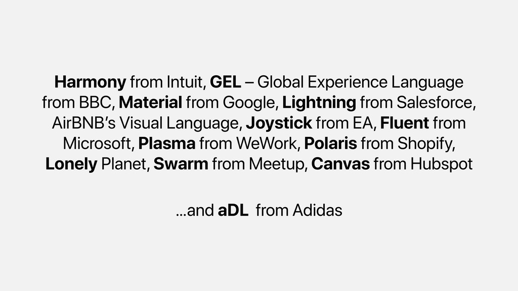
Harmony from Intuit, GEL – Global Experience Language from BBC,
Material from Google, Lightning from Salesforce, AirBNB’s Visual Language, Joystick from EA, Fluent from Microsoft, Plasma from WeWork, Polaris from Shopify, Lonely Planet, Swarm from Meetup, Canvas from Hubspot …and aDL from Adidas
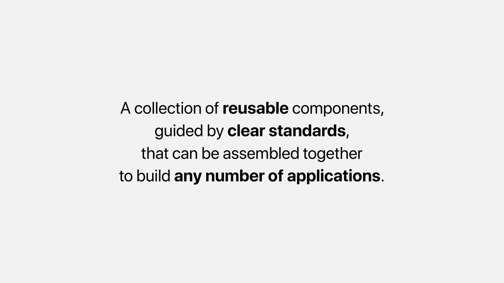
What is a design system?
A collection of reusable components, guided by clear standards, that
can be assembled together to build any number of applications.
None
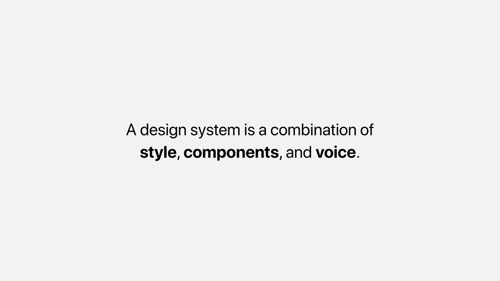
A design system is a combination of style, components, and
voice.
It is scalable at any level
Provides consistency between different pages and applications
With the set of rules and guides, increases the efficiency
Enhances the teamwork and eases the on-boarding of new members
http://bit.do/yarnds
http://bit.do/adl_
Components
Components support levels of abstraction in an application. It is
layered and feature-based.
Individual components provide decoupling which leads to better unit testings
and stability.
Design system and Components combine mostly in UI layer where
your presentation occurs
Besides, components can also communicate with the data layer while
rendering our content.
…and with the standardisation, it improves quality.
None
How Popular Libraries Think?
Build encapsulated components that manage their own state, then compose
them to make complex UIs.
Components define areas of responsibility in your UI that let
you reuse these sets of UI functionality.
It’s an abstraction that allows us to build large-scale applications
composed of small, self-contained, and often reusable components.
But the mainly, they should have a responsibility over a
single part.
None
How to Organise?
Define your folder structure based on their functionalities
Think of everything is sort-of a pluggable component. In most
cases, when you remove it, you should expect no traces left.
// DON’T . !"" controllers | !"" cart.js | #""
checkout.js !"" models | !"" cart.js | #"" checkout.js #"" views !"" cart.pug #"" checkout.pug // DO . !"" cart | !"" index.js | #"" template.pug #"" checkout !"" index.js #"" template.pug
…and tests are a part of your components.
// add test specs . !"" cart | !"" index.js
| !"" test.spec.js | #"" template.pug #"" checkout !"" index.js !"" test.spec.js #"" template.pug
Separate config and scripts away from your components.
. !"" config | !"" index.js | #"" server.js !""
scripts | !"" build.sh | #"" post-install.sh !"" test | !"" index.js | #"" setup.spec.js !"" cart | !"" index.js | !"" test.spec.js | #"" template.pug #"" checkout !"" index.js !"" test.spec.js #"" template.pug
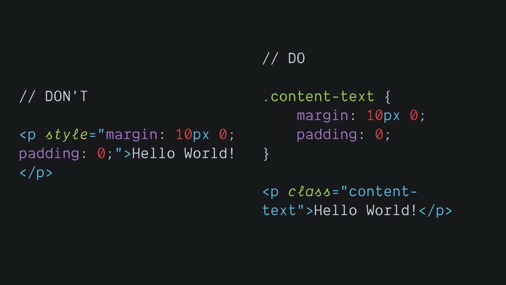
Keep HTML and CSS separate in your source code and
never inline manually
// DON’T <p style="margin: 10px 0; padding: 0;">Hello World! </p>
// DO .content-text { margin: 10px 0; padding: 0; } <p class="content- text">Hello World!</p>
Always think about specificity in CSS, try to avoid creating
specific selectors
// DON’T #main .article .title span { font-size: 32px; font-weight:
bold; } // DO .main-article-title { font-size: 32px; font-weight: bold; }
Do not write the code you are going to overwrite
// DON’T .content { display: flex; max-width: 1280px; margin: 0
auto; } .article { width: 900px; } .supplementary { width: 380px; } @media screen and (min-width: 48.0625em) and (max-width: 64em) { .article { width: 644px; } } @media screen and (max-width: 48em) { .content { flex-direction: column; } .article, .supplementary { width: 100%; } } // DO .content { max-width: 1280px; margin: 0 auto; } @media screen and (min-width: 48.0625em) { .content { display: flex; } .article { flex: 1; } .supplementary { width: 380px; } }
A way to unify different frameworks?
Web components are a set of web platform APIs that
allow you to create new custom, reusable, encapsulated HTML tags to use in web pages and web apps.
Custom components and widgets build on the Web Component standards,
will work across modern browsers, and can be used with any JavaScript library or framework that works with HTML.
<script type="module" src=“components/nav/app- drawer“></script> <app-drawer raised class=“indigo">raised</app-drawer>
<script> class AppDrawer extends HTMLElement {...} window.customElements.define('app-drawer', AppDrawer); </script> <app-drawer></app-drawer>
Good part, all JS frameworks outputs to HTML. Theoretically, we
can use any popular JS library to create Web Components
What is more?
Having self-contained, reusable components helps to turn you app to
micro frontends
… that can have independent deployment, build, coding
… leads to autonomous teams
… and you can have a shell that orchestrates which
micro frontend to load
… with the “Best Friend of Frontend"
Your components should not know what the dependencies are in
behind the curtains you are using.
It should only aware of which functions are available for
a particular action.
Every dependency comes with a technical debt for the future.
Thank you @bcinarli
 bcinarli
 yukikurage
 tk3fftk
 mu7889yoon
 kajitack
 ganchiku
 panda728
 suikabar
 handlename
 ryugen04
 tomoyanonymous
 codmoninc
 62gerente
 jonoalderson
 eileencodes
 aleyda
 sergeychernyshev
 tammyeverts
 auna
auna
 sabderemane
 marketingsoph
 soudai