Upgrade to Pro
— share decks privately, control downloads, hide ads and more …
Speaker Deck
Features
Speaker Deck
PRO
Sign in
Sign up for free
Search
Search
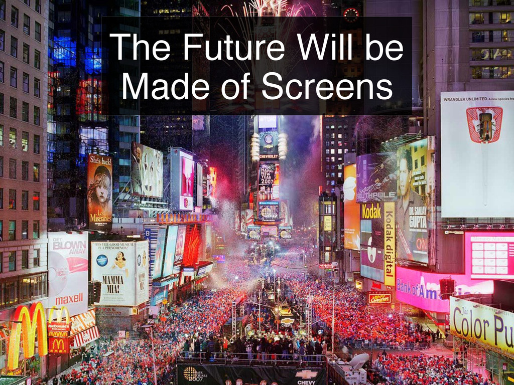
The Future Will be Made of Screens
Search
Sponsored
·
Your Podcast. Everywhere. Effortlessly.
Share. Educate. Inspire. Entertain. You do you. We'll handle the rest.
→
binx
February 24, 2012
320
3
Share
Embed
Copy iframe code
Copy JS code
Copy link
Start on current slide
The Future Will be Made of Screens
Presented at the February 2012 Designers & Geeks Meeup
binx
February 24, 2012
More Decks by binx
See All by binx
On the Importance of Iteration
binx
0
140
Designing for Spacecraft Operations
binx
2
650
Place and Space
binx
0
550
Error: Success
binx
0
550
Peak Visualization?
binx
1
620
The Data Visualization Hustle
binx
2
490
People, Not Users
binx
2
270
Data Collection and Memory
binx
1
250
The Road To Code
binx
1
420
Featured
See All Featured
The AI Revolution Will Not Be Monopolized: How open-source beats economies of scale, even for LLMs
inesmontani
PRO
3
3.5k
Practical Tips for Bootstrapping Information Extraction Pipelines
honnibal
25
2k
The Hidden Cost of Media on the Web [PixelPalooza 2025]
tammyeverts
2
340
Designing Powerful Visuals for Engaging Learning
tmiket
1
430
Writing Fast Ruby
sferik
630
63k
<Decoding/> the Language of Devs - We Love SEO 2024
nikkihalliwell
1
270
How To Stay Up To Date on Web Technology
chriscoyier
790
250k
Avoiding the “Bad Training, Faster” Trap in the Age of AI
tmiket
0
190
Large-scale JavaScript Application Architecture
addyosmani
515
110k
Google's AI Overviews - The New Search
badams
0
1.1k
世界の人気アプリ100個を分析して見えたペイウォール設計の心得
akihiro_kokubo
PRO
72
40k
Design and Strategy: How to Deal with People Who Don’t "Get" Design
morganepeng
133
19k
Transcript
The Future Will be Made of Screens
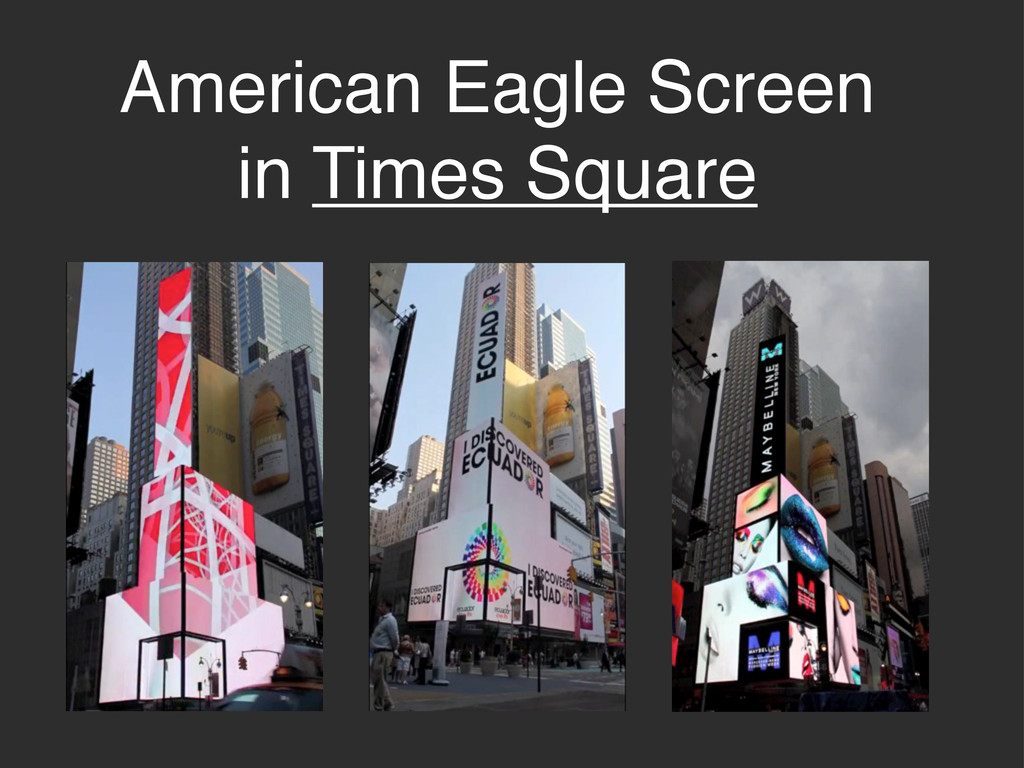
American Eagle Screen in Times Square
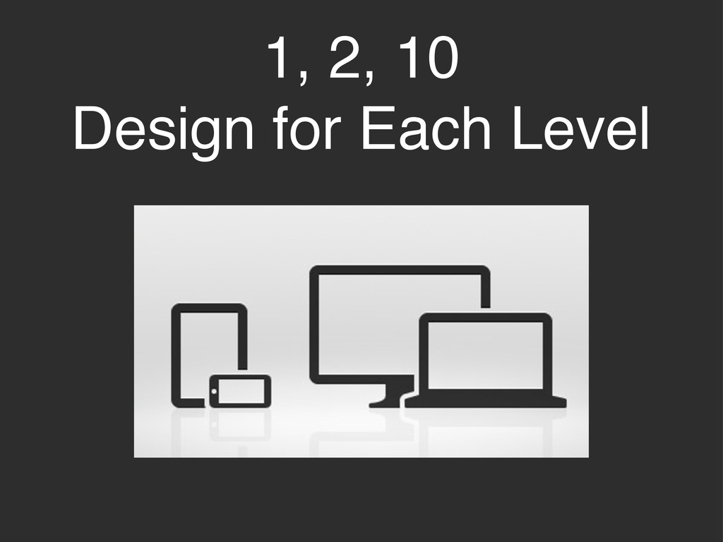
1, 2, 10 Design for Each Level
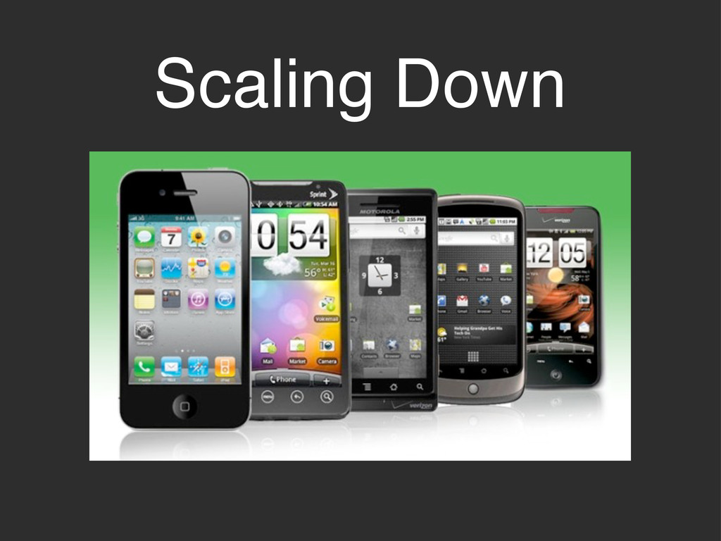
Scaling Down
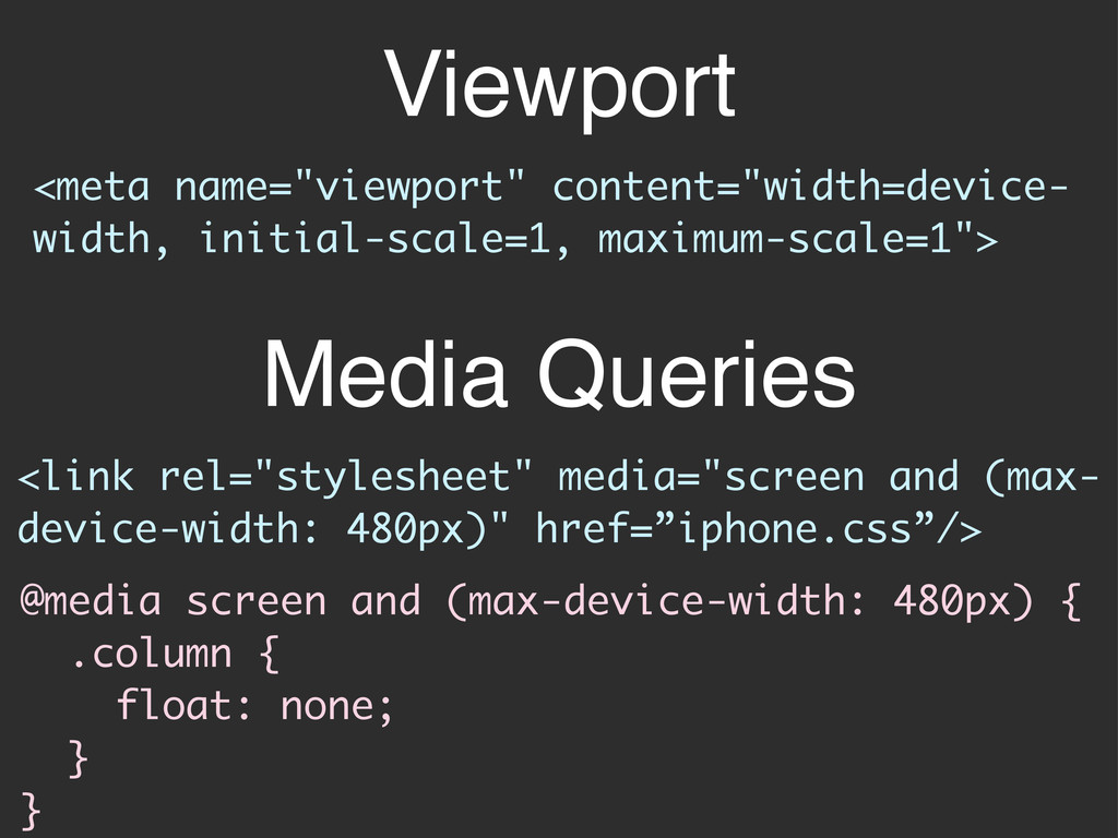
Viewport <link rel="stylesheet" media="screen and (max- device-width: 480px)" href=”iphone.css”/> <meta
name="viewport" content="width=device- width, initial-scale=1, maximum-scale=1"> @media screen and (max-device-width: 480px) { .column { float: none; } } Media Queries
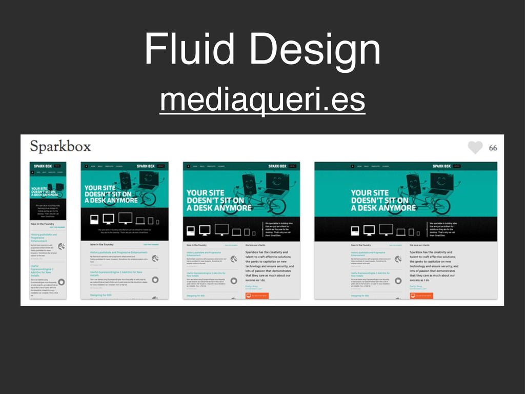
Fluid Design mediaqueri.es
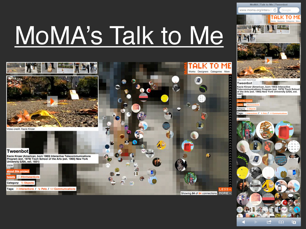
MoMA’s Talk to Me
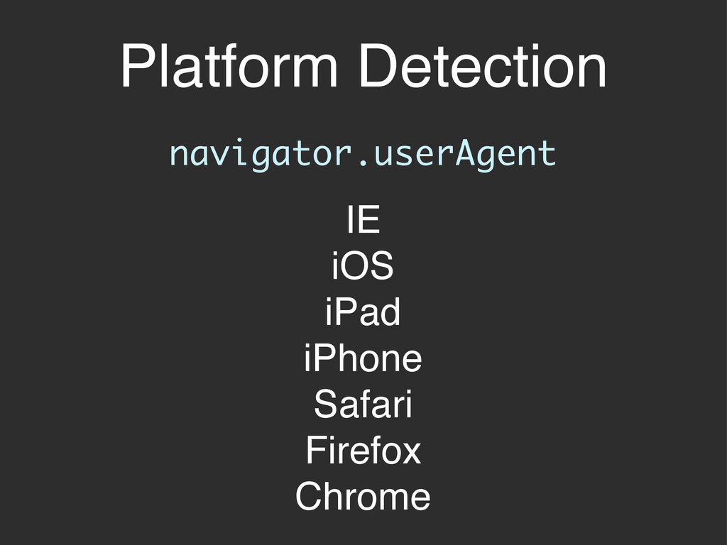
Platform Detection navigator.userAgent IE iOS iPad iPhone Safari Firefox Chrome
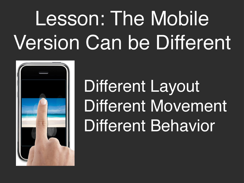
Lesson: The Mobile Version Can be Different Different Layout Different
Movement Different Behavior
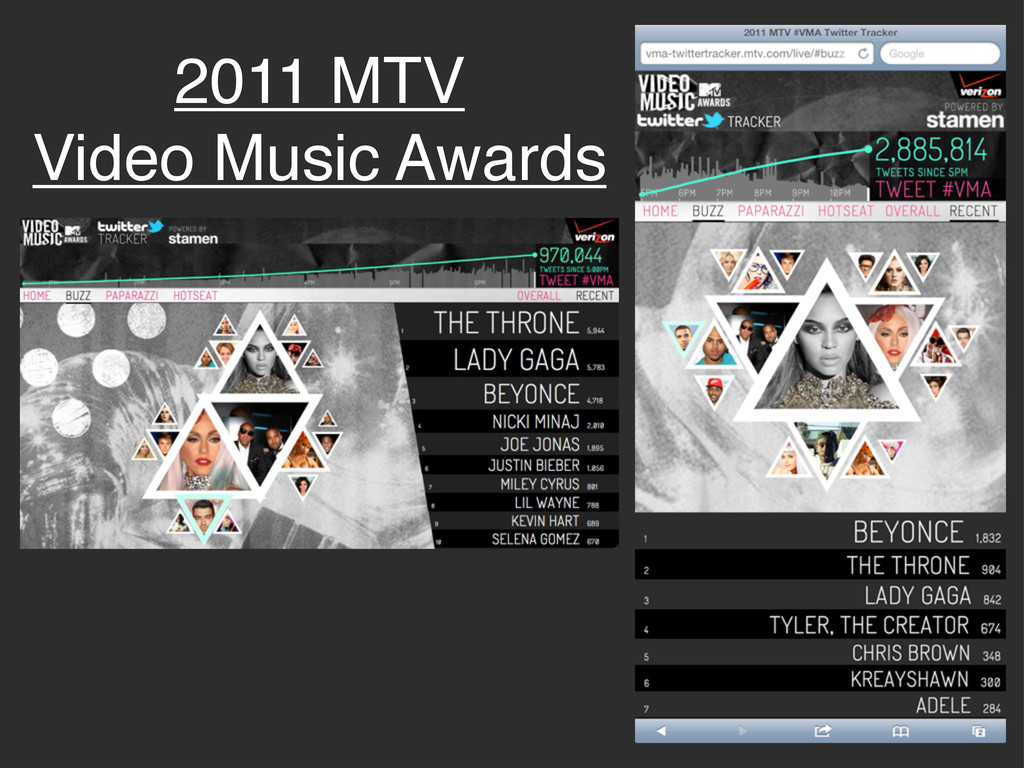
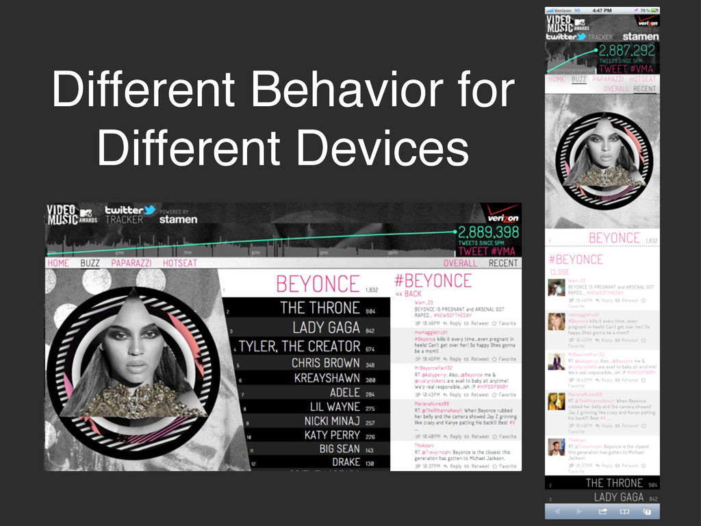
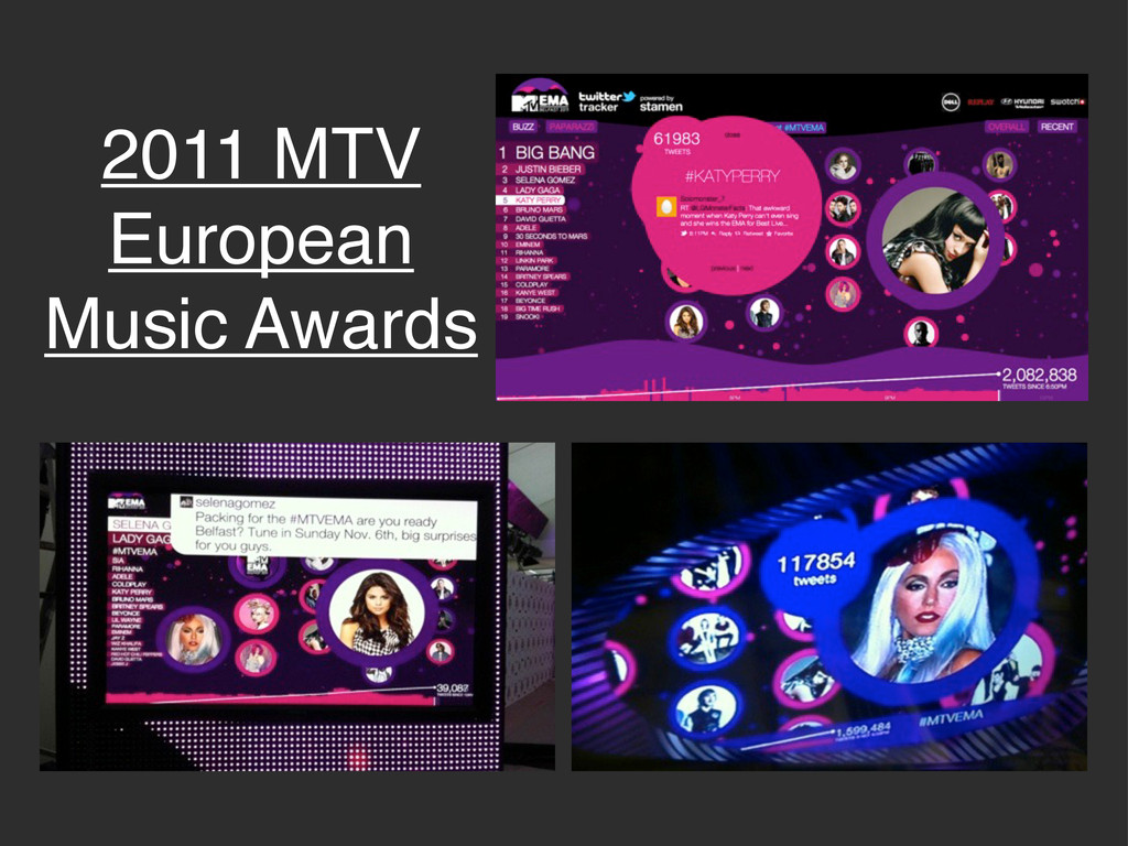
2011 MTV Video Music Awards
Different Behavior for Different Devices
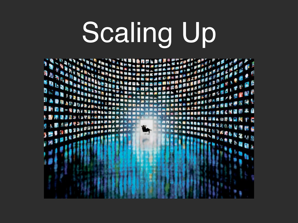
Scaling Up
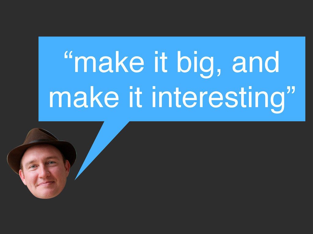
“make it big, and make it interesting”
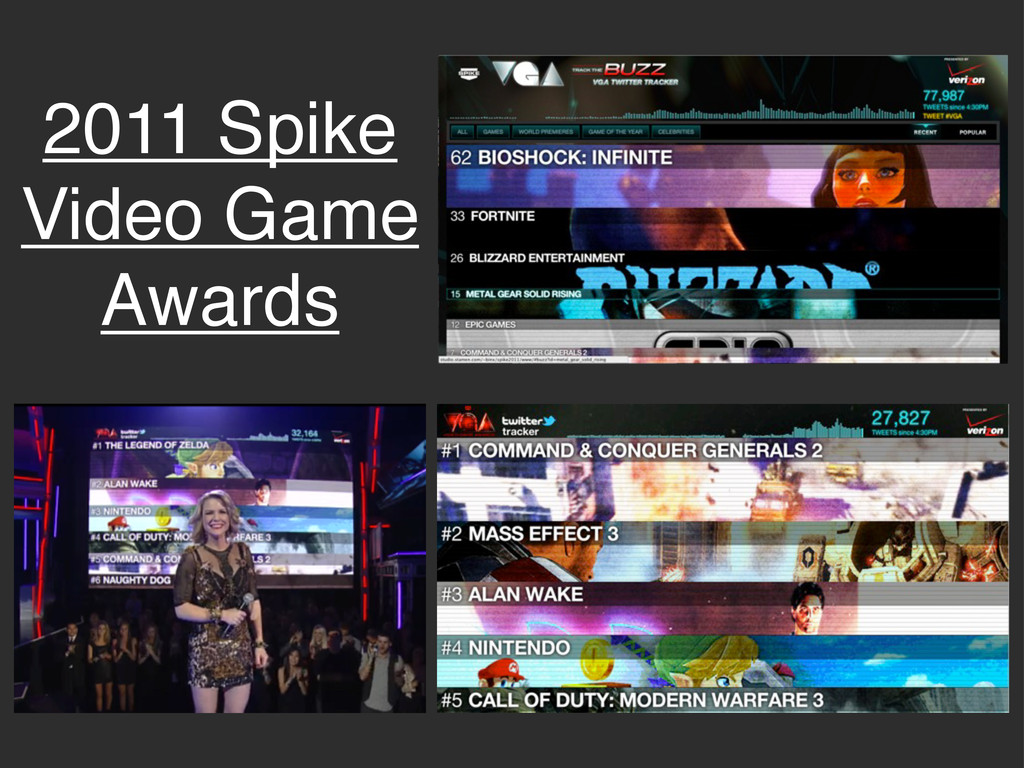
2011 Spike Video Game Awards
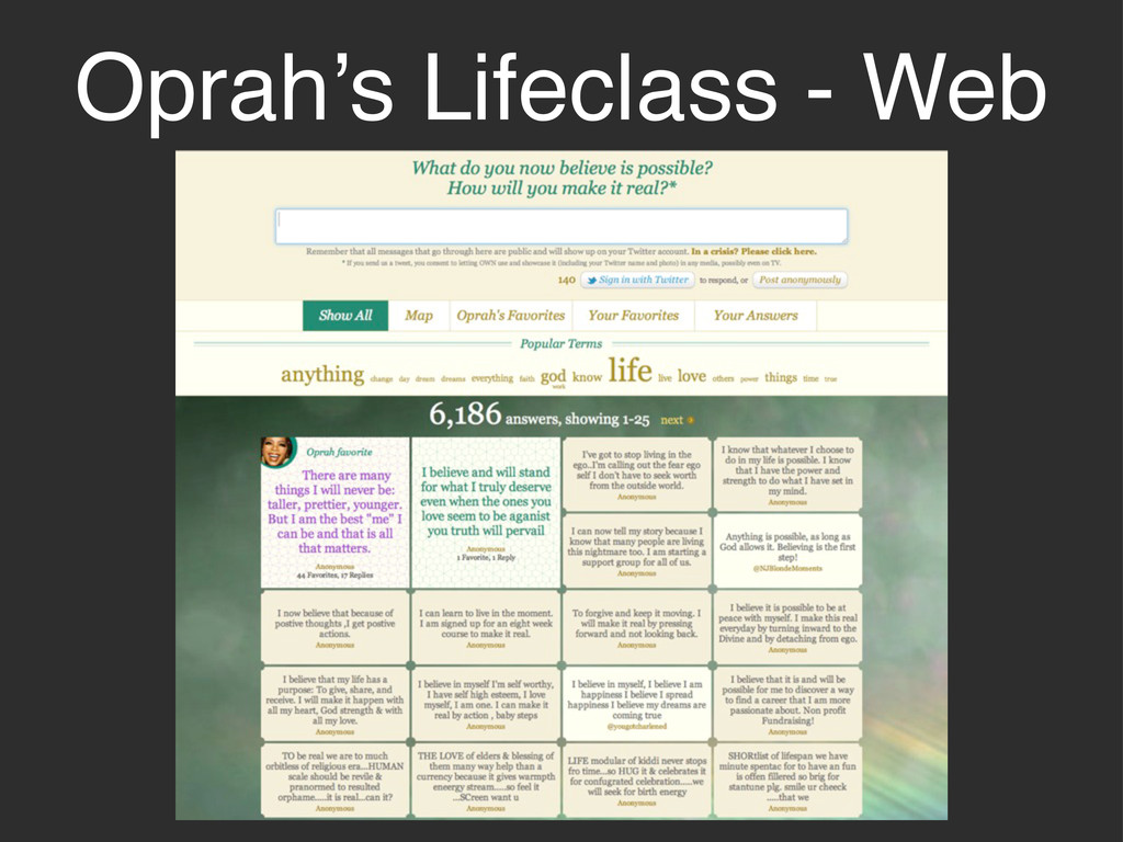
Oprah’s Lifeclass - Web
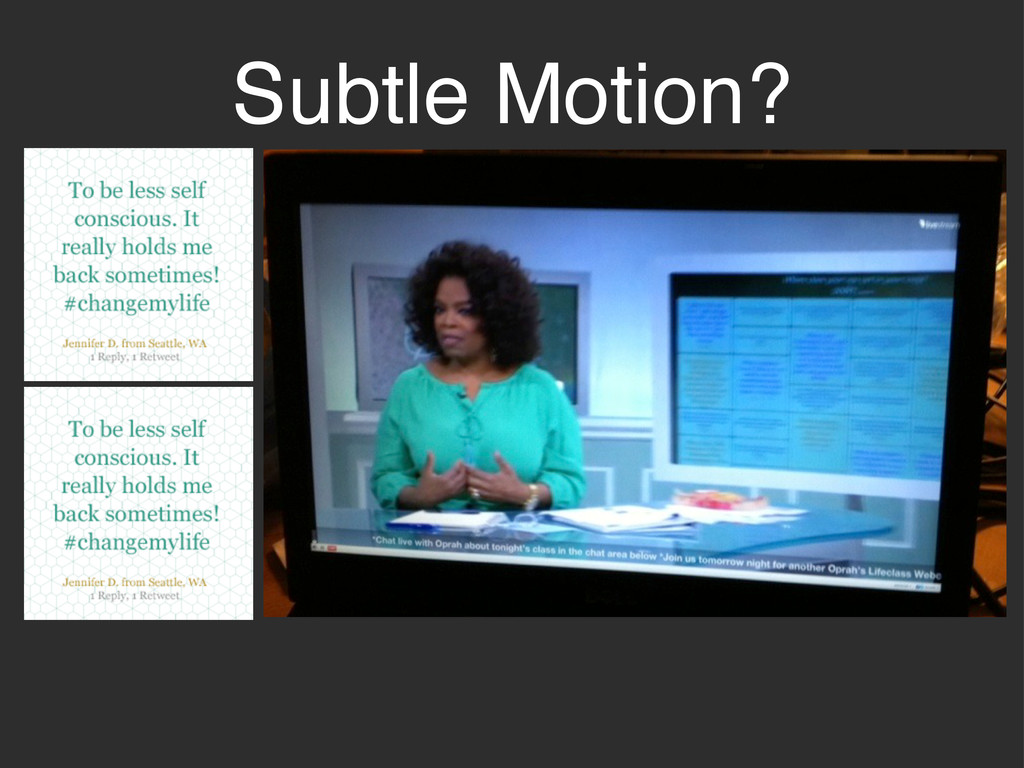
Subtle Motion?
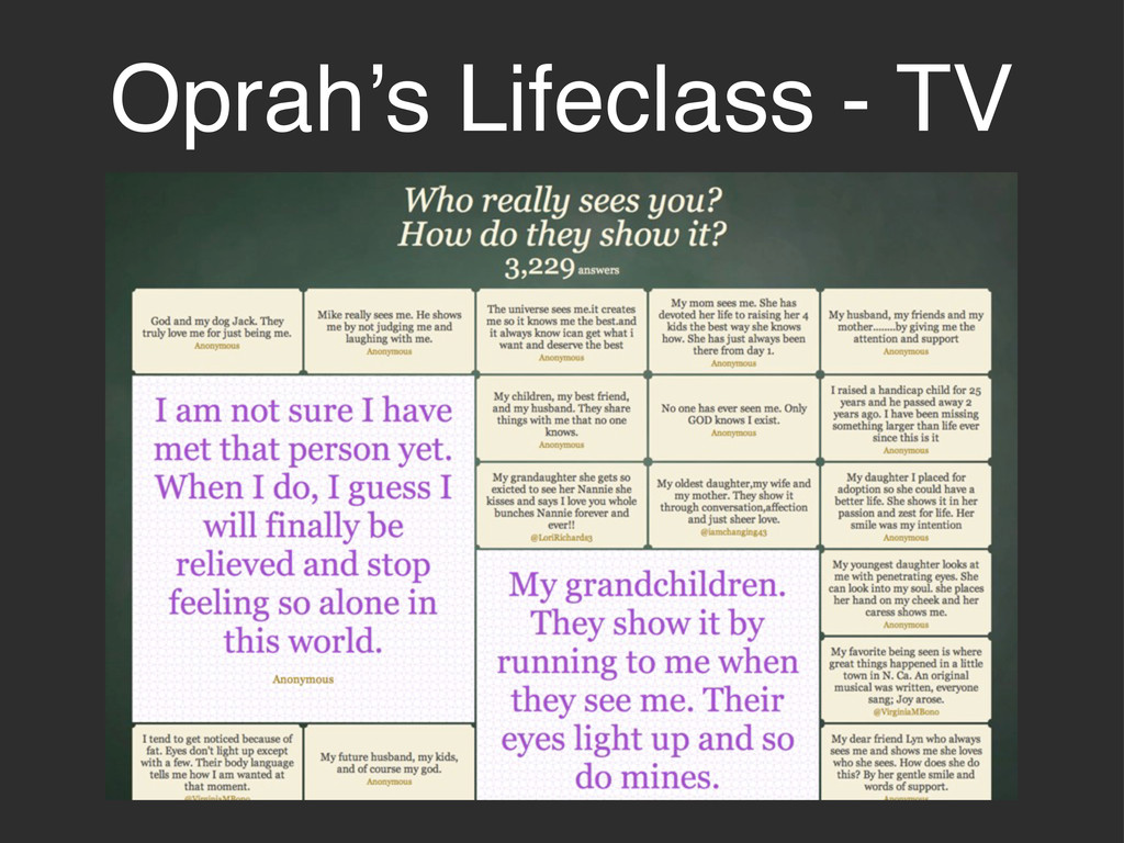
Oprah’s Lifeclass - TV
2011 MTV European Music Awards
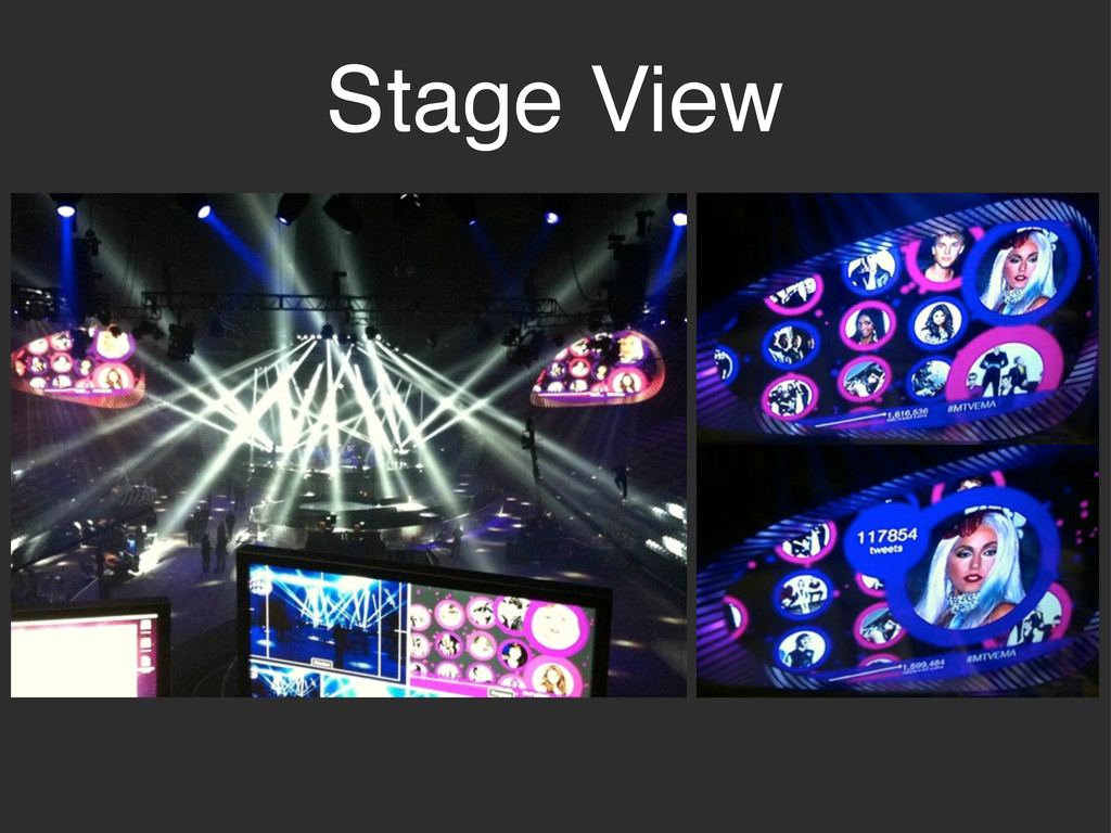
Stage View
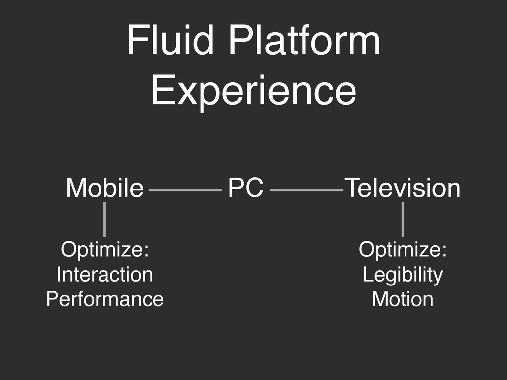
Fluid Platform Experience PC Mobile Television Optimize: Interaction Performance Optimize:
Legibility Motion
None
Thanks!
[email protected]
@rachelbinx
 Your Podcast. Everywhere. Effortlessly.
 binx
binx
 inesmontani
 honnibal
 tammyeverts
 tmiket
 sferik
 nikkihalliwell
 chriscoyier
 addyosmani
 badams
 akihiro_kokubo
 morganepeng
![Thanks! [email protected] @rachelbinx](https://files.speakerdeck.com/presentations/4f47ebb408476d00220014a6/slide_21.jpg)