Upgrade to Pro — share decks privately, control downloads, hide ads and more …

HTML5 goes Mobile.

HTML5 goes Mobile.

Boris Fründt

April 05, 2012
Tweet

More Decks by Boris Fründt

Other Decks in Technology

Transcript

  1. Der Speaker. • Boris Fründt • Senior Web Developer •

    Jung von Matt/next • bondt.me • @bondt 2 Donnerstag, 5. April 2012
  2. Die Agenda. • Die Abgrenzung. • Die Herausforderungen. • Der

    Begriff HTML5. • Der Stand der Entwicklung. • Die Lösungsansätze. • Das Fazit. • Der Ausblick. 3 Donnerstag, 5. April 2012
  3. • Viele verschiedene Geräte. • Unterschiedliche Display-Größen. • Variierende Fähigkeiten.

    • „Native-App-Experience“. • Geschwindigkeitsdefizite. • Schwieriges Testing und Debugging. Die Herausforderungen. 7 Donnerstag, 5. April 2012
  4. Der Begriff HTML5 - Semantik. • <header>, <footer>, <nav> •

    <section>, <article> • <hgroup>, <aside> • <progress>, <meter>, <details> 9 Donnerstag, 5. April 2012
  5. Der Begriff HTML5 - Formulare. Android type=“text“ Android type=“number“ iOS

    type=“email“ iOS type=“tel“ 10 Donnerstag, 5. April 2012
  6. Der Begriff HTML5 - Formulare. • Attribut „required“ • Attribut

    „placeholder“ • CSS Selector :invalid, :valid 11 Donnerstag, 5. April 2012
  7. Der Begriff HTML5 - Audio & Video. <video width="320" height="240"

    controls="controls"> <source src="movie.mp4" type="video/mp4" /> <source src="movie.ogg" type="video/ogg" /> Alternativer Inhalt. </video> <audio controls="controls"> <source src="song.ogg" type="audio/ogg" /> <source src="song.mp3" type="audio/mp3" /> Alternativer Inhalt. </audio> 12 Donnerstag, 5. April 2012
  8. Der Begriff HTML5 - Styles & Animationen. • CSS3! •

    Rounded Corners, Gradients, Drop Shadows, etc. • Transitions, Transformations, Animations. • 3D Transformationen. 13 Donnerstag, 5. April 2012
  9. Der Begriff HTML5 - Styles & Animationen. #box1 { !

    margin-left: 0; ! -webkit-transition: margin-left .5s ease-in-out; } #box1.active { margin-left: 95%; } 14 Donnerstag, 5. April 2012
  10. Der Begriff HTML5 - Styles & Animationen. #box2 { !

    -webkit-transition: -webkit-transform 1s ease-in-out; } #box2.active { ! -webkit-transform: scale(.75) rotateX(-52deg) rotateY (36deg) translate3d(600px, 389px, 0px); } 15 Donnerstag, 5. April 2012
  11. Der Begriff HTML5 - Styles & Animationen. @-webkit-keyframes blink {

    ! from { ! ! opacity: 0.0; ! ! font-size: 8px; ! } ! to { ! ! opacity: 1.0; ! ! font-size: 14px; ! } } #box3.active { -webkit-animation-name: blink; -webkit-animation-duration: 1s; -webkit-animation-iteration-count: infinite; -webkit-animation-timing-function: ease-in-out; -webkit-animation-direction: alternate; } 16 Donnerstag, 5. April 2012
  12. Der Begriff HTML5 - Geolocation. if (navigator.geolocation) { navigator.geolocation.getCurrentPosition(function(position) {

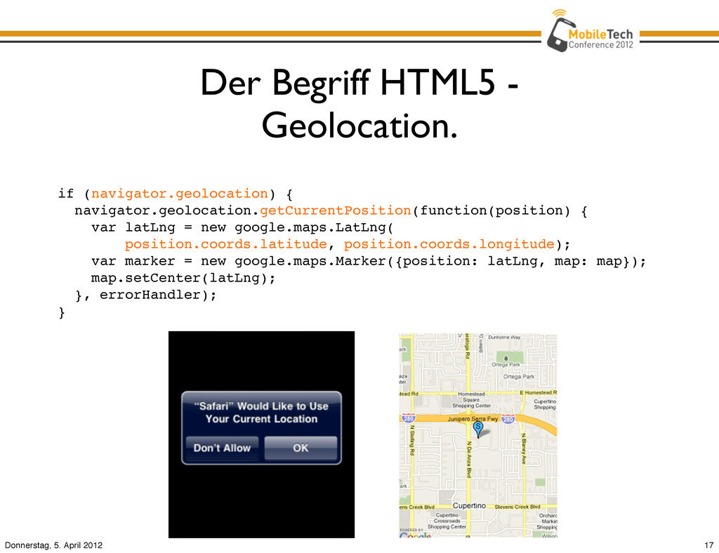
    var latLng = new google.maps.LatLng( position.coords.latitude, position.coords.longitude); var marker = new google.maps.Marker({position: latLng, map: map}); map.setCenter(latLng); }, errorHandler); } 17 Donnerstag, 5. April 2012
  13. Der Begriff HTML5 - Offline. • App Cache • Local

    storage, Indexed DB, WebSQL DB • History API 18 Donnerstag, 5. April 2012
  14. Der Begriff HTML5 - Device Orientation. window.addEventListener('deviceorientation', function(event) { var

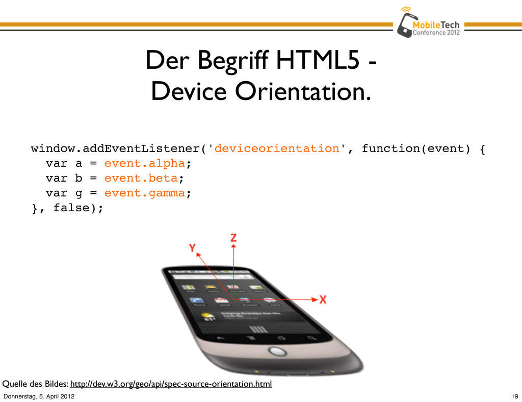
    a = event.alpha; var b = event.beta; var g = event.gamma; }, false); Quelle des Bildes: http://dev.w3.org/geo/api/spec-source-orientation.html 19 Donnerstag, 5. April 2012
  15. Der Begriff HTML5 - Canvas. • Simple API zum Zeichnen.

    • Zugriff auf Bild- und Video-Informationen. • Pixel-Manipulationen. • Niedrige Performance auf mobilen Geräten. 20 Donnerstag, 5. April 2012
  16. Der Begriff HTML5 - SVG. • Basiert auf XML. •

    Erstellung von simplen Objekten & Pfaden. • Einbindung von Bildern & Texten. • Möglich sind Styles, Transformationen, Animationen und Filter. • http://raphaeljs.com/ 22 Donnerstag, 5. April 2012
  17. Der Begriff HTML5 - WebGL. • OpenGL für Browser. •

    3D-Objekte im Browser. • Zukunftsmusik für mobile Geräte. 23 Donnerstag, 5. April 2012
  18. Der Stand der Entwicklung - Desktop vs. Mobile. Quelle: Morgan

    Stanley Research, 2010 24 Donnerstag, 5. April 2012
  19. Die Lösungsansätze - Polyfills. „A polyfill, or polyfiller, is a

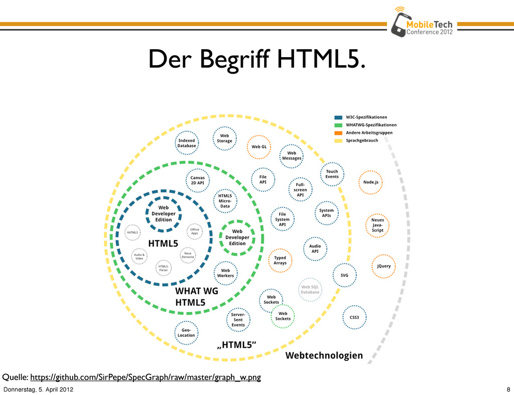
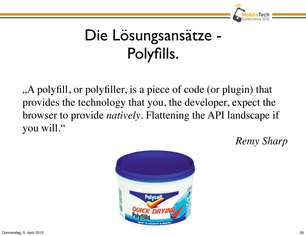
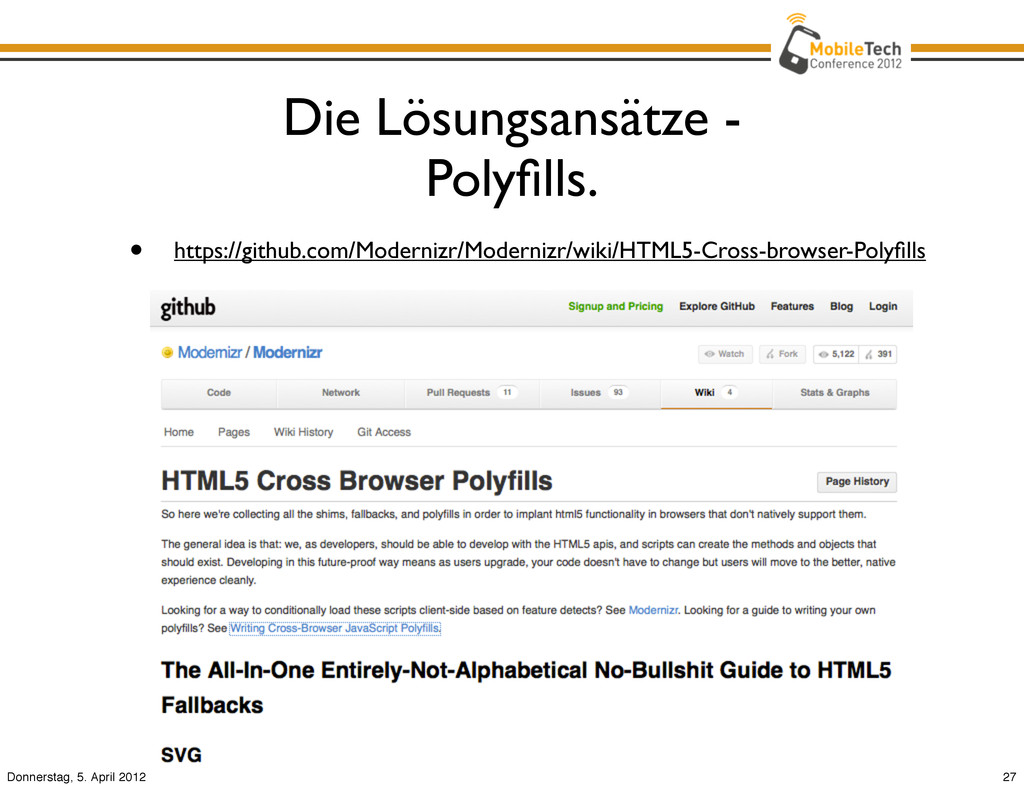
    piece of code (or plugin) that provides the technology that you, the developer, expect the browser to provide natively. Flattening the API landscape if you will.“ Remy Sharp 26 Donnerstag, 5. April 2012
  20. Die Lösungsansätze - CSS Media Queries. • @media (min-device-width: 640px)

    { ... } • @media screen and (device-aspect-ratio: 16/9) { ... } • @media (orientation:portrait) { ... } • <link rel="stylesheet" media="handheld, only screen and (max-device-width: 320px)" href="phone.css"> Quelle der Grafik: http://www.adobe.com/devnet/html5/articles/css3-basics.html 29 Donnerstag, 5. April 2012
  21. Die Lösungsansätze - Mobile Meta Tags. • <meta name="viewport" content="width=device-width,

    initial-scale=1.0, user-scalable=yes"> • <meta name="apple-mobile-web-app-capable" content="yes"> • <link rel="apple-touch-icon" href="/images/ icon.png" /> • <link rel="apple-touch-icon-precomposed" href="/ images/icon.png" /> 30 Donnerstag, 5. April 2012
  22. Die Lösungsansätze - Performance Optimierungen. • Keine iFrames verwenden (Share

    widgets). • Application Cache nutzen. • CSS/JS-Komprimierung (YUI Compressor, Closure Compiler). • CSS-Sprites verwenden. • Bilder komprimieren. • Skripte vor </body>. • Inline <style> vermeiden. • DOM-Manipulationen reduzieren. 31 Donnerstag, 5. April 2012
  23. Die Lösungsansätze - Tools & Helfer. • HTML5 Boilerplate •

    modernizr • jQuery + jQuery Mobile • iScroll 32 Donnerstag, 5. April 2012
  24. Die Lösungsansätze - Tools & Helfer: HTML5 Boilerplate. • Sammlung

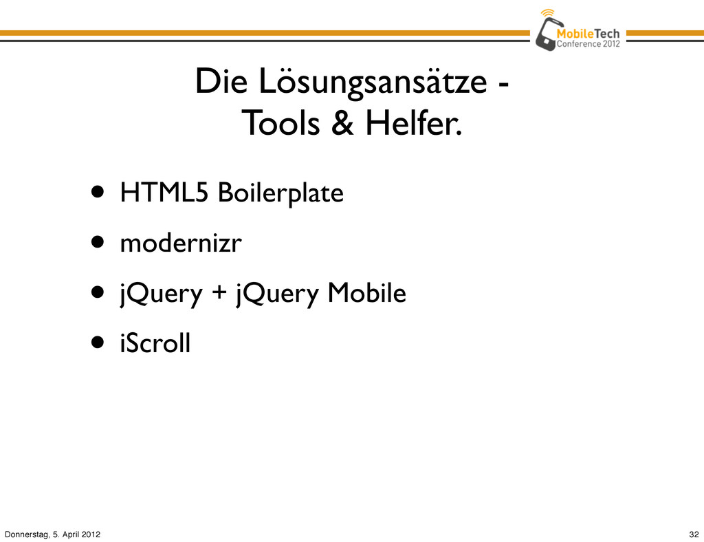
    von Best Practices • professionelles HTML/CSS/JS-Template • http://de.html5boilerplate.com/ • http://html5boilerplate.com/mobile 33 Donnerstag, 5. April 2012
  25. Die Lösungsansätze - Tools & Helfer: modernizr. • Open-Source JS

    Library • Feature Detection • Hilft bei Progressive Enhancement • http://www.modernizr.com/ 34 Donnerstag, 5. April 2012
  26. Die Lösungsansätze - Tools & Helfer: jQuery Mobile. • Web

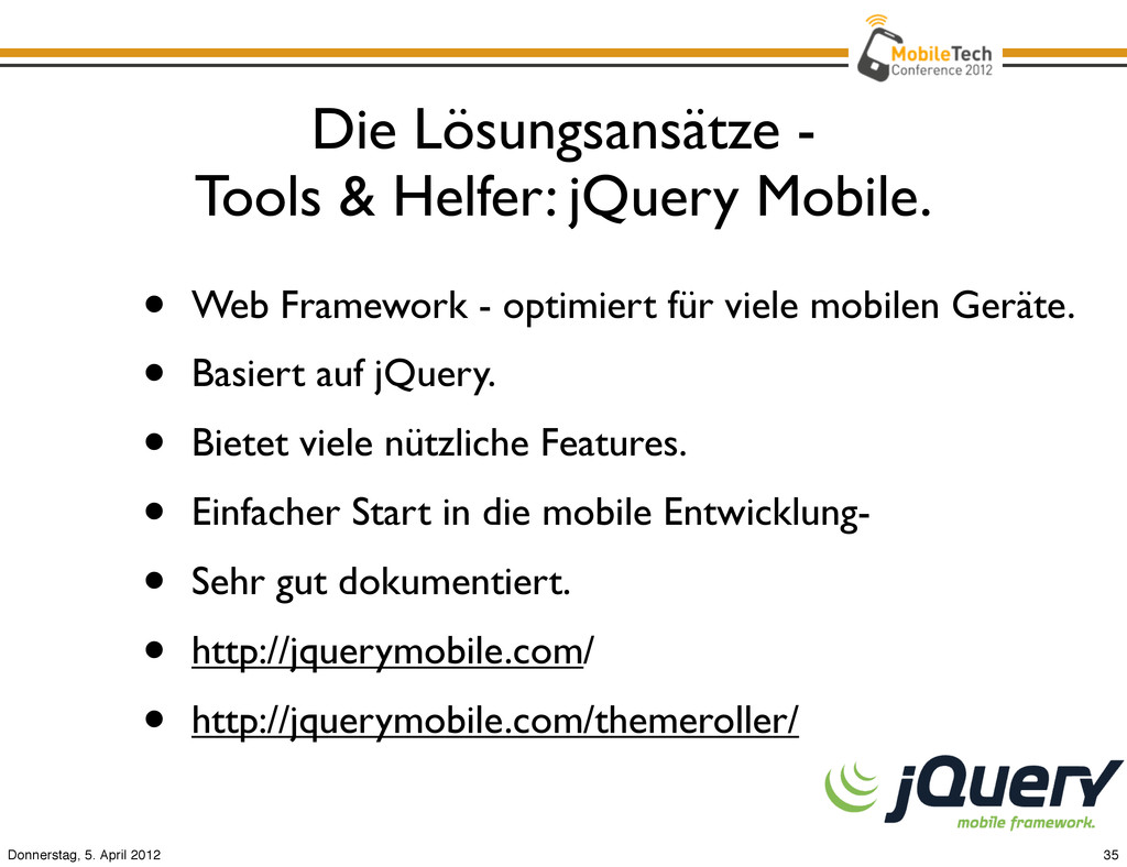
    Framework - optimiert für viele mobilen Geräte. • Basiert auf jQuery. • Bietet viele nützliche Features. • Einfacher Start in die mobile Entwicklung- • Sehr gut dokumentiert. • http://jquerymobile.com/ • http://jquerymobile.com/themeroller/ 35 Donnerstag, 5. April 2012
  27. Die Lösungsansätze - Tools & Helfer: iScroll. • JS Bibliothek

    für Cross Browser „Scroll-Inside-Verhalten“ • http://cubiq.org/iscroll-4 36 Donnerstag, 5. April 2012
  28. Die Lösungsansätze - Testing & Debugging. • Remote Debugging mit

    Weinre / Adobe Shadow. 37 Donnerstag, 5. April 2012
  29. Das Fazit. • Mobile Web Apps haben Nachteile. • ABER

    - sie bieten auch viele Vorteile. • Entwicklung hat große Reichweite. • geringere Entwicklungskosten. • keine Updates notwendig. • „Native-App-Experience“ kann (nahezu) erreicht werden. 38 Donnerstag, 5. April 2012
  30. • Viele verschiedene Geräte. • Unterschiedliche Display-Größen. • Variierende Fähigkeiten.

    • „Native-App-Experience“. • Geschwindigkeitsdefizite. • Schwieriges Testing und Debugging. Die Herausforderungen. 39 Donnerstag, 5. April 2012
  31. Das Fazit. • Mobile Web Apps haben Nachteile. • ABER

    - sie bieten auch viele Vorteile. • Entwicklung hat große Reichweite. • Geringere Entwicklungskosten. • Keine Updates notwendig. • „Native-App-Experience“ kann (nahezu) erreicht werden. 40 Donnerstag, 5. April 2012
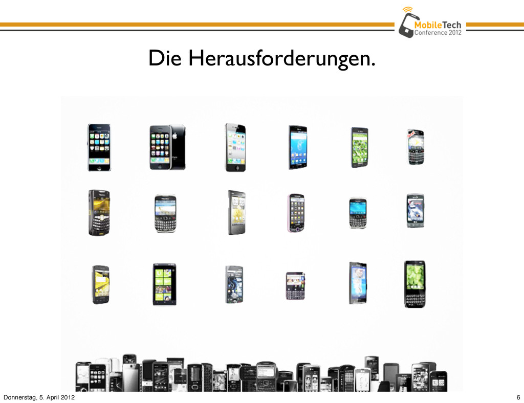
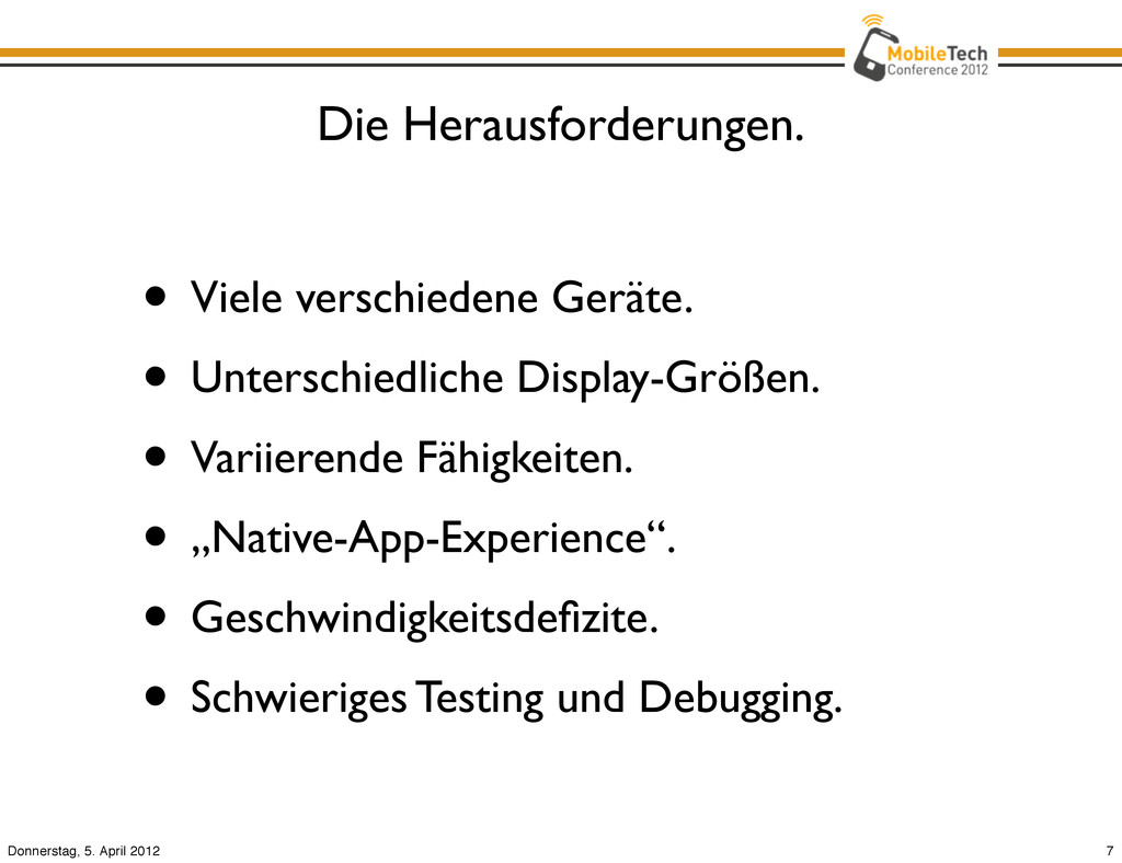
  32. Der Ausblick. • Höhere Geräte-Performance. • Schnellere Verbindungen. • Bessere

    Tools. • Mobile Device APIs: Camera, Battery Status, Contacts, Messaging, Network Information API, etc. 41 Donnerstag, 5. April 2012