a Business Site * Know nothing about WP * PHP Guru or CSS Master * John Stamos I love WordPress! Someone who needs to use responsive design! Saturday, January 19, 13
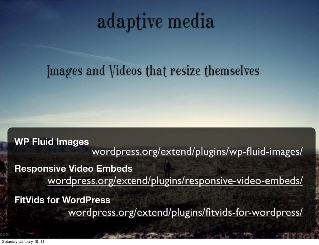
Fluid Images Responsive Video Embeds wordpress.org/extend/plugins/responsive-video-embeds/ FitVids for WordPress wordpress.org/extend/plugins/fitvids-for-wordpress/ Saturday, January 19, 13
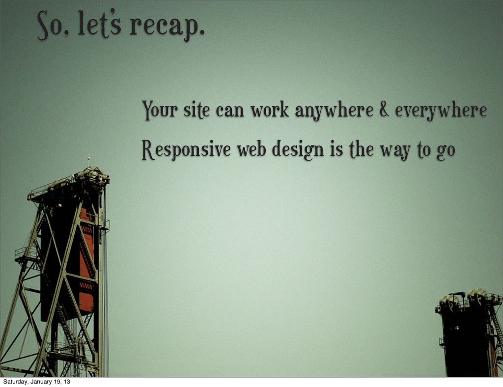
optimize for those devices first * Simplify your site for all devices, desktop, and mobile * Don’t be afraid to go test at the AT&T store Saturday, January 19, 13
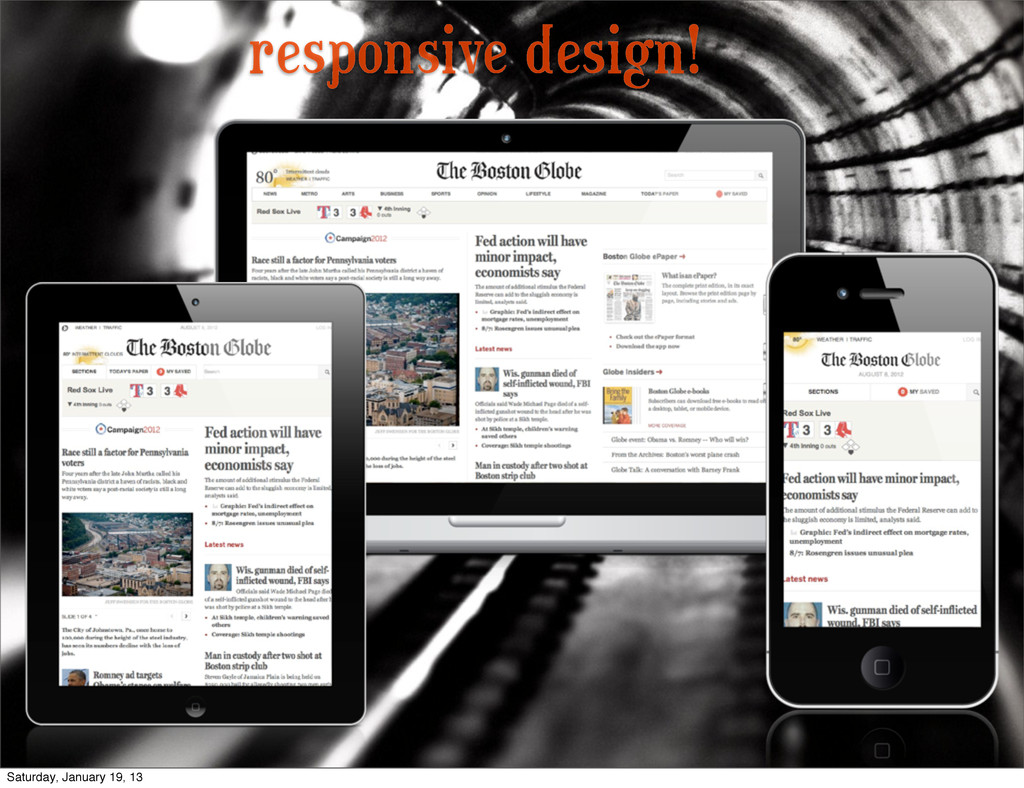
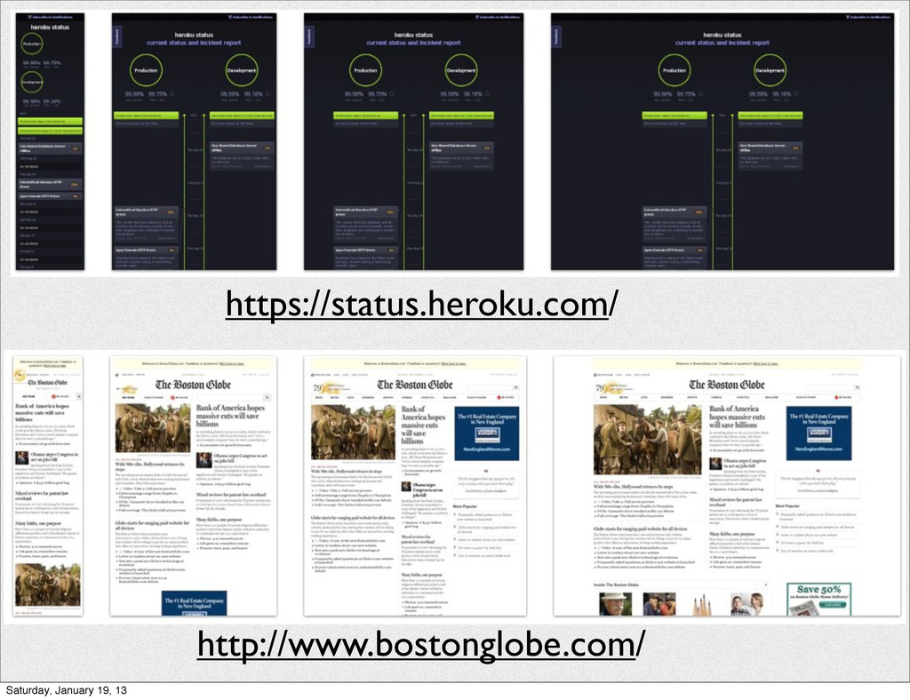
plugins out there to help Responsive web design is the way to go Your site can work anywhere & everywhere John Stamos loves WordPress Saturday, January 19, 13
 bradp
bradp
 tammyeverts
 skipperchong
 cassininazir
 szymonslowik
 chikuwait
 davidcarrasco
 tmiket
 vanstee
 irinanazarova
 inesmontani
![@BradParbs Brrad.com [email protected] Go make your site responsive right meow!](https://files.speakerdeck.com/presentations/6166c18043c40130f33f1231381d4ca8/slide_73.jpg)