Upgrade to Pro — share decks privately, control downloads, hide ads and more …

Characteristics of a well-designed UI

Characteristics of a well-designed UI

"Designing a good user interface is like tightrope walking: it's all about finding the right balance."

Translated slides for a presentation I gave at Luca School of Arts, Gent, March and November 2015.

(Slightly updated November 2015)

Thomas Byttebier

March 02, 2015
Tweet

More Decks by Thomas Byttebier

Other Decks in Design

Transcript

  1. User interfaces Characteristics of a well-designed UI These slides are

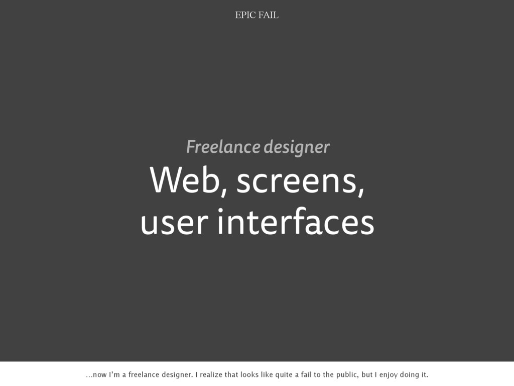
    the blueprint of a presentation I did at Luca School of Arts in March 2015. I tried to make them understandable to people that didn’t attend by including these quick notes.
  2. Web, screens, user interfaces Freelance designer EPIC FAIL …now I’m

    a freelance designer. I realize that looks like quite a fail to the public, but I enjoy doing it.
  3. “A picture is worth a thousand words. An interface is

    worth a thousand pictures.” —Ben Shneiderman, 2003 also says a lot about the power of a UI
  4. You don’t want to impress as a UI designer. You

    want a good product. Probably the most important thing I learned over the years.
  5. “As far as the customer is concerned, the interface is

    the product.” —Jef Raskin, 2001
  6. What’s the characteristics of a good designed user interface? No

    reason to be scared. Let’s introduce some real order here. I’ll give you 8 characteristics of a good designed UI.
  7. Read this book! Short resume: you don’t want to make

    your users think when they’re using your interface.
  8. Messages iOS Messages app: excellent example of a clear user

    interface. All mums will instantly understand this.
  9. Dropbox Things These parts of the apps require content. User

    hasn’t added content yet. What a perfect place to display a clear, helpful message.
  10. No content yet: helpful information in a more personal way.

    Nicer than just showing an empty screen.
  11. Only use an icon if its message is a 100%

    clear to everyone Let’s talk icons… they’re an essential part in every UI design.
  12. Apple Mail. I always have to think twice what button

    to click for composing a new email.
  13. WTF? WTF!? Later update added this. Hoping to draw more

    user’s attention to the functionality?
  14. Recently Instagram added a message to the top of the

    stream to explain users what the icon means. It’s like saying: we know it’s not clear…
  15. It’s in our nature to stay away from the unknown.

    When Google hid links behind this icon, they got tons of support requests: ‘where’s my apps?’
  16. Clear icons yet ambiguous in this context. I’ve for sure

    clicked the wrong icon more than once!
  17. Tweetbot Clear icons in the context of Twitter. Twitter users

    will recognize these. Seems okay to me for that reason.
  18. Rdio Mac app: most icons are clear in the context

    of a music player. One icon has 2 meanings though: volume and currently playing song.
  19. Rdio Talking about icons… let’s discuss the popular hamburger icon.

    It’s beautiful and saves a lot of space. But is it clear enough?
  20. Simple change 20% increase in clicks http://exisweb.net/menu-eats-hamburger One test reveals

    a 20% increase in clicks by using the word ‘menu’ instead of the hamburger icon.
  21. This makes no sense at all: there’s more than enough

    space to display the full navigation.
  22. Facebook Also excellent: they don’t just use icons but they

    add text labels to them. A text label is always clearer than an icon.
  23. Unclear icons but still want to use them by all

    means? Always add text labels!
  24. Menu… or… hmmm… Wish list, isn’t that clear? App Store

    Just when you thought you recognized the hamburger icon… grrr… lol!
  25. “All text needs legible typefaces. But especially at interfaces, our

    eyes need fonts that cooperate rather than resist.” —Tobias Frere-Jones
  26. It has to be invisible Roboto Clarendon Clarendon is a

    beautiful typeface, but is too present in all its glory. It may distract the user from her tasks and goals.
  27. It has to be clear in small font-sizes Text easily

    gets really small in user interfaces.
  28. What’s more readable? Lucida Grande Helvetica Neue Submit question Submit

    question Half close your eyes. Which button is more readable?
  29. Much criticism from the design community when Apple switched from

    Lucida Grande to Helvetica Neue in OS X Yosemite…
  30. Lucida Grande Helvetica Neue Milliliter Milliliter Roboto Milliliter …Spiekermann tip:

    half close your eyes, try to read that word in Helvetica Neue and you’ll see why.
  31. You want clear passwords, tables or data comparisons Verdana Gill

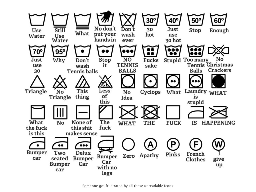
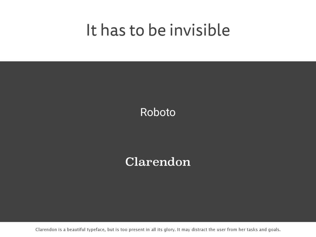
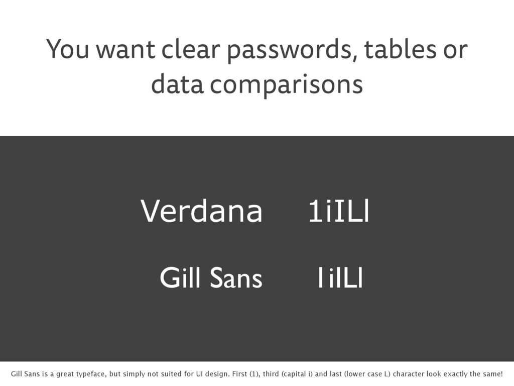
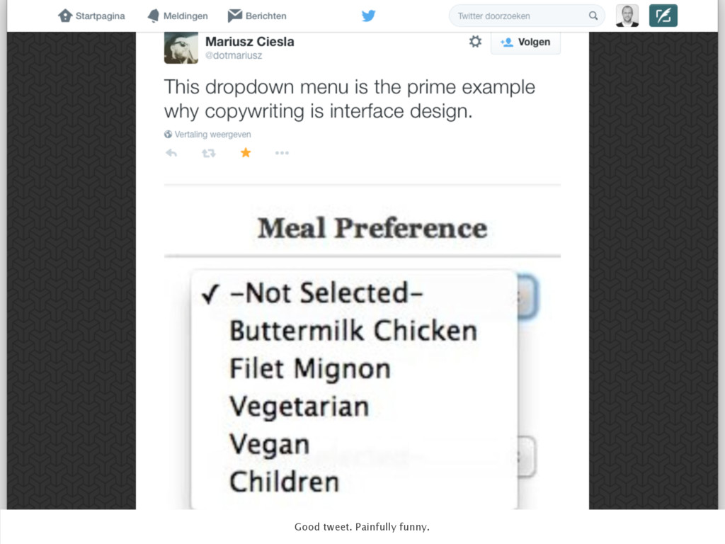
    Sans 1iILl 1iILl Gill Sans is a great typeface, but simply not suited for UI design. First (1), third (capital i) and last (lower case L) character look exactly the same!
  32. Lucida Grande Submit question Verdana Submit question Fira Sans Submit

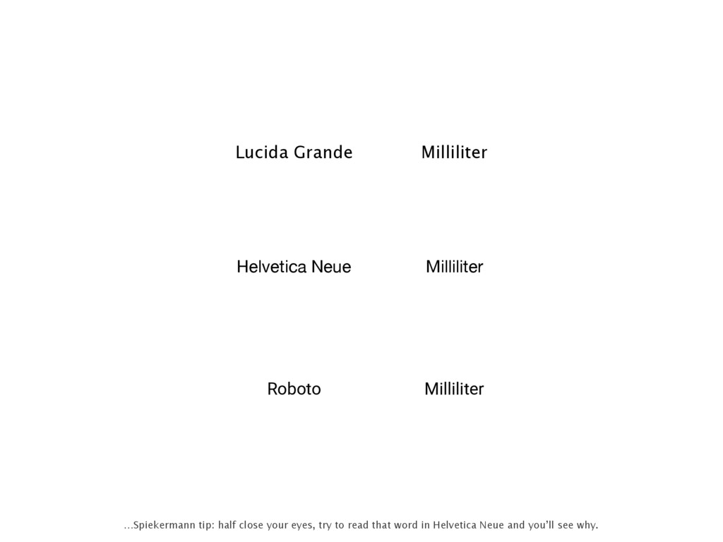
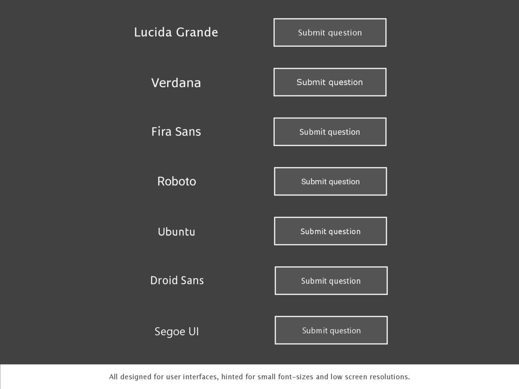
    question Roboto Submit question Ubuntu Submit question Droid Sans Submit question Segoe UI Submit question All designed for user interfaces, hinted for small font-sizes and low screen resolutions.
  33. Good to see Apple switched away from Helvetica and is

    now using a custom designed typeface called San Francisco. Not ideal (yet), but better!
  34. “If you think every pixel, every icon, every typeface in

    your app’s user interface matters, then you also need to believe every letter matters.” —37Signals
  35. Good writing is good design It’s Dutch for ‘Sign up’

    and ‘Log in’. Most Dutch speaking people absolutely don’t know the difference in meaning between these two words.
  36. “The fastest way to improve your user interface is to

    improve the copywriting.” —Joshua Porter
  37. This is well done: instead of ‘search’ it says: ‘where

    are you going?’ it’s much more inviting.
  38. Does the user really need this extra thing? Can I

    find a better solution? Important question to ask before you add anything to your UI.
  39. Genius Scan To the point. There’s room for improvement though:

    there’s no need for an ‘Edit’ button here. And there’s the hamburger icon…
  40. No one enjoys filling out these… You know there’s going

    to be problems when you click the ‘Submit’ button…
  41. The best interfaces are invisible to the user The keyboard

    in iOS Notes is only there when you need it. That makes it practically invisible.
  42. “The real problem with the interface is that it is

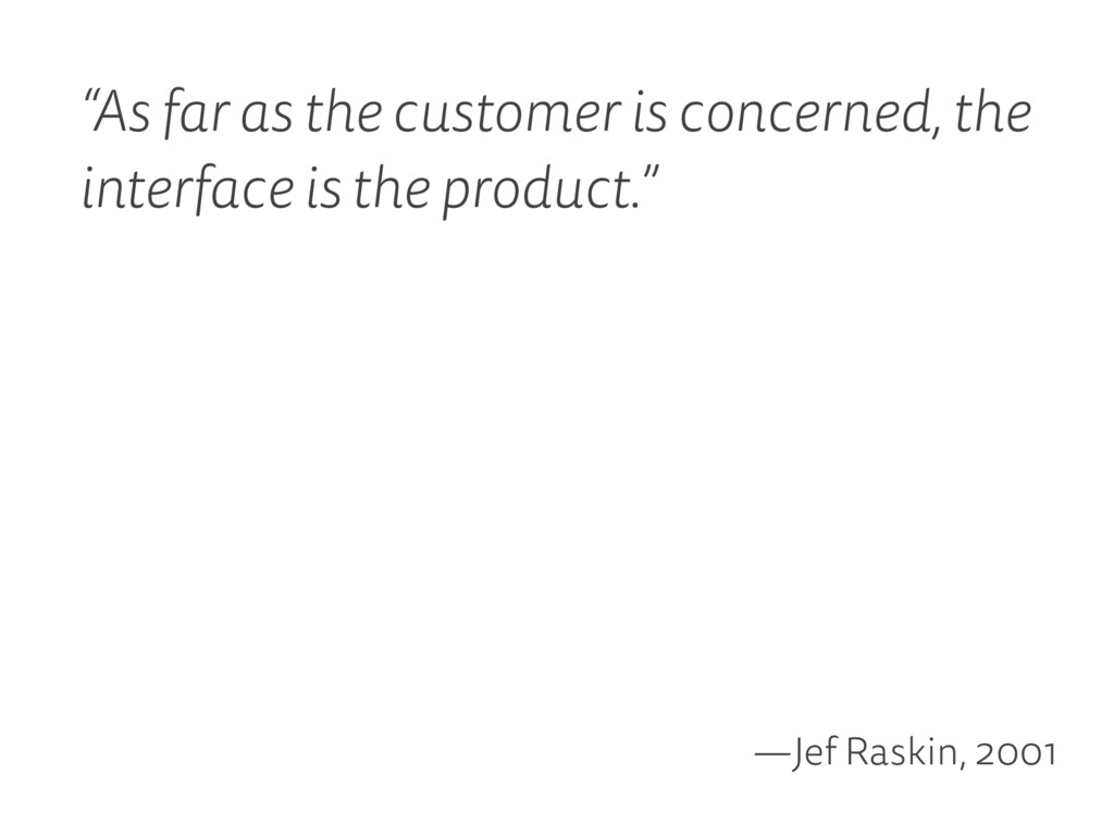
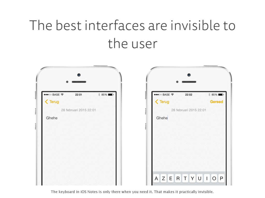
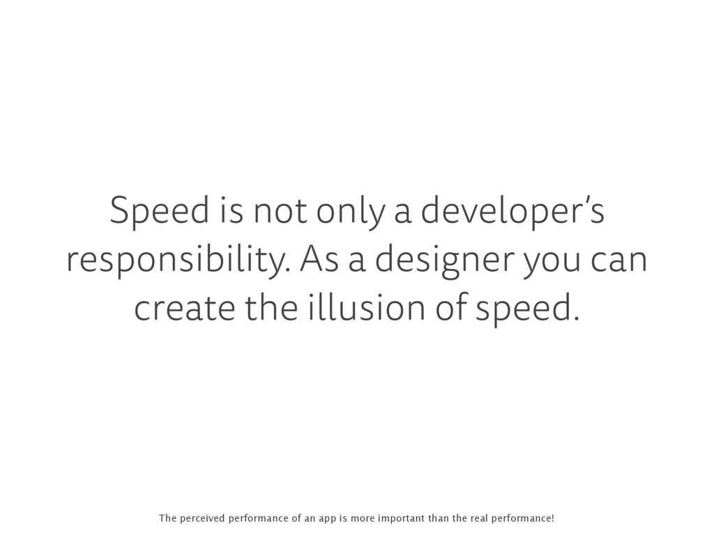
    an interface. Interfaces get in the way. As a user, I don’t want to focus my energies on an interface. I want to focus on the job…” —Donald Norman, 1990
  43. “The interface gets in the way” What if my car

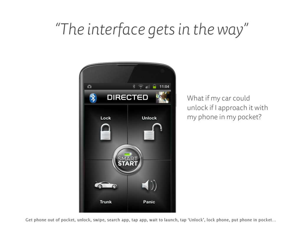
    could unlock if I approach it with my phone in my pocket? Get phone out of pocket, unlock, swipe, search app, tap app, wait to launch, tap ‘Unlock’, lock phone, put phone in pocket…
  44. Do we really need this, if the answer is Yes

    9 times out of 10? The 80 percent rule…
  45. The best interfaces are invisible The best interface is no

    interface. Saving files usually happens in the background nowadays.
  46. The real world: if I write a note I don’t

    have to save it to keep my changes!
  47. A user doesn’t have to think when she recognizes a

    UI element 1Password 1Password uses TouchID to unlock, like many apps. Users easily recognize that, no interface to learn.
  48. Kindle iOS app standard iOS UI elements The Font Game

    custom designed UI elements The Font Game features custom designed UI elements. They may look better but may also challenge the user.
  49. As a designer you don’t want an original design by

    all means. You want a user-friendly interface.
  50. Inventive and recognizable = win! The subtle green line at

    the top shows a reader’s progress on a long page.
  51. Collection of nice UI design details . Nice collection of

    UI elements, often both inventive and recognizable.
  52. Design a system of reusable interface elements And then use

    them everywhere in your app. It’s instantly recognizable. Add a style guide as an explanation.
  53. “The more users’ expectations prove right, the more they will

    feel in control of the system and the more they will like it.” —Jakob Nielsen
  54. FaceTime on iOS and OS X Ever used FaceTime on

    iOS? Then you know how to use it on your Mac. And the other way around of course. (Say hi to Johny!)
  55. Speed is not only a developer’s responsibility. As a designer

    you can create the illusion of speed. The perceived performance of an app is more important than the real performance!
  56. A smart UI can make the app feel faster, more

    responsive Facebook uses instant placeholders while the real content is loading. Smart trick that makes the app feel faster.
  57. Also, the user feels more assured It’s clear the app

    is doing something here. I did not fuck up.
  58. Instant feedback is often very easy to implement yet makes

    a huge difference to the user Think about what happens in-between screens.
  59. No need to wait while uploading a video to Tumblr.

    You can add a caption, tags… while the app is uploading.
  60. Medium shows a simple animation while content loads: clear, concise,

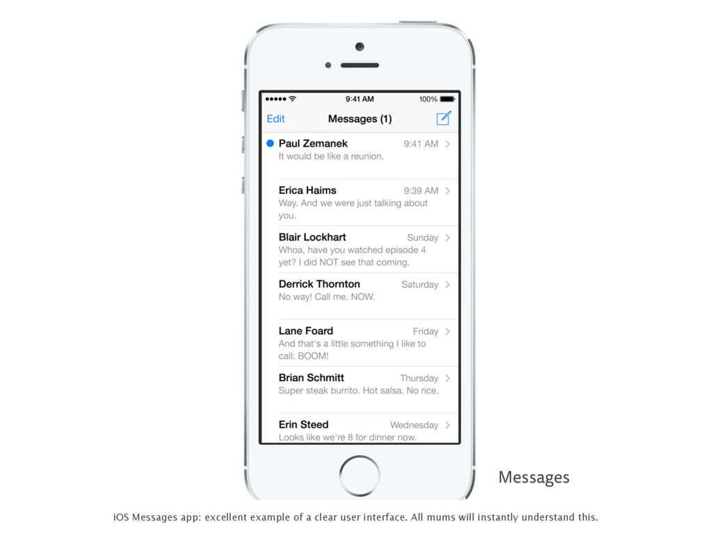
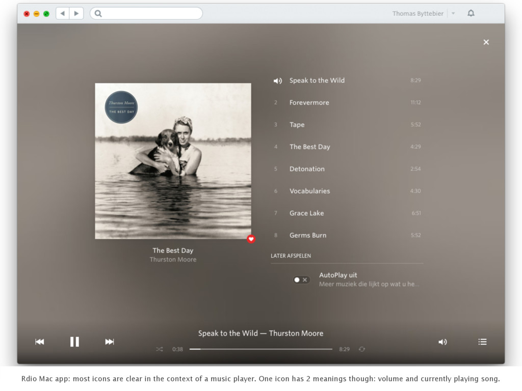
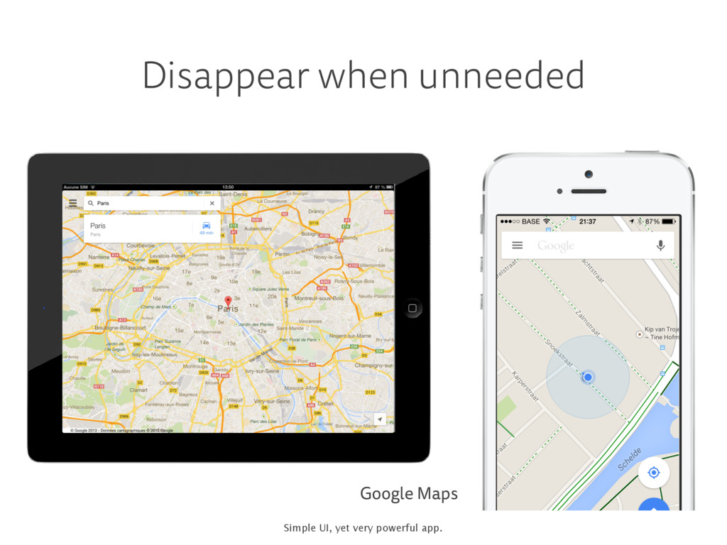
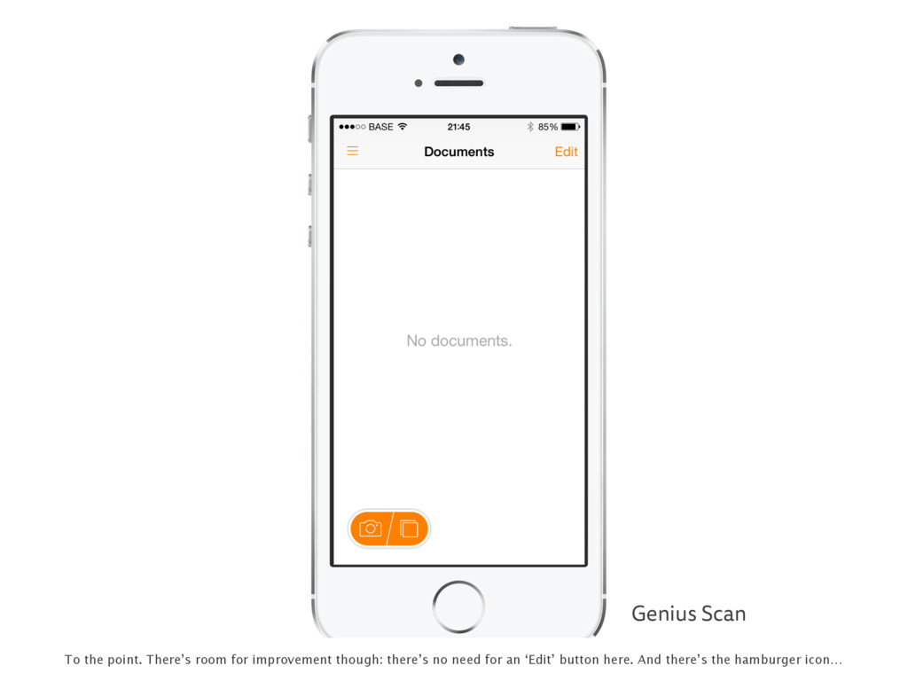
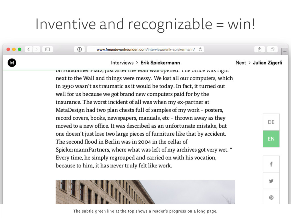
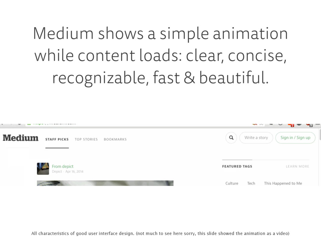
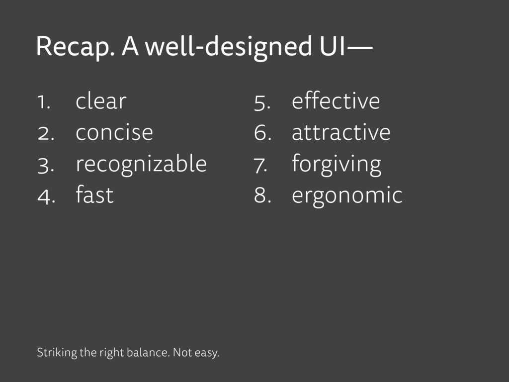
    recognizable, fast & beautiful. All characteristics of good user interface design. (not much to see here sorry, this slide showed the animation as a video)
  61. It is definitely clear… but effective? Everytime I launch my

    mobile banking app, I get this ‘You were automatically logged out’ message. Even if I only used the app days ago…
  62. To design an effective user interface, you must know your

    user Why is she using your software? When? What’s her goals? What’s her mood? Where is she? Is she hungry? …
  63. Easier to make substantiated decisions When it launches, Qustomer shows

    the QR code, ready to be scanned at the box office. There may be people in a line behind you.
  64. Messages app Mail app Swipe to search in Messages yet

    Mail app shows search field immediately. May be inconsistent, it does make sense. Users search mail often.
  65. Local website that promotes a healthy lifestyle. Each day it

    requires you to mark your agenda. But I can never find my agenda after login.
  66. Not logged in Logged in The weird thing is, the

    mobile version does it right: it displays a visible link to the agenda. Much more usable.
  67. iOS Camera app tap to focus, slide to lighten/darken I

    didn’t know this, but after focusing you can use the sun icon to lighten/darken your photo. It’s a more or less hidden feature for power users.
  68. OS X Spotlight search Power users definitely appreciate Spotlight on

    the desktop. App launcher, calculator and so much more…
  69. HTML forms Don’t customize your form elements, especially if it

    breaks default behavior. Power users love to use shortcuts to navigate form elements.
  70. ING mobile banking BNP mobile banking I only have one

    account with both banks. ING needs me to select that account every time I want to transfer money. BNP has it preselected.
  71. ‘Next busses’: I always tap that button to get an

    idea of the frequency of busses. Why not display it by default?
  72. . VMF app Finally the VMF app remembers what ranking

    my team is in. I don’t have to scroll through dozens of them any more every time I use the app.
  73. A great looking UI is more attractive • general look

    & feel • typography, color, contrast • visual design trends • subtle animations and transitions • subtle affirmative sounds • …
  74. Undo doesn’t interrupt a user’s workflow “Are you sure?” is

    unpleasantly distracting. Undo is like a friend who’s there when you need her.
  75. I’m afraid of the Skype UI Years ago I clicked

    an icon and it started video calling someone I didn’t want to. I’ve been extremely suspicious ever since.
  76. What if your user makes a typo? I made a

    typo and I’m not aware of it. The app shows irrelevant information. There’s nothing I can do now. Frustration.
  77. NMBS app Belgian railway service. Same functionality as previous app.

    Same typo. I get a helpful suggestion. That’s well done!
  78. Good design Google’s “Did you mean?” We all recognize this.

    It’s not particularly beautiful, but it’s excellent design!
  79. “Nobody is perfect, and people are bound to make mistakes

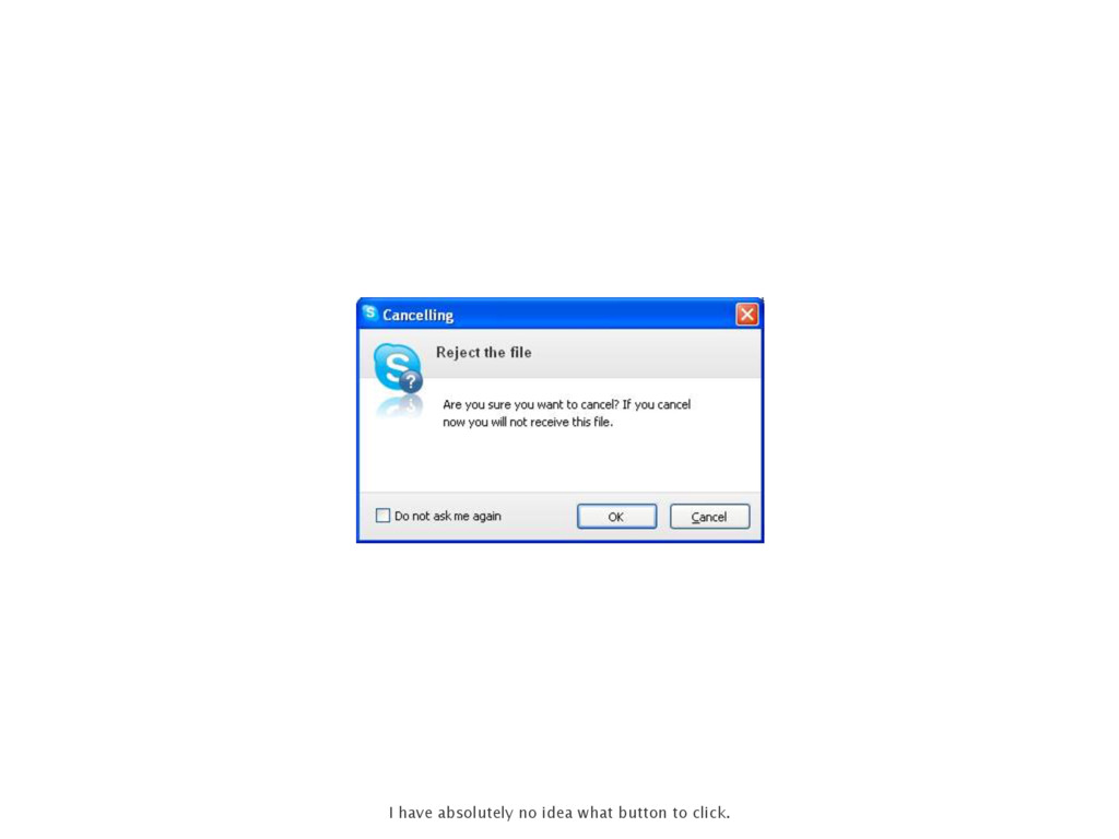
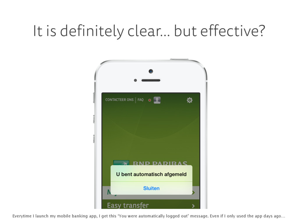
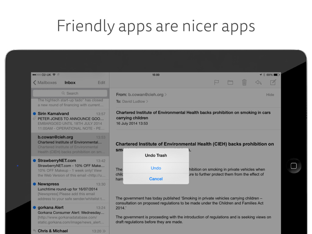
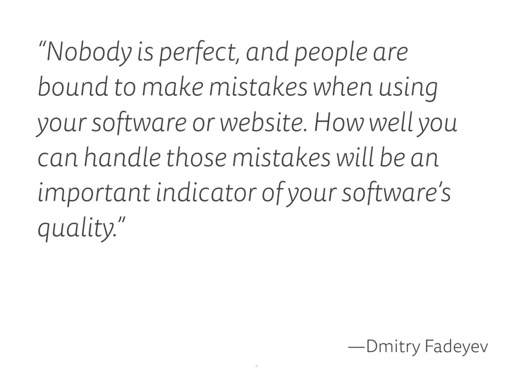
    when using your software or website. How well you can handle those mistakes will be an important indicator of your software’s quality.” —Dmitry Fadeyev .
  80. Design ergonomically With this information, it would be silly to

    put the most important buttons in the red areas.
  81. Genius Scan Genius Scan does it very well: when outlining

    a scan your thumb will cover the parts you need to see. Hence the helpful magnifier.
  82. Design ergonomically • place most used buttons in an easy

    to reach part of the screen • test as quickly as possible on a real device • when in doubt, make it larger .
  83. . “When in doubt, make it larger.” That’s probably what

    Maradona was thinking after his football career.
  84. Recap. A well-designed UI— 1. clear 2. concise 3. recognizable

    4. fast 5. effective 6. attractive 7. forgiving 8. ergonomic Striking the right balance. Not easy.
  85. “When the point of contact between the product and the

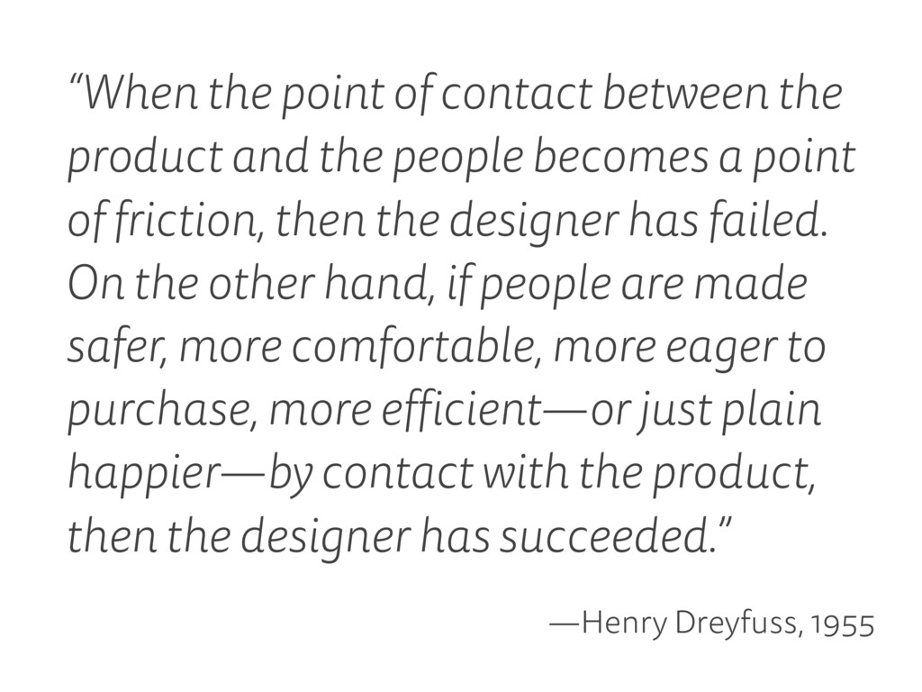
    people becomes a point of friction, then the designer has failed. On the other hand, if people are made safer, more comfortable, more eager to purchase, more efficient—or just plain happier—by contact with the product, then the designer has succeeded.” —Henry Dreyfuss, 1955
  86. A good UI is like Maradona’s infamous hand of god.

    No one notices it and yet it gets the job done really fast.
  87. Thomas Byttebier thomasbyttebier.be — @bytte Thanks for listening. Contact details

    on my website. I design user interfaces! As little as possible, you now know what I mean with that! :)
  88. Links & sources, photos, thanks to all of you •

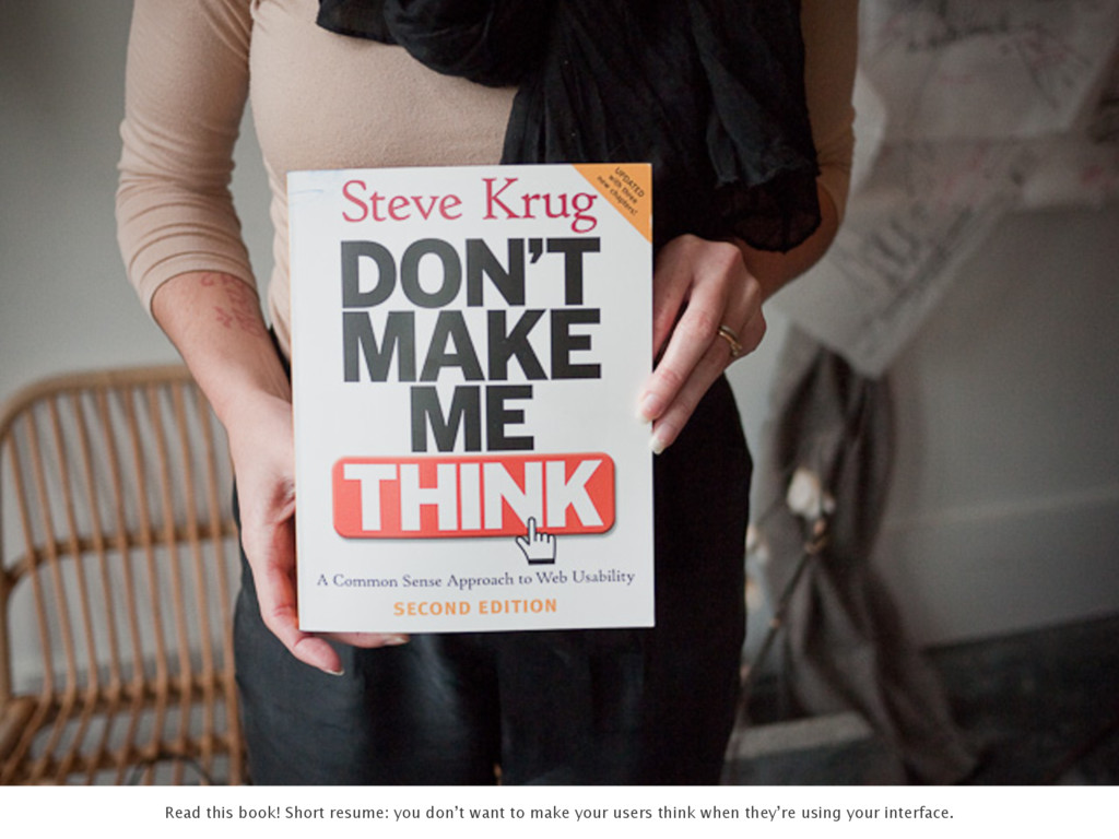
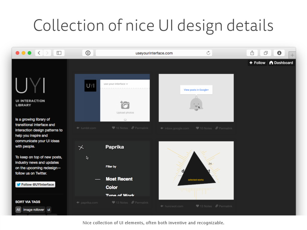
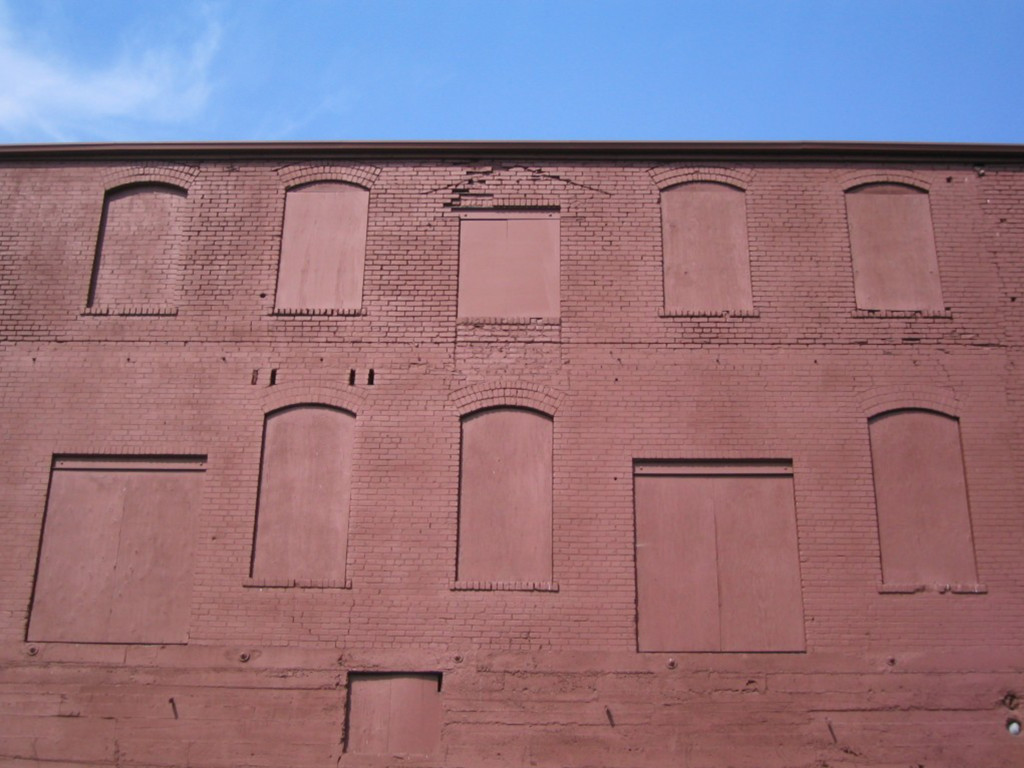
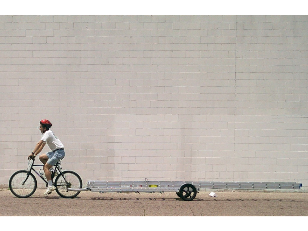
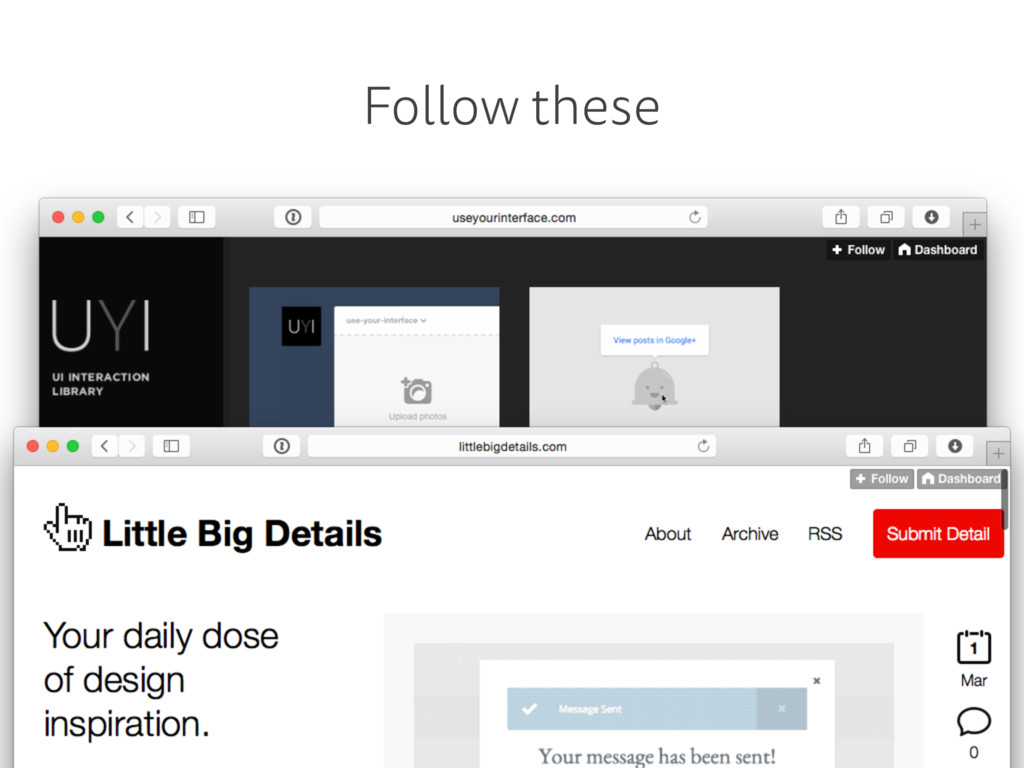
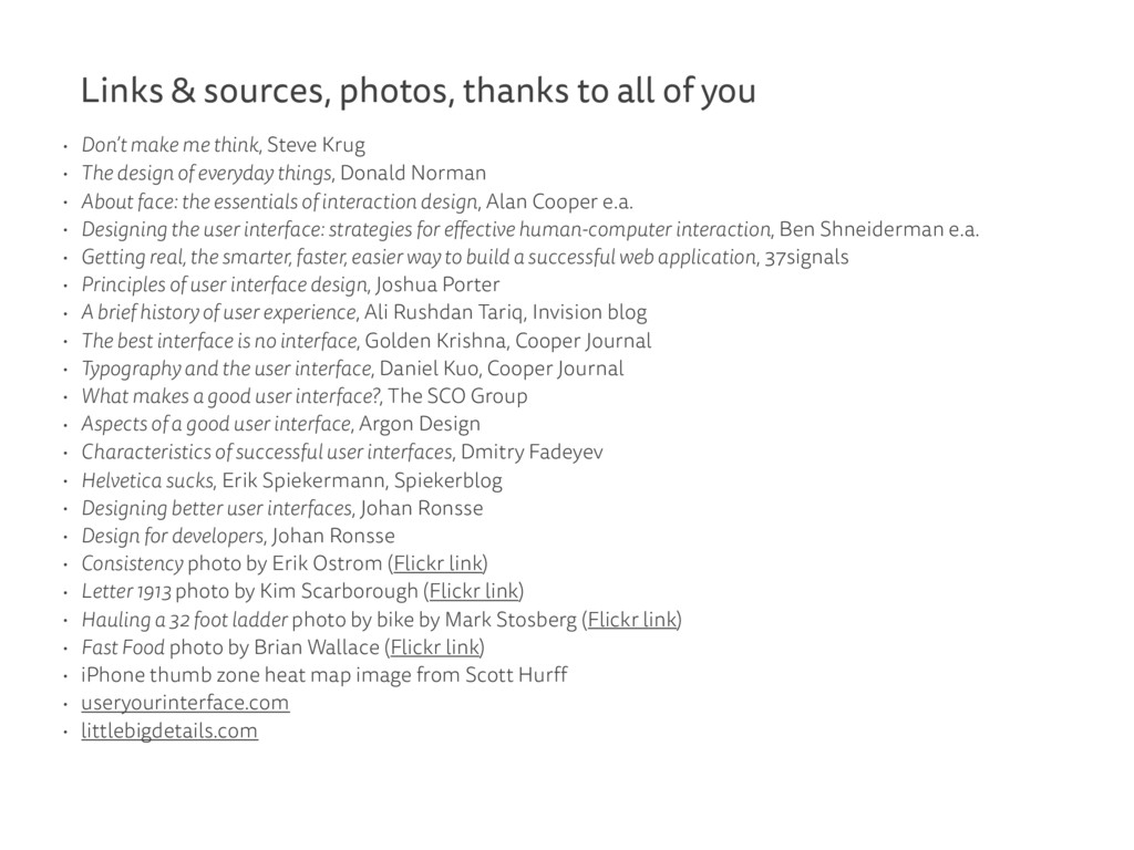
    Don’t make me think, Steve Krug • The design of everyday things, Donald Norman • About face: the essentials of interaction design, Alan Cooper e.a. • Designing the user interface: strategies for effective human-computer interaction, Ben Shneiderman e.a. • Getting real, the smarter, faster, easier way to build a successful web application, 37signals • Principles of user interface design, Joshua Porter • A brief history of user experience, Ali Rushdan Tariq, Invision blog • The best interface is no interface, Golden Krishna, Cooper Journal • Typography and the user interface, Daniel Kuo, Cooper Journal • What makes a good user interface?, The SCO Group • Aspects of a good user interface, Argon Design • Characteristics of successful user interfaces, Dmitry Fadeyev • Helvetica sucks, Erik Spiekermann, Spiekerblog • Designing better user interfaces, Johan Ronsse • Design for developers, Johan Ronsse • Consistency photo by Erik Ostrom (Flickr link) • Letter 1913 photo by Kim Scarborough (Flickr link) • Hauling a 32 foot ladder photo by bike by Mark Stosberg (Flickr link) • Fast Food photo by Brian Wallace (Flickr link) • iPhone thumb zone heat map image from Scott Hurff • useryourinterface.com • littlebigdetails.com