Upgrade to Pro — share decks privately, control downloads, hide ads and more …

Responsive web design

Responsive web design

Slightly adapted version of http://speakerdeck.com/u/bytte/p/responsive-web-design, as presented at KaHo Sint-Lieven April 16th 2012.

Thomas Byttebier

April 17, 2012
Tweet

More Decks by Thomas Byttebier

Other Decks in Design

Transcript

  1. RESPONSIVE WEBDESIGN KAHO SINT-LIEVEN / APRIL 2012 These slides are

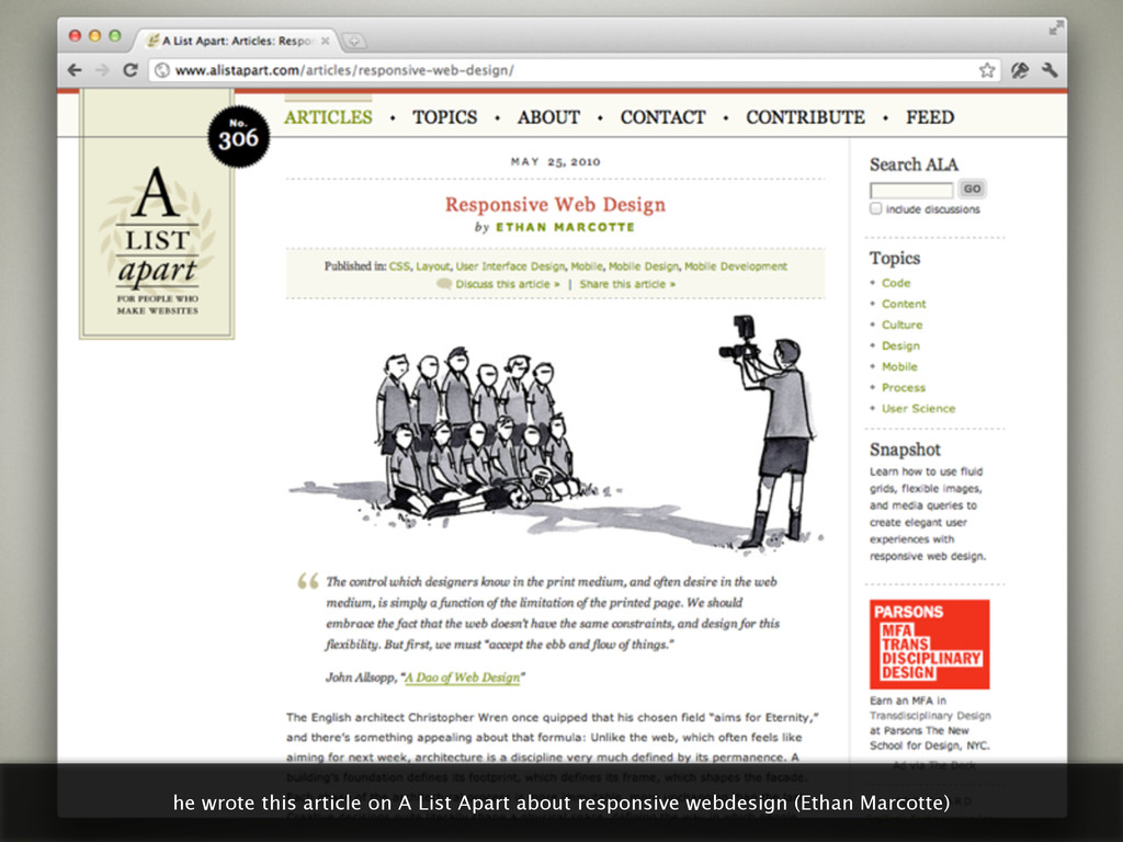
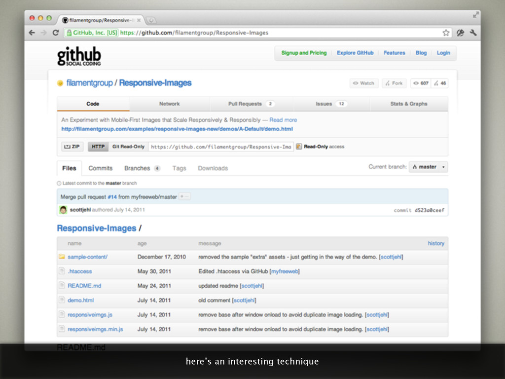
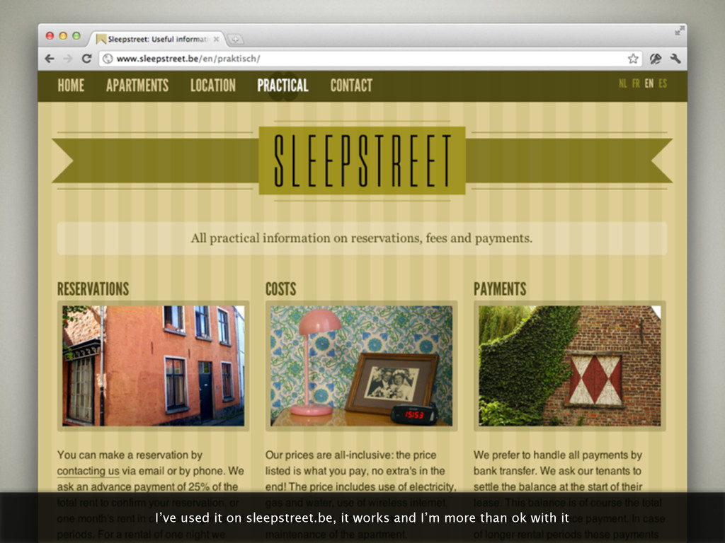
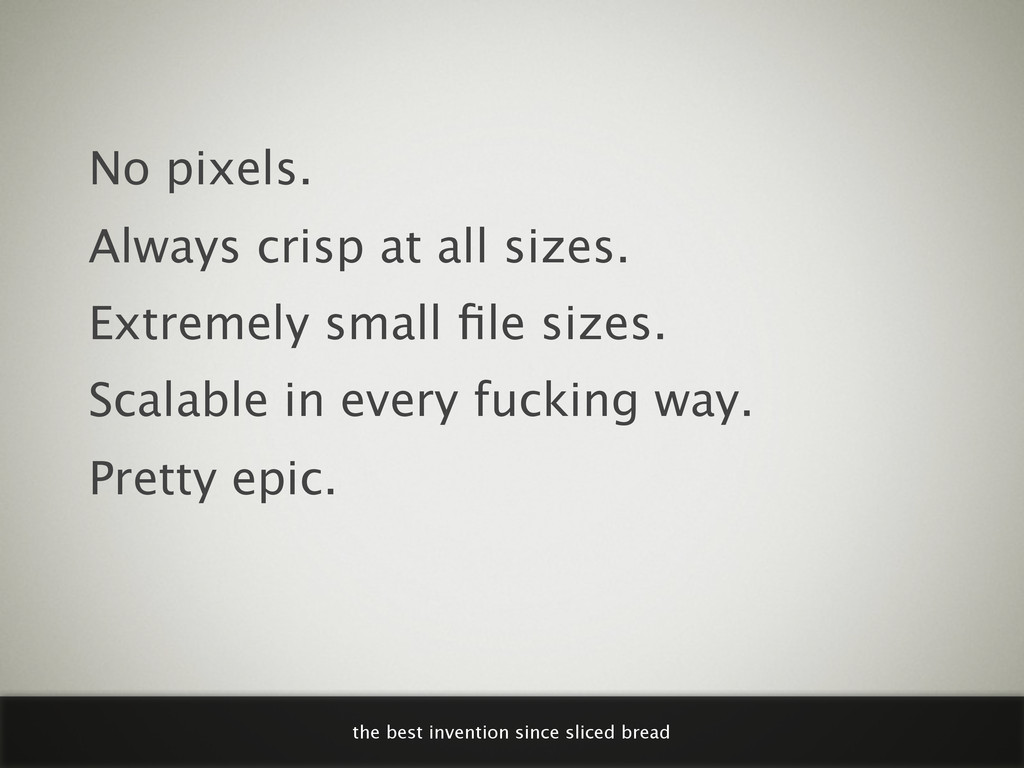
    the blueprint of a presentation I did at KaHo Sint-Lieven recently. I tried to make them understandable to people that didn’t attend the presentation by including these dull looking quick notes. The presentation is a slightly updated version of http://www.slideshare.net/bytte/responsive-web-design-10389263
  2. I realize that looks like quite a fail to the

    public, but I enjoy doing it
  3. RESPONSIVE WEBDESIGN WHY / PROBLEMS / SEMI-SOLUTIONS / OWN EXPERIENCES

    here’s what I talked about and what these slides are about
  4. he talked about how few products had such in impact

    in our lives as the car in the 20th century
  5. at the end of the 20th century the pc was

    another product that dramatically changed our lives
  6. this guy goes up and down the crater a few

    times a day carrying many kilos of sulfur on his shoulders
  7. here’s a few more sulfur miners, they likely won’t live

    long as their lungs are poisened with sulfur
  8. even these really poor people carry a phone, they get

    to know the internet through cheap mobile devices
  9. hard + expensive to maintain, and frankly kind of silly

    to have an app mirroring your website
  10. “90% of all websites are too simple to justify the

    time and money it takes to develop a separate mobile version.” — COMMON SENSE THINKER it’s hard to argue with that
  11. “It is not the strongest of the species that survives,

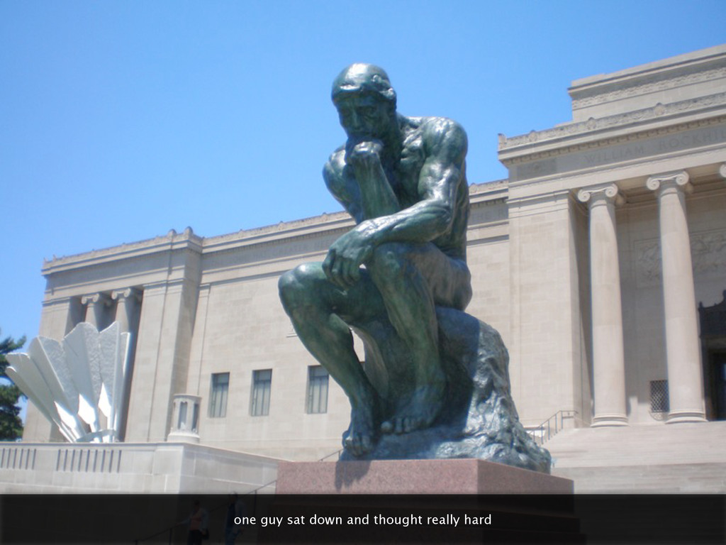
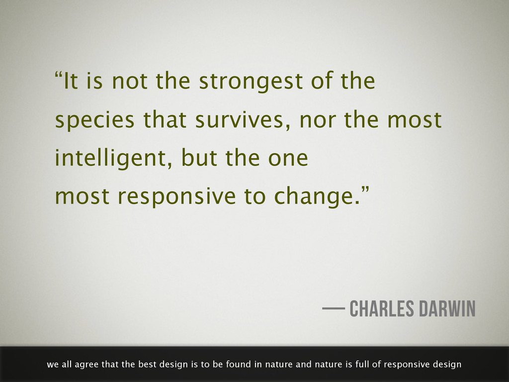
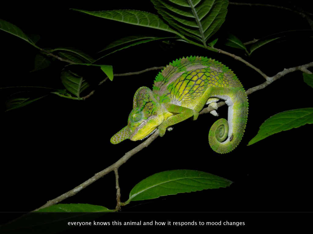
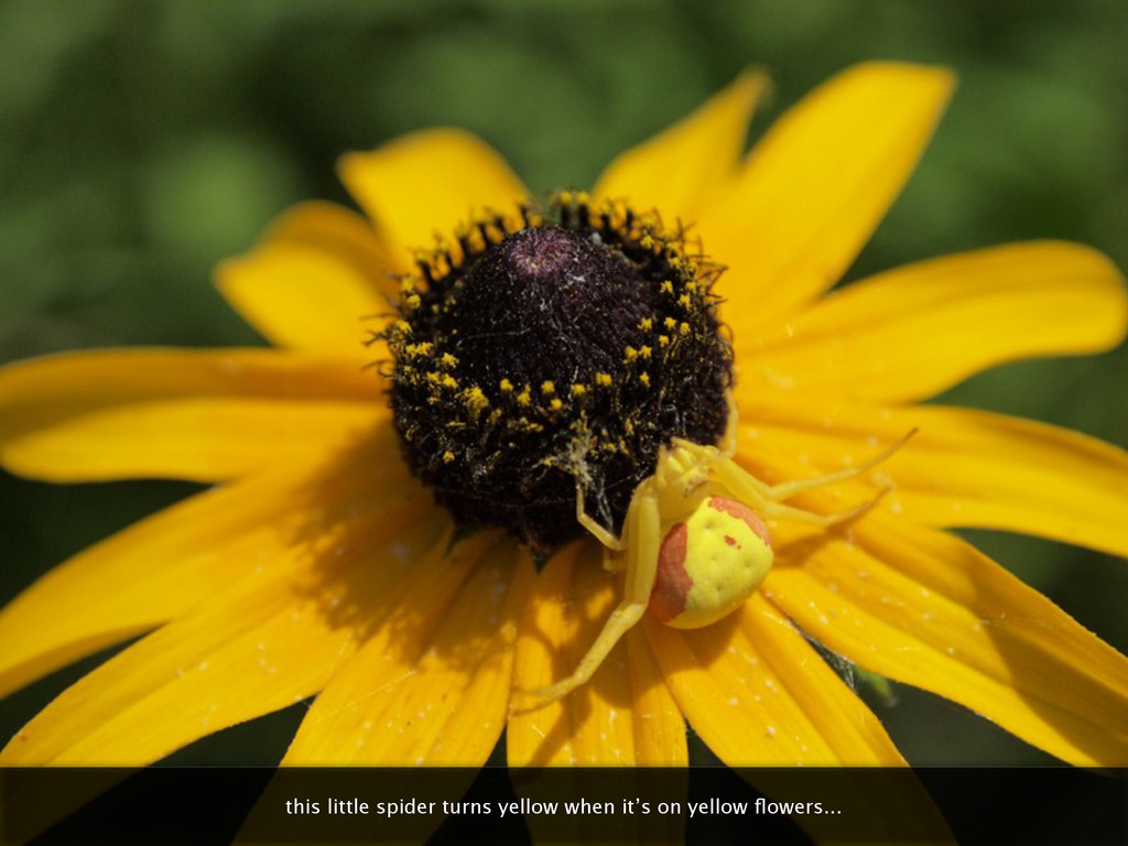
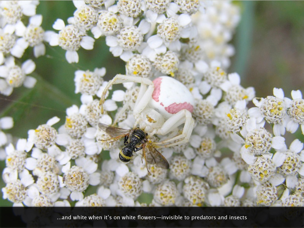
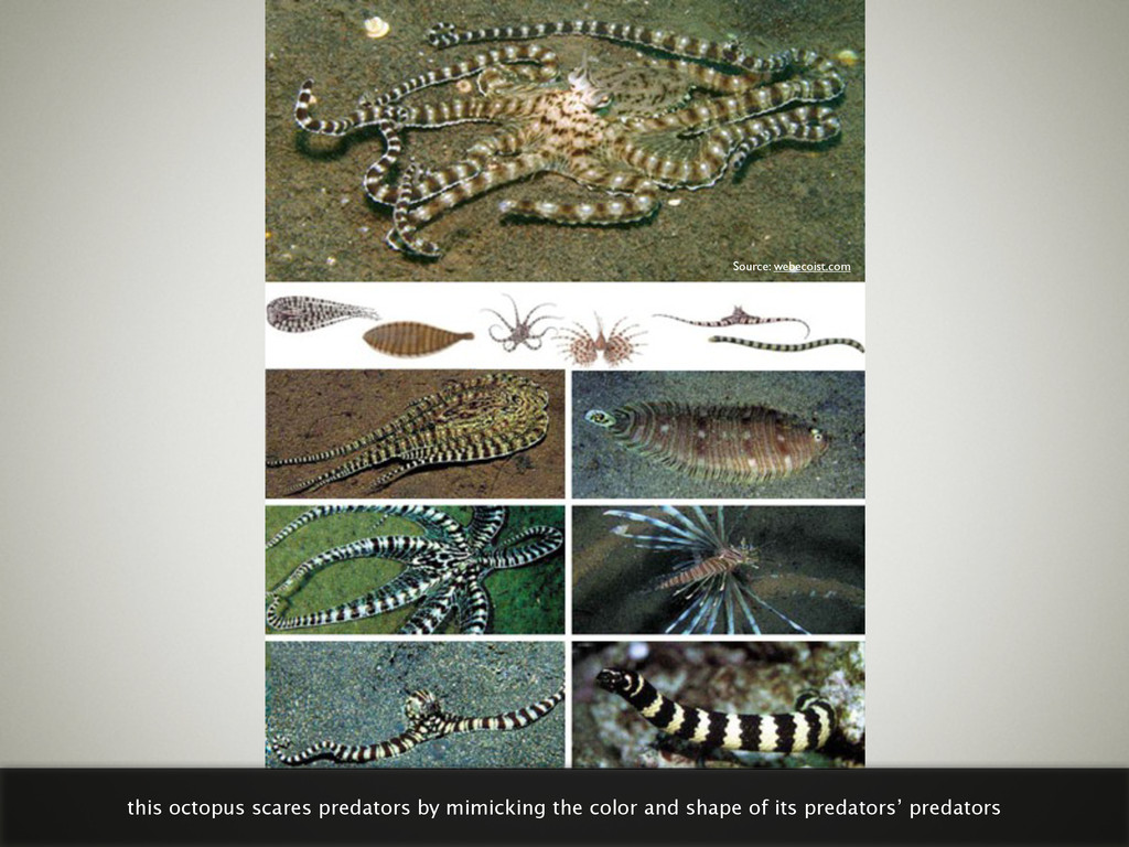
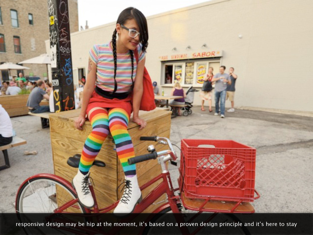
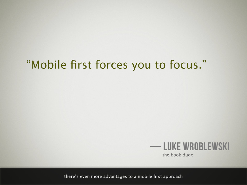
    nor the most intelligent, but the one most responsive to change.” — CHARLES DARWIN we all agree that the best design is to be found in nature and nature is full of responsive design
  12. this octopus scares predators by mimicking the color and shape

    of its predators’ predators Source: webecoist.com
  13. responsive design may be hip at the moment, it’s based

    on a proven design principle and it’s here to stay
  14. <link rel="stylesheet" href="layout.css" media="screen and (min-width:400px)" /> @media (min-width:400px) {

    } this one’s different: as soon as the browser viewport reaches 400 px, use this stylesheet
  15. thanks to css media queries, we can change the layout

    at larger screen sizes: text is readable again
  16. 320 480 768 1024 most responsive designers use media queries

    to change layout at common sizes, but that’s no necessity
  17. no

  18. 1. Write CSS for desktop browsers— the way you always

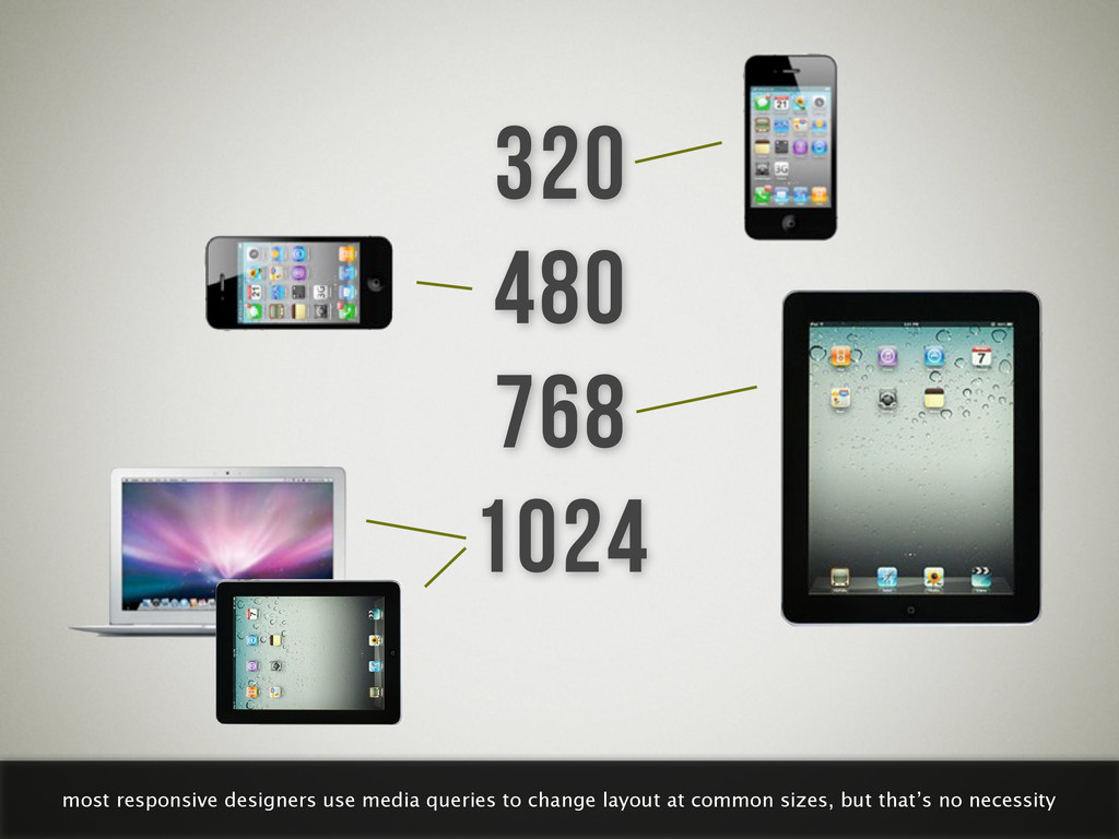
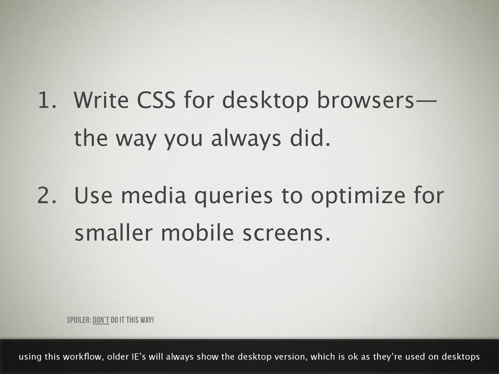
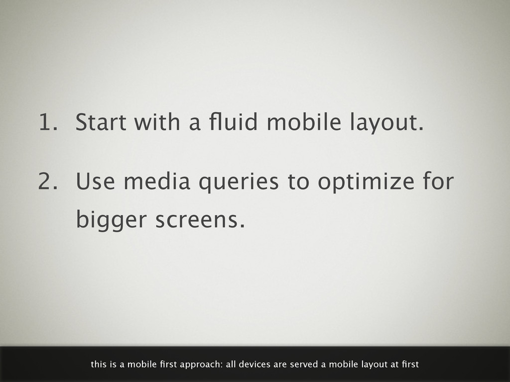
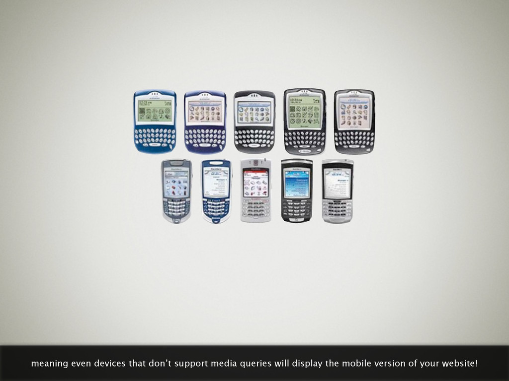
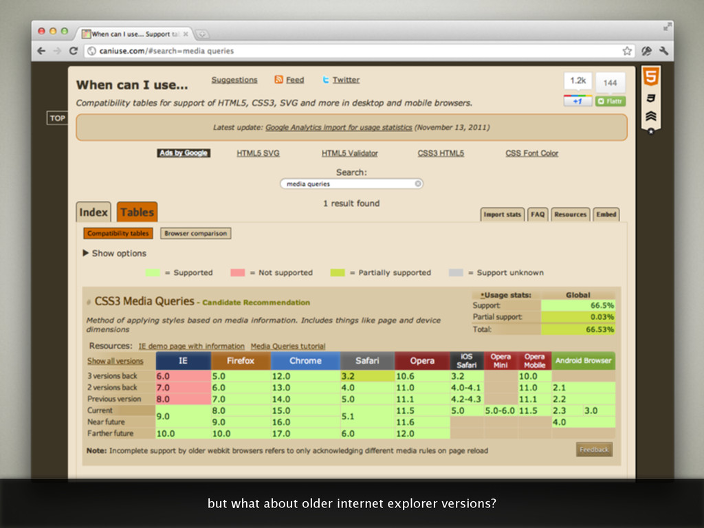
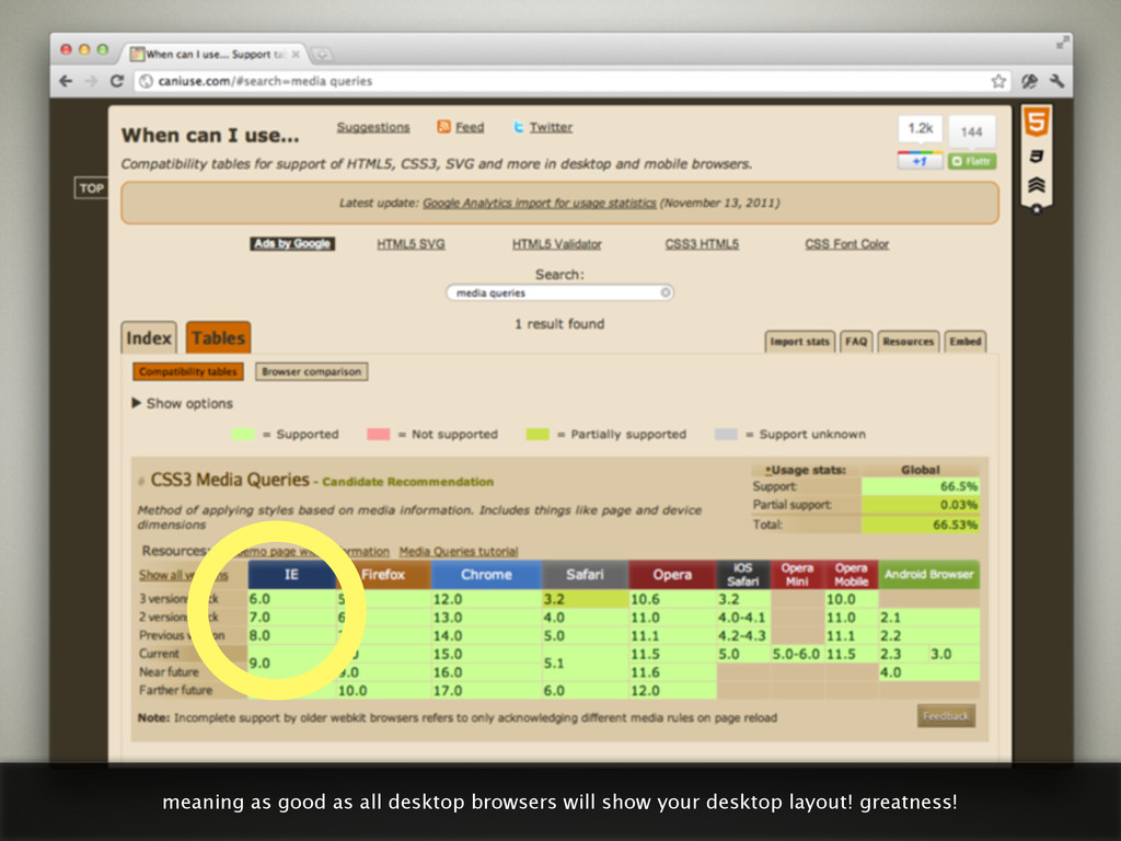
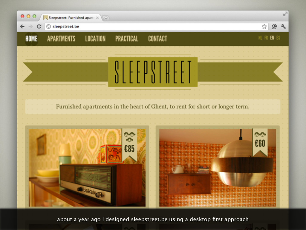
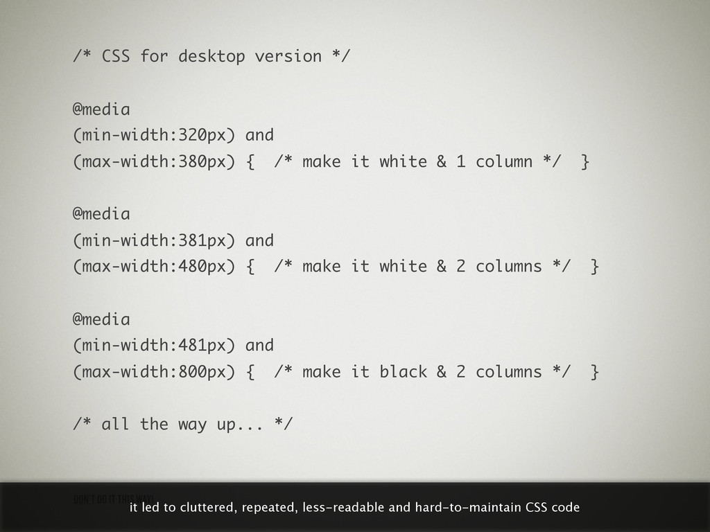
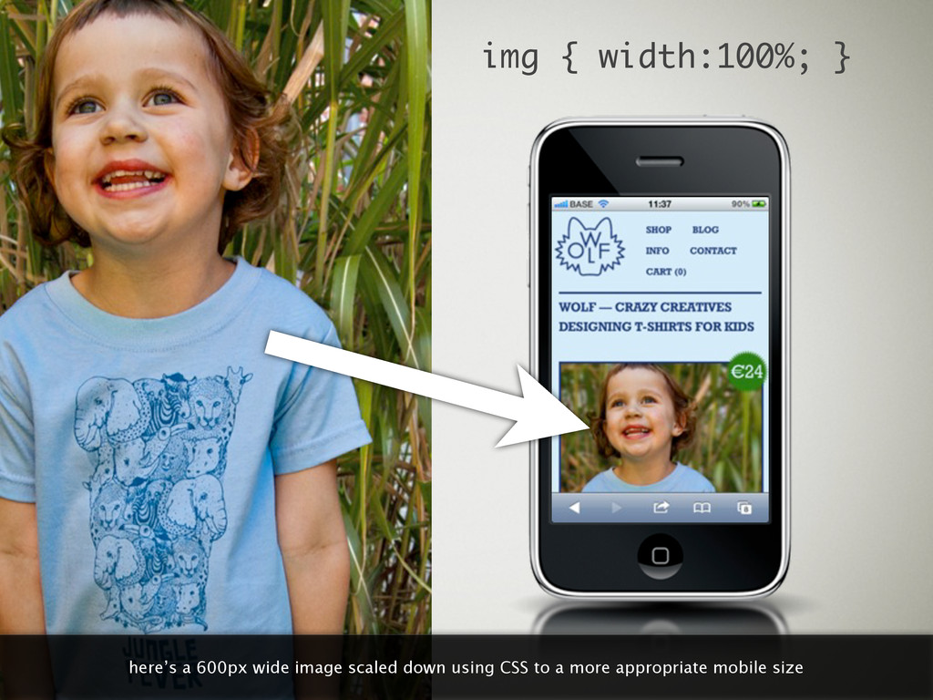
    did. 2. Use media queries to optimize for smaller mobile screens. SPOILER: DON’T DO IT THIS WAY! using this workflow, older IE’s will always show the desktop version, which is ok as they’re used on desktops
  19. you know, not all of us browse the web using

    the latest and hippest mobile devices
  20. 1. Write CSS for desktop browsers— the way you always

    did. 2. Use media queries to optimize for smaller mobile screens. using this workflow means these devices won’t show our mobile layout. argh.
  21. 1. Start with a fluid mobile layout. 2. Use media

    queries to optimize for bigger screens. this is a mobile first approach: all devices are served a mobile layout at first
  22. NOT GREAT, YET NOT CRAZY BROKEN the layout will be

    broken but the content will still be readable
  23. “Mobile first forces you to focus.” — LUKE WROBLEWSKI the

    book dude there’s even more advantages to a mobile first approach
  24. thinking about mobile first forces you to focus: there’s less

    screen real estate to abuse, so relevance first
  25. LESS & CLEANER CSS A MOBILE FIRST APPROACH LEADS TO

    another advantage of mobile first, at least in my experience
  26. /* CSS for desktop version */ @media (min-width:320px) and (max-width:380px)

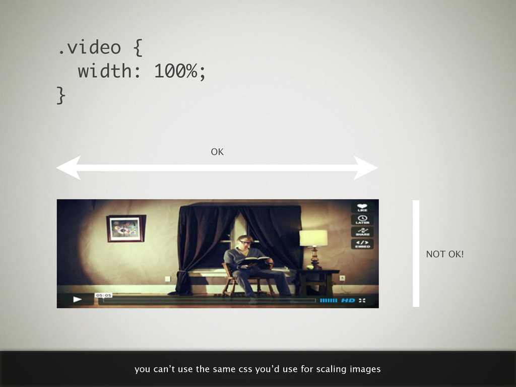
    { /* make it white & 1 column */ } @media (min-width:381px) and (max-width:480px) { /* make it white & 2 columns */ } @media (min-width:481px) and (max-width:800px) { /* make it black & 2 columns */ } /* all the way up... */ DON’T DO IT THIS WAY! it led to cluttered, repeated, less-readable and hard-to-maintain CSS code
  27. /* CSS for mobile version */ @media (min-width:400px) { /*

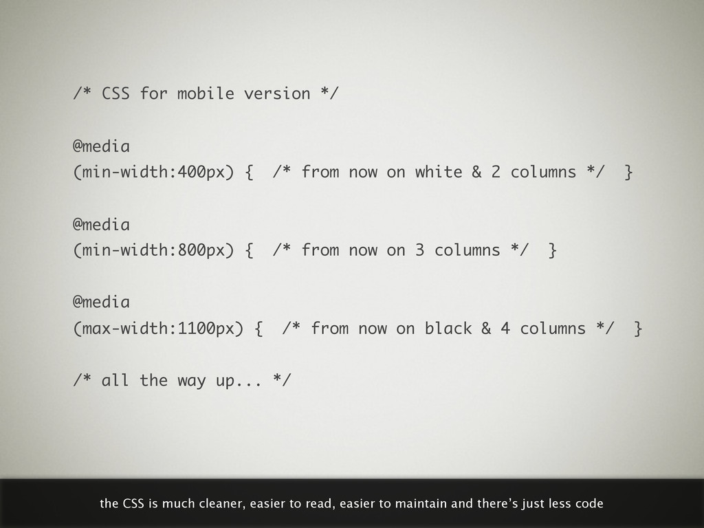
    from now on white & 2 columns */ } @media (min-width:800px) { /* from now on 3 columns */ } @media (max-width:1100px) { /* from now on black & 4 columns */ } /* all the way up... */ the CSS is much cleaner, easier to read, easier to maintain and there’s just less code
  28. Use desktop-sized images in your mobile first design & scale

    down using CSS. SPOILER: DON’T DO IT THIS WAY! the solution’s easy at first thought
  29. img { width:100%; } here’s a 600px wide image scaled

    down using CSS to a more appropriate mobile size
  30. But their filesize looks great on the mobile version of

    your website too. 200kb for a 300px wide photo! that’s a minus!
  31. “If I hadn’t used media queries, the user would have

    seen the desktop website with desktop-sized images anyway.” — UNCARING WEB DESIGNER there’s truth in that
  32. Use desktop-sized images in your mobile first design & scale

    down using CSS. have a heart: we just can’t do it this way
  33. W3C IS SLOWLY WORKING TOWARDS A SOLUTION <picture alt="A beautiful

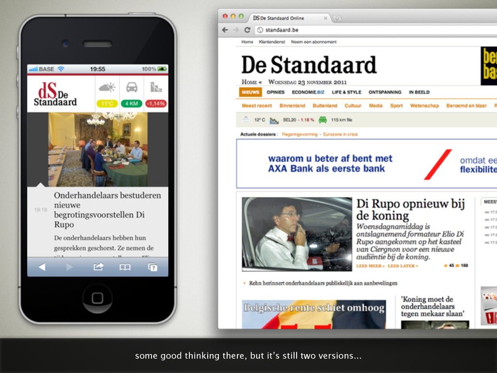
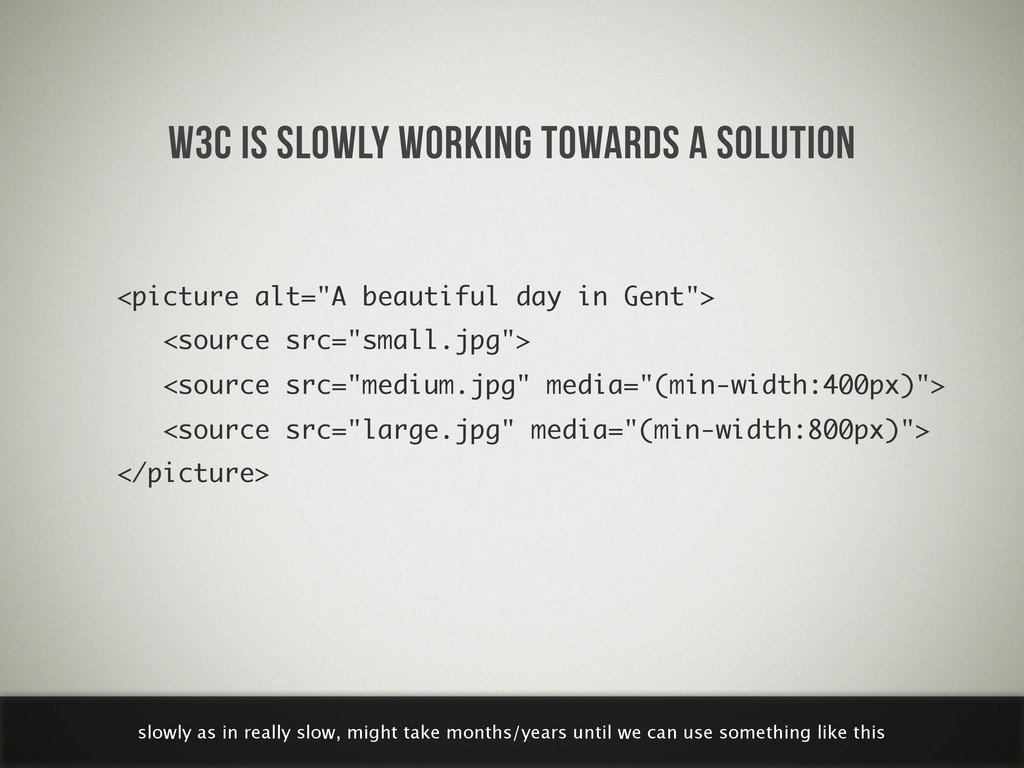
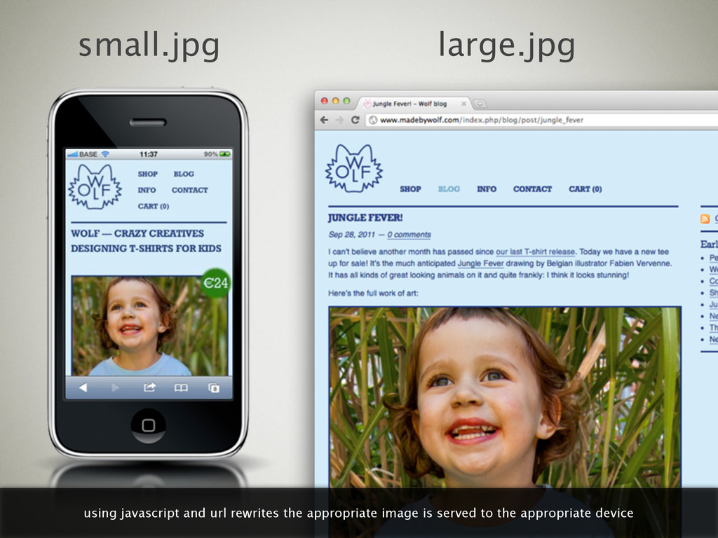
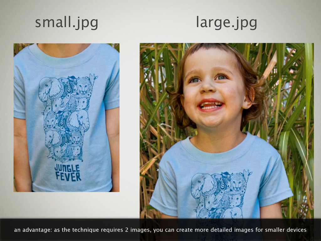
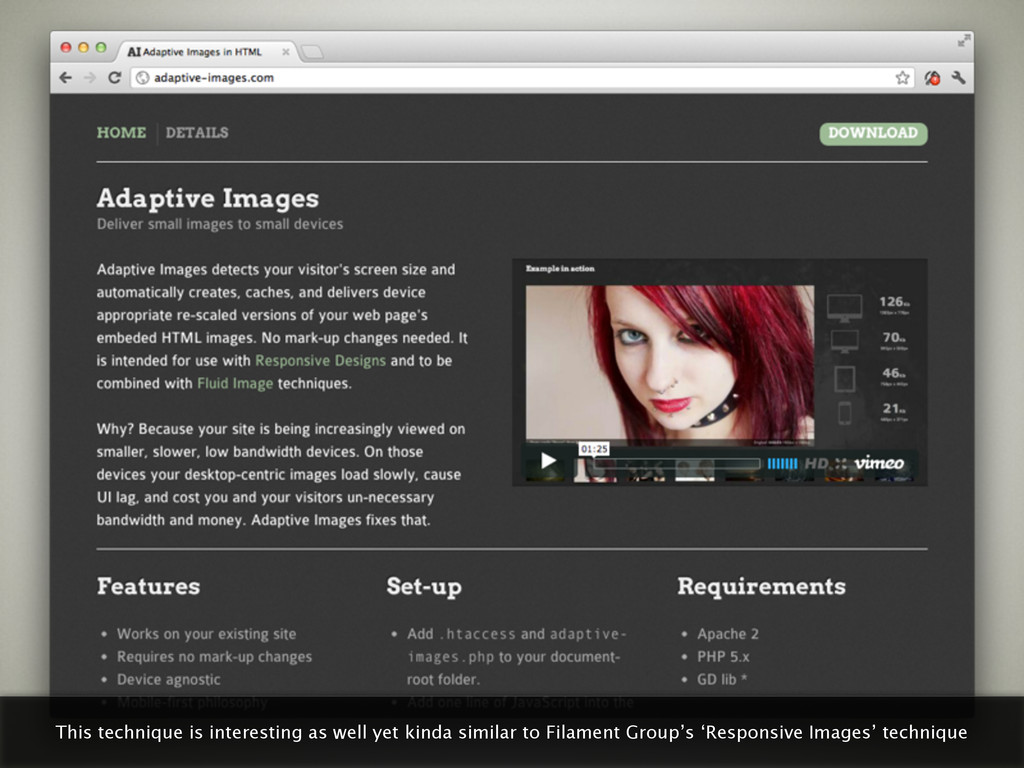
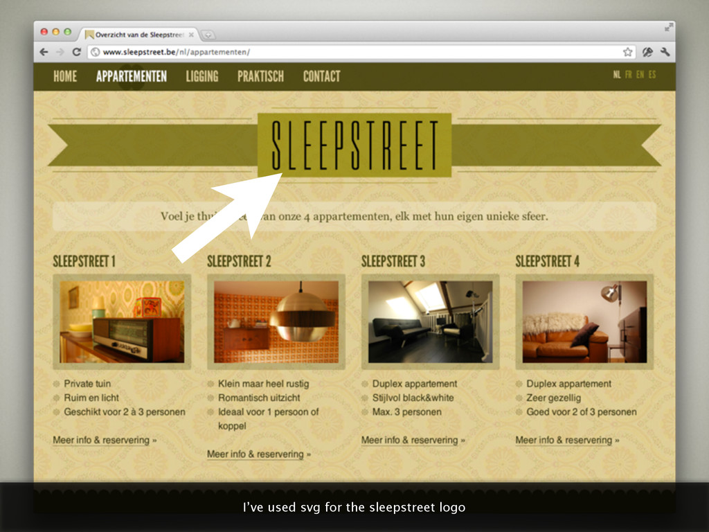
    day in Gent"> <source src="small.jpg"> <source src="medium.jpg" media="(min-width:400px)"> <source src="large.jpg" media="(min-width:800px)"> </picture> slowly as in really slow, might take months/years until we can use something like this
  34. small.jpg large.jpg an advantage: as the technique requires 2 images,

    you can create more detailed images for smaller devices
  35. small.jpg large.jpg it’s written mobile first and browsers that don’t

    support javascript will only download the small image
  36. This technique is interesting as well yet kinda similar to

    Filament Group’s ‘Responsive Images’ technique
  37. No pixels. Always crisp at all sizes. Extremely small file

    sizes. Scalable in every fucking way. Pretty epic. the best invention since sliced bread
  38. and it would result in a huge logo on desktop

    computers (clients would have loved it :)
  39. as it’s svg I could use javascript to reposition anchor

    points based on screen width (thanks @christaanvdp)
  40. So why is not everyone using svg? if svg is

    so great, why is not everyone using it all the time?
  41. but it required me to redraw the logo using javascript.

    and that’s not how you want to spend your day.
  42. but the future is bright! @joggink is working on a

    solution called willistrator (no joke!)
  43. OK NOT OK! .video { width: 100%; } you can’t

    use the same css you’d use for scaling images
  44. but smart people have written good articles about the matter,

    such as Thierry Koblentz on a list apart
  45. video { width: 100%; height: auto; } basically this is

    all you have to do if you want responsive video using the html5 video tag
  46. but if you depend on external video hosting services you

    may need to support different embedding solutions
  47. spoiler: not easy, if you have a site that depends

    heavily on data tables, better close your browser window
  48. “Data tables don’t do so well with responsive design. Just

    sayin’.” — GARRETT DIMON excellent tweet, couldn’t have said it any better
  49. ...and made a pie chart of it on mobile! great

    but works only with numerical data of course
  50. basically it came down to this: less than ever we

    have a fixed canvas to design in
  51. I can’t design in the browser, it’s no design tool

    whatsoever—still need to find a better workflow
  52. web design & typography is moving away from print design

    more than ever (great poster by Wim Crouwel)
  53. Thanks to these people for sharing their photos with a

    creative commons license: http://www.flickr.com/photos/sashakimel/6189771935/ http://www.flickr.com/photos/strebkr/3151902438/sizes/l/in/photostream/ http://www.flickr.com/photos/julietbanana/4733245476/sizes/z/in/photostream/ http://www.flickr.com/photos/canadianveggie/167924582/sizes/l/in/photostream/ http://www.flickr.com/photos/yourdon/3568718036/sizes/l/in/photostream/ http://www.flickr.com/photos/missningyou/2679843655/sizes/l/in/photostream/ http://www.flickr.com/photos/kiwanja/3169449999/sizes/o/in/photostream/ http://www.flickr.com/photos/crfullmoon/22195292/sizes/l/in/photostream/ http://www.flickr.com/photos/42244964@N03/4325982802/sizes/l/in/photostream/ http://www.flickr.com/photos/frak_tal/2455855855/sizes/l/in/photostream/ http://www.flickr.com/photos/dinoowww/4557829098/sizes/z/in/photostream/ http://www.flickr.com/photos/kentclark/4720549350/sizes/l/in/photostream/ http://www.flickr.com/photos/hanneorla/1439963888/sizes/l/in/photostream/ http://www.flickr.com/photos/ter-burg/1405605889/sizes/o/in/photostream/ http://www.flickr.com/photos/spyker3292/3721376470/sizes/l/in/photostream/ http://www.flickr.com/photos/soylentgreen23/491093601/sizes/l/in/photostream/ http://www.flickr.com/photos/danielygo/6209676842/sizes/l/in/photostream/ http://www.flickr.com/photos/extraketchup/459020985 http://www.flickr.com/photos/torek/2266105751 http://www.flickr.com/photos/smokingpermitted/2052869864/