Repurposing some of the slides from my "Code is Design" presentation, I did another talk about specifically about responsive design at the July 2013 Social Media Breakfast in Portland, Maine. Transcript included below.
http://www.socialmediabreakfastmaine.com/
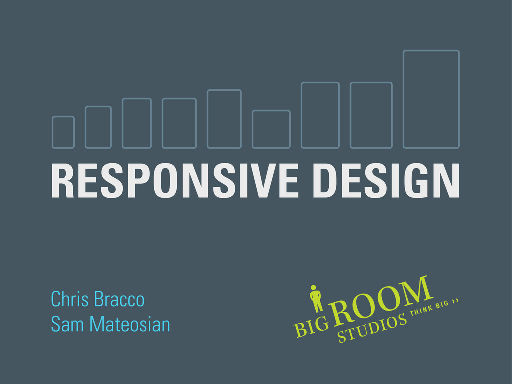
# 01
Good morning, and thanks for coming out to Social Media Breakfast Maine. My name is Chris Bracco, and the man standing next to me is Sam Mateosian. We share a desk at Big Room Studios, a creative technology firm down on Danforth Street, and we’re here to talk about responsive design.
# 02
A quick show of hands, how many of you are familiar with "responsive web design", in some capacity? Has anyone here actually built a responsive web application before? Cool, I’m glad to see some hands. I realize we have a mixed audience here, so I will try not to get too technical, but basically...
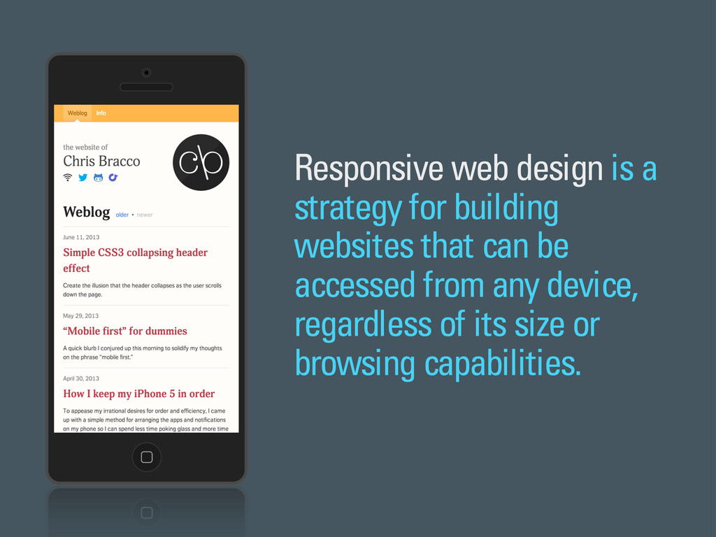
# 03
Responsive web design is a strategy for building websites that work across a wide range of devices. The approach suggests that a website can and should be accessible from any device, regardless of its dimensions, browser, or connection speed.
Long before Ethan Marcotte coined the phrase back in 2010, most website designs were based on a few general assumptions about the devices, browsers, and Internet speeds that were most common at the time.
# 04
For over two decades, desktop computers were the best way to browse the web. Our experience of the web was confined to these clunky boxes for a long time. It made sense for web designers to create websites that were optimized for these fixed viewing spaces.
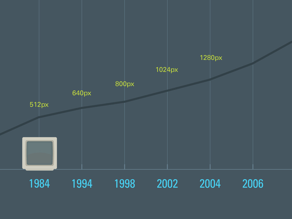
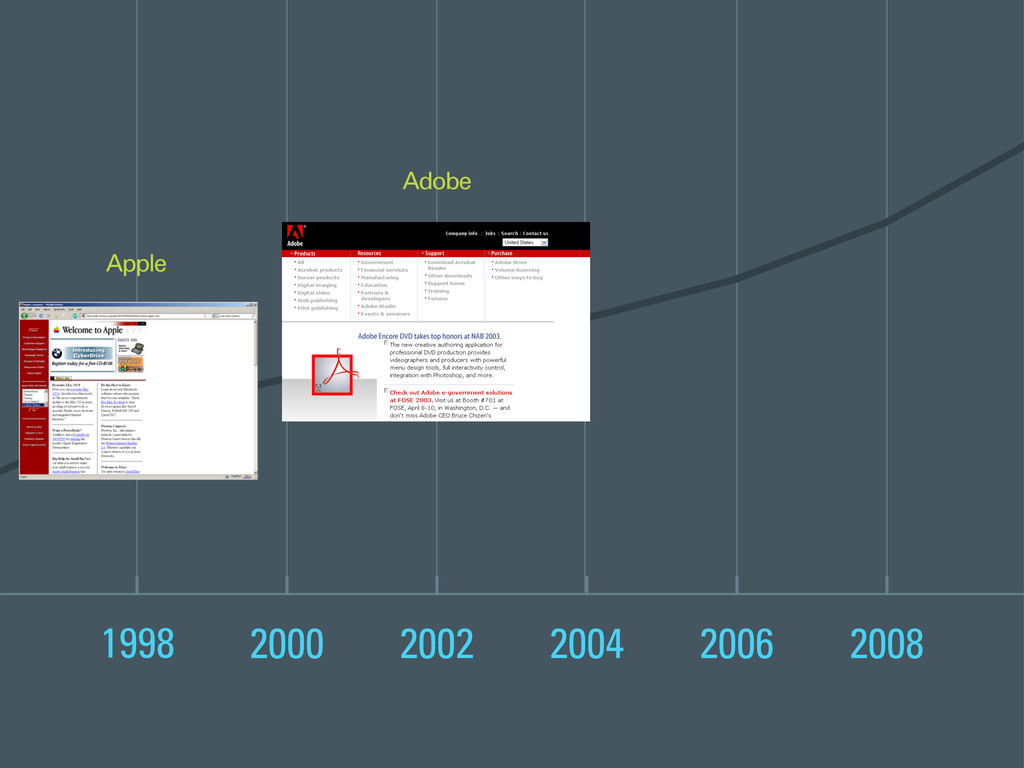
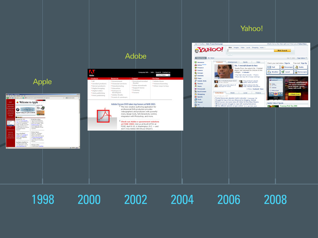
# 05, 06, 07
And as the viewing space grew larger over time...
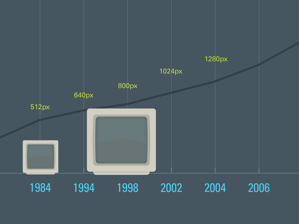
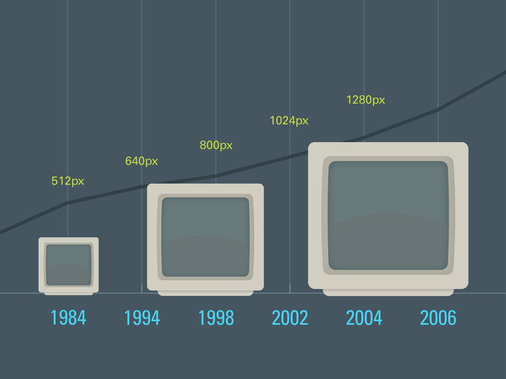
# 08, 09, 10
Our designs grew right along with them.
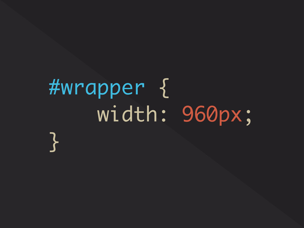
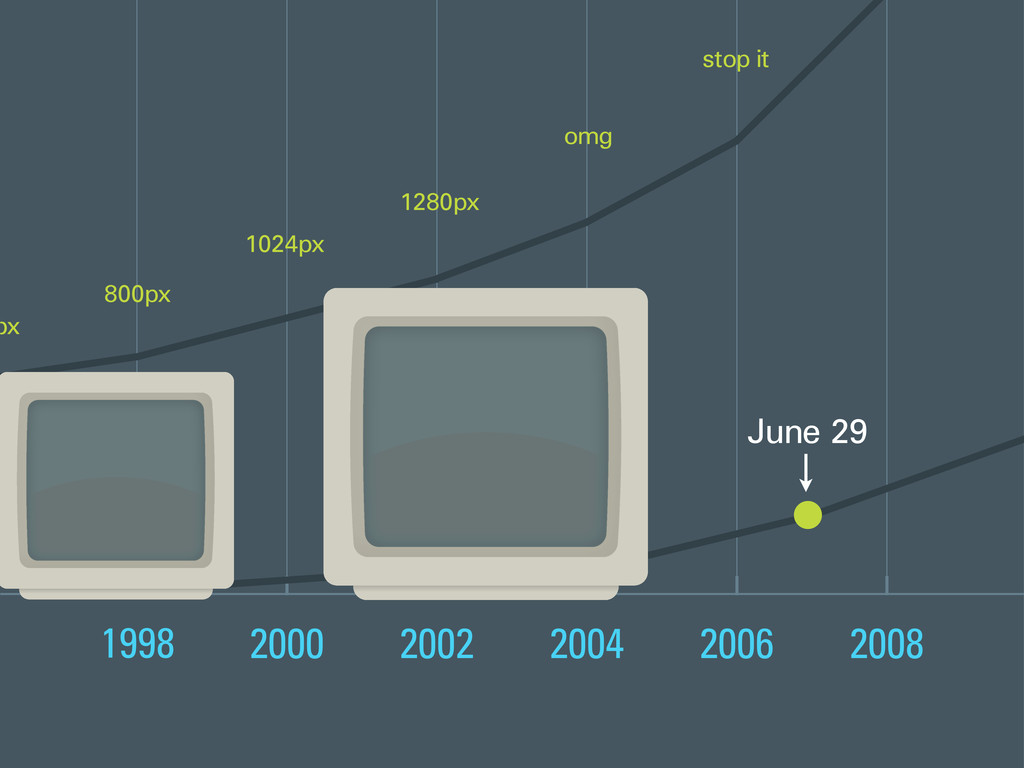
# 11
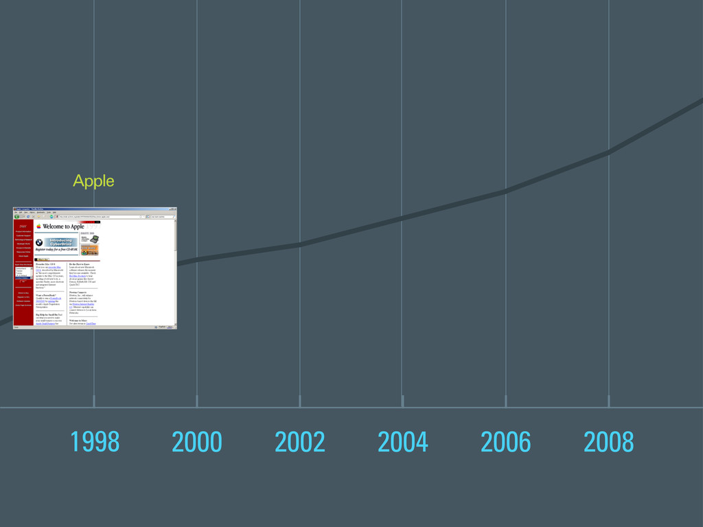
The designer community eventually settled on 960 pixels as the industry standard width of a website, because it looked best on most common screen sizes. Things we’re just peachy, at least for a few years.
# 12
And then on June 29, 2007...
# 13
...the iPhone dropped. The launch of the first iPhone was an exciting day for consumers, and...
# 14
...a rude awakening for web designers and developers. It was time to take a step back and re-evaluate our process.
# 15
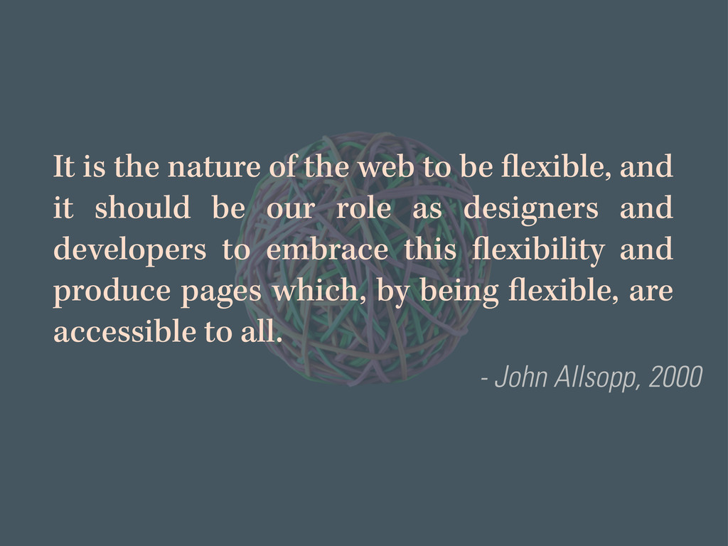
The web was never intended to be constrained to a single context. Quite the opposite, actually. The web is a flexible medium by nature, and it has always been that way! Mr. Allsopp tried to remind us of this nearly thirteen years ago, but to no avail.
# 16
Many designers ignored the inherent flexibility of the web, or maybe they never saw John’s article, because they continued building their “pixel-perfect” masterpieces for the better part of the last two decades.
My theory is that designers adapted the print design process for the web, using a workflow that begins by defining a fixed width and height. It’s easier to manipulate finite values than something more abstract like a set of percentages.
Regardless of the reasoning, however, we needed to act fast because those beautiful, pixel-precise websites that we tinkered with for years were...
# 17
...instantly broken on mobile devices. More devices introduced a new set of problems for designers and developers to solve.
Clients were pissed, and demanded immediate solutions, so developers spun up separate “iPhone-optimized” and “mobile-friendly” versions of their websites to appease them.
# 18
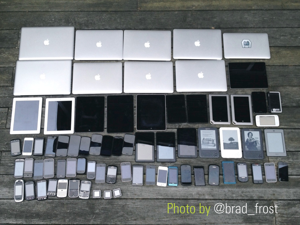
But, the number of devices that could access the web increased rapidly. Soon enough, websites had to work on all of these things, whether it be a mobile phone, a tablet, a Kindle, or one of those stupid little square gadgets.
But, building the same website 73 times over is a grand waste of everyone’s time. There has to be a better way, right?
# 19
Ethan’s seminal 2010 article on responsive design marked the beginning of the web community returning to its roots, and embracing its inherent flexibility.
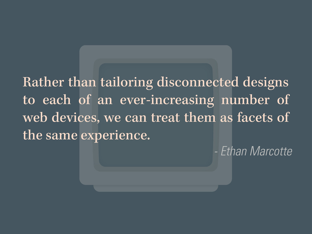
In his aptly titled article, “Responsive Web Design” Ethan suggests: “Rather than tailoring disconnected designs to each of an ever-increasing number of web devices, we can treat them as facets of the same experience.”
Ethan is basically saying enough with the “iPad 2” or “Galaxy S3”-optimized websites, already. It’s a zero sum game. Humans access the web from many different devices now, and if your website only works on a few of them, what’s the point? You’re leaving a big chunk of your audience in the dust by doing so.
# 20
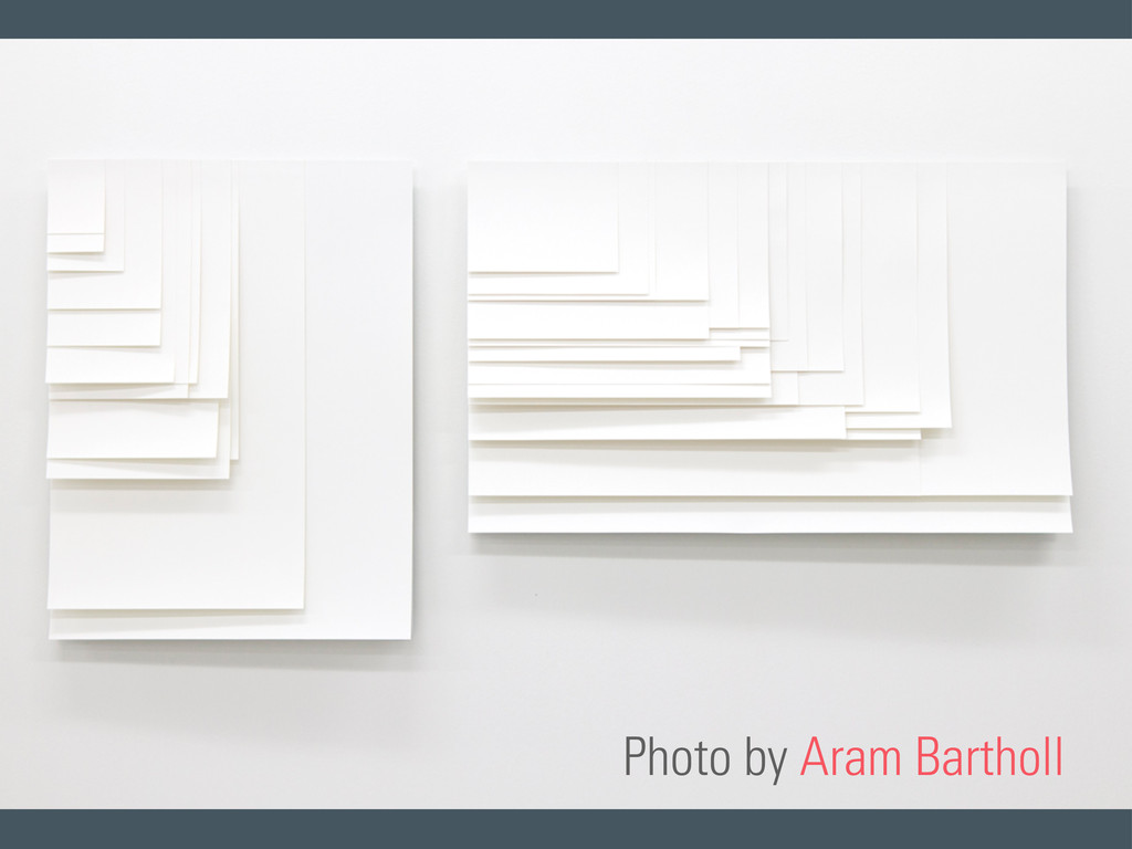
This photo by Aram Bartholl illustrates screen resolutions and aspect ratios, and how they’ve evolved over the last two decades. I thought it was pretty neat to see the web represented this way, in a non-flexible medium.
It no longer makes sense to build websites for a few common screen resolutions. Today, as you can see, there are screens of all shapes, sizes, and orientations.
# 21
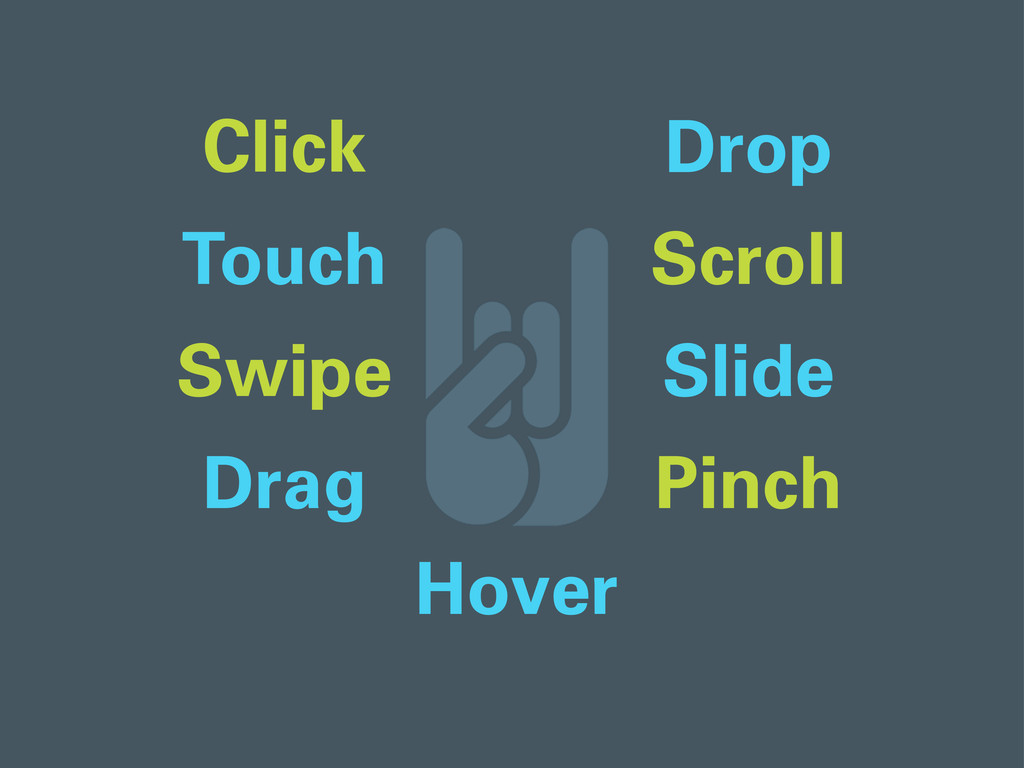
There are also many input types. Users can click, touch, swipe, drag, drop, scroll, slide, pinch, hover...
# 22
...or rock out.
# 23
But why do we give users the ability to perform all of these actions? For one reason. So they can interact with our...
# 24
CONTENT. COOONNNTTEENTTTT. You know, the stuff that your customers want. The stuff that replaces all that lorem ipsum nonsense in your design mockups.
# 25
It’s what they’ve always wanted all along, yet over time websites became very bloated with other stuff. Businesses were cramming their websites with advertisements, tracking scripts, sidebars, social sharing buttons, you name it.
What these businesses did not realize is that all of this extra stuff really just gets in the way and pisses off their users, who are just trying to find your goddamn content.
# 26
So as a business with a website, what do you do when device screens suddenly shrink from 1024 pixels to 320 pixels? What becomes important to your business when you lose 70% of your real estate? A wider array of devices means web designers and businesses need to think about the core content and functionality FIRST.
Responsive design is a reinforcement of the idea that...
# 27
...content is indeed king.
# 28
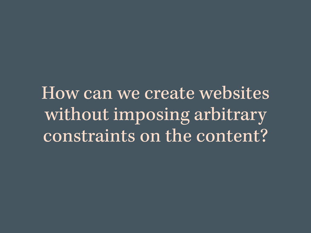
So, how can we create websites without imposing arbitrary constraints on the content?
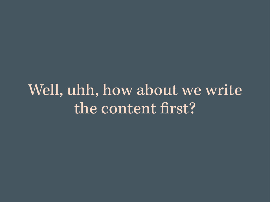
# 29
Well, how about we write the content first. By doing so, you are preparing it to go anywhere.
# 30
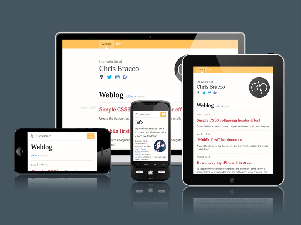
Responsive design relies on having the content portion done first. It’s an approach to web design that utilizes the web’s inherent flexibility instead of ignoring it. It’s building a single website that can adapt to the device it’s being viewed on, and serve the appropriate content in the appropriate manner.
# 31
Techniques for responsive design typically fall into one of two categories: graceful degradation or progressive enhancement. Both of these concepts predate responsive design, and one of them makes a lot more sense to me than the other.
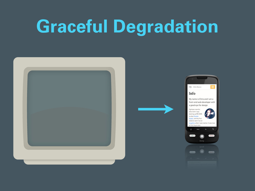
# 32
The first, graceful degradation, is the traditional web strategy of optimizing web applications for the latest browsers first, and allowing the application to degrade and remain presentable in older browsers without hurting the user experience too badly.
This strategy comes with the attitude that the user should just upgrade their browser for a better experience. This attitude is usually a result of time and budget constraints. It’s quicker to build web applications this way, but it ignores users who may not be fortunate enough to have access to modern web browsers and high speed connections.
# 33
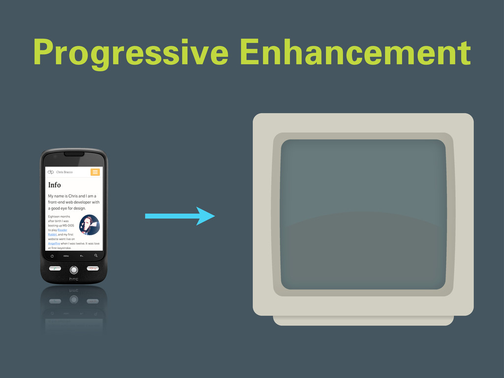
In progressive enhancement, the strategy is deliberately reversed. You begin your design for the lowest common denominator, and then add functionality or improvements to the presentation and behavior of the application. This is sometimes referred to as "mobile-first" responsive design.
Start at the bottom, and work your way up. This method forces you to prioritize and determine what are the most important content and interactions on your website, and it’s the approach that makes the most sense to me.
# 34
If done right, the result is a website that allows everyone to access the core content and functionality from any browser or connection speed, while also providing an enhanced version of the website to those with more advanced browsers and faster connections. Everyone’s happy. It’s all gravy, right?
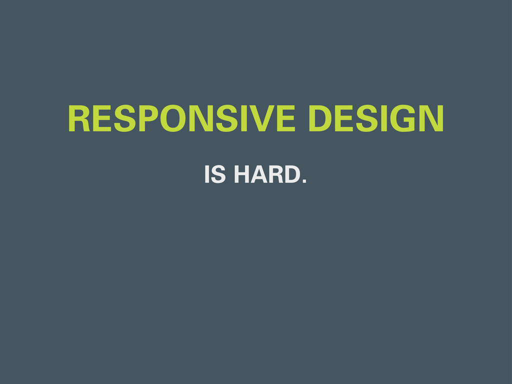
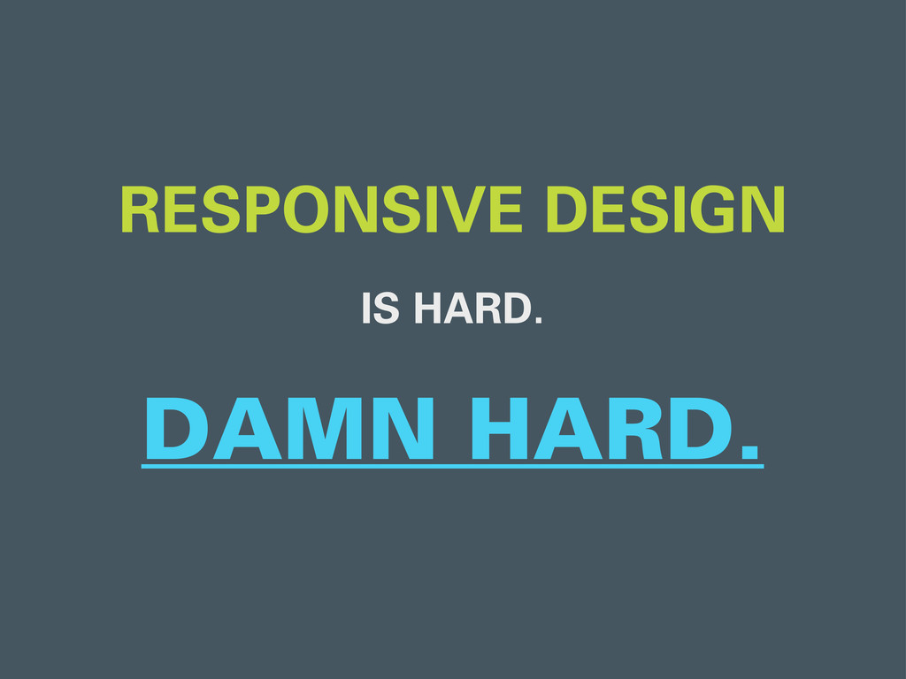
# 35
Well, the biggest drawback of responsive design is that it’s hard.
# 36
Damn hard, in fact.
# 37
Mobile-first, responsive web design requires a complete website overhaul, but more importantly it requires a complete mental overhaul. Many designers are still building static mockups in photoshop and handing them off to developers, but think about it - how can this possibly make sense anymore?
# 38
As a front-end developer, getting handed a design that is optimized for a desktop screen and being asked to “make it responsive” or “optimize it for mobile” is backwards and frustrating. You shouldn’t even be thinking about the design until the content has been mapped out.
Responsive design takes time. It’s not a bandaid solution or some magical switch that I’m supposed to flip. It’s a development strategy that requires careful planning, timing, and execution if you want to do it right.
# 39
The initial investment is large, but the payoff for businesses who dive in to responsive design can be huge. Luckily, some large organizations are sharing data about the impact of their new responsive websites.
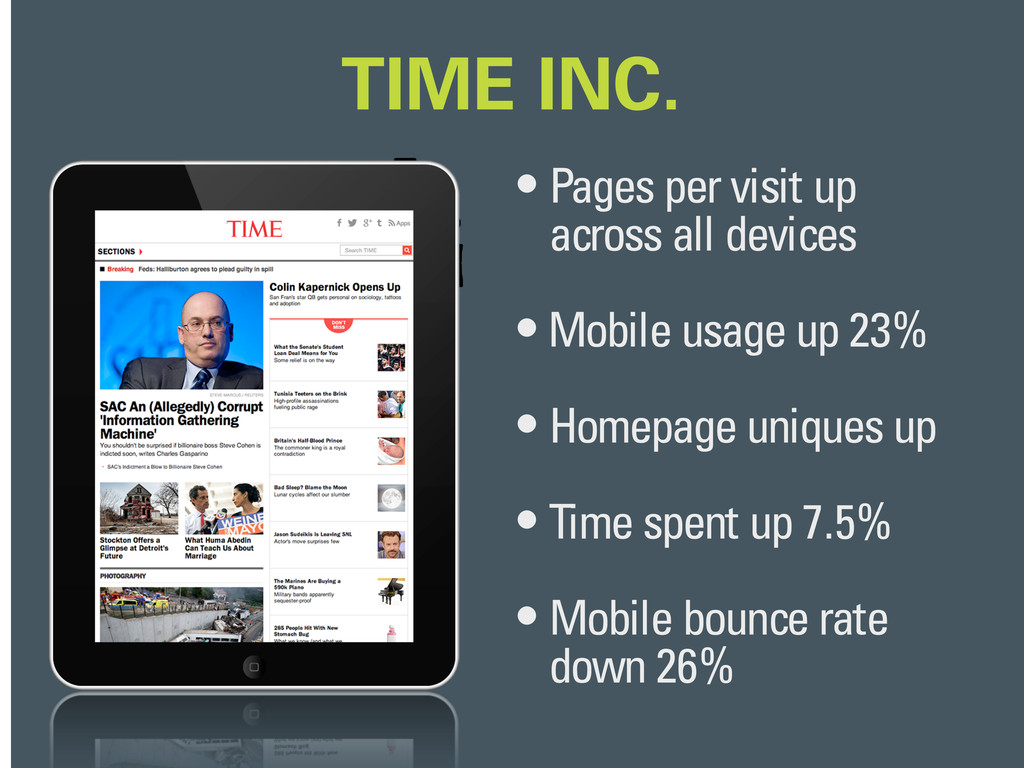
# 40
Time Magazine implemented a responsive design in 2012, and after collecting data they saw some nice improvements.
# 41
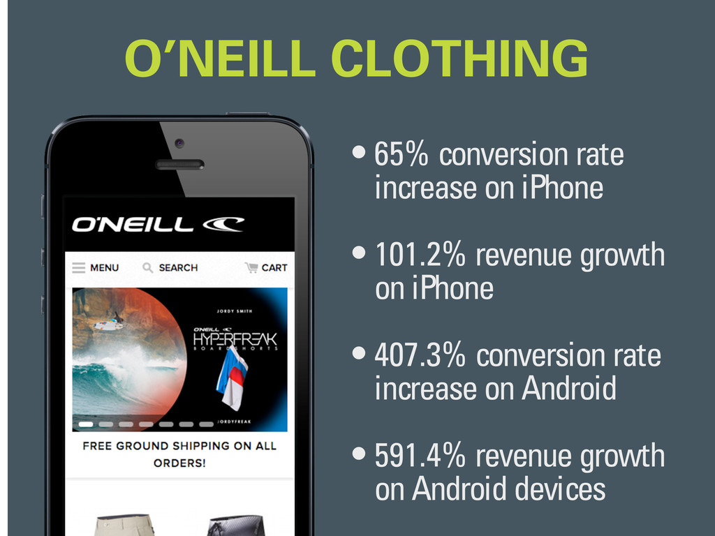
Electric Pulp, the design agency who helped O’Neill redesign their clothing website, posted a case study on their website that had astounding results. After quietly implementing a responsive design, O’Neill saw insane increases in conversation rates and revenue growth.
# 42
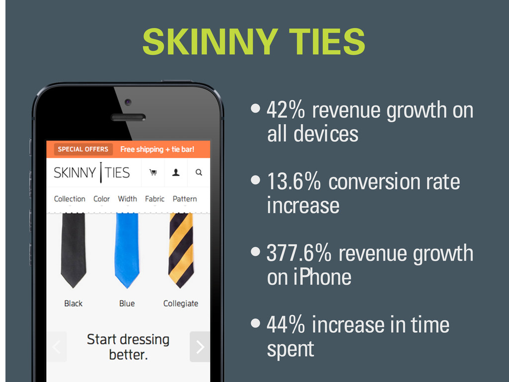
Skinny Ties also experienced great results upon release of their responsive design.
# 43
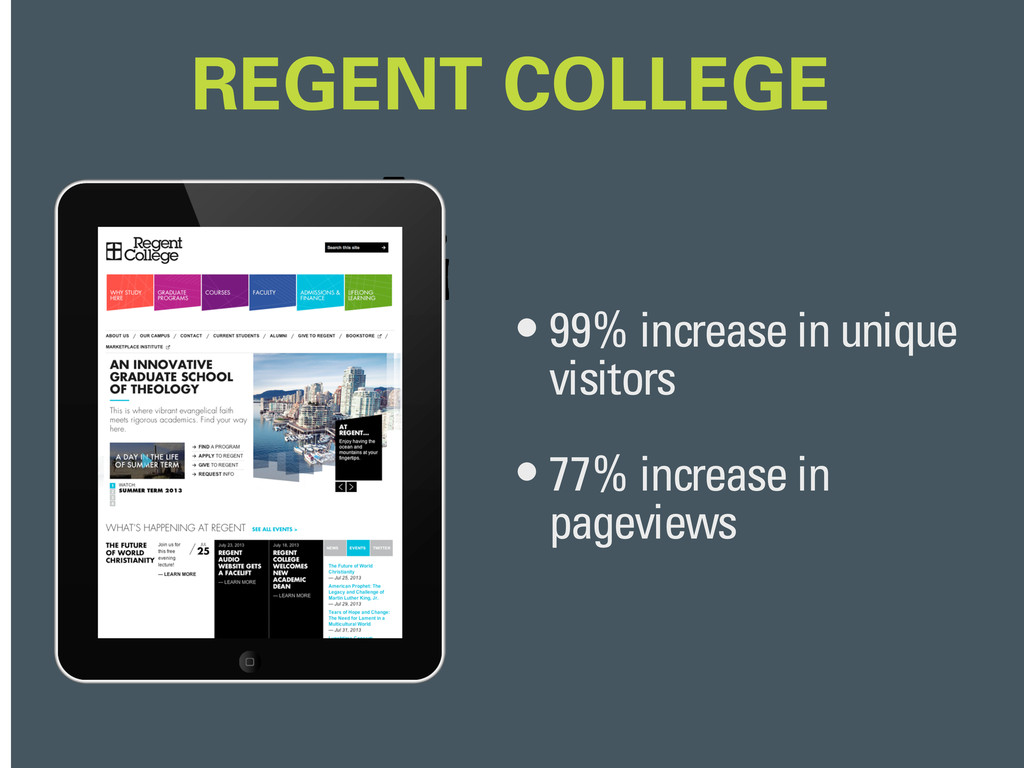
Regent College even got in on the action, hiring Domain7 to give their website a bold, responsive revamp.
And now I'd like to hand it off to Sam Mateosian, who will talk about his experiences with responsive design. Thanks for listening!
 cbracco
 lynteo
 xtone
xtone
 securecat
 kamechi7222222
 ncdc
ncdc
 visional_engineering_and_design
 kgsi
kgsi
 keroyama
 sekiguchiy
 signull
 calpin
 mottox2
 skipperchong
 stephenakadiri
 tammyeverts
 aki_iinuma
 frankvandijk
 lara
lara
 marktimemedia
 madoxten
 techseoconnect
 apolaine
 sergeychernyshev