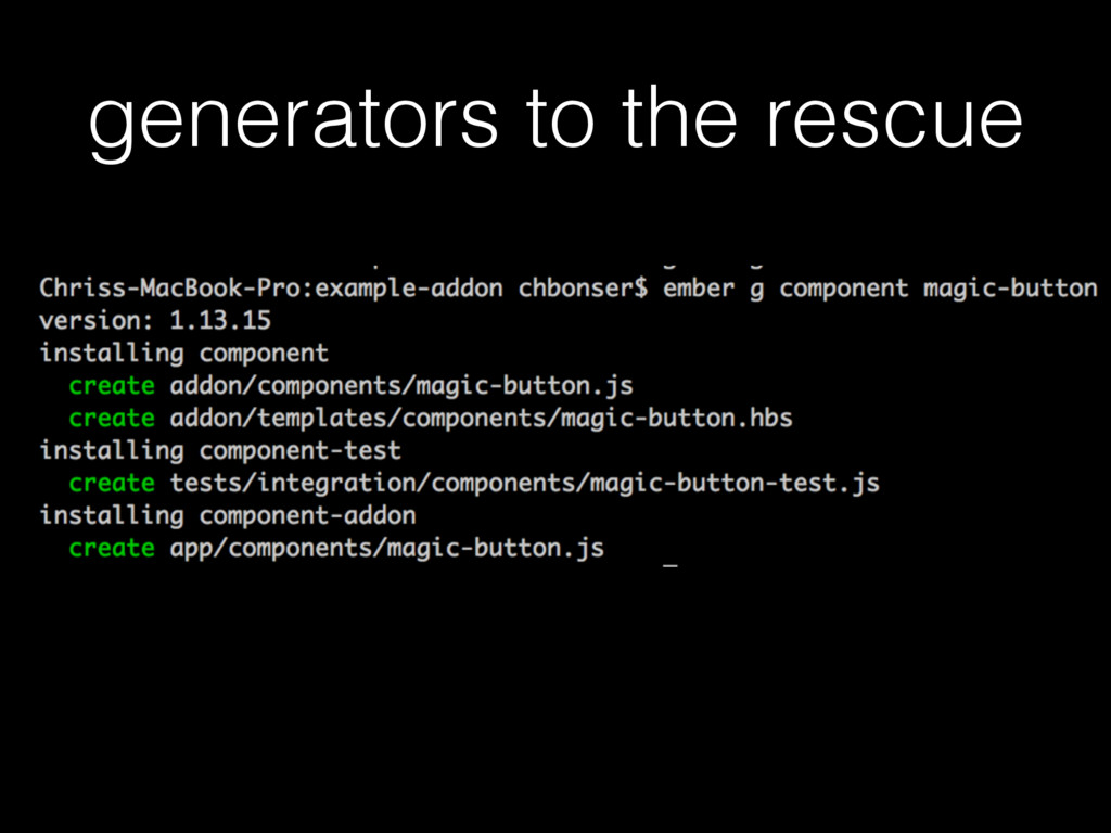
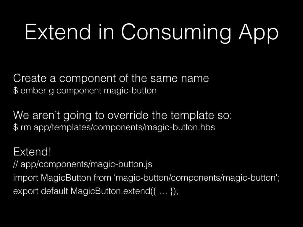
name $ ember g component magic-button We aren’t going to override the template so: $ rm app/templates/components/magic-button.hbs Extend! // app/components/magic-button.js import MagicButton from ‘magic-button/components/magic-button'; export default MagicButton.extend({ … });
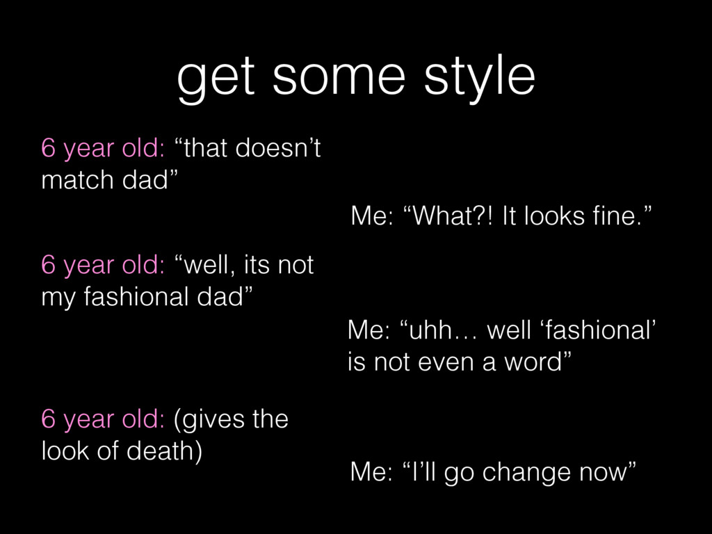
Me: “What?! It looks fine.” 6 year old: “well, its not my fashional dad” 6 year old: (gives the look of death) Me: “uhh… well ‘fashional’ is not even a word” Me: “I’ll go change now”
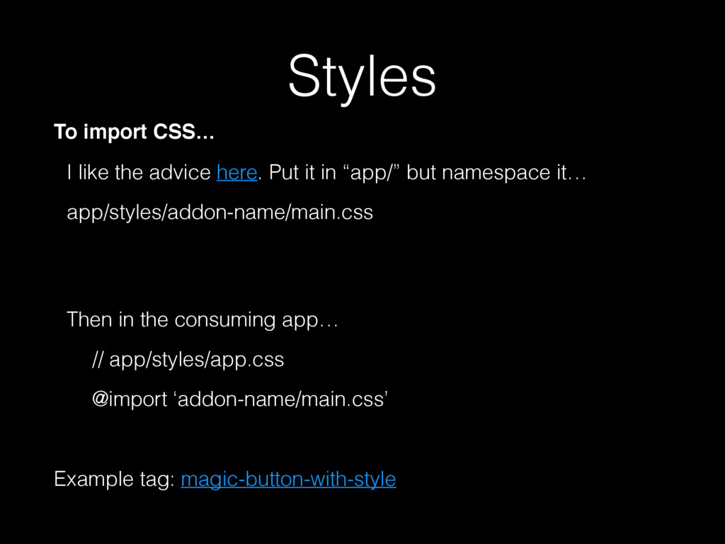
it in “app/” but namespace it… app/styles/addon-name/main.css Then in the consuming app… // app/styles/app.css @import ‘addon-name/main.css’ Example tag: magic-button-with-style
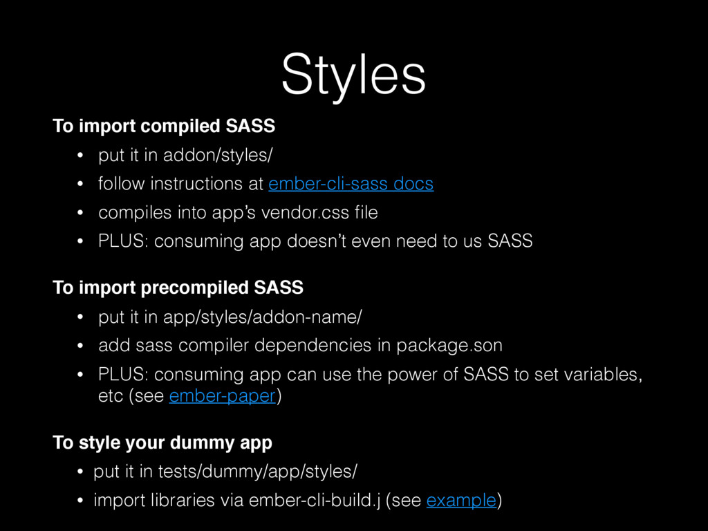
• follow instructions at ember-cli-sass docs • compiles into app’s vendor.css file • PLUS: consuming app doesn’t even need to us SASS To import precompiled SASS • put it in app/styles/addon-name/ • add sass compiler dependencies in package.son • PLUS: consuming app can use the power of SASS to set variables, etc (see ember-paper) To style your dummy app • put it in tests/dummy/app/styles/ • import libraries via ember-cli-build.j (see example)
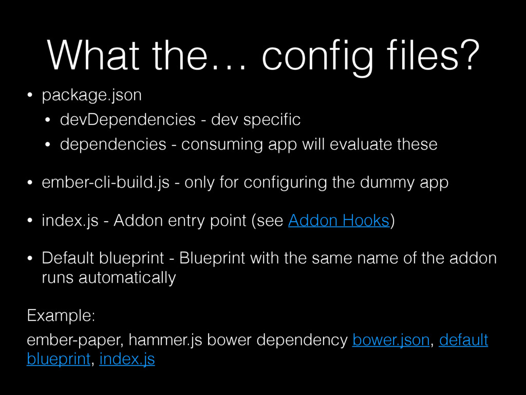
specific • dependencies - consuming app will evaluate these • ember-cli-build.js - only for configuring the dummy app • index.js - Addon entry point (see Addon Hooks) • Default blueprint - Blueprint with the same name of the addon runs automatically Example: ember-paper, hammer.js bower dependency bower.json, default blueprint, index.js
on an item opens a panel and closes other sibling items • Un-classic requirements • Optionally allow multiple items to be open at once • An item can have multiple toggle buttons and panels • Components in a panel should be able to close the panel • Accordions should be nestable
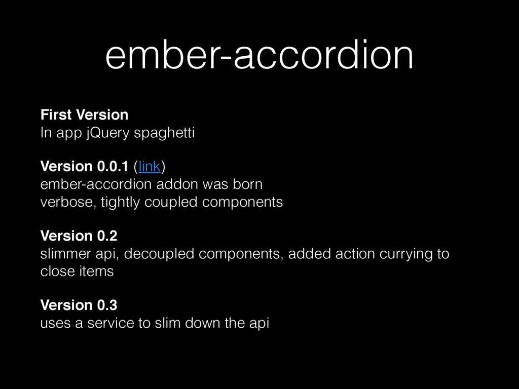
ember-accordion addon was born verbose, tightly coupled components Version 0.2 slimmer api, decoupled components, added action currying to close items Version 0.3 uses a service to slim down the api
 shirouz
 takkuhiro
 kaym
kaym
 flatt_security
 kakehashi
 srenext
 shibuiwilliam
 cscengineer
 sugimomoto
 you
you
 moznion
 bengo4com
 bethany
 scottboms
 raygrieselhuber
 cassininazir
 eitanlees
 inesmontani
 bkeepers
 csswizardry
 matthewcrist
 ryanjones
 mraible