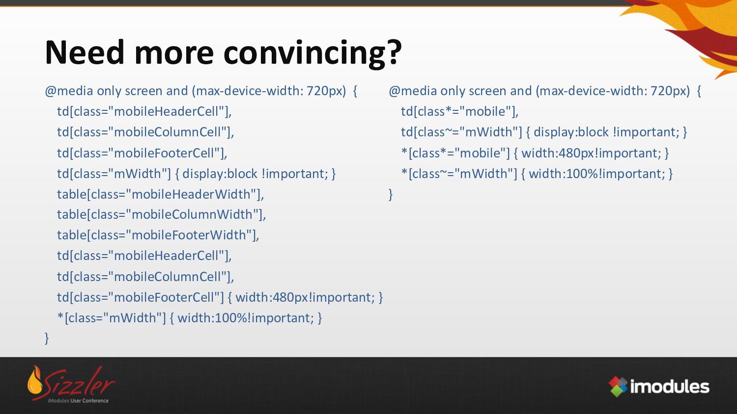
td[class="mobileHeaderCell"], td[class="mobileColumnCell"], td[class="mobileFooterCell"], td[class="mWidth"] { display:block !important; } table[class="mobileHeaderWidth"], table[class="mobileColumnWidth"], table[class="mobileFooterWidth"], td[class="mobileHeaderCell"], td[class="mobileColumnCell"], td[class="mobileFooterCell"] { width:480px!important; } *[class="mWidth"] { width:100%!important; } } @media only screen and (max-device-width: 720px) { td[class*="mobile"], td[class~="mWidth"] { display:block !important; } *[class*="mobile"] { width:480px!important; } *[class~="mWidth"] { width:100%!important; } }
 chrismith
 davetheseo
 csswizardry
 dougneiner
 mlcsv
mlcsv
 keathley
 inesmontani
 ammeep
 thoeni
 lauravandoore
 ks91
ks91
 sabderemane
 addyosmani
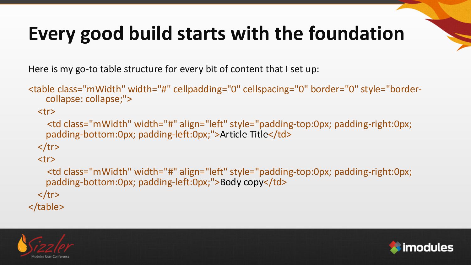
![The pitfalls of [Attribute Selectors] Attribute selectors are very specific](https://files.speakerdeck.com/presentations/1d52c1c12c69445d8435c78516d7a59a/slide_17.jpg)
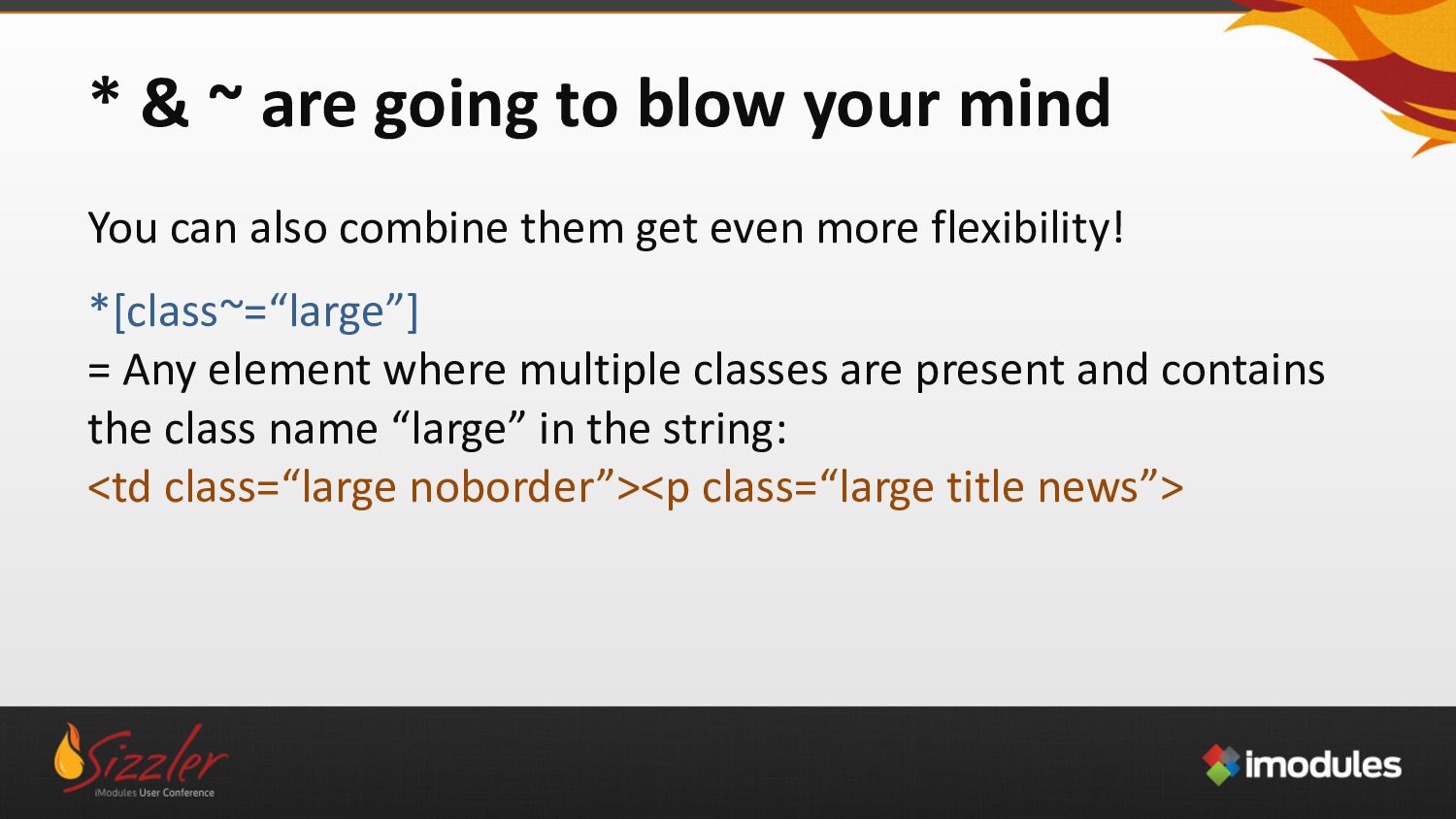
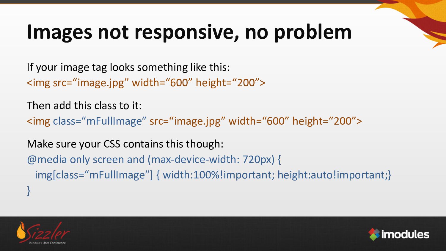
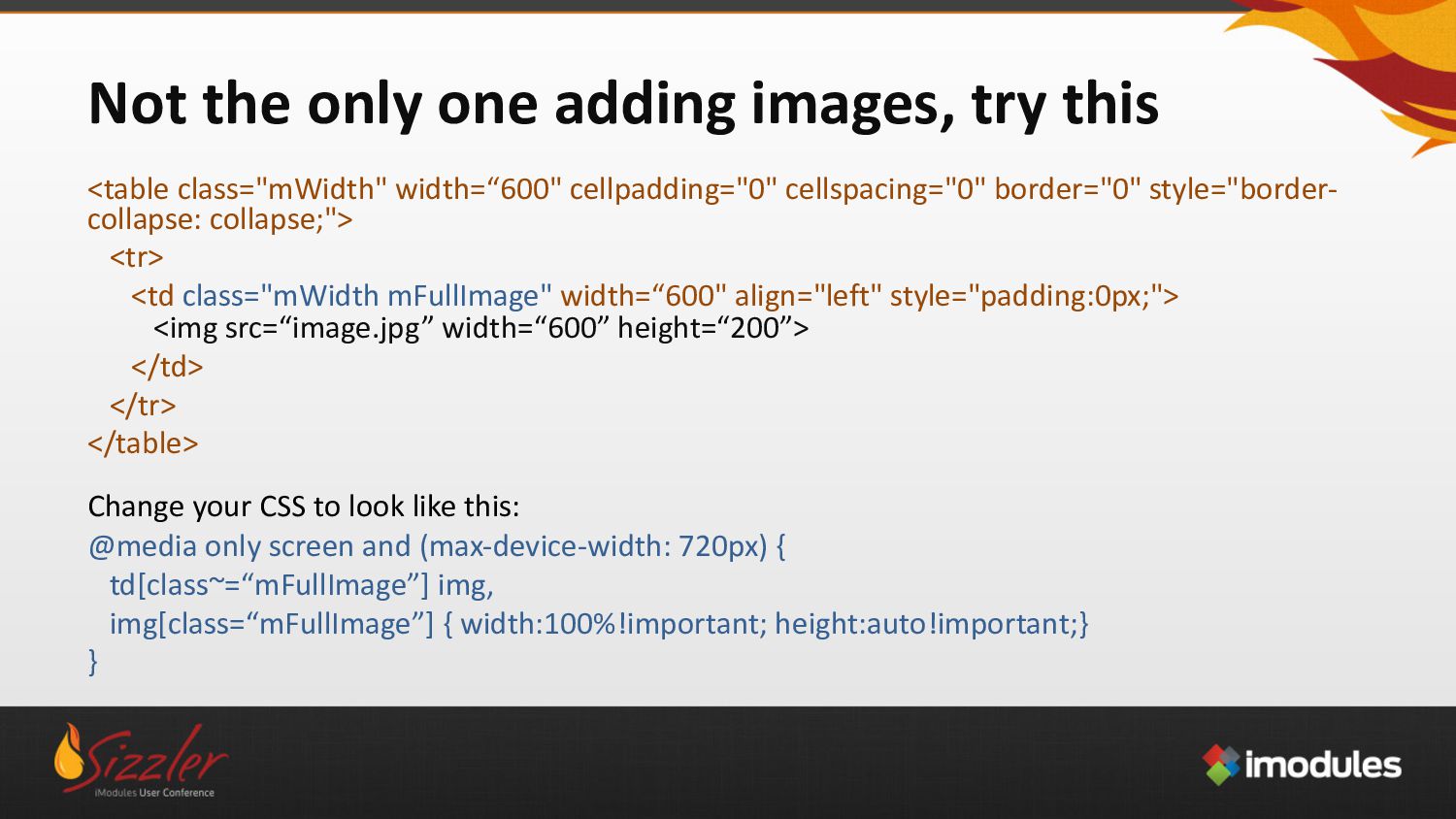
![* & ~ are going to blow your mind *[class=“large”]](https://files.speakerdeck.com/presentations/1d52c1c12c69445d8435c78516d7a59a/slide_18.jpg)