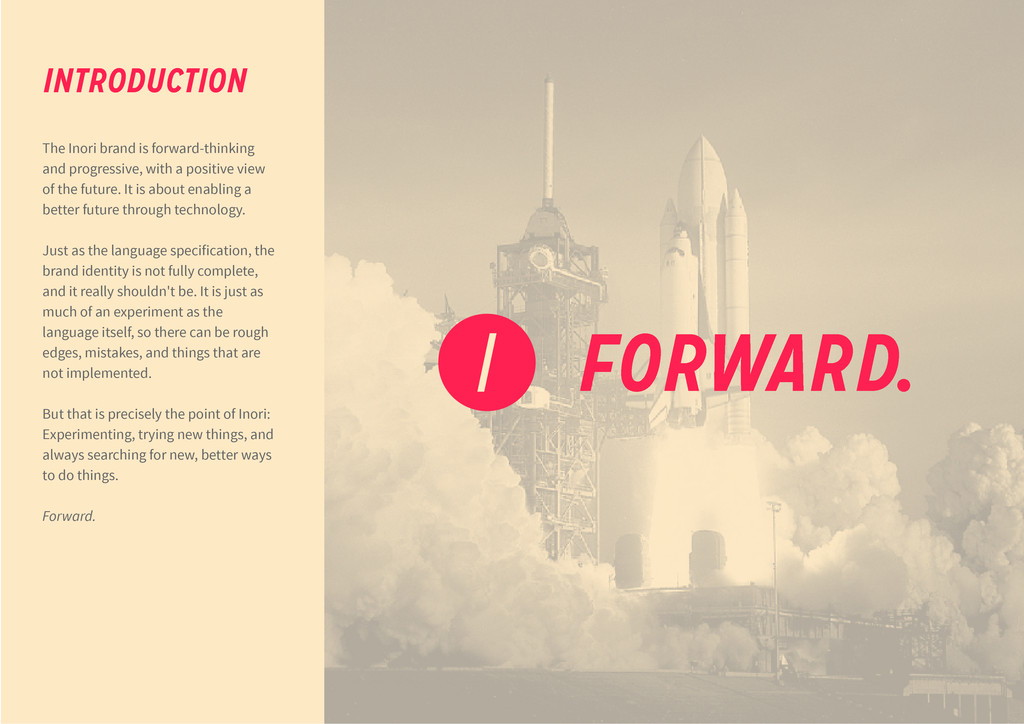
view of the future. It is about enabling a better future through technology. Just as the language specification, the brand identity is not fully complete, and it really shouldn't be. It is just as much of an experiment as the language itself, so there can be rough edges, mistakes, and things that are not implemented. But that is precisely the point of Inori: Experimenting, trying new things, and always searching for new, better ways to do things. Forward. INTRODUCTION FORWARD.
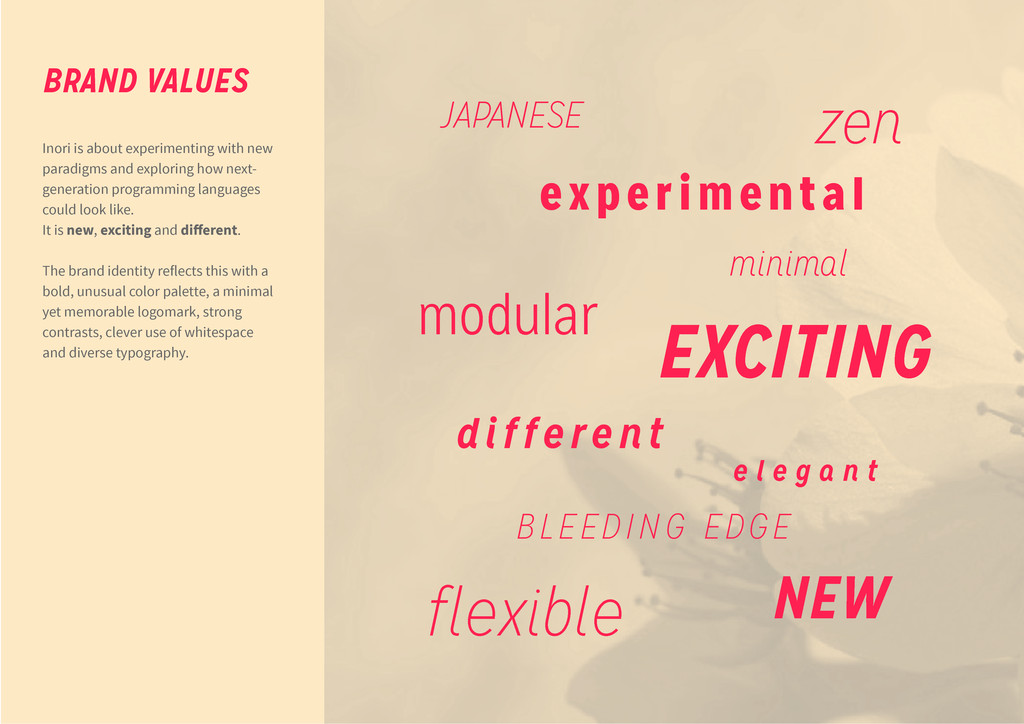
next- generation programming languages could look like. It is new, exciting and different. The brand identity reflects this with a bold, unusual color palette, a minimal yet memorable logomark, strong contrasts, clever use of whitespace and diverse typography. BRAND VALUES JAPANESE minimal modular flexible zen BLEEDING EDGE e x p e r i m e n t a l NEW different EXCITING e l e g a n t
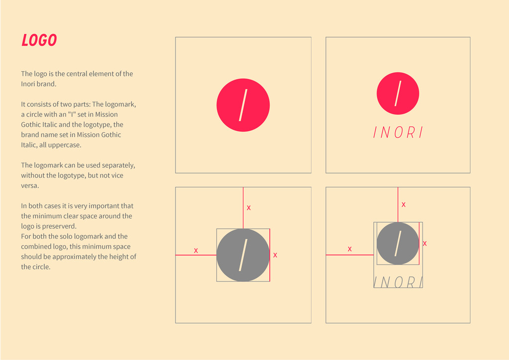
It consists of two parts: The logomark, a circle with an "I" set in Mission Gothic Italic and the logotype, the brand name set in Mission Gothic Italic, all uppercase. The logomark can be used separately, without the logotype, but not vice versa. In both cases it is very important that the minimum clear space around the logo is preserverd. For both the solo logomark and the combined logo, this minimum space should be approximately the height of the circle. LOGO x x x I I I N O R I I I I I N O R I x x x
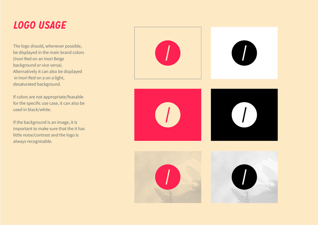
brand colors (Inori Red on an Inori Beige background or vice versa). Alternatively it can also be displayed in Inori Red on a on a light, desaturated background. If colors are not appropriate/feasable for the specific use case, it can also be used in black/white. If the background is an image, it is important to make sure that the it has little noise/contrast and the logo is always recognizable. LOGO USAGE
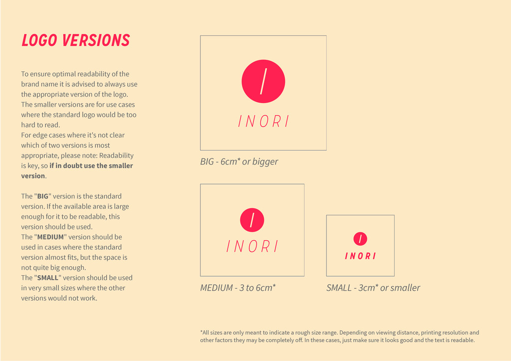
advised to always use the appropriate version of the logo. The smaller versions are for use cases where the standard logo would be too hard to read. For edge cases where it's not clear which of two versions is most appropriate, please note: Readability is key, so if in doubt use the smaller version. The "BIG" version is the standard version. If the available area is large enough for it to be readable, this version should be used. The "MEDIUM" version should be used in cases where the standard version almost fits, but the space is not quite big enough. The "SMALL" version should be used in very small sizes where the other versions would not work. LOGO VERSIONS I I N O R I I N O R I I N O R I BIG - 6cm* or bigger MEDIUM - 3 to 6cm* SMALL - 3cm* or smaller *All sizes are only meant to indicate a rough size range. Depending on viewing distance, printing resolution and other factors they may be completely off. In these cases, just make sure it looks good and the text is readable.
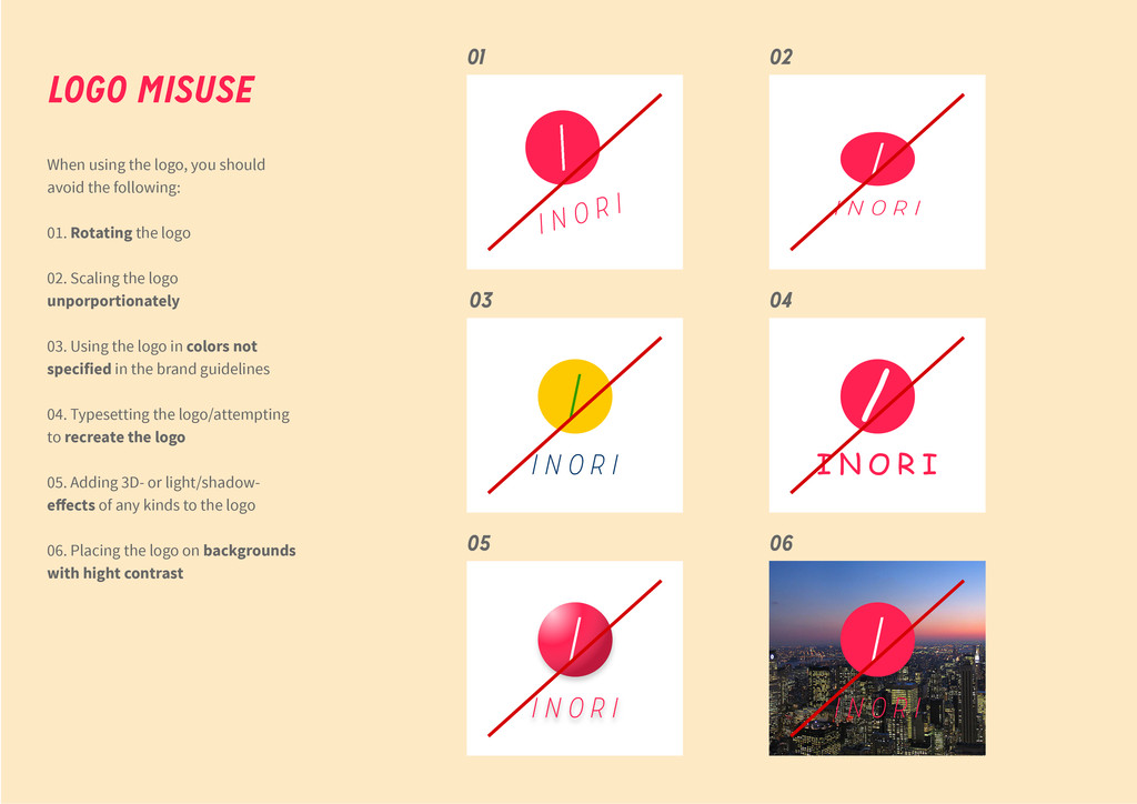
Rotating the logo 02. Scaling the logo unporportionately 03. Using the logo in colors not specified in the brand guidelines 04. Typesetting the logo/attempting to recreate the logo 05. Adding 3D- or light/shadow- effects of any kinds to the logo 06. Placing the logo on backgrounds with hight contrast LOGO MISUSE I I N O R I I I N O R I 01 02 03 04 05 06 I I N O R I I I N O R I I I N O R I / I N O R I
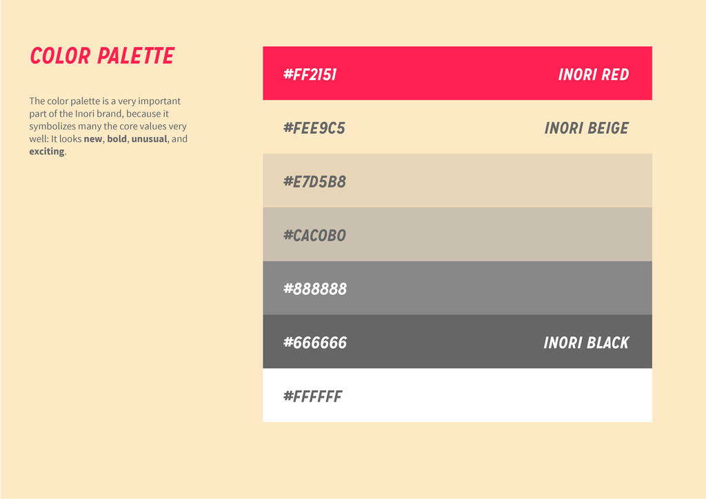
Inori brand, because it symbolizes many the core values very well: It looks new, bold, unusual, and exciting. COLOR PALETTE #FF2151 #FEE9C5 #E7D5B8 #CAC0B0 #888888 #666666 #FFFFFF INORI RED INORI BEIGE INORI BLACK
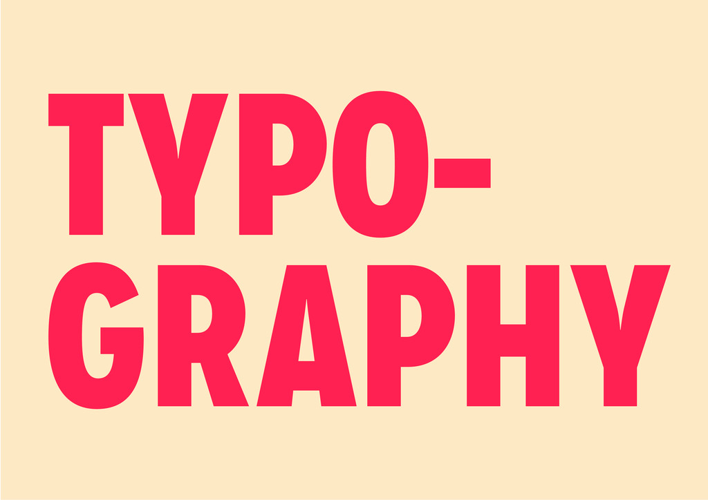
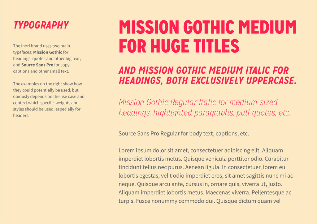
ipsum dolor sit amet, consectetuer adipiscing elit. Aliquam imperdiet lobortis metus. Quisque vehicula porttitor odio. Curabitur tincidunt tellus nec purus. Aenean ligula. In consectetuer, lorem eu lobortis egestas, velit odio imperdiet eros, sit amet sagittis nunc mi ac neque. Quisque arcu ante, cursus in, ornare quis, viverra ut, justo. Aliquam imperdiet lobortis metus. Maecenas viverra. Pellentesque ac turpis. Fusce nonummy commodo dui. Quisque dictum quam vel MISSION GOTHIC MEDIUM FOR HUGE TITLES AND MISSION GOTHIC MEDIUM ITALIC FOR HEADINGS, BOTH EXCLUSIVELY UPPERCASE. Mission Gothic Regular Italic for medium-sized headings, highlighted paragraphs, pull quotes, etc. The Inori brand uses two main typefaces: Mission Gothic for headings, quotes and other big text, and Source Sans Pro for copy, captions and other small text. The examples on the right show how they could potentially be used, but obiously depends on the use case and context which specific weights and styles should be used, especially for headers. TYPOGRAPHY
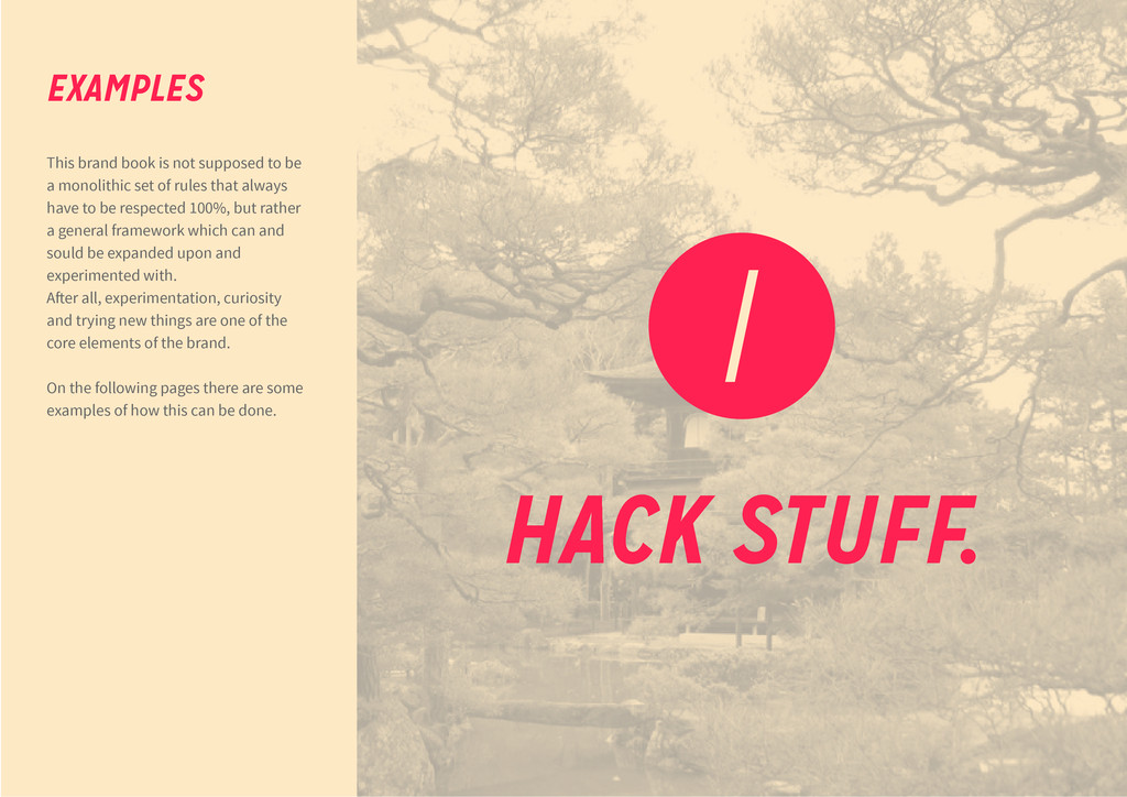
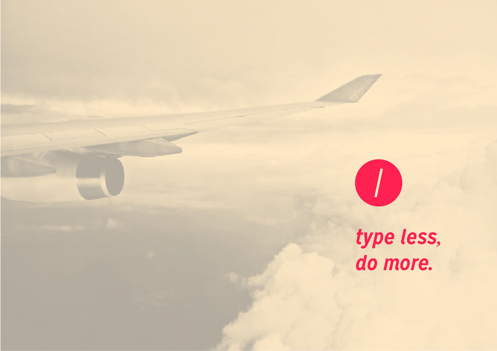
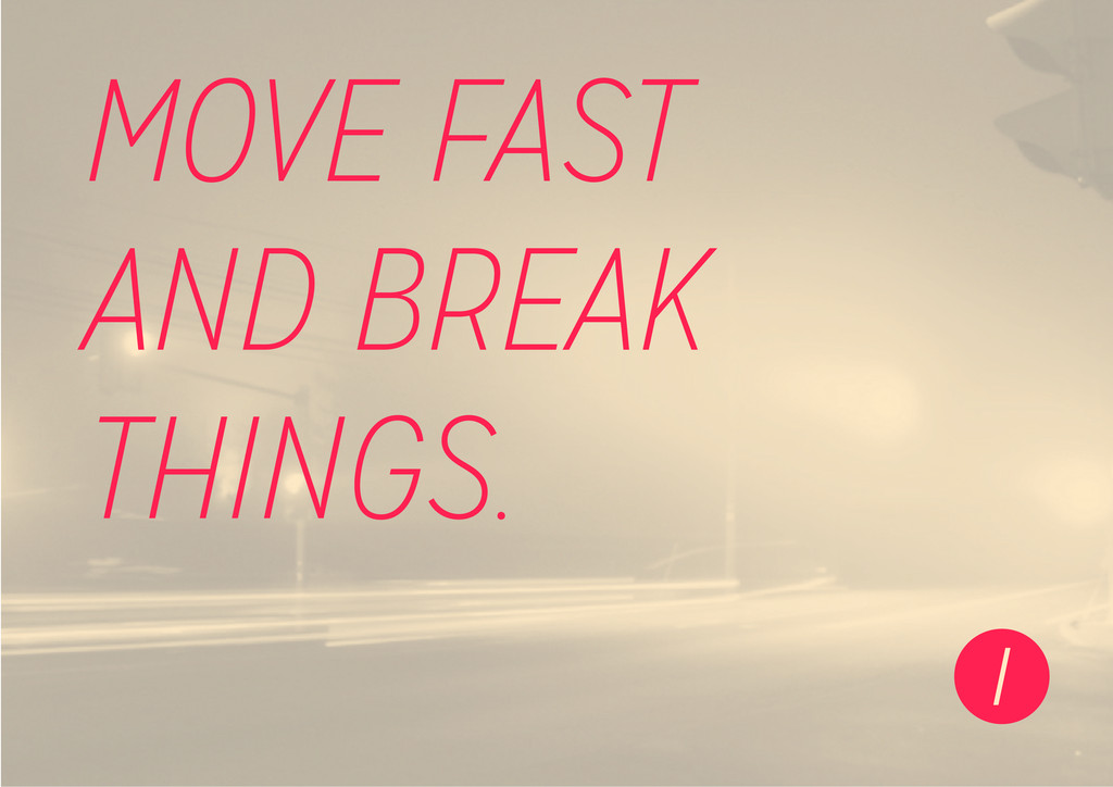
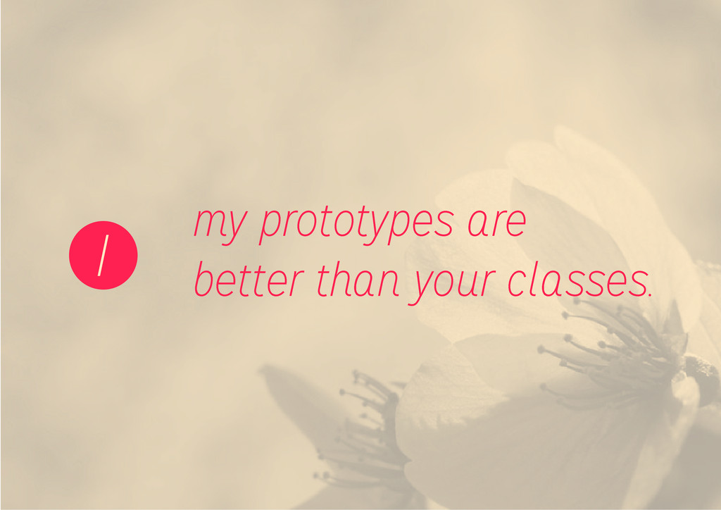
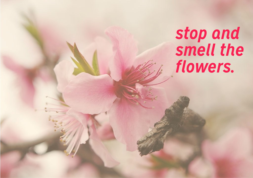
set of rules that always have to be respected 100%, but rather a general framework which can and sould be expanded upon and experimented with. A�er all, experimentation, curiosity and trying new things are one of the core elements of the brand. On the following pages there are some examples of how this can be done. EXAMPLES HACK STUFF.
![lead developer [email protected] yawnt @yawnt 123 345 5678 GIANLUCA STIVAN](https://files.speakerdeck.com/presentations/96d638d0df740130ea9e5a0b7a1270e4/slide_15.jpg)