Upgrade to Pro
— share decks privately, control downloads, hide ads and more …
Speaker Deck
Features
Speaker Deck
PRO
Sign in
Sign up for free
Search
Search
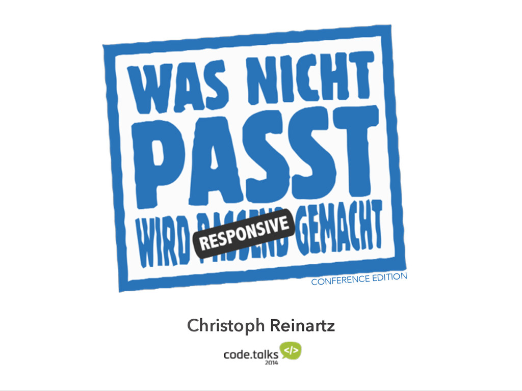
Was nicht passt wird responsive gemacht - confe...
Search
Christoph Reinartz
October 10, 2014
Technology
89
0
Share
Embed
Copy iframe code
Copy JS code
Copy link
Start on current slide
Was nicht passt wird responsive gemacht - conference edition
the slides from my responsive presentation at code.talks 2014 in hamburg
Christoph Reinartz
October 10, 2014
More Decks by Christoph Reinartz
See All by Christoph Reinartz
Lessons learned from running a Design System or How to escape a filter bubble
creinartz
1
410
From Engineering to Product - A True Story
creinartz
0
540
Design Systems Engineering - Scaling User Interfaces @trivago
creinartz
1
710
Design Systems Engineering - Scaling User Interfaces @trivago
creinartz
1
370
Rebuilding an aircraft on the fly
creinartz
2
980
Rebuilding an aircraft on the fly
creinartz
0
250
Rebuilding an aircraft on the fly
creinartz
1
240
Large Scale CSS Refactoring
creinartz
3
890
Large Scale CSS Refactoring
creinartz
0
970
Other Decks in Technology
See All in Technology
AI時代の開発生産性は、個人技からチーム設計へ
moongift
PRO
4
2.3k
ruby.wasmとPicoRuby.wasmに対応した仮想DOMライブラリを作ってる話 #kaigieffect_kaigi
sue445
PRO
0
150
CIで使うClaude
iwatatomoya
0
290
AI時代の闇と光
tatsuya1970
0
110
Type-safe IaC for Dart
coborinai
0
160
しぶいSRE: サーバから見えない障害にどう向き合うか。ラストワンマイルのデバッグ実践 / Shibui SRE
kanny
13
6.5k
AI Agent SaaS を支える自社仮想化基盤への挑戦と実運用 / ai-agent-saas-virtualization
flatt_security
3
4.1k
Empower GenAI with Agile - あなたのアジャイルが生成AIのバフになる仕組み
hageyahhoo
1
210
カードゲーム作りが教えてくれた プロダクトオーナーシップ
moritamasami
0
110
Making sense of Google’s agentic dev tools
glaforge
1
280
誤解だらけの開発生産性 / Myths and Misconceptions about Developer Productivity
i35_267
2
790
はじめてのWDM
miyukichi_ospf
1
150
Featured
See All Featured
Unsuck your backbone
ammeep
672
58k
Designing for humans not robots
tammielis
254
26k
Fantastic passwords and where to find them - at NoRuKo
philnash
52
3.8k
Getting science done with accelerated Python computing platforms
jacobtomlinson
2
310
30 Presentation Tips
portentint
PRO
1
350
[Rails World 2023 - Day 1 Closing Keynote] - The Magic of Rails
eileencodes
38
2.9k
Design of three-dimensional binary manipulators for pick-and-place task avoiding obstacles (IECON2024)
konakalab
0
490
Agile Actions for Facilitating Distributed Teams - ADO2019
mkilby
0
220
Jess Joyce - The Pitfalls of Following Frameworks
techseoconnect
PRO
1
190
Ecommerce SEO: The Keys for Success Now & Beyond - #SERPConf2024
aleyda
1
2.1k
SEO in 2025: How to Prepare for the Future of Search
ipullrank
3
3.6k
SERP Conf. Vienna - Web Accessibility: Optimizing for Inclusivity and SEO
sarafernandez
2
1.5k
Transcript
Christoph Reinartz CONFERENCE EDITION
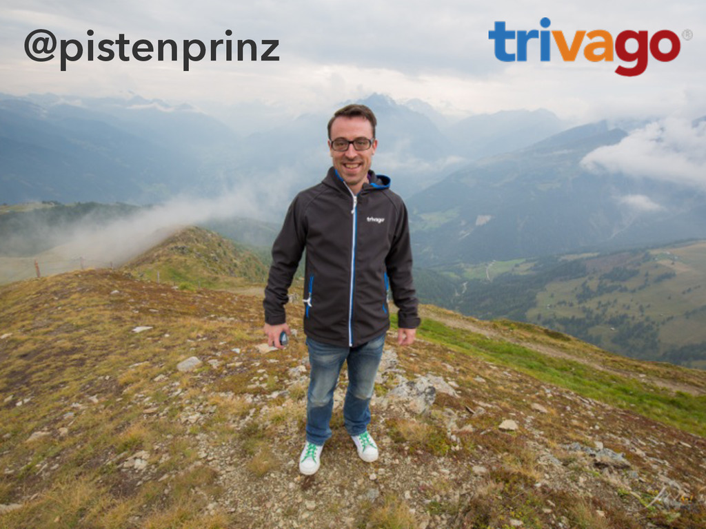
@pistenprinz
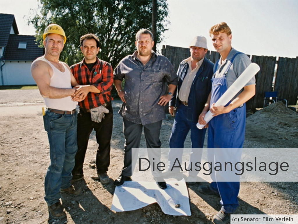
Die Ausgangslage (c) Senator Film Verleih
https://www.flickr.com/photos/glenscott/509720363
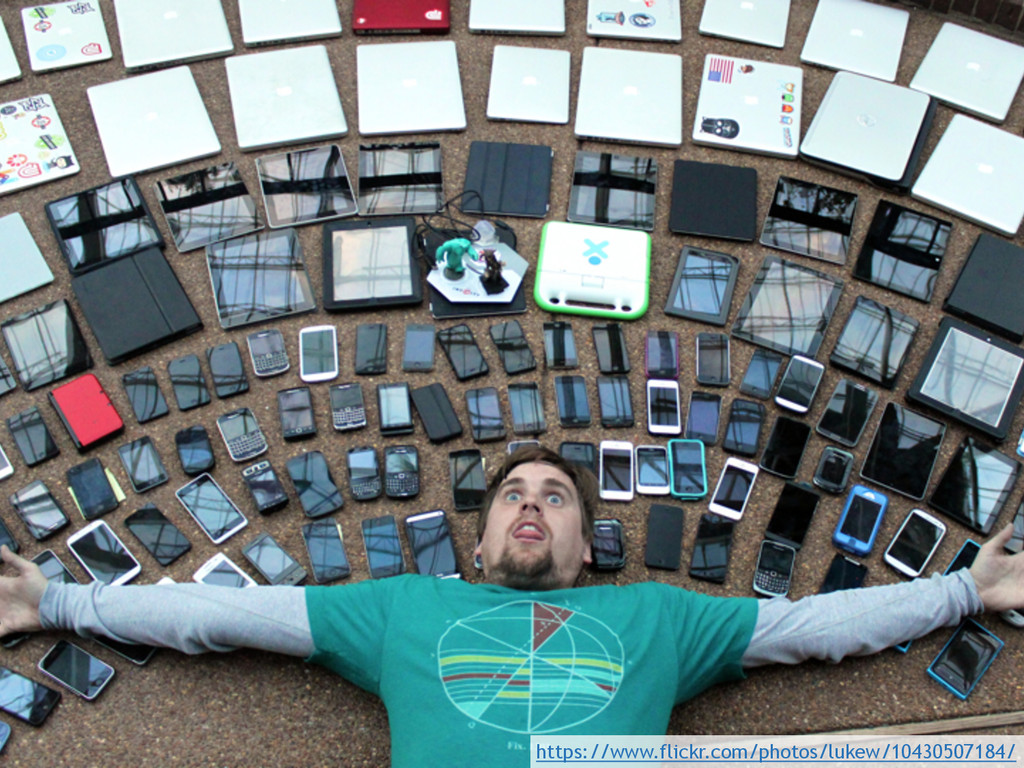
https://www.flickr.com/photos/lukew/10430507184/
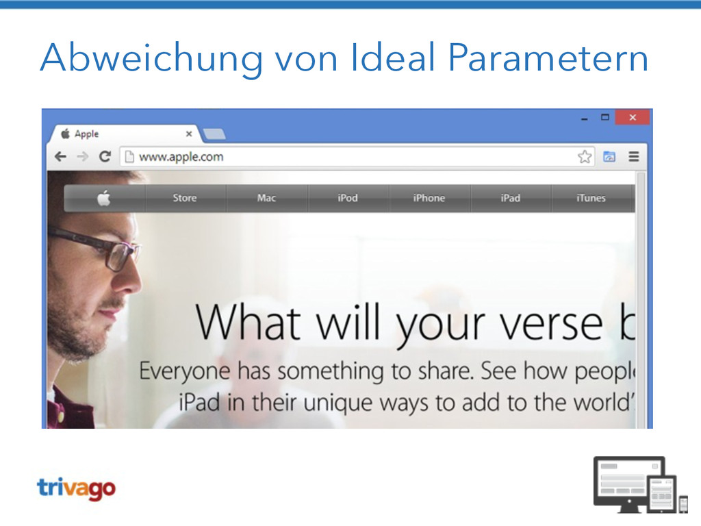
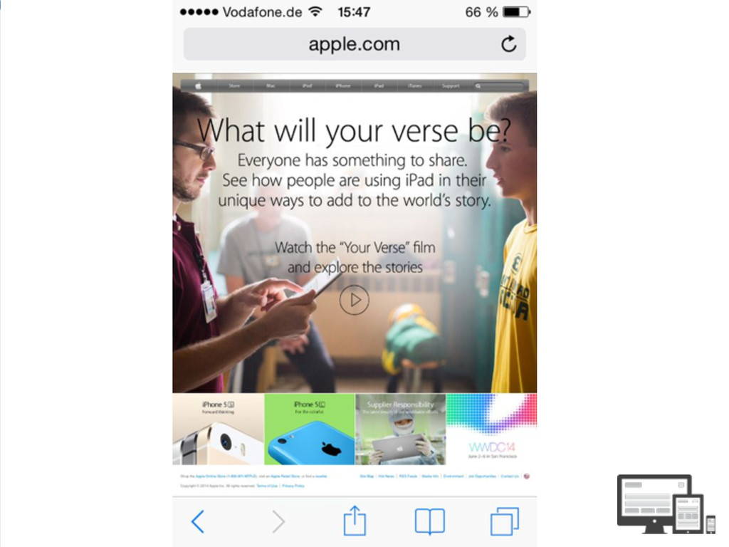
Abweichung von Ideal Parametern
None
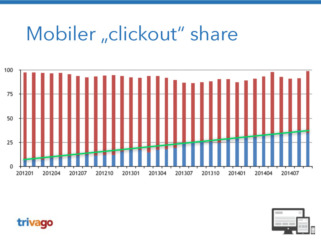
Mobiler traffic
Mobiler „clickout“ share
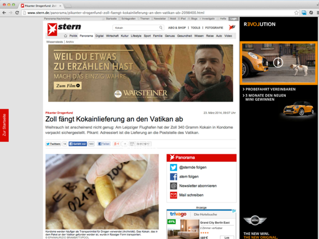
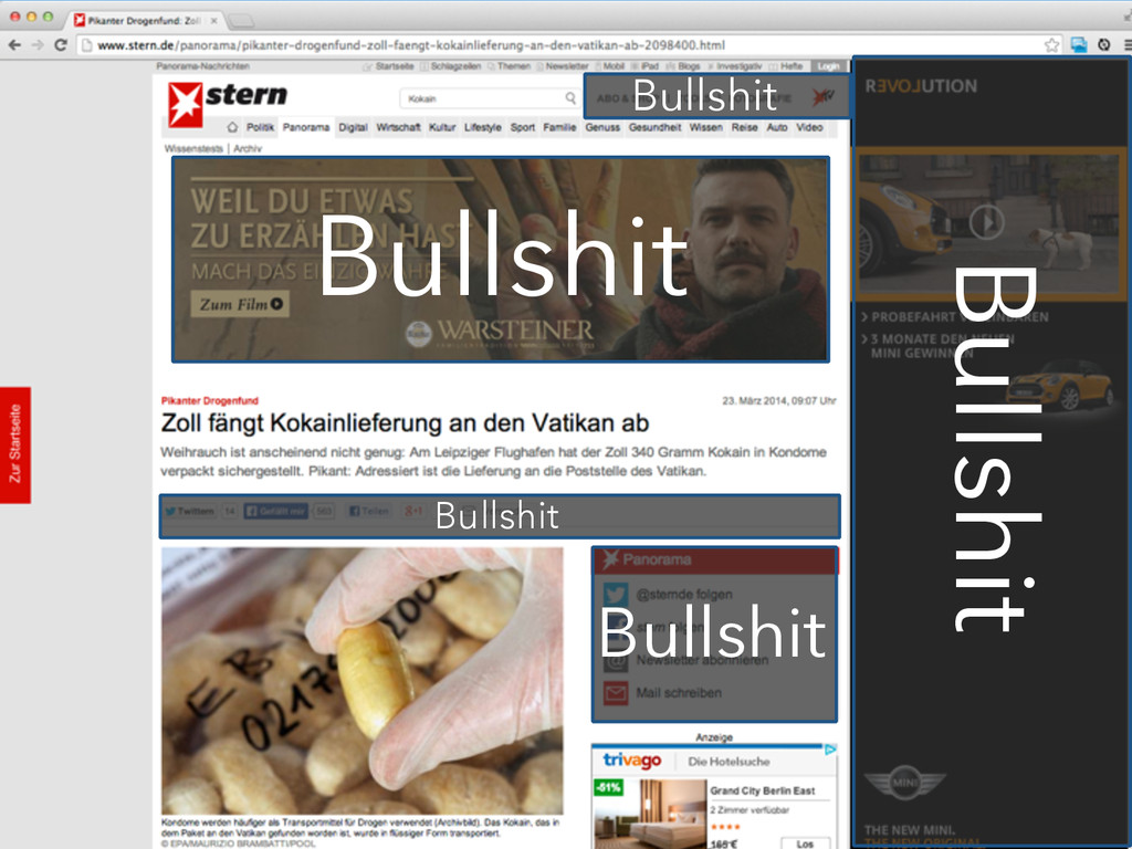
Der klassische Ansatz • 2 Webseiten • Desktop-Seite • speziell
auf mobile Geräte angepasste mobile Seite • Redirect auf m. * je nach User-Agent
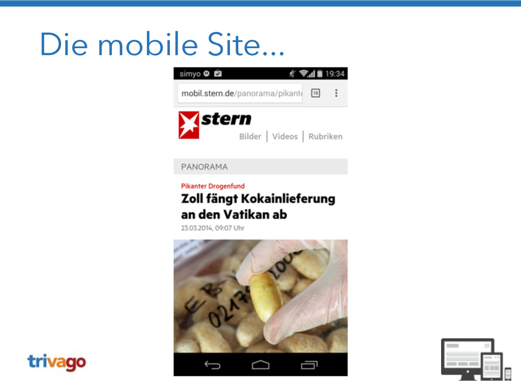
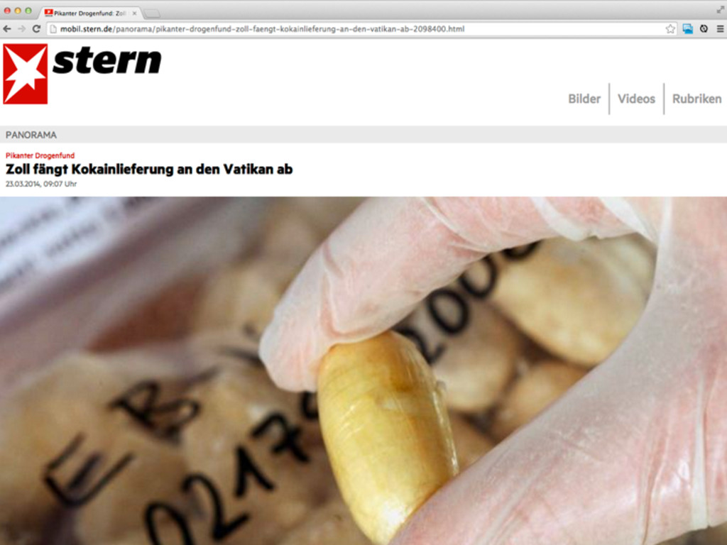
Die mobile Site...
Die mobile Site...
None
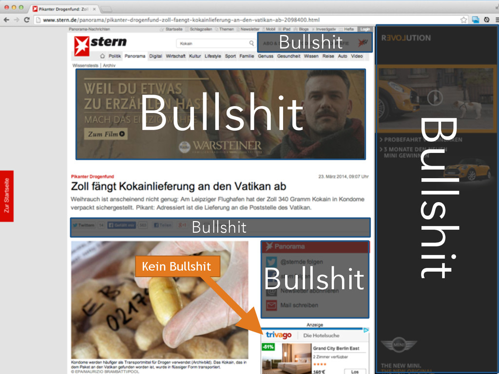
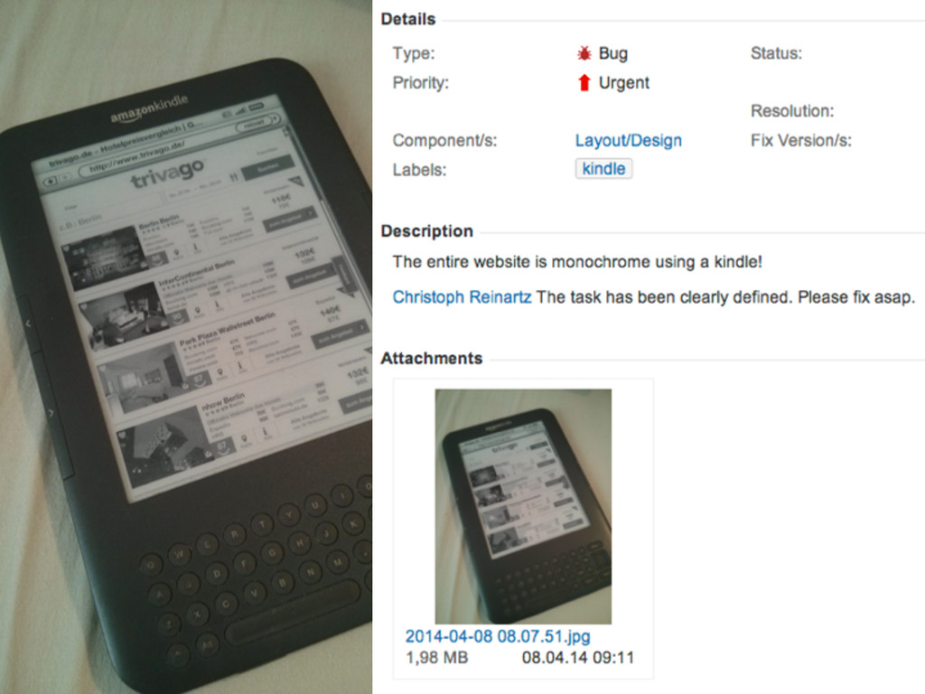
Bullshit
Bullshit Bullshit Bullshit Bullshit Bullshit
Bullshit Bullshit Bullshit Bullshit Bullshit Kein Bullshit
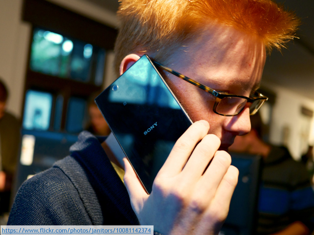
https://www.flickr.com/photos/janitors/10081142374
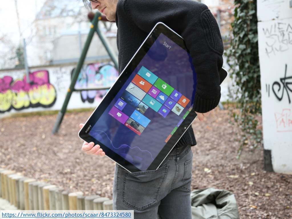
https://www.flickr.com/photos/scaar/8473324580
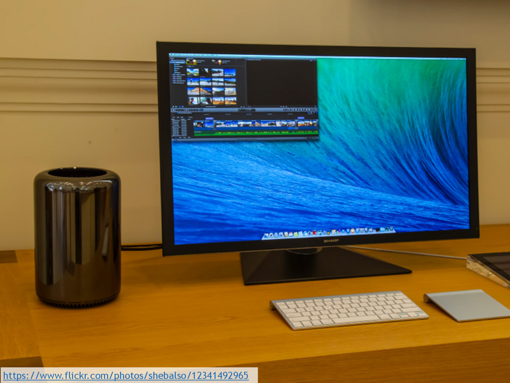
https://www.flickr.com/photos/shebalso/12341492965
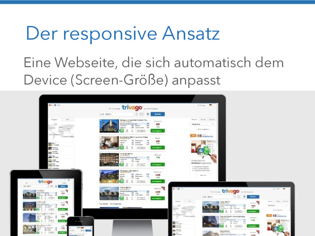
Der responsive Ansatz Eine Webseite, die sich automatisch dem Device
(Screen-Größe) anpasst
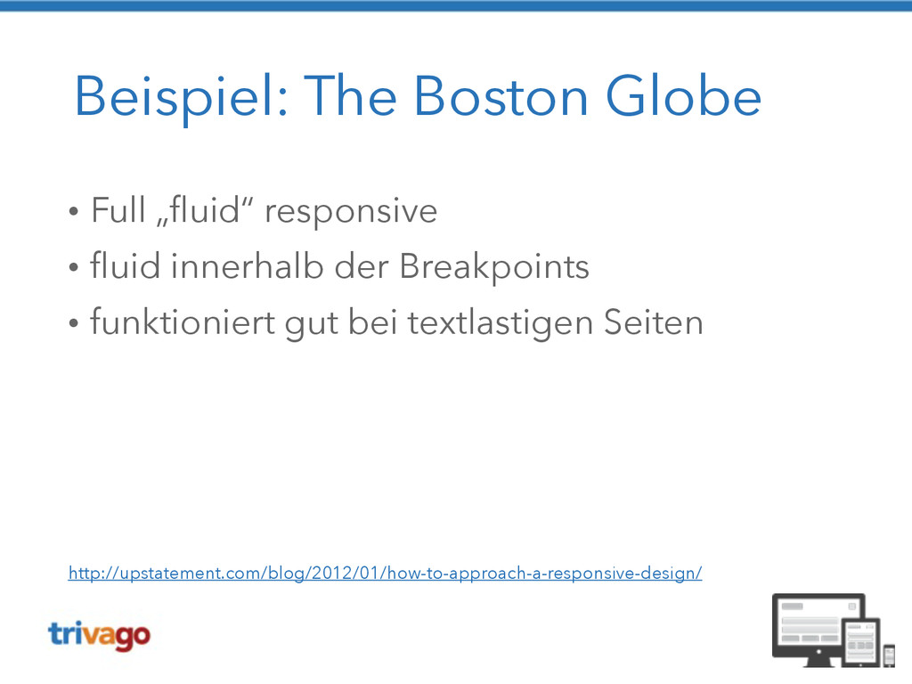
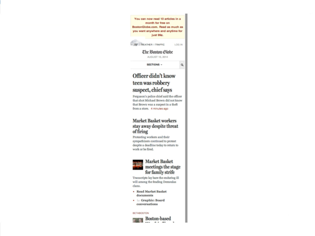
Beispiel: The Boston Globe • Full „fluid“ responsive • fluid
innerhalb der Breakpoints • funktioniert gut bei textlastigen Seiten http://upstatement.com/blog/2012/01/how-to-approach-a-responsive-design/
None
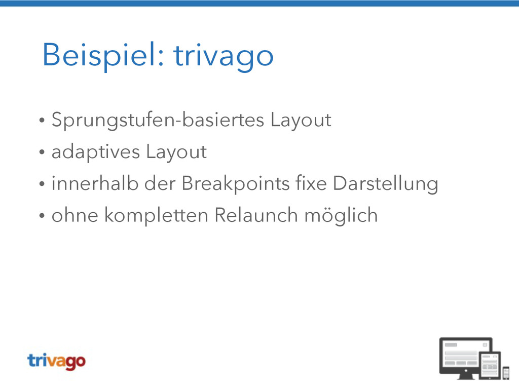
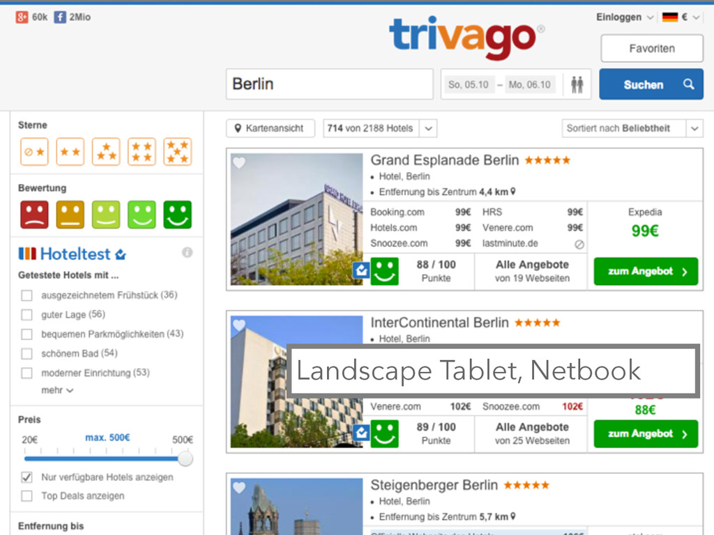
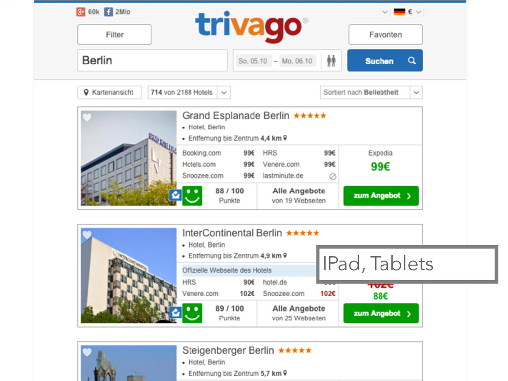
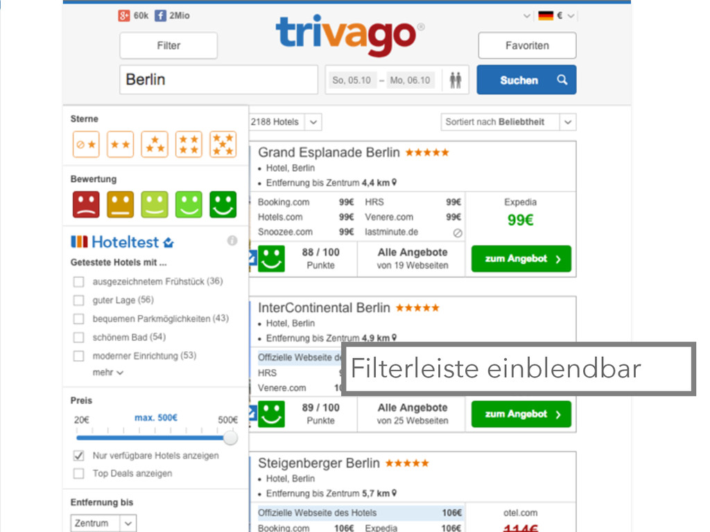
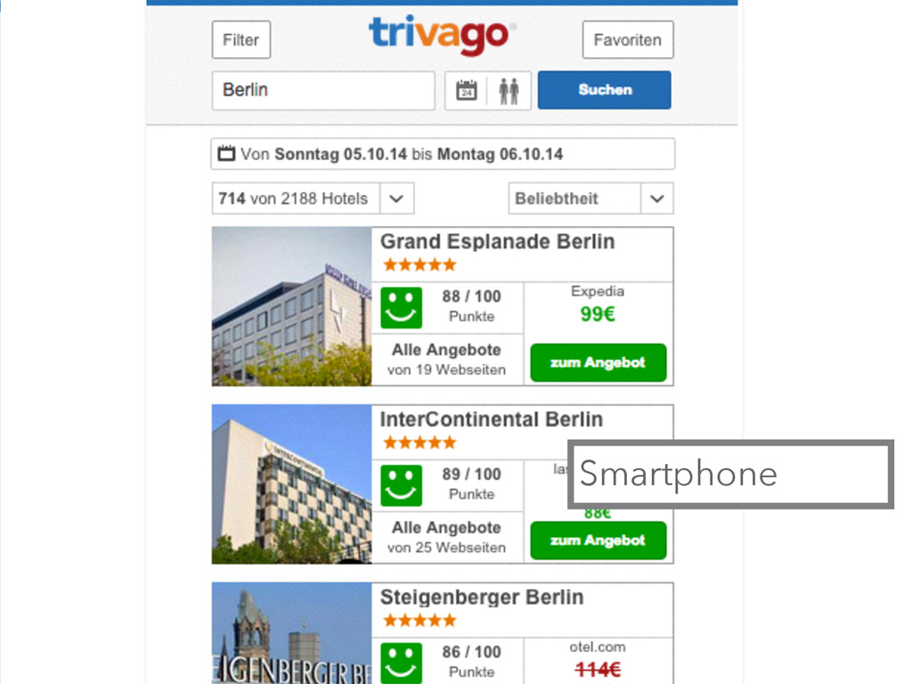
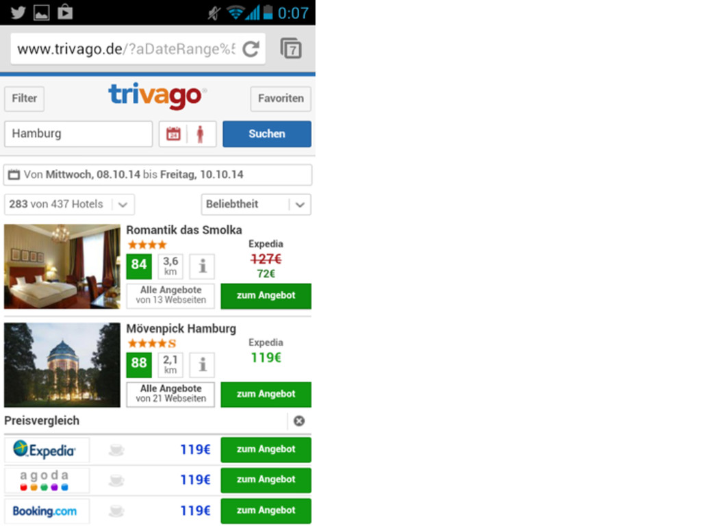
Beispiel: trivago • Sprungstufen-basiertes Layout • adaptives Layout • innerhalb
der Breakpoints fixe Darstellung • ohne kompletten Relaunch möglich
Desktop, iMac, Laptop
Landscape Tablet, Netbook
IPad, Tablets
Filterleiste einblendbar
Smartphone
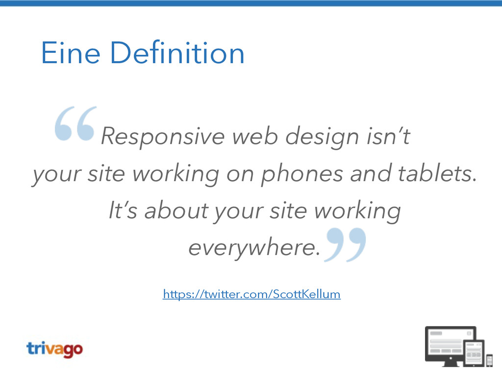
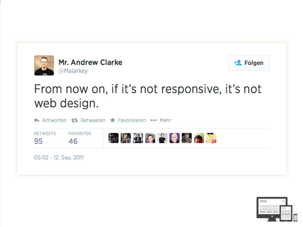
Eine Definition Responsive web design isn’t your site working on
phones and tablets. It’s about your site working everywhere. https://twitter.com/ScottKellum
Ich würde sagen dat passt! (c) Senator Film Verleih
None
None
None
None
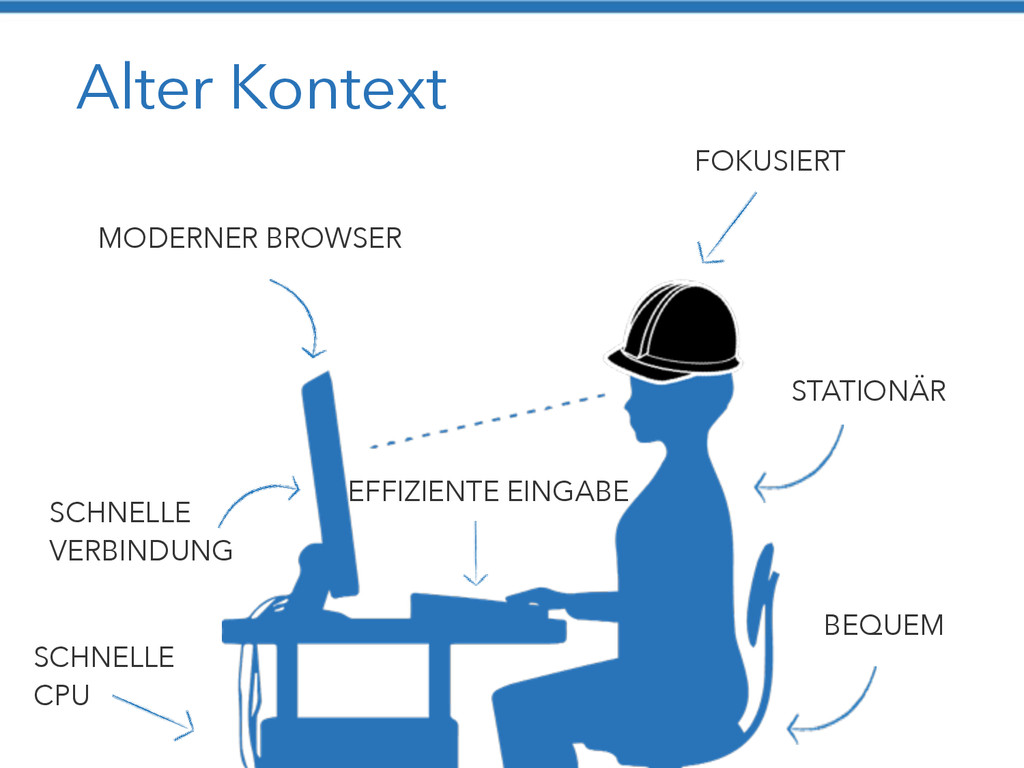
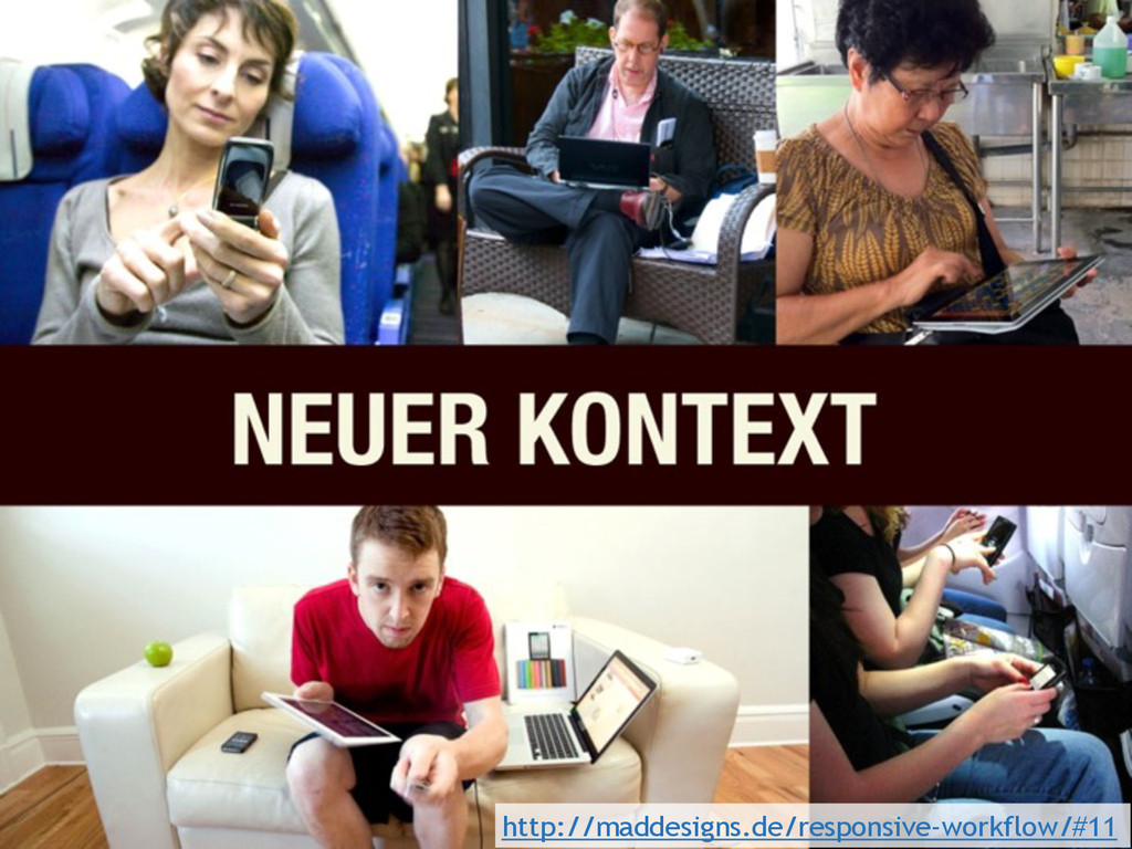
Alter Kontext MODERNER BROWSER FOKUSIERT STATIONÄR BEQUEM SCHNELLE VERBINDUNG SCHNELLE
CPU EFFIZIENTE EINGABE
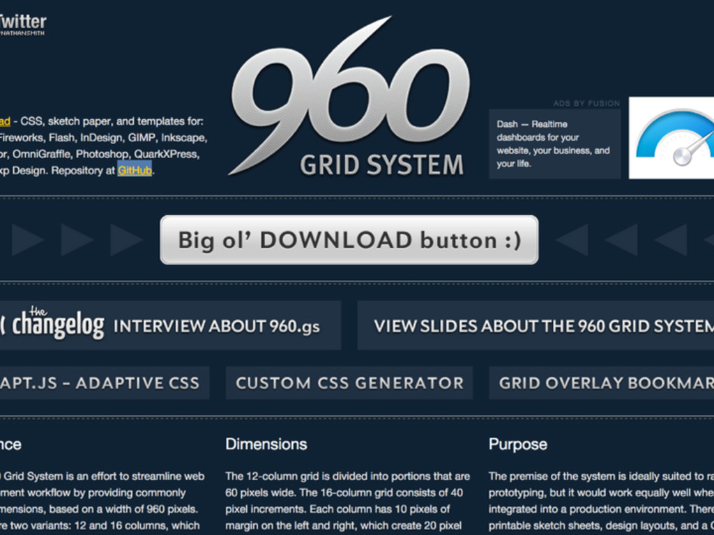
960 https://www.flickr.com/photos/tomwachtel/14015354802
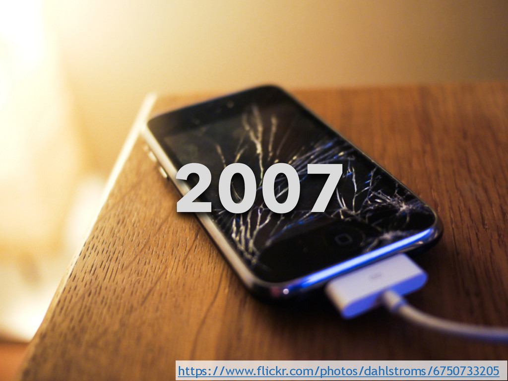
2007 https://www.flickr.com/photos/dahlstroms/6750733205
http://maddesigns.de/responsive-workflow/#11
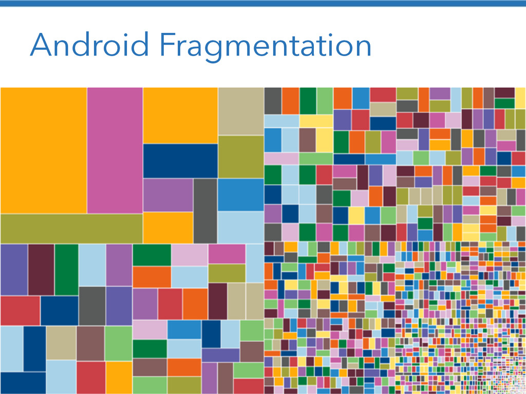
Android Fragmentation http://bradfrostweb.com/blog/web/responsive-web-design-missing-the-point/
None
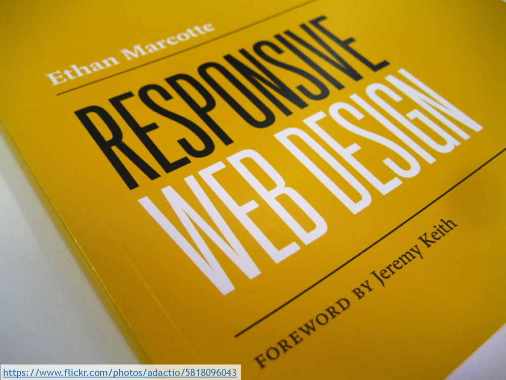
https://www.flickr.com/photos/adactio/5818096043
None
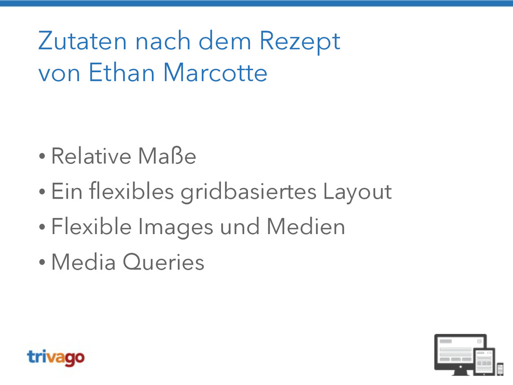
Zutaten nach dem Rezept von Ethan Marcotte ! •
Relative Maße • Ein flexibles gridbasiertes Layout • Flexible Images und Medien • Media Queries
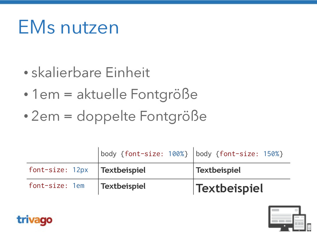
EMs nutzen • skalierbare Einheit • 1em = aktuelle Fontgröße
• 2em = doppelte Fontgröße body {font-size: 100%} body {font-size: 150%} font-size: 12px Textbeispiel Textbeispiel font-size: 1em Textbeispiel Textbeispiel
None
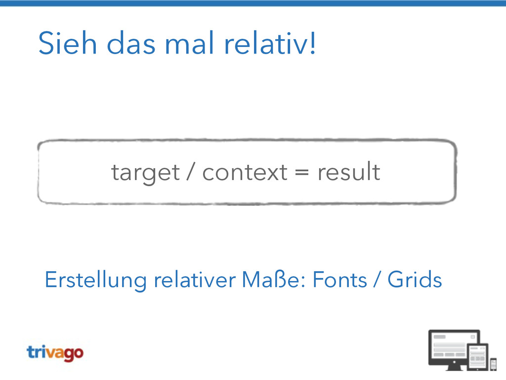
Sieh das mal relativ! ! ! target / context =
result Erstellung relativer Maße: Fonts / Grids
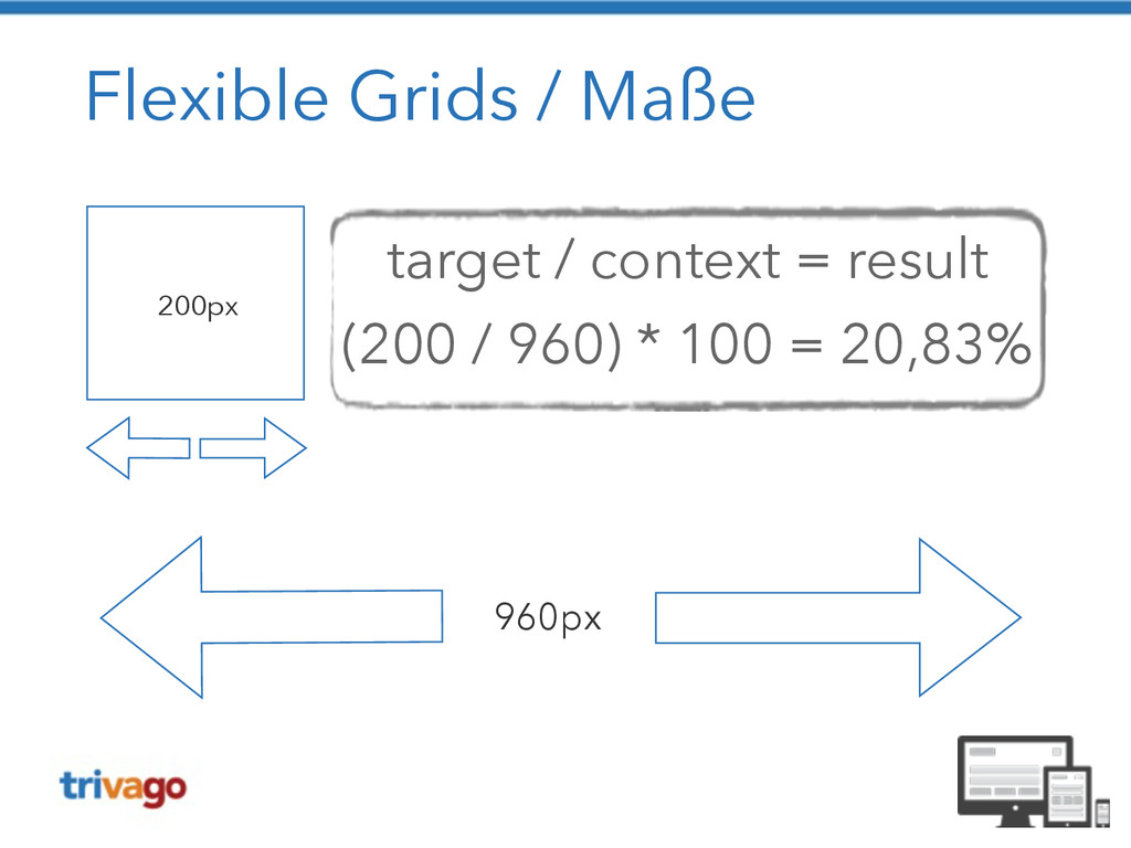
Flexible Grids / Maße 960px 200px target / context =
result (200 / 960) * 100 = 20,83%
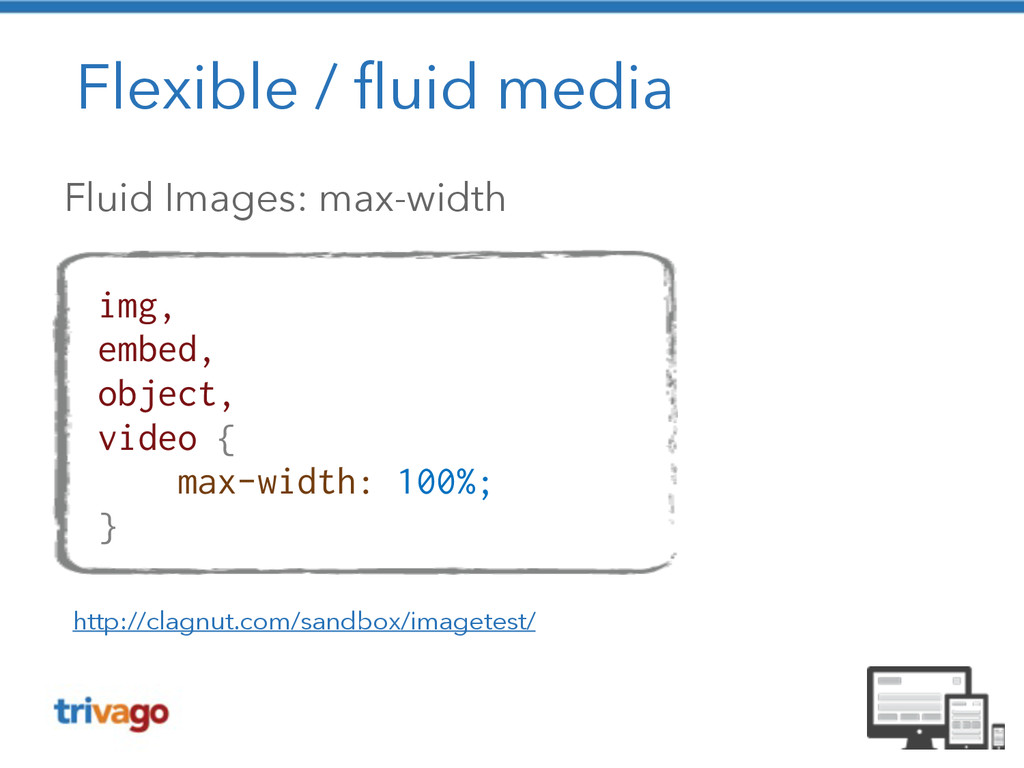
Flexible / fluid media Fluid Images: max-width http://clagnut.com/sandbox/imagetest/ img, embed,
object, video { max-width: 100%; }
Flexible / fluid media
Flexible / fluid media
Flexible / fluid media
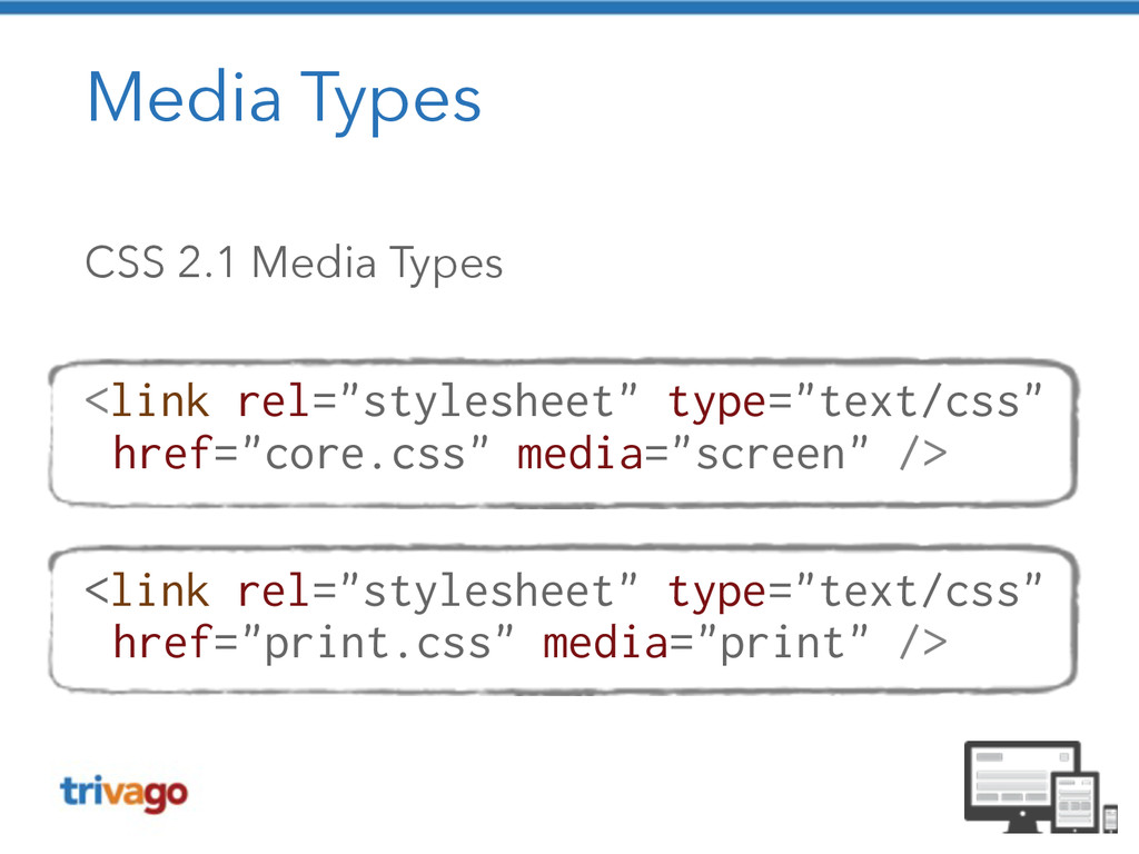
Media Types CSS 2.1 Media Types ! <link rel="stylesheet" type="text/css"
href="core.css" media="screen" /> ! <link rel="stylesheet" type="text/css" href="print.css" media="print" />
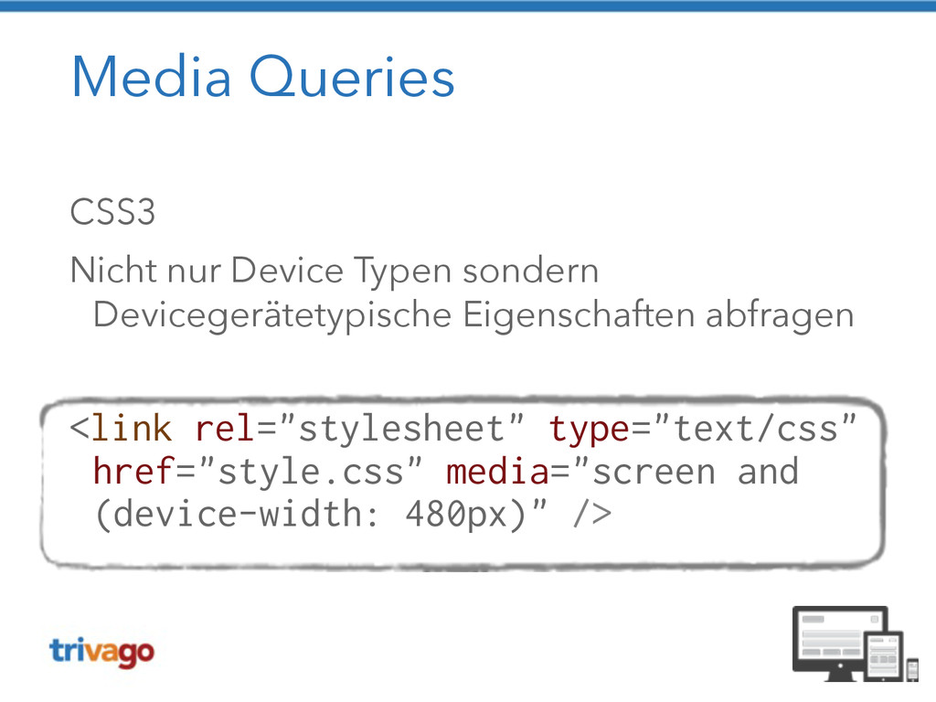
Media Queries CSS3 Nicht nur Device Typen sondern Devicegerätetypische Eigenschaften
abfragen ! <link rel="stylesheet" type="text/css" href="style.css" media="screen and (device-width: 480px)" />
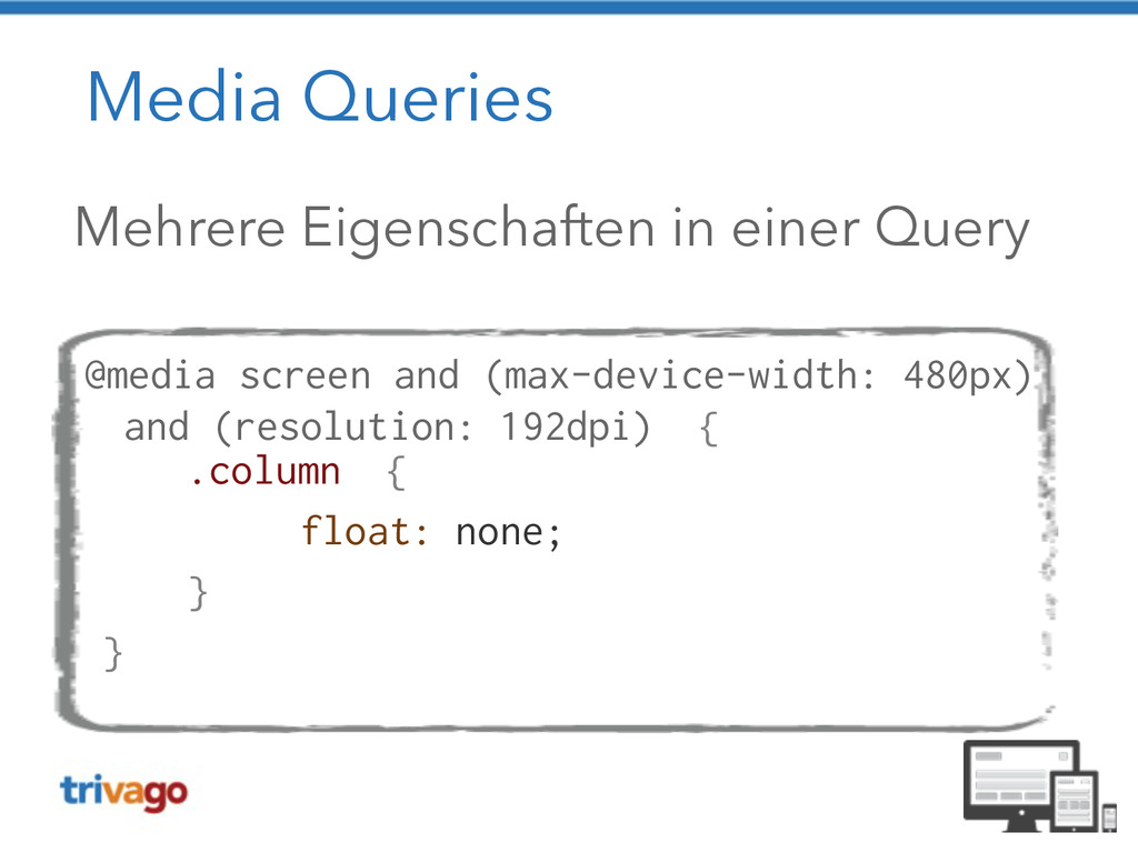
Media Queries Mehrere Eigenschaften in einer Query ! @media screen
and (max-device-width: 480px) and (resolution: 192dpi) { .column { float: none; } }
Viewport https://www.flickr.com/photos/mendhak/2252824493
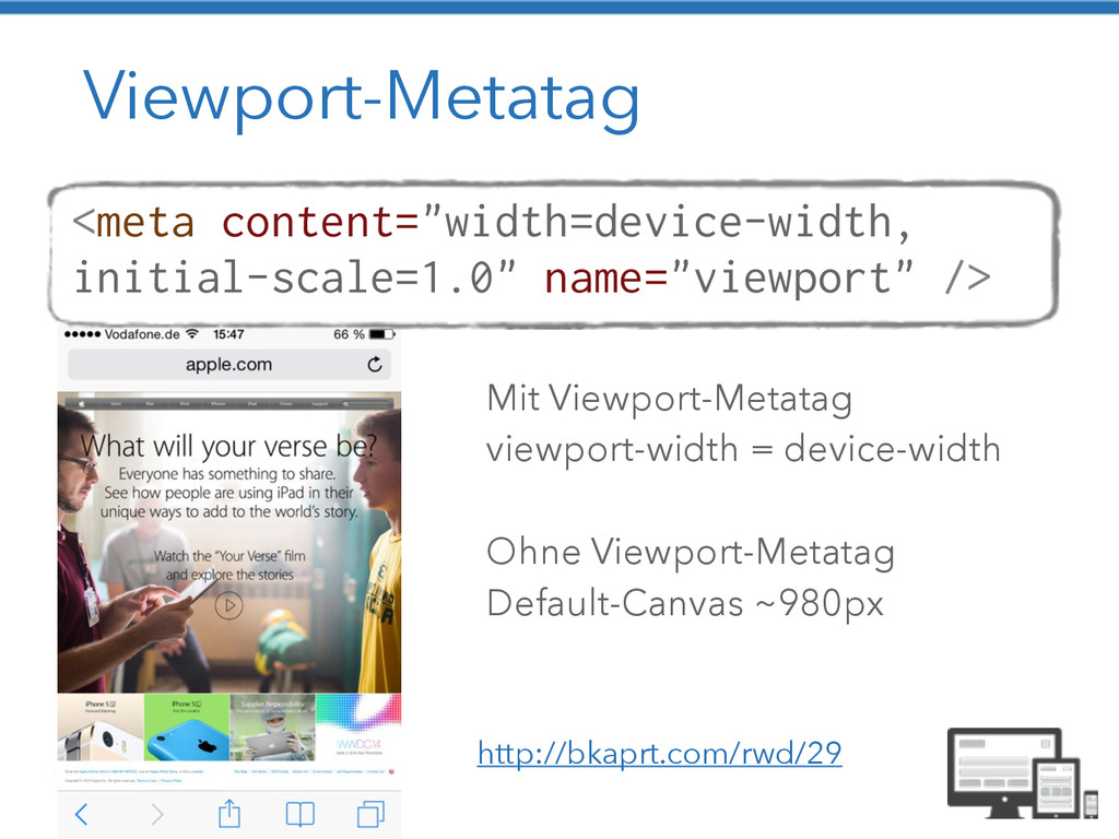
Viewport-Metatag <meta content="width=device-width, initial-scale=1.0" name="viewport" /> Mit Viewport-Metatag viewport-width =
device-width ! Ohne Viewport-Metatag Default-Canvas ~980px http://bkaprt.com/rwd/29
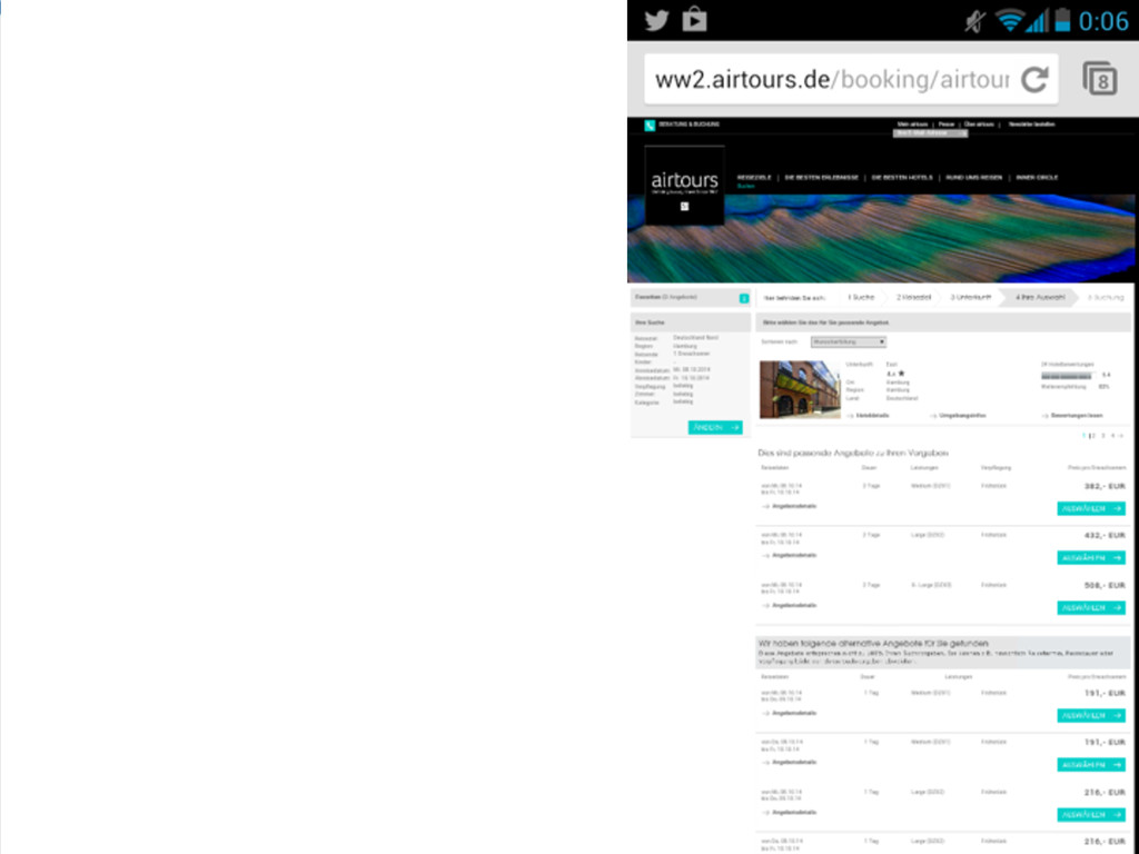
Klassischer Workflow http://blog.meltmedia.com/2013/04/a-clients-prep-guide-for-a- responsive-project/
Responsive Workflow http://blog.meltmedia.com/2013/04/a-clients-prep-guide-for-a- responsive-project/
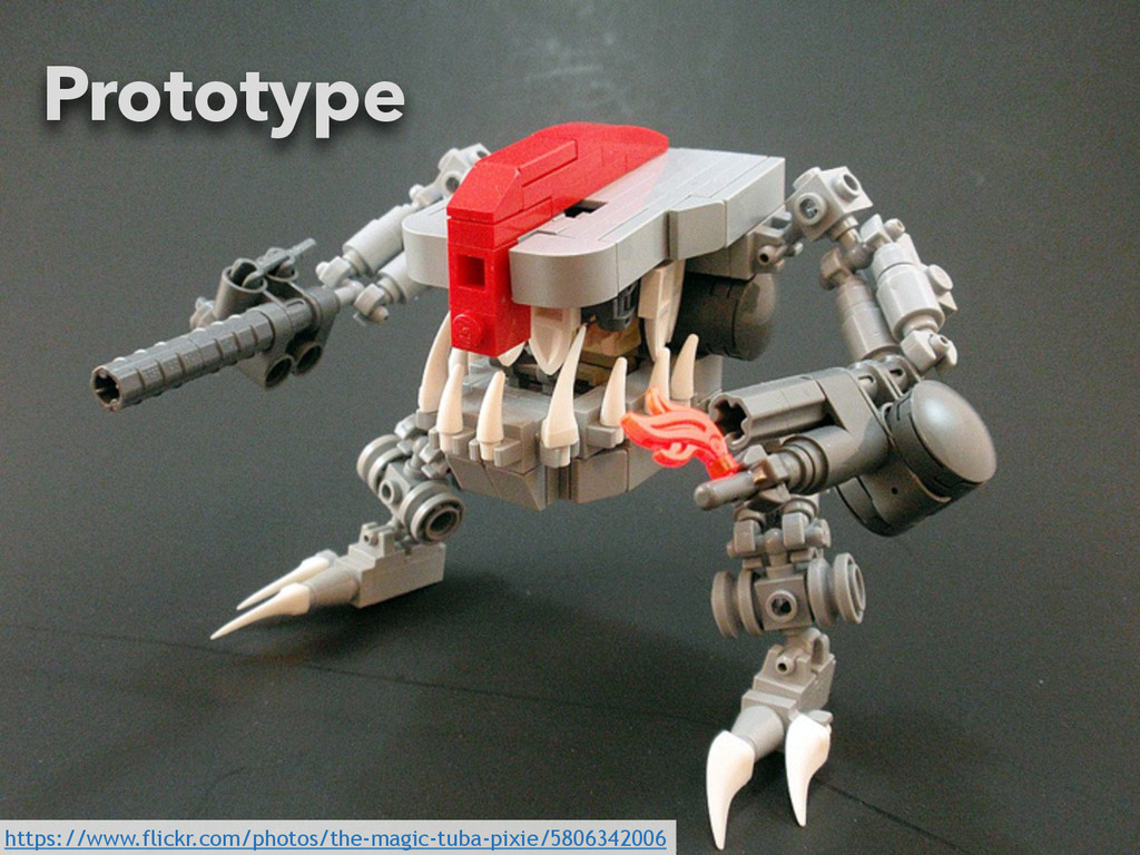
59 https://www.flickr.com/photos/the-magic-tuba-pixie/5806342006 Prototype
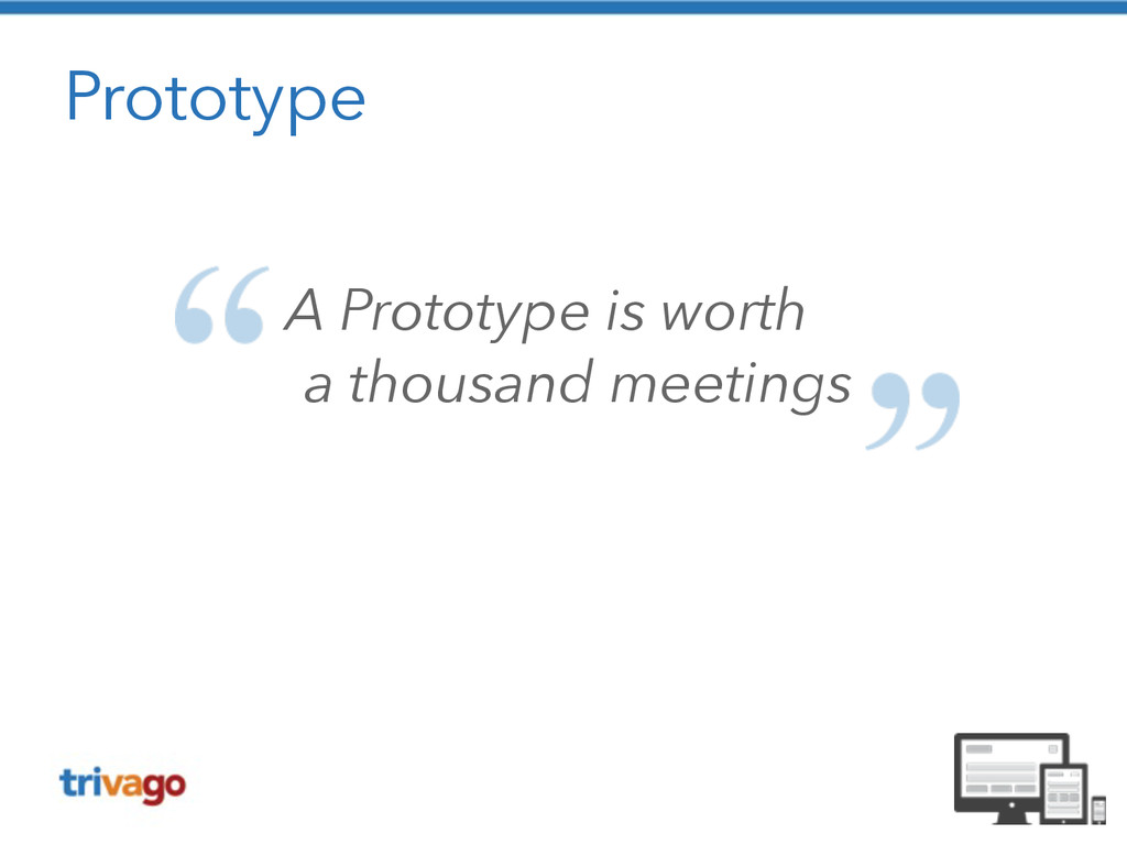
Prototype A Prototype is worth a thousand meetings
Aus der Praxis (c) Senator Film Verleih
A/B Testing https://www.flickr.com/photos/esparta/4482887906
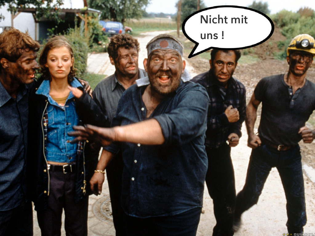
Der User schlägt zurück
Der User schlägt zurück Nicht mit uns !
Der User schlägt zurück https://www.flickr.com/photos/95284782@N06/8880500036
Jawohl, dat passt! (c) Senator Film Verleih
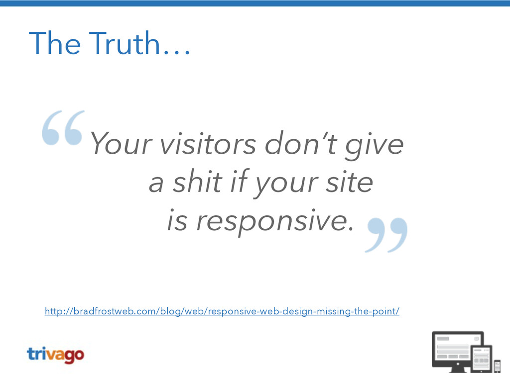
The Truth… Your visitors don’t give a shit if
your site is responsive. http://bradfrostweb.com/blog/web/responsive-web-design-missing-the-point/
None
None
None
So doch nicht !!
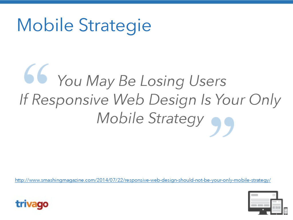
Mobile Strategie You May Be Losing Users If Responsive
Web Design Is Your Only Mobile Strategy http://www.smashingmagazine.com/2014/07/22/responsive-web-design-should-not-be-your-only-mobile-strategy/
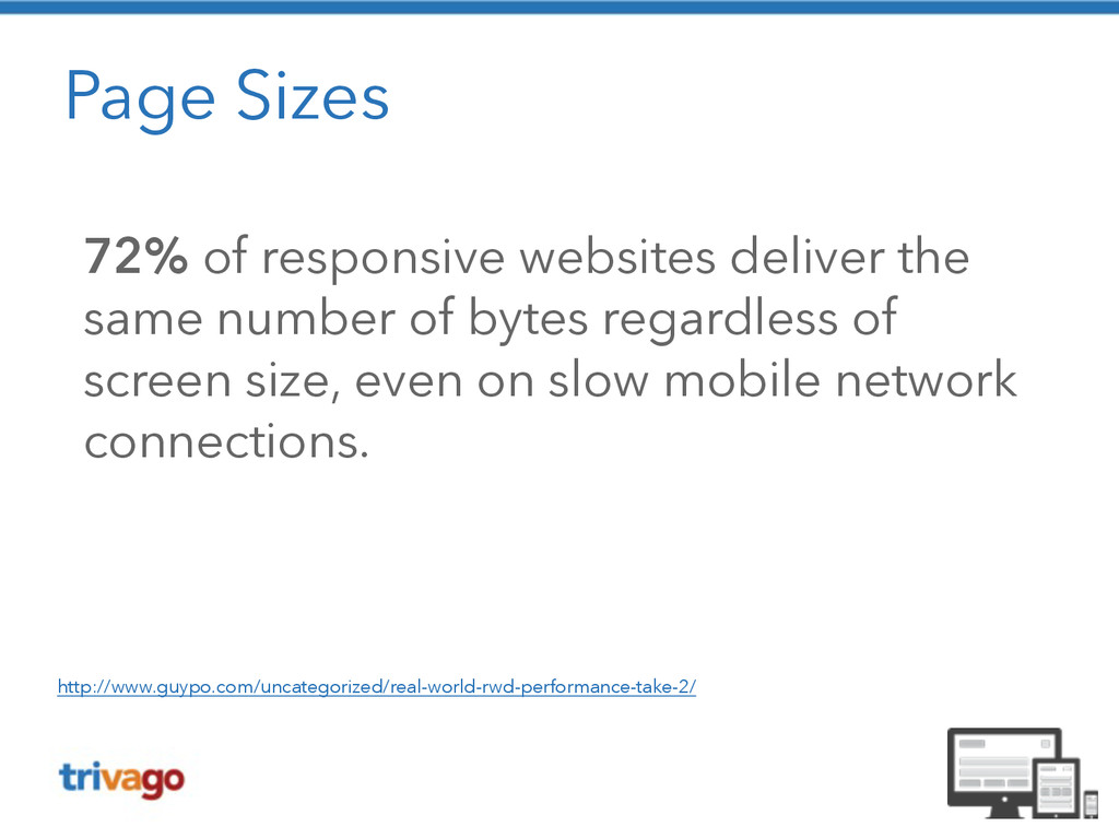
Page Sizes 72% of responsive websites deliver the same number
of bytes regardless of screen size, even on slow mobile network connections. http://www.guypo.com/uncategorized/real-world-rwd-performance-take-2/
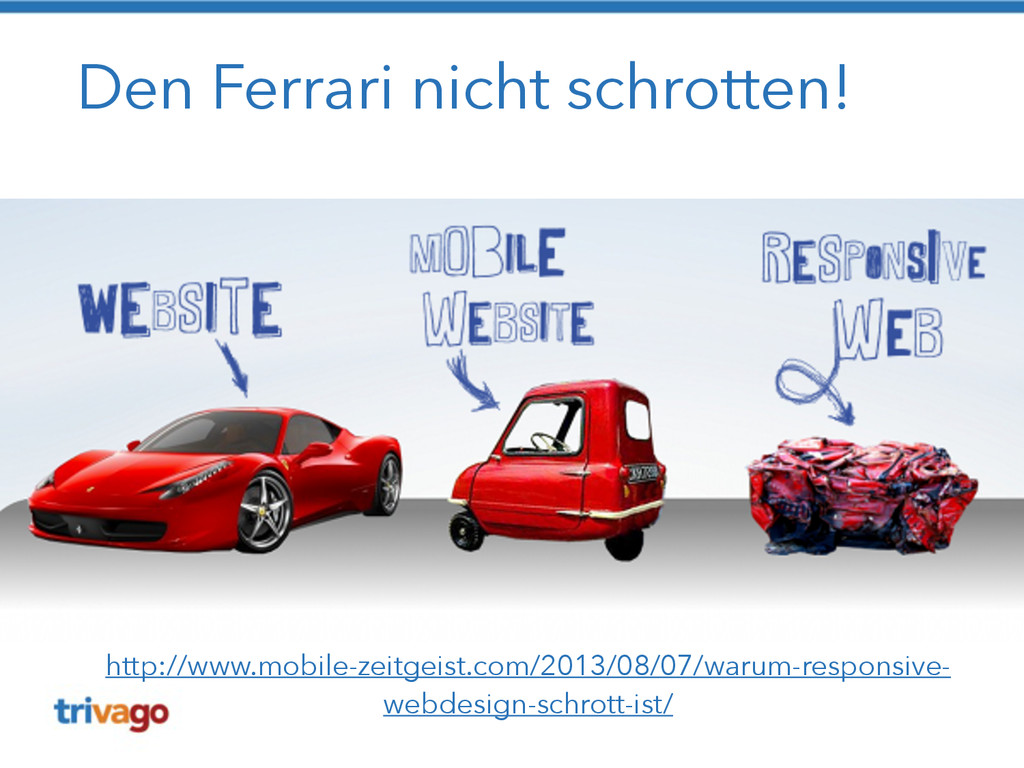
Den Ferrari nicht schrotten! http://www.mobile-zeitgeist.com/2013/08/07/warum-responsive- webdesign-schrott-ist/
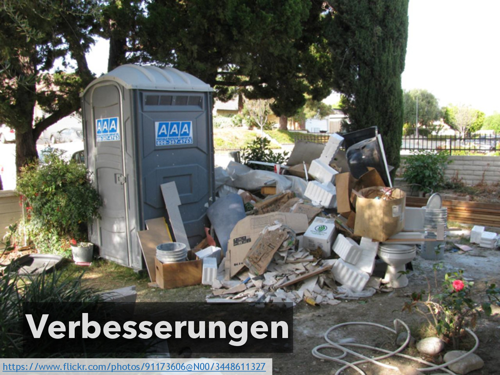
Verbesserungen https://www.flickr.com/photos/91173606@N00/3448611327
Gleiche URL, aber andere Struktur https://www.flickr.com/photos/chrisdlugosz/3402955869
Mobile First Ansatz wählen https://www.flickr.com/photos/pixel_boogie/3451813645
Content First https://www.flickr.com/photos/klara/4236116910
Performance messen / verbessern https://www.flickr.com/photos/aussiegall/286709039
Auf echten Devices testen https://www.flickr.com/photos/hysysk/4042285394
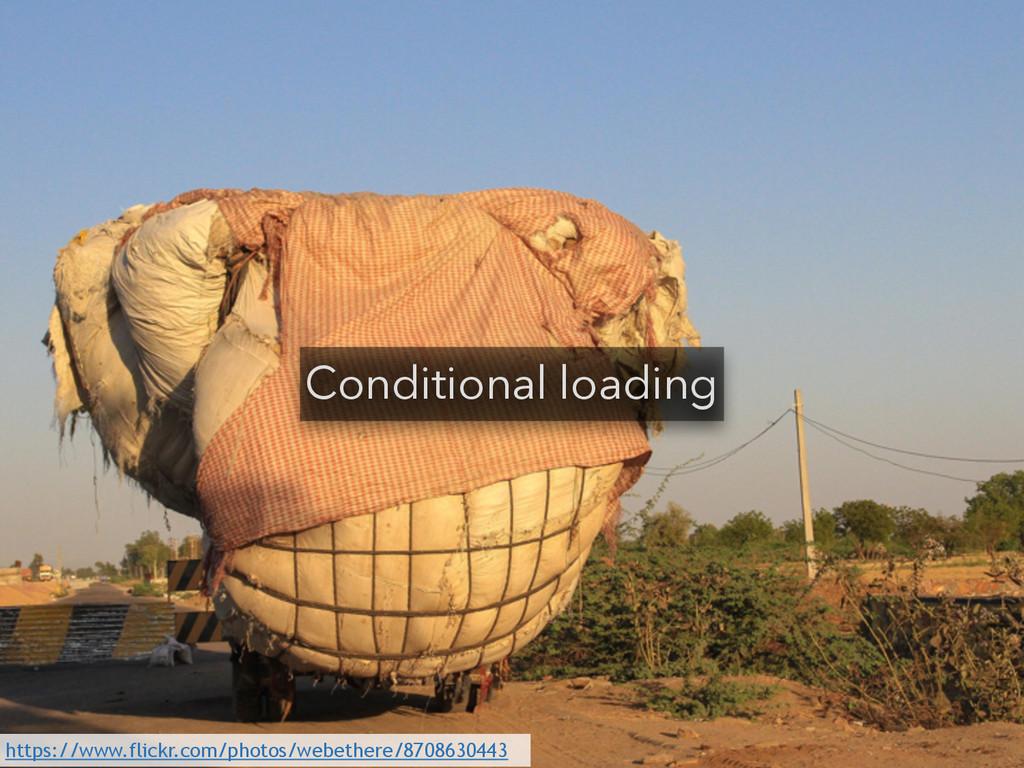
Conditional loading https://www.flickr.com/photos/webethere/8708630443
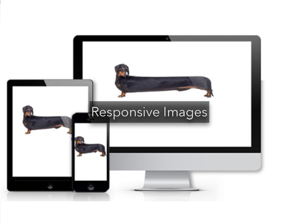
Responsive Images
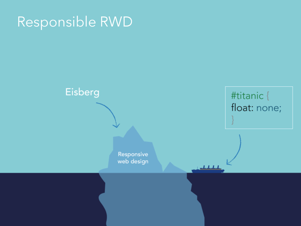
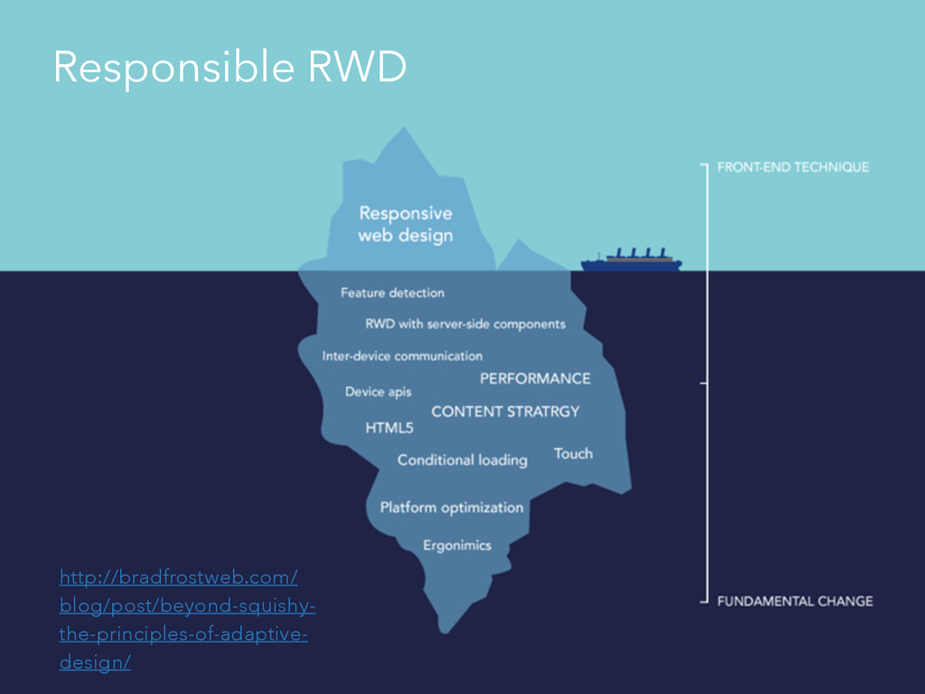
Responsible RWD
http://bradfrostweb.com/ blog/post/beyond-squishy- the-principles-of-adaptive- design/ Responsible RWD
Ich habe fertig! !
Danke! Prosit! (c) Senator Film Verleih
Vielen Dank an Senator Film Verleih
 creinartz
 moongift
 sue445
 iwatatomoya
 tatsuya1970
 coborinai
 kanny
kanny
 flatt_security
 hageyahhoo
 moritamasami
 glaforge
 i35_267
 miyukichi_ospf
 ammeep
 tammielis
 philnash
 jacobtomlinson
 portentint
 eileencodes
 konakalab
 mkilby
 techseoconnect
 aleyda
 ipullrank
 sarafernandez