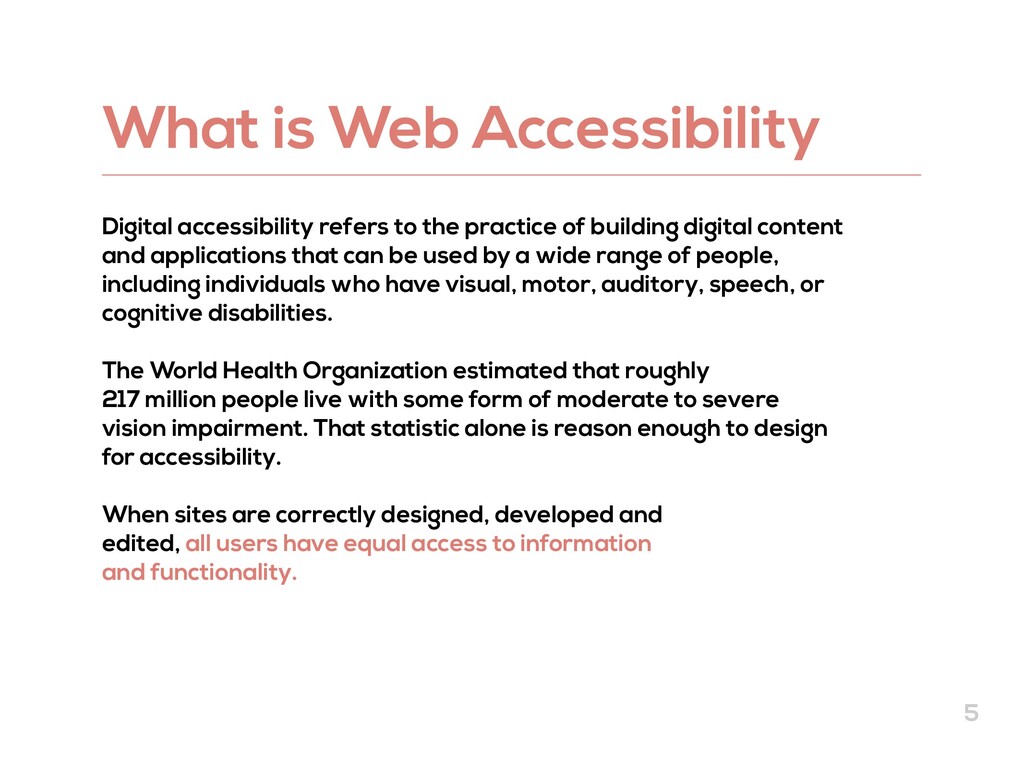
practice of building digital content and applications that can be used by a wide range of people, including individuals who have visual, motor, auditory, speech, or cognitive disabilities. The World Health Organization estimated that roughly 217 million people live with some form of moderate to severe vision impairment. That statistic alone is reason enough to design for accessibility. When sites are correctly designed, developed and edited, all users have equal access to information and functionality.
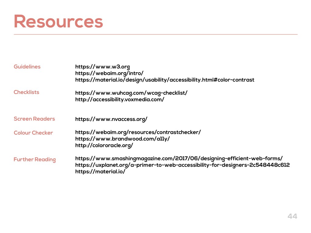
the international standard. Level AA is the standard many governments are using as a benchmark as this level targets the most common and most problematic issues for web users. www.w3.org
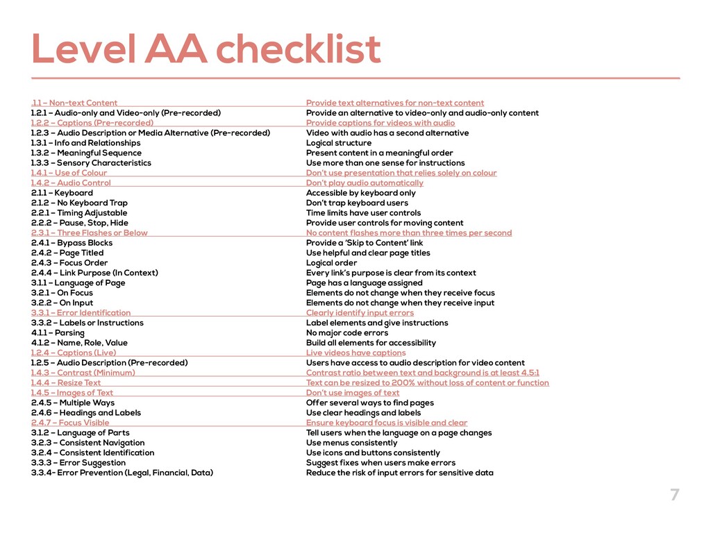
alternatives for non-text content 1.2.1 – Audio-only and Video-only (Pre-recorded) Provide an alternative to video-only and audio-only content 1.2.2 – Captions (Pre-recorded) Provide captions for videos with audio 1.2.3 – Audio Description or Media Alternative (Pre-recorded) Video with audio has a second alternative 1.3.1 – Info and Relationships Logical structure 1.3.2 – Meaningful Sequence Present content in a meaningful order 1.3.3 – Sensory Characteristics Use more than one sense for instructions 1.4.1 – Use of Colour Don’t use presentation that relies solely on colour 1.4.2 – Audio Control Don’t play audio automatically 2.1.1 – Keyboard Accessible by keyboard only 2.1.2 – No Keyboard Trap Don’t trap keyboard users 2.2.1 – Timing Adjustable Time limits have user controls 2.2.2 – Pause, Stop, Hide Provide user controls for moving content 2.3.1 – Three Flashes or Below No content flashes more than three times per second 2.4.1 – Bypass Blocks Provide a ‘Skip to Content’ link 2.4.2 – Page Titled Use helpful and clear page titles 2.4.3 – Focus Order Logical order 2.4.4 – Link Purpose (In Context) Every link’s purpose is clear from its context 3.1.1 – Language of Page Page has a language assigned 3.2.1 – On Focus Elements do not change when they receive focus 3.2.2 – On Input Elements do not change when they receive input 3.3.1 – Error Identification Clearly identify input errors 3.3.2 – Labels or Instructions Label elements and give instructions 4.1.1 – Parsing No major code errors 4.1.2 – Name, Role, Value Build all elements for accessibility 1.2.4 – Captions (Live) Live videos have captions 1.2.5 – Audio Description (Pre-recorded) Users have access to audio description for video content 1.4.3 – Contrast (Minimum) Contrast ratio between text and background is at least 4.5:1 1.4.4 – Resize Text Text can be resized to 200% without loss of content or function 1.4.5 – Images of Text Don’t use images of text 2.4.5 – Multiple Ways Offer several ways to find pages 2.4.6 – Headings and Labels Use clear headings and labels 2.4.7 – Focus Visible Ensure keyboard focus is visible and clear 3.1.2 – Language of Parts Tell users when the language on a page changes 3.2.3 – Consistent Navigation Use menus consistently 3.2.4 – Consistent Identification Use icons and buttons consistently 3.3.3 – Error Suggestion Suggest fixes when users make errors 3.3.4- Error Prevention (Legal, Financial, Data) Reduce the risk of input errors for sensitive data
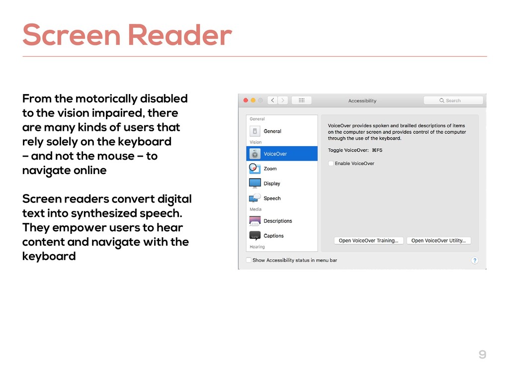
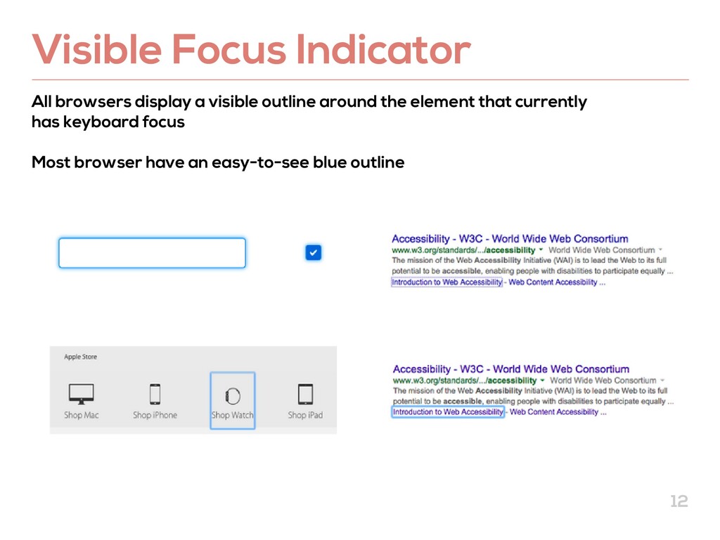
impaired, there are many kinds of users that rely solely on the keyboard – and not the mouse – to navigate online Screen readers convert digital text into synthesized speech. They empower users to hear content and navigate with the keyboard
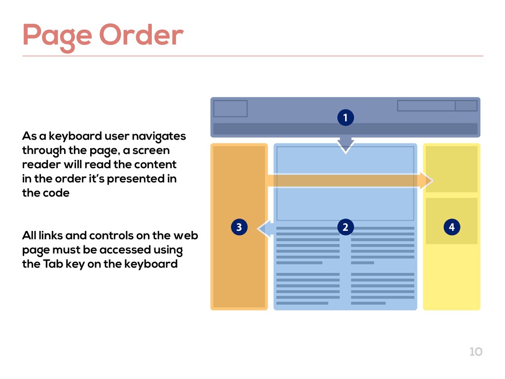
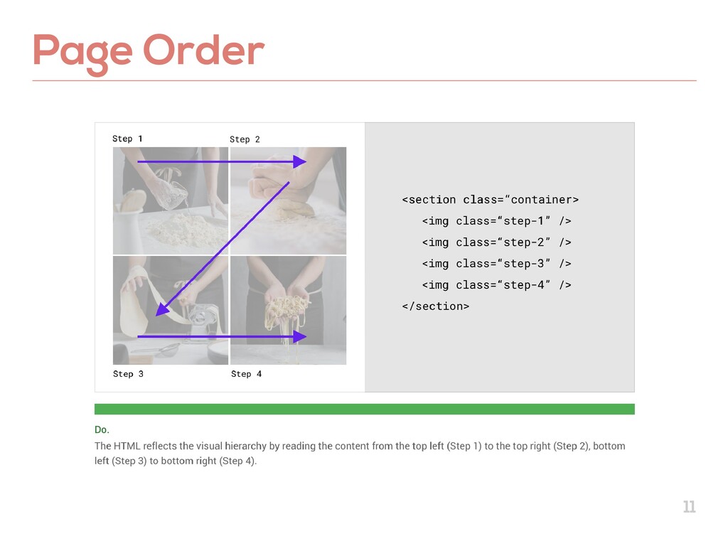
page, a screen reader will read the content in the order it’s presented in the code All links and controls on the web page must be accessed using the Tab key on the keyboard
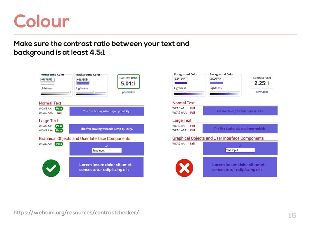
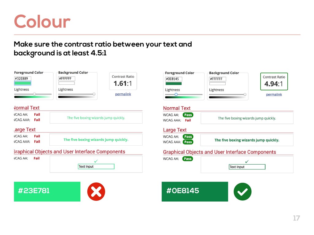
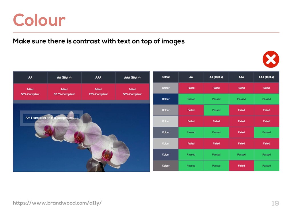
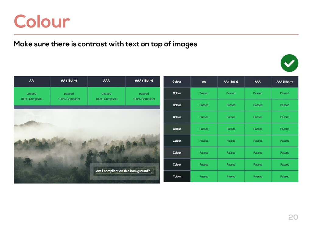
and background is at least 4.5:1 https://webaim.org/resources/contrastchecker/ Lorem ipsum dolor sit amet, consectetur adipiscing elit Lorem ipsum dolor sit amet, consectetur adipiscing elit
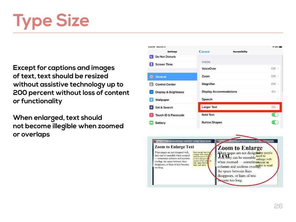
text should be resized without assistive technology up to 200 percent without loss of content or functionality When enlarged, text should not become illegible when zoomed or overlaps
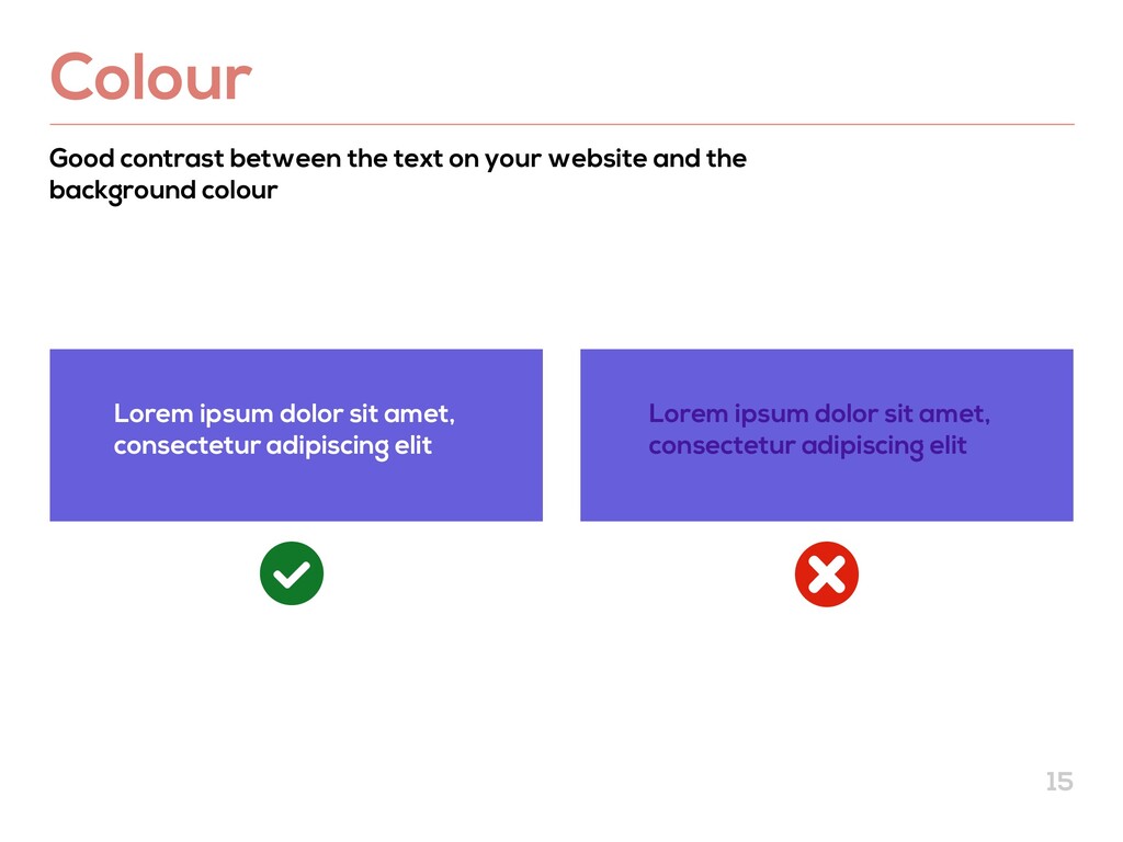
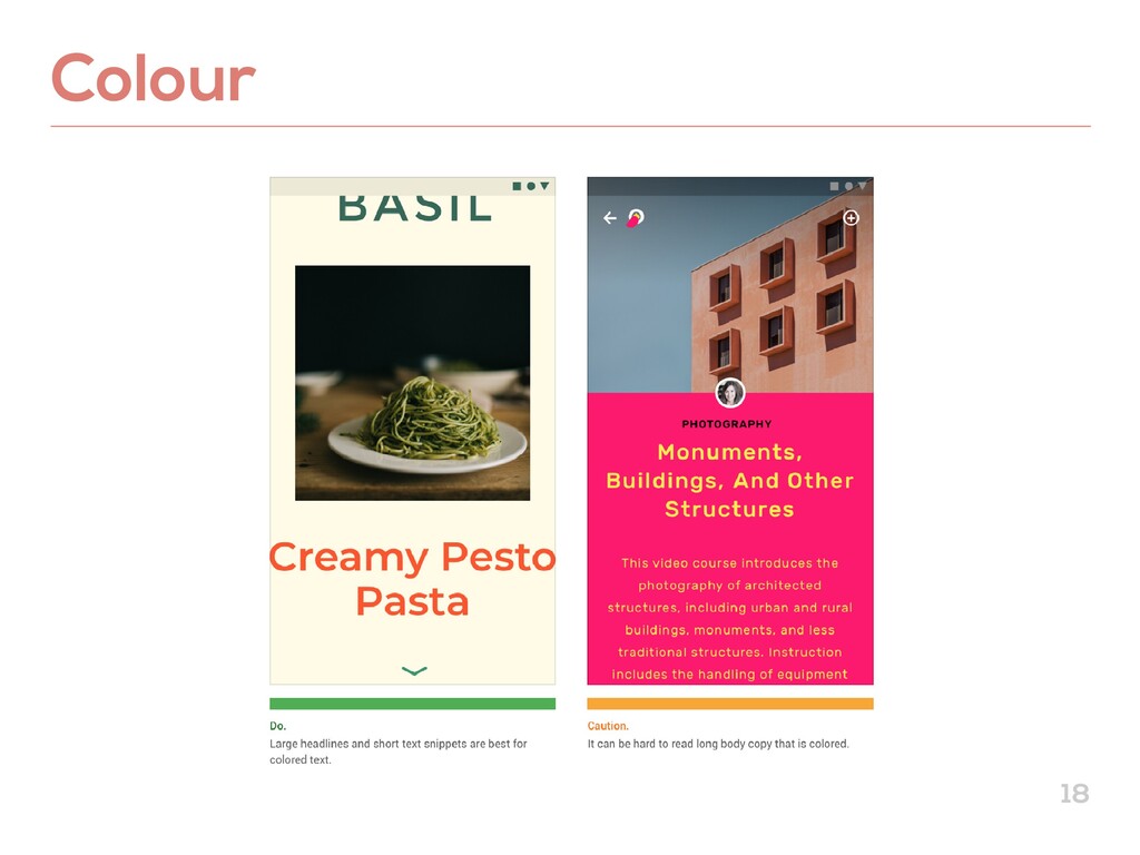
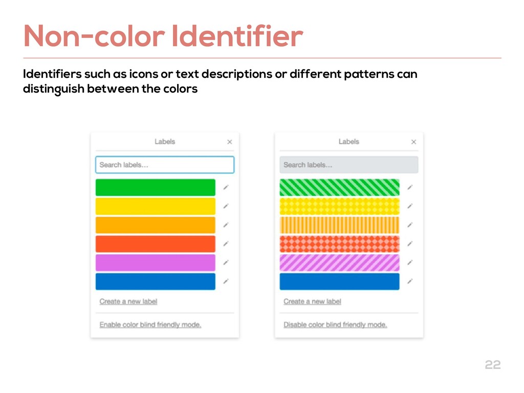
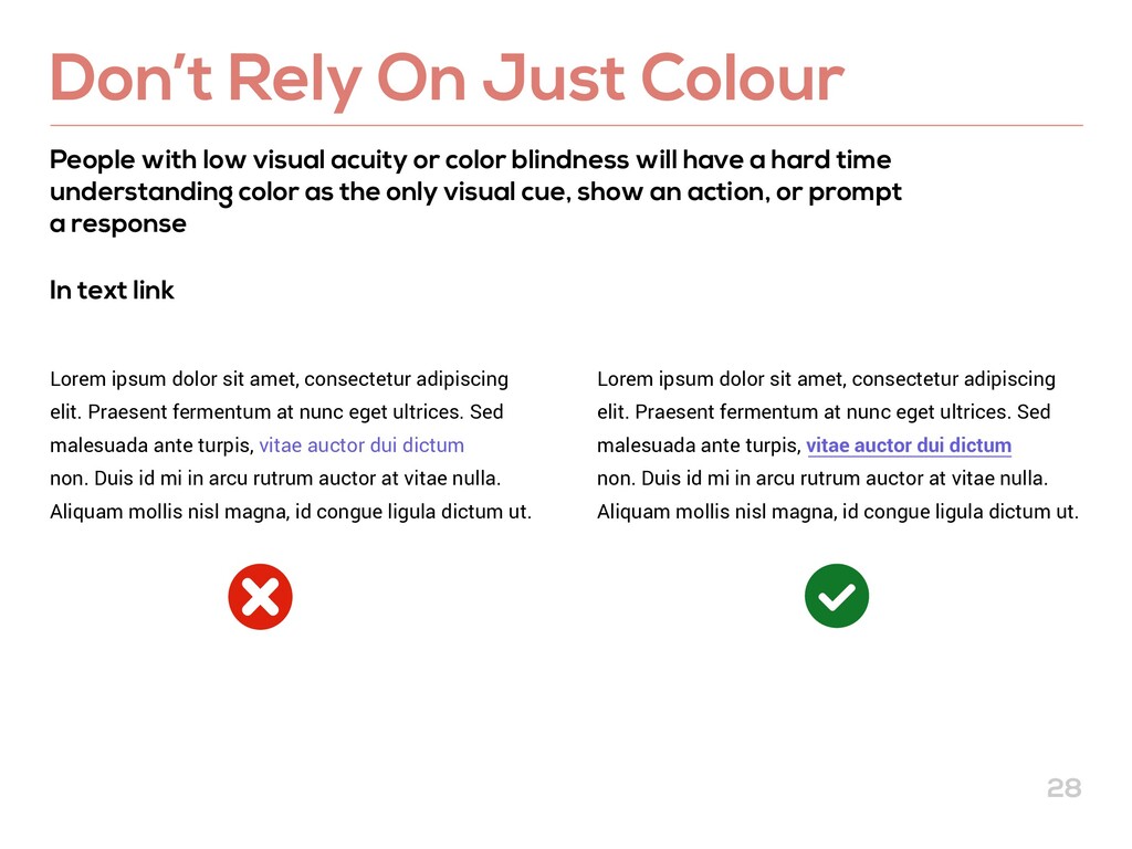
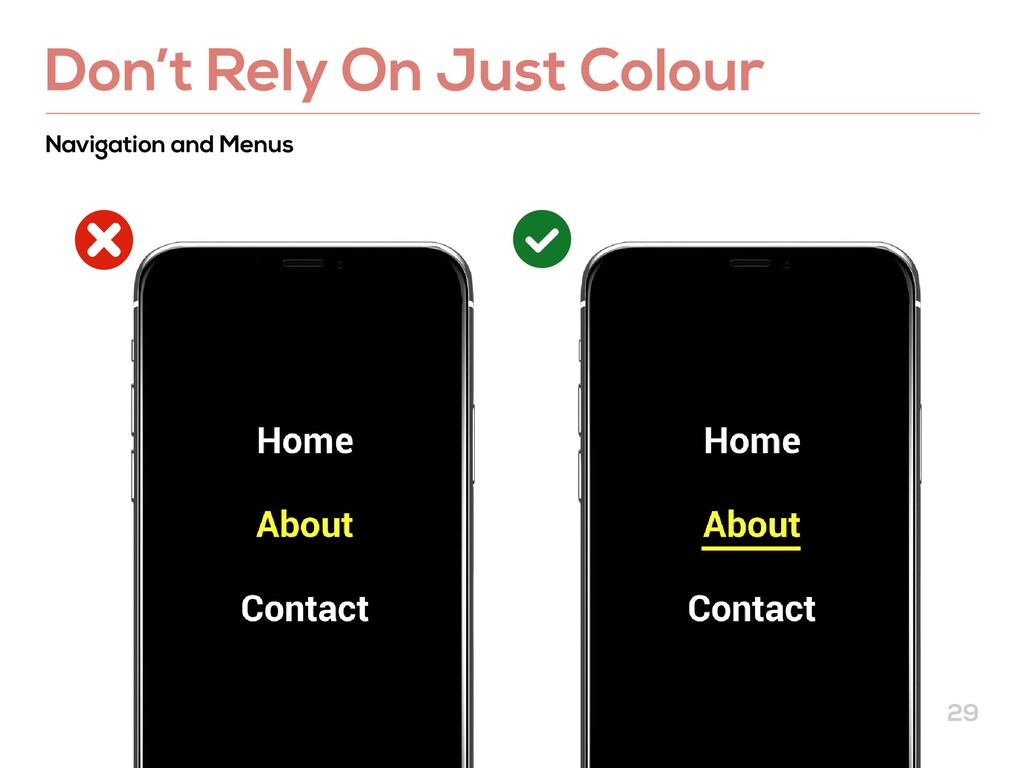
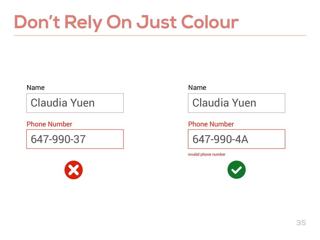
acuity or color blindness will have a hard time understanding color as the only visual cue, show an action, or prompt a response Lorem ipsum dolor sit amet, consectetur adipiscing elit. Praesent fermentum at nunc eget ultrices. Sed malesuada ante turpis, vitae auctor dui dictum non. Duis id mi in arcu rutrum auctor at vitae nulla. Aliquam mollis nisl magna, id congue ligula dictum ut. Lorem ipsum dolor sit amet, consectetur adipiscing elit. Praesent fermentum at nunc eget ultrices. Sed malesuada ante turpis, vitae auctor dui dictum non. Duis id mi in arcu rutrum auctor at vitae nulla. Aliquam mollis nisl magna, id congue ligula dictum ut. In text link
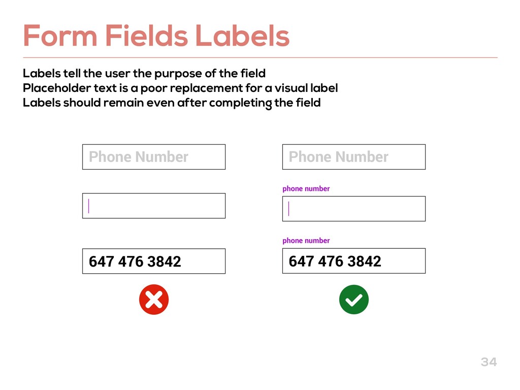
of the field Placeholder text is a poor replacement for a visual label Labels should remain even after completing the field Phone Number 647 476 3842 Phone Number 647 476 3842 phone number phone number
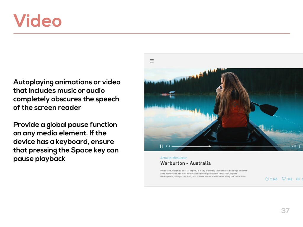
audio completely obscures the speech of the screen reader Provide a global pause function on any media element. If the device has a keyboard, ensure that pressing the Space key can pause playback
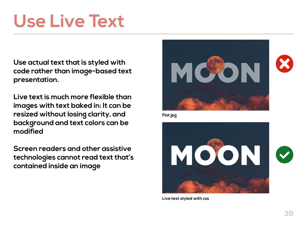
with code rather than image-based text presentation. Live text is much more flexible than images with text baked in: It can be resized without losing clarity, and background and text colors can be modified Screen readers and other assistive technologies cannot read text that’s contained inside an image Flat jpg Live text styled with css
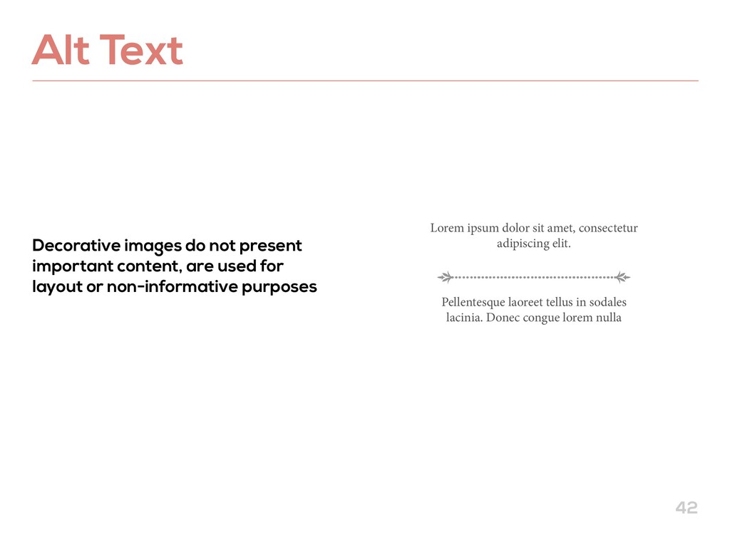
elit. Pellentesque laoreet tellus in sodales lacinia. Donec congue lorem nulla Decorative images do not present important content, are used for layout or non-informative purposes
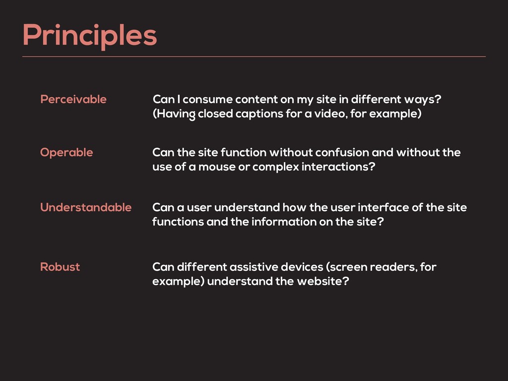
in different ways? (Having closed captions for a video, for example) Operable Can the site function without confusion and without the use of a mouse or complex interactions? Understandable Can a user understand how the user interface of the site functions and the information on the site? Robust Can different assistive devices (screen readers, for example) understand the website?
![45 Thank you Let’s be friends: www.claudiayuen.com @cyseewhy ca.linkedin.com/in/claudia-yuen-61318b5b [email protected]](https://files.speakerdeck.com/presentations/9052beced03b45b4b76b1a650346a2ce/slide_44.jpg)