Upgrade to Pro
— share decks privately, control downloads, hide ads and more …
Speaker Deck
Features
Speaker Deck
PRO
Sign in
Sign up for free
Search
Search
Intro to Responsive Design
Search
Sponsored
·
Ship Features Fearlessly
Turn features on and off without deploys. Used by thousands of Ruby developers.
→
Dan Barber
August 16, 2012
Design
490
4
Share
Embed
Copy iframe code
Copy JS code
Copy link
Start on current slide
Intro to Responsive Design
An introduction to responsive design, what it is, why it exists and how to implement it.
Dan Barber
August 16, 2012
More Decks by Dan Barber
See All by Dan Barber
Design Eye for the Developer Guy
danbarber
21
19k
Other Decks in Design
See All in Design
結びながら、ひらく - にじむ境界のデザイン
hilokifigma
4
1.7k
セブンデックス プロジェクト事例 / innovation Scenes
sevendex
1
1.3k
生成AIの不確実性を価値に変える、「ビズリーチ」の体験設計 / KNOTS2026
visional_engineering_and_design
6
1.3k
Signull 団体説明資料
signull
0
700
Decksh keywords
ajstarks
0
110
The Art of Messy the Maid
marzstarz
0
110
再設計される業務 - AIにより再設計される "デザインワークフロー" / AI Ops Lab #2 Redesigned orkflows
kgsi
0
760
改正JISを見据えた、企業のアクセシビリティ対応ロードマップ
securecat
1
410
怖くないアクセシビリティ -カウンターカルチャーとしてのアッカン東京-
securecat
1
220
AIスライド生成を進化させるMDファイル
kenichiota0711
1
1.4k
つくり方を変えていく | change-how-we-build
mottox2
2
1.3k
2026年の勢い / Momentum for 2026
bebe
0
490
Featured
See All Featured
The untapped power of vector embeddings
frankvandijk
2
1.8k
Skip the Path - Find Your Career Trail
mkilby
1
160
Bash Introduction
62gerente
615
220k
From Legacy to Launchpad: Building Startup-Ready Communities
dugsong
0
260
What Being in a Rock Band Can Teach Us About Real World SEO
427marketing
0
1k
Done Done
chrislema
186
16k
No one is an island. Learnings from fostering a developers community.
thoeni
21
3.8k
Building the Perfect Custom Keyboard
takai
2
810
How Fast Is Fast Enough? [PerfNow 2025]
tammyeverts
3
650
Making Projects Easy
brettharned
120
6.7k
Principles of Awesome APIs and How to Build Them.
keavy
128
18k
4 Signs Your Business is Dying
shpigford
187
22k
Transcript
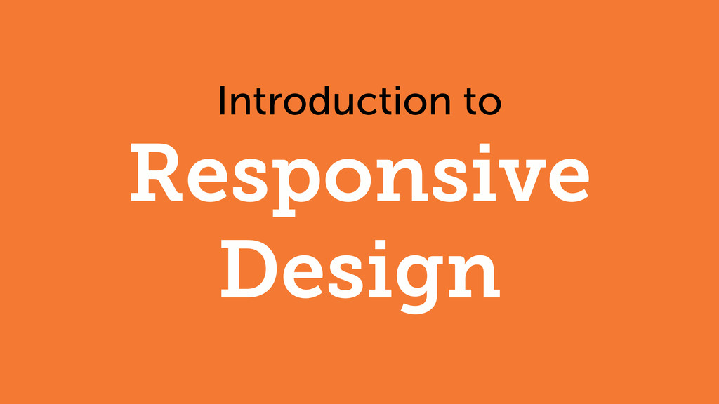
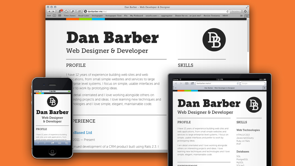
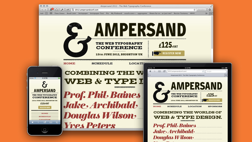
Introduction to Responsive Design
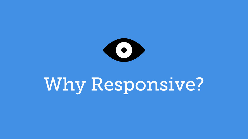
Why Responsive?
None
Best Viewed at 1024x768
None
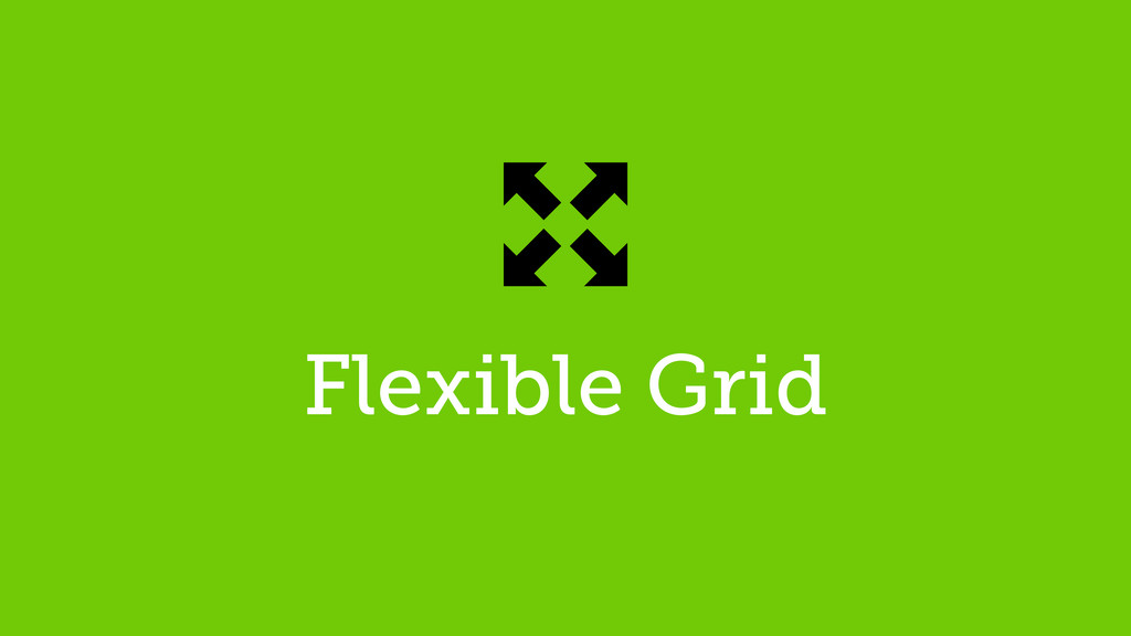
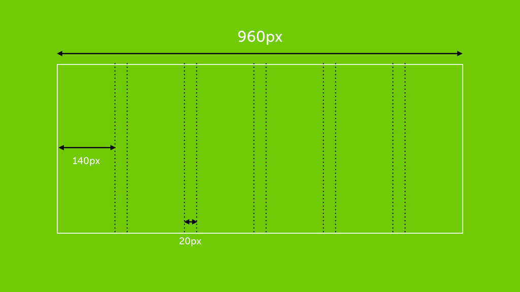
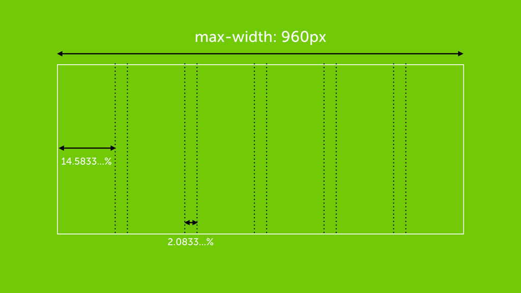
Flexible Grid
960px 140px 20px
max-width: 960px 14.5833...% 2.0833...%
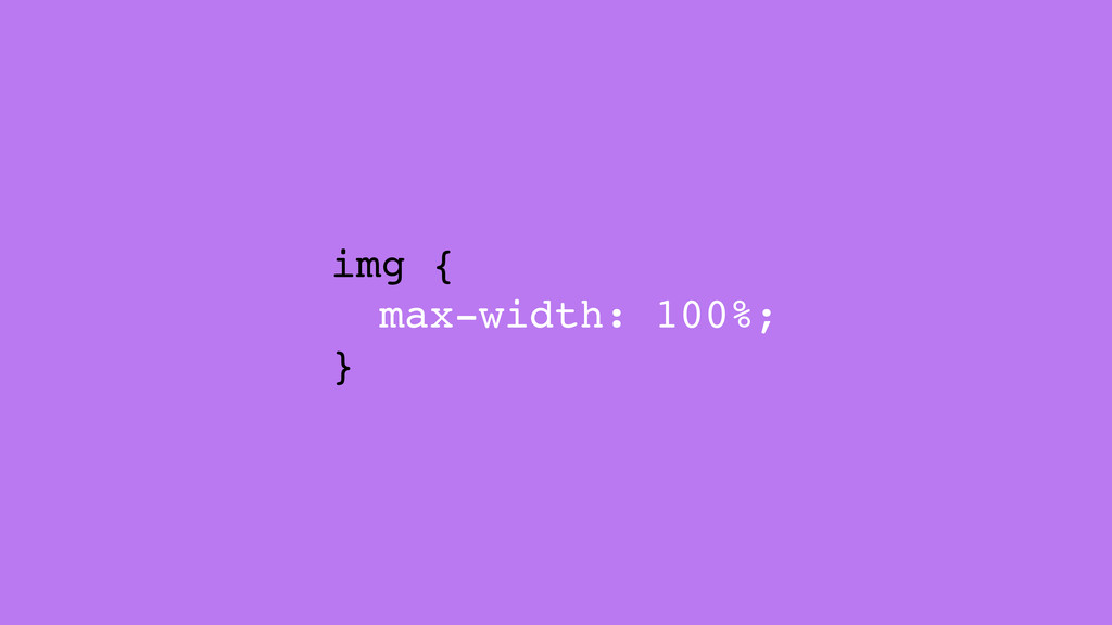
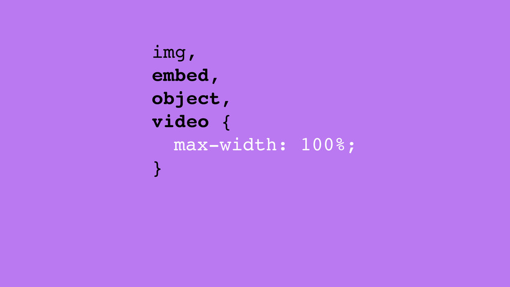
Flexible Media
img { max-width: 100%; }
img, embed, object, video { max-width: 100%; }
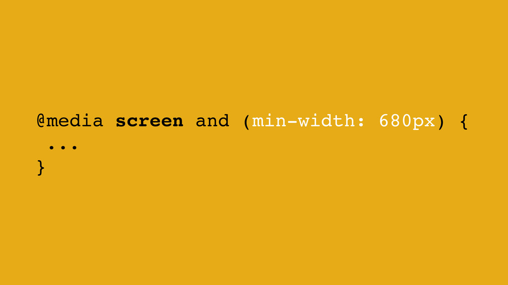
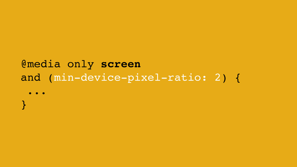
Media Queries
@media screen and (min-width: 680px) { ... }
@media only screen and (min-device-pixel-ratio: 2) { ... }
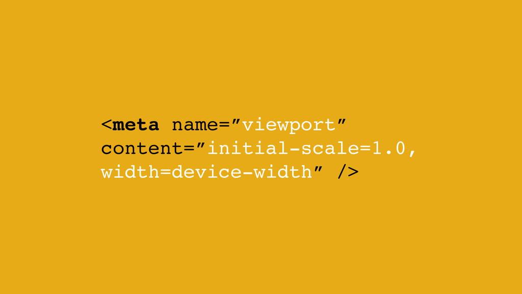
<meta name=”viewport” content=”initial-scale=1.0, width=device-width” />
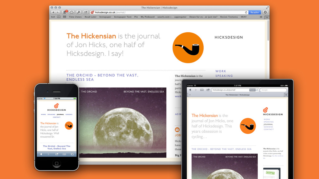
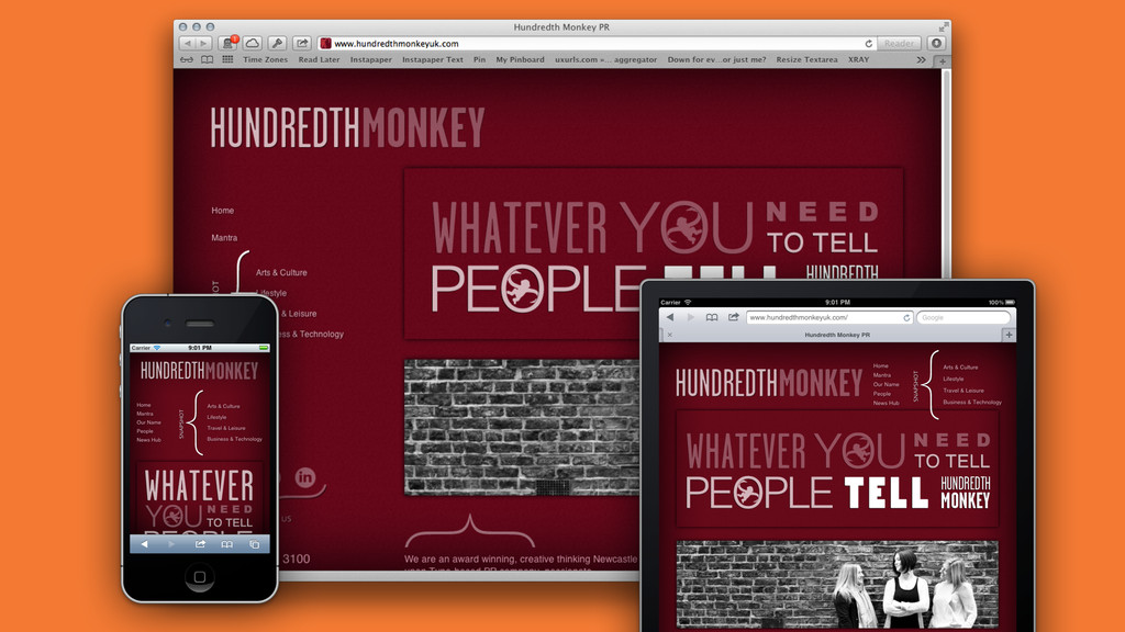
Showcase
None
None
None
None
Fin
 danbarber
 hilokifigma
 sevendex
 visional_engineering_and_design
 signull
 ajstarks
 marzstarz
 kgsi
kgsi
 securecat
 kenichiota0711
 mottox2
 bebe
bebe
 frankvandijk
 mkilby
 62gerente
 dugsong
 427marketing
 chrislema
 thoeni
 takai
takai
 tammyeverts
 brettharned
 keavy
keavy
 shpigford